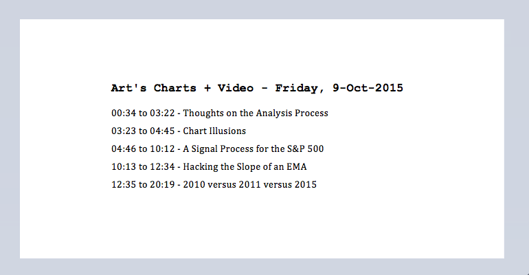
Before looking at some charts to establish the bigger trend, I would like to philosophize a little on the analysis process and my approach. I use basic chart analysis and some simple trend-following indicators to define the trend and trade accordingly. My main goal is to be as OBJECTIVE as possible and see what is actually there. David Fuller of Fuller-Treacy Investment Strategy, gave a presentation many moons ago and one quote stuck in my head. To paraphrase:
There are three possibilities when you look at a chart:
- You see what you WANT to see.
- You see what you THINK you see.
- You see what is ACTUALLY there.
Everything looks like a nail if you are a hammer! Fuller is basically telling us to leave our biases at the door and keep an open mind when looking at the charts. Bullish or bearish, biases stink and I am constantly working to get rid of them. The market is what it is, and does care if you are a bull, a bear or a hammer. Speaking of illusions, what do you see in the picture below?

There is clearly no uptrend in the picture above. The picture shows a young lady with her head turned away and she is wearing a necklace. The other half may see something else. Alternatively, it shows an older lady with a large nose and she is facing forward. The necklace is her mouth. This is detailed in today's video. In any case, this picture represents a price chart with indicators. There are always several interpretations on a chart and our job is to see more of what is actually there and less of what we want to see.
Interpreting a chart is quite subjective and we have to make some assumptions at some point. Truth be told, nobody really knows where the market is going and where the S&P 500 will be in 3, 6 or 9 months. We all know where it has been when we look at a chart and we try to extrapolate the future from the past.
My basic assumption is that a trend in motion stays in motion. In other words, I identify the trend and expect that trend to continue until it reverses. To reduce the subjective part of chart analysis, I incorporate trend-following indicators that remove some of the guesswork. No matter what is happening on the chart, these indicators provide a black and white interpretation of the trend. It is either rising or falling. I am bullish when it is rising and bearish when it is falling.
I also adhere to a basic tenet of Dow Theory: the length and the duration of the trend are indeterminable. Even though I sometimes make upside projections based on patterns and breakouts, I take these targets with a grain, or rather a bucket, of salt. The trend trumps all. A bullish trade is working as long as the trend is rising. A bearish trade is working as long as the trend is falling. Do more of what works and less of what doesn't. That little gem comes from Steve Clark in Hedge Fund Wizards (by Jack Schwager).
It is all about process. We need to have a process in place that will put us into the market at certain times and take us out of the market at certain times. There is no sense getting out if you do not have a strategy that will get you back in. By "market" I am referring to the broad market indices, namely the S&P 500, Russell 2000 and Nasdaq 100. I spend a lot of time focusing on these three because the trend for the broader market is the single biggest factor influencing sectors, industry groups and stocks.
A Signal Process for the S&P 500
Based on my analysis, the bigger trend for the S&P 500 (stock market) turned down in August and it remains down. There really are only three positions possible in a downtrend: short, out or a combination of the two. As noted before, it is difficult to make money on the downside because counter trend rallies can be very sharp. In fact, the S&P 500 is up almost 7% in seven days.
The chart below shows monthly candlesticks for the S&P 500 over the last ten years. There are three indicators and we have seen seven signals, less than one per year. The current signal is bearish and this triggered at the end of August. It is a monthly chart so we only get signals at the end of the month. A bearish signal triggers when two of the three indicators are bearish. The PPO(1,12,1) turns bearish when the S&P 500 closes below its 12-month EMA. The slope of MACD(10,0,1) turns negative when the 3-period slope of the 10-month EMA turns negative. This means the 10-month EMA has turned down. In the bottom window the trend turns down when the index moves below the lower line of the 12-month price channel. This tells us that a 12-month low was recorded. The green areas on the price chart mark support zones and you can see that some sort of support break accompanied each bearish signal.

This chart tells me that the bigger trend for the S&P 500 is down and I want to be defensive right now. What would it take to reverse this downtrend? Two of the three indicators would have to turn bullish again. This means the S&P 500 needs a monthly close above the 12-month EMA or the 3-period slope of the 10-month EMA needs to turn up. Note that the August low did not break the lower line of the 12-month Price Channel. This indicator is still in bull mode so it would only take one more bullish signal to tilt the balance back to the bulls. Also notice that the August 2015 low held above the October 2014 low, just as the October 2011 low held above the July 2010 low.
Hacking the Slope of an EMA
The direction of a moving average is just as important as its relationship to price. In fact, some analysts think it is even more important. A close below the 12-month moving average suggests that prices have turned down. Similarly, a downturn in the moving average also indicates that the direction is down. Chartists can eyeball the moving average to determine direction or hack MACD to chart the slope of an exponential moving average. MACD is the difference between two EMAs. MACD(10,0,1) is the 10-period EMA less the 0-period EMA (0), which is just the 10-period EMA. The "1" in (10,0,1) is the EMA for the signal line. Chartists can add the Slope indicator to MACD using the advanced options and this will show when the EMA turns up or down. The Slope is positive when the EMA is rising and negative when the EMA is falling.


2010 versus 2011 versus 2015
Even though no two bottoms are exact, we can learn from prior bottoms and apply these lessons to the current market. I am still focusing on the bottoms in 2010 and 2011 because of the similarities with the August breakdown. Both bottoms formed after a volatile basing period that lasted two to three months. The first chart shows the 2010 base and breakout. The bigger downtrend clearly reversed when SPY broke out on September 20th, 2010. This breakout was confirmed by zero line crosses in the PPO (10,60,1) and PPO (20,120,1), an AD Line breakout and a surge in new highs.

The 2011 reversal triggered on October 21st, 2011. The index broke resistance, the PPO (10,60,1) turned positive, the AD Line broke resistance and new highs expanded. Notice that strong breadth accompanied these breakouts. I will discuss the impulse moves and pullbacks in today's video.

Turning to the current SPY chart, we can see that SPY exceeded its mid September high with a sharp advance the last eight days, but has yet to negate the August support break. A move above 205 is needed to negate this breakout. The medium-term PPO (10,60,1) and long-term PPO (20,120,1) are both negative. At the very least, the medium-term PPO needs to turn positive. The AD Line did break above its mid September high, but we have yet to see a significant expansion of new highs because S&P 500 High Low% ($SPXHLP) remains below +5%. All told, I do not see enough bullish evidence here to warrant a change from bearish to bullish.

****************************************
Thanks for tuning in and have a good day!
--Arthur Hill CMT
Plan your Trade and Trade your Plan
****************************************