- Performance Overview.
- When Uptrends Lose Consistency.
- Only One Breadth Thrust.
- Not A Lot of Strong Uptrends.
- Majority of Stocks below 200-day EMA.
- S&P 500 Hits Moment-of-truth.
- On-Trend versus NOT On-Trend.
- Breakdowns Followed by Sharp Rebounds.
- This Week in Art's Charts.
- Notes from the Art's Charts ChartList.
 ... Getting Selective
The stock market rebounded with the biggest eight day advance since July 2016, which was just after the BREXIT vote. The S&P 500 advanced 6.27% in November and moved back above its 200-day SMA. Is it time to sound the "all clear"?
The chart below shows the index with the 8-day Rate-of-Change so we can compare the recent move with prior big moves. It is not often that the index surges over 4%, plus or minus, in eight days. As uptrend aficionados, we don't mind surges above 4% as long as they are not accompanied by surges below -4%.
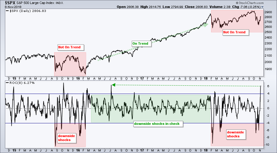
The red zones show when the index declined more than 4% over an eight day period. At the very least, such declines signal that the uptrend has lost its consistency. Notice that the 8-day ROC did not exceed -4% from March 2016 to January 2018 and this coincided with a consistent uptrend.
The 8-day ROC dipped below -4% at least six times in 2015-2016 and at least five times in 2018. The uptrend was hardly consistent from August 2015 to February 2016 and it is hardly consistent now. Downside shocks do not occur in strong and stable uptrends.

Analyzing Breadth During the Market Bounce
So we got a wicked bounce in November, but just how wicked was it? Well, it was enough to trigger one bullish breadth signal. The other eight remain with bearish signals and this means the eight day surge was not enough to reverse the bearish signals from mid October. Let's review the indicators.
Only One Breadth Thrust
The first chart shows the 10-day EMA of AD Percent, which is used to measure bullish and bearish breadth thrusts. This is usually the first indicator group to signal. All three indexes triggered bearish in early February, two triggered bearish again in late March and one triggered bullish in May ($SML). All three triggered bearish on October 10th. The S&P 500 triggered bullish this week with a move above +30%, but we have yet to see signals from the S&P Small-Cap 600 and S&P Mid-Cap 400. At least 2 bullish siganls are needed to turn this indicator group net bullish.

Not A Lot of Strong Uptrends
The High-Low Percent indicators measure the degree of market leadership or strong trends. A stock making a 52-week high is in a strong uptrend, while a stock recording a 52-week low is in a strong downtrend. This indicator group turned net bullish in late March 2016 and remained net bullish until October 10th, which is when all three AD Percent indicators moved below -10%. This means the number of new lows exceeded 10% of total issues in each index. All three High-Low Percent indicators turned positive again this week, but I have yet to see a big enough expansion of new highs to overturn the bearish signals from October.
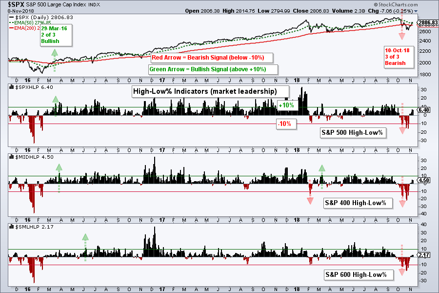
Majority of Stocks below 200-day EMA
The percentage of stocks above the 200-day EMA measures the strong uptrends within each index. This indicator needs to get above 60% to show enough "critical mass" to turn bullish, which all three did in March 2016. All three moved below 40% on October 10th to trigger bearish signals. The S&P 500 is currently above 50% again and leading because the S&P Small-Cap 600 and S&P Mid-Cap 400 remain below 45%. These two indexes have 900 stocks and this means the majority of stocks are below their 200-day EMAs. At least two of the three indicators need to exceed 60% to turn this group bullish again.

The bounce over the last eight days was impressive by itself, but not when compared to the selling pressure seen in the first two weeks of October. In other words, more follow through is needed to reverse the bearish signals from mid October.
S&P 500 Hits Moment-of-truth
As David Fuller of fullertraecymoney.com says, there are three possibilities when we look at a chart. 1) We see what we want to see (based on our bias). 2) We see what we think we see. 3) We see what is really there.
The challenge is to see what is really there, but we are human and cannot always be right. At this point, I could make both bullish and bearish arguments for this S&P 500 chart.
Bullish: The index hit a new high in September, held above the spring lows, the 50-day SMA is above the 200-day SMA and prices just moved above the 200-day SMA.
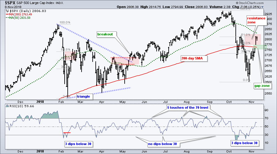
Bearish: The May breakout did not hold, the index is back below the January high, the index broke the 200-day with a decisive decline in October and the 200-day is turning down. The eight day surge is impressive, but the index did not break the mid October high and remains below the falling 50-day SMA.
Hmm.. it seems like the bearish evidence outweighs the bullish evidence. But there's more! RSI touched 70 five times from June to September and held above 30 from April to September. This bullish RSI range shifted lower with 3 dips below 30. Thus, I think we can add RSI to the bearish indicator group.
Turning back to the chart, Wednesday's gap above the 200-day SMA is the first area to watch for the success or failure of this eight day bounce. A close below 2750 would fill the gap and put the index back below the 200-day SMA.
On-Trend versus NOT On-Trend
The next two charts are very different. The Semiconductor iShares (SOXX) represents a price chart that is NOT "On Trend" and the HealthCare Providers ETF (IHF) shows a price chart that IS "On Trend". There are three possible trends when looking at a chart: up, down or flat. Two of the three are NOT "On Trend" as far as I am concerned (flat and down). I am looking for stocks and ETFs with uptrends that are consistent and persistent.
The first chart shows SOXX with a trend that is anything but consistent, stable or persistent. The ETF moved sideways from December to September with lower highs forming in June and early September. The breakdown and 52-week low were simply the icing on the cake (inconsistent trend).

Now compare the SOXX chart with the HealthCare Providers ETF (IHF) below. This ETF recorded new highs in January, May, July, August, September and October. The ETF has also been above its rising 200-day SMA for over a year. The pullback in October held well above the 200-day SMA as the ETF formed a falling channel. It looked like a normal pullback and it ended with the breakout late last week.

When looking through charts, I skip the ones that do not show consistent, stable and persistent uptrends. There are 1000s of stocks and ETFs out there and we should be very selective, not just now, but all the time.
Breakdowns Followed by Sharp Rebounds
I will be the first to admit that charts with breakdowns and sharp rebounds are especially challenging because we must pick the dominant move. Is the breakdown still the dominant move or did the rebound cancel it out?
The Cloud Computing ETF (SKYY), Cyber Security ETF (HACK) and Software iShares (IGV) hit 52-week highs in September and were leading the market then. All three plunged in October and broke the summer lows. Thus, we have big downside catalysts and lower lows. Such moves suggest that SKYY is no longer "On Trend" because the uptrend lost its consistency.
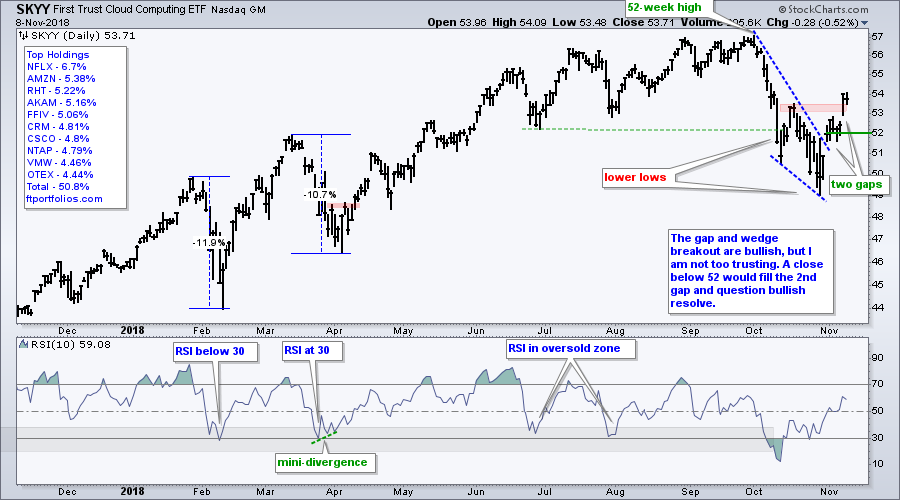
And then came the big bounce. We can draw some lines and see a falling wedge of sorts and a wedge breakout with the gap up on October 31st. After stalling for a few days, SKYY gapped up after the election and exceeded its mid October high, which is a benchmark high. Stocks and ETFs trading above this high are leading over the last five weeks or so.
As with the S&P 500 chart, the November rebound is impressive, but SKYY lost trend consistency in October. Wednesday's gap is the first area to watch going forward. The wedge breakout is clearly holding as long as SKYY holds above 52. A break below this level would question bullish resolve.
This Week in Art's Charts
- I covered S&P 500 resistance, the %Above 50-day EMA indicators and the downturn in some 200-day SMAs on Monday.
- Tuesday's show, On Trend, looked at the price action in XLY, XLK and XLC since the big sector realignment.
- Wednesday's commentary focused on some stocks with uptrends and the pre-election gaps (I am now watching the post-election gaps.
- Thursday's commentary focused on the Health Care SPDR (XLV), the HealthCare Providers ETF (IHF), the Medical Devices ETF (IHI) and nine stocks.
Note from the Art's Charts ChartList
- The Retail SPDR (XRT) got a re-draw because it broke above the October high and shows some leadership on this bounce.
- The Cyber Security ETF (HACK) and Software iShares (IGV) bounced, but did not clear their October highs (SKYY did).
- The Semiconductor iShares (SOXX) and Semiconductor SPDR (XSD) surged around 10% the last eight days, but did not break their mid October highs.
- The Broker-Dealer iShares (IAI) surged, but returned to the scene of its big support break.
- The Airline ETF (JETS) surged above its mid October high, but this surge began from the 2018 low and the big trend is down.
- The Biotech iShares (IBB) held the 2018 lows with a big bounce, but is hardly "On Trend" and in a trading range, at best.
- The HealthCare Providers ETF (IHF) is the leader with a 52-week closing high this week.
- The Medical Devices ETF (IHI) broke out of a falling wedge and exceeded its mid October high.
Questions, Comments or Feedback?
I do not take symbol request and I cannot promise to response to all correspondence, but I will read it and take into under consideration. I greatly appreciate all feedback because it helps me improve the commentary and provides ideas for the future.

Plan Your Trade and Trade Your Plan.
- Arthur Hill, CMT
Senior Technical Analyst, StockCharts.com
Book: Define the Trend and Trade the Trend
Twitter: Follow @ArthurHill