I've been nagging about how weak the commodities have been for a while. Some serious price levels are on the charts. It's timely to review the big picture. My personal list of the major commodity countries are Australia, Brazil, Canada and Russia.
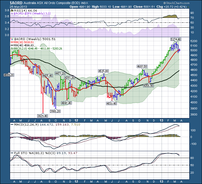
I want to focus in on these charts. Australia is a bright spot. Here is the chart.
It is very normal to watch the test of the 10 WMA. (DMA= Daily, WMA=weekly,MMA = Monthly). So far it looks very successful, but its very early (within a week).
When the 10 week moving average (WMA) is tested, we expect it to bounce the first time. That would appear to be what's happening with Australia. The dip back in November bounced down through the 10 WMA and tested the black line which is the 40 WMA. The 10 WMA is considered short term support and the black 40 WMA is considered longer trend support. Australia is clearly well above the long term line and looks super healthy.
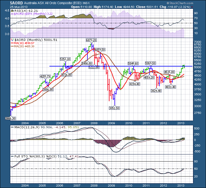
Here is the Aussie Monthly.
While Australia is above the 2 moving averages, we have to be impressed. The fact that the short term MMA has pushed above the long term is good news. I also notice Australia is hitting resistance at a major horizontal level once again. On a shorter term chart like weekly above, it looked so good. Driving up to the long term resistance level is good news. Now it neeeds to break through. It has now pulled back below the blue line. We'll see where it finishes Friday, but the fact it stalled at this major support and resistance level really is important. Maybe we get a better picture if we look at the other commodity charts to see what might happen next.
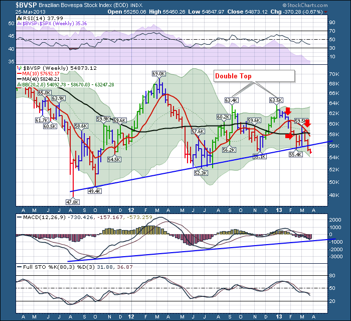
Let's move onto Brazil. Just going alphabetically, no particular reason for doing another southern hemisphere country next.
This Brazil chart lacks all the things we like to see. It failed in late January on the test of the 10 WMA. Two weeks later, it failed to hold above the 40 WMA. The first week of March was very important on this chart. You can see the blue candle went lower than the week before, then bounced. Then it soared above the 40 WMA, hitting the 10 WMA. We would be gettting very bullish. But then it finished the week back at the 40 WMA. Still in the top half of the week, it was ok. The next week, it went up against the 10 WMA and stopped. It fell from there, back below the 40 WMA and closed near the lows. Yucch! Last week it fell below a very solid trendline from the last 2 years. It closed below there. At this point, a technician starts to follow the price action intensely. If it gets support here, things are tragic but at least it is bouncing. Yesterday, the $BVSP continued lower giving us confirmation of the break below the line. You can also see the red line 10 WMA fell below the black line 40 WMA. That is how we start a downtrend. The short term average goes below the long term average. So red flags are going off all over this chart. It is a weekly chart, so it has until Friday to make it back up above Monday, back above last weeks close and back above the trendline.
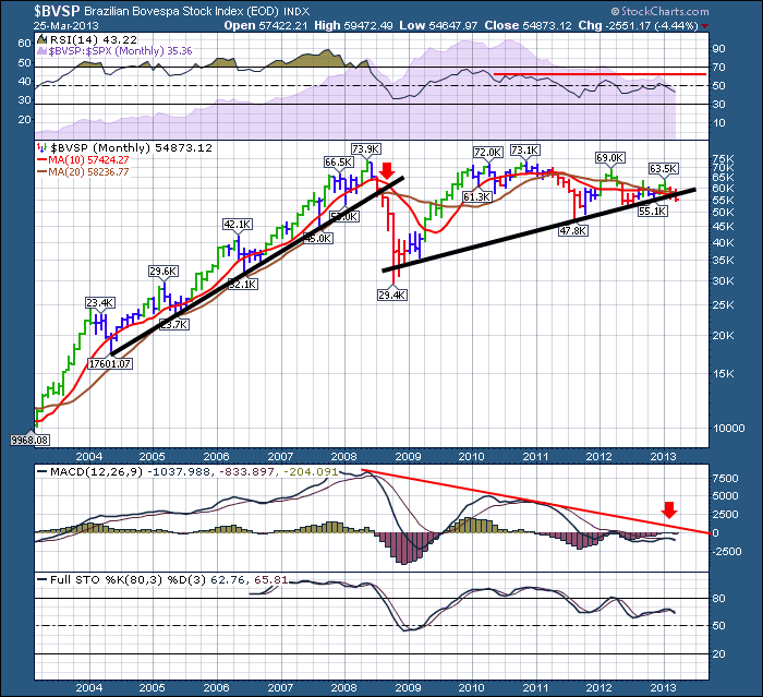
But I need to show one more chart for Brazil. The monthly chart.
Let's walk through this chart. Starting at the top of the chart, look at what the RSI is telling us. It keeps making lower highs and you can see that before the financial crisis it lived above the 60 RSI line for 3 years. Now it is exactly the opposite. No momentum higher. Moving to the price box, we notice when the black trendline broke in June 2008, it was a really big deal. You can see we are now breaking below the current black trendline which is a monthly trendline. The Index has now also fallen below its 10 MMA and that is a problem. I have put a 20 MMA in Brown on the chart as I find a 40 MMA just too long to be relevant for my investing cycle. We are below the trio of the trendline, the 20 MMA and the 10 MMA. The trendlines are confirming a long term down cycle. This is as strong a message as we can get that something is amiss. But it's only one country. Being aware of this condition should help us position better if investing in Canada or Australia. If life is a highway, it's telling us we might have to detour around the commodity sector.
Lets move on to Canada. Supplier of commodities to the most bullish charts on the third planet.
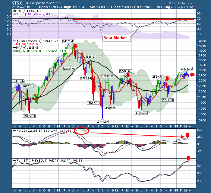
The $TSX is a very interesting chart. Lets start at the top. The RSI having lows down around 30 tells us we are in a bear market. The bounce off the November low above 40 is usually a support bounce that can then go on to make new highs and be the start of the bull market thrust. I was very hopeful back in December as you may remember. Unfortunately, the $TSX has continued to underperform the $SPX as shown in the shaded purple area since last fall. Moving to the price, we can see the $TSX has been flat at best for the last 10 weeks. It tried recently to break out to the 12904 level, but closed the week off the highs and slightly lower than the week before. It continued to find support at the 10 WMA but remember that the $SPX has been on a moonshot making new highs seemingly every week. The snap of the 10 WMA this week is considerably negative. There are 4 days left in the week and the month and the quarter so who knows how much juice can be applied to lift this back up. It needs it promptly. The MACD has gone negative as shown in the red circle, but it is not the end of the week yet. The Full sto's have also crossed which is a problem but could oscillate up here above the 80 level. A move back below 80 would be very concerning. Again, the $BVSP is showing extreme weakness, and I would now expect Canada to follow suit. It may not happen this week, but it feels imminent.
Here is the monthly for the $TSX.
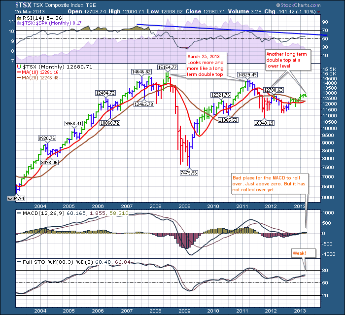
The monthly $TSX has two double top areas which is very interesting. Unfortunately the RSI continues to make lower peaks on the long term chart. The slight rise of the recent RSI level above the Spring 2012 level was promising, but it seems to have too much gravity for the price to break out. The MACD is just barely above zero. A confirmed downturn at this level would be bad news for commodity investors.
Let's go look at Russia.
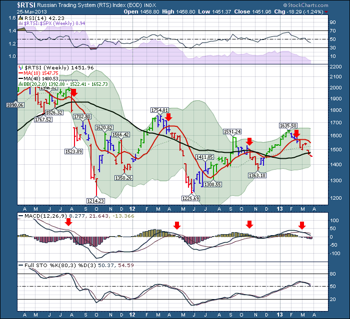
The Russian Index looks distraught as well. We can see the price has failed at the 10 WMA and the 40 WMA. The MACD has rolled over just above zero which is usually indicative of a failed breakout.
Here is the Monthly.
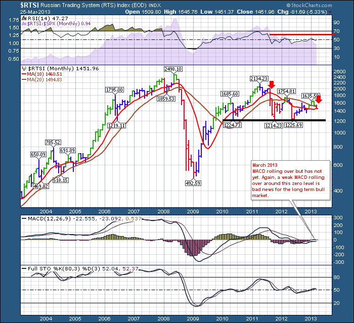
The RSI has not been able to get positive momentum for the last year. On the price plot, the short term 10 MMA is below the 20 MMA which is indicative of a bear market. By looking at the legend top left, you can see the price has now fallen below the 20 MMA and the 10 MMA. The price is making lower highs for the last 2 years. While the MACD has not confirmed the rollover yet, it is looking increasingly negative and I would be careful or at least not to expect to see a large inflow of funds before month end to reverse the trend based on the Cyprus situation. Horizontal support appears about 15% below this level.
Lets summarize the charts.
So it looks like on the monthly, two charts are breaking below the MMA's. Only Brazil has broken down through the price trendlines, but it would appear to be a bigger warning. Canada looks like its starting to break down based on it being below the level of the last 10 weeks and the fact that it could not break above horizontal resistance around 12800 even though the US markets were aimed skyward with euphoric price action. It also failed at what is a technically important double top. I don't know how common 'double-double' tops are. Knowing the Canadians affection for double-double coffees at Tim Horton's, maybe that's the link. Australia is by far the strongest of the charts but its test of the 10 WMA this week will be important. Australia failing at monthly horizontal resistance, in light of the other commodity charts, would let my Aussie friends protect their profits near the top.
If all four markets end up below the 10 week MA to finish the month and the quarter, that would be a problem technically. I'll be watching the monthly charts across 18 countries carefully for wide dispersion of this weakness. As I indicated a few weeks ago, the BRIC countries are starting to break down, not up. Global slowdowns usually affect everyone, even America. We'll see if it is different this time. Its enough to push me to the sidelines at this point.
Good Trading,
Greg Schnell, CMT

