I want to review some of the major market peaks and what made them roll over. Part of the analysis is the way the rollover happens. It is a changing of mood and of circumstance that eventually affects a wider audience. So let's go to the charts and explain the 2000 top.
The 2000 top was characterized by a specific sector breaking down. After having what anyone would call a boom, the technology sector imploded. Many companies that had no earnings were building out the world with new ideas. Massive sums were paid for companies with no earnings. The AOL merger was the classic buy at the peak. AOL, the internet upstart, was valued more than the vast brand of Time Warner and they were 'merging'. Valued at $350 Billion, it is a story that should be studied by every business student. More importantly it should be understood by investors. The deal was announced January 10, 2000. They did not know it at the time but Y2K was this massive technological pinnacle that they were all striving to get through.
Because the early days of programming were all about minimizing data fields, they had only used 2 digits for dates. So the 99 in 1999 was a problem. A lot of software was written and how a date rollover to a time of '00' - translated to nothing or no date - was suggested to create havoc worldwide. The first day of the new millennium was hyped to watch systems crash on power plants, electrical grids, traffic lights etc.. So while companies were recoding all old software they were also buying some new software. The internet was rolling out. Owning domain names was a really big deal. There was a rapid redeployment of new technology including moving voice and data by fibre rather than copper. Microsoft came out with Windows 2000. Sony was making gorgeous televisions and Walkmans. Cisco was connecting the world with their bridge logo. Global Crossing was laying fibre worldwide to be the world's backbone. You could sense the euphoria. Looking at the chart, we see this pinnacle. It only took a few months to realize it was all over. From March to April the Nasdaq 100 was down 35%!
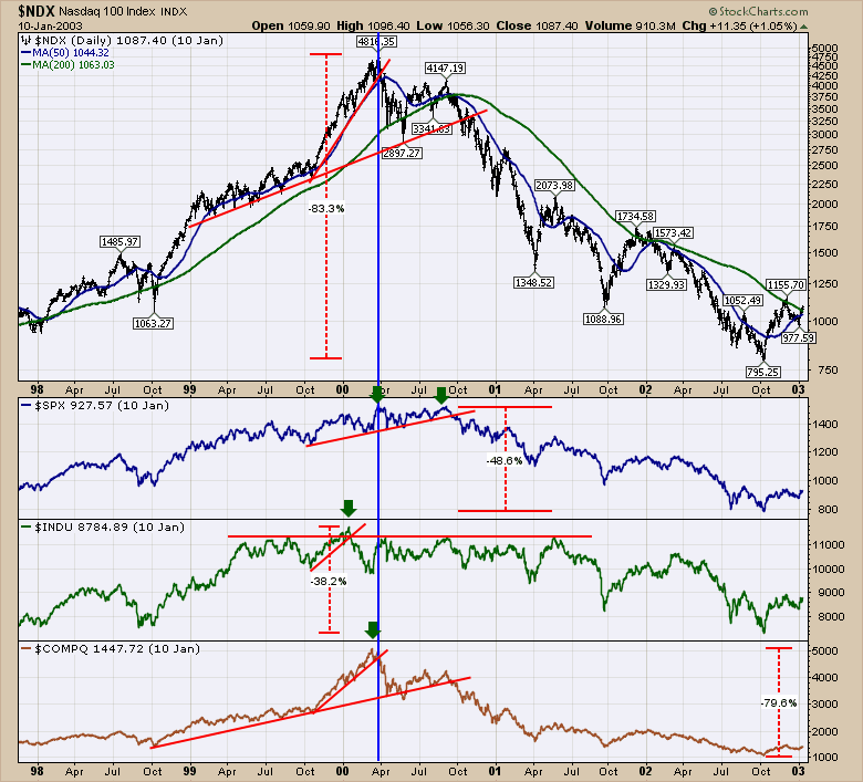
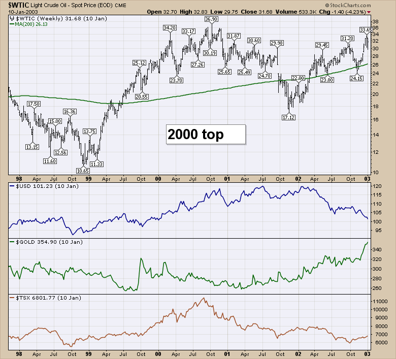
One of the things I find fascinating about the chart of the 2000 top, Is how long it took for other markets to break down. Everyone made the assumption that this blowoff was just that. A one sector deal. It was also after one of the longest bull markets from 1982 to 2000. Walmart, Microsoft, Sony and Home Depot were kings in the new world. But new crowns were on Cisco, Amazon, Ebay etc. The telco's were rockstars. Canada's Nortel made switching equipment. It made up 33 % of the Canadian stock market by market cap at one point. JDSU went from $1 to $1200 and back. Yes, all the way back. JDSU and Nortel were in on the fibre optic side. Just take a moment to look at the Dow in Chart 1. While the $INDU plateau'd in 1999, it made a brief surge to the early January high. The Dow peaked 5 days after the AOL merger. January 14, 2000. Microsoft peaked December 31, 1999. But notice the Dow traded between 10000 and 11000 for most of 3 years. 9/11 knocked it off its perch. The $SPX tried to make a new high late in September 2000, but was unable to do so. Chart 2 shows how oil traded.
Oil continued to make higher highs into the end of the year 2000, well after the market top. In 2001 it was making lower highs and lower lows but similar to the Dow. Moving sideways was the real theme in wide ranging swings. When the $USD finally put in its high in early 2002, the commodities started their major bull run. However, the fall in oil from 2000 to 2001 was more than 50% on the back of global weakness and had dropped 33% if you do not include the aftermath of 9/11. I lived in Europe and watched KPN, the Dutch National Telco, restructure as part of the telecom crush. It takes a while for these effects to be fully felt but the real point to make clear is the devastation in one industry slowly filtered to the others. The lower highs and lower lows in the oil business had nothing to do with fibre optic cable, internet startups, and media mergers, but the layoffs in one sector slowly infected other sectors of the economy. This was on the back of one of the greatest broad based bull markets ever. While commodities moved lower in price through the 1990's into the 2001 - 2002 lows, the tech market soared. However, they both ended up basing between late 2001 through 2002. However, the Bullish Percent Indexes for the NYSE and Nasdaq were under 50%. The lowest panel is the Canadian exchange ($TSX) where Nortel imploded after making up more than 33% of the Canadian index. The oil stocks fell hard as well.
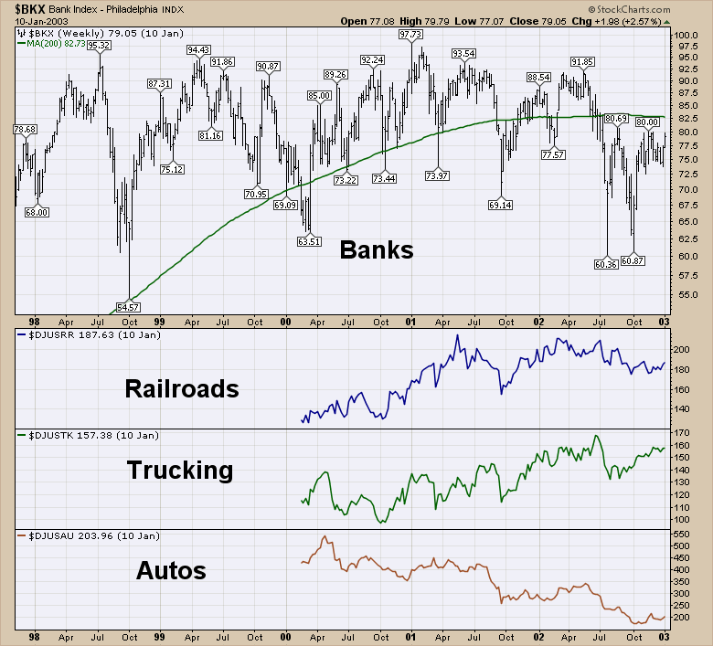
Lastly we have the US banks, railroads, trucking and autos. The banks were able to manage through it all. They suffered 30% swings throughout the 5 year period. But look how hard the automakers were hit. They lost almost 70%. Even though crude oil was falling, the auto industry fell. Some of that was foreign competition but a lot was the wider economy. Trucking and railroads continued to climb on the back of the biggest economic boom and really continued higher.
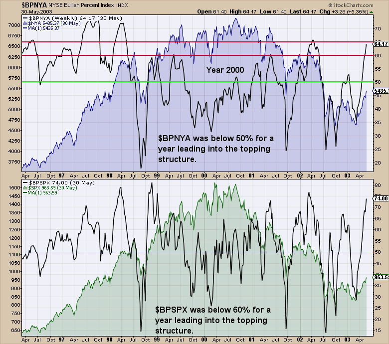
Here are the bullish percent indexes. I went back as far as the data we have.
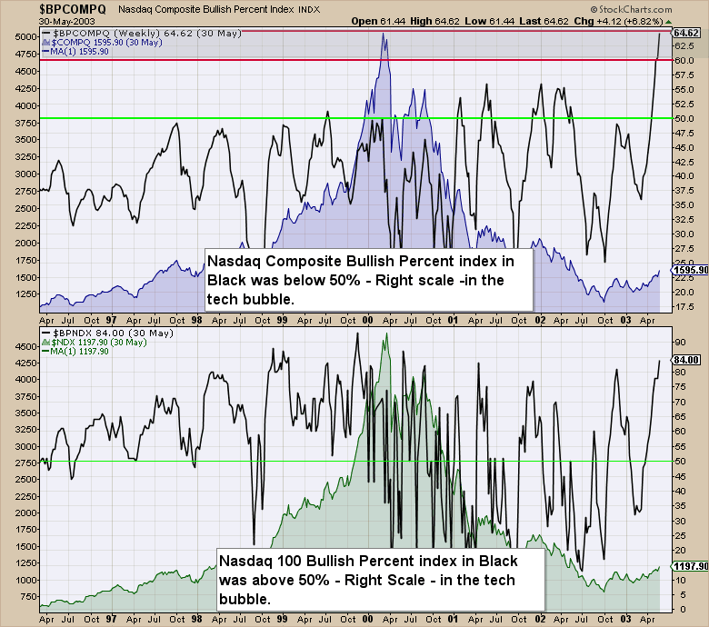
Here are the Bullish Percent Indexes for the NYSE Composite ($NYA) and the $SPX in the year 2000.
So that sets the basic stage for our discussion. When one sector implodes, where can we look for other damage to see if this will materialize into a larger problem? The charts of the major banks are really interesting, because they have just lost 13-18% in 3 weeks in 2015. I don't see anything different than back at the 2000 top where the banks oscillated but didn't make any progress. Most are currently around or below the same price as they were for the end of 2013. What I am writing about here is also discovery for me while we go. I have done lots of analysis of the market tops over the years. This time I see the implosion of the oil patch and I wonder if there are enough similarities to historic tops. The most recent mania was in Fracking and Shale. It was one of Cramerica's favourite horses to ride. He likes what is working lately. So as we read through the articles on this subject, think about the similarities to the 2014 oil environment. Lots of oil and gas producers have plummeted 50%. Large companies like Exxon Mobil, Chevron, Suncor, Shell have only fallen 25% at this point because of the additional profits on the refinery side that they make while the crude price falls. I don't know how this review of market manias will work out, but together we'll reach a conclusion of whether or not this has the potential to be one of those 'Aha' moments in time.
The 2007 top was in housing. While we don't have a specific exchange dedicated to the housing stocks, we'll look to see the similarities in Part 2 on this series of Market Manias.
Good trading,
Greg Schnell, CMT
