The $TSX is back in the zone of previous highs and is trying to push through. As I have said before, the $TSX has struggled with these levels for 10 years, so getting through won't be easy.
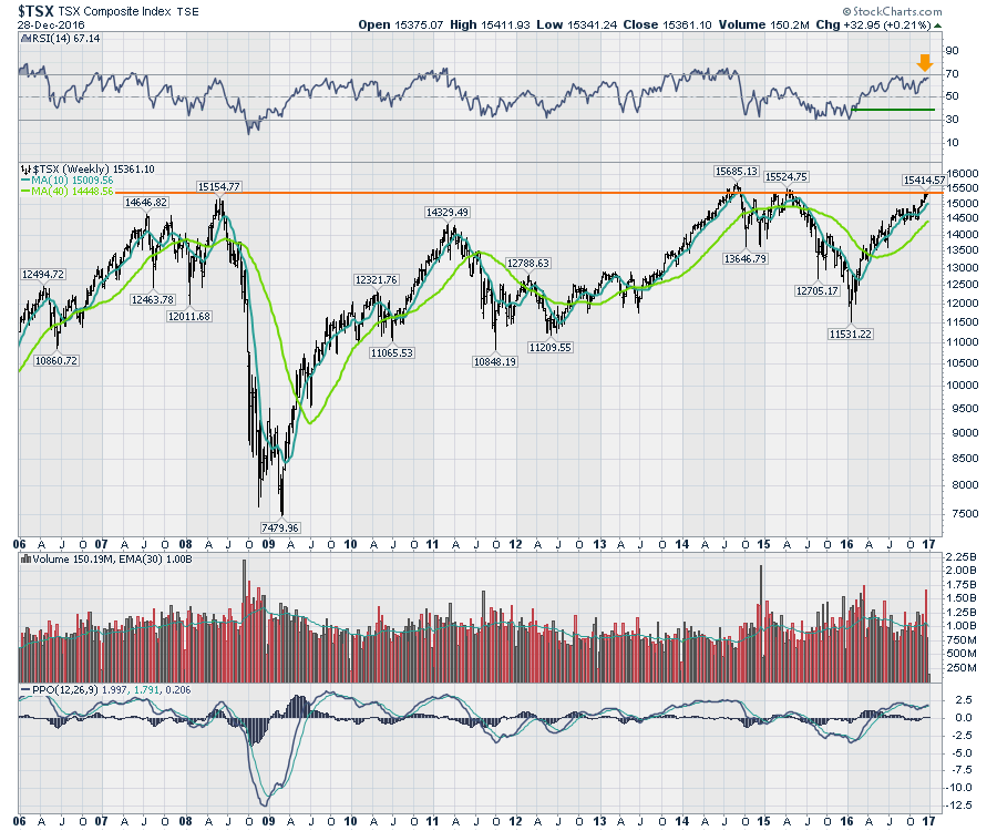
The RSI indicator shows that this has run a long way from 30 to 70, and now is making a slightly lower high, while price is considerably higher than the mid-summer high. It doesn't make it a sell, but it suggests we should be aware of the potential for the market to turn as it hosts lower momentum on this run than the August highs.
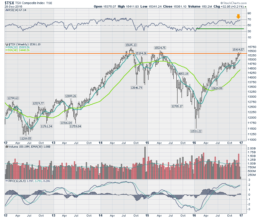
The PPO in the bottom panel is trending up but currently has a lower high as well. When momentum wanes after being up around this 2.5% level, there are not a lot of strong results after six months at these levels. Chart 2 is a closer look. The strong thrust in 2013-2014 had global Central Bank action pushing higher. This current move has been a doubling of commodities off the lows. Oil bottom around $26, it is now $54. Natural Gas bottomed around $1.60, it is now $3.70. Gold had an incredible rally this year and gave most of it all back. The financials surged massively in Canada on the back of the surge in US interest rates, but the Canadian economy is still sluggish.
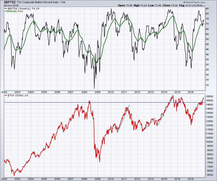
 I like to look at the Bullish Percent indexes. I covered them off in my webinar this week. Here is the BPI for the Toronto Stock Exchange ($BPTSE). On this chart, I have placed a simple 40 Week moving average in green. First of all, it is rare in the last 15 years, that the moving average gets above 70. When it does, that indicates a bit of an extreme. But more interestingly, a downward move through this level is usually pretty important. I only count 5 in 15 years, including the one in October 2016. Usually the corrections were 10% or more. October was a false breakdown. We currently have bounced back up but are starting to wiggle here. While this still suggests being long because it is above the 40 WMA, the wiggling is creating a lower high if it rolls over here. That would be bearish. So we need to watch this closely.
 Another way of looking at the Bullish Percent Index is in combination with the % of stocks above the 200 DMA ($TSXA200R). This is a regular part of my Commodities Countdown Webinar. The next one will be wrapping up the year 2016, so register for that by following this link. Commodities Countdown Webinar 2016-12-29. Here is the BPI chart with the $TSXA200R.
The reason this chart shows a different perspective is when the two indicators do not agree. While they are not really diverging, the $BPTSE has bounced to stay above the red line to suggest a strong bull market with lots of breadth, although weaker than the summer as we discussed. However, the $TSXA200R in black suggests that this bounce in the percentage has not gotten back into strong bull territory and currently looks weak enough to be a concern. The lime green line on both indicators is our current level. We need to see this continue to expand higher. Declining breadth from the summer to now is how tops are put in as you can see. The significance of the top is not known at the top, it's known only at the bottom! The $TSXA200R has been flat for 4 weeks as you can see in the zoom box on the right.
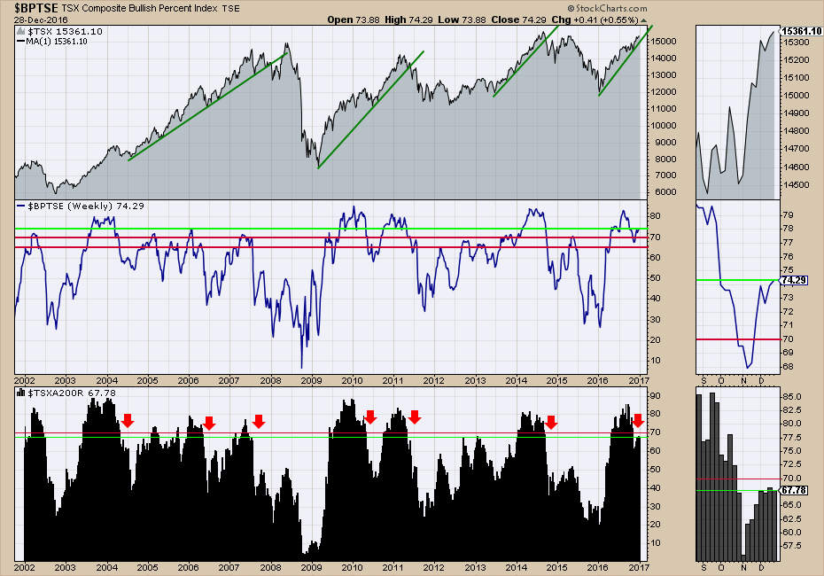 In summary, the combination of indicators with the previous highs in price make these indicator readings more important. The RSI is struggling to push to higher levels after this rally which suggests it might be running out of steam. The PPO with negative divergence from the August highs is on watch, but still trending up slightly. Each week that goes by with little or no progress rolls this PPO over. The $BPTSE is now at a lower level after being at a very high level. This wobble is important. All previous examples that turned down made meaningful corrections. These indicators are clues that we have as technicians that fundamental analysts do not have. The $TSXA200R is currently stalling under the breadth I associate with a big bull market. The fact that this is after a big bullish thrust is more concerning. It's the "Is That ALL You've Got?" statement in a picture.
Nothing is in sell mode. Everything is teetering on sell mode. I covered off lots more on the live webinar. I forgot to record the live webinar so I made a condensed recording of the live webinar after the fact. You can view that here.
The Canadian Technician LIVE! with Greg Schnell - 2016-12-27 17:00 from StockCharts.com on Vimeo.
With that, I'll be back in the New year with Martin Pring on Tuesday. You can join us by registering here. Martin Pring's Market RoundUp Live 2017-02-03.
Good trading,
Greg Schnell, CMT, MFTA
