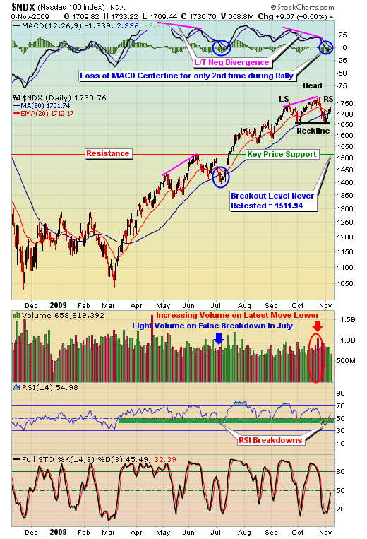
In my latest article on October 18, I provided a very cautious tone but noted that volume trends remained strong - good news for the bulls! Well, short-term volume trends now have turned negative, though the really key long-term price support levels remain intact. A couple damaging technical developments make the end of week rally very suspect. In the chart below on the NASDAQ 100 (or NDX), check out several annotations of significance:
There's a lot of information on this chart to digest so let's address each item, one at a time. First, notice since the March lows, we've seen the daily MACD break below its centerline only twice - once in early July and the other just recently. The MACD centerline breakdown in July was accompanied by a breakdown beneath the 50 day SMA as well, just like we're seeing now. The big difference though, in my view, is that the volume that accompanied the breakdown in July was extraordinarily light. Recently, our breakdown has occurred with the heaviest down volume since the March lows. This is a big red flag until it's resolved with a heavy volume breakout to the upside.
Next, notice the bearish head & shoulders pattern that has developed. This pattern is not confirmed until we see a breakdown beneath the neckline on heavy volume. Bottom line, the bears' work is not done yet. It is, however, a beautiful symmetrical head & shoulders pattern, the easiest to identify visually. Here are some of the key attributes of this head & shoulders pattern:
(1) Downsloping shoulders (from left to right) thus far, generally more bearish than upsloping shoulders
(2) Left shoulder peak = 1754.54
(3) Right shoulder peak (thus far) = 1733.22 (lower than left shoulder)
(4) Downsloping neckline, generally more bearish than upsloping neckline
(5) Left side of neckline = 1656.57
(6) Right side of neckline = 1652.44 (lower than left side of neckline)
(7) Distance between top of head (1780.83) and right side of neckline (1652.44) = the potential measurement on a breakdown, or 128.39 points
(8) Target on breakdown = right side of neckline (1652.44) minus measurement (128.39) = 1524.05.
The target on a potential breakdown is very interesting because it would represent a level that is less than 1% above the July breakout level that was never retested. One of the basic tenets of technical analysis is that a price resistance level, once broken, becomes price support. Usually such breakouts result in a later retest of the breakout level. In the case of the July breakout, however, we have yet to see a retest. This is the primary reason why I believe a short-term breakdown, if one were to occur, may only be temporary to backtest the July breakout. I still view the July breakout level to the be biggest technical price support level on the various indices and sectors. A head & shoulders breakdown could lead us exactly where we need to go technically, at least from a price support perspective.
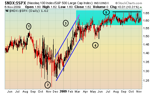
The reason for studying the NDX instead of our other major indices is quite simple. The NDX is comprised of many of the higher risk, higher beta names among the medium to large cap companies. When market participants have an appetite for risk, the NDX begins outperforming the S&P 500. We normally see this outperformance just before major bottoms are formed. Likewise, the NDX usually begins to underperform the S&P 500 just before tops are reached. So a quick review of the relative performance of the NDX vs. the S&P 500 can yield very important clues about how market participants view the market. In our world at Invested Central, this is one of many "under the surface" clues we regularly watch to identify changing market conditions.
Below is a relative chart that dissects the performance of the NDX relative to the S&P 500. Check out the chart and explanation below:
A few items stand out and are explained as follows:
Point 1 - represents the peak of outperformance by the NDX, just one month before the market's major meltdown that kicked into full gear by mid- to late-September 2008.
Point 2 - notice that in November 2008, the NDX began to outperform the S&P 500, a few months BEFORE the S&P 500 actually bottomed.
Point 3 - outperformance by the NDX on a relative basis was significant from November 2008 to March 2009 as the S&P 500 bottomed. Investors were showing their appetite for risk long before the market bottomed
Point 4 - By late April/early May 2009, this relative ratio was hitting levels that we're still failing to break above, a potential warning sign.
Point 5 - currently, this is the biggie. As the major indices continue to break out month after month during this uptrend, why isn't the NDX outperforming? I believe the appetite for risk is waning despite the higher equity prices. If this relative ratio falls back beneath 1.55, it would signal a major shift in market sentiment.
Bottom line, the warning signs are out there and watching the price/volume trends turn negative short-term adds to our cautious stance.
Happy trading!


