Yep, you read the headline correctly. I want to personally congratulate you if you're able to successfully trade this market. Because it ain't easy. Friday was yet another example. Not only did the report fall well short of expectations on the July jobs, the revision to June was another 100,000 of jobs lost. In a market that seemed ripe for a pullback, at a minimum, and possibly something much worse, the bulls didn't flinch. Sure, there was early selling on Friday, but by day's end the sellers were gone and the bulls once again established control of the action, nearly finishing the day with the major indices in positive territory. Crazy!
The bears were left wondering what it might take to drive prices lower. Seriously, what could have been worse than the disappointing July jobs numbers and the major downside revision to the June? Clearly, the market is heading higher, right? Well, that's where the "wackiness" comes in.
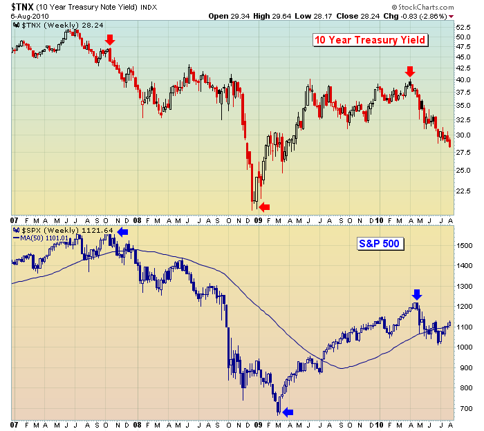
I've had serious issues with the market advance, starting in April. Two major technical problems surfaced in April that led to the broad selloff. First, the financial sector led the advance from the February bottom to early April. But as the market attempted another rally in late April, relative support from financials had reversed and this influential group began lagging, never a good sign. The second red flag involved the 10 year treasury yield. The yield has generally moved in unison with equity prices, with one caveat being that we've usually seen the yield move first, seemingly dragging equity prices along for the ride. We've seen several instances where the two have diverged, only later to realize that the yield seems to be the dog wagging equity prices, the tail. It happened in January 2009, when the 10 year treasury yield bottomed a couple months before the S&P 500 finally hit rock bottom in March 2009. More recently it happened in April 2010 as the yield topped at 4.00% in early April, a few weeks before the S&P 500 topped.
Check out this chart:

Focus on the red and blue arrows above. Note that every significant change in direction in the S&P 500 follows an earlier move in the 10 year treasury yield. It's as if the bond market senses and prices in economic changes slightly ahead of the stock market. While the downtrend in both the bond yield and the S&P 500 is quite apparent, the subtle leadership of bond yields may not be. If you study individual movements in each chart, you'll find a couple times where it appears the S&P 500 leads the bond yields as well. But the major moves seem to be led by the bond market. Keep mind that bond prices move inversely with bond yields. So a falling yield means that money is moving INTO bonds. Given that treasuries are viewed as a "safety net", the increasing bond values and falling yields also send a disturbing signal that investors continue to search out safety over higher risk. This always represents a red flag for equity prices.
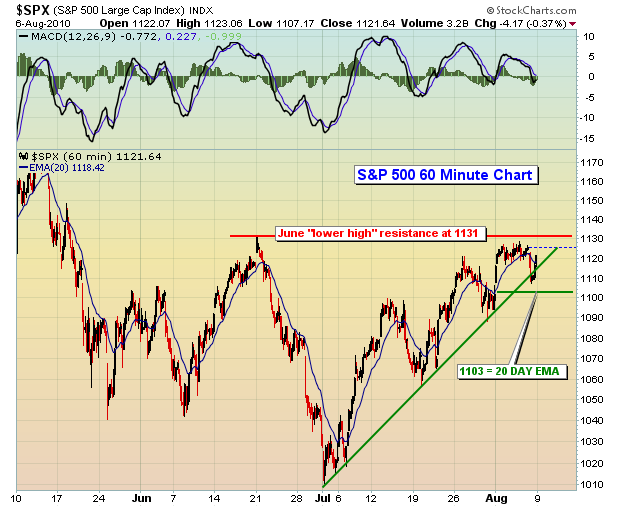
Back to that chart for a moment. As the S&P 500 continues its march higher and the bulls' resiliency shines through, how should we interpret the action in the bond market and the new recent lows in bond yields? Personally, I view it as a bearish backdrop for equities looking ahead. The problem with this thinking, however, is that many of the technical indicators I follow have turned decidedly bullish. The daily MACD, for instance, has made a very bullish centerline crossover and is pointing higher. This is unmistakable evidence that the bulls are in control of the action in the near-term. A downtrend is defined as a series of lower highs and lower lows. While the Dow Jones recently cleared its June "lower high" of 10594, the S&P 500 is still trying to clear its June "lower high" of 1131. That's the next hurdle to clear to the upside. And the bulls need to clear this hurdle while they have bullish momentum on their side. The short-term uptrend line and the 20 day EMA are the bulls' biggest lines of defense during periods of selling. I'd consider following this chart for additional short-term clues:
Happy trading!
The bears were left wondering what it might take to drive prices lower. Seriously, what could have been worse than the disappointing July jobs numbers and the major downside revision to the June? Clearly, the market is heading higher, right? Well, that's where the "wackiness" comes in.
I've had serious issues with the market advance, starting in April. Two major technical problems surfaced in April that led to the broad selloff. First, the financial sector led the advance from the February bottom to early April. But as the market attempted another rally in late April, relative support from financials had reversed and this influential group began lagging, never a good sign. The second red flag involved the 10 year treasury yield. The yield has generally moved in unison with equity prices, with one caveat being that we've usually seen the yield move first, seemingly dragging equity prices along for the ride. We've seen several instances where the two have diverged, only later to realize that the yield seems to be the dog wagging equity prices, the tail. It happened in January 2009, when the 10 year treasury yield bottomed a couple months before the S&P 500 finally hit rock bottom in March 2009. More recently it happened in April 2010 as the yield topped at 4.00% in early April, a few weeks before the S&P 500 topped.
Check out this chart:

Focus on the red and blue arrows above. Note that every significant change in direction in the S&P 500 follows an earlier move in the 10 year treasury yield. It's as if the bond market senses and prices in economic changes slightly ahead of the stock market. While the downtrend in both the bond yield and the S&P 500 is quite apparent, the subtle leadership of bond yields may not be. If you study individual movements in each chart, you'll find a couple times where it appears the S&P 500 leads the bond yields as well. But the major moves seem to be led by the bond market. Keep mind that bond prices move inversely with bond yields. So a falling yield means that money is moving INTO bonds. Given that treasuries are viewed as a "safety net", the increasing bond values and falling yields also send a disturbing signal that investors continue to search out safety over higher risk. This always represents a red flag for equity prices.
Back to that chart for a moment. As the S&P 500 continues its march higher and the bulls' resiliency shines through, how should we interpret the action in the bond market and the new recent lows in bond yields? Personally, I view it as a bearish backdrop for equities looking ahead. The problem with this thinking, however, is that many of the technical indicators I follow have turned decidedly bullish. The daily MACD, for instance, has made a very bullish centerline crossover and is pointing higher. This is unmistakable evidence that the bulls are in control of the action in the near-term. A downtrend is defined as a series of lower highs and lower lows. While the Dow Jones recently cleared its June "lower high" of 10594, the S&P 500 is still trying to clear its June "lower high" of 1131. That's the next hurdle to clear to the upside. And the bulls need to clear this hurdle while they have bullish momentum on their side. The short-term uptrend line and the 20 day EMA are the bulls' biggest lines of defense during periods of selling. I'd consider following this chart for additional short-term clues:
Generally, when the MACD is as strong as it is now, the 20 day EMA holds as support during directional trend periods. I've plotted 1103 on the chart, identifying that as the current 20 day EMA. If 1103 is lost as support, clearly the short-term uptrend will have ended and significant short-term moving average support will be lost as well, a bearish development. However, if the bulls can continue to show their recent resiliency and clear 1131 price resistance on a closing basis, it's another feather in their cap.
So, how can we make "cents" out of this market? Good question. First, I'd lower the bar in terms of performance expectations. It's a difficult market environment. I like to scan for very specific stock candidates with very low risk in the event the recent whipsaw action continues. It's not a guaranteed method to riches, but it is a disciplined approach to trading a wacky market. Along these lines, I'm pleased to announce that Invested Central is introducing its first in a new Premier Active Trader Series, "Scanning Strategies for Active Traders". CLICK HERE for more details. Our Chart of the Day for Monday, August 9th, represents a trading candidate from one of our weekend scans. CLICK HERE to view this chart.Happy trading!

About the author:
Tom Bowley is the Chief Market Strategist of EarningsBeats.com, a company providing a research and educational platform for both investment professionals and individual investors. Tom writes a comprehensive Daily Market Report (DMR), providing guidance to EB.com members every day that the stock market is open. Tom has contributed technical expertise here at StockCharts.com since 2006 and has a fundamental background in public accounting as well, blending a unique skill set to approach the U.S. stock market.
Learn More
