Hello Fellow ChartWatchers!
It was "back to the future" time for the markets this week with the Dow falling over 350 points and ending up just below 16,000. This has caused lots of consternation and teeth-gnashing in the mainstream financial press, but let's back up and get some technical perspective before drawing conclusions. Here's my chart of the current big picture:
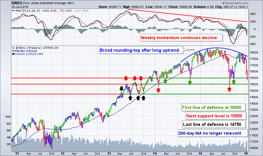
This is this same chart I featured during last week's webinar. (So far, I haven't needed to update the annotations either!) There's a lot of stuff going on here so let's break it down:
- The market continues to roll over (blue line) after a l-o-n-g uptrend stretching back to at least 2011. Investors that got used to that long uptrend were spooked last August when things first broke down. Those same investors loved it when the market quickly recovered in October. Now - somehow - they are once again shocked by the recent decline back down to the same levels we saw in August/September. (They seem to be "memory challenged" in my book.)
- Looking above the price chart, we see that the market's weekly momentum continues to decline with the MACD below zero and heading lower quickly. That's not surprising given the sharp declines over the past two weeks. You can expect momentum to continue moving lower for several more weeks at least.
- The green arrows on the chart point out our "first line of defense" - 16,000 - which has proved very important to the market in the past. Will it provide support for things this time around? That is THE questing right now. There was some evidence of support at 16,000 at the end of the day of Friday, but we won't know for sure until Tuesday's open. (Monday is a market holiday in the US.)
- The interesting thing is that 15,500 is probably a more important support level for the Dow (as shown by the red arrows). That's where last August's big drop turned around. It also was an important level back in 2013. As I said last week, if 15,500 doesn't hold, that will be the time to become more seriously concerned about the long-term health of the market.
- The black arrows show the "last line of defense" which is around 14,750. Let's not talk about that yet shall we?
- One last thing to notice on this chart: weekly volume hasn't spiked siginificantly during the past two weeks. Yes, it is high, but not unusualy so like it was in August.
Even though the market headed lower last week, that doesn't mean that there weren't any opportunities for the bulls. Our Sector Rotation PerfChart (below) shows you exactly where those opportunities were:
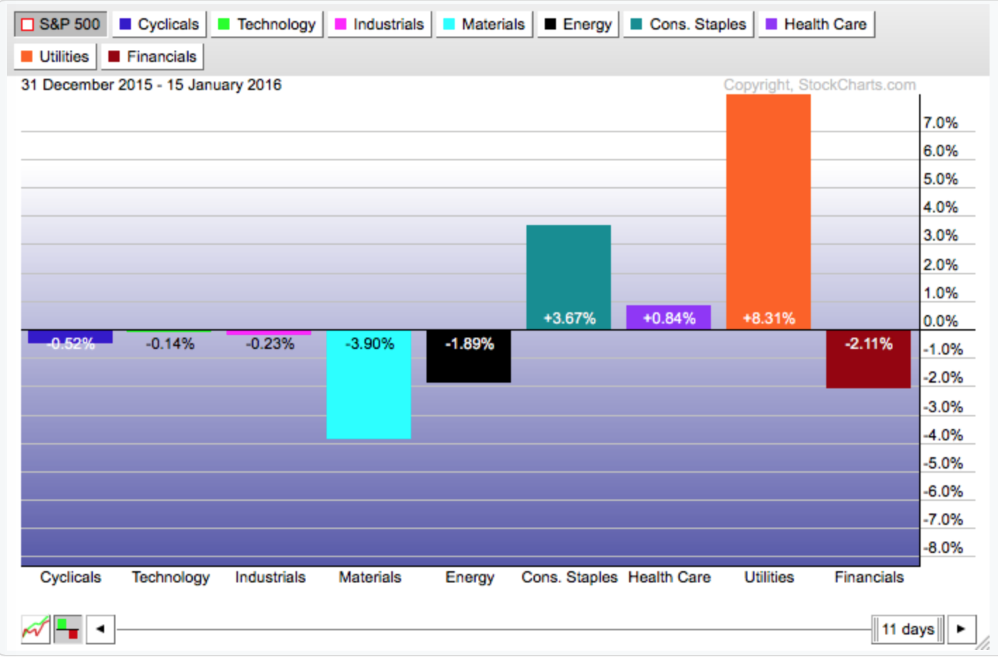
This chart says that since the start of the year, three sectors - Consumer Staples, Health Care, and Utilities - have out-performed the S&P 500. Since those are key defensive sectors, we should expect the market overall to keep moving lower in the near term.
Note that the chart above doesn't show the entire picture however because the S&P itself has been heading lower too. Let's see this chart using absolute performance instead of performance relative to $SPX. By clicking on the grey "S&P 500" box in the upper left corner of that chart, we get the absolute picture:
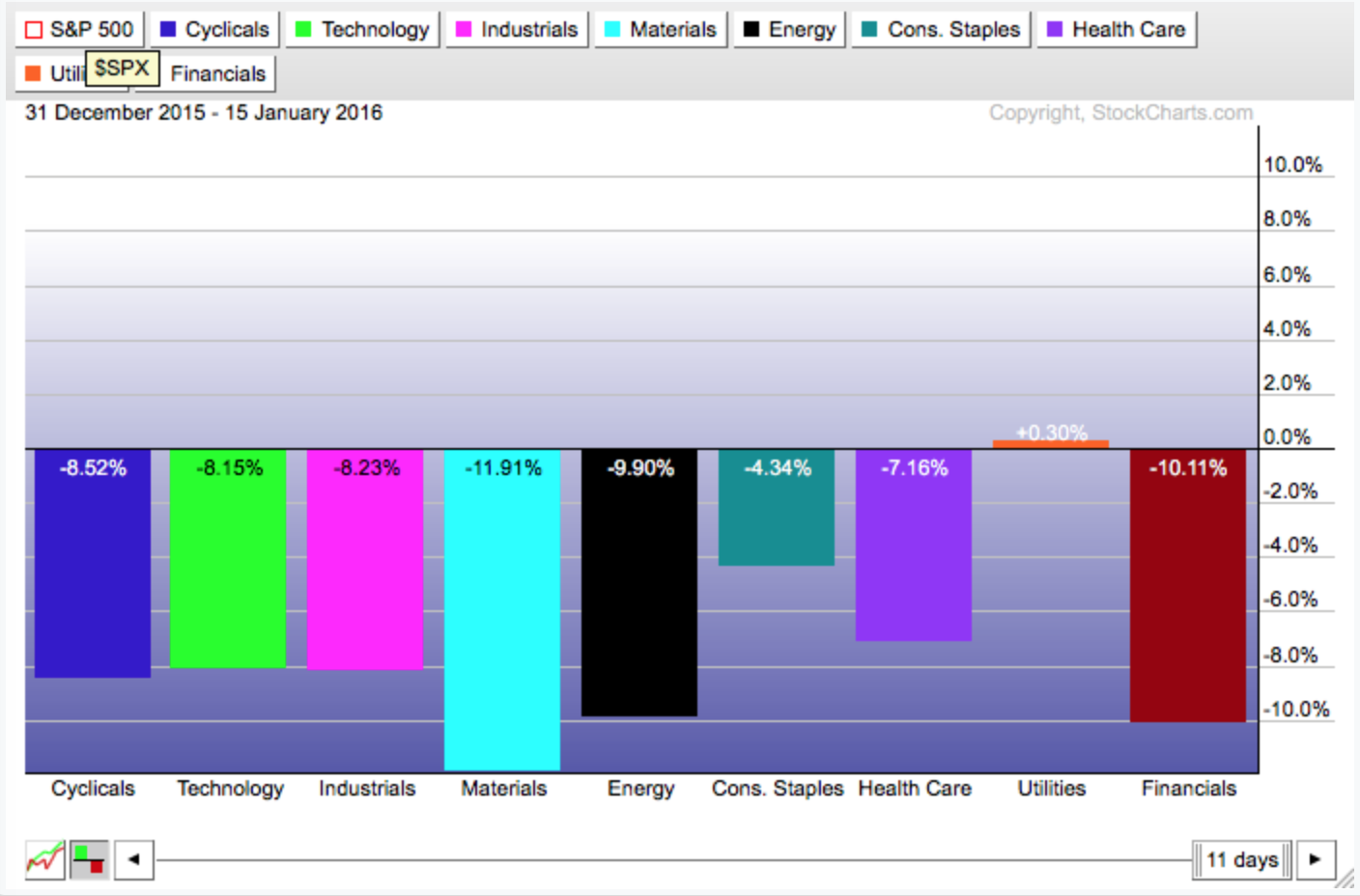
Hmm... That's kind of depressing. We now see that only the Utilities sector (which is a proxy for the Bond market i.e., the "anti-stock market" sector) has shown a gain in January. If you need to buy stocks right now, Utilities (and possibly Staples and Health Care) are the stocks to look at.
Clearly now is a time for caution. In reality, the charts have been negative since early 2015. That said, now is not the time to "tune out." As the market declines, technical analysis becomes more and more important. As I demonstrated above, charts can show you where previous support levels are located and technical indicators can tell you if those levels will hold or not. The expression "Wall Street is on sale" is becoming more true every day as stocks decline. Use charting to help you discover when the sale is ending.
- Chip
P.S. Don't think there are any bullish charts out there right now? Check out Campbell Soup which was returned by my "Strengthening Strength" scan. (See last week's webinar for details on that scan.) No promises, but it is still doing well and is in one of the key defensive sectors (Staples) this is doing relatively well right now. Something to keep an eye on.
