The US markets and Canadian markets are totally different beasts right now, but it makes a great learning moment to look at both of them to understand how markets break down.
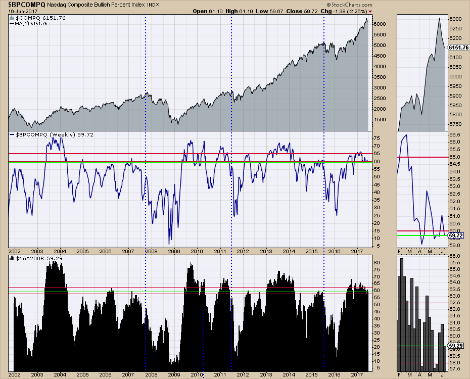
The chart below is the Bullish Percent Index for the Nasdaq Composite ($BPCOMPQ). I have two other plots on the chart. On top is the plot of the Nasdaq Composite ($COMPQ) and the other is the Percentage Of Stocks Above The 200 DMA ($NAA200R). To read more about the Bullish Percent Index, read the ChartSchool article here. Bullish Percent Indexes (BPI). As a quick comment, the BPI keeps track of the percentage of stocks in a group that are on a buy signal meaning they are making higher highs.
On the charts below, the green lines on the panels that I have placed there manually are the current market levels. I have placed two red lines on each of the indicator plots. The top one is when the market is Big Bull", the other is the level that the market usually finds support in a big bull market. When the Nasdaq Composite Bullish Percent Index ($BPCOMPQ) is above 65, the market can roar forward. Recently it spent from December to March above that level. In April, May and June it has hovered around 60% and we can see the market still roared ahead. That is fine, the lower level is more for brief pullbacks. When it starts to fall under these levels, the market is usually in a correction of some sort. However, the BPI is slower to notify than the $NAA200R in the bottom panel. When a stock is below the long term 200 day moving average, technicians call that condition bearish. This chart keeps track of all of the stocks on the Nasdaq Composite and currently shows a level of 59% (green line in zoom box). If you look left on the chart, corrections usually start around the 58% level. These are eyeball levels based on the charts history and are different depending on the group of stocks you are looking at as I will explain later. In 2015, the market started to break down below these levels as an example. The late October 2016 4% pullback showed this chart pulling back to 54% roughly. In broad terms, if enough stocks are currently participating in the bull market (59%), the overall market can still push higher. We refer to this as the breadth of the market. The more individual stocks in uptrends, the better the 'breadth' of the market.
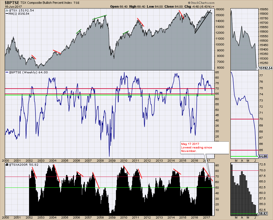
If I show the Canadian market currently to illustrate a market breaking down, the recent change in the levels of these two indicators becomes much more important. The bottom red line on the Bullish Percent Index has been breached as the indicator sits at 64 %. However, the Percentage Of Stocks Above The 200 DMA ($TSXA200R) has been getting weaker since late February when it fell below 70%. You can see the declines on both panels in the zoom box. This has been warning us that the 'breadth of the market is shrinking' and more stocks are falling behind. Since May 1, the Canadian market is down 2.6% and from the highs in February, 4.7%. My annotation on May 17th on the $TSXA200R was that the breadth was starting to hit new 6-month lows. This was a mid week reading at the time, but it alerted us that the market was vulnerable. The BPI was still strong enough but more and more Canadian stocks were falling below the 200 DMA. Now, a full 49% of the stocks are below the 200DMA and the Canadian market is falling almost every day now. The green line shows 50.89% above the 200 DMA ($TSXA200R). Understanding how these breadth readings contribute to seeing market weakness can be helpful.
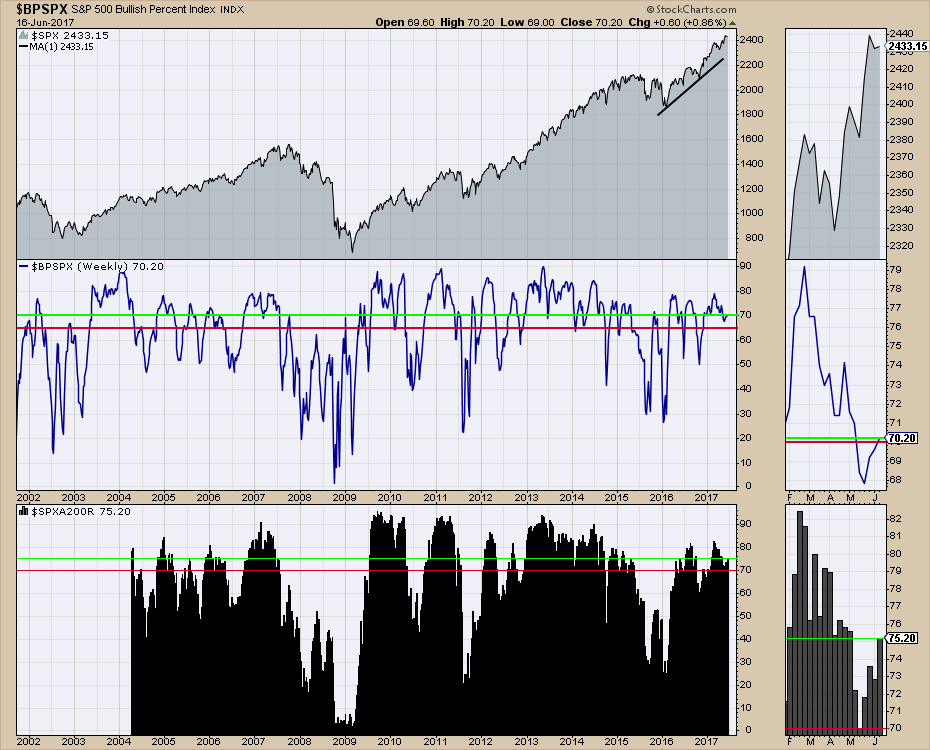
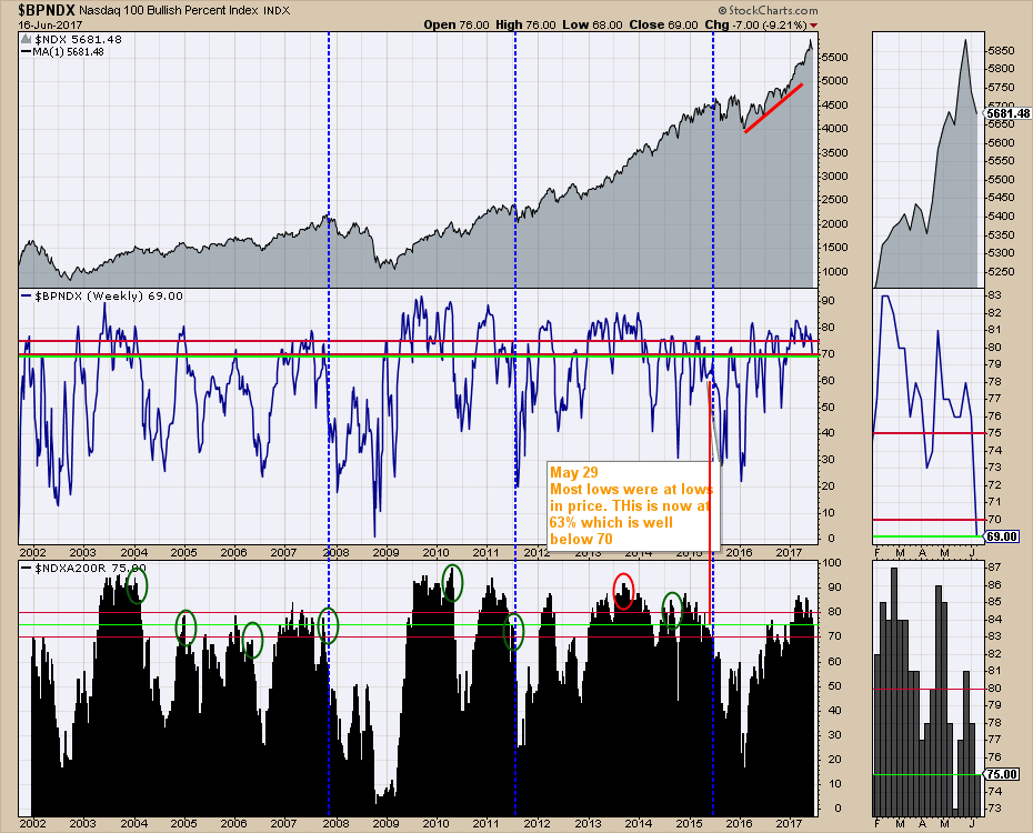
 Let me go back to the USA markets again. We all know that the FANG type stocks have been driving 50% of the Year To Date gains. As long as the big caps in the USA continue to hold up, the US market can continue higher. There are two charts that make that obvious. One is the BPI for the S&P 500 ($BPSPX), the other is for a smaller, tighter, more powerful group which is the BPI for the Nasdaq 100 ($BPNDX). Both of these charts appear strong and until they start cracking more broadly, there is plenty of breadth for the US market to continue higher.
The chart below is for the Large Cap 500 stocks in the S&P500 ($SPX). It is still very strong with lots of breadth.
 For the $NDX, the big pullback in Technology stocks last week made a difference to the $BPNDX level but the stocks were all well above the long term 200 DMA so that indicator did not move much. Looking in the zoom box, we can see both indicators trending lower but still at strong levels based on looking left on the chart. If the decline in breadth continues to detiorate, we'll have to be concerned about the potential for a bigger pullback. Currently, the levels are holding strong. This won't get you out at 1% off the highs level, but it will show you when breadth is too narrow to push the market higher.
 You can find these charts with the green lines showing the current level updated frequently on my Commodities Countdown Chartlist of 30 important charts. This list is always available for you to quickly scroll through and is easy to bookmark in your browser. In just a few minutes you can get a broad update on what I think are important charts. Hopefully, that helps! As well, you can click the 'notify me' button on each blog that StockCharts authors write to get an email when there are new articles. The email won't be used for spam in any way.
Good trading,
Greg Schnell, CMT, MFTA.
