History tells us that, at major turning points for commodities, there is a strong, albeit imprecise, tendency for the gold price to have preceded that reversal. Gold generally leads because a rising price anticipates inflation, while a falling one anticipates deflation. This idea is represented by the rightward sloping solid arrows in Chart 1, which join important turning points for both series. The dashed ones represent exceptions to this rule. The recent dichotomy between a rising gold price and lower commodities is therefore flashing the probability of an imminent bottom for the latter. The problem with this conclusion is that the lead times between the low in gold and that of commodities has varied considerably. A more precise approach is therefore needed if we are to take full advantage of this relationship.
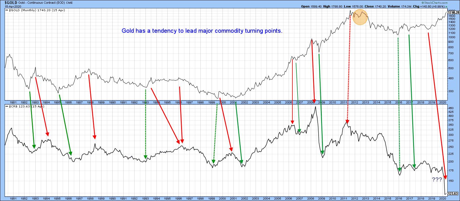
Chart 1
Chart 1 established the principle that trends in the gold price generally discount those for commodities. Consequently, reversals in the relative performance between them should as well. That brings us to Chart 2, which compares the relative performance between gold and the CRB Composite to the CRB Composite itself. A rising relationship means that gold is outperforming commodities and vice versa. The solid vertical green arrows indicate KST peaks for the ratio. The smaller ones above the CRB draw our attention to the fact that such action is almost always bullish for commodities themselves. One exception developed in 1980; the major difference between this failure and the multitude of successful signals is that commodities had already enjoyed one of the best bull markets in history and, therefore, were ready for some corrective action. Normally, when the ratio peaks, it is associated an oversold commodity market, which stands a greater propensity to advance.
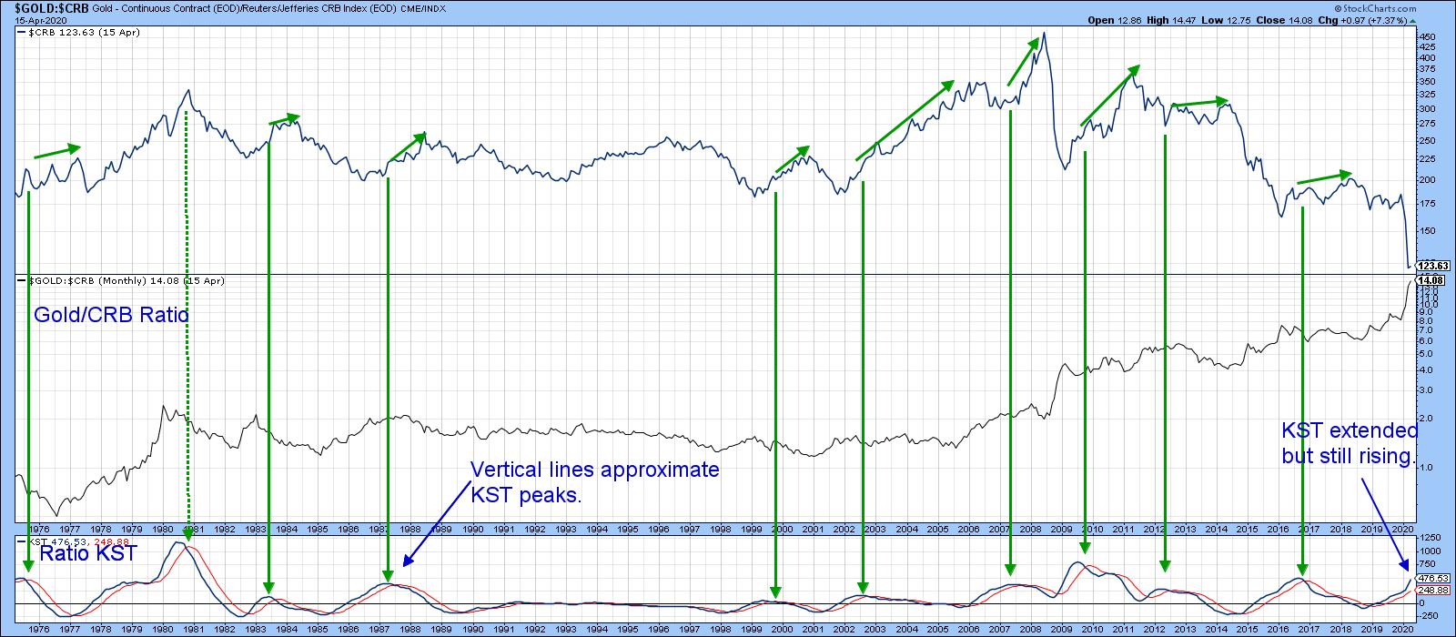
Chart 2
In the last couple of months, the gold price has rallied while commodities have fallen sharply. This has resulted in an unprecedented divergence and a high reading in the ratio's KST. We can't yet say that this relationship has peaked, as both series are still marching higher. Unfortunately, the KST, being a smoothed indicator, may take some time before it signals a change in course. Consequently, we should look for a more timely, yet reliable indicator to give us a clue as to when a reversal is taking place.
That might come with a simple 15-month ROC, as featured in Chart 3. Using the benefit of hindsight, the green arrows once again signal peaks in the ROC that developed when it was close to or above the +50% level. It is certainly overstretched on the upside, but, once again, there is no evidence of an actual top.
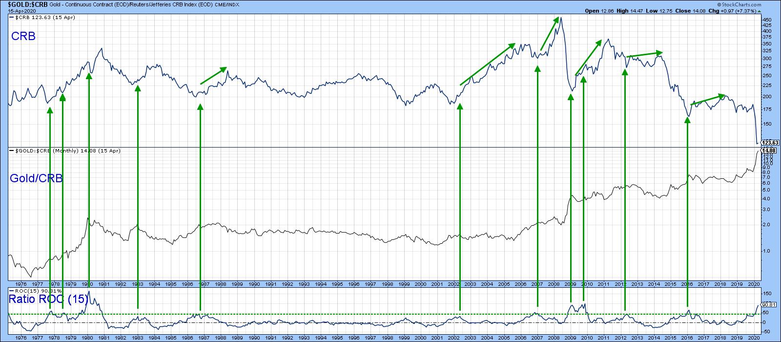
Chart 3
Editor's Note: This is an excerpt of an article that was originally published in Martin Pring's Market Roundup on Thursday, April 16th at 7:55pm ET. Click here to read the full article, which includes Charts 4-5 and a discussion of more potential indicators.
Good luck and good charting,
Martin J. Pring
The views expressed in this article are those of the author and do not necessarily reflect the position or opinion of Pring Turner Capital Group of Walnut Creek or its affiliates.