 If you recall from the earlier article on Chapter 4, it is being presented in two parts because there are almost 50 charts in that chapter. Chapter 4, Part 1 is here. I selected the following indicators for this article, you can see by the Chart numbers below each chart that there are many more that will be in the book.
Advance Decline Index – Eakle
Author/Creator: Eakle
Data components required: Advances (A), Declines (D).
Description: This is a smoothed rate of change of the Advance Decline Line. It was originally used as a weekly indicator with a smoothing of 35 weeks and then a 2 week rate of change.
Interpretation: Because of the simplicity of this indicator, using the concept on daily data seemed reasonable. Chart 4-18 shows the Eakle advance decline index using a 10 day (2 weeks) rate of change and a 175 day (35 weeks) smoothing.
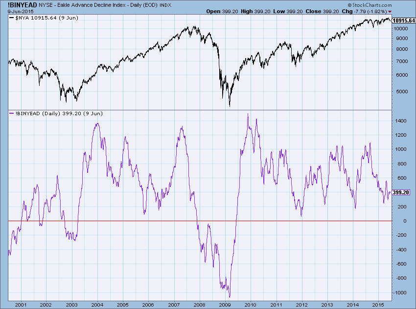
Chart 4-18
Author Comments: The only source for this was John McGinley’s Technical Trends service. Since the daily version in chart 4-18 did not seem to work very well, here, in chart 4-19 is the weekly version as it was originally designed to be used. Market bottoms seem to be well identified by the downward spikes in the indicator and whenever the indicator is above the zero line, the market is generally bullish. However it does tend to stay bullish too long and does not seem be work well for tops.
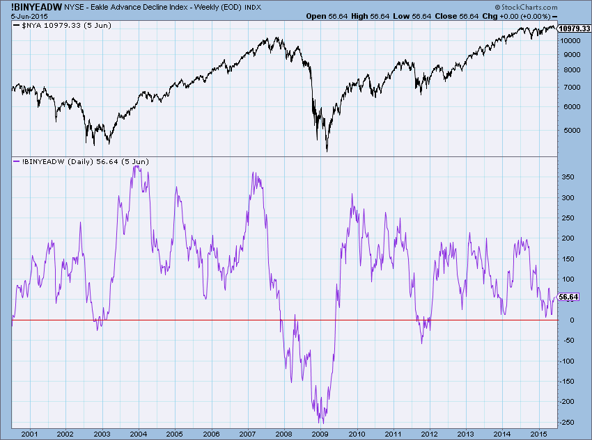
Chart 4-19
Formula: ∑ (A – D)
StockCharts.com Symbol: daily: !BINYEAD, weekly: !BINYEADW
References:
McGinley, John. Technical Trends. Wilton, CT.
Advance Decline Line - Normalized
Author/Creator: Tushar Chande
Data components required: Advances (A), Declines (D).
Description: This is the adjusted Advance Decline Line normalized with a moving five day formula similar to that used in George Lane’s stochastics. This process shows extremes in the Advance Decline Line. Also like stochastics, the use of 20 for oversold and 80 for overbought works well.
Interpretation: Using a short period such as 5 days makes this more of a trading oscillator. Chande says that oversold values of zero and overbought values of 100 would be good for trading. Chart 4-20 shows the normalized advance decline line for trading as Chande suggests.
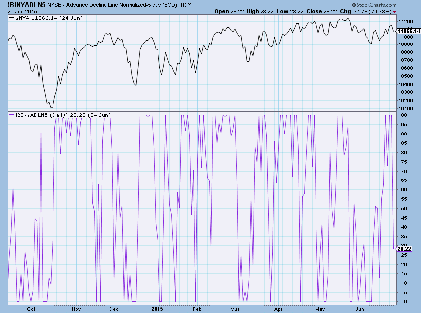
Chart 4-20
Author Comments: Tushar Chande has been a big contributor to the field of technical analysis, so I pay particularly close attention, not only to his work, but try to understand the concept he is revealing. To take this normalizing concept and reduce the signals, I used a 21 day period for the normalization and then smoothed the results with a 7 day exponential average. This makes the indicator slower and better for intermediate analysis. You can see in chart 4-21 that when the indicator is rising and goes above 50, it is the early part of a market rise. After the indicator goes above 80, and then drops back below 80, you can leg out of your long position. Sell all of it when it goes below 50.
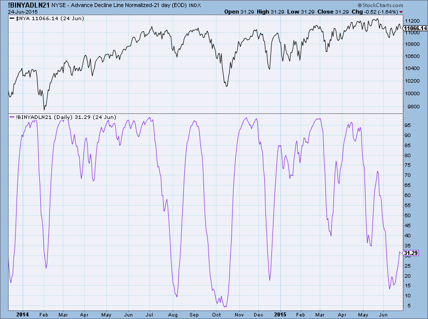
Chart 4-21
Formula: Previous Value + Today’s(A – D) = AD, (((AD – lowest value (AD)) / (highest value (AD) – lowest value (A))) * 100
StockCharts.com Symbol: !BINYADLN5 and !BINYADLN21
References:
Chande, Tushar, “Breadth Stix and Other Tricks.” Stocks and Commodities, Volume 12, May 1994, pp. 211-214.
Big Movers Only
Author/Creator: Greg Morris
Data components required: Advances (A), Declines (D), Total Issues (TI)
Description: This is the Advance Decline Line using only days when either the advances, declines, or both were above a predetermined percentage of total issues traded. Initially, this was developed in an attempt to remove days of very inactive trading, such as the Friday after Thanksgiving, days in which the exchanges were not open all day, etc.
Interpretation: The intent was to filter out the boring days in the standard Advance Decline Line and use only data when either the number of advances or declines are significant. Long periods of inactivity in the market can still have a bias either upward or downward. It was felt that those trading days did not adequately reflect the underlying trends of the market. By removing a certain percentage of inactive days, this modification to the advance decline line reflects only the more powerful moves in the market. Chart 4-25 shows the Advance Decline Line where days with less than 35% of total issues (either advances or declines) removed. It seems to reflect the market quite well.
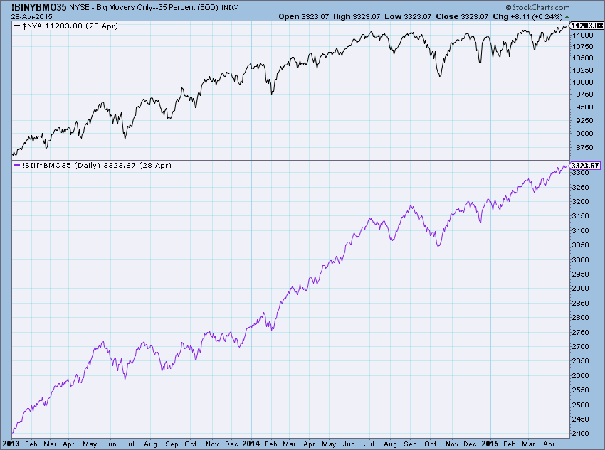
Chart 4-25
Author Comments: When I first developed this back in the 1980s, I used a fixed number of 1200 for the limit on whether the advances or declines for that day would be part of this indicator. Like most breadth indicators, adjusting for the big increase in issues traded was necessary. If you look at a long term chart of this indicator, you will see that it will better reveal longer term trends than most Advance Decline Line indicators used in the standard or more generally accepted manner. This is good for keeping the “big picture” in mind during your analysis. Chart 4-26 removes all advance decline data less than 50% of total issues. It is interesting how, during one of the big bull markets in history, from 1988 to 2000, this went down. What does that mean? Somewhere between 35 % and 50% of the large breadth moves of the market were not present in those years. This is also proven true by looking at Zweig’s Breadth Thrust (chapter 5) where, beginning in 1984, there were no breadth thrust signals until 2004. This Big Movers line limited to the top 50% breadth days also reflects that.
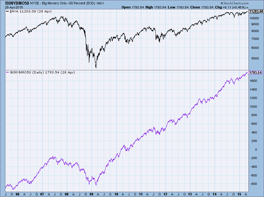
Chart 4-26
Formula: ∑ (A>%TI – D>%TI).
StockCharts.com Symbol: !BINYBMO35 and !BINYBMO50
References:
Morris, Greg, 1995, “Indicators and Trading Systems Software,” G. Morris Corporation, Dallas, TX.
Absolute Breadth Index
Author/Creator: Norman G. Fosback
Data components required: Advances (A), Declines (D)
Description: This indicator was termed by Norman Fosback as a “going nowhere” indicator because you take the absolute value of the difference between advancing issues and declining issues. It does not matter whether there are more or less advances or declines, it is the absolute difference between them that the Absolute Breadth Index measures. It totally disregards market direction. It shows market activity or lack thereof.
Interpretation: The thinking behind the creation of the Absolute Breadth Index is that when the difference between the advances and declines is high, the price changes are also big, which, in turn, can mean the market is more prone to being at a bottom than at a top. This is an indication of good market activity. Similarly, if the difference between the advances and declines is small (low Absolute Breadth Index values), the market is not going anywhere and probably more near a top. This indicates a lack of activity in the market. In chart 4-29 you can easily see that when the Absolute Breadth Index is smoothed by 50 days, it clearly is pointing out market bottoms and tops.
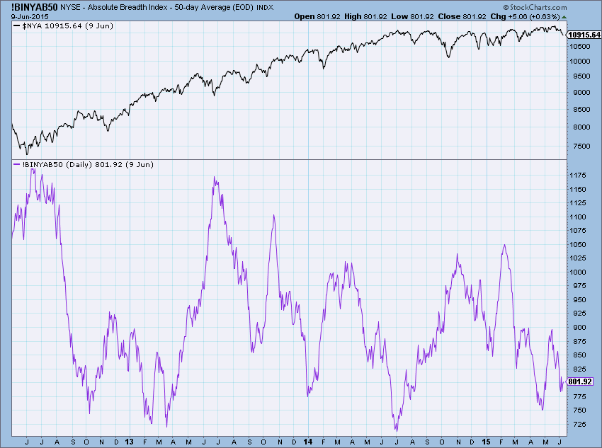
Chart 4-29
Author Comments: This indicator was one of the early ones, as is most of Fosback’s work. It is also one of the good ones and because it seems so simplistic, many times I forget to look at it. I prefer to smooth it with 21 days and watch it as it goes over 1100 for bottoms and below 300 for market tops. These are the current settings. Because the number of issues has increased so much in recent years these levels needed to be spread further apart. You can see this in chart 4-30.
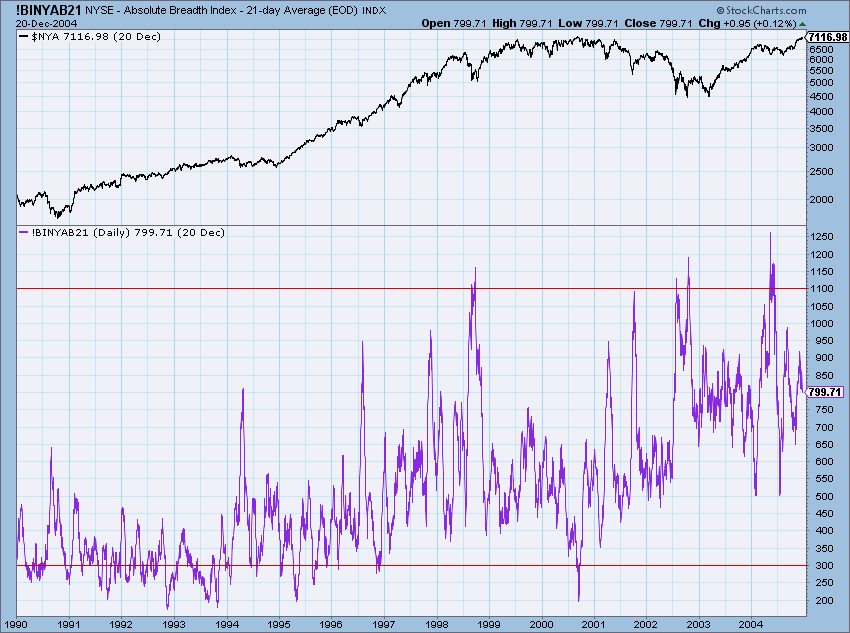
Chart 4-30
During the 1970s and 1980s, the levels that seemed to work best were 250 and 600. This is merely because of less issues being traded. See chart 4-31 below. A more current method of using the Absolute Breadth Index would be the Absolute Breadth Index adjusted for the total issues the way so many indicators from the past can and should be used this way. See Absolute Breadth Index Adjusted in this chapter.
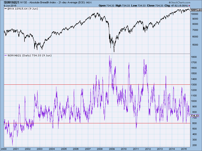
Chart 4-31
Formula: | A – D |
StockCharts.com Symbol: !BINYAB50 and !BINYAB21
References:
Fosback, Norman G. Stock Market Logic, Fort Lauderdale, FL: The Institute for Economic Research, Inc., 1976.
Merriman Breadth Model
Author/Creator: Paul Merriman
Data components required: Advances (A), Declines (D), Market Index (MKT)
Description: This indicator uses the advance decline line and the New York Composite Index. It utilizes a relationship between the two in a manner not as complex as the advance decline divergence oscillator, one that is effective.
Interpretation: A buy signal is given when the advance decline line is 2% or more above is 150 day moving average and when the index is 2% or more above its 150 day moving average. A sell signal is given when the advance decline line is 2% or more below its 150 day moving average or the index is 2% or more below its 150 day moving average. In chart 4-43 a buy signal is when the indicator is at +1 and a sell signal is when it is at -1. Multiple signals should be ignored.
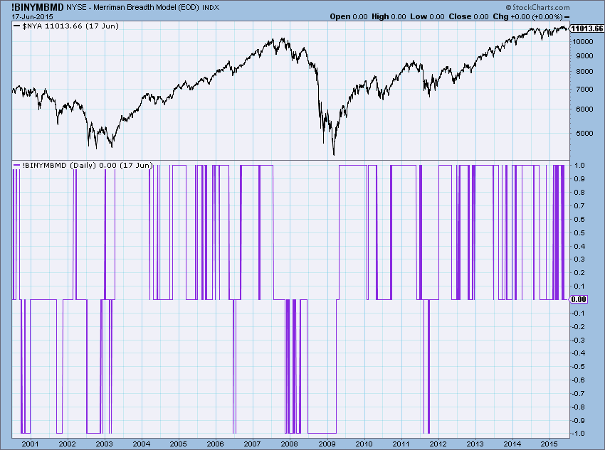
Chart 4-43
Author Comments: This is a simple but quite good concept. It offers double confirmation in order to get into the market where only one of the two components can get you out. I’m not sure how he measures the percentages because the numerical values of the advance decline line can get quite large depending upon where the calculation was started. However, if he is looking at the percentage relative to a moving average of the same values, so this would self-adjust over time.
StockCharts.com Symbol: !BINYMBMD
References:
Merriman, Paul, www.fundadvice.com/modelsexplained.html.
We are vigorously working on the update to the 2nd Edition of “The Complete Guide to Market Breadth Indicators.” We have completed the first 5 chapters, which contained about 40% of the indicators.
I'm taking a vacation next week; next article probably on July 30. Sign up for email notifications and you will always be alerted the instant a new article appears.
Trade well,
Greg Morris