 Welcome to 2018! I was born in the 1940s and am delighted to be here. If you were a trend follower with reasonable stop placement, 2017 was a fabulous year. If you were a buy and hold investor in most stocks, then 2017 was a fabulous year. If you were a market timer and always trying to guess the top, 2017 probably wasn’t so great. I realize there are many other successful categories of investors, but hopefully my message is succinct. Chart A shows the Nasdaq Composite (red), the Dow Industrials (orange), the S&P 500 (blue), and the Russell 2000 (green). The small cap Russell 2000 took a while to take off; in fact, had a significant pullback in the summer. Those invested in small caps, surely got stopped out as I know all StockCharts.com folks use stops. The other three indices were climbing like a homesick angel (sort of like my golf handicap).
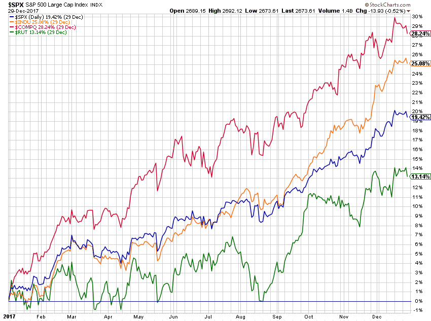 Chart A
The top performer in Chart A was the Nasdaq Composite which is tech heavy; confirmed by Chart B showing the sectors with Technology clearly being the winner. If you recall from some of my very early articles about market action, capitalization weighted indices are driven by the top stocks in each index. Bottom line is that 2017 was a solid up move. Will it continue? I have no idea, but know a trend following model will keep me invested until the uptrend ceases. And yes, there may be a few whipsaws during the transition from up to down. Remember, market tops are long-term periods of distribution and often volatile.
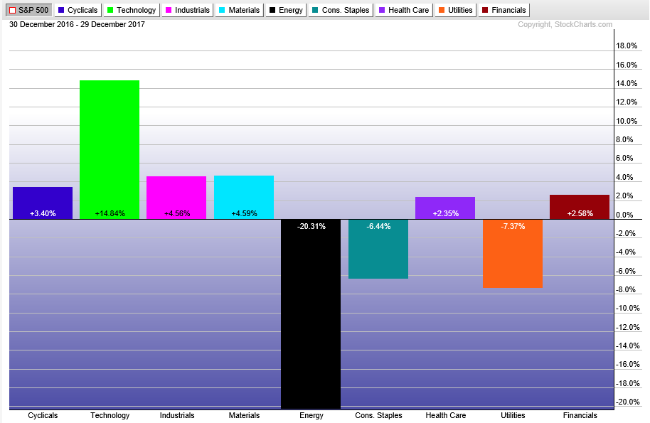 Chart B
Chart C shows Gold, Silver, Bonds, Real Estate, and Managed Futures. Unlike 2016, which had prices move in all different directions, 2017 has them moving somewhat in concert with each other. I think that is quite rare. You would have to say that they didn’t knock it out of the park in 2017. This chart also confirms that the action in 2017 was in the equity market.
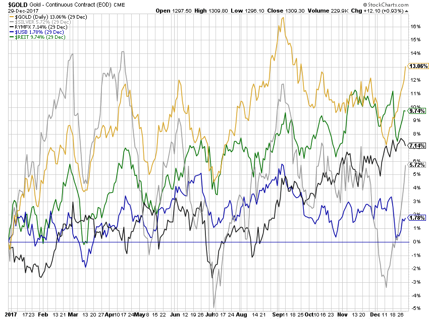 Chart C
Chart D is from Ron Griess’ website (www.thechartstore.com) showing the 20-year rolling returns on the S&P 500 Index. The last value is 5.2% annualized return over past 20 years as of 12/29/2017. Note: that number isn’t on the chart because those numbers are just significant peaks and troughs in the data. To put that in perspective, Chart E is the S&P 500 Index for that same 20-year period. Sometimes it is hard to remember that it wasn’t until 2013 that this index began making new highs. I picked the 20-year chart because that is the time period most have to sock it away for retirement.
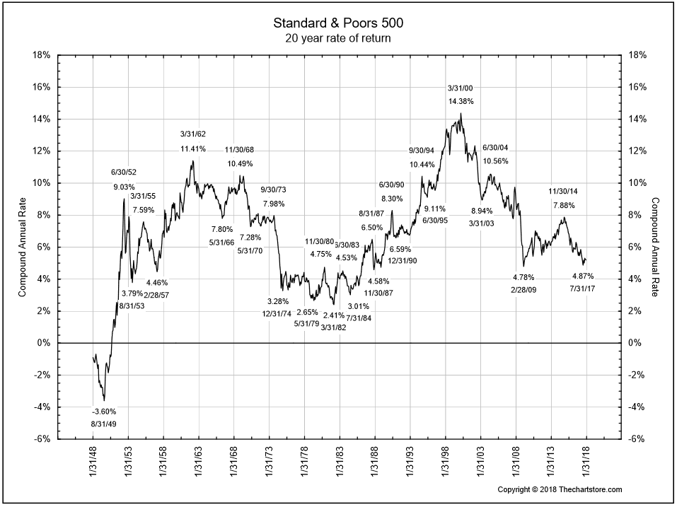 Chart D
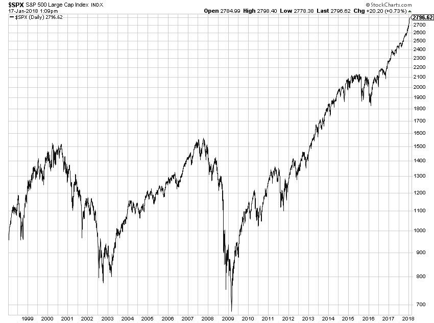 Chart E
Let’s hope 2018 is at least half as good as 2017 was.
Dance with the Trend,
Greg Morris