Some time ago I wrote an article featuring the 1% EMA (200EMA) of the S&P 500 Advance-Decline Ratio. My purpose was to point out the negative divergences (red lines) that occurred at major market tops in 2000 and 2007, as well as to show the current developing negative divergence. A sharp-eyed reader asked about the positive divergence (blue lines) that occurred between 2000 and 2002.
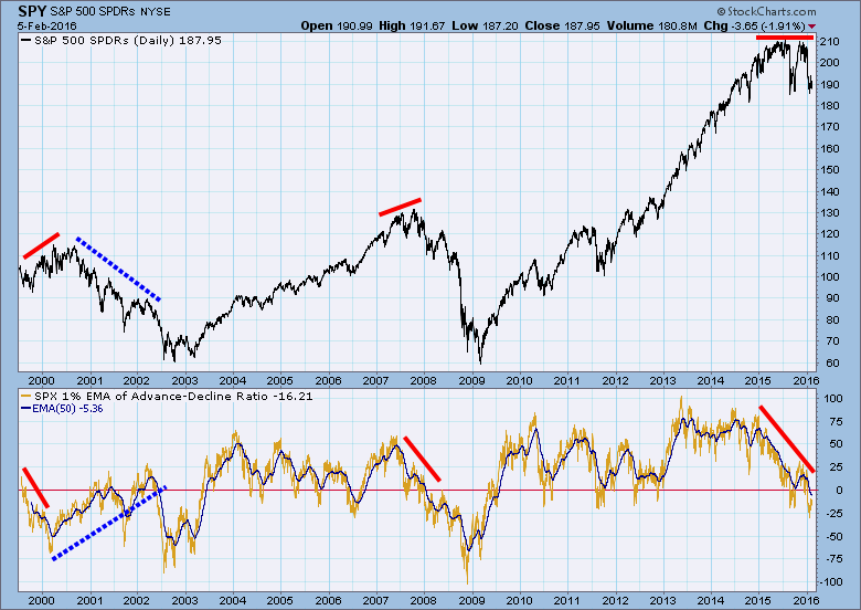
I had observed that divergence for many years, and had concluded that it simply didn't offer any useful information. For the entire period it implied that internals were building to effect an end of the bear market, but that never happened. In situations like that we still must rely on basic price trend analysis, being alert for possible reversal, but responding to price action. Nevertheless, our reader's question gave me the idea to show a little deeper analysis of this phenomenon.
Looking at a chart of the SPX A-D Line for that period we can see, except for the notable exception of 9-11-2001, the A-D Line ran sideways until Q2 2002. One could ask why the A-D Line could be flat during a bear market? One reason is because advances and declines are equally weighted regardless of the size of the advance or decline. For example, stock XYZ could advance a penny for four days straight, but on day five it declines a dollar. The net price change would be -0.96, but the A-D Line for XYZ would be +3.
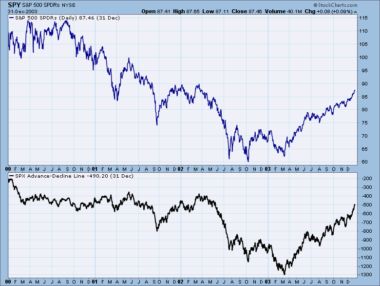 Another reason was that during the decade preceding the 2000 market top, investors were especially partial to the largest-cap stocks, so price declines during the subsequent bear market were greatly affected as those positions unwound.
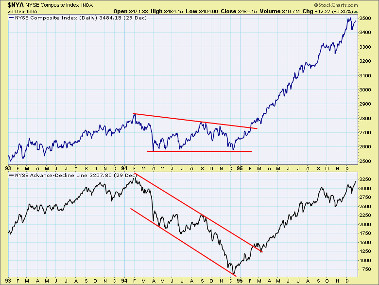
The best example for me personally is the negative divergence that occurred in 1994. Price consolidated while the A-D Line tanked, and it was one of the events that taught me to pay attention to price first, last and always. At the time this was happening, I was convinced that the A-D Line was going to take price down, but what the chart was trying to tell me was that the individual declines were tiny, and that prices overall were firming. Live and learn.
 Enough of history. Let's take another look at the first chart see an important recent event. We assume a SELL signal has been generated when the 1% EMA index (light brown) drops below the zero line, but it is pretty choppy. To overcome that I decided to add a 50EMA of the 1% EMA to smooth it out, and I think that gives a much better result. Zero line crossovers and direction changes are greatly reduced, and are, therefore, more significant when they do occur. Most recently the 50EMA dropped below the zero line. This combined with the severe negative divergence is very bearish.
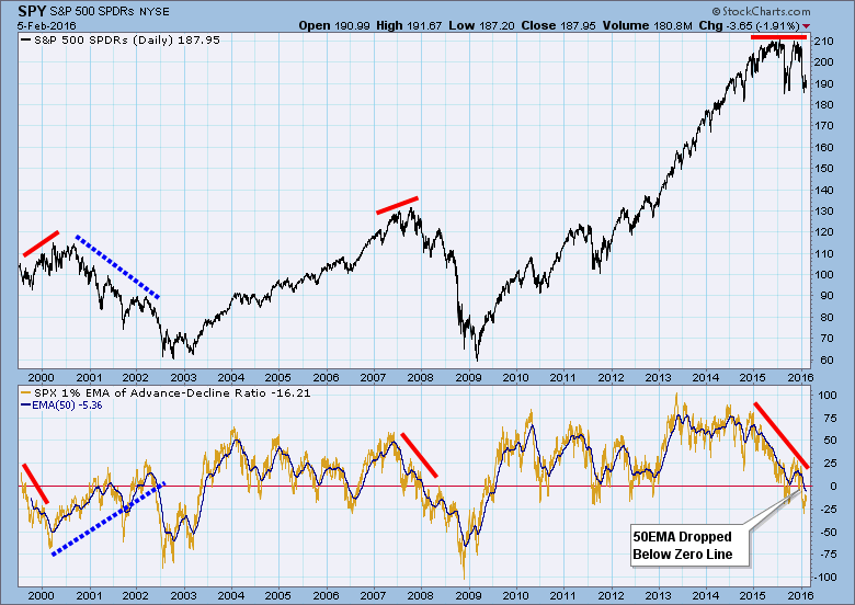 CONCLUSION: Breadth divergences need to be taken with a grain of salt. The positive divergence that developed during the 2000-2002 bear market was a false signal that was never confirmed by price movement. We can also see that the 50EMA zero line crossovers are not always reliable, but nothing is ever 100%. Currently, we have a negative divergence and zero line downside crossover. There is no guarantee, but because of the context I believe it is a warning that the bear market is going to get worse.
Technical analysis is a windsock, not a crystal ball.