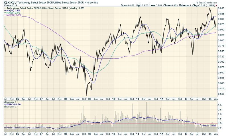
Here's a chart that you should definitely not ignore:
(Click on the chart for a live version.)
So this is a chart of the relative strength of the Technology sector (using XLK as a proxy) versus the Utilities sector (XLU). These two sectors are at opposite ends of the market cycle. When everyone is bullish and the market is heading higher, tech stocks usually lead the way. When people are bearish, Utilities (i.e. bonds) show lots of strength. So charting the ratio of technology and utilities will give you a very quick way to see the market's current state. If the ratio line is going up - tech stocks are stronger and the market is generally bullish. If - as has happened recently - the line is going down, the market is generally headed lower.
Something else this chart shows is some sentiment information via the ratio of the volume of the two ETFs. If the volume ratio is above 1.00, then the Technology ETF has more volume than the Utilities ETF - a sign investors are voting on bullishness with their wallets. See the points where the 30-day MA of the volume ratio (blue line) moved above/below 1.00 (red line)? Significant investor sentiment changed around those times.
- Chip

