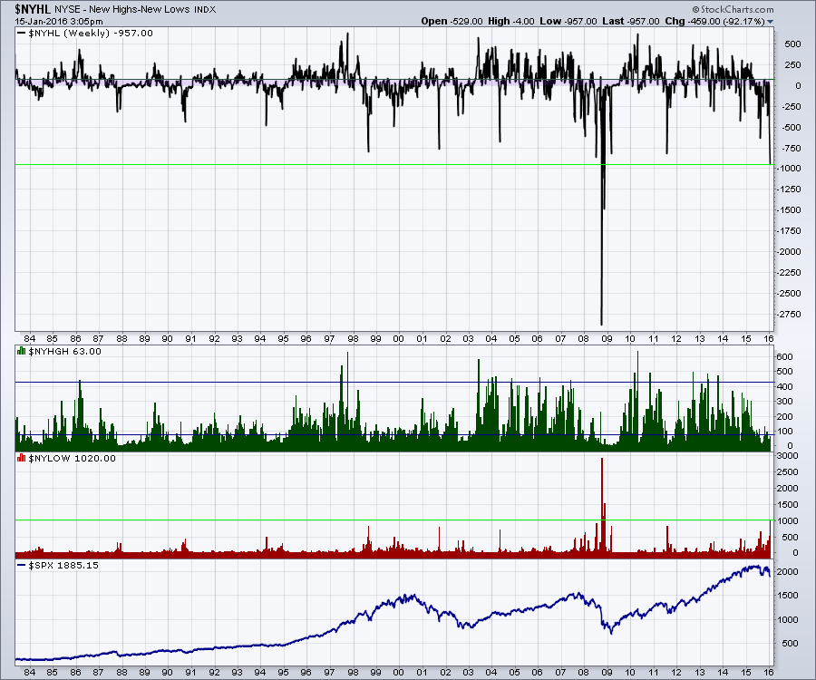
The market has been brutal. No doubt about it. The common question now is when will it end? I spent a lot of time on Thursday's webinar suggesting that the market was near extremes, but extremes can always become more extreme. Here is the New Highs Minus New Lows chart ($NYHL) for the NYSE. In the main plot, you can see the difference between new highs and new lows. I notice one thing on the chart. With the exception of the Lehman meltdown, this is the worst week in history. Back in 1987, there were fewer stocks listed, so the candle would have been bigger back then as a percentage. I also think it is important to note, that almost every case was a singular week. History has a way of creating a new history, so anything is possible.
Moving to the New Highs data shown in green, it does not look that irregular. The New Lows data in red shows a massive number of new lows that wipes out the previous extremes with the exception of the Lehman moment. As an example, we are already way worse than the Bear Stearns weekend. I do not think the final lows are in for the year. But I do think the selling probably hit an extreme level today.
For me, it does mean I have to start thinking that it doesn't get much worse. As hard as it feels to be thinking about buying, it's probably not a bad idea. With stops under your entries of course. Unless you think the Federal Reserve and congress need to inject another 800 Billion in stimulus this weekend, it might be a tradable low. You'll have a long weekend to think about it. Enjoy the holiday Monday and the NFL playoffs!
Good trading,
Greg Schnell, CMT

