In a previous article we looked at using Relative Rotation Graphs for analyzing asset class rotation. One of the main caveats that was pointed out in that blog was to be very careful on what ticker symbols to use to construct the RRG with. Especially the mixture of yield series for fixed income instruments versus price series for equity instruments for example.
In this article I want to take a look at international equity markets. The catch here is that "international" markets are usually quoted and traded in "international" , non-USD, currencies.... The additional hurdle, when we take on the challenge of analyzing these international markets, is that a lot of the financial instruments, primarily the US traded ETFs, are quoted in US dollars. That is not a problem, it is a challenge!! And once again it underscores that it is important for investors to realize what exactly they are looking at when they pull up the charts of these various instruments. Indeed this challenge is not limited to RRG charts but goes for every chart of an instrument that covers a non-US market but is quoted in US dollars.
Germany vs Germany
Let me try to clarify this with an example first. Probably the most important market in (continental) Europe is Germany, the benchmark stock market index is the German DAX index, which StockCharts.com carries under ticker symbol <$DAX>. The equivalent ETF is <EWG>, the "iShares Germany" traded on the NYSE and quoted in USD. The chart below shows the daily bar-chart for both ticker symbols over a year.
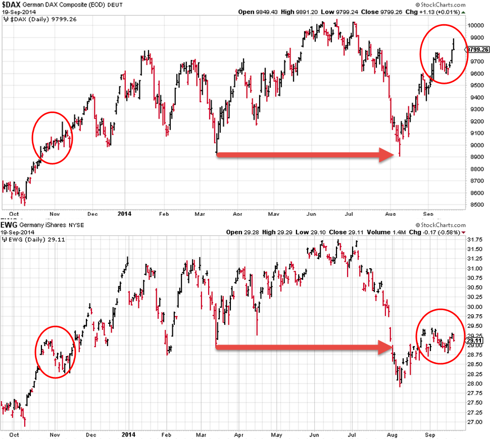
Now look at some of the high-lights (but there are many more if you look carefully. In November 2013 the $DAX index is solidly moving higher with some wild intraday swings but clearly moving higher roughly from 8900 to 9200. Now compare that move to the move in EWG...
Also note the low in March 2014, around 8900 in $DAX, clearly an important that could be expected to act as support going forward. And it did, recently in August that 8900 low was tested as support almost to the point. Compare that with the price action in EWG.. It dropped below that March low on EWG as if it did not exist, like nobody was paying attention to that level.
Truth is that in Germany where this index is quoted and traded no trader or investor had $ 29.00 in EWG in their mind as being a support level for the DAX index BUT they very well realized that 8900 was an important level for $DAX .... Again, more recently look at the price pattern on $DAX in the top graph and compare that to the price action over the same period for EWG on the bottom graph...
Clearly the EUR/USD translation causes these effects to happen and they can be very pleasant or very unpleasant and it completely depends on which side of the ocean you're living or better what is the base currency of your investment portfolio.
Another picture that clarifies this effect is shown below.
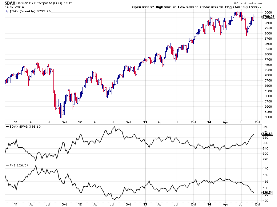
This chart shows the price chart (bars) of the $DAX index, the pane below shows the ratio btween $DAX and EWG and finally the lowest pane shows the price of FXE which is the "Currency shares Euro trust" which replicates the price of the EUR/USD currency pair. As you can see, pretty much exactly the opposite of the $DAX/EWG ratio...
The size (of your currency) does matter
The whole point of this, rather long intro, is that CURRENCIES DO MATTER!!! you cannot ignore them. Personally I prefer the purist approach and I believe that charts of stocks or stock-indices, or any instrument for that matter, should be analyzed in their local currencies as that is where the price is made and that is what investors and traders will keep in their minds as important price, support and resistance, points.
If you believe that, based on your analysis, the price of an instrument goes up and it is based in a different currency than your own then you will have to make up your mind about the expected move of that currency pair. If you think that the currency will have a negative effect than consider hedging the resulting FX position.
Having said that I do realize that there are also a lot of people who prefer to bundle these two decisions into one and just look at the "investable" instrument, ie an ETF for example, in their base currency and use that in their analysis and decision making. I guess there is no right or wrong here and its more a matter of preference but I do believe that you have to be very aware of what you're doing and what you are looking at in either approach.
Now how does that work out on Relative Rotation Graphs?
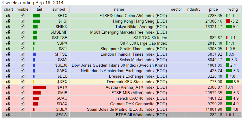
When you pull up the basic RRG page it will show you the (free) RRG chart holding a number of major market indices. The selection box <groups> will allow the selection of other pre-defined universes. One of these universes is "International ETFs" which will populate the RRG with ETFs tracking the stock indices of various countries around the world. I have added FXI (China) to the symbols and I have changed the benchmark to SPY (instead of $SPX). This results in the chart below.
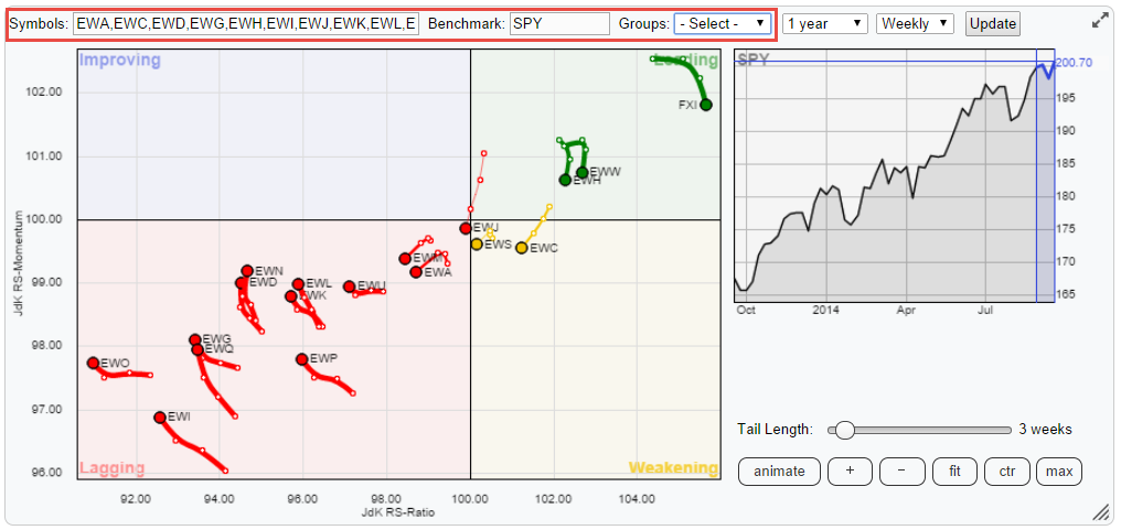
This picture pretty much sums it up for US based and USD denominated investors... The US equity market is the place to be with the exception of China, Mexico and Hong Kong but given the size of these markets they will probably not be major parts of an equity portfolio (unless you really like to bet of course :)
In order to connect this International ETF chart back to the introduction on the FX effects I have tried to replicate the RRG above, holding instruments that are all quoted in USD, with the base (index) instruments for the same markets quoted in their local currencies and I have set the benchmark to be a global equity index ($FAW = FTSE All world index). Which gives the picture below.
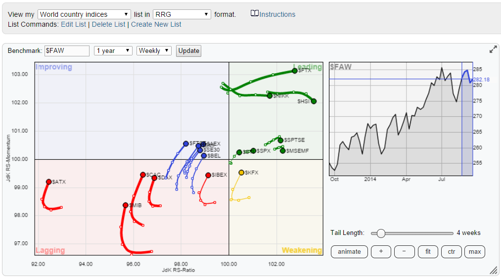
The first thing that catches the eye is that the second RRG shows a more evenly distributed universe over the area of the plot. This is because the benchmark here is a world benchmark instead of the US so the centre is shifted more to the left and the US equity market ($SPX) is now inside the leading quadrant fairly close to the benchmark which is not surprisingly as the US makes up a big chunk of that benchmark.
The second observation is that on the first picture the tickers in the lower left hand, lagging, quadrant are still moving more or less further to the left and if they go up as well, it is only slightly. The same group of their equivalent tickers on the second RRG are clearly moving higher on the JdK RS-Momentum scale but also have started to move to the right, higher on the JdK RS-Momentum scale. Some have even already entered the top left, improving, quadrant.
The cause ? the recent strength of the US dollar against pretty much all other currencies.
Not a problem but a challenge that you have to deal with when making up your mind about new or existing positions in international equity markets.
Julius
