It's time to check the world again.
The Relative Rotation Graph below shows the relative positions and movement of international equity markets against the FTSE All World index. Please note that I am using $ ticker symbols for the actual indices and not the ETFs to avoid the currency effect of the US dollar strength to distort the picture.
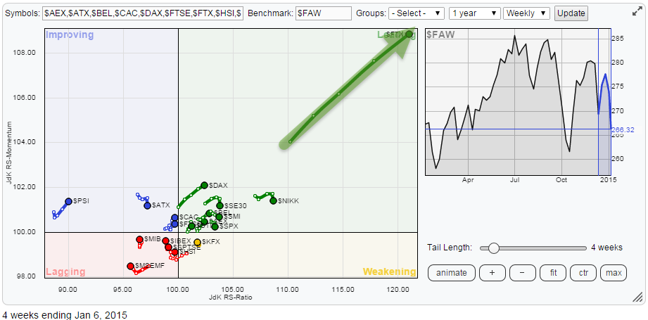
And swoooosh there goes China. The $FTX (FTSE / Xinhua A50 Index) really shot through the roof over the past few weeks. The tail is almost straight and at a 45 degree angle, meaning it is still gaining on both the JdK RS-Ratio and the JdK RS-Momentum axes. Relative Rotation will not get much stronger than this!
I will dig a bit deeper into the other indices on the plot later but the big rotational picture is that, obviously, China is standing out. Pretty much opposite China is the Emerging Markets index in the Lagging quadrant and the cluster of 'greens' is dominated by European markets and the US ($SPX).
China
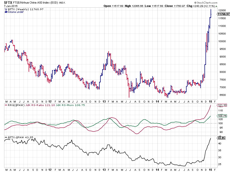 My default settings for the charts that I use in this blog (to keep a bit of consistency) is a weekly chart, thick OHLC, fill the chart, bar 4, size 900. Problem is that when I use that picture it is easy to get fooled... If we would stop at this picture it would be easy to conclude that the Chinese market is breaking into un-charted territory and that there is no overhead resistance seen anywhere near. Hence "the only way is up" ...... Or maybe not?
In these cases it is always good, if not mandatory for a thorough analysis, to switch to a longer-term time frame and inspect more historical price movements before jumping to conclusions.
Hence the picture below.
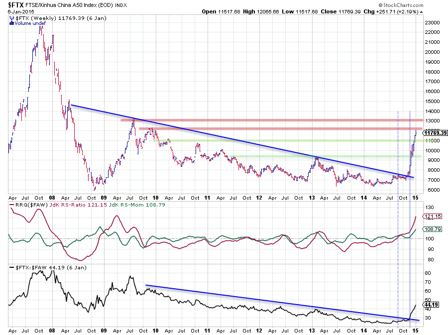
Adding some history adds a bit more perspective to the recent move. Admitted, we do have to go back to 2009-2010 to find some references but they are there and they will very likely get back into play over the coming weeks.
The first levels to watch were/are the 9.500 and the 10.500-11.000 areas coming off the 2011-2013 and 2010 peaks (green shaded horizontal lines) These were the first resistance levels that have been broken by the market a few weeks ago. Very easily even. In case of a correction these areas may be watched for support. The next two, probably more important levels are coming off the mid- and late 2009 highs. The first one near 12.000 is currently being attacked, The next one is 1000 points higher up near 13.000. This means that we now have two horizontal levels providing (heavy) overhead resistance and therefore limiting upward potential with downside risk increasing rapidly.
From a relative point of view a very long standing relative down-trend has been broken recently. See the falling trend-line on the raw RS-line in the lower pane of the chart. This trend spans over 5 years of history and has now clearly turned around. The almost vertical move on the raw RS line as well is causing the 45 degree angle on the Relative Rotation Graph. So, how to handle this from here on? Clearly if you're in it, sit back, relax and enjoy the move, there are no real signs of weakness at the moment. If you're watching it, it might be smarter to keep on watching it for now as, like I said above, the risk reward for this trade is now probably not as good any more as it was. Especially on the price chart there is now room for a corrective move as the market is nearing resistance and we all know that "What goes up, must come down" and it all starts with momentum levelling off.
On the RRG we will see this process starting with the tail starting to rise at a slower pace and eventually starting to head down and cross over into the weakening quadrant at some stage. However, given the very high level on the JdK RS-Ratio axis it is very likely that a corrective move will be a temporary loss of (relative) momentum and that a rotation will take place completely at the right hand side of the plot, indicating a very mature and strong relative up-trend. Potentially a new entry point.
Now that we have $FTX out of the way we can toggle the display of the tail on the RRG off to make it more readable for the other elements on the chart.
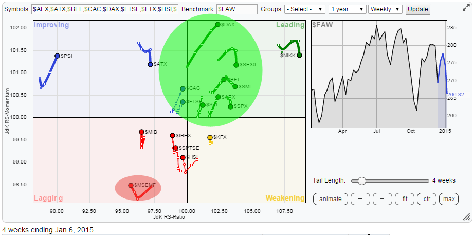
There are two things that interest me on this chart. The first is $MSEMF (The MSCI Emerging Markets Free index) in the lagging quadrant and secondly the $DAX (German DAX composite index) inside the green shaded cluster in the leading quadrant.
Emerging Markets
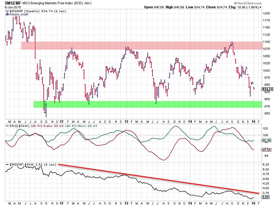
The EM index is captured between the boundaries of a very broad trading range over the past four years. The upper boundary of this range being between 1075-1100 and the lower boundary just below 900. With the stock-market rally we have seen over the past few years it is not difficult to understand that the relative trend of EM is heading down still. Even despite a temporary hiccup in the middle of 2014 the big trend is still clearly down.
The positions of the RRG Lines put the Emerging Markets index solidly inside the lagging quadrant on the Relative Rotation Graph and inspection of the chart above leads to the judgement, at least my interpretation, that there is no sign of real improvement in coming weeks. Nor on the price chart, nor on the relative chart.
Hence the title of this post: "Swap Emerging Markets for something more developed". And for the "something more developed" the German market seems to be a good candidate!
Germany
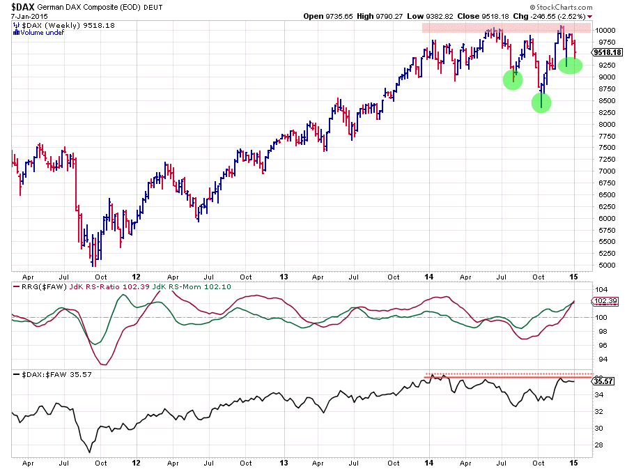
The above chart shows the German Dax Composite index ($GDAX) over the past three years in combination with the RRG-Lines and the raw RS line. On the price chart the 10.000 area is clearly a heavy overhead resistance area
The RRG-Lines are sending a pretty clear message here. Both are (way) above the 100-level indicating that a relative up-trend is underway. On the raw RS line this is not very well visible yet as there is some horizontal resistance that needs to be cleared but especially the strong relative momentum over the past few weeks looks encouraging.
Finally the pattern that seems to be developing on the weekly price chart looks very encouraging. This could very well be an inverted H&S continuation pattern in the making. The Head and the Shoulders are annotated by the green shades. The neckline is found somewhere in the 10.000 area. It fulfills pretty much all the pre-requisites for such a pattern to emerge. There's a well defined up-trend visible prior to the start of the pattern. The neckline is as good as horizontal, the relationship between the Head and the shoulders is taking at least some form of symmetry etc. etc. The only thing which we really need to wait for is confirmation and completion of the pattern by breaking above the neckline, i.e. a Friday close (this is a weekly chart remember) above, say, 10.100. So all eyes on that!!!
Adding a little more to this positive thought process is the fact that we can also identify a "failed H&S reversal pattern" in the period Jan - Oct 2014. The neckline was broken but the market quickly recovered back above this level and rallied further, negating the H&S reversal. And we all know from studying our Chief Technical Analyst, John Murphy's books that a "failed H&S" is actually a (very) bullish pattern!!
Conclusion
- China is on a roll but nearing overhead resistance
- Emerging markets in relative down-trend and better still avoided
- Germany starting to develop bullish characteristics on price chart while already in a relative up-trend
Julius de Kempenaer | RRG Research
RRG, Relative Rotation raphs, JdK RS-Ratio and JdK RS_Momentum are registered TradeMarks by RRG Research
