One of the subjects covered in this blog on a regular basis is the relative rotation (sector rotation) in the US equity market. The data, ticker symbols, that I use for the analysis are the nine ETFs from the SPDRS family, provided by State Street Global advisors. SPDR actually stands for Standard & Poor's Depository Receipts, which I'm sure you already knew. All these ETFs together encompass all 500 stocks inside the S&P 500 index (or the SPY ETF).
A typical relative rotation graph of this universe looks like this.
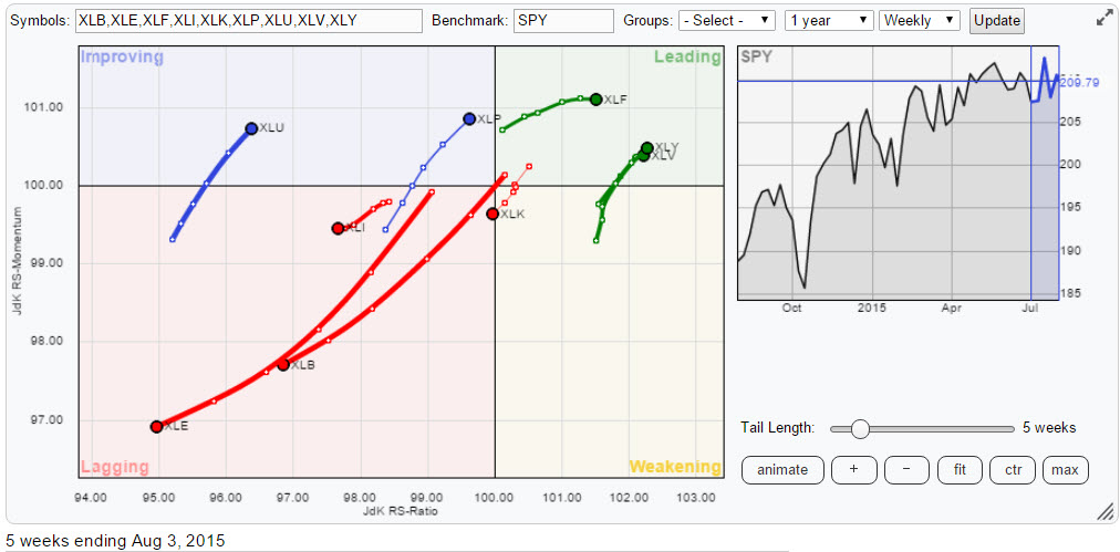
The RRG above covers the movement of trends in relative strength of all stocks in the S&P 500 index grouped by sectors, which makes it a great tool for a higher level analysis which can actually be put into action by using the ETFs themselves. A great way for investors who do not have the time or do not want to go into the details of individual stock analysis.
However for those of you who want to delve a little deeper and have a look at the relative rotation of individual stocks inside a sector, that can easily be done. What we need for that is the composition of the sector that we would like to have a better look at. There are a few ways to achieve that.
Sector summary page
One way of diving into the composition of a sector is via the StockCharts.com sector summary page. This route enables you to start at a high level, the ETF and then click through / drill down a universe. This route will take you down via sub-sectors / industry groups to individual stocks.
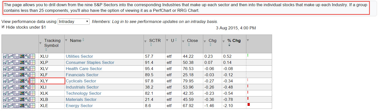
You may have noticed that among the icons preceding the ticker symbol is a RRG icon. Just one click on that icon and the RRG belonging to that (sub-) sector will open up populated with the indices of that group. Also pay attention to the note above the table which says that only universes that contain less than 25 components will have an RRG (or PerfChart) icon. This is seen when you click one level down, in this case via XLY, the Cyclicals (or Consumer Discretionary) sector.
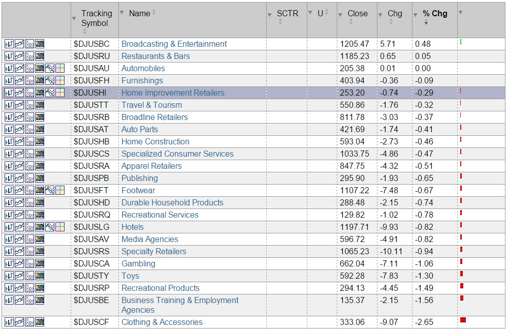
One step further down the RRG will be populated with the individual stocks within that group. This enables you to very quickly move from high level ETF analysis down to selecting individual stocks and get a better insight into the relative movement of those individual stocks that make up the index.
if you want to skip (sub-) groups and look at the behavior of individual stocks inside one of the nine ETFs we need to know the composition in terms of the individual stocks that make up that specific ETF.
Index providers and Investment managers
Index analysis is a complicated beast and subject to a lot of proprietary information and Intellectual Property laws. In the ETF game there are two important providers of information. The first one is the company that provides the underlying index that is being tracked by the ETF. In our example here that would be Standard and Poors and more specifically the US sector indices. You can find information about those indices here. As you will see there is a lot of information there about these indices and their major characteristics but not the entire list of holdings.
The second important provider for ETFs is the actual investment management company, in this case State Street Global advisors fund management, that manages the ETF on a daily basis to make sure that the investment fund (in the end of the day an ETF is nothing else than a fund) holds the correct number of shares for each stock in the index to track the underlying index. The index provider licenses the use of its index or indices to the investment management company and will provide the IM with all the information needed to track that index and thus offer the ETF to the public.
Now with ETFs being passive and above all 'transparent' instruments the investment manager is required to disclose the holdings of the ETF on a periodic, often daily, basis. This is how you as an individual investor can get a rough breakdown of the members of an index by studying the composition of the ETF. Since we are trying to dissect the universe of sector indices in the above RRG we need to find information provided by State Street, as they are the fund management company. A bit of online searching will quickly tell you that there is actually a whole website, surprise surprise, dedicated to SPDRs; www.spdrs.com where you can find specific information about all ETFs listed by State Street.
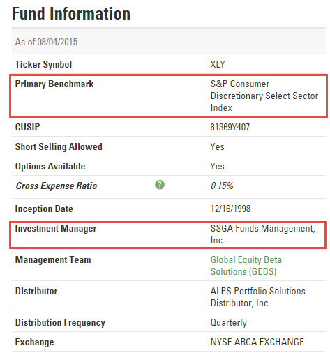 Information specifically about XLY can be found here. The Fund information, among other things, will show you S&P as the provider of the benchmark and SSGA as the investment manager. On that same page you will find a tab "holdings". On that tab you will find information about the holdings of the ETF and a comparison of these holdings with the holdings of the actual index.
Note that this comparison information only covers the top-ten holdings for the ETF and the index as this information about the index is made publically available by S&P. Below the top-ten Fund holdings you will find a download link which enables you to download the holdings of the fund/ETF to a spreadsheet. Just to be clear; these are NOT the holdings or the exact composition of the underlying index but they will serve our purpose just fine.
Once you have downloaded the data to your spreadsheet you will see that this XLY ETF has 88 members which is too much to realistically monitor in a Relative Rotation Graph. For this reason and also for performance reasons the number of ticker symbols on one RRG is limited to 50 on StockCharts.com. Therefore we need to make a selection from the 88 names in the ETF.
A straightforward selection would be to sort this universe on weight and select the top-50 for display on the RRG. With the data all available in a spreadsheet this is an easy task to do. Watch the video to see how you can easily sort and select the data from this universe and apply a little Excel trick which allows you to copy-paste the tickers directly into a Relative Rotation Graph on StockCharts.com.
Using the top-50 tickers on a Relative Rotation Graph will help you analyse which individual stocks (heavy-weights) are driving the performance of the sector. If you are looking for more 'off-the-beaten-path' trading ideas you may want to try to select the bottom-50 and thus exclude the heavy-weights as these big boys will obviously be close to the performance of the index itself while the smaller weights in a universe can move far away from the benchmark (center of the RRG) and make wide rotations that can provide a lot of alpha.
Julius de Kempenaer | RRG research
RRG, Relative Rotation Graphs, JdK RS-Ratio and JdK RS-Momentum are registered TradeMarks by RRG research.


