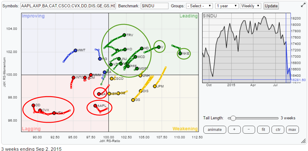
This article takes a look at the relative rotation of the members of the Dow Jones Industrials ($INDU) index. On the relative rotation graph below all members are plotted against $INDU. I will highlight and discuss some of the charts that show up on the RRG as "worth having a look at".
Initial observations
The first thing that strikes when I look at the RRG above is that the center of gravity has shifted slightly to the leading quadrant. Given the very volatile and negative (initially) behavior of the stock-market in the past weeks this is an interesting observation. As this RRG is a so called "closed universe" adding up all the vectors/distances from the center of the chart should give me a sum of zero... BUT only when corrected for Market Cap. And that is where the crux lies for the shift of tickers inside the leading quadrant compared to the lagging quadrant.
The keen observer will probably already have noticed why that is?
AAPL is now inside the lagging quadrant which means already more than 12% of this universe. Therefore we need probably 3 or 4 stocks with a market cap of 3-4% in the leading quadrant to only offset AAPL. Add to that, that a few other heavy-weights like XOM, INTC and CVX are also in the leading quadrant and you will understand the relatively high number of names in the leading quadrant. Consequently it means that a few big boys are weak and dragging the general market down..
I will add a section to the ChartSchool article about this as it is a fundamental part of the RRG concept and why a universe of tickers will normally show a roughly even spread across all four quadrants.
So AAPL is defintely a candidate for further inspection and so are the three stocks in the far left corner, DD, CVX, UTX.
Inside the weakening quadrant we see IBM close to crossing over into lagging and also GS, DIS and JPM are showing big (long trail) moves heading lower on both axes. One of the things that I have learned over the years is that when you want to "beat the index" it is far more important to be able to avoid the "big bleeders" within the index than to focus on which members of the universe to buy. The RRG above gives me very clear answers on which stocks I should not be holding at the moment.
Nevertheless I will try to do some cherry-picking inside the green, leading, quadrant where a few potentially interesting names are showing up.
Avoid ! The easy picks.
In the lower left hand corner of the Relative Rotation Graph we see three stocks that are going through pretty much the same rotational pattern and which are tracking each other closely. These are DD, CVX and UTX.
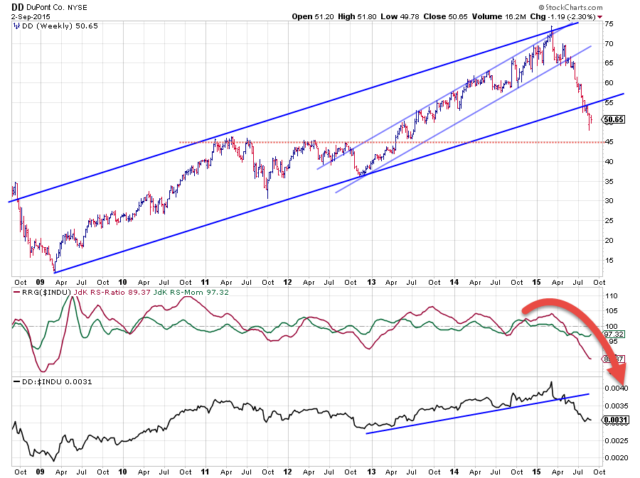
DD broke the rising support line under the lows on the raw RS-line in April-May when the JdK RS-Ratio line started to pick up a new down-trend in relative strength and dropped below 100. Shortly thereafter the stock completed a Head & Shoulders reversal pattern in the price chart by breaking neck-line support near $ 65. This was the trigger for a very steep drop which is still ongoing.
Just recently things got a little worse for DD when the long-term rising support line, connecting the major lows (2009, 2011 (nearly), and 2012) on the price chart was broken downward which added new fuel to the decline. The next serious support level is only seen around $ 45 while the upside is now covered with former support levels that will start to act as resistance. Clearly a stock to avoid for the time being.
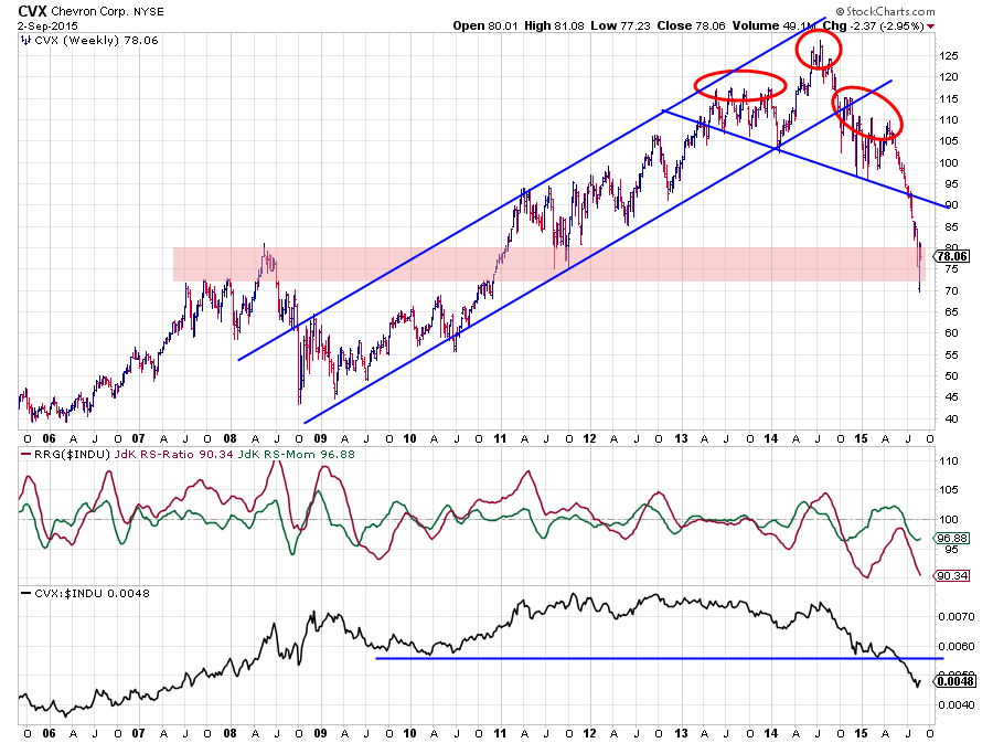
The deterioration for CVX already started back in 2014. Initially with the break of the rising support line that emerges out of the 2009 low. The price action following that break, roughly between $100-110 can be seen as the right shoulder of a stretched out H&S pattern which was completed when the down-slanting neck-line was broken. This was merely a confirmation of an already really bad technical picture. That break accelerated the decline towards the broad support zone that can be detected between $ 70-80. Whether the market will actually find support there or not remains to be seen but just like DD the chart is covered with overhead resistance levels which will make it very hard for CVX to start a new up-trend anytime soon.
From a relative perspective the RRG-lines and the raw RS-Line are also showing a very weak picture with the JdK RS-Ratio line sinking hard and steep again after topping out below 100 and the raw RS-line breaking below a long-term horizontal support level going back to early 2010.
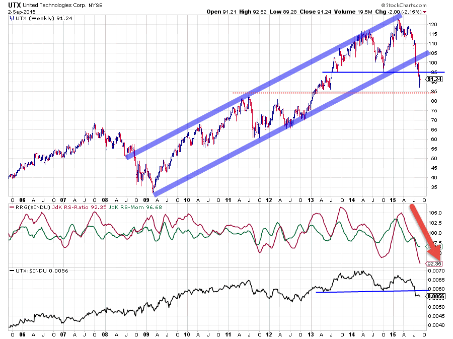
The third stock is UTX. Again a clear break of two important support levels. First the rising support line mid July, followed by horizontal support about two weeks ago. I am eyeing for the next support level around $ 85 now. A break below that mark would deteriorate the picture even further.
The relative picture is not much better. The raw RS-line just dropped below horizontal support while the steepness of the JdK RS-Ratio line and the current low level confirm that relative weakness. As a matter of fact you need to go back to 2001 !!! to find a JdK RS-Ratio level lower than what we see at the moment.
And once again the upside for UTX will be very difficult in the weeks ahead. There has simply been too much distribution since the beginning of the year. This has to be digested first.
As said these were the easy picks to avoid and they make up about 5% of the total market capitalization of the Dow.
How about AAPL?
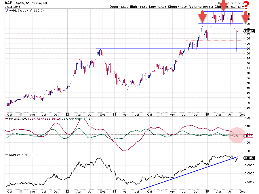
This heavy-weight in the Dow Jones Industrials index is a bit harder to read at the moment. If we start with the relative graphs this time the deterioration can clearly be seen, however it is not as aggressive as in the previous three pictures. The raw RS-line has broken a rising support line but the recently formed low is still at a higher level than the low before (beginning of this year). Both RRG-lines are below the 100-level which puts AAPL inside the lagging quadrant but not very deep yet.
On the price chart a (triple-) top formation can be identified between $ 120-130 from February to the break out of this pattern 5 weeks ago. This break immediately caused an acceleration and took AAPL from $120 to below $ 95 in a matter of weeks. The horizontal support offered by the 2012 peak caught the decline and has been able to prevent a further fall so far. What we now see is a recovery rally and the former $ 120 support level will now become very important as possible resistance. IF that level holds as resistance and a new peak will be put into place at or below that $ 120 level we can start to think of a major H&S reversal pattern being under construction.
Because of the wide swings recently I find the chart hard to read as levels have only been touched very briefly and not thoroughly tested. One of the things I sometimes do to get rid of this noise and potentially get a clearer picture is to revert back to a simple line chart, which is what I have done in the chart below.
What a difference a chart (type) makes ..
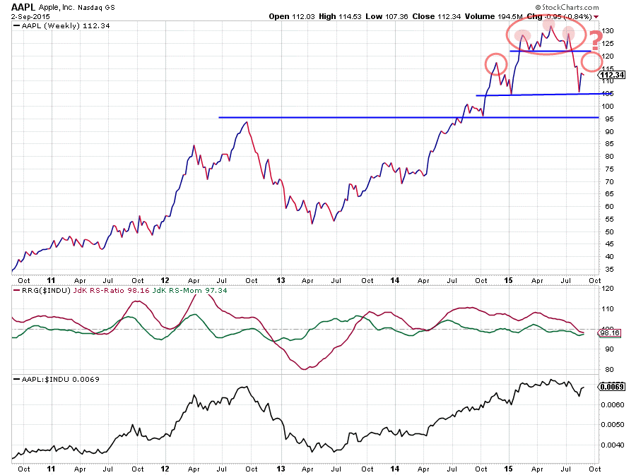
With all the intra-week swings now removed some levels clearly show up. The support level just above $ 120 as well as the horizontal levels at $ 105 and $ 95. Also note how the triple-top under the hood, based on closing prices, is actually a very neat (completed) H&S pattern. And also on this chart one could see a larger H&S pattern in the making when a new high will be put into place at or below $ 120.
So all in all it is definitely not a "good" chart. Is it really bad ? Not yet i would say, but things can turn pretty nasty for AAPL, pretty fast. A break below $ 105 (weekly close) would be a first sign while dropping below $ 95 would be really bad. Such moves will obviously impact the readings of the relative strength charts as well. Needless to say that such a weakening for AAPL will weigh on the general market ($INDU) as well.
We're not there yet but we need to be keen observers in coming weeks. Things are not "back to normal" yet.
Not everything is looking ugly.
Luckily enough there are also a few stocks which have survived the recent market turmoil fairly well and they are actually (still) looking pretty good, at the minimum from a relative perspective. I have picked two names from the leading quadrant which I feel could offer new or ongoing potential.
McDonalds - MCD
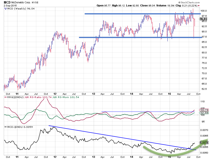
Despite all the weakness in the market MCD has held up very well and is still within the boundaries of a broad trading range between $ 87.5 and $ 98-100. This causes the relative strength charts to show very good pictures. On the raw RS-line a long-term down-trend, in play since 2012, has been broken upwardly which opens up the way for more relative improvement going forward. This is confirmed by both RRG-lines moving above 100, positioning MCD comfortably inside the leading quadrant and still heading deeper into it suggesting an out-performance versus $INDU in coming weeks.
Have a look at this same chart using a line chart again: MCD-line chart
Home Depot - HD
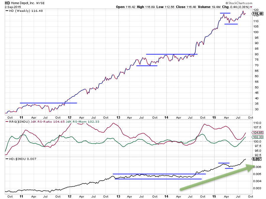
HD is the second chart I picked from the leading quadrant and as you can see I immediately converted it to a line chart. if you look at the bar-chart you will know why.
The up-trend in HD that started back in 2009 is still fully intact, no matter what qualification you want to use for an up-trend. The real move began when HD broke out of a multi-year trading range late 2011 and took out horizontal resistance around $ 35. Since that break the market never looked back and we're currently trading around $ 115 which comes down to more than 300% return over 3.5 years.
HD moved into the leading quadrant well before the actual break above $ 35, which triggered the acceleration, and has remained in there ever since with the exception of a few months during a sideways move late 2013 into early 2014.
This year HD showed a rotational pattern from leading into weakening but reversed back up into leading again, thus confirming its relative strength. HD's position inside the leading quadrant, backed by a long trail powering higher on both axes, makes HD one of the stronger stocks in the Dow at the moment.
Conclusion
- Weakness of AAPL causes shift of stocks into leading quadrant
- DD, CVX and UTX to be avoided
- AAPL weak and inside lagging quadrant but not dramatic yet (but keep a close eye)
- IBM (chart not shown) heading towards lagging quadrant
- MCD and HD showing strong relatives
Julius de Kempenaer | RRG research
RRG, Relative Rotation Graphs, JdK RS-Ratio and JdK RS-Momentum are registered TradeMarks by RRG research.


