Summary
- Commodities threatening to break down yet again
- Bond rally starting to fade already, halting turn for the better
- S&P 500 leading in international equity rotation
Quick scan
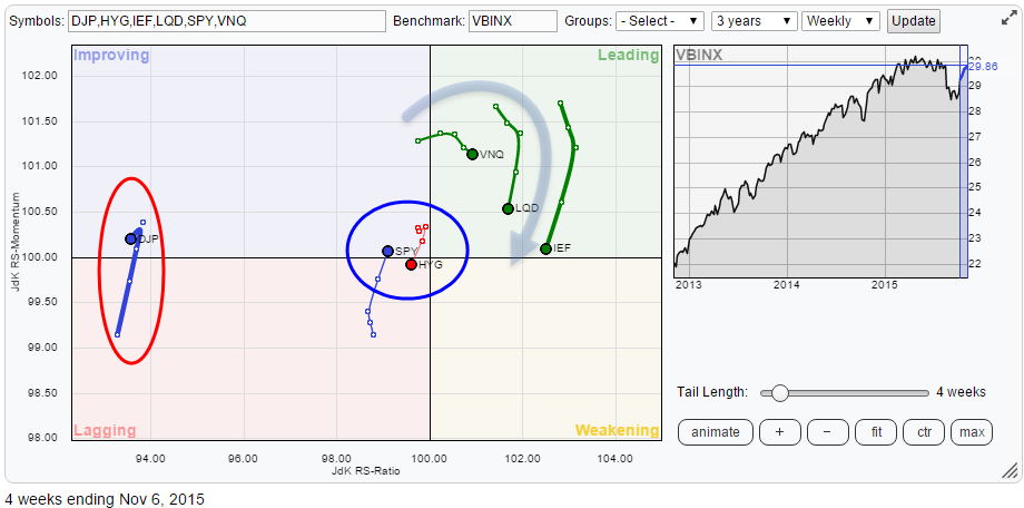
The Relative Rotation Graph above holds a number of asset class ETFs while using VBINX (Vanguard Balanced Index fund) as the benchmark.A first quick observation points to three areas of interest, worth further inspection.
All bond related asset classes, IEF, LQD and HYG started to lose relative momentum in the past two weeks. Equities, SPY, on the other hand, picked up relative momentum. However, all bond ETFs are still on the right-hand side of the RRG chart AND on the right-hand side of the SPY trail. The latter situation indicates that bonds are still in a relative uptrend versus equities, but the momentum moves raise doubt on how strong this trend is and whether bonds will be able to continue to lead.
Effectively this would mean that bonds need to rotate back up again while remaining on the right-hand side of the graph (and SPY) while SPY would need to rotate back down again while remaining on the left-hand side.
Given the short distance between the securities on the Relative Rotation Graph, this seems to be difficult to achieve. Especially the rotation of SPY versus HYG looks to turn in favor of SPY. A longer term view will help us dissect this setup and rotation.
The only asset class that is really separated from the rest is commodities (DJP). For a few weeks, commodities were able to pick up some relative momentum but this move occurred far away from the benchmark at very low JdK RS-Ratio levels.
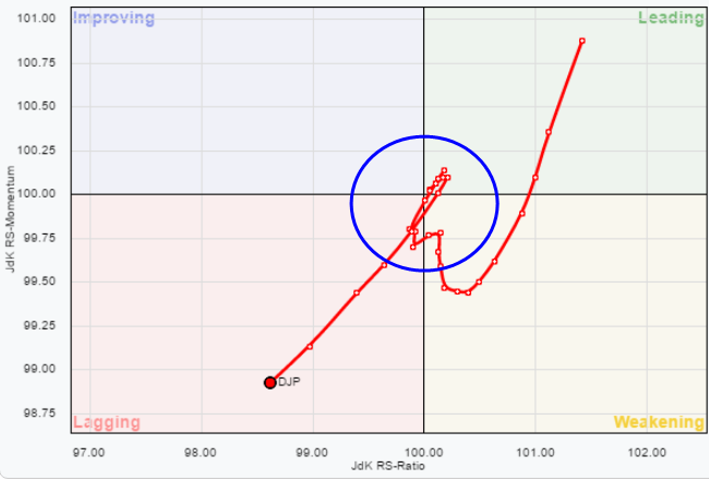
As we see very often this type of momentum rally is "only" a temporary recovery and usually not strong enough to carry the security all the way through the improving quadrant towards leading, let alone actually cross over into it. Such a rotation is now taking shape for commodities. On the weekly chart, the rotation is so sharp that it looks as if it is rotating backwards.
This has to do with the difference between weekly and daily Relative Rotation Graphs. If you zoom in from a weekly RRG to a daily RRG, see chart below, you will see that on the daily chart it is actually a clockwise rotation as you are used to but it turns so fast that the weekly has difficulties keeping up and throws a hook down to the left.
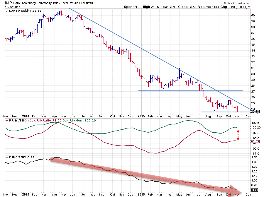
Commodities - DJP
For a longer-term, annotated, chart of commodities you can refer to a previous article on asset classes; "OK, SPY is falling .. now what?". This article already dates back to 24 August, but the annotations and the comments still hold up.
The shorter term chart of DJP is printed below. The downtrend is clearly visible with the upside capped by the falling resistance line and, after the last test of this trendline, it shows that the market is now (very) close to breaking below the previous low formed in August. If this will actually happen it is very likely that the downtrend will once again accelerate pushing commodities even further down.
With the position of DJP on the Relative Rotation Graph as it is, this will definitely cause another rotation back dow into the lagging quadrant.
From an asset allocation point of view, simply avoiding commodities still makes sense.
Equity / Bond Rotation (SPY-IEF)
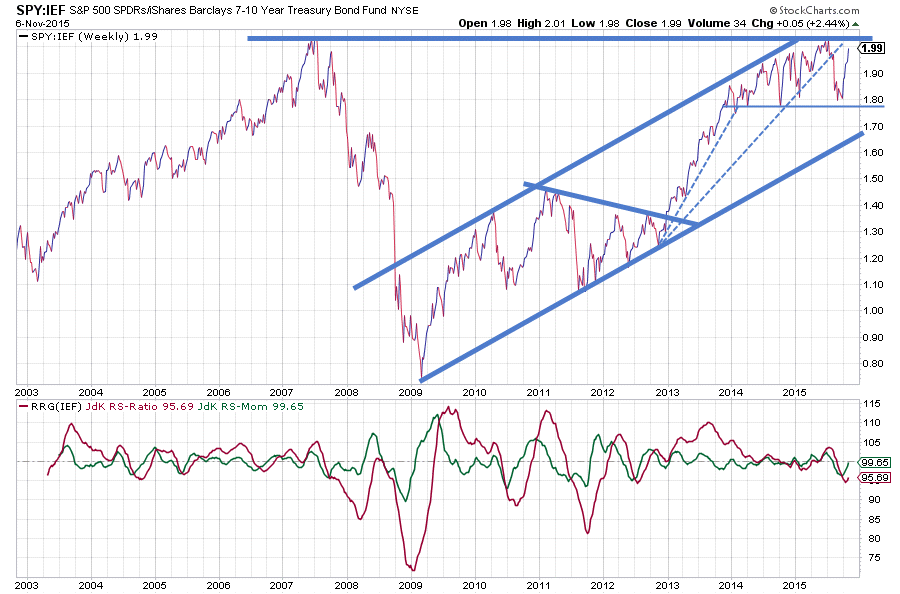
In the chart above I have left out the price chart and zoomed in on the relative strength of sPY vs IEF. The reason for doing this is that the recent wide swings in the equity market can distract the attention from the relative movement that is underway. By plotting only the relative strength, it is easier to focus on that relationship.
What we see there is that the old "all-time-high" in relative strength is now acting as a (very strong) resistance level for the equity/bond ratio to move higher. The very volatile and rapid sequence of swings in this ratio is not making the analysis any easier. As a matter of fact, it is confusing.
Clearly in 2013 and the better part of 2014 the trend was up and equities outperformed bonds by a mile. Late 2014 the ratio arrived in the area near or just below the previous, 2007, peak and started to act more nervous. This situation continued into 2015 and is still present to this day.
High volatility = nervousness.
And that is exactly what we see in the markets today, a lot of nervousness. Investors are afraid to be trapped again in a rapid decline, but they are equally afraid of missing the next (big) leg higher. Any news item or release of economic or corporate figures is used as an excuse to trade. Today it means buying, tomorrow it's a sell.
Where does that leave us in terms of asset allocation and more specifically the equity/bond decision?
Focussing on the chart above it is very clear that the horizontal barrier at or just above 2 is a very heavy resistance level which will play a significant role for the future course of the relative strength of equities versus bonds. As long as the course is unclear it is probably better to stay close to the benchmark in portfolios and not make big bets on one asset class or another.
Over the past year and a half a wide trading range in the SPY:IEF ratio seems to be emerging with the upper boundary being the aforementioned horizontal resistance level and the lower boundary formed by the last few troughs that have been formed in the 1.80 area. If this area is going to hold, ie the ratio will be moving more or less sideways there will not be much to gain by overweighting either equities or bonds.
Short-term trading opportunities may arise when the ratio hits either the upper or the lower boundary assuming another swing within the range. From the reading of the JdK RS-Ratio, the preference is still for bonds over equities at this stage. However, this is a trend-following indicator that will be late signalling up- down-swings inside a trading range.
Real opportunities will arise when the ratio breaks out of the range in either direction, an upward break meaning a preference for equities while a break below would signal a preference for bonds. For sure the RRG-Lines will then start to move further away from the 100-mark.
For a break on either side to occur we need a decisive move in either SPY or IEF or even better for SPY and IEF to move opposite of each other.
2135 in $SPX* is the level to watch for equities to break higher. If such a break occurs and holds we will very likely see a strong continuation of the previous uptrend in equities very likely to be followed by a break of the ratio above its highs. Will it happen? I don't know we'll have to see. With a new low formed rather far away from current levels, I'm not sure if a drop back of SPY will be able to push the ratio below the lower boundary.
*don't forget that the price of the ETF, in this case, SPY, follows the index and not the other way around
The other option is a decisive move in IEF. What we see here is, also, a very strong rising trend that stretches over multiple years.
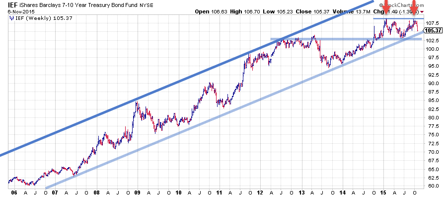
The pattern which has formed during 2015 could very well turn out to be a big double top formation with the in-between low near $ 102,50. The last upward move after breaking horizontal resistance in 2014 was not able to push all the way up to the upper part of the rising trend like previous moves in 2008, 2011 and 2013.
Instead, the area around $ 109 materialized as a horizontal resistance level that once again was too strong to break higher after last month's rally. $ 102,50 is the support level to watch. When that gives way bonds will have broken below the rising trendline and at the same time complete a major double top formation at the end of a multi-year trend.
Such a move will very likely trigger a further decline of IEF towards the next big level near $ 95.
It looks as if the strength of bonds over equities has already started to fade away. For the time being relative strength seems caught in a range which means that there are not a lot of opportunities to bet on either side. Breaks of resistance in SPY and/or support in IEF will likely change this situation.
International equity market rotation
The Relative Rotation Graph below shows the rotation of various equity markets around the world in comparison to the FTSE all world Index ($FAW).
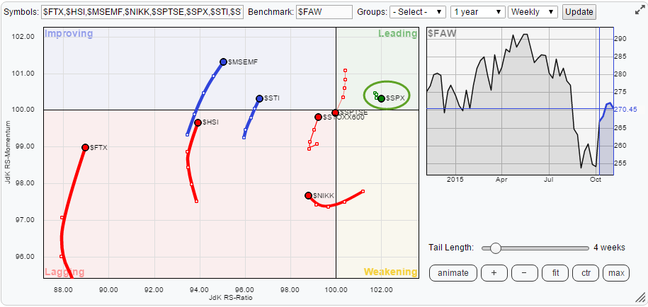
On the left-hand side of the RRG, we find a number of markets that have been gaining momentum over the past 5-6 weeks. Inside the lagging quadrant, these are China ($FTX), Hong Kong ($HSI) and to a lesser extent Europe ($STOXX600). Inside the improving quadrant, they are Emerging Markets ($MSEMF) and Singapore ($STI). With the exception maybe of Europe, all these markets are far away from the 100-level on the JdK RS-Ratio axis which makes these momentum moves suspect and they all run a high risk of rotating back into the lagging quadrant before reaching the top-right, leading, quadrant.
At the moment, there is only one market inside the leading quadrant. This is the US stock market represented by SPY. The US is well above the 100-level and it is the only market in the universe. This means that within the asset clas equities, the US is definitely the leading market at the moment.
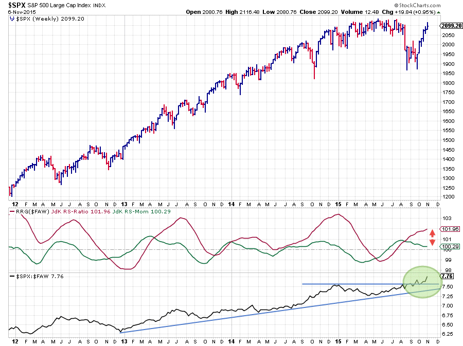
On the RRG, $SPX not only is the highest ranked market on the RS-Ratio scale, it also has the shortest trail of all markets displayed. This short trail indicates that the current relative uptrend is very stable and not in the process of turning around. This is better seen on the price chart of SPY, with relative strength against $FAW, below.
 .
.
The relative strength of $SPX against $FAW started to move higher in the second half of 2011. Since then the JdK RS-Ratio picked up some trending moves, the last one starting in July of this year. Subsequently the raw RS-line broke beyond the horizontal resistance level freeing up the way for a further rise and pushing the rs-Ratio line even higher.
With RS-Momentum still above 100 and potentially putting in a new low above 100 in coming weeks this outperformance of US equities against the rest of the world is expected to continue for a little while longer.
Julius de Kempenaer | RRG Research
RRG, Relative Rotation Graphs, JdK RS-Ratio and JdK RS-Momentum are registered TradeMarks by RRG Research
