 In my last blog, we looked at the 30 components of the Dow Jones Industrials Index and more specifically at the relative positioning and relative rotation of these 30 stocks around their common denominator the DJ Industrials index ($INDU).
And despite the fact that this is valuable information you may want to keep an eye on the (absolute) price trends that are in play within that universe as well.
The good news is that no new tools are needed to do that as Relative Rotation Graphs are fully capable of providing its “BIG picture in ONE picture” visualization from an absolute (price) perspective, in ONE graph, as well.
Here is how it works.
Summary
- Professional portfolio managers are interested in “beating a benchmark” like the S&P 500
- Private investors have no benchmark other than the value of their investment or retirement account
- Different approaches need different benchmarks; Relative Rotation Graphs can cater for both a relative- and a price-rotation picture.
- It can even be achieved in the same graph
It's all about the benchmark
Professional portfolio managers
If you are a professional money manager whose job it is to run an equity portfolio and beat a benchmark, let’s say the DJ Industrials index, then using Relative Rotation Graphs as they were originally designed, is the way to look at things.
Most likely the guidelines of your portfolio are to be fully invested, and you are only allowed a small percentage of cash. This means that the general direction of the market is just a “nice to know” but of less interest to reach your goal.
Knowing or analyzing where the market, in this case, your DJ Industrials benchmark, is heading is not going to be of much help in achieving the goal of the portfolio which is to beat that benchmark.
In other words, when the market is going up you need to select stocks that are going up faster than your benchmark and vice versa, when the market is going down you need to select stocks that are going down less than the benchmark or, if you can find them, still going up.
Private investors
If you are a private investor, your world looks a little different. There is no one looking over your shoulder, other than maybe your spouse, and there is no one cutting your bonus or firing you when you fail to beat “a benchmark.”
As a matter of fact, chances are that you couldn’t care less about beating the Dow 30 index, as your “benchmark” is the value of your investment or retirement account at the beginning of the year and the end of the year. And you would like to see the value at the end of the year to be higher than the value at the beginning of the year.
De facto this means that, when working with Relative Rotation Graphs, your benchmark is ONE.
Why ONE?
Maybe you’re wondering why your benchmark would be ONE instead of for example zero.
Anything positive, above zero, is good an any negative results, below zero, are bad. And that is true, but then you’re talking about performance which is something different than a “benchmark.”
When you work with benchmarks, by definition, you are working with comparisons.
On a Relative Rotation Graph that shows, let’s say, the S&P sectors with the S&P 500 index as the benchmark (center of the chart) all these sectors are compared with that benchmark, and as a result of the algorithm, with all other sectors on the chart.
When you want to get an absolute return perspective you need to compare securities with themselves. And comparing something with itself (are you still with me?) is done by comparing it with “1”.
Simply said comparing a security with a benchmark, which is essentially a moving target, is done by dividing the price of the security by the price of the benchmark and monitoring that relationship. Comparing a security with itself is done by dividing the price of the security by 1, so it remains the price compared to a static target.

Comparing RRGs
On a Relative Rotation Graph, the benchmark is a parameter that we can change. Most of the time we would use a benchmark that applies to the universe on display. For the Dow 30 stocks, the obvious one is using $INDU as the benchmark.
However there is nothing that would stop us from using, say, the S&P 500 Index ($SPX) as the index, or something completely different, for the Dow 30 universe. As long as you feel it makes sense to compare the securities on the graph with that benchmark, there is nothing wrong with that.
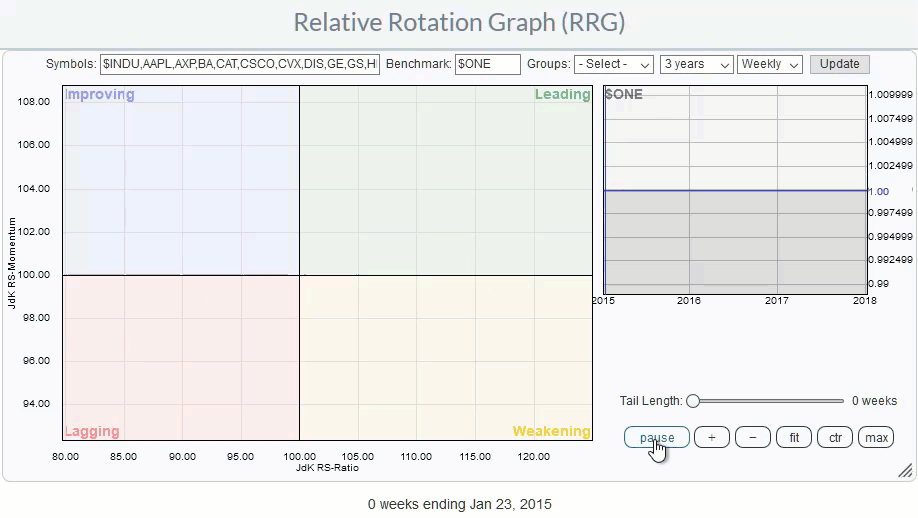
In order to get a handle on price-based, absolute, movement inside a universe, the only thing that needs to be done is change the benchmark from a moving index like $INDU to a static series like $ONE.
Now with this knowledge in place, let’s compare two Relative Rotation Graphs.
RRG with $INDU benchmark
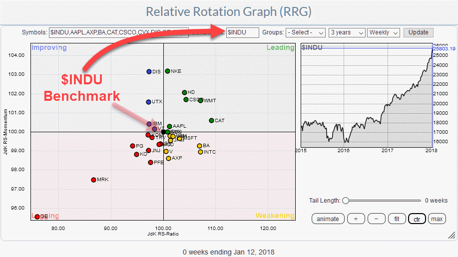 The RRG above shows the Dow 30 universe, as we know it, with $INDU as the benchmark and the stocks that make up the DJ Industrials index, more or less, evenly scattered and rotating around that benchmark.
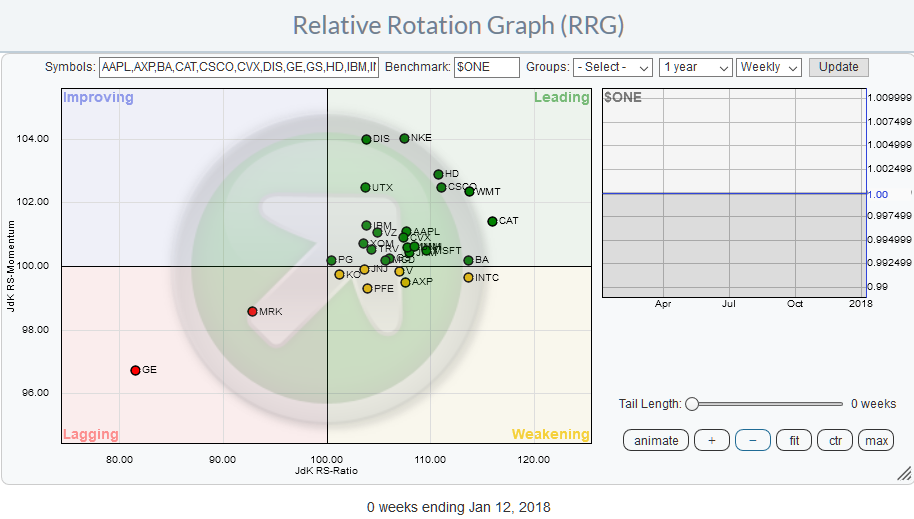
RRG with $ONE benchmark
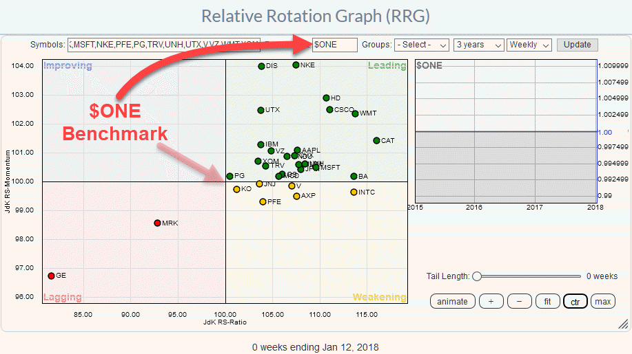
The second RRG above shows the same Dow 30 universe but now with the $ONE benchmark applied.
Note how basically ALL securities have shifted to the top-right, LEADING, quadrant as a result of using $ONE as the benchmark.
With the Dow currently in a strong uptrend that is to be expected. The message from the RRG against $ONE is that all stocks in the Dow 30 are in an uptrend from a price perspective except for GE and MRK which are in the lagging quadrant.
The symbols inside the weakening quadrant on the $ONE quadrant are still in an uptrend, but they are losing upward momentum.
See the shift in action
The animated GIF below visualizes what happens with the RRG when the benchmark is changed from $INDU to $ONE.

Combining both RRGs in ONE picture
Now the next question obviously will be: “But what if I want to combine those two views?”. The RRG answer:”No problem!”.
If you would like to combine both the relative and the (absolute) price based views into one picture, there is no need to keep an eye on a second RRG holding the same universe or for a “new tool.” It can be achieved with one Relative Rotation Graph.
The way to do it is very simple. Using the example of the Dow 30 stocks you change the benchmark to $ONE but you ALSO add the $INDU symbol to the securities on the graph.
Before you do that think where you expect that $INDU symbol to show up on that RRG?
Exactly, somewhere inside the LEADING quadrant.
Why? Because the DJ Industrials itself is in an uptrend.
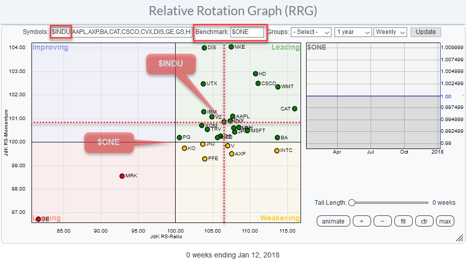
The RRG below shows this setup with $ONE as the benchmark for the RRG and $INDU added to the universe.
To get an idea of the relative movement around the Dow 30 index, you simply draw imaginary x- and y-axes through the position of $INDU on the chart. As the position of $INDU itself will now change through history, the relative x- and y-axis will also change with it.
To visualize this, please watch the animated GIF below which shows the RRG for the Dow 30 stocks with $INDU added to the universe and $ONE as the benchmark. I have highlighted $INDU and stretched the history to three years in the animation to better see its rotational movement and also cover periods where most securities went through a down-move dragging $INDU to the (lower-)left, LAGGING, part of the RRG.
Two views in one
I hope you like the above explanation on how to use Relative Rotation Graphs to get a big picture view based on price strength and the option to combine the visualization of price- and relative strength in one picture.
This article relates to an article I wrote on how to show "Currency Rotation" on a Relative Rotation Graph.
Let me know what you think of this usage of RRG in the comments? If you want to receive a notification when a new article in the RRG blog is published? Simply "Subscribe" and leave your E-mail address.
Julius de Kempenaer | RRG Research
RRG, Relative Rotation Graphs, JdK RS-Ratio, and JdK RS-Momentum are registered TradeMarks ®; of RRG Research
Follow RRG Research on social media:
If you want to discuss RRG with me on SCAN, please use my handle Julius_RRG so that I will get a notification
