When evaluating the stock market for a potential top, there's another intermarket relationship that seems to provide us a nice clue. So without further hesitation, let me move on to my third area of the stock market to watch:
3. WHICH GROUP OF CONSUMER STOCKS IS LEADING?
There's an aggressive side of consumer stocks (discretionary) and a more conservative or defensive side (staples). It's very important to watch the relationship between the two closely. Why? Well, as you might imagine, if the stock market believes that brighter economic days are ahead, money will skew towards discretionary stocks as they're much more apt to accelerate their earnings quickly in a growing economy. This is more of a common sense test. Companies that fall within the discretionary space include Starbucks (SBUX), Ford Motor (F), priceline.com (PCLN), Walt Disney Company (DIS), LinkedIn (LNKD), various homebuilders, and amazon.com (AMZN) and other retailers. We spend money on products of these companies when we feel wealthy and we feel good about the economy and our job. These are products we WANT, but don't necessarily NEED. When the economy contracts and we become more fearful, we tend to cut out discretionary spending and these companies perform poorly on a relative basis. Consumer staples stocks, on the other hand, generally represent companies that sell products we NEED. You'll probably recognize these first two household names - Colgate-Palmolive (CL), Proctor & Gamble (PG), food & beverage companies, drug retailers and the like. It doesn't matter how the economy is performing, I hope you still brush your teeth and clean your house. From a common sense perspective, it would seem that an uptrending stock market would be supported by consumer discretionary stocks (XLY) outperforming its consumer staples counterparts (XLP) on a relative basis (XLY:XLP). That would be the expected theory, but does it work in reality?
Well, let's take a look at the last two bear markets once again. First, let's take a look from 1999-2007 on the S&P 500. This will cover the bear market of 2000-2002:
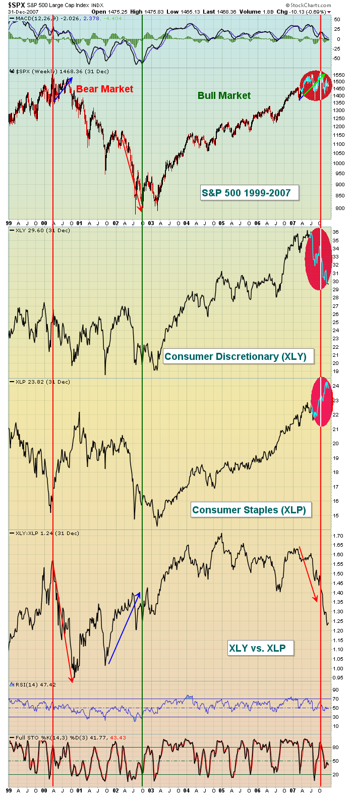
There are four key components to this chart. The S&P 500 performance is at the top, followed by the ABSOLUTE performance of both consumer discretionary stocks (XLY) and consumer staples stocks (XLP). The final analysis pits the relative value of the XLY vs. the XLP. So the absolute charts will tell us whether the sectors are going up or down. But that last XLY vs. XLP chart will tell us which of the two sectors are leading on a relative basis. When this price relative ratio heads higher, it means the XLY is outperforming the XLP. When it's moving lower, the opposite is true. Note that during bull markets, both the XLY and XLP move higher. It's not like one moves without the other. Instead, it's simply a case of which one moving faster, or attracting the most money on a relative basis. The red vertical lines mark the start of the two bear markets so far this century. The green vertical line illustrates the point at which the bull market begins. Let's discuss this chart in greater detail. Notice that at the end of the bull market in 2000, money began flowing AWAY from discretionary stocks on a relative basis. The blue arrow on the S&P 500 part of the chart in 2000 suggests the S&P 500 is on the verge of a breakout, but what does the "under the surface" XLY vs. XLP message tell us? Money is flowing heavily AWAY from consumer discretionary stocks. That's a warning sign. If the S&P 500 is going higher, we should conclude that the market is anticipating a stronger economy. A stronger economy should benefit the XLY more than the XLP so the XLY vs. XLP line should be advancing. But it's NOT. That was suggesting that we be careful. Note that by the end of the bear market in 2002, both the XLY and XLP were moving lower, but the XLY was gaining significant traction on a relative basis. Why would this happen in a bear market? Well, because the market saw the rotation of money into areas that would benefit from a strengthening economy. Hence, the end of the bear market.
The bull market of 2002 to 2007 was similar. First, note that the XLY and XLP were both trending higher throughout the bull market. The XLY:XLP relative ratio was trending higher throughout although there were periods of a lagging discretionary sector as homebuilders began to struggle. The real key to me, however, was analyzing the red circles highlighting action in 2007. Note the S&P 500 was pushing to an all-time high in October 2007. Note also that consumer staples (XLP) were screaming higher. Consumer discretionary, though, fell through the floor and check out the XLY vs. XLP relative ratio. It fell like a rock. Once again, the S&P 500 did NOT tell us the whole story. Instead, money was rotating into the defensive consumer staples sector, which was problematic.
Now let's fast forward to the past 8 years and look at the same chart:
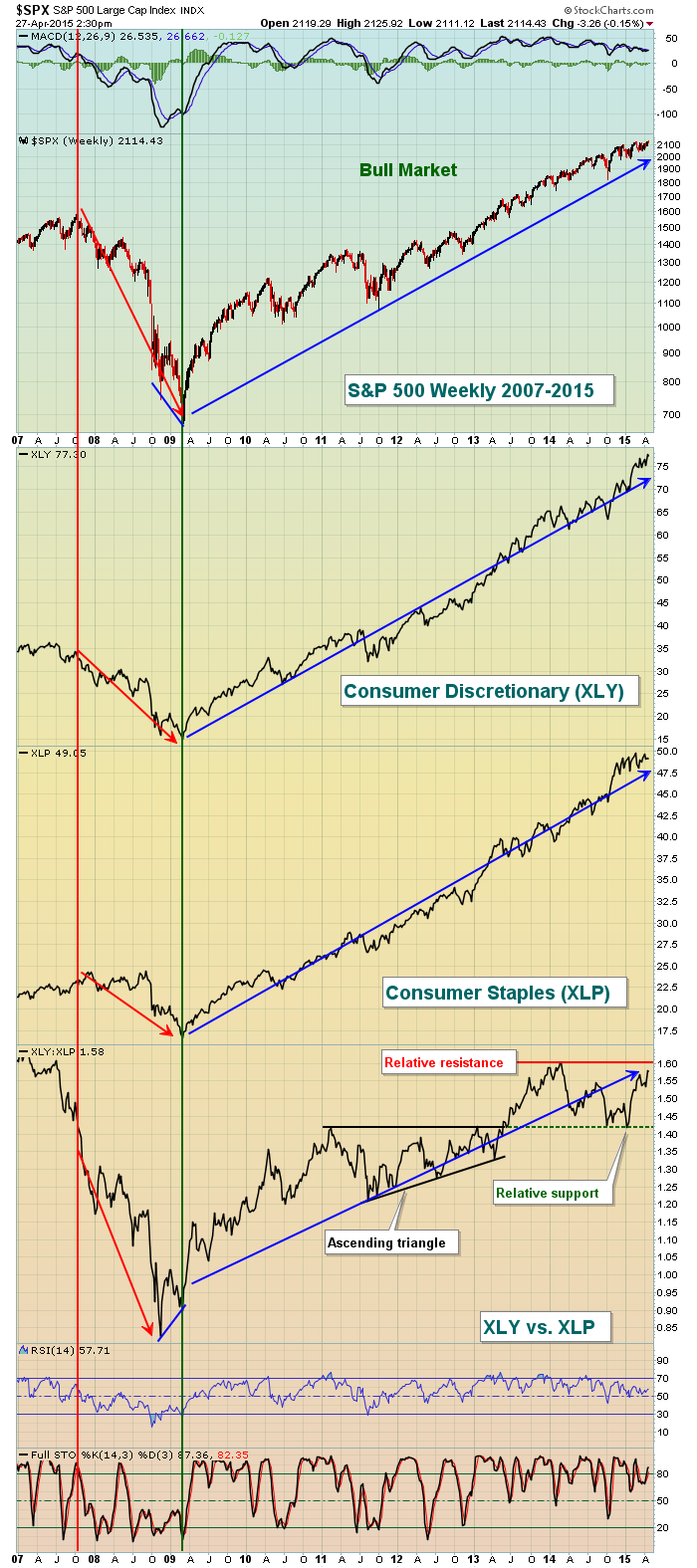
There are two things I want to point out here. First, look back to the end of the bear market in late 2008/early 2009. Notice how the S&P 500, XLY and XLP all keep pushing to fresh lows? But check out the subtle positive divergence that emerged on the XLY vs. XLP relative chart. On the surface, the S&P 500 was setting new lows. But under the surface, money was beginning to rotate. That was a sign that the bear market was nearing its end. The relative action throughout the current bull market has been strong. We are still awaiting another relative breakout. Should we get it, I believe that the bull market is alive and well. For now the relative ratio is consolidating between 1.42 and 1.60. If we break higher, it's bullish. If we break lower, it's bearish. Time will tell here although I see little to be worried about at this point.
Next up: What does the performance of bank stocks and financials in general tell us? Stay tuned.
Happy trading!
Tom


