Hello Fellow ChartWatchers!
First off I wanted to make sure you knew that our Holiday Special is now underway! Long time members will tell you that if you are a StockCharts fan, the best time to join or renew is during our Holiday Sale Special. If you renew right now for 12 months, we'll give you 2 additional months for free. If your account expires within the next 6 months, now is definitely the time to renew. If you have been thinking about becoming a StockCharts member, now is the time to join.
Members: To renew, login and then click the "Your Account" link at the top of the page.
New Subscribers: Click here and select your service level to get started.
Do not let this opportunity pass you by. This sale only lasts through December 19th!
Also, we've inserted a longer article by John Murphy into this newsletter because John has some important, timely observations for everyone right now. Feel free to forward this email to your friends using the link at the top of this email message.
AVERAGE TRUE RANGE COMPARISON
The other day, someone wrote in and asked why our ChartSchool formula for Average True Range (ATR) was different from what they saw on other websites. Curious, we looked into the issue and were very surprised to discover that several other websites were describing ATR incorrectly.
ATR was created by J. Welles Wilder - the creator of the RSI indicator, the ADX indicator, the Parabolic SAR indicator, and several others. He first described it in his amazing book "New Concepts in Technical Trading Systems."
The first part of the equation involved computing something called the "True Range." Everyone gets that part correct. (You can see the details for yourself here.) It's the second part - the "Average" part - that many other websites are getting wrong.
On page 23 of Wilder's book it says:
"The equation for the AVERAGE TRUE RANGE is as follows:
ATR(latest) = ( 6 x ATR(previous) + Today's True Range ) / 7
To get the ATR initially, add the true range, as defined, for the past seven days and divide by seven. The answer from this will be used as the ATR(p) in the equation for the next day."
On page 26, Wilder reiterates the steps:
"2. ATR -- AVERAGE TRUE RANGE
A. Initially obtained by adding the true ranges for seven days and dividing by seven.
B. The latest ATR is obtained by multiplying the previous ATR by six, adding today's true range and then dividing the total by seven."
Those discussions are in the context of creating a 7-day ATR. To create the more typical 14-day ATR, you would use 13 instead of 6 and 14 instead of 7 in the above formula. That's the same as the information we present in our ChartSchool article and it's what we use in our programs.
Unfortunately, other website just take the 14-period Simple Moving Average of the True Range values and call that average the ATR. That is a huge mistake on their part caused - we guess - by laziness.
To see why, lets look at the current ATR value of the Dow Jones Industrial Average using our website and a popular competitor's site:
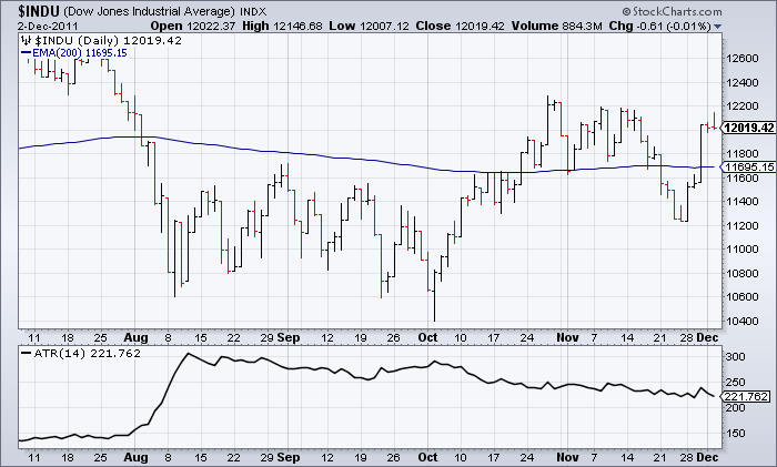
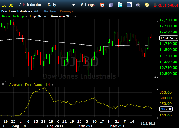
So we show that the Dow's ATR(14) should be 221.762 whereas our competition shows it at 206.98. That's a HUGE difference! Why is that?
The answer is obvious if you look at the following Excel spreadsheet that calculates ATR using both Welles Wilder's way of averaging things and the simple moving average method. Here's a screenshot of the bottom of that speadsheet:
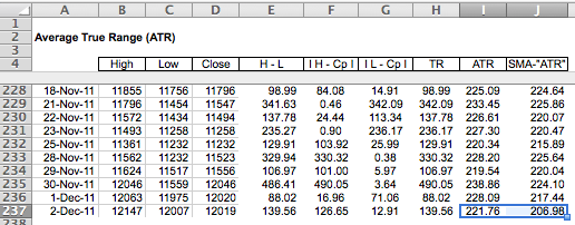
And there you go - If you use the Wilder averaging method you get 221.76 which is what our chart shows. If you don't do your homework and assume that "Average" means "Simple Moving Average", you get 206.98 just like our competitor does.
(BTW, our chart shows the 200-day EMA at 11695.15 whereas the competition has it at 11703.14. Here a link to an article explaining why our number is correct in that case as well.)
The bottom line here is that StockCharts.com is 100% dedicated to accurate calculations and we take the time to go to the authoritative source for our formulas. Not everyone does that and, if they can't get ATR correct, what else do they have wrong?
Happy Holidays!
- Chip
STOCK RALLY STALLS AT 200-DAY AVERAGE... This past week's impressive stock rally ran into some profit-taking on Friday just shy of 200-day moving averages. Charts 1 and 2 show the S&P 500 and the Nasdaq Composite closing near the their daily lows after nearing that important resistance barrier. The daily stochastic lines below Chart 1 turned up from a short-term oversold reading (below 20) which helped support this week's strong rebound. The two lines, however, are already nearing overbought territory over 80. Needless to say, those market indexes need to clear their 200-day lines if this week's rally is going to turn into something more meaningful.


DOLLAR BOUNCES OFF 50-DAY LINE ... Part of Friday's stock selling may be the result of a bouncing dollar. Chart 3 shows the DB Bullish Dollar ETF (UUP) bouncing off its 50-day average on Friday. The main reason for that was a drop in the Euro (which accounts for 56% of the UUP). Chart 4 shows the Euro selling off on Friday and remaining below its 50-day line. Global markets may need to see more of a bounce in the Euro to continue this week's central bank-inspired enthusiasm.


COMMODITIES TRACK STOCKS CLOSELY... Commodities rallied this week along with stocks, which continues their yearlong pattern of trending together. Chart 5 shows the DB Commodities Tracking Fund (DBC) ending the week above its 50-day average, but well below its November high. A trendline drawn over the July/August highs also comes into play near the November high as well. The DBC would have to clear both barriers to turn its trend higher in more decisive fashion. The line below Chart 6 shows how closely the S&P 500 has been tracking commodities.

VIX DROPS TO 200-DAY LINE... This week's stock rally pushed the CBOE Volatility (VIX) Index sharply lower during the week. That makes sense since the VIX and stock market trend in opposite directions. Interestingly, the VIX is now testing potential support at its 200-day moving average (just as the S&P 500 is meeting resistance at its 200-day line). What the VIX does at that support line will help determine if this week's stock rally has any real staying power.

While gaps are not what they used to be, there were a few island reversals on the charts this week. The chart below shows the Nasdaq 100 ETF (QQQ) with a large island reversal over the last three weeks. A bullish island reversal forms with a gap down, a consolidation and then a gap up. The two gaps match, which makes the price data in between appear detached â like an island. Traders establishing short positions between the gaps are trapped on the island with losses.
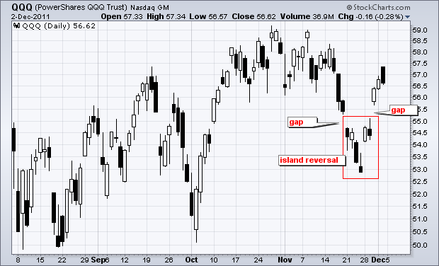
Click this image for a live chart.
The chart above shows QQQ with a bullish island reversal. The ETF gapped down on November 21st, consolidated and then gapped up on November 30th. Actually, there was even a reversal within the consolidation. QQQ formed an inverted hammer on Friday and then gapped up on Monday. Follow through with Wednesdayâs big gap completed the island reversal. In general, a gap up is considered bullish as long as it holds. The gap zone turns into the first support zone to watch. A bullish gap should hold. Failure to hold this gap would be bearish.
Good trading!
Arthur Hill CMT
The US Dollar Index appears to be setting up for a medium-term double top. This week it broke down through a short-term rising trend line drawn from the October low after reaching a level equal to the October top. The PMO made a lower top, creating a negative divergence.

The 20-EMA crossed up through the 50-EMA in early September, generating a Trend Model BUY signal. The 50-EMA crossed up through the 200-EMA signaling that The Dollar Index is now in a long-term bull market. Since the EMAs are in a bullish configuration, it is less likely that a full bearish outcome will transpire, but we could see a decline to suport at the 200-EMA or the rising trend line drawn through the August and October lows.
The Weekly chart presents a positive picture with a rising PMO and positively configured EMAs.

Bottom Line: The Dollar Index has been particularly vulnerable to the alternating extremes of attitude within the investing community of panic and relief brought on by the global debt crisis; however, while the charts refelct this volatility, they also seem to reflect a tendency toward a positive outcome in the long run.
With one week left to go, the S&P 500 was on the verge of its worst November in the last sixty years. Then the Fed and other central bankers came to the rescue of global markets last week and everything was just peachy again (sarcasm intended). November turned out to be a flat month with the S&P 500 falling approximately 0.5%. If you're on the short side of the market, Ben Bernanke is likely your biggest enemy.
Despite the huge rally last week, technical obstacles remain. Key price resistance is now evident on all three of the defensive sectors. Let's look at the ETFs that track these defensive groups - healthcare, utilities and consumer staples:
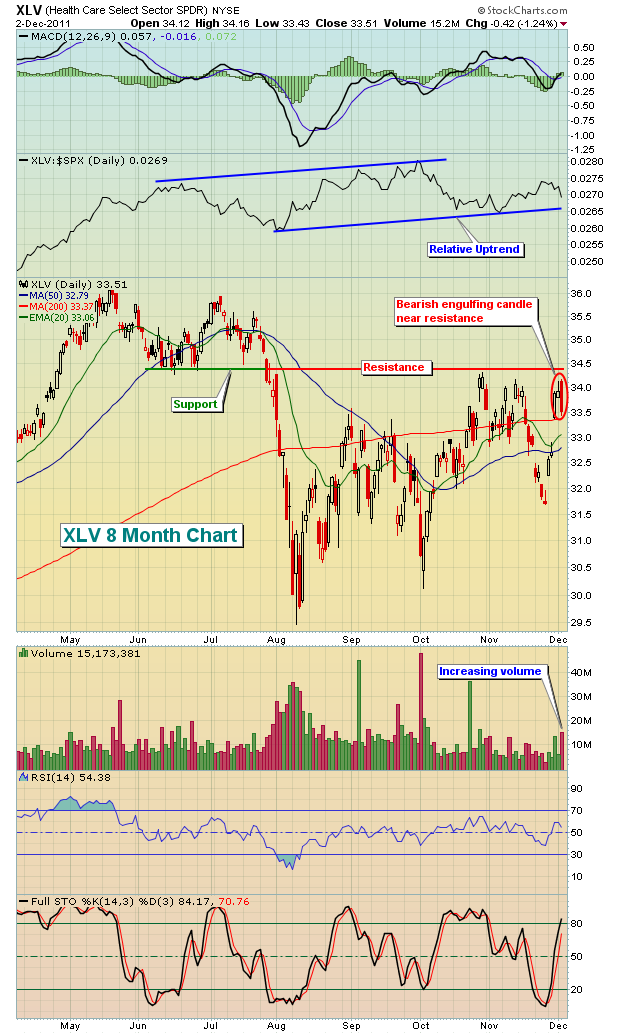
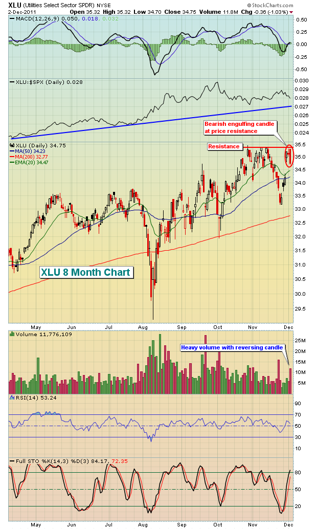
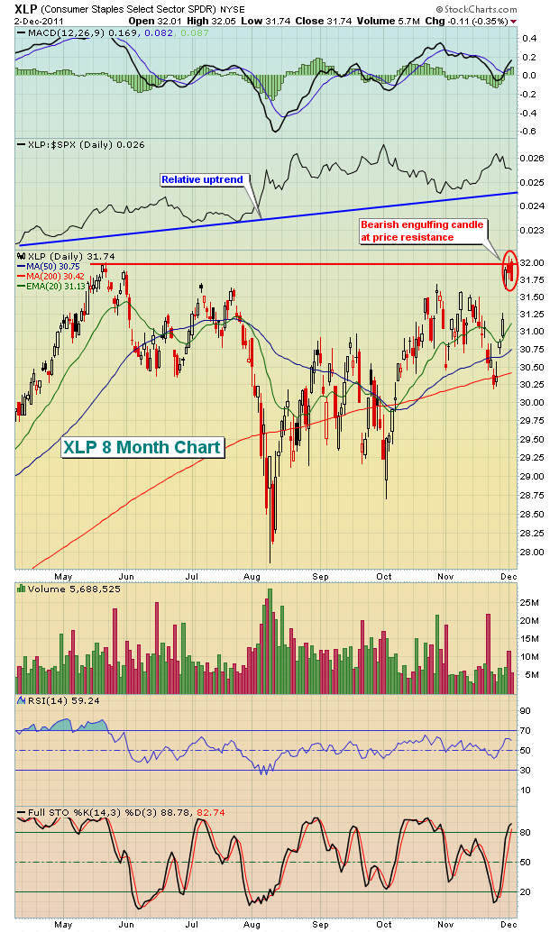
The resistance on each of the above charts is fairly obvious. But price resistance isn't my biggest concern. Did you notice the relative strength line on each of these defensive sector charts? They all are printing higher lows. The rising relative strength line in defensive stocks was one of the biggest warning signs the market flashed back in late April as our major indices topped. It's NEVER a good sign to see money flowing towards safety. That's the kiss of death for the stock market. We want to see investors and traders willing to take on MORE risk, not less.
In another startling move to safety, the bond market reversed course on Friday, just as it appeared we were seeing a key technical breakdown. Bond yields, which move inversely to bond prices, had broken out on Friday morning after the news that the U.S. unemployment rate had unexpectedly fallen to 8.6%. It turned out to be a head fake, however, as the yield tumbled back beneath closing resistance by day's end. Check this out:
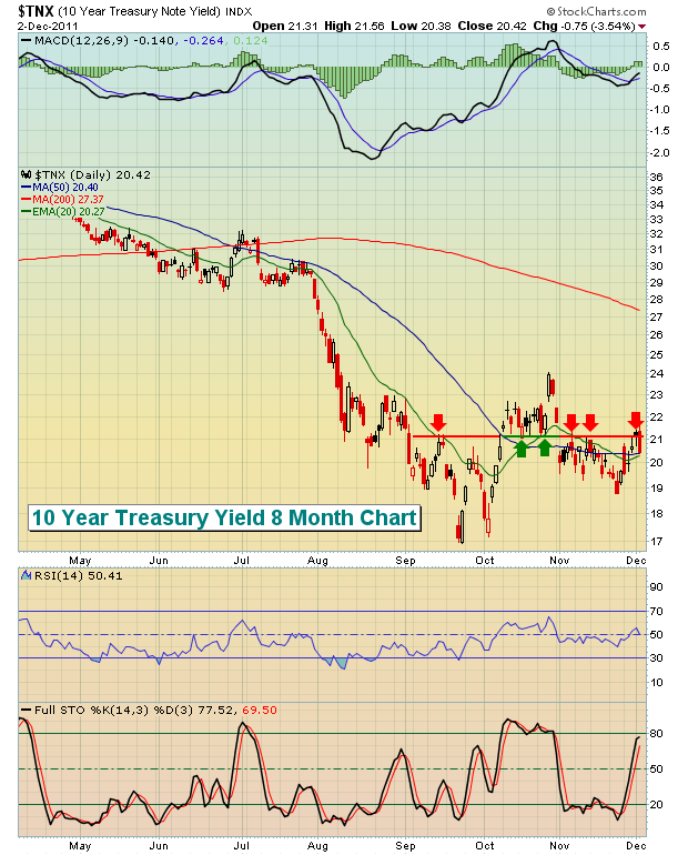
The 10 year treasury yield posted a reaction high in early September at 2.11%, then proceeded to mark a significant low near 1.70%. That became the trading range until the breakout in the second week of October. Upon that breakout, 2.11% became the support on the yield. But the yield began tumbling in late October and 2.11% support was lost. We have yet to rebound back above that technical level, though we had great opportunities on both Thursday and Friday to do just that. We failed miserably on Friday with a very ugly long red candle. Yields have had a strong history of leading stock market action the past several years. We can't take the yield's failure last week too lightly.
The November flight to treasuries and the continuing relative strength of defensive sectors paint a not-so-great picture of our current market environment. Throw in the volatility and daily gaps because of uncertainty in Europe and it simply spells trouble for equity investors and traders. Don't believe me? Ask the MF Global traders. Or the Goldman Sachs market making unit. Or John Paulson, hedge fund manager extraordinaire, who last week issued an apology for losing investors 44% year-to-date in his Advantage Plus Fund. This market is taking down EVERYONE. In my view, the best strategy of late has been to take up bowling.
There are signs to look for in determining when the market is primed for a sustainable rally. Those signs haven't emerged. Studying the behavior of ETFs and their relative strength can provide us valuable clues, however. That is the subject of a FREE ETF webinar that I'll be leading on Tuesday evening. If you're interested in more information, CLICK HERE.
Happy Trading!
Last week, the world's stock markets cheered the coordinated central bank efforts to supply dollar liquidity to the world banking system via lower than market rates. This clearly resulted in a "risk-on" trade across the board, and we expect more to follow in the weeks ahead as the ECB lower rates, and China moves quickly to halt its declining economy.
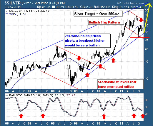
Our interest in this new round of money printing and stimulus stands in the precious metals again such as gold, silver and platinum. We can make a very bullish case for each at this point, but we'll focus on the "high-beta" silver futures contract. All healthy precious metal bull markets are led by silver; and we sense that silver is now poised to outperform once again - with new contract highs forging above the $50/oz level.
The techncials of the trade are rather simple: silver has traced out a rough 9-month bullish "flag pattern", which tends to resolve itself in the direction of the major trend, which is higher given the pattern of higher lows. Also, we point out that the 20-week stochastic is back to levels that in the past have coincided with rather major bottoms. The only caveat is the rolling over 250-week moving average, which on many occassions has shown its bullish and bearish worth. We are of the opinion, that once the 250-week is violated to the upside at $35.50 - this a rally of massive proportion shall be upon us. Lest we not add that that Wednesday's daily trade put in place a key reversal higher - which in our mind is sufficient to consider long positions at current levels.
Good luck and good trading,
Richard