| THIS WEEK'S ARTICLES |
| ChartWatchers |
| Step Into The Heart Of Finance In "The Big Board" - An Exclusive, Behind-The-Scenes Tour Of The NYSE Trading Floor |
| by Grayson Roze |
|

Hello Fellow ChartWatchers!
This week, it's story time.
This past December, right in the midst of the holiday rush and the endless festivities of the season, a few of us from the StockCharts team put down the gift wrap, packed up our suitcases and flew across the country for a last-minute trip to New York City. We had received a very special invitation from our good friend, Jay Woods, CMT, and no amount of Christmas cookies could hold us back from this one.
Jay is an Executive Floor Governor and dedicated market maker with IMC Trading. He's spent over 27 years on the floor of the NYSE, right in the center of capitalism and the heart of global finance. To say that Jay's professional life is unique would be a tragic understatement. His perspective on the markets, stocks, charts and everything else financial is unlike anything you're used to, and we had the rare opportunity to capture it on film.
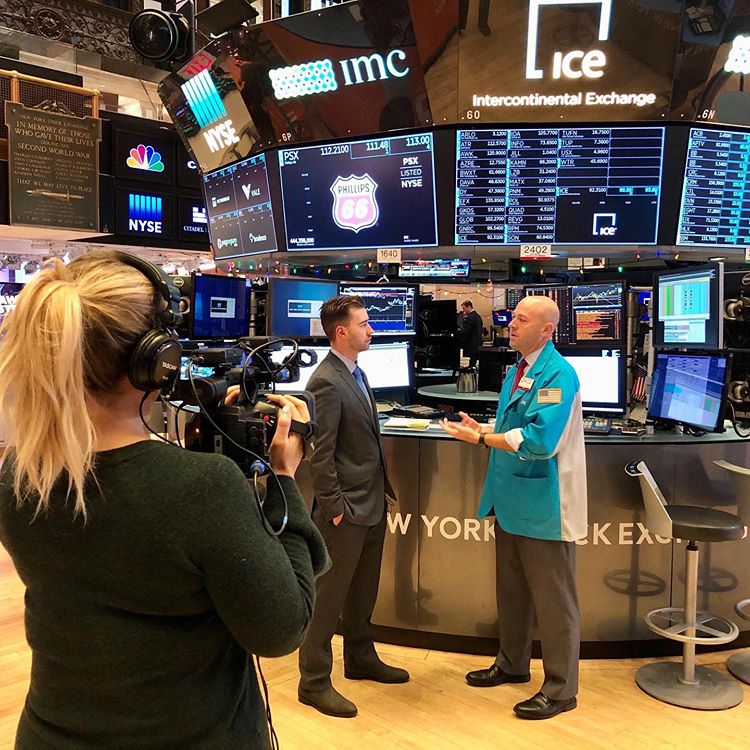
Suited up and ready for action, Dave Keller and I ventured down to Wall Street alongside our producer, Gretchen Pitluk. With special permission from the NYSE, we donned our colorful guest badges and helped Gretchen lug a load of camera equipment through the historic halls of the exchange.
Jay came to greet us and ushered us to his post, where his fellow IMC market makers were all settling in before the opening bell. After a quick strategy discussion, we mic'd up, straightened our ties and waited for Gretchen's countdown.
"3. . . 2. . . 1. . . ACTION!"
For the next several hours, Jay toured us around the floor of the NYSE and beyond, deep into the exchange to areas that only a select group of invited guests have a chance to see. Humbled and excited, we followed along as our guide lead through his home away from home.
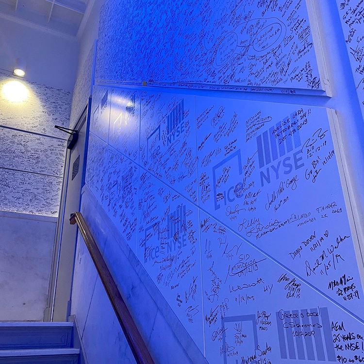
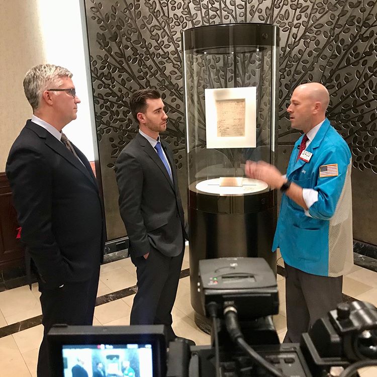
We wound through the maze of monstrous trading posts for each firm on the floor, past giant monitors with fast-moving charts and brightly-lit quote boards flashing rapidly with each price change. We stood below the infamous bell that's rung every morning and afternoon to open and close the session. We made our way up through the stairway lined with signatures from dozens of corporate figures and other guests that have visited the NYSE to ring the bell, emerging out onto the balcony that looks down on the trading floor from high above – a space where few have been since it was closed to the public after 9/11. We even had a chance to zip upstairs to the private hall where the exchange's founding document, the historic Buttonwood Agreement, is on display.
In short, it was everything two market geeks like Dave and I could ever dream of.
I'll be honest, I struggled to contain myself throughout this experience. I'd like to think I held it together pretty well on camera, but every time Gretchen gave me the signal I couldn't help but let my jaw hit the floor, eyes wide, smiling from ear to ear, head turning every which way as I tried to take in the incredible atmosphere that is the New York Stock Exchange.
When the cameras were rolling though, it was all business. We talked to Jay about the history of the exchange, got to see how he and the other traders on the floor operate, heard about how charts factor into Jay's unique role and listened as he described his fascinating approach to the trading day as a market maker. We even had the chance to watch an IPO in real time, from opening bell through the initial pricing process to the stock's first trade on the NYSE.
So if you didn't catch the premiere of our two-part StockCharts TV special earlier this week, grab yourself a seat and enjoy "The Big Board: Behind The Scenes At The NYSE", out now on the official StockCharts YouTube channel.
PART 1 – "The Big Board: Behind The Scenes At The NYSE"
PART 2 – "The Big Board: Behind The Scenes At The NYSE"
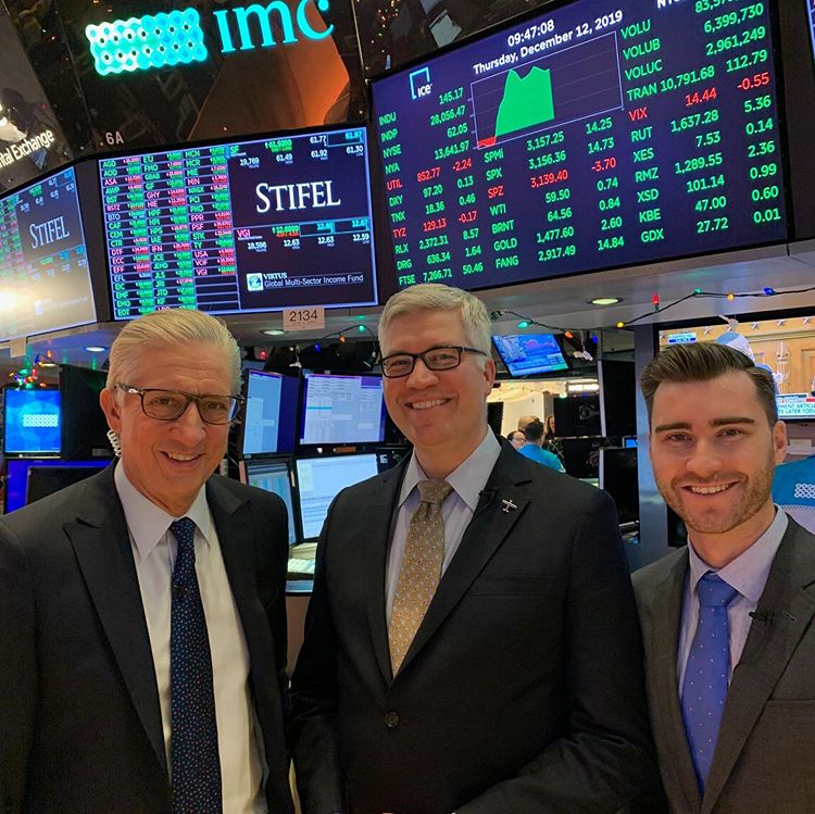
 David Keller, Grayson Roze and CNBC's Bob Pisani on the NYSE trading floor David Keller, Grayson Roze and CNBC's Bob Pisani on the NYSE trading floor
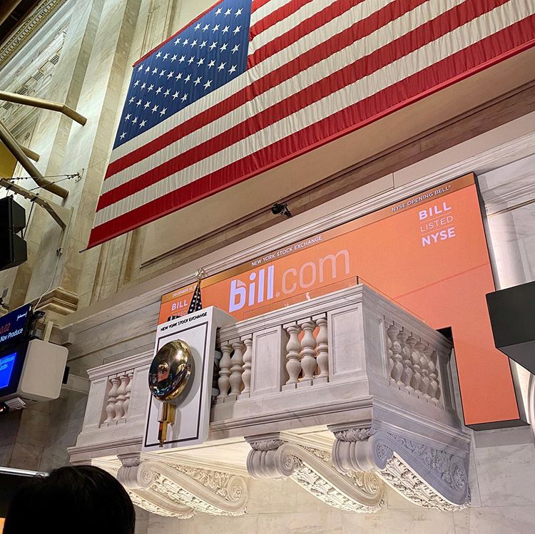
 The opening bell, prepped for the IPO of Bill.com (BILL) The opening bell, prepped for the IPO of Bill.com (BILL)
 The stairway of signatures from corporate figures and guests of the exchange The stairway of signatures from corporate figures and guests of the exchange
 Jay speaks with David and Grayson in front of the Buttonwood Agreement Jay speaks with David and Grayson in front of the Buttonwood Agreement
Chart on, my friends.
- Grayson Roze
VP of Operations, StockCharts.com
Author, Trading For Dummies (Wiley, 2017)
Author, Tensile Trading (Wiley, 2016)
|
| READ ONLINE → |
|
|
|
| Market Roundup |
| A Rising Gold Market Says It May Soon Be Time to Cover Those Commodity Shorts |
| by Martin Pring |
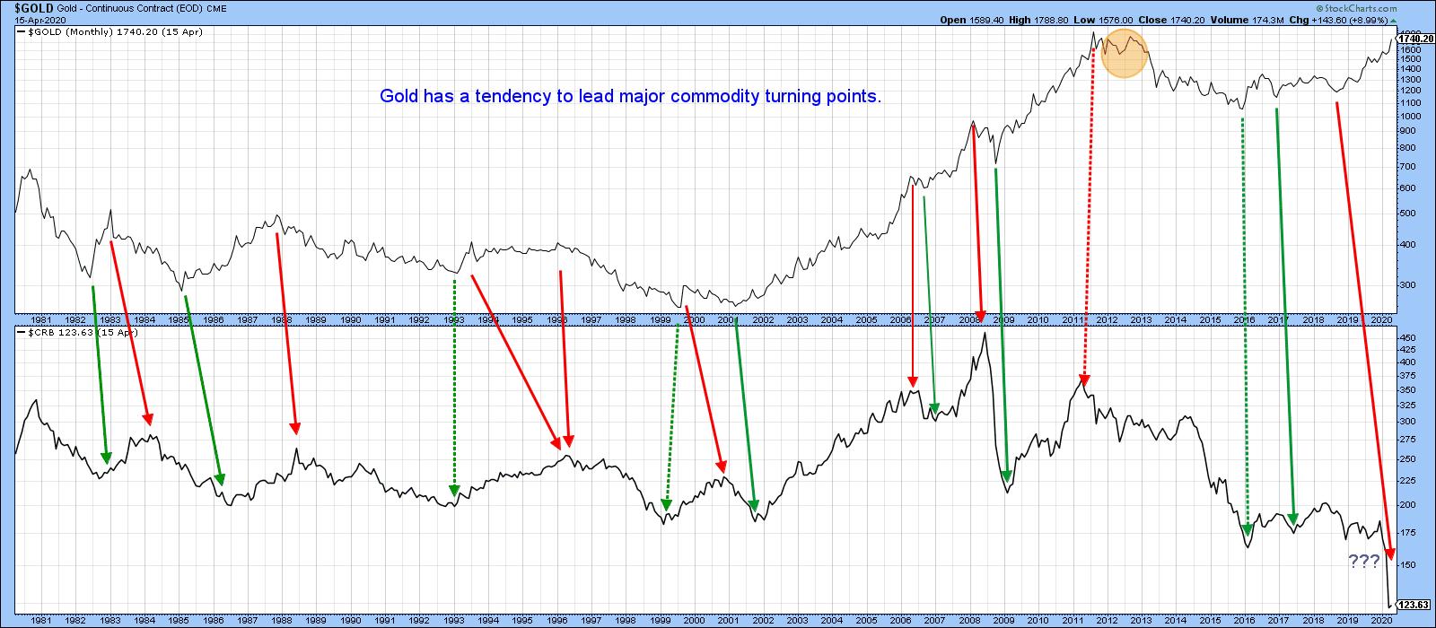
History tells us that, at major turning points for commodities, there is a strong, albeit imprecise, tendency for the gold price to have preceded that reversal. Gold generally leads because a rising price anticipates inflation, while a falling one anticipates deflation. This idea is represented by the rightward sloping solid arrows in Chart 1, which join important turning points for both series. The dashed ones represent exceptions to this rule. The recent dichotomy between a rising gold price and lower commodities is therefore flashing the probability of an imminent bottom for the latter. The problem with this conclusion is that the lead times between the low in gold and that of commodities has varied considerably. A more precise approach is therefore needed if we are to take full advantage of this relationship.

Chart 1
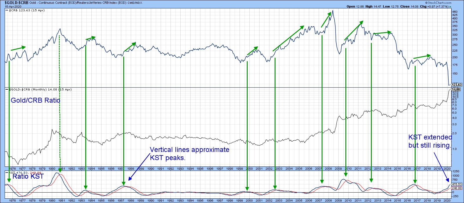
Chart 1 established the principle that trends in the gold price generally discount those for commodities. Consequently, reversals in the relative performance between them should as well. That brings us to Chart 2, which compares the relative performance between gold and the CRB Composite to the CRB Composite itself. A rising relationship means that gold is outperforming commodities and vice versa. The solid vertical green arrows indicate KST peaks for the ratio. The smaller ones above the CRB draw our attention to the fact that such action is almost always bullish for commodities themselves. One exception developed in 1980; the major difference between this failure and the multitude of successful signals is that commodities had already enjoyed one of the best bull markets in history and, therefore, were ready for some corrective action. Normally, when the ratio peaks, it is associated an oversold commodity market, which stands a greater propensity to advance.

Chart 2
In the last couple of months, the gold price has rallied while commodities have fallen sharply. This has resulted in an unprecedented divergence and a high reading in the ratio's KST. We can't yet say that this relationship has peaked, as both series are still marching higher. Unfortunately, the KST, being a smoothed indicator, may take some time before it signals a change in course. Consequently, we should look for a more timely, yet reliable indicator to give us a clue as to when a reversal is taking place.
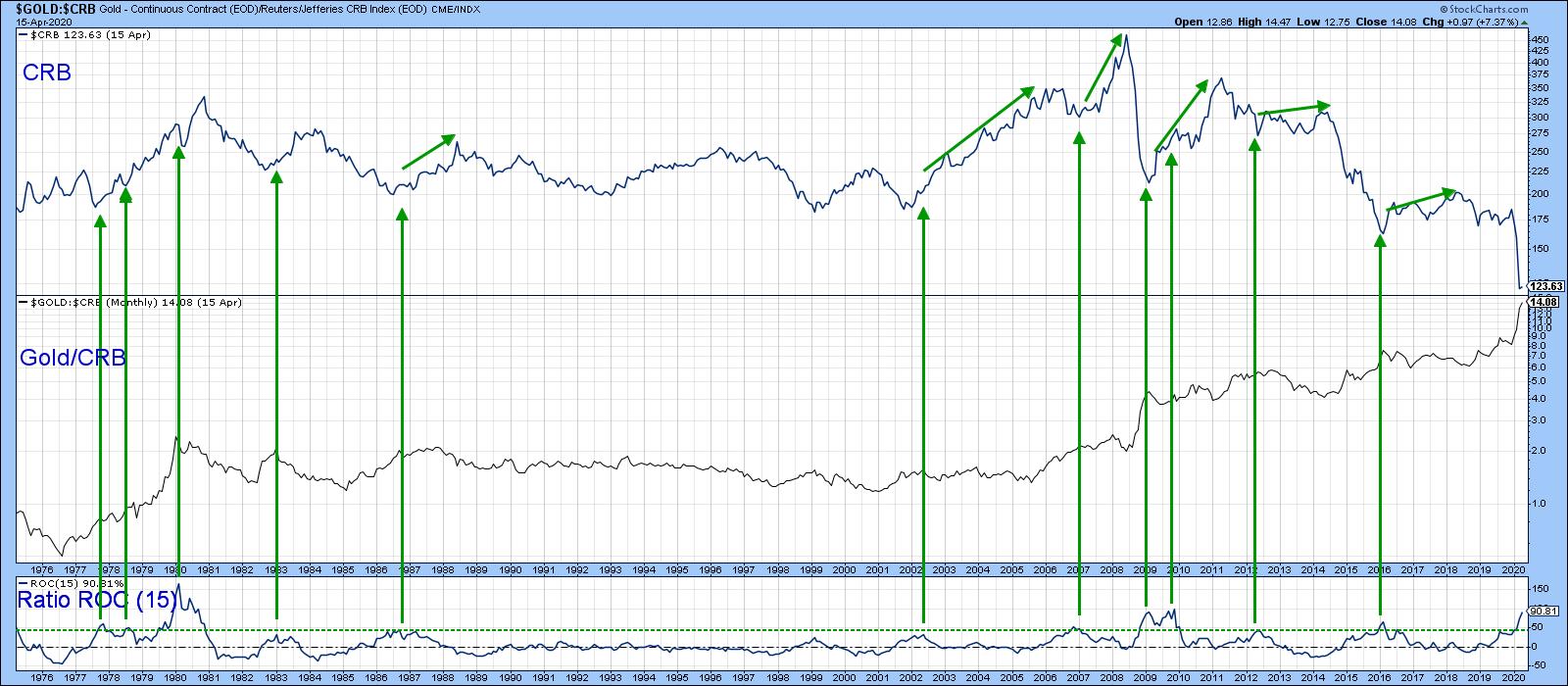
That might come with a simple 15-month ROC, as featured in Chart 3. Using the benefit of hindsight, the green arrows once again signal peaks in the ROC that developed when it was close to or above the +50% level. It is certainly overstretched on the upside, but, once again, there is no evidence of an actual top.

Chart 3
Editor's Note: This is an excerpt of an article that was originally published in Martin Pring's Market Roundup on Thursday, April 16th at 7:55pm ET. Click here to read the full article, which includes Charts 4-5 and a discussion of more potential indicators.
Good luck and good charting,
Martin J. Pring
The views expressed in this article are those of the author and do not necessarily reflect the position or opinion of Pring Turner Capital Group of Walnut Creek or its affiliates.
|
| READ ONLINE → |
|
|
|
|
|
| Art's Charts |
| A Few Get Back to Positive, but Many Remain Beaten Down |
| by Arthur Hill |

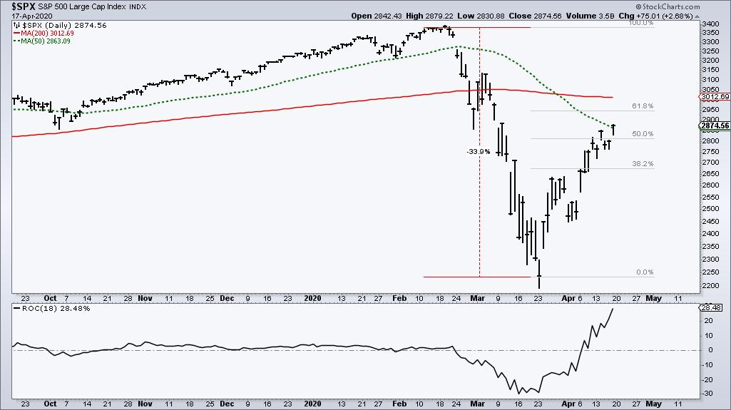
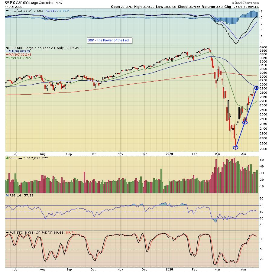
With a surge over the last 18 days, the S&P 500 reclaimed the 50-day moving average for the first time since February 21st. The move is truly remarkable, but the index remains well below the falling 200-day SMA. Moreover, a 28.5% surge in 18 days recovered just over half of the 33.9% decline. This advance is truly impressive when viewed on its own, but it still pales in comparison to the prior breakdown.

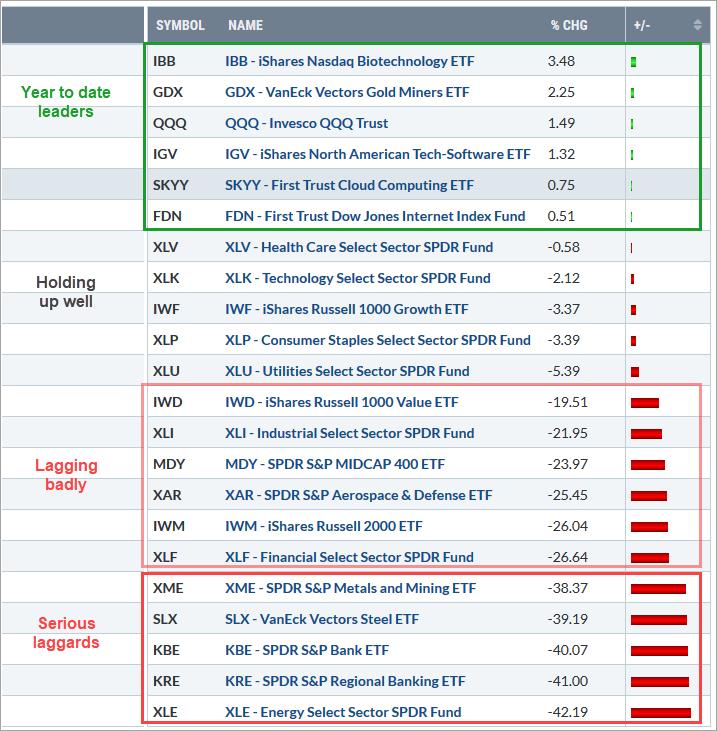
There are clearly some strong parts in the market, but there is also some serious weakness in key groups. The image below shows some 20 ETFs sorted by year-to-date performance. Six are now positive year-to-date, but only one is trading at a new high. The Biotech ETF (IBB) is the undisputed leader with a new high this week.

Elsewhere we can see strength in the Technology sector with the Nasdaq 100 ETF (QQQ), Technology SPDR (XLK), Software ETF (IGV), Cloud Computing ETF (SKYY) and Internet ETF (FDN) turning positive year to date. Despite strength in the technology sector, the Finance SPDR (XLF) and Industrials SPDR (XLI) are still down over 20% this year. Within the Finance sector, the Bank SPDR (KBE) and Regional Bank ETF (KRE) are still down over 40%.
While the surge in the S&P 500 is impressive, several key parts of the market are not keeping pace and remain in bear market mode. Technology and Healthcare can keep the market afloat, but participation from these other groups is needed to break the bear's back.
Interested in breadth charts and a focused ETF ChartList? Subscribe to TrendInvestorPro.com to get the Essential Breadth Indicator ChartList (100+ charts) and Master ETF ChartList (200 charts). The Index and Sector Breadth Models will also be updated this weekend with a video presentation.
Click here to take your analysis to the next level!
-----------------------------------
|
| READ ONLINE → |
|
|
|
| The Canadian Technician |
| Is Gold Precious or Precarious? |
| by Greg Schnell |
One of the more interesting phenomena this week is the separation of investors across broad areas of the market. The bulls are firmly in the bull camp, with no retest of the lows expected. The bears are firmly in the bear camp and expect the market to fall. As the market goes up without them, the fear of missing out becomes more ingrained.
For the tech stock community, they are the happier-than-ever investors. There cannot be a stronger attachment to the concept that the tech names will definitely be the train to ride through this dislocation. The top 5 tech stocks dominate every move in the index. The stay-at-home tech names, the teledoc ideas, are riding the tech trend as well.
For the oil and gas industry, the bears are dominating the discussion. Will the first move back be onto the subways and metros? How much lower will it go?
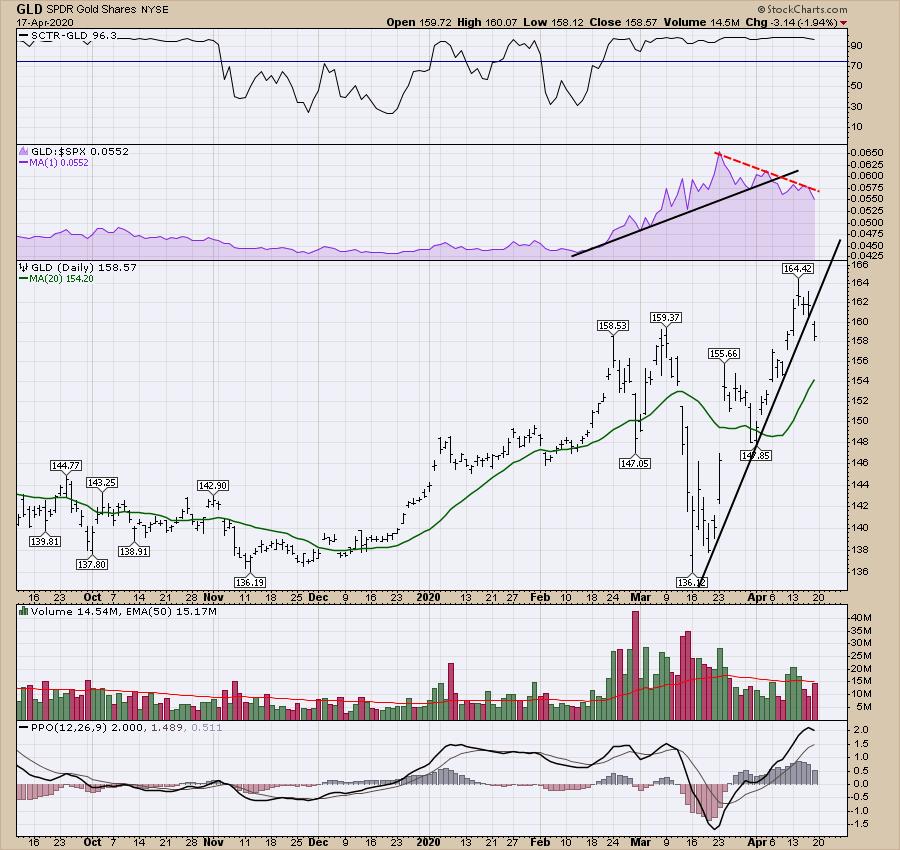
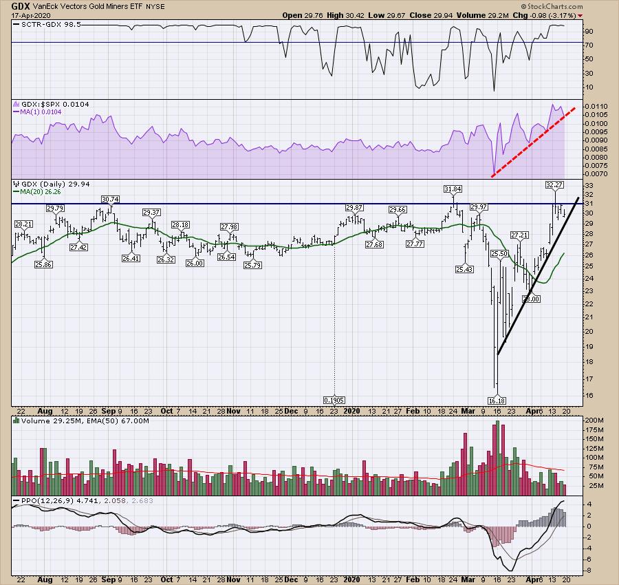
And then we arrive at the Gold business. The gold industry appears to be having a moment of tension. While the price of the bullion has climbed to new highs, the miners have been unable to push to new highs, suggesting a divergence. This divergence has shown up at a major high, and potential reversals in the bullion ounce price.
On the chart below, Gold started to underperform the $SPX just after the March 23rd low. While gold went up when the market went up, it has actually underperformed the index since then. Notice the red downtrend.

Looking at the gold miners below, we can see they have been unable to break out and hold new highs. With gold spending a week above the $160 breakout level, we still don't see that breakout action in the miners. In terms of relative strength (in purple), the gold miners are still outperforming the $SPX, as the purple area is still trending higher. If this uptrend also breaks (Gold broke it above), that makes gold and related trades look more likely to go lower, not higher.

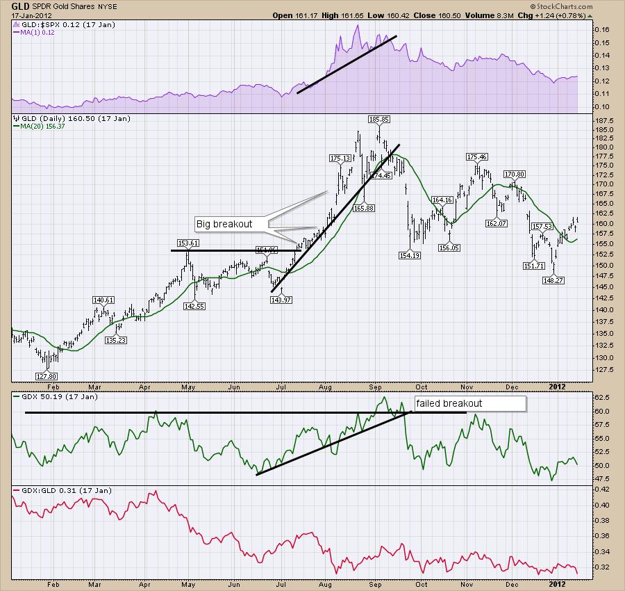
On the chart below, I compare the GLD chart with the GDX chart back at Gold's final high in 2011. We see the same conditions here, as Gold broke out above a consolidation and kept going. The gold miners (third panel) tried to break out right as Gold topped out and failed. Gold also broke a relative strength uptrend versus the $SPX; all three occurred within a few days of each other.

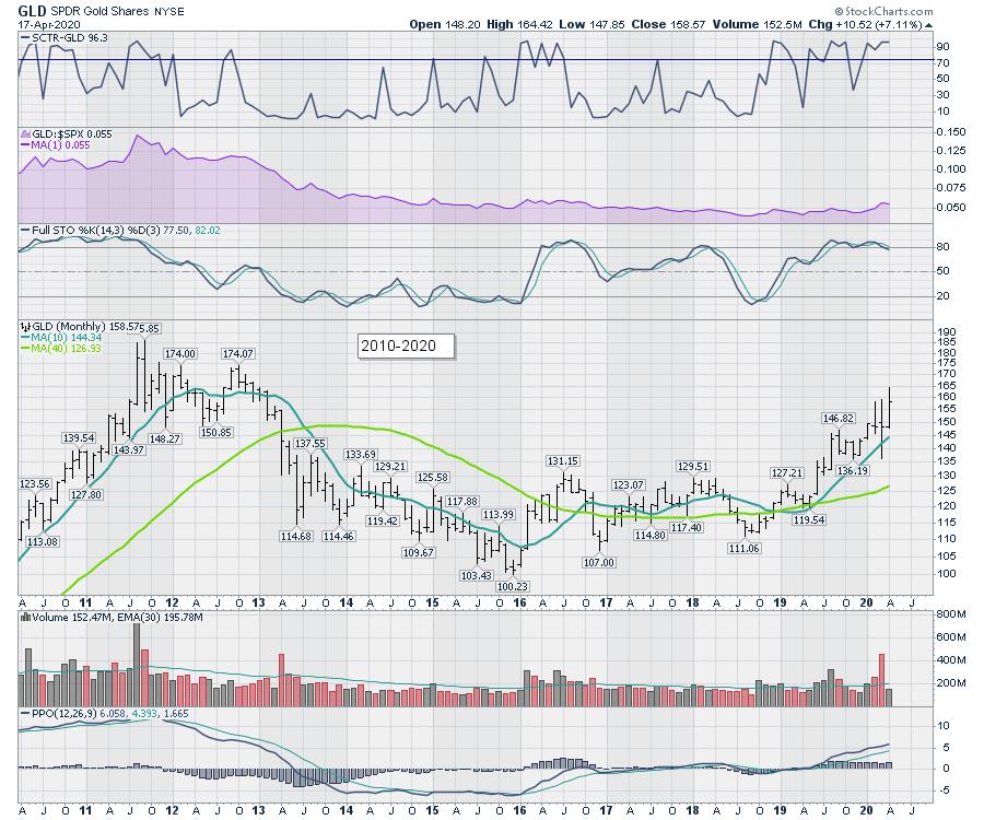
Here is how Gold topped out on the monthly chart compared to 2011.

All the setups are there. Watch closely to make sure the gold miners follow Gold higher and hold the breakout. If not, keep your eyes peeled for an exit!
|
| READ ONLINE → |
|
|
|
| The Traders Journal |
| This Hasn't Been More Crucial In The 12 Years Since 2008: ChartPack Update #27 (Q1 / 2020) |
| by Gatis Roze |

It's a new age. On March 25th, StockCharts TV held a sensational one-hour summit with 13 commentators focused on "Navigating the Bear Market". What came afterwards was equally big news. StockCharts made the commentators' charts available to download directly into your account together as a single ChartPack.
Two important thoughts. First, let me say that all investors should be open to considering how other investors monitor and chart the markets. Having said that, charts are very personal. Secondly, that needs to come with some essential caveats. Resist the urge to clutter your Dashboard with random charts and ChartLists. Remember that everything has to earn a precious slot in your permanent Dashboard. Those slots are attained by these four qualifiers:
- Ask yourself if the chart you are considering speaks to your personal investment style.
- Install the chart first in your Watchlist. Then test drive it for awhile. Is it useful? Does it earn your shelf space or not?
- Where would this chart best fit? Don't just randomly create another ChartList to warehouse this chart.
- If the chart does not meet these top three criteria, then you should delete it altogether.
It's been over 10 years since I first began sharing my personal toolkit with the investors who were taking my classes. Shortly after, we created the Tensile Trading ChartPack available to all StockCharts.com subscribers as well. Ever since, Grayson and I have incorporated hundreds of user suggestions and our own personal updates each and every quarter.
I firmly believe that ours is unlike any ChartPack available, and it's a trifecta of features that makes it so.
- It's a comprehensive roadmap of all essential ChartLists organized in a clear intuitive manner.
- The ChartPack consists of 99 ChartLists which are all pre-populated with the tickers and descriptions you need. For example, ChartList #105 — The Master ETFs list — is pre-populated with the 166 most popular ETFs. ChartList #450 — the Dow Industry Group — is pre-populated and labelled with all 152 industries and so on.
- A great many charts in our pack have descriptive explanations and helpful tips attached in the "ChartList Notes" below each chart. That's a decade's worth of valuable information contributed by a user community numbering in the thousands.
The bottom line is that you should start with the ChartPack but then make it your own. If you don't trade country funds, ChartList #205 goes to the trash. If you don't follow currencies, ChartList #210 also goes to the trash, and so on. This introduction is longer than I wanted, but hopefully it brings home the imperative that you must be the guardian of your Dashboard.
Just as you can't successfully trade some one else's canned methodology, you can't embrace a few ChartLists from select gurus. The key is to have a complete full-feature Dashboard of ChartLists with which you're intimately familiar in both bull and bear markets. That is your foundation and anchor. Then consider your fellow investor suggestions and incorporate those charts most appropriate to your personal style. The essential step is to run them through your own filters before they qualify for coveted shelf space in your personal Dashboard.
#400 to #413: Sector ChartLists
I wrote a blog in February 2020 detailing explicitly how to empower your sector analysis and metaphorically speaking, "to put it on steroids". The outperformance is both stunning and very profitable. These sector ChartLists make it super-easy to become a sector prophet (or profit!).
#416: Stock Portfolios of Proven Stock Pickers
This new ChartList embraces the same principles we have been employing effectively via our Fidelity Sector Funds and tracking their quarterly buys and sells. This ChartList contains all five large cap funds that have ALL outperformed $SPX (the S&P 500 Index) for the past 2 years, 3 years, 5 years and 10 years. No flash-in-the-pan here. These are the market wizards of stock pickers.
When all five funds own the same stock — pay attention! When all 7 stocks are owned by 4 of these funds — pay attention! When all 5 funds over-allocate by 260% to the Communication Services Sector — pay attention! See the ChartList Notes for many more insights.
#640: Dividend Darlings
This ChartList is now a combination of three dividend strategies:
- The top dividend mutual funds and ETFs.
- The dividend yielding stocks found most often in these top funds.
- The stocks that have raised their dividends consistently for the past 25 years.
This ChartList has 3 top mutual funds, 5 top dividend ETFs, and 23 of the most attractive dividend-yielding stocks. We try hard to make it really easy for our user community! This quarter, we also added Proshares S&P 500 Dividend Aristocrats (NOBL) — an A-rated ETF according to ETF.com. This ETF tracks an equal-weighted collection of S&P constituents that have increased dividend payments annually for over 25 years. It tends to have a Mid-Cap tilt, assets over $6 billion, and average spreads of 0.01%. That is why we felt it added a unique dimension to this ChartList.
#420-12 to #420-90: Fidelity Sector Funds
Let's first dive into the total pool of 43 Sector funds and how they are collectively allocated this quarter.
13% of their allocation is in foreign stocks with the balance in US equities. Remember that the prime objective here is not global diversification. It is USA sector investing.
Relative to the S&P Sector Funds that comprise the S&P 500, Fidelity has over-allocated and emphasized these four. The largest over-allocation is in Basic Materials. Next up are Utilities, with Healthcare and Industrials modestly over-allocated.
I find it insightful that relative to a broader index such as the Wilshire 5000 (total stock market), Fidelity's nearly doubled their allocation in mid-caps and small caps relative to the index. Draw your own conclusions.
Our favorite insights from these exercises is looking at the number of different Sector Funds that own particular stocks, namely:
- Alphabet (GOOGL) — held by 7 funds.
- Visa (V) and Activision (ATVI) — each held by 6 different funds.
- Fidelity National (FIS) — held by 5 funds.
Microsoft (MSFT), Mastercard (MA), Amazon (AMZN), Verizon (VZ) and T-Mobile (TMUS) — all held by at least 4 different funds.
As you analyze the many adjustments this quarter (i.e.buys and sells) within these Sector Funds, remember the following:
– Historically, the market's next big winners show up first in these Sector Funds.
– Take note of the size of the investment in a particular stock. The bigger the position, the weightier their commitment.
– Don't ignore what they are liquidating (selling).
– Rank the performance of all 43 funds. It's an easy "click" to sort by whatever period you choose. This always yields wonderful insights.
– Dig deeper into holdings of top performing Sector Funds.
Finally, with so much happening in the markets as we've shifted from historic bull run to rapid bear market, here are a few specific Fidelity funds with moves that caught our attention:
- The Computers portfolio (#420-26) dropped a classic FAANG name in favor of another mega-cap tech stock.
- The Energy portfolio (#420-40) took major stakes in BP and Cheniere.
- Lots of movement in the Gold portfolio (#420-46).
- The Wireless portfolio (#420-90) saw some big shakeups and interesting additions this past quarter.
Already have the ChartPack? Here's how to upgrade:
- Log in to your account, then visit the "Manage ChartPacks" page (accessible from the bottom of the Members Dashboard or from the "Your Account" page).
- In the table that appears, find the entry for the "Tensile Trading ChartPack" (if you don't see the Tensile Trading ChartPack listed, that means that you haven't purchased it. Click Here to do so now).
- Click the "Re-Install" button next to the Tensile Trading ChartPack to start the update process
The download should take about 15 seconds, after which you can explore the new ChartLists and other updates!
New to the ChartPack? Here's how to install it:
If you'd like to add the Tensile Trading ChartPack to your StockCharts account, Click Here.
Trade well; trade with discipline!
- Gatis Roze, MBA, CMT
- Grayson Roze, VP of Operations, StockCharts.com
StockMarketMastery.com
Co-Authors, Tensile Trading: The 10 Essential Stages of Stock Market Mastery (Wiley, 2016)
Co-Presenters, How To Master Your Asset Allocation Profile
|
| READ ONLINE → |
|
|
|
| DecisionPoint |
| Is Technology the New Defensive Sector? |
| by Erin Swenlin |
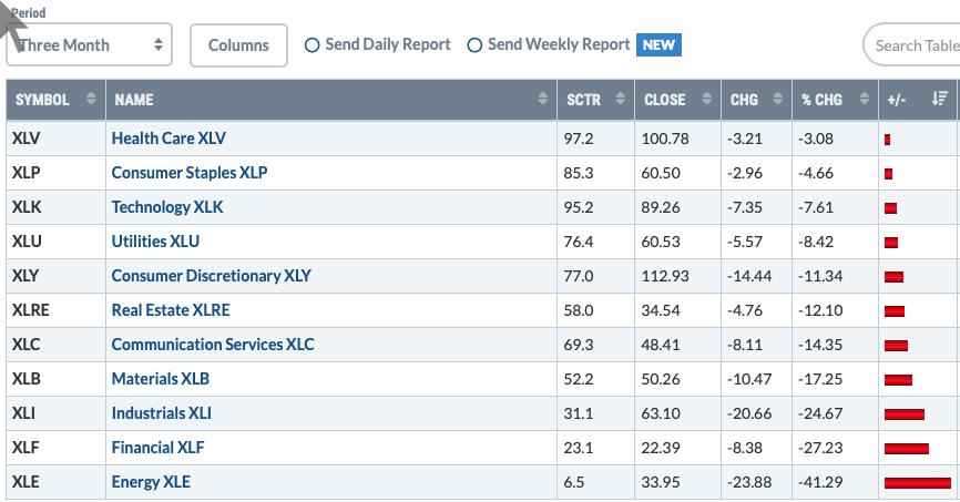
While co-hosting the WealthWise Women show with me yesterday, Mary Ellen McGonagle said something that got my attention and filled me with intrigue. To summarize, she said that she was finding that the Technology sector is becoming more of a defensive one in the face of the coronavirus. That is an interesting proposition, since the Technology sector has always been considered the "jewel" of the aggressive sectors. As I studied the tables and thought about this more, I had to agree with her. Check out the Sector Summary for the past three months. Technology is right up there with the top three defensive sectors of Health Care, Utilities and Consumer Staples (despite negative returns, those four sectors held up the best overall).

Live Trading Room - Tuesdays/Thursdays
I'm teaming up with Mary Ellen McGonagle (MEMInvestmentResearch.com) to do regular "LIVE Trading Room" sessions for FREE at 11:00a EST. We've had excellent reviews on our new LIVE Trading Rooms and plan on continuing them Tuesdays/Thursdays 11:00a EST. The link is sent out the day before the event. Sign up for our free email list on DecisionPoint.com to be notified!
If you drill down into the Technology sector, you will see that not all have been profitable, but Software has:

Let's take it one step further and look at the top SCTR-ranked stocks within Software over past three months. There are a small-, mid- and large-cap at the top:

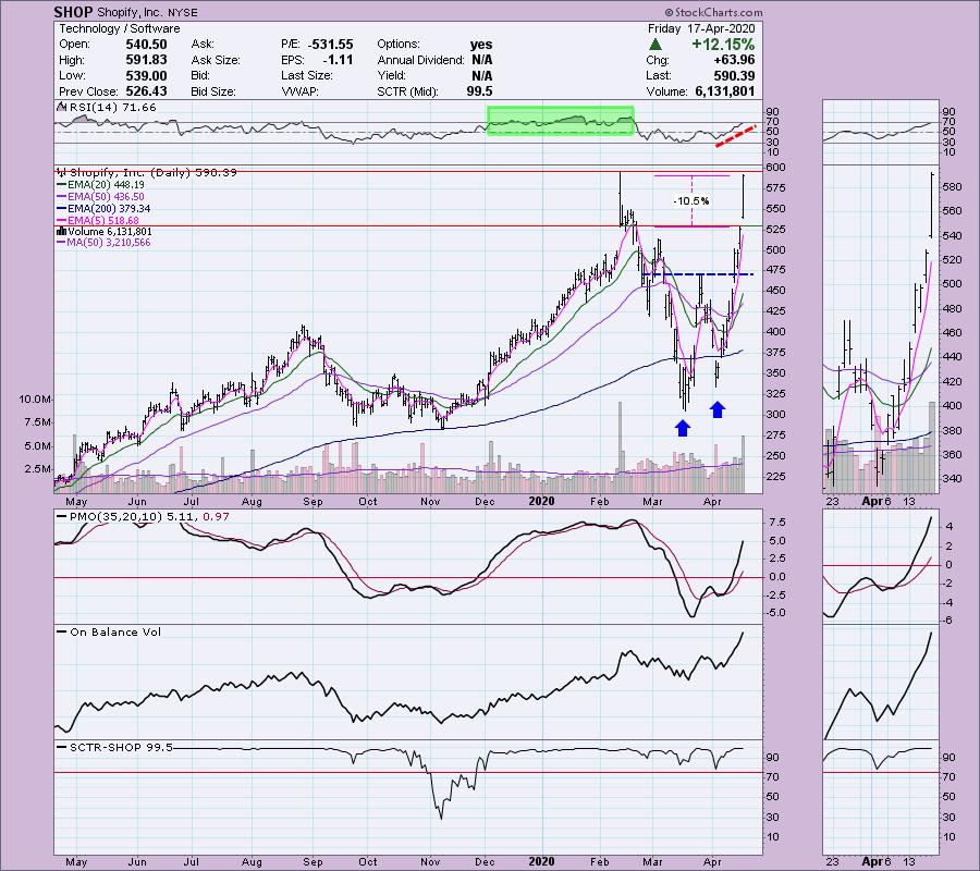
Shopify (SHOP) is a mid-cap stock that is up nearly 30% over the past three months. Consider that. That gain occurred when the overall market fell about 14%. That's a 44% delta. (As an aside, Mary Ellen added this stock in her model portfolio a while back; it went up 75% since then). The question is whether it's too late to get in. After today's action, I have to say I'd want to see a pullback next week, but it has been a runner and runners like to run. The indicators suggest it will run higher and overcome resistance at its all-time high. The double-bottom formation that easily executed has a minimum upside target of about $625. Volume continues to rise on this rally. The PMO is overbought, but not in the extreme. The RSI is overbought, but also not to an extreme. Notice that the RSI can stay overbought for some time in a strong bull market phase for SHOP. For my Diamonds Report readers, I usually annotate a percentage stop-loss zone. There was a Silver Cross (20/50-EMA positive crossover) yesterday, which triggered an IT Trend Model BUY signal.

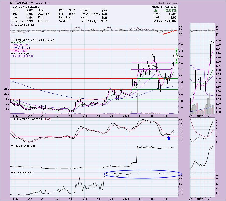
Next up is NantHealth (NH). This is a thinly-traded, low-priced small-cap stock. It isn't my cup of tea on face value for those reasons. However, it is the top SCTR-ranked small-cap in the software industry group, so I'm covering it. The PMO has a BUY signal and is not overbought. The RSI is rising and also is not overbought. Support at $1.80 is a little over 10% away. Should price meet the next area of overhead resistance, it would produce a gain of over 20%.


As investors, we want to accomplish two basic things: (1) Determine the trend and condition of the market and (2) select stocks that will ride that tide. The DecisionPoint Alert helps with the first step, and DecisionPoint Diamonds helps with the second. Go to DecisionPoint.com and SUBSCRIBE TODAY!
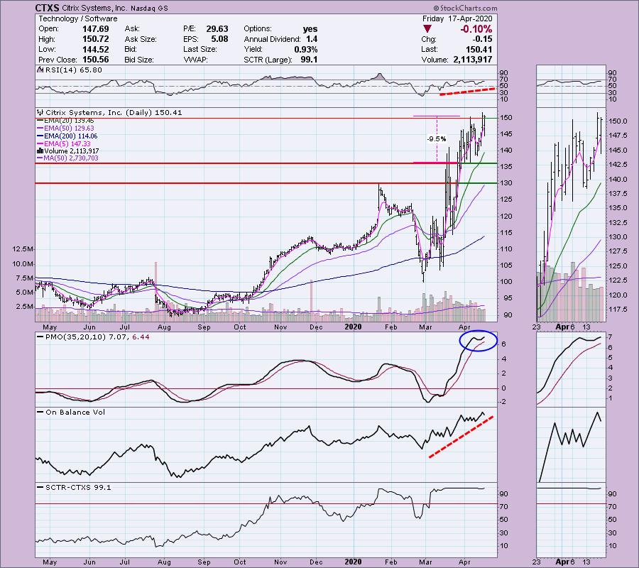
Citrix Systems (CTXS) was in the Diamonds Report for 3/10. It's currently up over 31% since then. The PMO is extremely overbought. The RSI is mildly overbought, but is rising. Short-term support is 9.5% away. The chart is still very favorable. I honestly like that it was down slightly and we saw a declining top. This one may pull back and make it more desirable than it already is.

CONCLUSION: There are areas of Technology that are now shifting to "defensive" rather than "aggressive", given the new work-from-home revolution that has been forced on many due to the virus. Whether these industry groups remain "defensive" when the virus subsides, only time will tell.
Technical Analysis is a windsock, not a crystal ball.
Happy Charting! - Erin
Email: erin@decisionpoint.com

New dates have been released for The Money Show in Las Vegas! Erin Swenlin will still be presenting at the The MoneyShow Las Vegas August 16-18, 2020 at Bally's & Paris Resorts! You'll have an opportunity to meet Erin and discuss the latest DecisionPoint news and Diamond Scans. Claim your FREE pass here! You can watch online with this pass too!!
Helpful DecisionPoint Links (Can Be Found on DecisionPoint.com "Blogs & Links" Page)
Erin's PMO Scan
DecisionPoint Shared ChartList and DecisionPoint Chart Gallery
Trend Models
Price Momentum Oscillator (PMO)
On Balance Volume
Swenlin Trading Oscillators (STO-B and STO-V)
ITBM and ITVM
SCTR Ranking
|
| READ ONLINE → |
|
|
|
| ChartWatchers |
| Are You "Fed-Up" Yet? If Not, You Should Be |
| by John Hopkins |
Some promising news on a drug from Gilead Sciences (GILD) to help those with the coronavirus came out on Thursday after the market closed, which resulted in a big move in futures and a solid end to the week as traders got excited about the prospects of making progress on the pandemic that has paralyzed the nation. But even prior to that good news, the market had made great progress the past two weeks, especially the tech-heavy NASDAQ.
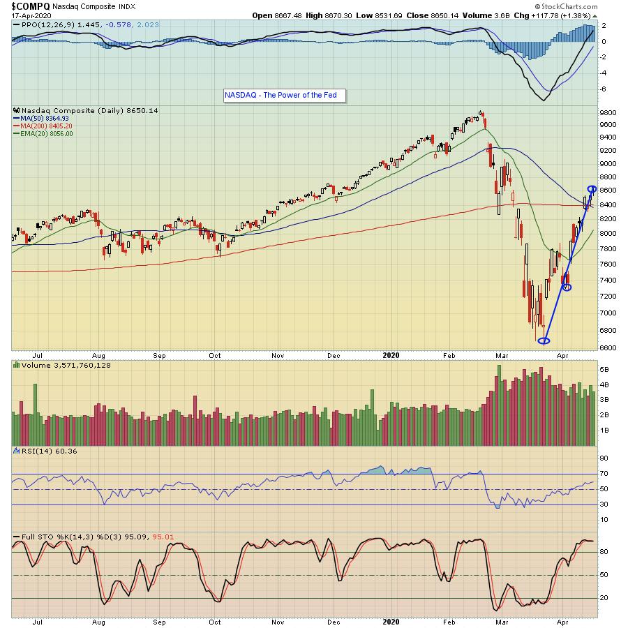
As you might recall in my last ChartWatchers article two weeks ago today, the headline read "Be Prepared to be Shocked - To the Upside". And what's happened since then? The S&P has risen by over 15% and the NASDAQ has risen by 17%, which some might consider a great year!


You might also recall that one of the main reasons I was feeling a strong rally was about to begin was this: "The US government throwing everything it's got (and more) at the economy in an effort to keep the US financial structure afloat as we move through this diabolical virus. And, if round one and two don't do the trick, watch for rounds three and four. The Fed "all in" behind the economy shows the seriousness of the situation - and it is going to be attacked full force until things turn around." So what's happened since then? Another trillion or two committed to keep the economy afloat with a promise for much more as necessary.
In fact, I will argue that the primary reason the market has held up as well as it has is the Fed. It certainly was not the millions of jobless claims reported, or the Empire State Manufacturing Survey with a record-worst reading of -78.2, or Leading Economic Indicators of -6.7 (the worst reading in its almost 60-year history) or any other recent economic report showing how bad things have gotten. Nope. It's primarily been the actions of the Fed pumping money into the economy like there's no tomorrow. And what if the Fed had not acted as decisively as they had? Well, that March 23 low on the S&P of 2191 would likely have been blown through with a reduced chance of recovery, certainly not like what we've seen these past two weeks.
Of course, in order to have taken advantage of the nice move to the upside, even with the Fed in our corner, you still needed to know which sectors/stocks to pursue - and which ones to avoid - that might provide the best reward-to-risk opportunities. For example, on the bullish side, you have stocks like Netflix (NFLX) and Zoom (ZM) for a quarantined world, while on the bearish side, the energy sector and the entertainment sector are two prime examples of what to avoid. This is why we developed our Strong Accumulation/Distribution ChartList, which currently has 354 stocks that have SCTR Scores greater than 80 and have strong accumulation/distribution lines. We also developed a Weak Accumulation/Distribution ChartList, which has 250 stocks with SCTR Scores less than 20 that should be avoided - or could potentially be short trading candidates. And EarningsBeats.com Chief Market Strategist Tom Bowley will be discussing both lists and how to strategically use them in a webinar today (Saturday, April 18) that you won't want to miss. Just click here to see for yourself how stocks in both lists performed and to learn how you can save a seat to today's timely event.
At your service,
John Hopkins
EarningsBeats.com
|
| READ ONLINE → |
|
|
|
| MORE ARTICLES → |
|
