| THIS WEEK'S ARTICLES |
|
|
|
|
| The Mindful Investor |
| S&P 500 Head and Shoulders Top Confirmed |
| by David Keller |
There's no denying that we've seen signs of distribution from key stocks like Apple, Inc. (AAPL) and Tesla (TSLA) breaking down to breadth conditions that have become less bullish by the week.
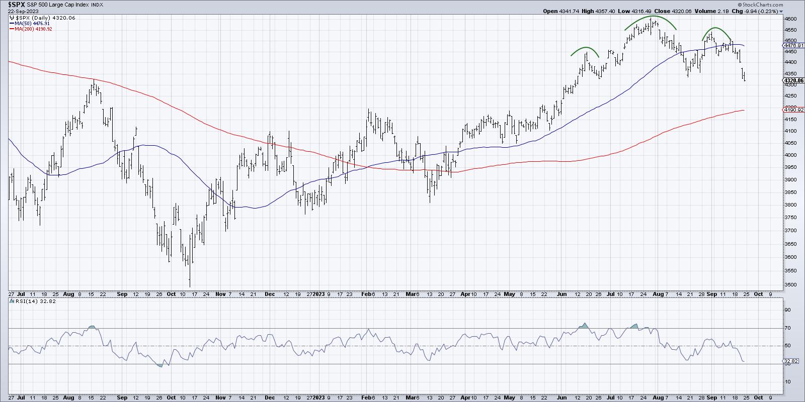
This week, we confirmed a head and shoulders topping pattern for the S&P 500, giving a bearish tone to the major equity averages going into next week. While the selloff into the end of this week was certainly related to the Fed meeting and Powell's press conference on Wednesday, the signs of deterioration have been building for the last couple of weeks.
Today, we'll break down the head and shoulders topping pattern on the $SPX chart, outline the three phases of price patterns in general, and identify some potential downside targets for the S&P 500.
The Head and Shoulders Pattern Defined
A number of technical analysis disciplines, from Elliott Wave to Dow Theory, use an analysis of highs and lows to define trends and identify potential reversals. Charles Dow's basic definition was that an uptrend is comprised of higher highs and higher lows. Once that pattern is broken, then the uptrend may be in jeopardy.
Robert Edwards and John Magee, in their classic book Technical Analysis of Stock Trends (one of the most important books on our Recommended Reading List), described the head and shoulders top as an important pattern representing a "change of character" on the chart.

I like to think of the head and shoulders top as a failed attempt to make another new high. The uptrend phase keeps making higher highs and higher lows until, finally, there's a failed attempt to push to a new price high. This often indicates an exhaustion of buyers or sellers beginning to unload shares into the market or both. For whatever reason, the price no longer fits the description of an uptrend.
I've found that novice technical analysts tend to label price patterns like the head and shoulders way too early before the pattern has been completed. This is why I've come to describe the three phases of price patterns. By waiting for these three steps, you can minimize false signals and whipsaws.
The Three Phases of Price Patterns
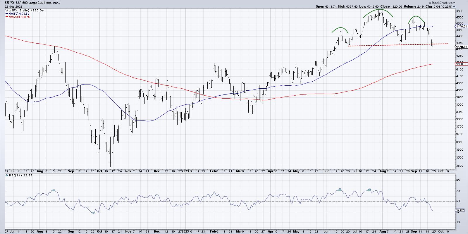
All price patterns can be broken down into three specific phases: the setup, the trigger, and the confirmation. Let's review these three steps using an updated S&P 500 chart that includes the crucial neckline.

The setup is when the pattern starts to become recognizable. You can see the lower high (the right shoulder in a head and shoulders top); it sure looks like a head and shoulders pattern, and you're ready to label it as such.
But you have to remember that until the price breaks the neckline of the pattern (dashed red line above), you can only label it as a "potential" head and shoulders pattern. The trigger is the point at which you can remove the "potential" label, and correctly identify the pattern as completed.
On the S&P 500, that meant we needed a break below the neckline which was around 4350. Then and only then can we identify likely downside targets based on the height of the pattern.
The final phase is the confirmation, which involves some further move in the direction of the breakdown. This is a crucial step, because I've often found that a chart will break below a key level of support, only to reverse course and move right back in the previous direction. This sort of whipsaw move can be frustrating for traders, as what appears to be a clear signal never materializes into anything further.
There are a couple of different ways to define the follow-through, but I tend to keep it very straightforward. I look for at least one more bar moving in the direction of the breakdown as a validation that the pattern has been completed.
We saw the initial breakdown of the pattern on Thursday, and then Friday's session pushed even further down below the neckline. In my opinion, that is enough to declare this as a confirmed head and shoulders top for the S&P 500 index.
Downside Objectives for SPX
Now that we've confirmed a breakdown, what's next for the major equity averages? We need to remember that short-term patterns yield short-term objectives, and long-term patterns yield long-term objectives. So while this breakdown seems like a climactically negative bear move for the SPX, it may just confirm that the current corrective move has a bit further to go.

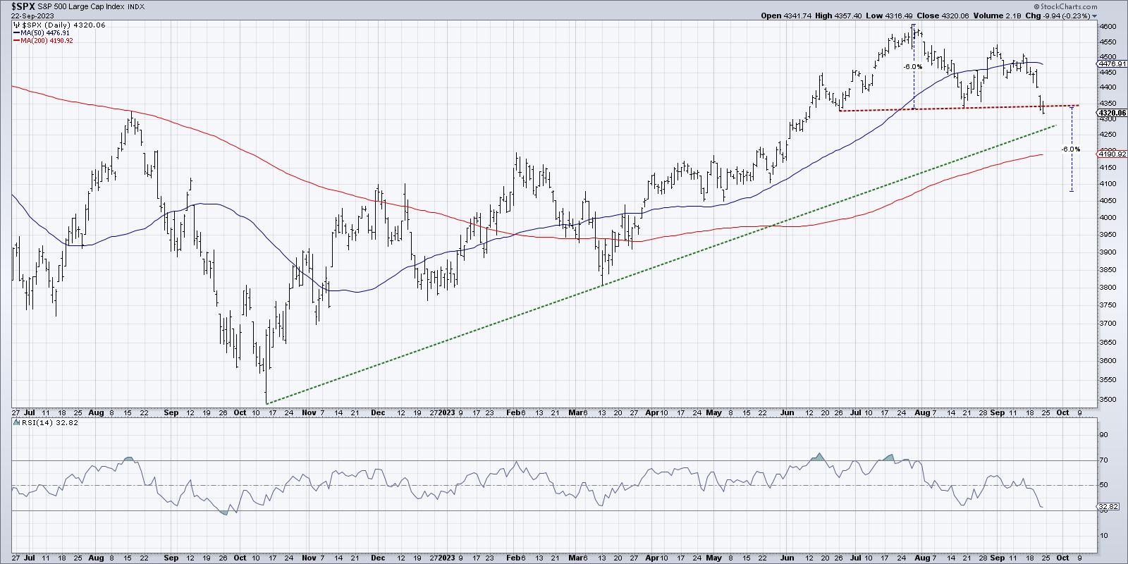
The classic measurement technique for a head and shoulders pattern is to take the height of the pattern from the head to the neckline and then project a similar move down after the break.
This particular pattern consisted of about a 6% move from the July peak to the neckline, which means that a similar downside move would result in a minimum downside objective of around 4080.
It's worth noting that I'm using percentages here because I almost always use log scale charts, where the Y-axis is defined by percentages instead of dollar values. The other way to measure the downside objective is just to use the dollar values on an arithmetic scale. It's about a 250-point range from the top of the head to the neckline, which would mean a downside objective of around 4100.
It's important to remember that these patterns do not occur in a vacuum! So other potential areas of support, including the 200-day moving average and major trendlines, are still very much in play. But one thing I've learned over the years is to follow the trend. And for now, the trend in the S&P 500 appears negative.
RR#6,
Dave
P.S. Ready to upgrade your investment process? Check out my free behavioral investing course!
David Keller, CMT
Chief Market Strategist
StockCharts.com
Disclaimer: This blog is for educational purposes only and should not be construed as financial advice. The ideas and strategies should never be used without first assessing your own personal and financial situation, or without consulting a financial professional.
The author does not have a position in mentioned securities at the time of publication. Any opinions expressed herein are solely those of the author and do not in any way represent the views or opinions of any other person or entity.
|
| READ ONLINE → |
|
|
|
| ChartWatchers |
| Q4 Stock Market Outlook: 3 Analysts, 3 Insights |
| by Jayanthi Gopalakrishnan |

Traders and investors don't generally look forward to September. Besides being the end of summer vacations and back-to-school season, the stock market usually hits its weakest point at this time of the year. But that doesn't necessarily mean you should stay away from the stock market in September.
If you patiently wait for the pullback to unravel, it could present investment opportunities for the last quarter of the year. And given that 2023 is a pre-election year, it's usually a strong one for equities. But which market segment should you invest in, and which ones should you stay away from?
In a recent StockCharts TV episode of Charting Forward, recorded on September 12, 2023, Chief Market Strategist of StockCharts.com, David Keller, CMT, spoke with the following three technical analyst veterans:
In it, the group discussed how the broader market went through a pullback in August but has since recovered. Given September is considered a weak month, does that mean the stock market could see another pullback before moving back up? Which areas of the market are likely to perform well, and which ones are likely to be the laggards in Q4? Let's find out.
"I'm not as bearish as I should be. The risk factors we look at say "risk-on" is the way to go." —Mish Schneider
So, assuming nothing out of the ordinary happens, Mish's outlook is positive. The stock market has remained strong despite rising interest rates, inflationary pressures, and rising oil prices. When the stock market is trending higher, there's no reason to fight that trend.
"We are in the summer doldrums and could see one more drop before going higher. But I'm also bullish." —Tom Bowley
Earlier in the year—mid-July—sentiment indicators showed bearish signs, and some negative divergences were emerging in the broader indexes. But that has reversed.
"If you look at a daily chart of the S&P 500 ($SPX), there is a series of higher highs and higher lows since the August pullback. I wouldn't be surprised if the S&P 500 exceeds 4600 in Q4." —Julius de Kempenaer
Well, you can't argue there. The way things are now (short of systematic risk hitting the market), the stock market seems to be hanging in there. It's almost as if it's waiting for a catalyst to push it higher.
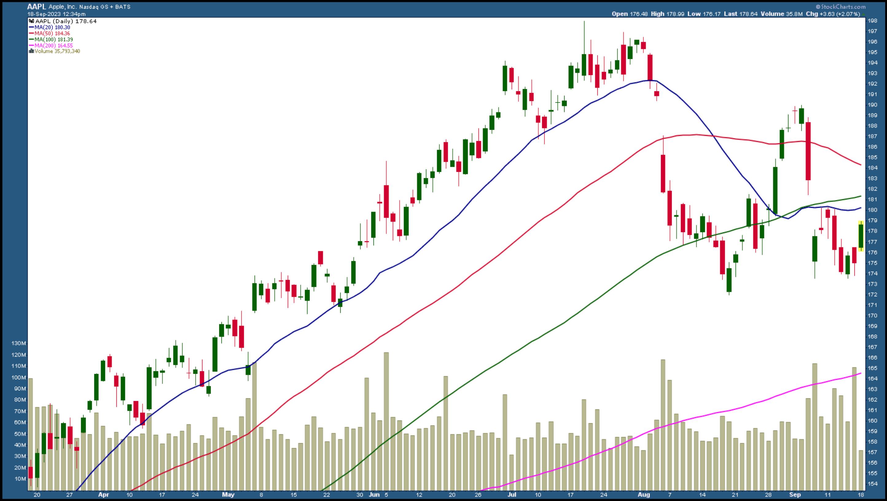
The pullback of the Magnificent Seven stocks was healthy and perhaps a much-needed one. Apple (ticker symbol: AAPL) hit a rough patch when China restricted the use of the iPhone. But if you look at a daily chart of AAPL (see below), it doesn't paint a doom-and-gloom picture.

CHART 1: DAILY CHART OF APPLE, INC. Although Apple's stock price faced some pressure, it still didn't take out its August low.Chart source: StockCharts.com. For educational purposes.
The stock hasn't taken out its August 18 low of $172 and could potentially reverse. If a hard-hit stock isn't looking bearish, is there any reason for investors to question the strength of the equity market?
What Could Go Wrong
For Mish, it would be the retail space. Consumer behavior is strongly correlated with the health of the US economy. And if consumers cut back on their spending, which is possible when inflationary pressures are ubiquitous and interest rates are high, it could add some stress to the broader market.
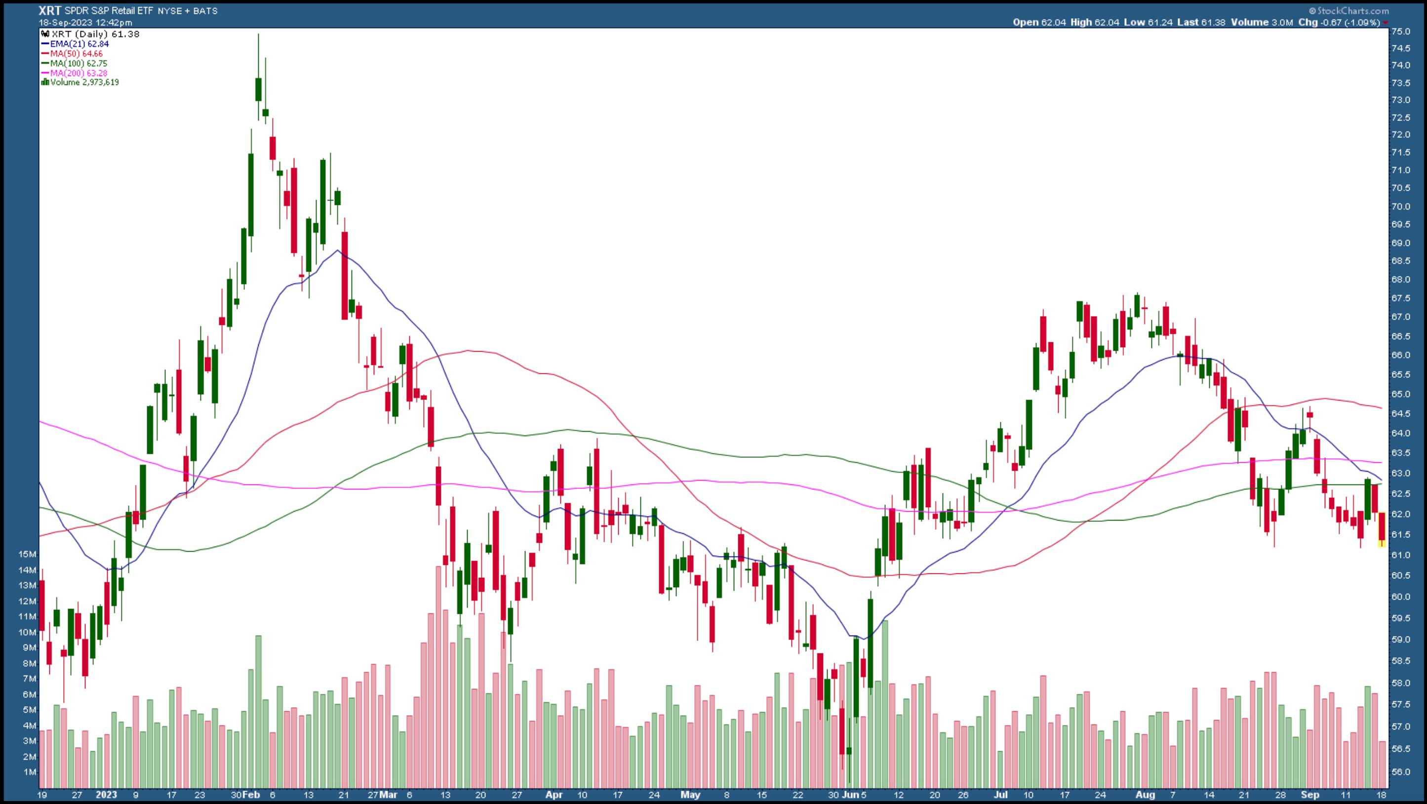
So far, there are no signs of a drop in retail sales. August retail sales were up 0.6% month over month—higher than the 0.1% increase expected by economists. A large part of that rise can be attributed to higher gasoline prices. If you strip away auto and fuel from the data, retail sales rose by a mere 0.2%. This could indicate that consumers may face pressure, so it's best to keep an eye on the retail sector by closely watching the SPDR S&P Retail ETF (XRT).

CHART 2: THE RETAIL SECTOR HELPS GAUGE CONSUMER SENTIMENT. The August high didn't come close to its February high. Does that mean retail spending could decline in the near future?Chart source: StockCharts.com. For educational purposes.
One interesting point Mish made was that the uptrend in XRT from June to July (2023) didn't come close to the February 2023 high. And even though XRT saw a jump due to the positive retail sales number, there's no sign of an uptrend—higher highs and higher lows.
Rising oil prices could put pressure on the equity market. While energy stocks are rising, Julius points out that other sectors, such as Consumer Discretionary, Technology, and Communication Services, are getting ready to gain strength. It's likely the Magnificent Seven will take the lead again, which is encouraging, given that the Energy sector is looking overbought.
Sector Relationships Are Important
Relationships between sectors often hold the key to future market action. Tom Bowley pays close attention to the relationships for warning signs. What you hear in the media may not appear on the charts. So, what are the charts indicating?
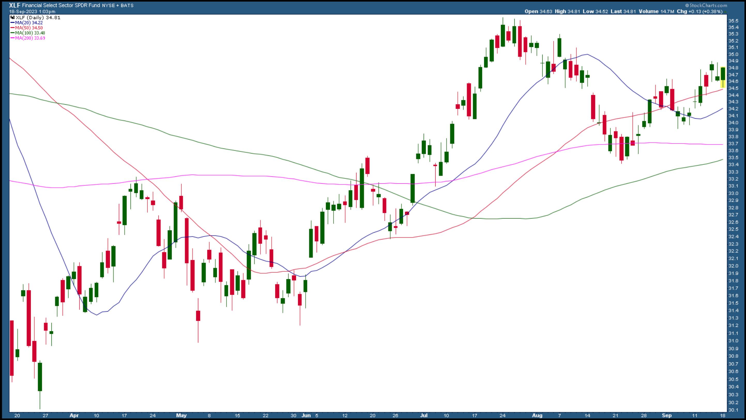
"In addition to Consumer Discretionary and Technology, Industrials and Financials tend to perform well during Q4," said Tom. So keep an eye on the chart of the Industrial Select Sector SPDR Fund (XLI) and the Financial Select Sector SPDR (XLF). The daily chart of XLF below shows the ETF bouncing off its 50-day simple moving average.

CHART 3: DAILY CHART OF THE FINANCIAL SELECT SECTOR SPDR (XLF). The Financial sector could perform well in Q4. The ETF appears to be bouncing off its 50-day simple moving average.Chart source: StockCharts.com. For educational purposes.
Another sector to watch is Materials. Besides production cuts, Mish feels that the rise in oil prices has to do with shortages. Because of this, we could see a boom in commodities. "Commodities have started to bottom and are picking up steam," added Julius.

Many say, "This time, it's different." And there's some truth to that. When considering buying a stock, there are many factors to analyze. For example, we're in a high-interest rate environment, which generally hurts growth stocks. But we haven't seen that.
"Interest rates are only one part of the equation," mentioned Tom. So, if growth is strong, you can expect growth stocks to continue rising.
The Bottom Line
So all three analysts had a similar opinion of the overall direction of the broader market. However, each had unique perspectives in their analysis. For additional insights on cryptocurrencies, sectors likely to outperform or underperform, and which stocks or charts to watch in Q4, check out the video (link at the bottom of this article).
We're approaching the second half of September, which is typically the worst part of the month. But the broader indexes are showing bullish signs. Even hotter-than-expected inflation numbers didn't spark a selloff. There's still a Fed meeting later this month, but the chances of Fed Chairman Powell making any comments that may cause the market to sway significantly in either direction are slim. Will September's performance be different this year?
|
| READ ONLINE → |
|
|
|
|
|
| Martin Pring's Market Roundup |
| Two Charts I'm Watching Closely for Potential Breakouts |
| by Martin Pring |
The title of this article should really be more in the vein of two technical situations I am watching, because the long-term forces look as if they may be converging with short-term ones to form a kind of potential bullish reverse domino effect. Let's consider our first candidate, the Japanese yen.
Japanese Yen
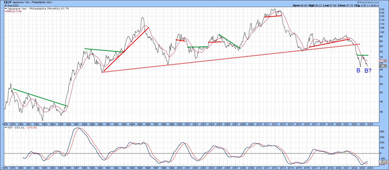
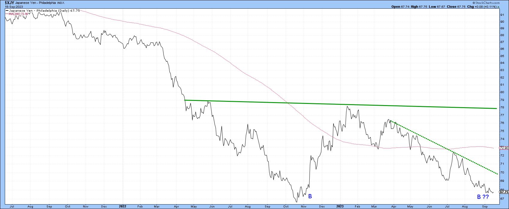
Chart 1 offers us a long-term perspective, in that the currency broke down from a multi-year top some time ago. The event was marked by the penetration of the 1990-2022 dashed up trendline. This break was followed by a nasty extension to the very long-term bear market. I am assuming that secular downtrend is still in force. However, prices do not generally move in a straight line, which opens up the possibility of a contra-secular primary uptrend developing over the next 1-2 years. In that respect, the chart hints at the possibility that the currency is in the process of tracing out the second bottom of a double bottom formation. The long-term KST continues to rally, which is an encouraging factor.
 Chart 1 Chart 1
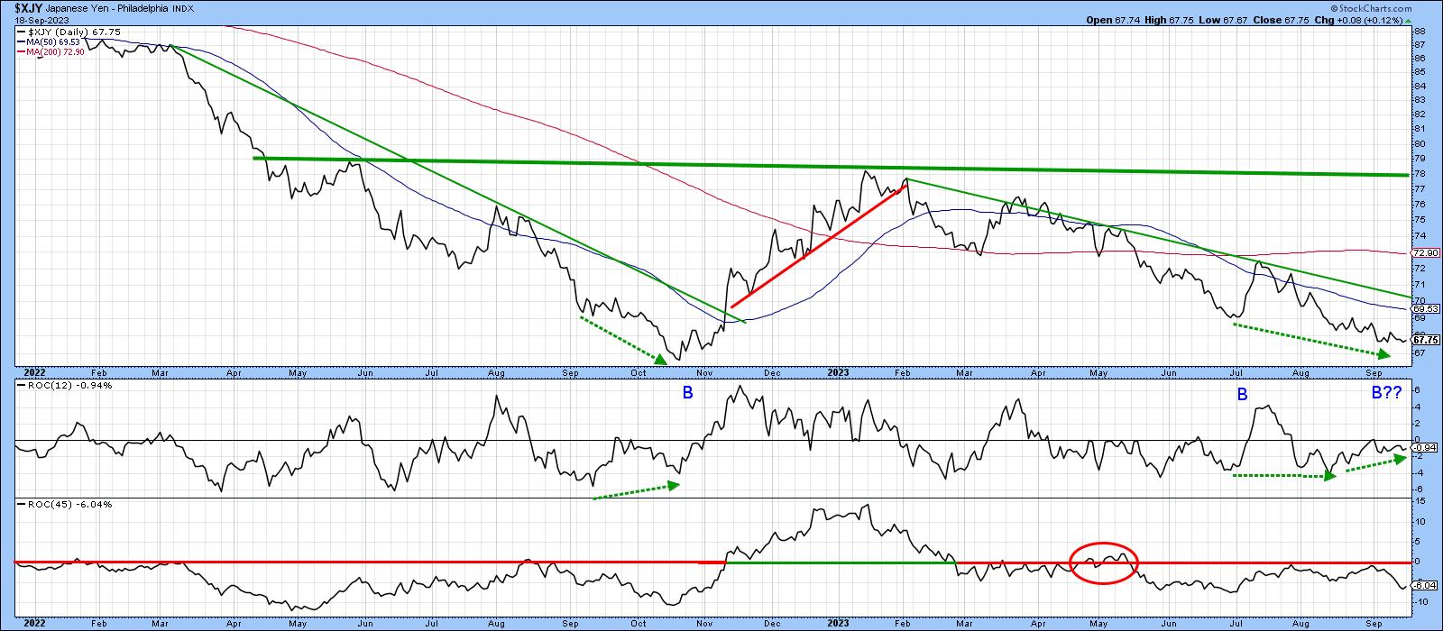
Chart 2 features recent action in greater detail, but this time on a daily basis. The yen rallied sharply at the turn of the year and has been selling off ever since. It is now within striking distance of last year's low, which throws up the possibility that a double bottom formation is being created. For that to happen, it would first be necessary for the currency to hold around the October 2023 low, before then clearing the February 2023 high. The first sign that something is stirring would be a break above the dashed 2023 down trendline, which is currently around 70.
 Chart 2 Chart 2
Chart 3 features two ROCs with a 12- and a 45-day time span.
A couple of things are worth noting. For one, a positive divergence is forming between the 12-day ROC and the yen itself. However, in order to mean anything, this constructive action needs to be confirmed by a penetration of the down trend line. The 45-day series is also interesting since it has, apart from the period in the ellipse, been trading below zero since March. The last time it remained below this equilibrium level for an extended period and then crossed above it, a rally off the first potential bottom was triggered. A move above that 70 zone would most likely result in a similar bullish outcome.
 Chart 3 Chart 3
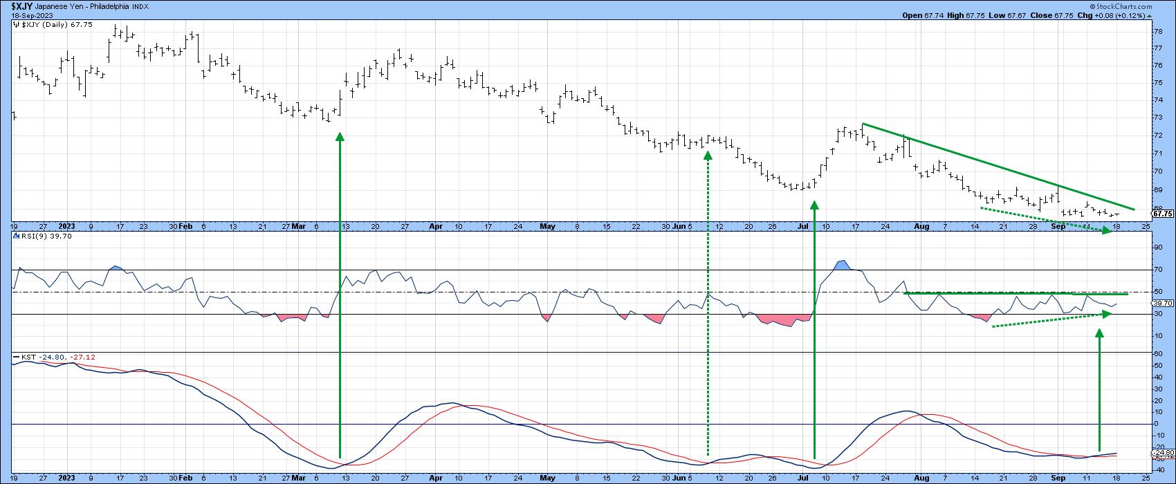
Finally, Chart 4 features the daily bars together with a 9-day RSI and the daily KST. Note that the RSI has diverged positively with the currency, and the KST has just triggered a buy signal. Both represent constructive developments but mean little without confirmation by the price. That would come with a decisive break that can hold above the July/September down trendline, which is currently around the 68 level.
 Chart 4 Chart 4
My conclusion on the yen, is that it is in a secular and primary bear market. However, if it is going to rally and reverse the primary trend, the currency should find support somewhere close to last October's bottom. With momentum diverging positively, an initial break above the 68 level would start the ball rolling. A stronger signal would come with a subsequent penetration of the down trendline at 70 (Chart 3). That would set in motion a test of the January high, the surpassing of which would confirm the completion of a double bottom completion.
Tesla
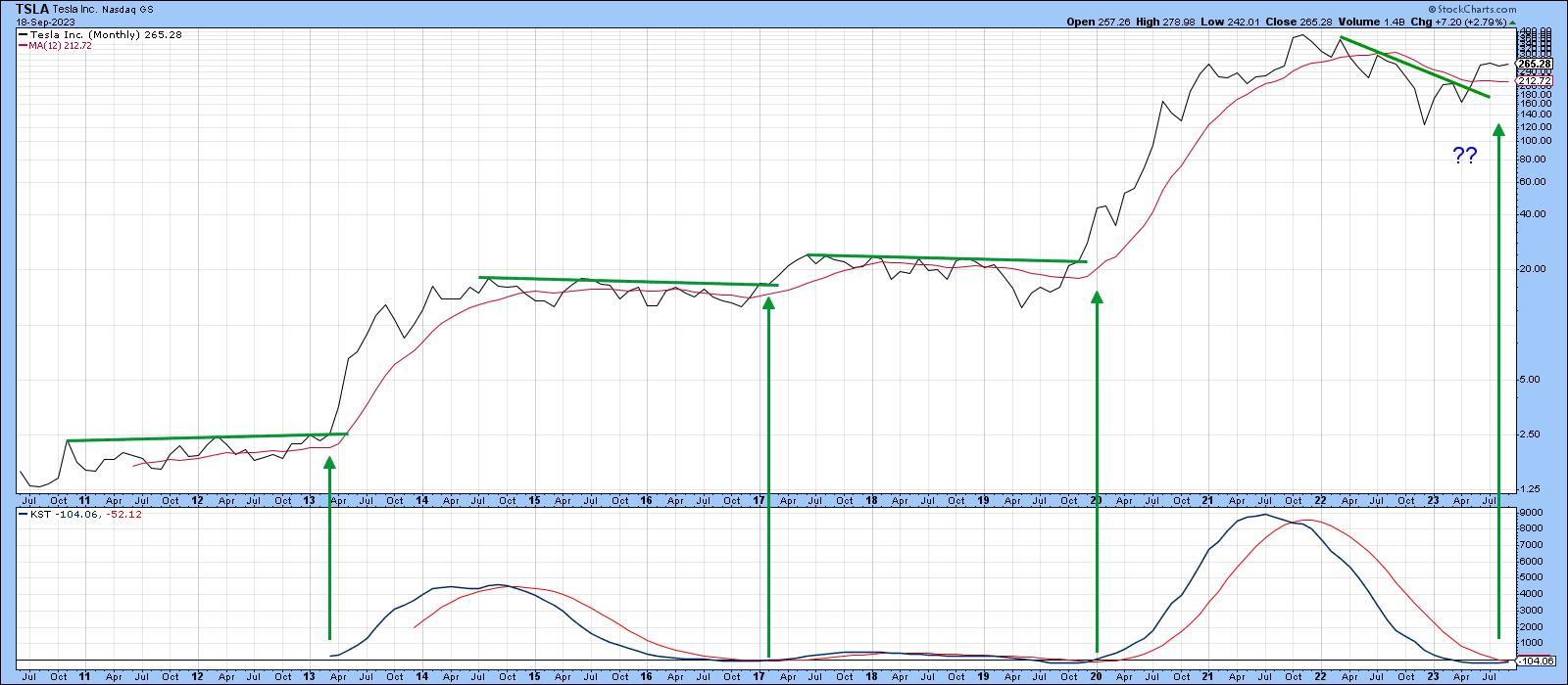
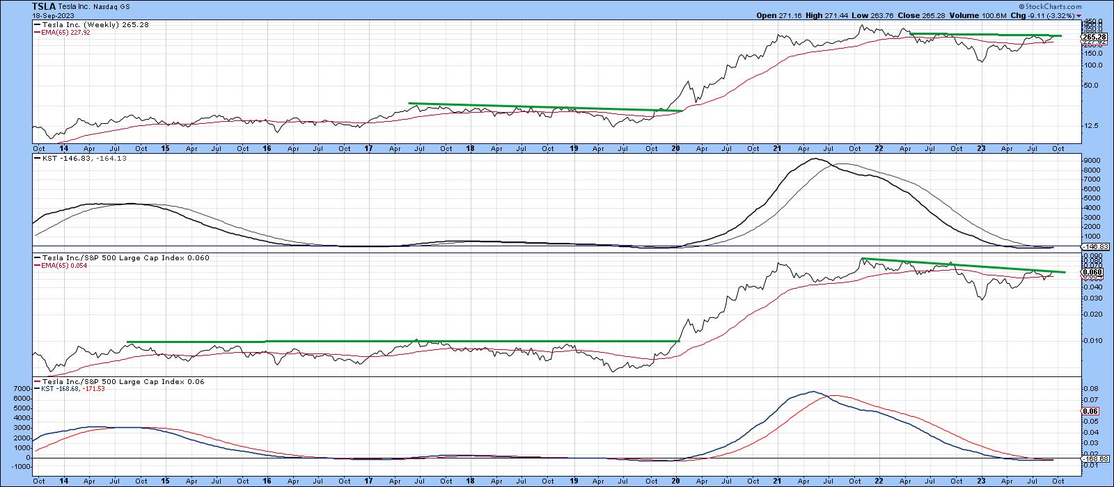
Chart 5 shows that, since 2011, Tesla (TSLA) has experienced three breakouts following a lengthy period of consolidation. Each time, the price has punched through a resistance trendline, crossed above its 12-month MA and experienced a long-term KST buy signal. The same action appears to have played out in 2023, except the resistance trendline has been a down trendline instead of a horizontal one and the KST at -102 has not yet crossed below its 9-month MA at -52. That's one of the reasons I am watching the stock.
 Chart 5 Chart 5
Chart 6 indicates how close the price is to a breakout, as the more sensitive long-term KST (-146), using weekly data, is above its 26-week EMA at -164. The price itself is already above its 65-week EMA, but has yet to clear its resistance trendline. Meanwhile, the third window tells us that the TSLA RS line is also trading very close to its resistance line, with the relative long-term KST, in the bottom window, set to follow suit if indeed the RS line does break to the upside.
 Chart 6 Chart 6
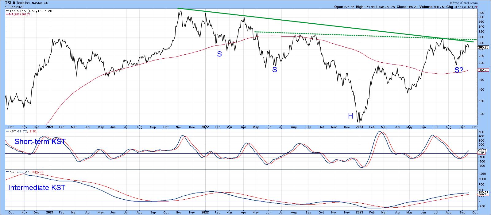
Finally, Chart 7 hints that the post-2022 consolidation will turn out to be an inverse head-and-shoulders consolidation pattern, if completed with an upside breakout. The pattern can be constructed in two different ways, as flagged by the solid and dashed trendlines. Either qualifies as a potential neckline. The potential formation indicated with the solid neckline would require a daily close above $290, whereas the dashed, more horizontal formation would be completed with a decisive close that can hold north of the previous high of $291, so, let's say, a round $300. The two positive KSTs suggest that if it is going to happen, the next few weeks would be as good a time to expect it as any.
 Chart 7 Chart 7
Good luck and good charting,
Martin J. Pring
The views expressed in this article are those of the author and do not necessarily reflect the position or opinion of Pring Turner Capital Group of Walnut Creek or its affiliates.
|
| READ ONLINE → |
|
|
|
| Art's Charts |
| Energy-related Commodities Lead, but Oil Looks Vulnerable |
| by Arthur Hill |
Energy-related Commodities Lead, but Oil Looks Vulnerable
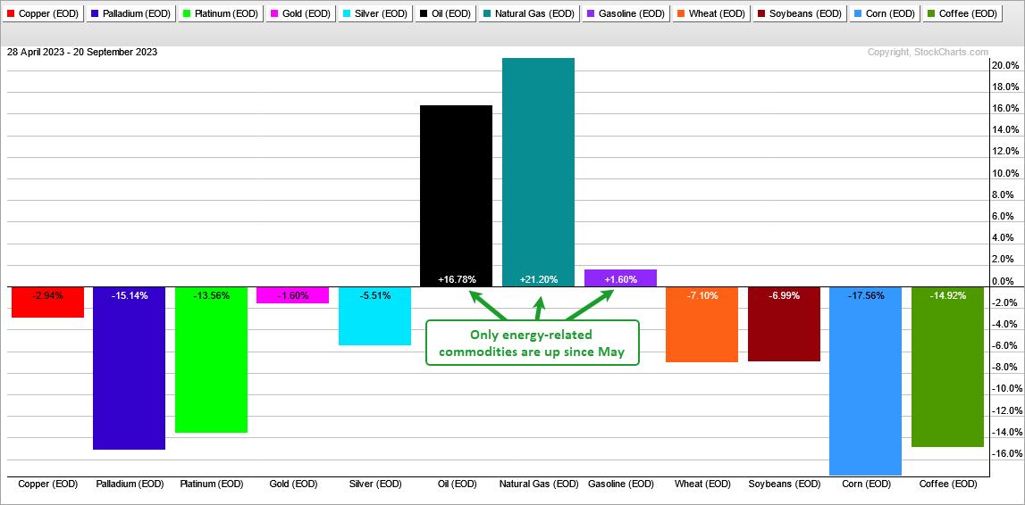
It has been a rough ride for most commodities this year and especially over the last 100 trading days (since May). Of the twelve spot prices I track, nine are up and three are down. Precious metals, base metals, lumber and grains are all down. The energy complex is the only gainer since May. Oil is up over 15%. Even though oil is leading, it hit an overbought extreme and looks vulnerable to a pullback. This analysis originally appeared in Thursday's Chart Trader report and video.

As an aside, there is an old saying that the cure for high oil prices is high oil prices. In other words, demand will wane as prices climb and supply will eventually exceed demand. The same is perhaps true for inflation. The cure for high inflation is high inflation. Demand will wane as prices climb and consumers cut back on spending. This drop in demand is what will ultimately cure inflation.
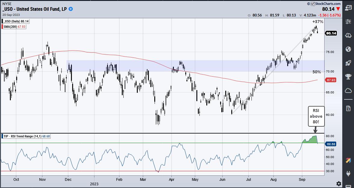
The chart below shows USO becoming overbought in July-August and even more overbought in September. . Yes, there is overbought and then there is OVERBOUGHT. RSI exceeded 70 in late July and early August. This is the garden variety overbought reading. It then exceeded 80 in mid September. This creates an exceptionally overbought condition that could lead to a pullback.

Where might USO find support? USO was up some 37% from the June low to the September high. A 50% retracement of this move would extend to the 70 area. The blue shading marks a prior resistance zone in the low 70s and this is also a target for a pullback. Taken together, I would suggest a zone in the 70-73 area for a pullback.
I covered USO and two energy ETFs in Thursday's Chart Trader report and video. This report summarized the bearish evidence for stocks and put forth downside targets for SPY and QQQ. Three bearish stock ideas were also presented with downside targets. Click here to learn more and gain immediate access.
The TIP Indicator Edge Plug-in for StockCharts ACP has 11 indicators to enhance your analysis and trading. These include the Trend Composite, Momentum Composite and ATR Trailing Stop. Click here to learn more.
---------------------------------------
|
| READ ONLINE → |
|
|
|
| ChartWatchers |
| Timing the Market With the WillTrend Indicator |
| by Karl Montevirgen |

Successful market timing relies on choosing the right market to time. In the StockChartsACP suite of Larry Williams plug-in indicators, three of them—Williams True Seasonal, Williams Money Flow Index, and Williams Sentiment Index—were designed with that purpose in mind. So now comes the timing part for entries and exits.
Before entering a market, the most basic questions you need to ask are:
- Is the market in an uptrend or downtrend?
- Where should you buy or sell (or sell short)?
- Where should you place your stop loss?
Providing a visual answer to these questions is what Larry Williams' WillTrend indicator is designed to do. Developed in 1988, WillTrend shows you whether a stock is trending and, if so, where, exactly, to enter a buy or sell.
How the WillTrend Indicator Works
This indicator is designed to work on weekly and daily charts only (sorry, intraday traders!). The signals and trend identification tools are remarkably clear and easy to understand. Take a look at the chart below.

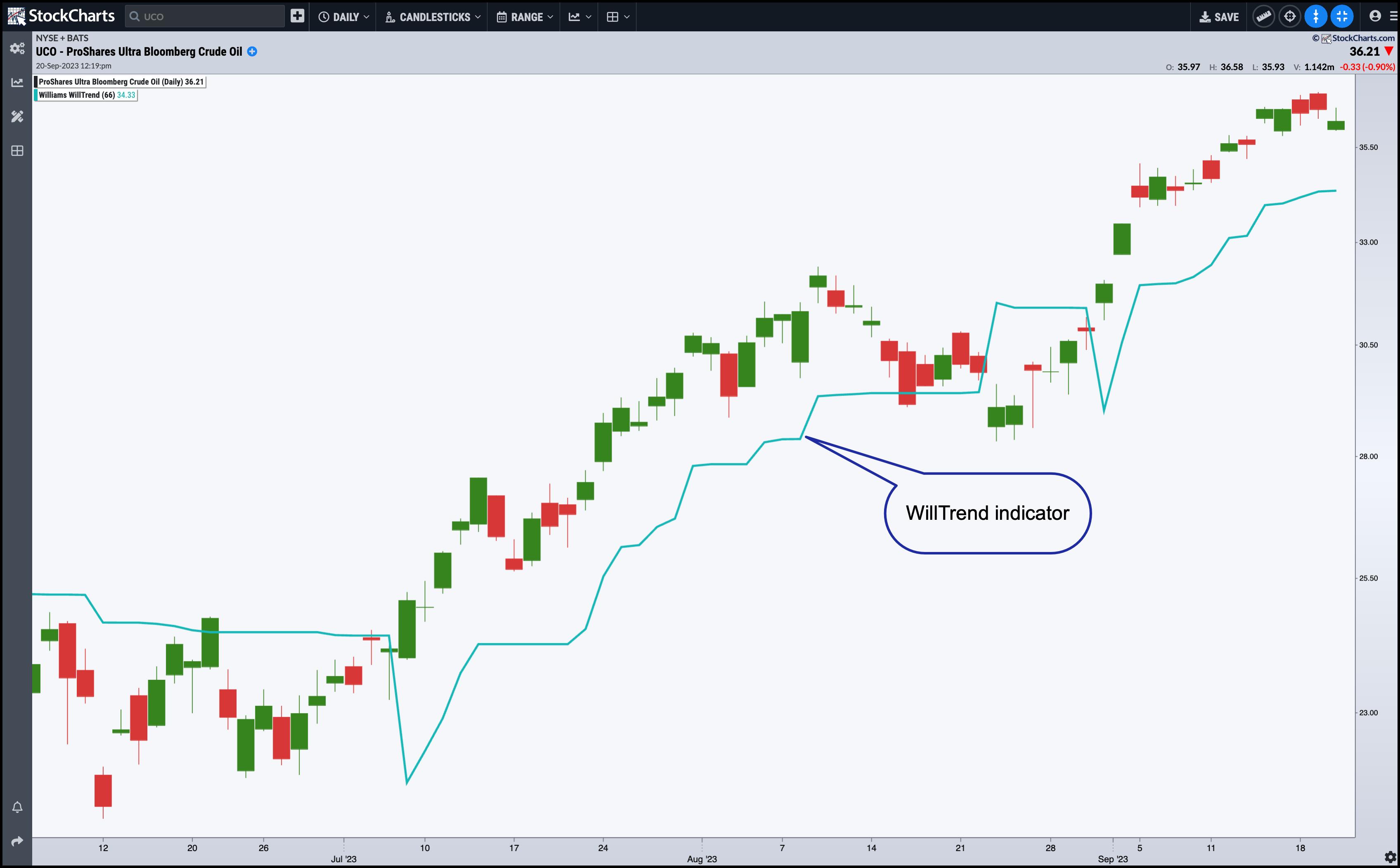
CHART 1: DAILY CHART OF PROSHARES ULTRA BLOOMBERG CRUDE OIL ETF (UCO) AND WILLTREND INDICATOR. The WillTrend indicator clearly outlines the trending activity in UCO.Chart source: StockChartsACP. For educational purposes.
Looking at the daily chart of UCO, the picture is pretty clear. UCO broke out of a congestive area and began trending up. The WillTrend indicator correctly identified the trend action, although anyone who might have shorted UCO when prices fell below the WillTrend line might have gotten burned. But no indicator is perfect, and you have to consider the overall technical and fundamental context when engaging in any trade.
How to Apply the WillTrend Indicator in StockChartsACP
- From Your Dashboard, click on the StockChartsACP button.
- Add a symbol in the symbol box and hit return.
- Under Chart Settings, scroll down to the Larry Williams Plug-Ins.
- Select Williams WillTrend.
How To Use the WillTrend Indicator
Looking at the description alone, you can probably guess how to put this indicator to use. Let's look at the weekly chart for Intel Corp (INTC).

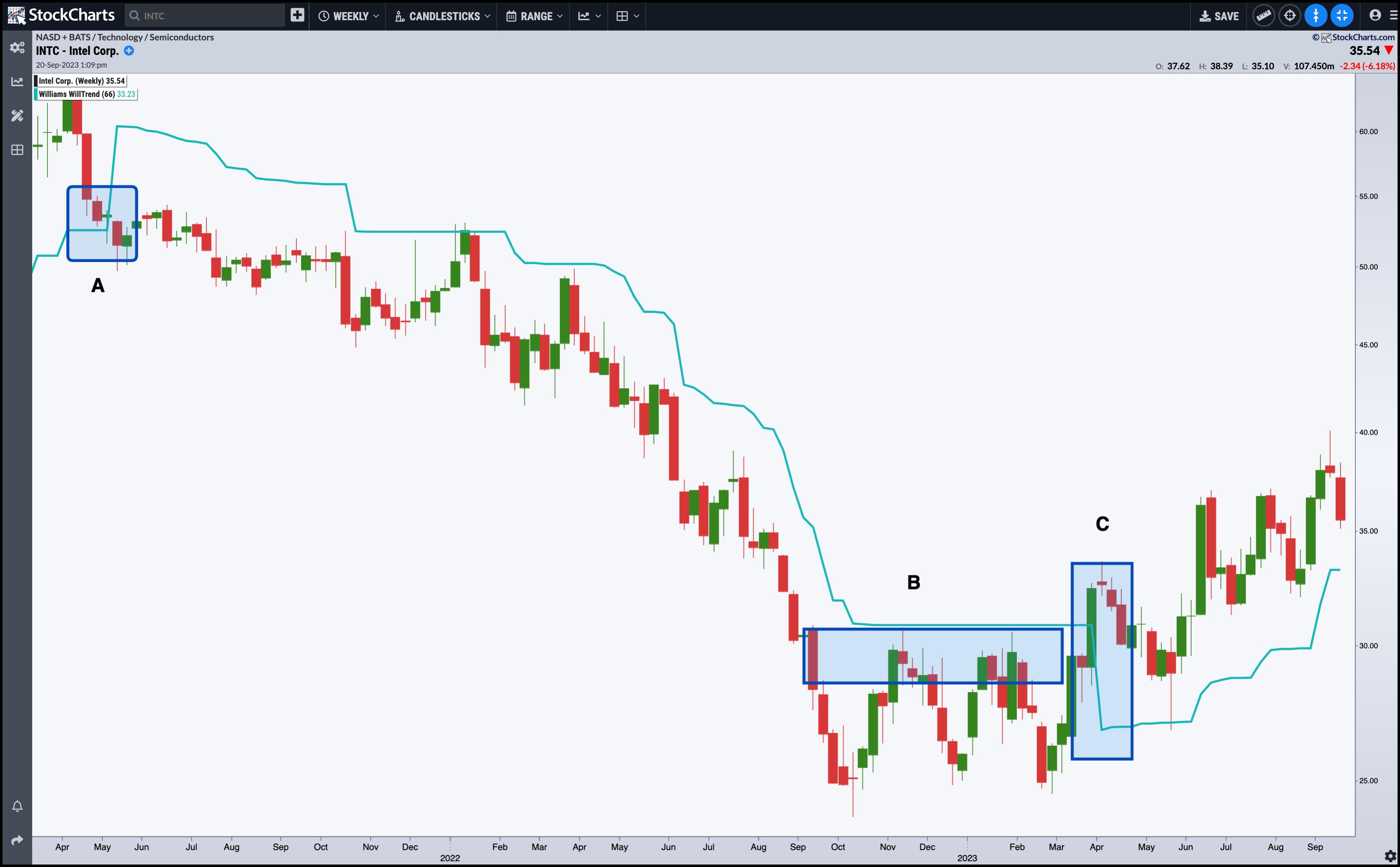
CHART 2: INTEL CORP. AND WILLTREND INDICATOR. Watch the patterns and breakouts as they unfold in relation to the WillTrend indicator.Chart source: StockChartsACP. For educational purposes.
Check out the following:
A— WillTrend was spot-on in identifying the beginning of INTC's 15-month downtrend (a profitable ride for anyone who took that signal early on). When prices fell below the WillTrend line, the crossover signaled to go short INTC (of course, you do this with discretion). You would also place a stop loss above the WillTrend line, which served as an effective trailing stop.
B— INTC saw six months of congestion; if you had a stop loss above the WillTrend line, you would have remained in the trade. However, INTC was basing and no longer trending downward.
C— Prices crossed above the WillTrend line, triggering a buy signal and a trailing stop loss order below the WillTrend line.
This illustrates a trade where you could have remained in the market, first short and then long. Still, not all trading scenarios will be this "accommodative" to the indicator.
As effective an indicator as WillTrend can be in many cases, you still have to use your noggin when making trading decisions, such as in the daily chart of Apple, Inc. (AAPL) below.

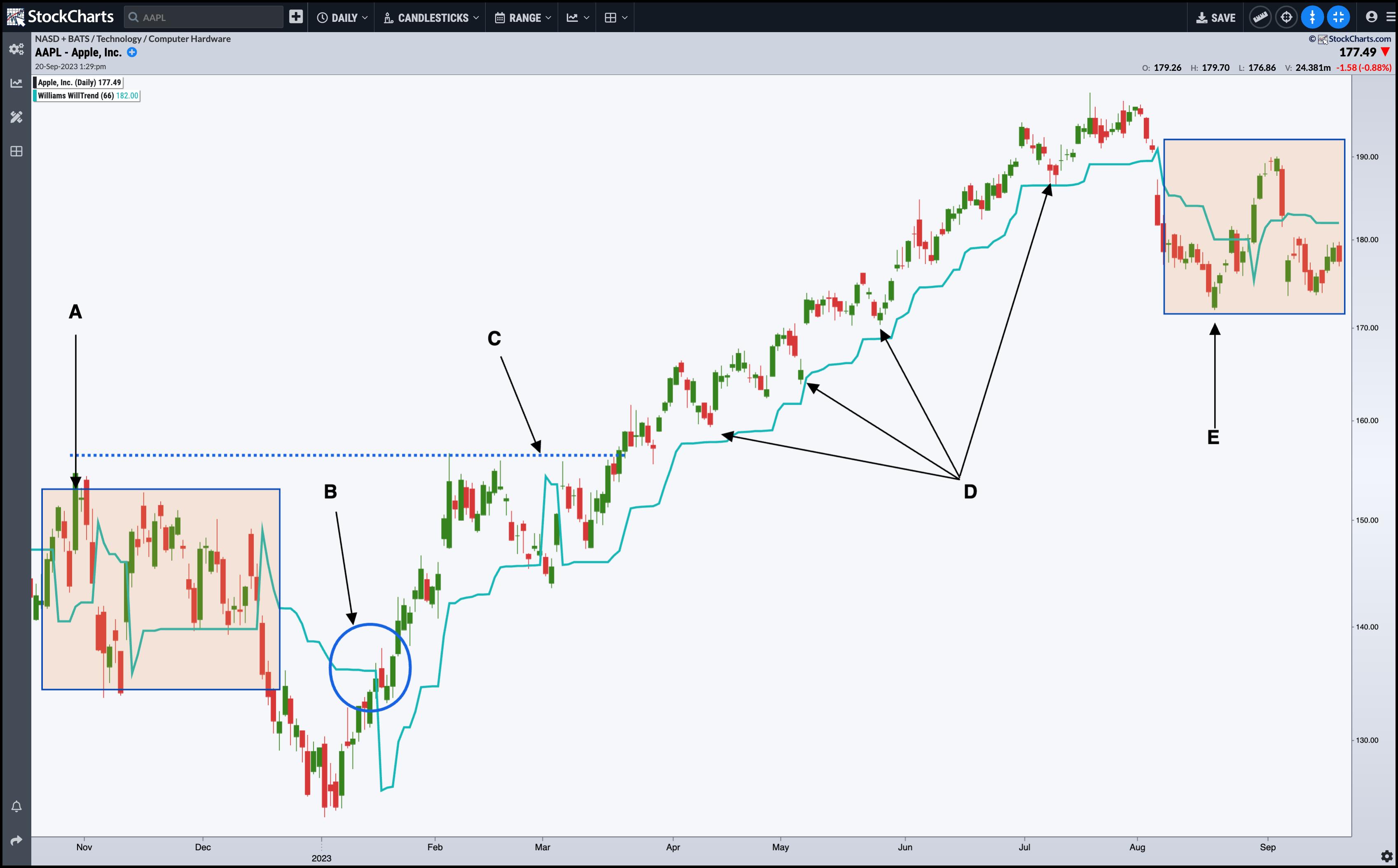
CHART 3: AAPLE STOCK AND THE WILLTREND INDICATOR. The chart shows an uptrend punctuated by congestion periods. Trading during congestion periods can be tricky.Chart source: StockChartsACP. For educational purposes.
There are plenty of opportunities peppered with problematic pitfalls.
A— Congestion! Taking a trading signal within a congestion range will almost always spell trouble unless you have a compelling reason. In this case, you would have been whipsawed, and quite badly.
B— Nevertheless, an early entry signal off a risky V-bottom occurred shortly after congestion led prices downward. What might have made some traders nervous entering at this point were the layers of resistance up ahead.
C— The market response to this resistance caused traders to unload their positions (or sellers to enter theirs) as prices fell below the WillTrend line for three days. Would you have closed your long position or gone short at this level?
D— The uptrend resumes, and you can see several more buy points or opportunities to scale up your position as you rode the uptrend for several months. Needless to say, the market action that followed the March dip illustrates the most accommodating scenario for the WillTrend indicator.

E—Similar to A, the area designated as E marks another zone of congestion, much of it in response to the larger economic conditions surrounding the broader market. Do you go long, short, or hold off? When uncertainty strikes, or when buyers and sellers are in a temporary instance of equilibrium or agreement (with regard to valuations), you'll want to hold off until further fundamental data or technical indications give a compelling case to take one position or another.
The WillTrend indicator can be effective in various market scenarios, but you must take a nuanced approach when analyzing your market and managing your trades. No indicator is perfect, but some are better than others in particular scenarios.
The Bottom Line
Larry Williams' WillTrend indicator can be a valuable tool for identifying market trends and pinpointing entry and exit points. It's designed to answer the basic (yet most actionable) questions: Is the market in an uptrend or downtrend? Where should you buy or sell or sell short? Where should you place your stop loss? However, as shown through various examples, while the WillTrend can be remarkably precise, it isn't infallible. No indicator is. But if used wisely, the WillTrend can give you an edge particular to its design.
|
| READ ONLINE → |
|
|
|
| RRG Charts |
| Sector Rotation Signals an Important Week Ahead for Stocks |
| by Julius de Kempenaer |
First of all, my apologies for everybody who has been waiting for a Sector Spotlight this week. I traveled back from the US on Monday, got caught up in working on back-log stuff, and now it is Friday already :(
A new SSL will be recorded and posted on Monday! Sorry for the delay.
But here's a quick take on sector movements over the past few days.
Daily Sector Rotation

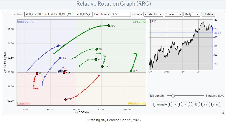
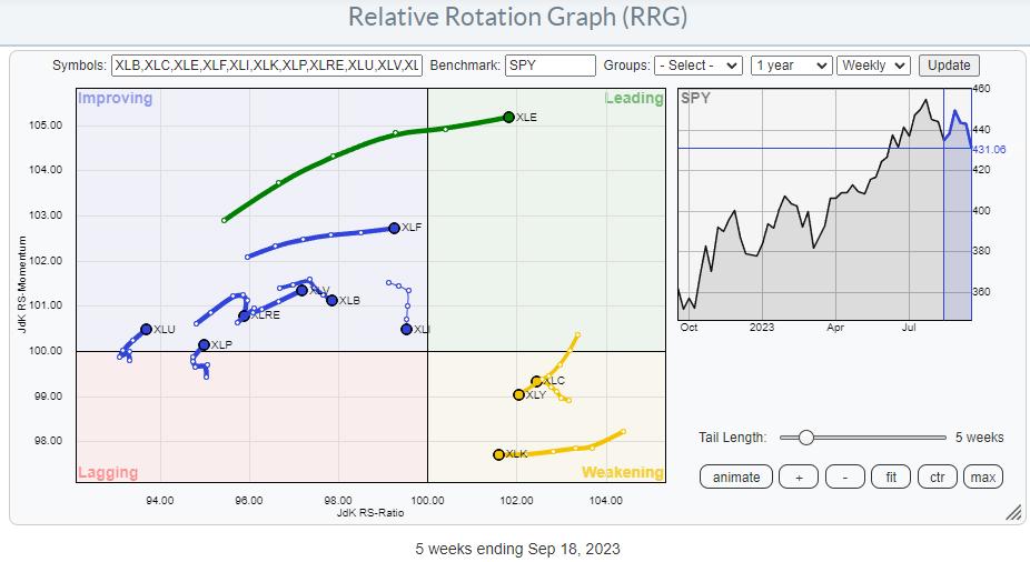
The daily RRG for this week shows an apparent risk-off rotation with XLU, XLV, and XLP on strong RRG-Headings moving into or toward the leading quadrant.
On the opposite side, it is primarily XLK moving into the lagging quadrant while XLY and XLE are still inside, leading but rolling over and losing relative momentum.
With the S&P 500 down almost three percent, it is a bad week for the markets.

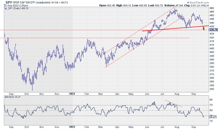
Looking at the daily chart of SPY, I see two possible scenarios.
Completed Head & Shoulders Top, or Market Finding Support?
The first is a completed H&S (like) formation triggered yesterday when the neckline broke with a downward gap. Measuring the top of the formation to the neckline and projecting that distance downward from the breaking level puts the target for the pattern around 405-410 in SPY.
Upside potential will be limited to the level of the neckline. Former support returning as resistance and/or the gap area between 435 and 440.
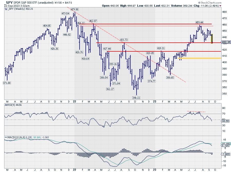
The second scenario could be that SPY is currently trying to find support at the level of the August 2022 high, and possibly starting to form a new low against that support level.
I am leaning more toward the second scenario, where SPY is trying to find support and possibly looking for renewed upside movement from current levels. This is primarily based on the sector rotation as it is still playing out on the weekly RRG.

XLC, XLY, and XLK are still inside the weakening quadrant and leveling off in terms of relative momentum, potentially setting the tails up for a rotation back up towards leading and resuming their relative uptrends against SPY.
The defensive sectors, XLP, XLV, and XLU, are all inside the improving quadrant, showing short tails and potentially rolling over to start moving lower, back towards the lagging quadrant.
430 Holds The Key

In either case, the area around 430 is crucial for the development in SPY in the coming week(s). If it holds, the market can get more constructive again and seek higher levels.
A clear break lower will confirm the first (H&S) scenario and its possible target area and negate the second scenario simultaneously. From a sector rotation perspective, the moves that I will be watching next week are:
When the daily tails for XLY, XLV, and XLP start to roll over, and XLY, XLK, and XLC pick up strength again, that would support scenario 2. This should be followed by a further rotation towards the leading quadrant on the weekly RRG for XLY, XLK, and XLC shortly after, and the defensive sectors rolling over while they are still inside the improving quadrant.
A continued strength for the group of defensive sectors in the coming week, possibly combined with SPY challenging 430, will be seen as a very strong sign of scenario one starting to play out. In the case of SPY breaking below 430, the first meaningful support level is found just below 420 in the area of the Jan 2023 peak.
#StayAlert and have a great weekend, --Julius
|
| READ ONLINE → |
|
|
|
| MORE ARTICLES → |
|
