| THIS WEEK'S ARTICLES |
| John Murphy's Market Message |
| FALLING BOND PRICES ARE HURTING BOND PROXIES LIKE UTILITIES, REITS, AND CONSUMER STAPLES |
| by John Murphy |
SEPTEMBER SECTOR RANKING... September has lived up to its reputation of being the year's weakest month. All major stock indexes have fallen during the month. And so have most S&P sectors -- except for one. Chart 1 shows energy being the only sector to end the month in the green. The ten others have lost ground. That's not a good track record for them and the market. It was recently pointed out that energy leadership is usually bad for the rest of the market. That's because rising energy prices are inflationary and put upward pressure on interest rates. That's not good for stocks either. Bond yields rose this week to the highest level in sixteen years. The recent spike in the ten-year Treasury yield has been the main factor pushing most stocks lower. Rising bond yields have taken a heavier toll on bond proxies like utilities and real estate.
 Chart 1 Chart 1
UTILITIES AND REITS FOLLOW BOND PRICES LOWER... Chart 1 shows Utilities and Real Estate SPDRS being the weakest sector performers during September. That's mainly because rising bond yields are pushing bond prices lower. That's hurting sectors that are usually viewed as bond proxies. Chart 2 shows the Utilities SPDR (black bars) tumbling to the lowest level in a year. The green area shows the close correlation between the XLU and falling bond prices.
Chart 3 shows the Real Estate SPDR (XLRE) and bond prices falling together and for the same reasons. Consumer staples are also being hurt by falling bond prices. That also explains why utilities, real estate, and consumer staples have been the market's weakest sector over the last quarter. Those three sectors are usually considered to be defensive in nature and normally do better when investors turn cautious on stocks. That hasn't been the case over the last quarter. All three sectors are in oversold conditions, however, and may start attracting some nervous money if stocks continue to weaken.
 Chart 2 Chart 2
 Chart 3 Chart 3
S&P 500 NEARS TEST OF SUPPORT...Last week's message ended with the following weekly bar chart and suggested that the S&P 500 was headed down for a test of its 40-week (or 200-day) moving average (red arrow). It's nearing a test of that important red support line. In addition, the SPX is nearing a test of its rising trendline drawn under its October/March lows (black line). What it does from there should help determine how serious the current pullback is likely to be.
 Chart 4 Chart 4
|
| READ ONLINE → |
|
|
|
| The MEM Edge |
| The Worst Month of the Year is Behind Us -- Here's What We Need to See for Better Times Ahead |
| by Mary Ellen McGonagle |
The S&P 500 posted its worst month so far, with a 4.9% decline that's pushed the year-to-date returns for this benchmark index almost in half. With elevated interest rates that may be with us for a while, investors have pushed stocks lower, in a move that has over 10% of large-cap stocks well into oversold territory. We're talking about names such as McDonalds (MCD), Boeing (BA) and Blackrock (BLK), to name just a few.
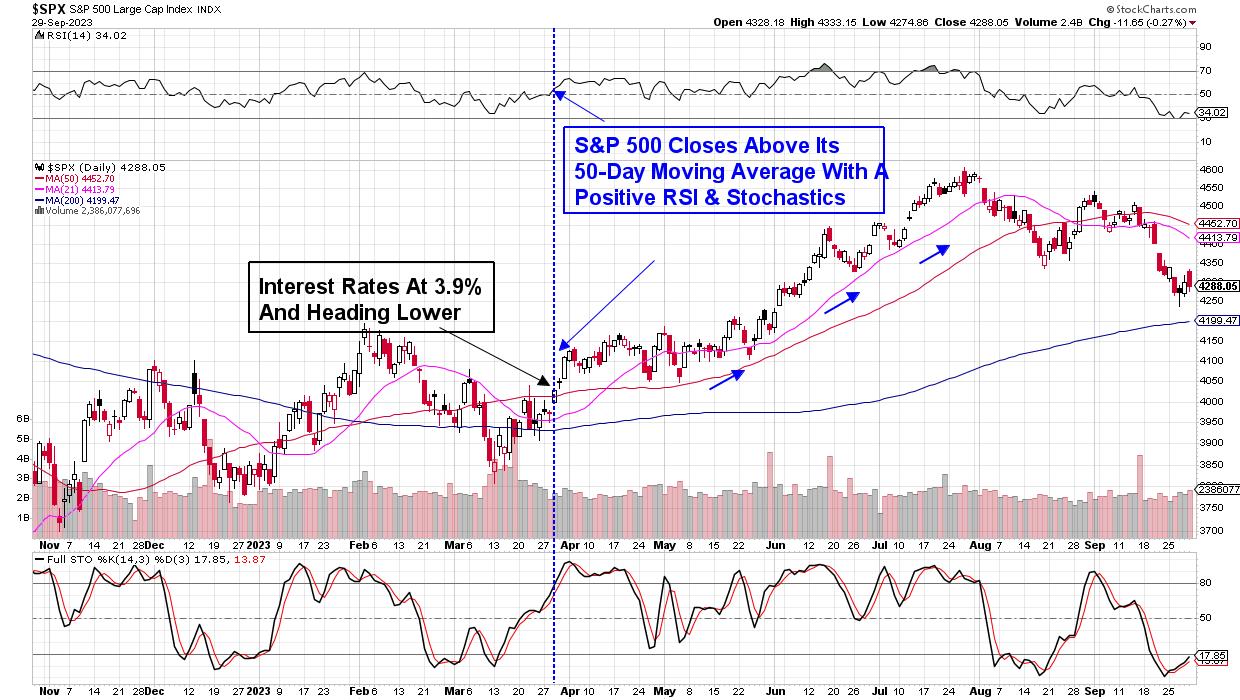
The current downtrend in the markets was signaled by a close below the 50-day moving average on heavy volume earlier this month, which was coupled by a move of the RSI and Stochastics into negative territory. Further weakness followed, with news that the Fed is anticipating an elevated rate scenario for longer than anticipated, pushing stocks even lower.
DAILY CHART OF THE S&P 500 INDEX

Above is a daily chart of the S&P 500, and highlighted are the key characteristics that need to take place before we're back in an uptrend. To begin, we'll need this index to close above its 50-day moving average, coupled with a positive RSI and Stochastics. While this may appear far from possibly taking place, a multi-day rally in the mega-cap names such as Microsoft (MSFT) and Alphabet (GOOGL), which led us out of the March pullback, would go a very long way in sparking a reversal.
Outside of price action on the chart of the S&P 500, we'll need to see interest rates trend lower from their current position. During the mid-March downtrend reversal, the yield on the 10-year Treasury note closed below the widely-watched 4% level after a lower-than-expected CPI report hinted at decelerating inflation. A similar drop in interest rates will be a key needed development to get investors back into these markets.
While we're on the lookout for the markets to trend higher going into year-end, near term, we may see further weakness heading into next week. While the major indexes rebounded from midweek lows, a continuation rally into Friday was reversed, in a signal that the short-lived rally attempt had ended. The reversal followed news that a federal government shutdown is increasingly likely on Sunday after House Speaker McCarthy's funding proposal was rejected.
With investor sentiment remaining negative over the near term, this is an ideal time to build out your watchlist for when we return to a more bullish period. For those who'd like to have immediate access to my highly curated watchlist, as well as be alerted to when it's safe to get back into the markets, use this link here.
Warmly,
Mary Ellen McGonagle
|
| READ ONLINE → |
|
|
|
| Martin Pring's Market Roundup |
| This Stock Market Looks Horrible... But... |
| by Martin Pring |
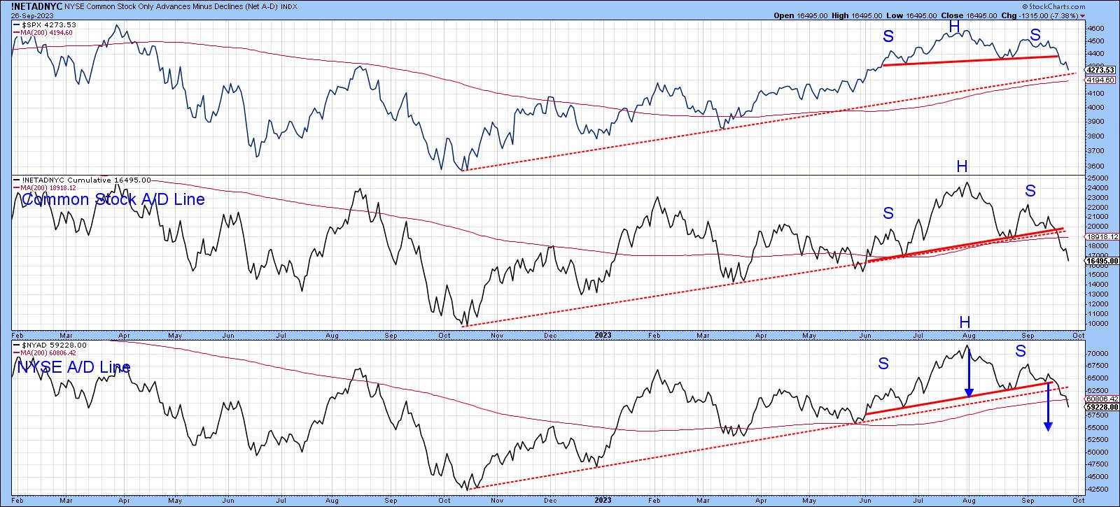
Chart 1 shows that the S&P Composite, like both A/D Lines, has completed and decisively broken down from a head-and-shoulders top. The two breadth indicators have also violated their bull market up trendlines. On the surface, things look pretty grim, with three seasonally weak September days left to trade and the crisis-prone month of October still to be experienced. What's not to like?

CHART 1. IT'S LOOKING BEARISH. When the S&P 500 ($SPX) and two Advance-Decline Lines have broken their bull market trendlines, should you start getting nervous or look for buying opportunities?Chart source: StockCharts.com. For educational purposes.
It's Still a Bull Market
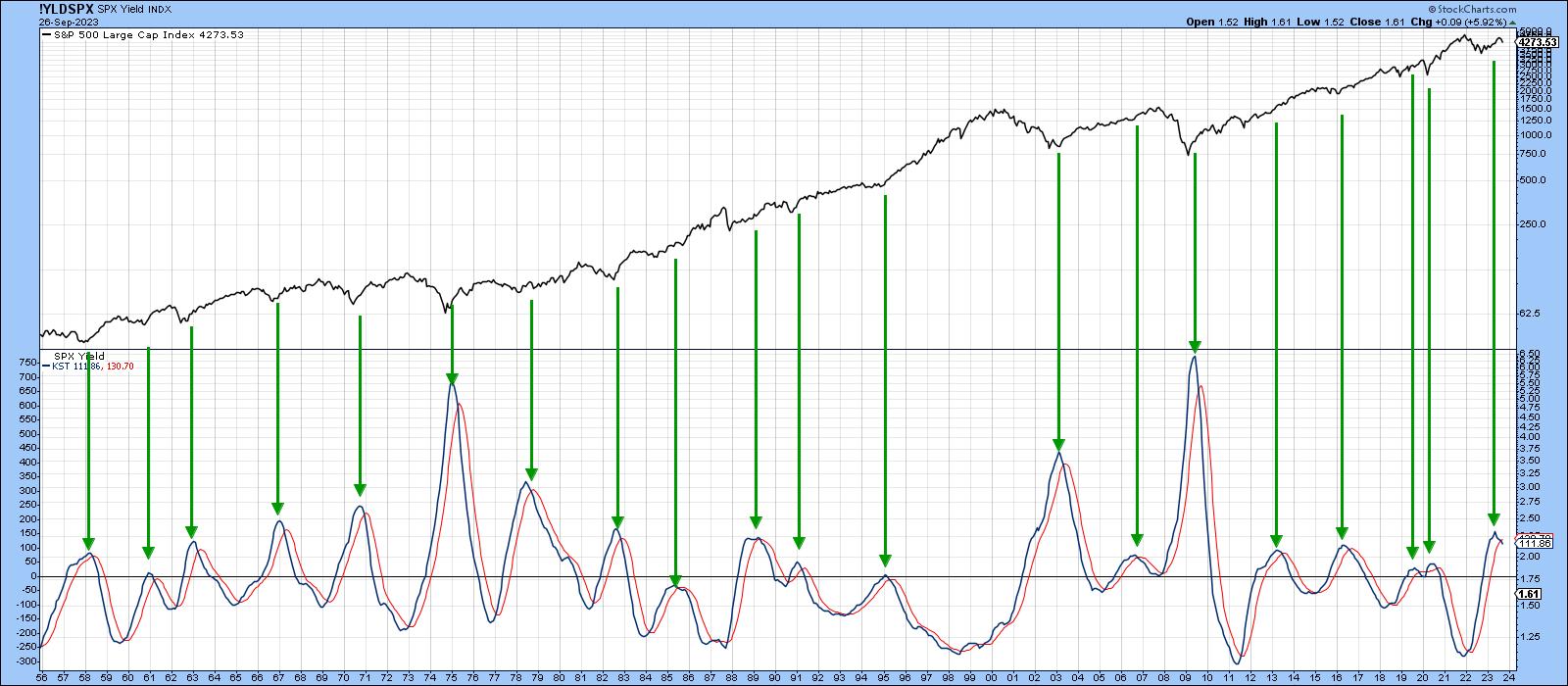
Chart 2 offers some long-term perspective, as it plots the long-term KST for the dividend yield on the S&P Composite. The arrows flag peaks in this momentum indicator.
There are two points worth noting. First, this approach has consistently called primary bull markets since the 1950s. The only questionable signal was generated in 2019, just prior to the pandemic. Remember, this chart covers a lot of data, so even the early 2007 signal was followed by nine months or so of a rising market. That brings me to the second point, which is that the latest buy signal has only just been given. There is nothing to stop it from reversing in the immediate future, but it seems unlikely when its 70-year history is considered.
In other words, it's still a bull market.

CHART 2. THE LONG-TERM KST INDICATOR SHOWS THAT THE MOST RECENT BUY SIGNAL IS STILL IN PLAY.Chart source: StockCharts.com. For educational purposes.
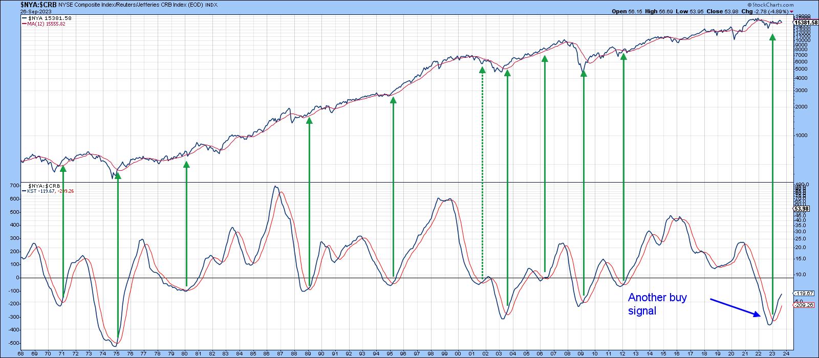
Chart 3 also paints a bullish picture. In this instance, it is a long-term KST of the ratio between the NYA and the CRB Composite (stocks vs. commodities). Sub-zero upside reversals in this interasset relationship have consistently generated profitable buy signals. Commodities have been rising lately, but the positive KST says that stocks can deal with it. I substituted the NYA for the S&P because it is very close to its 12-month moving average (MA), thereby reminding us that, although most of the primary trend indicators are bullish, we should certainly not be complacent about the possibility of a reversal.

CHART 3: $NYA:$CRB AND KST. This is another bullish picture for this interasset relationship.Chart source: StockCharts.com. For educational purposes.
Short and Intermediate Indicators Behave Differently in Bull and Bear Markets
Since most of the long-term indicators are positive, it is wise to assume that the uptrend since last October is intact. Generally speaking, when a market is in a primary uptrend, the short-term and intermediate indicators are relatively constrained on the downside and are more prone to false downside breakouts than when the overall trend is negative. In other words, these indicators behave differently in bull and bear markets.
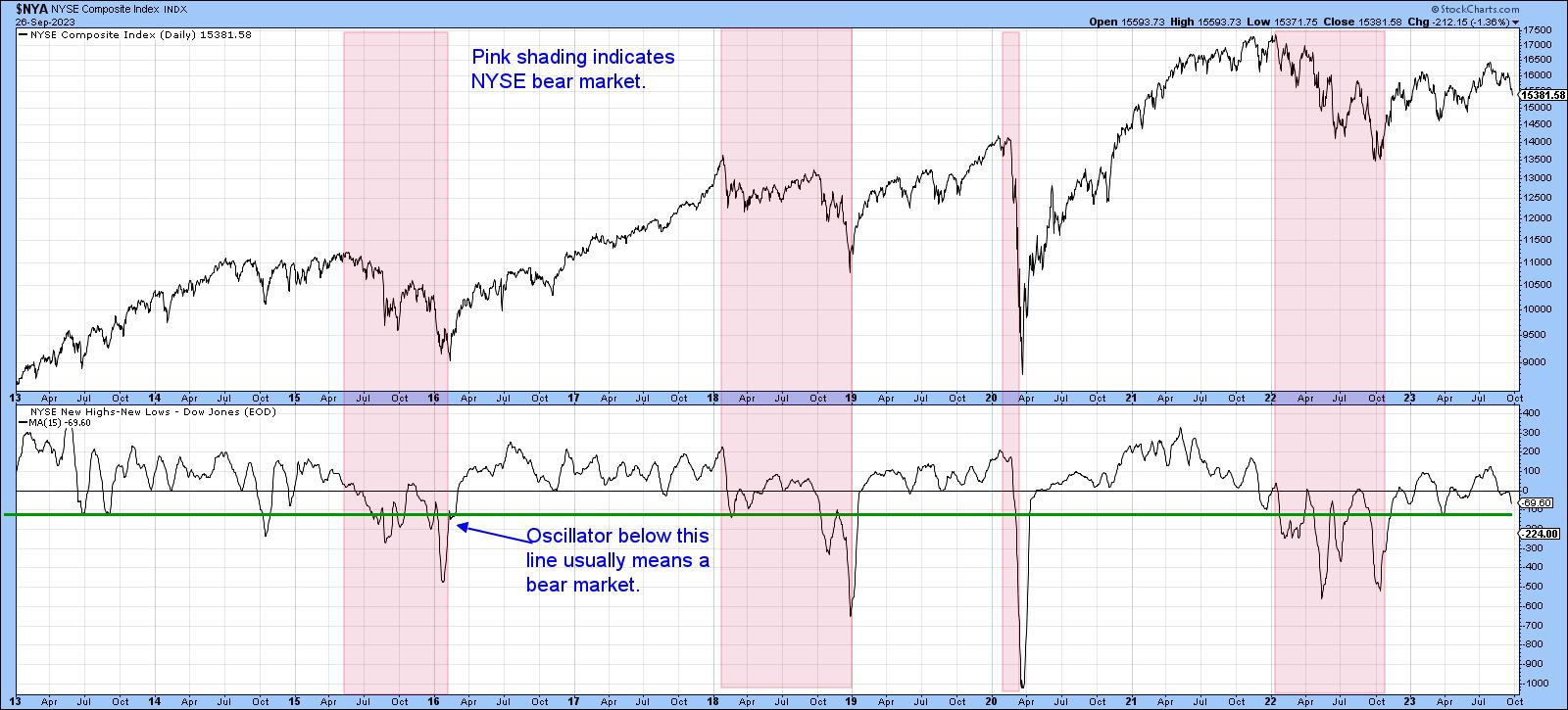
Chart 4 tries to make the point with NYSE high/low data calculated by Dow Jones. Using the benefit of hindsight, the pink shading identifies bear markets, leaving the unshaded areas to represent primary bull trends. There are very few instances when the 15-day high/low MA drops below the green horizontal line during a bull market. During last year's bear market, it dropped below the green line several times. Since then, the indicator has fallen to the line, but has failed to sink below it. That's always a possibility, but at this point, the indicator's behavior is consistent with what we would expect it to be doing in a primary bull market.

CHART 4. NYSE COMPOSITE AND NYSE NEW HIGHS-NEW LOWS. The unshaded areas represent bear markets, and we're not seeing that right now.Chart source: StockCharts.com. For educational purposes.
Three Indicators to Watch
Finally, there are three indicators I think are worth watching for a possible reversal, because they have a consistent record of calling rallies in bull markets, and they may be close to an upside reversal.
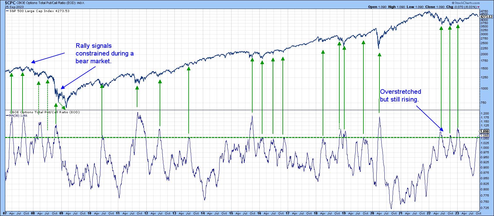
The CBOE Options Total Put/Call ratio, or its 30-day MA, has just entered a zone of pessimism. This is flagged by the horizontal green line in Chart 5. The arrows show buy signals are generated when sentiment becomes less pessimistic, i.e. when the indicator reverses to the downside. It's still rising, so we cannot call a turn yet, but if this is still a bull market, a reversal is probably not that far away.

CHART 5. CBOE OPTIONS TOTAL PUT/CALL RATIO. If this is a bull market, expect to see a downside move in this sentiment indicator. Chart source: StockCharts.com. For educational purposes.
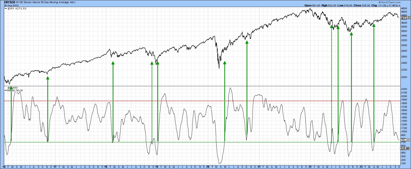
The same comments apply to the 10-day MA of the number of NYSE stocks trading above their 50-day (10-week) MAs. Again, the arrows tell us when this indicator goes bullish by falling to or below the green horizontal line and crossing back above it. This oscillator is still declining and hasn't quite reached the line, but it's not far from a signal provided, as I believe this is still a bull market.

CHART 6. NUMBER OF NYSE STOCKS TRADING ABOVE THEIR 50-DAY MOVING AVERAGE. The indicator might fall to or below the green horizontal line and cross back above it. That would be a bullish indication. Chart source: StockCharts.com. For educational purposes.
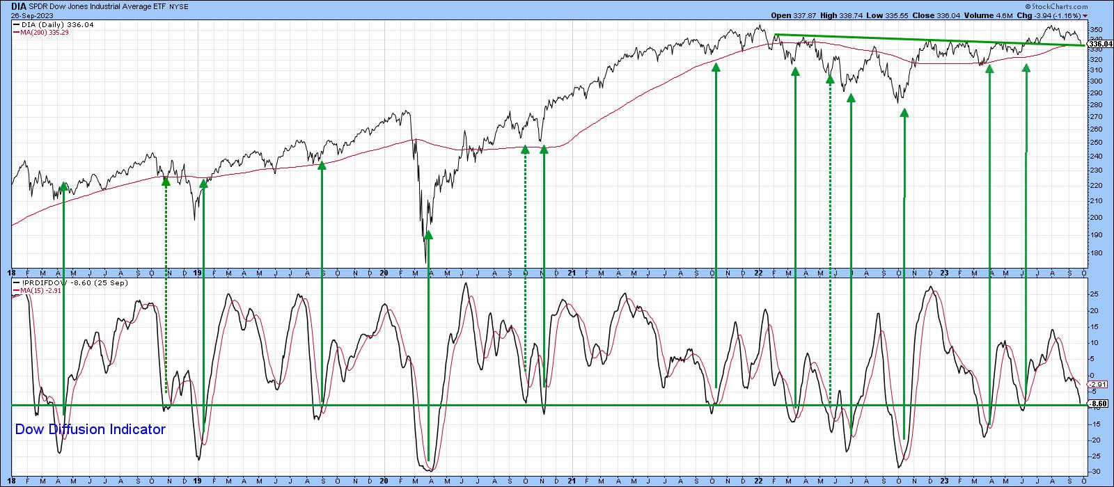
Chart 7 features my Dow Diffusion Indicator, which has just reached its oversold zone. Once again, we need a reversal to generate another bullish green arrow. That hasn't happened yet, but you can see the DJIA itself has now fallen right back to support its extended breakout trendline and the 200-day MA.
Could this be it??

CHART 7. DOW DIFFUSION INDICATOR. An upward reversal from its oversold zone would be a bullish indication.Chart source: StockCharts.com. For educational purposes.
Good luck and good charting,
Martin J. Pring
The views expressed in this article are those of the author and do not necessarily reflect the position or opinion of Pring Turner Capital Group of Walnut Creek or its affiliates.
|
| READ ONLINE → |
|
|
|
| Art's Charts |
| Which Cyber Security ETF is the Strongest? |
| by Arthur Hill |
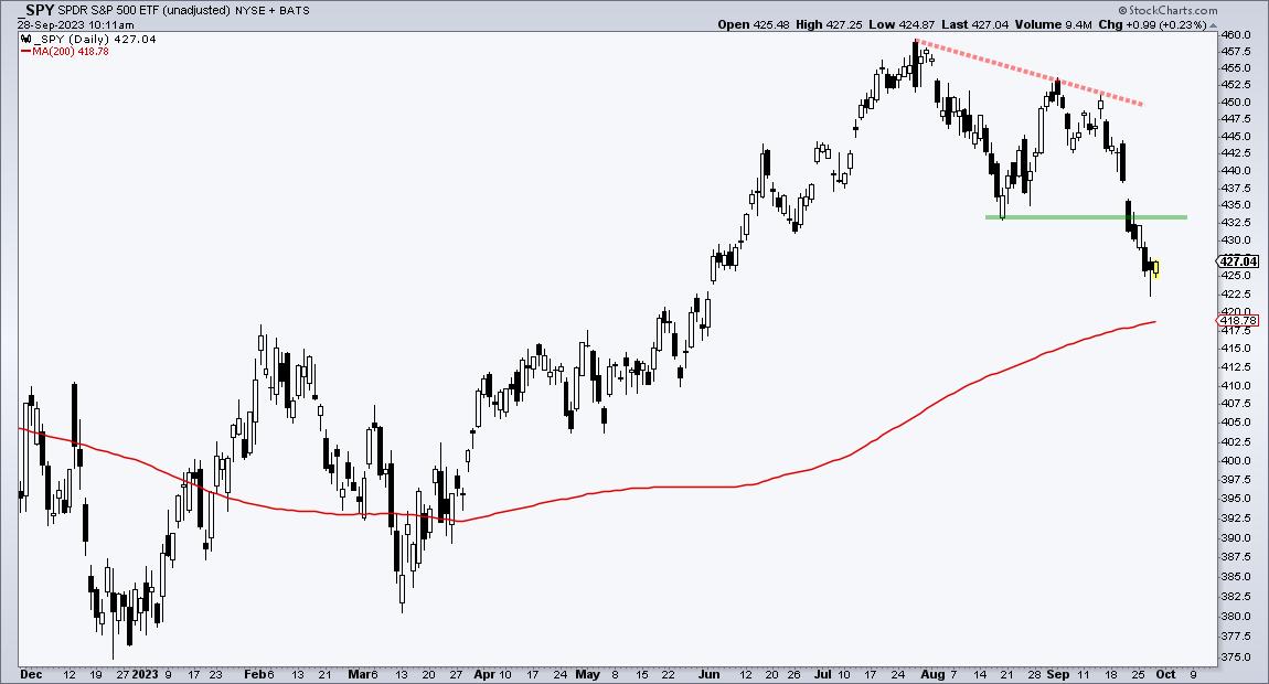
Which Cyber Security ETF is the StrongestStocks were hit hard the last two weeks with the S&P 500 SPDR (SPY) breaking below its August low. SPY also forged a lower high from July to August. Stocks and ETFs that held above their August lows are showing relative strength. With that in mind, the three cyber security ETFs stand out and one is stronger than the others. This standout and two cybersecurity stocks were featured in Thursday's Chart Trader Report & Video.
The first chart shows SPY to set the reference points. First, SPY formed a lower high from July to early September (red dashed lines). Second, SPY broke the August low with a sharp decline (green line). These are the two reference points to keep in mind going forward.

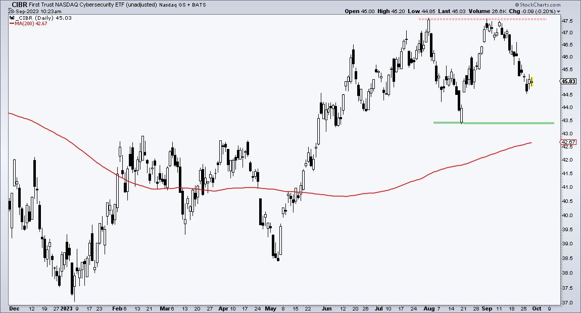
The next chart shows the Cybersecurity ETF (CIBR). First, notice that it formed two equal highs in the 47.50 area (red dashed line). CIBR did not forge a lower high and showed more strength. Second, CIBR held above the August low during the September decline. Again, CIBR is holding up better and showing relative strength.

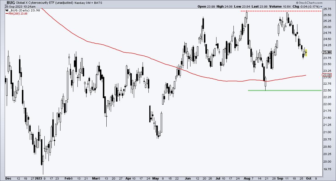
The next chart shows the Cybersecurity ETF (BUG) with the same characteristics.

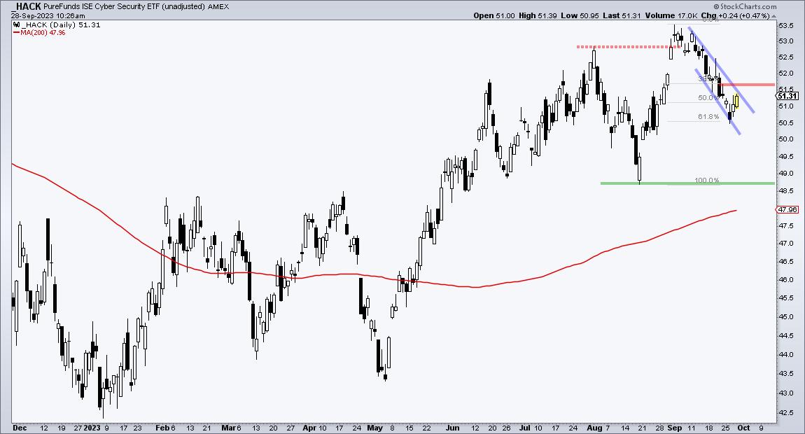
The next chart shows the Cyber Security ETF (HACK) with different characteristics. HACK forged a higher high and a 52-week high on September 1st. This higher high means it was stronger than SPY on the way up. HACK fell with the rest of the market over the last two weeks, but remains well above the August low. HACK shows relative strength on this decline.

The chart above also shows a bullish continuation pattern in play. This pattern is explained in the video above. Note that I featured HACK and two cybersecurity stocks in the Chart Trader Report & Video on Thursday morning. This report also showed three short-term breadth indicators becoming oversold the last two days. Click here to learn more and gain immediate access.
The TIP Indicator Edge Plug-in for StockCharts ACP has 11 indicators to enhance your analysis and trading. These include the Trend Composite, Momentum Composite and ATR Trailing Stop. Click here to learn more and take your trading to the next level.
---------------------------------------
|
| READ ONLINE → |
|
|
|
|
|
| ChartWatchers |
| Stock Market Weekly Wrap Up: The Charts You Need To Have On Your Radar Now |
| by Jayanthi Gopalakrishnan |

As Q3 and a dismal September end, some interesting dynamics are playing out in the stock market.
You can blame higher interest rates for some of the disjuncture that's going on. The CBOE Volatility Index ($VIX) is relatively low, yet the percentage of stocks trading below their 50-, 100-, and 200-day moving averages is relatively low. Here's the market in a nutshell:
- The Dow Jones Industrial Average ($INDU) is trading below its 200-day moving average.
- The S&P 500 ($SPX) is trading below its 100-day moving average.
- The Nasdaq Composite ($COMPQ) is trading below its 100-day moving average.
- The CBOE Volatility Index ($VIX) is relatively low, at less than 18.
- Year to date, Communication Services, Technology, and Consumer Discretionary are the three leading sectors.
We saw a similar scenario unfold in 2005, but there are stark differences between then and now. In 2005, Energy was the leading sector for the year, with Utilities in second place. Communication Services and Consumer Discretionary were the two sectors in negative territory.
The Big Picture
Although history is known to repeat itself, each time, it's still somewhat different. This year, investors are uncertain about inflation and interest rates. Plus, there is the possibility of a US government shutdown that could weave its way into the stock market. As Q3 ends and we gear up for Q4, it's important to have the bigger picture in mind.
Let's start with market breadth.
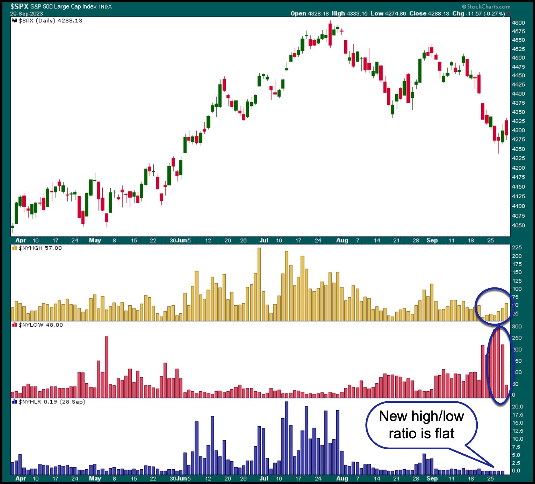
The chart below gives a good picture of the overall market breadth. The NYSE new 52-week highs ($NYHGH) are slowly rising. The new 52-week lows spiked, but they're slowing down. And if you look at the high/low ratio, it's pretty flat.

CHART 1: S&P 500 AND MARKET BREADTH. If there was one word to sum up the performance of the stock market, it would be "meh!" There's not much momentum in either direction.Chart source: StockCharts.com. For educational purposes.
The market seems to be lacking momentum. Sometimes, it looks like it will move up, but sellers come in and cap the move. Similarly, when the market looks like it's going to sink, buyers prop it up. So what catalyst will move the market in either direction? Will it be earnings, or something else?
The general thinking among Wall Street analysts is that Q4 will see strong earnings, which could be the catalyst the market is waiting for. But, on the flip side, Treasury yields are high. And higher yields haven't been great for growth stocks.
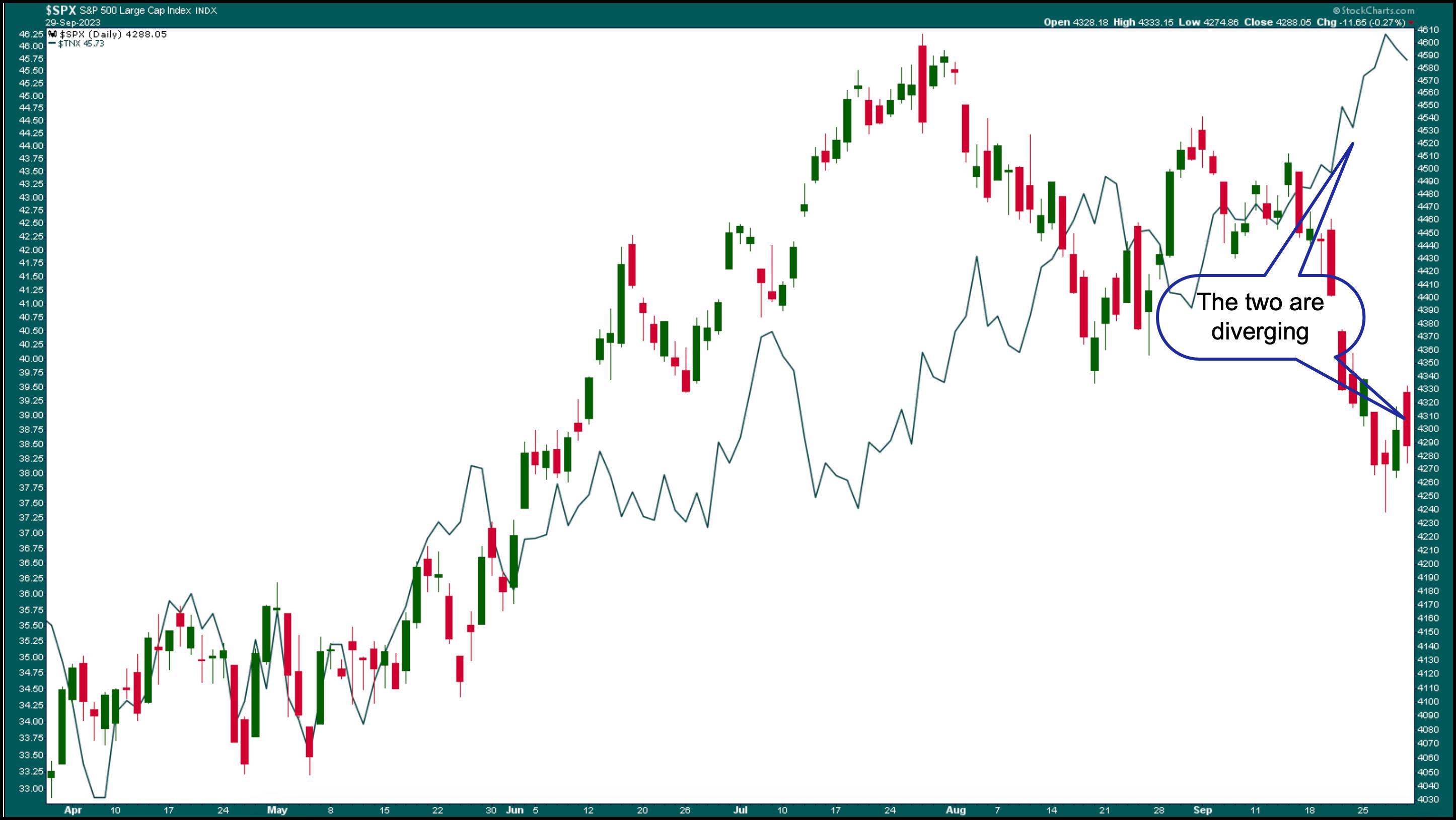
The chart below shows the relationship between the S&P 500 and the 10-year Treasury Yield Index ($TNX). In the last half of September, the two diverged significantly.

CHART 2: S&P 500 VS. 10-YEAR TREASURY YIELDS. Rising yields generally hurt growth stocks, as is evidenced in this chart. As yields were rising, the S&P 500 was moving lower.Chart source: StockCharts.com. For educational purposes.
Yields have reached levels they haven't seen since 2007, and let's hope the market doesn't perform the way it did in 2007. The circumstances are indeed different this time. We don't have the high levels of mortgage debt like we did then. There's a chance that interest rates may be close to a peak, although the Fed could still hike once more this year. So, that may mean yields could stay higher for longer. And it's the "higher for longer" regime that could be causing hesitancy among investors.
The bigger question is if stocks can perform well while interest rates are high. The dominant seasonality narrative of Q4 being strong could unfold. But if the large mega-cap stocks lead in Q4, could higher interest rates act as headwinds? If they are, it could make for relatively muted growth in Q4. But there's a chance that other asset classes could dominate. How will the last three months of 2023 shape up?
The Bottom Line
It all depends on what interest rates do. The market could go either way. It could turn around and go higher, or could fall even further before moving higher. Keep an eye on market breadth, because it can reveal what's brewing underneath the price bars.
End-of-Week Wrap-Up

US equity indexes mixed; volatility up
- $SPX down 0.27% at 4288.05, $INDU down 0.47% at 33507.50; $COMPQ up 0.14% at 13219.32
- $VIX up 1.04% at 17.52
- Best performing sector for the week: Energy
- Worst performing sector for the week: Utilities
- Top 5 Large Cap SCTR stocks: Super Micro Computer (SMCI); Dell Technologies (DELL); Palantir Technologies (PLTR); Splunk Inc. (SPLK); Jabil, Inc. (JBIL).
On the Radar Next Week
- September ISM Manufacturing PMI
- Fed speeches
- ISM Services PMI
- September non-farm payrolls
Disclaimer: This blog is for educational purposes only and should not be construed as financial advice. The ideas and strategies should never be used without first assessing your own personal and financial situation, or without consulting a financial professional.
|
| READ ONLINE → |
|
|
|
| DecisionPoint |
| New Tables Show Intermediate-Term Overview is Negative |
| by Carl Swenlin |
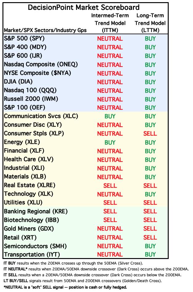
We have introduced two new tables in the DecisionPoint ALERT to give an overview of trend and BIAS for the major market indexes, sectors, and industry groups that we track. The first is our Market Scoreboard, which shows the current Intermediate-Term and Long-Term Trend Model (ITTM and LTTM) signal status. To review:
- The IT Trend Model generates a BUY Signal when the 20-day EMA crosses up through the 50-day EMA (Silver Cross).
- The IT Trend Model generates a NEUTRAL Signal when the 20-day EMA crosses down through the 50-day EMA (Dark Cross) above the 200-day EMA. This is a soft SELL Signal, going to cash or a hedge. It avoids being short in a bull market.
- The IT Trend Model generates a SELL Signal when the 20-day EMA crosses down through the 50-day EMA (Dark Cross) below the 200-day EMA.
- The LT Trend Model generates a BUY Signal when the 50-day EMA crosses up through the 200-day EMA (Golden Cross).
- The LT Trend Model generates a SELL Signal when the 50-day EMA crosses down through the 200-day EMA (Death Cross).
The current table shows that there is considerable stress in the intermediate-term; however, the long-term is still comfortably green for market and sector indexes. But we need to remember that the market indexes are cap-weighted, which means that they can be held aloft by large-cap stocks. The 11 sectors shown are composed solely of S&P 500 components, meaning that they will reflect the strength of that index. Industry groups, however, are not doing as well because they are less protected by the large-cap umbrella.

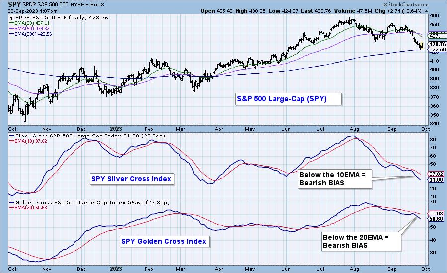
Next, let's look at how we determine the BIAS of a given index. First, the Silver Cross Index shows the percentage of stocks in an index that have a Silver Cross (20-day EMA above the 50-day EMA), and the Golden Cross Index shows the percentage of stocks in the index that have a Golden Cross (50-day EMA above the 200-day EMA). Next, we determine BIAS based upon the relationship of the Silver Cross Index to its 10-day EMA and the relationship of the Golden Cross Index to its 20-day EMA. When they are above, the BIAS is bullish. When they are below, the BIAS is bearish. See the chart below.

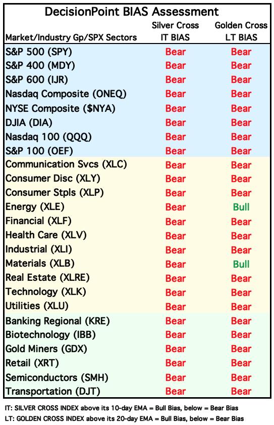
The following table shows the current intermediate-term and long-term BIAS of the market, sector, and industry group indexes we follow. Note that the picture is extremely bearish, but it is a very oversold condition, which will shift toward the positive in the event of a strong rally.

Conclusion: These new tables, available daily in the DecisionPoint ALERT, provide a quick overview of market trend and BIAS. They are intended to help focus attention on areas that may be of interest. They do not give action commands, but provide information flags to prompt assessment of the relevant charts.
Learn more about DecisionPoint.com:
Watch the latest episode of DecisionPoint on StockCharts TV's YouTube channel here!

Try us out for two weeks with a trial subscription!
Use coupon code: DPTRIAL2 at checkout!
Technical Analysis is a windsock, not a crystal ball. --Carl Swenlin
(c) Copyright 2023 DecisionPoint.com
Disclaimer: This blog is for educational purposes only and should not be construed as financial advice. The ideas and strategies should never be used without first assessing your own personal and financial situation, or without consulting a financial professional. Any opinions expressed herein are solely those of the author, and do not in any way represent the views or opinions of any other person or entity.
DecisionPoint is not a registered investment advisor. Investment and trading decisions are solely your responsibility. DecisionPoint newsletters, blogs or website materials should NOT be interpreted as a recommendation or solicitation to buy or sell any security or to take any specific action.
Helpful DecisionPoint Links:
DecisionPoint Alert Chart List
DecisionPoint Golden Cross/Silver Cross Index Chart List
DecisionPoint Sector Chart List
DecisionPoint Chart Gallery
Trend Models
Price Momentum Oscillator (PMO)
On Balance Volume
Swenlin Trading Oscillators (STO-B and STO-V)
ITBM and ITVM
SCTR Ranking
Bear Market Rules
|
| READ ONLINE → |
|
|
|
| ChartWatchers |
| Energy Sector Roulette: Bullish Signals, Sluggish Projections |
| by Karl Montevirgen |

The Energy sector has the highest percentage of analyst buy ratings (around 64%) of all S&P sectors in the US stock market.
The kicker, however, is that these same analysts project Energy to have the smallest price increase (a mere 10.7%) among all sectors in the next 12 months.
So, is the energy sector worth buying or not? Does it have room to run, and if so, how far can it go? We can see the tailwinds (recovering fuel demand and elevated oil and gas prices), but do we see any headwinds along the way?
OPEC+'s Surprise Power Play
In an unexpected move, the oil cartel slashed oil production by a whopping 1.66 million barrels per day on April 2. This catapulted the oil price and fueled a 4.5% surge in most energy stocks.
OPEC+ aims to induce a substantial market deficit through the end of the fourth quarter 2023. The global oil market responded to the drop in supply, with crude oil futures soaring over 30% from its 2023 low (reached in March and retested in May).
In a StockCharts article last Thursday, Arthur Hill sliced into the price dynamics of the United States Oil ETF (USO), unveiling how it's breached into "oversold" territory. Now, it's recoiling from those elevated levels, taking a slight dive from its RSI-filtered peak.
But that's not the case with the Energy sector, according to its proxy, the Energy Select Sector SPDR Fund (XLE).
Energy Stocks Have Room to Run, Say (Fundamental) Analysts
Anxieties stemming from the OPEC+ production cuts caused energy stocks to jump over 15% in the abovementioned period. Crude oil futures are now hovering at $90 a barrel. Citibank forecasts the global benchmark Brent crude can surpass $100 a barrel this year. Plus, energy stocks are churning out some of the most lucrative dividends among all 11 S&P sectors. And energy companies are hesitant to axe these incentives. So, what do the technicals say? Let's look at the weekly chart of XLE (see below).

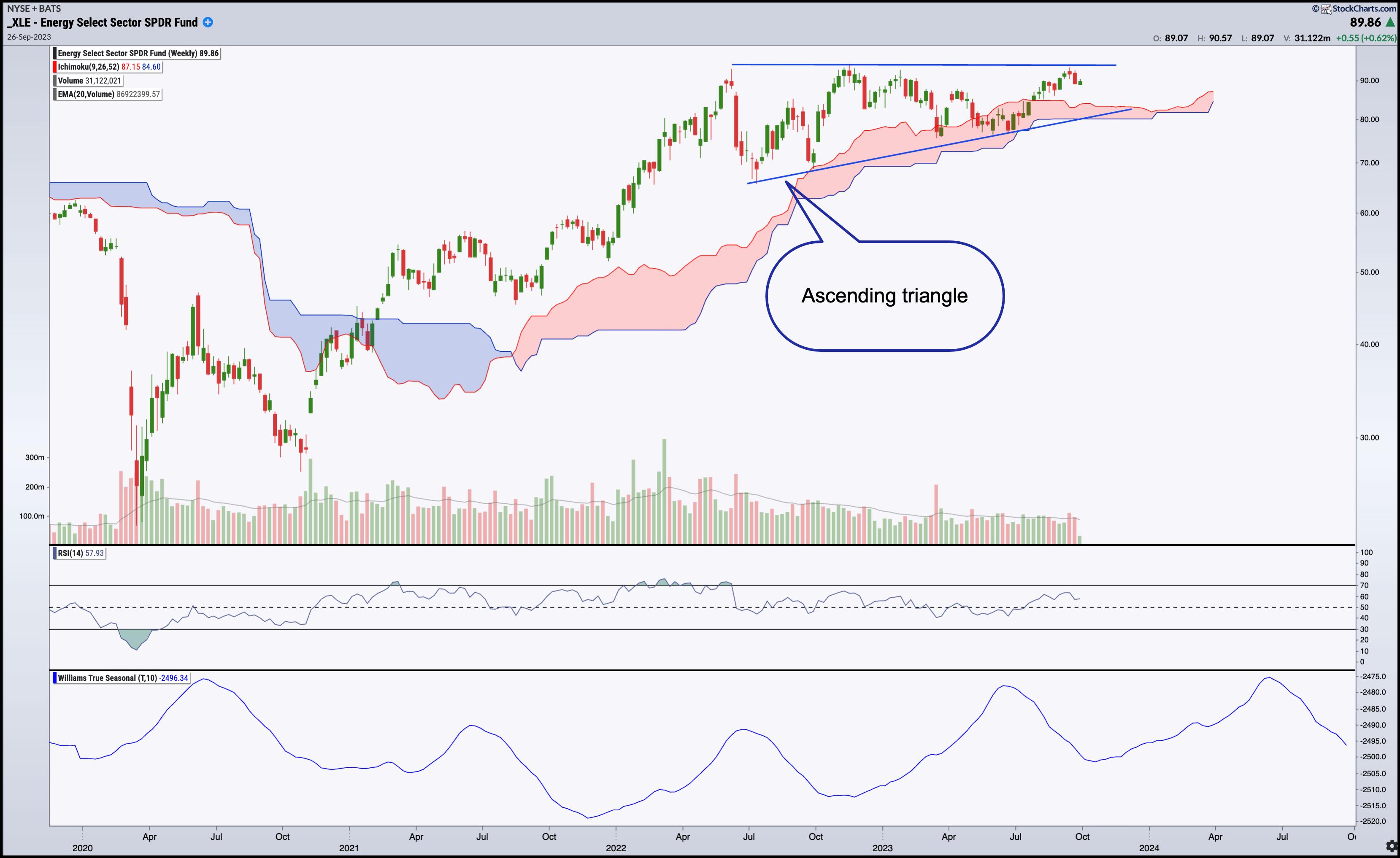
CHART 1: WEEKLY CHART OF ENERGY SELECT SECTOR SPDR FUND (XLE). A long ascending triangle, an RSI that's not in an overbought level, Williams True Seasonal indicator showing that demand for fuel could increase till summer, and an Ichimoku cloud driving higher indicates that energy stocks could rise further. Chart source: StockCharts.com. For educational purposes.
When we talk about ascending triangles, we typically refer to the pattern as it appears on the daily chart. The average ascending triangle lasts 20 days. The example above is much longer (over a year long) but it still exhibits the same market dynamics, which is bullish.
Consider the following:
- On a weekly scale (similar to what you'd find it you looked at the daily chart), XLE doesn't occupy "overbought" territory, according to the Relative Strength Index (RSI), unlike USO (which is correlated to the price of WTI crude oil futures). XLE has room to run.
- Looking at the Williams True Seasonal, XLE tends to trough toward the beginning of the year and peak in the summer, when fuel demand is at its highest.
- Plotting an Ichimoku Cloud, the Kumo, though red (meaning, bearish) and thin, is drifting upwards and serving as support.
The likelihood that XLE will break out toward the upside is high, as ascending triangles have a 17% failure rate. So, technically, you might want to wager on the upside.
But there are headwinds, not only fundamentally but technically.

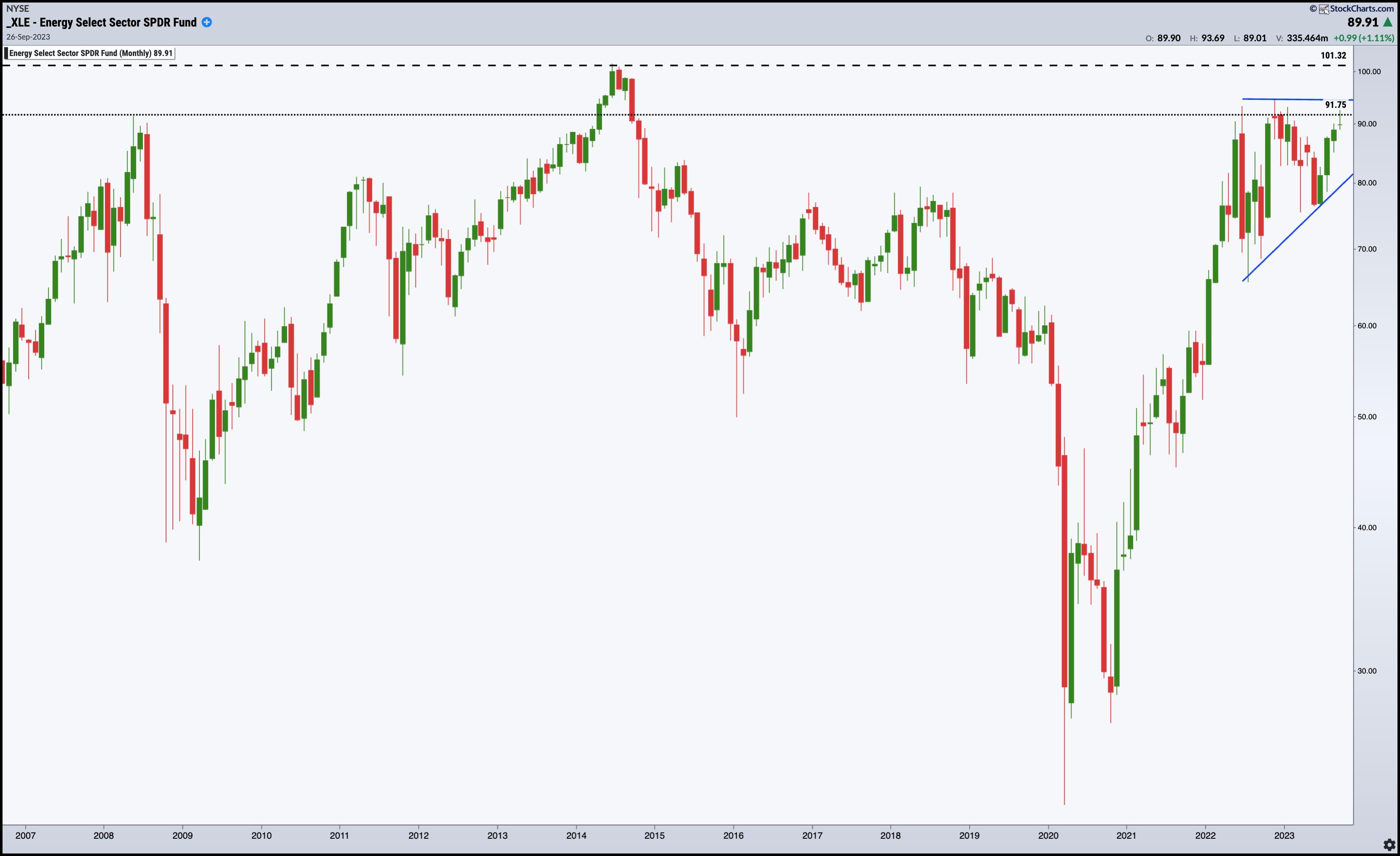
CHART 2: MONTHLY CHART OF XLE. If XLE breaks above the 2008 high, it could reach or break above its all-time high of $101.32. Chart source: StockChartsACP. For educational purposes.
Current resistance happens to coincide with the 2008 highs. And should XLE break above it, it also has to clear its all time high, reached in 2014, of 101.32. Will it break above this without a longer-term correction?
The Bottom Line
The Energy sector holds a strong 64% of analyst buy ratings, dwarfing all other sectors and flashing a bullish signal, yet analysts project a mere 10.7% price increase in the next 12 months. Thanks to OPEC+'s slash in oil production, the sector has seen a sharp surge, with attractive dividend yields on the table. But is it a siren song for investors? The Energy Select Sector SPDR Fund (XLE) shows some promising technicals, signaling room for a potential climb and a strong chance for a breakout to the upside. But it may also be treading on thin ice, facing formidable headwinds ahead.
Geopolitics holds the wild cards here. There's likely some upside in the near term. But what happens afterwards can send you into a spin. Be prepared for anything and be ready to shift direction if necessary.

Disclaimer: This blog is for educational purposes only and should not be construed as financial advice. The ideas and strategies should never be used without first assessing your own personal and financial situation, or without consulting a financial professional.
|
| READ ONLINE → |
|
|
|
| Mish's Market Minute |
| Risk-Neutral Market Gauges Ahead of Sunday Deadline |
| by Mish Schneider |

We do not want to walk down the political aisle. Nonetheless, what person can turn their heads away from the Sunday deadline on funding the government?
The aftermath of a shutdown will most likely include a credit downgrade for the US. Do Americans need another reason to distrust the politicos?
With a 90% consensus that the funding will not pass, the bounce we saw in equities last week could be short-lived.
The Retail ETF XRT had a technically perfect mean reversion in momentum and a classic glass bottom reversal. Coming into Friday, 3 of our risk gauges said risk neutral. That gave us hope that our Granny Retail could lead us out of harm's way. And, on the heels of Nike earnings, she kinda did.
However, will a bounce in the consumer sector help keep the risk gauges neutral? For that answer, we turn to another old reliable friend, high yield, high debt junk bonds.
These bonds are a key influencer for risk; after all, how bad can things be if companies with junk ratings are being bought for their higher-paying yield? That is a big risk-on factor.
We also look at their performance relative to the long bonds (TLT). Even though neutral can turn to risk-off, any hope from bond traders and/or the retail sector could also see risk-neutral turn to risk-on. We can hope, right?
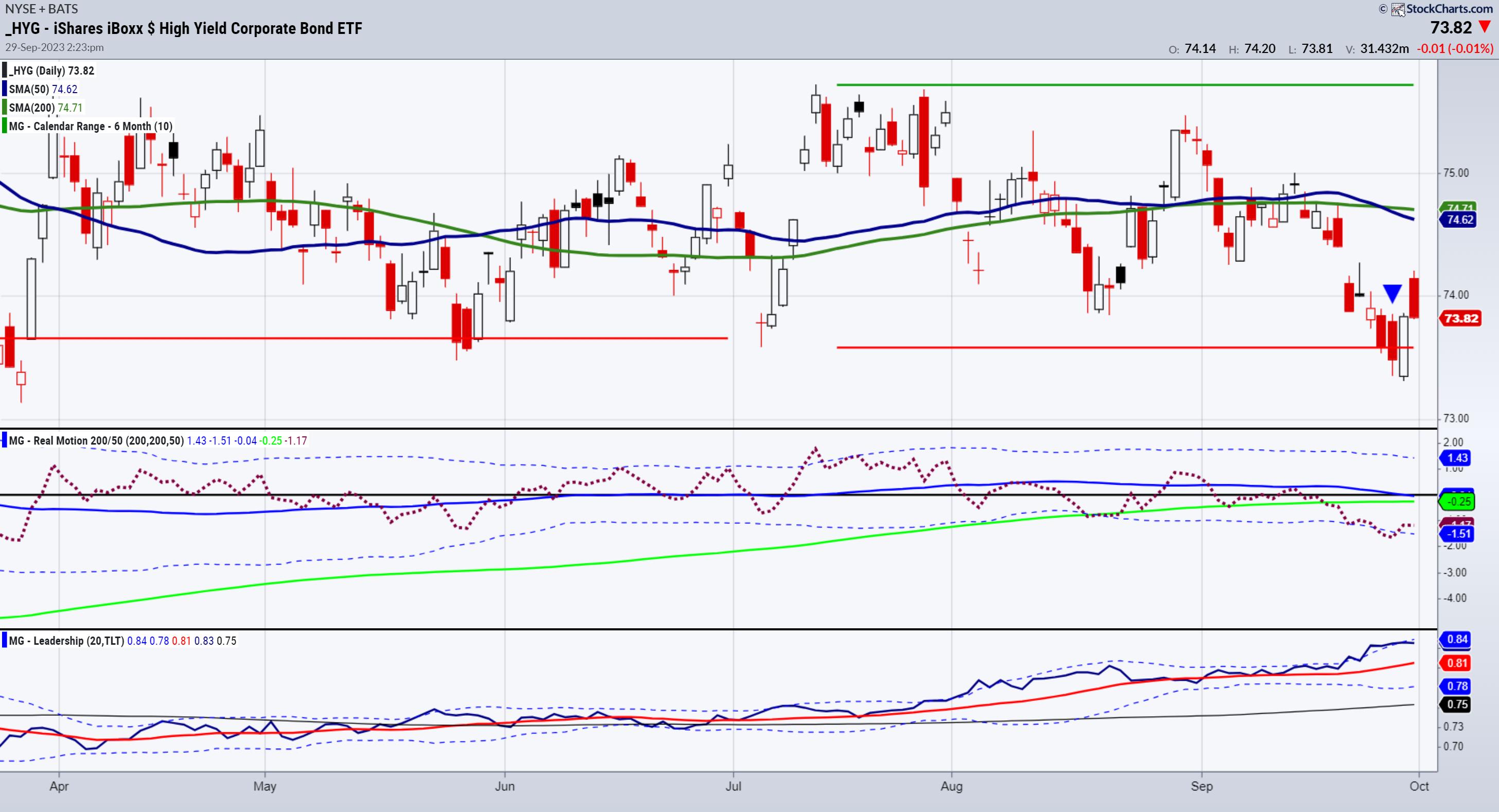
The chart of HYG has several fascinating and a somewhat taming influence on the extreme negativity. For starters, HYG held its ground on Friday as the indices turned red. (So did XRT, by the way.) Secondly, HYG returned over the July 6-month calendar range low (red horizontal line). Thirdly, HYG held the March lows made after the mini-banking crisis. Fourth, HYG had a mean reversion buy in our Real Motion momentum indicator.
Fifth, and here is the risk gauge ratio, HYG is strongly outperforming the TLT (Leadership indicator). That is what bulls need to continue to see. Conversely, bulls do not want to see HYG fail the March lows. Nor do they want to see XRT take out last week's lows. Furthermore, they do not want to see TLT catch a bid in fear of an oncoming recession while junk bonds underperform.
We like it when we can simplify the narrative. Junk bonds help us to accomplish that.
This is for educational purposes only. Trading comes with risk.
For more detailed trading information about our blended models, tools and trader education courses, contact Rob Quinn, our Chief Strategy Consultant, to learn more.
If you find it difficult to execute the MarketGauge strategies or would like to explore how we can do it for you, please email Ben Scheibe at Benny@MGAMLLC.com.

"I grew my money tree and so can you!" - Mish Schneider
Get your copy of Plant Your Money Tree: A Guide to Growing Your Wealth and a special bonus here.
Follow Mish on Twitter @marketminute for stock picks and more. Follow Mish on Instagram (mishschneider) for daily morning videos. To see updated media clips, click here.
See Mish argus investors could jump into mega-tech over value and explain why she is keeping an eye on WTI prices on BNN Bloomberg's Opening Bell.
Even as markets crumble, there are yet market opportunities to be found, as Mish discusses on Business First AM here.
Mish explains how she's preparing for the next move in Equities and Commodities in this video with Benzinga's team.
Mish talks about the head-and-shoulders top pattern for the S&P 500 in The Final Bar.
Mish covers sectors from the Economic Family, oil, and risk in this Yahoo! Finance video.
Mish shares why the most important ETFs to watch are Retailers (XRT) and Small Caps (IWM) in this appearance on the Thursday, September 20 edition of StockCharts TV's The Final Bar with David Keller, and also explains MarketGauge's latest plugin on the StockCharts ACP platform. Mish's interview begins at 19:53.
Mish covers 7 stocks that are ripe for the picking on the Wednesday, September 20 edition of StockCharts TV's Your Daily Five, and she gives you actionable levels to watch.
Take a look at this analysis of StockCharts.com's Charting Forward from Jayanthi Gopalkrishnan, which breaks down Mish's conversation with three other charting experts about the state of the market in Q3 and beyond.
Mish was interviewed by Kitco News for the article "Oil Prices Hit Nearly One-Year High as it Marches Towards $100", available to read here.
Mish covers short term trading in DAX, OIL, NASDAQ, GOLD, and GAS in this second part of her appearance on CMC Markets.
Mish talks Coinbase in this video from Business First AM!
Mish looks at some sectors from the economic family, oil, and risk in this appearance on Yahoo Finance!
Mish covers oil, gold, gas and the dollar in this CMC Markets video.
In this appearance on Business First AM, Mish explains why she's recommending TEVA, an Israeli pharmaceutical company outperforming the market-action plan.
As the stock market tries to shake off a slow summer, Mish joins Investing with IBD to explain how she avoids analysis paralysis using the six market phases and the economic modern family. This edition of the podcast takes a look at the warnings, the pockets of strength, and how to see the bigger picture.
Mish was the special guest in this edition of Traders Edge, hosted by Jim Iuorio and Bobby Iaccino!
In this Q3 edition of StockCharts TV's Charting Forward 2023, Mish joins a panel run by David Keller and featuring Julius de Kempenaer (RRG Research & StockCharts.com) and Tom Bowley (EarningsBeats). In this unstructured conversation, the group shares notes and charts to highlight what they see as important considerations in today's market environment.
Coming Up:
October 2: Schwab, The Watch List
October 4: Jim Puplava, Financial Sense
October 5: Yahoo! Finance
October 12: Dale Pinkert, F.A.C.E.
October 26: Schwab at the NYSE
October 27: Live in-studio with Charles Payne, Fox Business
October 29-31: The Money Show
Weekly: Business First AM, CMC Markets
ETF Summary
- S&P 500 (SPY): There are multiple timeframe support levels round 420-415.
- Russell 2000 (IWM): 170 huge.
- Dow (DIA): 334 pivotal.
- Nasdaq (QQQ): 330 possible if can't get back above 365.
- Regional banks (KRE): 39.80 the July calendar range low.
- Semiconductors (SMH): 133 the 200-DMA with 147 pivotal resistance.
- Transportation (IYT): Could be another bright spot if clears 237. 225 support.
- Biotechnology (IBB): 120-125 range.
- Retail (XRT): 57 key support; if can climb over 63, get bullish.
Mish Schneider
MarketGauge.com
Director of Trading Research and Education
|
| READ ONLINE → |
|
|
|
| MORE ARTICLES → |
|
 Chart 1
 Chart 2
 Chart 3
 Chart 4

