| THIS WEEK'S ARTICLES |
|
|
| The Mindful Investor |
| Why is S&P 4400 So Important Right Now? |
| by David Keller |
Right around the turn of the 20th century, financial pioneer Charles Dow developed a very simple and straightforward way to determine the trend in any market, one I've mentioned on The Final Bar more times than I can count. Namely, an uptrend is a pattern of higher highs and higher lows.
So as the S&P 500 finishes this week just barely above the crucial 4400 level, propelling our main equity benchmark to a new swing high, I definitely took notice. So what makes this level so meaningful, and what else would we need to see to validate this breakout?
Higher Highs Are Bullish
As legendary technical analyst Paul Montgomery used to say, "the most bullish thing the market can do is go up." We can debate potentially bearish macroeconomic factors, such as elevated interest rates, a somewhat still hawkish Fed, and an escalating situation in the Middle East, but the equity markets remain resilient regardless. And given the choice of following bearish macro themes or rising stock prices, I'll go with rising stock prices any day!
But instead of just taking a cursory glance at the chart to assess trend direction, Charles Dow gave things a little more structure by focusing on the peaks and valleys in the price action. A market is bullish if it makes new swing highs, and subsequent pullbacks do not eclipse the previous low. Higher highs and higher lows are bullish.
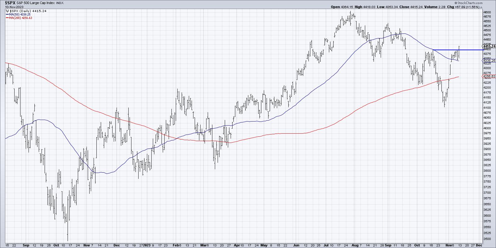
So the S&P 4400 is a key level in our assessment because a move above this level would mean a new swing high for the first time since July. And that would suggest that bulls may be finally regaining control of this languishing market for stocks.
Now Presenting the "Stoplight Technique"
Technical analysis is essentially a set of data visualization techniques to illustrate investor behavior. And when a chart is hovering between a key resistance level like 4400 and a major support level like 4200, we can use a "stoplight technique" to better visualize where the price sits between these two crucial levels.
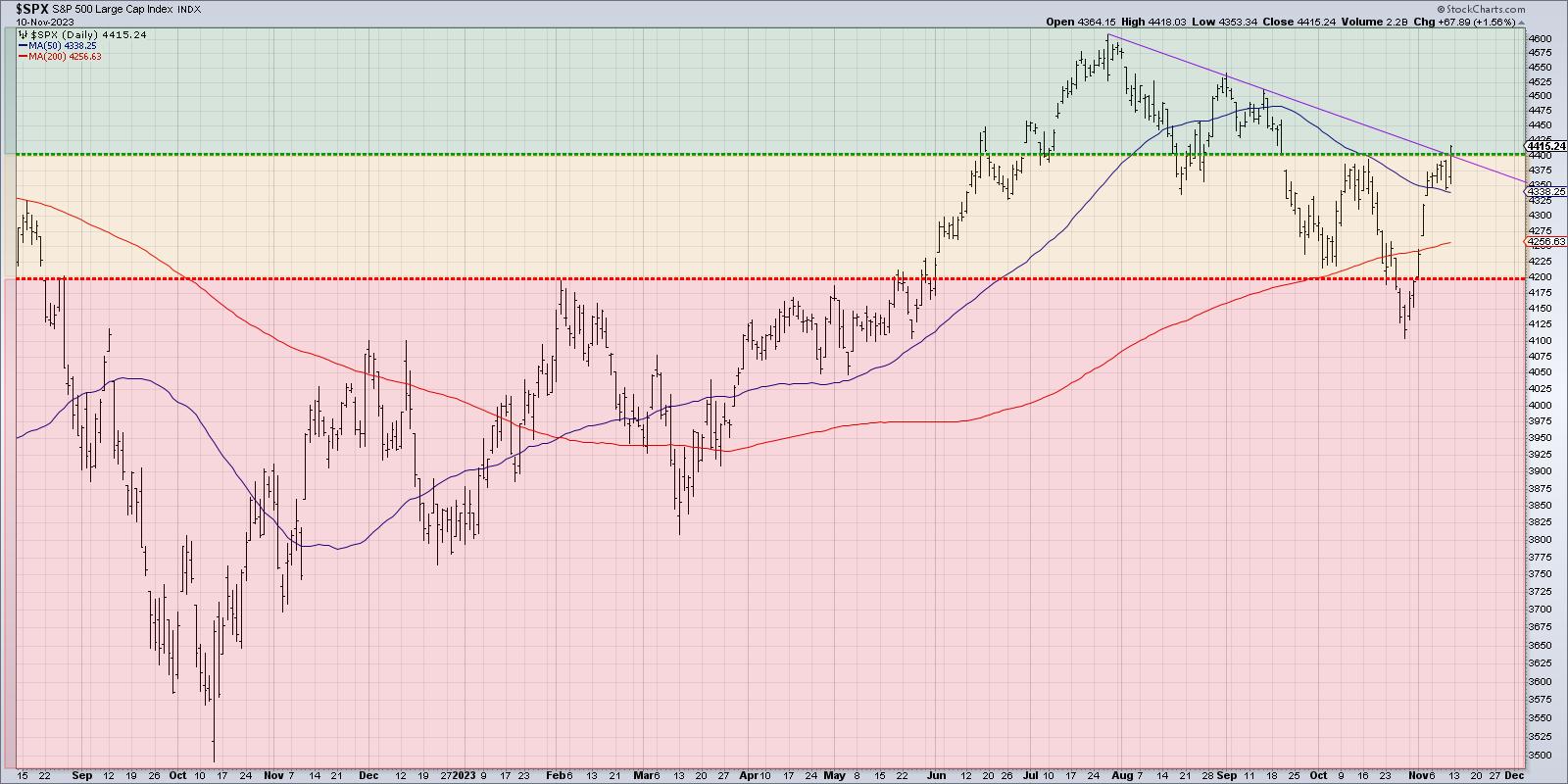
You can see from this chart that 4400 is not only meaningful because it represents a new swing high, but because it also would take the S&P 500 above a trendline using the highs in July, August, and September. So a validated breakout (see the section below!) would take the SPX out of the neutral yellow area and into the bullish green region.
On the other hand, a break below 4200 would take the S&P into the bearish red area. This would mean the price would have broken back below the 200-day moving average, and suggest a retest of the late October low around 4100. One of my mentors used to say, "All large losses begin as small losses." So the biggest concern after a break below 4200 is that the downside objective could end up being much, much lower!
It's All About the Follow-Through
With Friday's strong upside day, the S&P 500 ended the week around 4415. So why aren't we signaling an "all clear" bullish sign for stocks?
I think of any technical signal as occurring in three distinct steps: the setup, the trigger, and the confirmation. The setup is where you see a pattern emerging, in this case the market approaching a retest of the October swing high around 4400. The trigger occurred on Friday's close, where the price actually closed above this crucial resistance level. Now it's all about the confirmation, which means some sort of follow-through to validate the buy signal.
Some technical analysts would look for a move of a certain percentage above the key level, or a higher close the next day, or even just a higher intraday high. I tend to look for an additional close in the direction of the breakout, showing that additional buyers have come in and are willing to pay even more for the particular asset.
In other words, we are looking for the price to move not just to resistance but through resistance.
When the market reopens on Monday, I'll be looking for additional upside for the S&P 500 to complete the bullish rotation above 4400. I'm encouraged by the fact that the Nasdaq 100 has already made a breakout move to the upside, yet I'm discouraged by a bearish interest rate environment, a hawkish Fed, and the fact that strong performance still seems fairly focused in a couple of growthy sectors.
But at the end of the day, the market doesn't care what we think. The market is always right. And if prices are going higher, I want to be bullish!
RR#6,
Dave
P.S. Ready to upgrade your investment process? Check out my free behavioral investing course!
David Keller, CMT
Chief Market Strategist
StockCharts.com
Disclaimer: This blog is for educational purposes only and should not be construed as financial advice. The ideas and strategies should never be used without first assessing your own personal and financial situation, or without consulting a financial professional.
The author does not have a position in mentioned securities at the time of publication. Any opinions expressed herein are solely those of the author and do not in any way represent the views or opinions of any other person or entity.
|
| READ ONLINE → |
|
|
|
| Art's Charts |
| Skip the Noise and Focus on the Signal by Effectively Using the 200-day SMA |
| by Arthur Hill |
The S&P 500 is battling the 200-day SMA with four crosses over the last eleven days. We are also seeing a rise in volatility as this market benchmark plunged 5.86% in nine days (18-27 October) and then surged 5.85% the last five days. With such conditions, it is a good time to step back and look for ways to filter the noise. Today's report will show a technique and quantify the signals with a back test. Read to the end for an offer to access the extended version of this report.
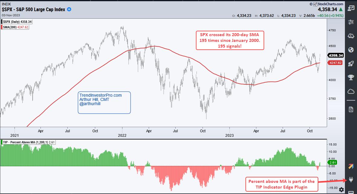
The chart below shows the S&P 500 with the 200-day SMA (red line) and the Percent above MA (1,200) indicator. This indicator shows the percentage difference between the close and the 200-day. It turns green when SPX crosses above the 200-day SMA and red when it crosses below. SPX crossed its 200-day SMA 195 times since January 2000. Anyone trading such a signal would experience lots of whipsaws and relatively small returns.
As the table below shows, there were 93 trades since January 2000. This means there were over 180 crosses of the 200-day moving average. Buy-and-hold for the S&P 500 generated a 4.66% Compound Annual Return with a 56.73% Maximum Drawdown. In contrast, trading the 200-day cross returned 3.65% with a Maximum Drawdown of 21.31%. This moving average cross strategy reduced the drawdown, but the whipsaws ate into the returns.

Chartists can improve performance by adding a filter. The next image shows the Percent above MA indicator with a 3% filter. This means the S&P 500 must be at least 3% above its 200-day SMA to generate a buy signal and 3% below its 200-day SMA for a sell signal. This strategy turned bullish on January 31st and remains bullish. The 5-day SMA was 2.9% below the 200-day SMA on October 27th and did not trigger a sell signal. According to this measure, the S&P 500 is still in a long-term uptrend.
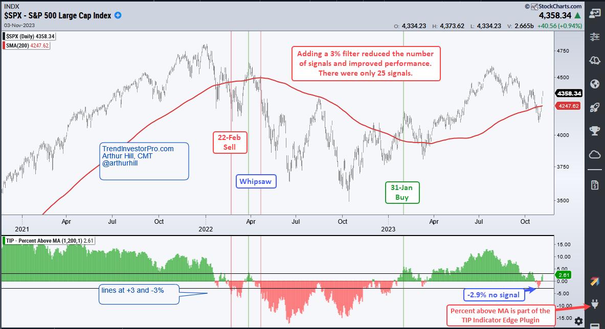
This simple filter seriously reduced the number of whipsaws because there were only 13 trades. The table below also shows a much improved performance. Compound Annual Return improved to 6% and the Maximum Drawdown dropped to 21.31%. The Win Rate more than tripled with an increase from 25% to 77%.

The S&P 500 is the most widely followed benchmark for US stocks and the 200-day SMA is the most popular long-term moving average. Perhaps the 200-day SMA works well for the S&P 500 because some many traders, investors and institutions watch it. While it may be a self-fulfilling prophecy, it is important to know the status of the S&P 500 because this is the single most important barometer for US stocks. In general, positive outcomes are more likely when the S&P 500 is above its 200-day SMA and negative outcomes are more likely when the index is below its 200-day.
Can we improve performance even more? How do the Nasdaq 100, S&P MidCap 400 and Russell 2000 perform with long-term timing? This report continues for subscribers to TrendInvestorPro. Look for the update on Sunday. We will take smoothing one step further and then test the results for the major stock indexes. This report includes expanded performance metrics and chart signal examples. Click here for more information.
///////////////////////////////////////
|
| READ ONLINE → |
|
|
|
| Martin Pring's Market Roundup |
| Benchmarks that Will Tell Us this Market Has Legs |
| by Martin Pring |
A couple of weeks ago, I wrote an upbeat article on the market, pointing out the fact that many short- and intermediate-term indicators were in a potentially bullish position at a time when stocks seemed impervious to bad news. I concluded "That does not mean the market will go straight up..... What it does imply, though, is that US equities are in an important buy zone going into a bullish end-of-year seasonal."
I also pointed out that a major problem would arise in the event the S&P dropped below its 12-month MA, at around 4,200, because that would confirm some weak action by the long-term KST. The 12-month span is not perfect, but it does test consistently better than most other primary trend moving averages. I stated that I did not expect such a scenario, given the position of the indicators at the time and the market's apparent resiliency to bad news. I was wrong, because October's selloff resulted in a marginal negative crossover. Since it requires a month-end close for a monthly plot, the Index is still technically below the average, though with a 4,365 Monday close it is back above it.
Obviously, we do not know where the S&P will close until the end of November. However, the position of the indicators is such that a positive re-cross seems very likely. Let's first review some of them, and then see what benchmarks need to be achieved to give us confidence the MA will be regained at the end of November.
Oversold and Bullish Indicators
Chart 1 features a 10-day MA of the NYSE Common Stock McClellan Volume Oscillator. The arrows tell us when the indicator reverses to the upside from a position below the horizontal dashed-green oversold line. In the vast majority of situations, a rally lasting more than 4 weeks typically materializes.
The indicator triggered a buy signal in early October, which was followed by a small rally and a marginal new low for the NYSE Composite (NYA) at the end of the month. However, this action enabled the oscillator to set up a second positive divergence with the Index. We need the Index to respond with a trend break of its own, but I will get to that later, except to say that positive divergences are rare for this series, so two potential divergences are far more scarce.
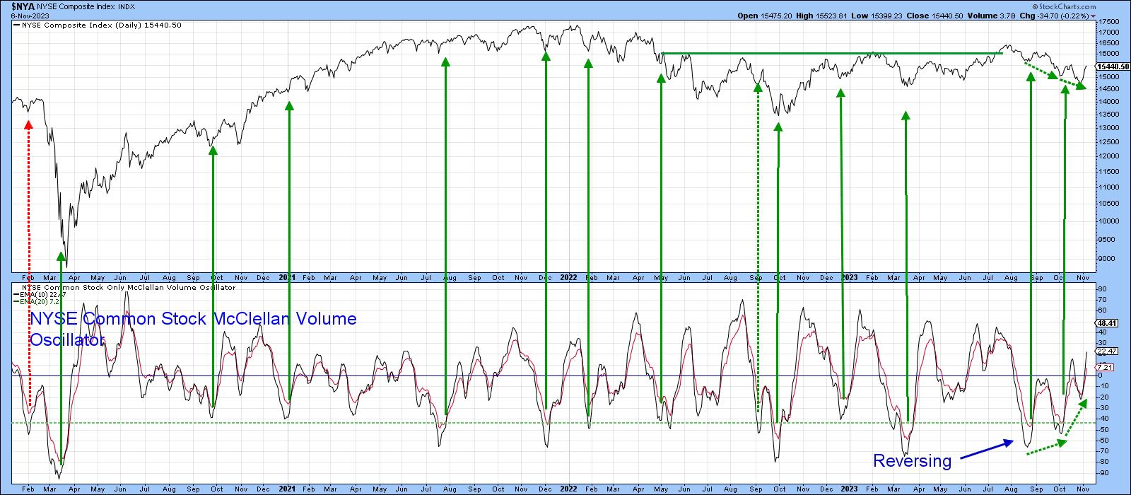 Chart 1 Chart 1
The 9-day Money Flow Indicator (MFI) has also diverged positively with the Index, having bounced sharply in the last few days. Previous examples have been flagged with green dashed arrows. All were followed by a short-term rally, greater in size than we have seen so far from the one, which in itself suggests more upside potential.
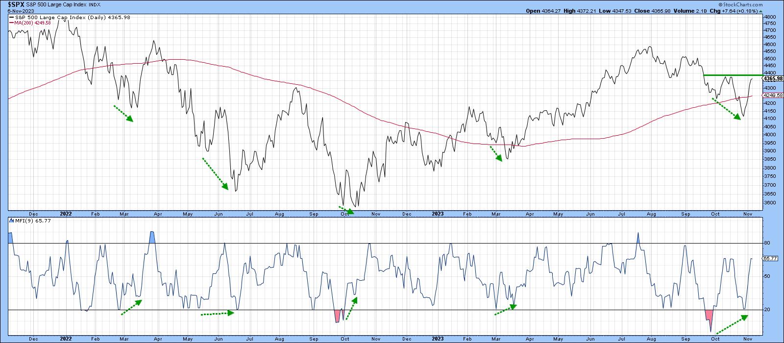 Chart 2 Chart 2
Another indicator I find useful is a daily KST applied to the $VIX. It is featured in Chart 3, where the arrows flag downside reversals that take place at or above the green "worry" line. Green ones indicate valid signals, red false positives. Another buy signal has been triggered, which again suggests higher prices will follow.
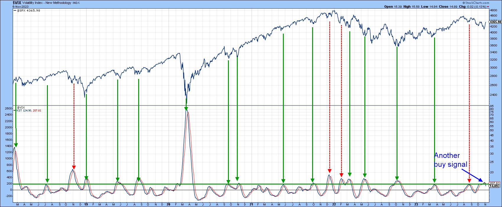 Chart 3 Chart 3
Chart 4 features a diffusion indicator that monitors the percentage of the DJIA components in a positive trend. It goes bullish when it reverses from the oversold zone. There have seen fifteen signals since 2018. The dashed arrows highlight the three disappointing buy signals, but the vast majority were successful. That places high odds that the market will move higher in the coming weeks, especially as the most recent low in the Dow was not confirmed by the oscillator.
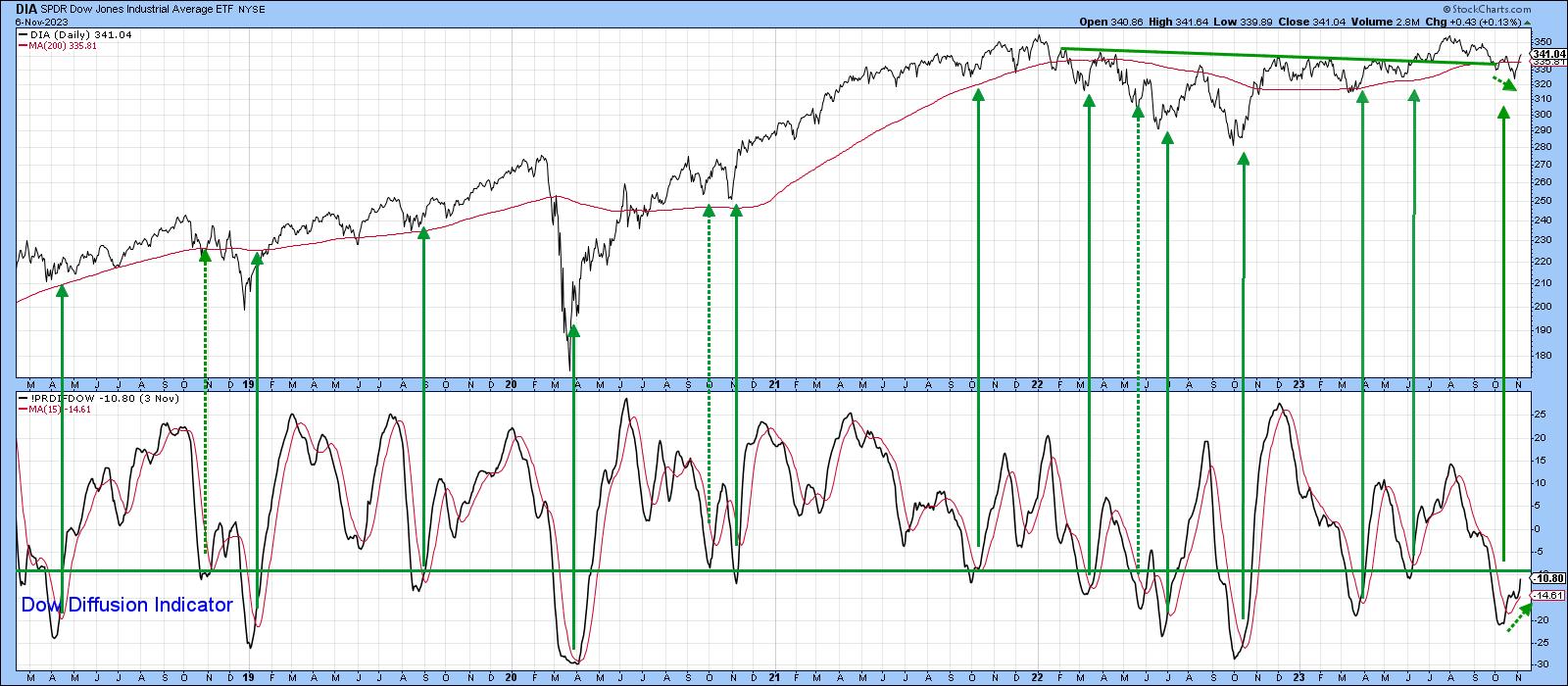 Chart 4 Chart 4
Finally, Chart 5 compares the NASDAQ Composite to an indicator that divides the number of NASDAQ stocks above their 200-day MA by that for the 50-day MA. It triggers buy signals when the market is sufficiently oversold, in order to permit the number of stocks north of the 50-day to be three or more times the slower turning 200-day MA series. When this number peaks, a buy signal is triggered. Once again, the green arrows indicate positive buy signals, and the two red ones false positives. October saw the indicator go positive for equities once again.
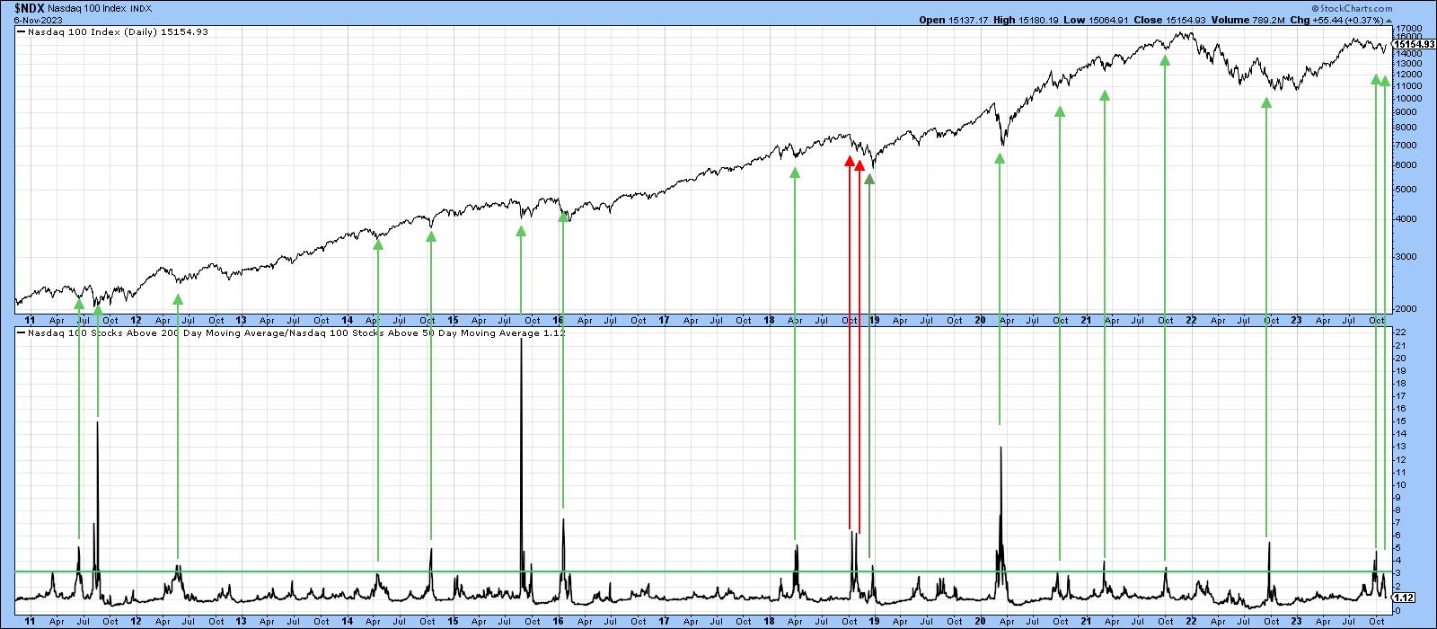 Chart 5 Chart 5
The Trend
We can see from the charts above that the short technical picture is very constructive and able to support a nice year-end rally. However, we need some evidence that suggests recent strength is more than a reflexive rally, which a crossover of the 12-month MA would confirm. That's why it's a good idea to examine the short-term trend aspect in order to have more confidence the S&P will still be above its 12-month MA at the end of the month.
Chart 6 sets the scene for the NYSE and S&P Composites, as well as the MSCI World ETF. The latter two have already regained their 200-day MAs, but all three face resistance in the form of their mid-October highs and August-November downtrend lines. The NYA has the biggest challenge, since that same resistance is also in the area of the 50- and 200-day averages, the highest of which is the 200-day span at 15,575. It seems to me that, if the NYA can break and hold above that level, this would be sufficient upside momentum from which to project a month-end crossover of the S& P 12-month MA, and therefore clearance to a test of the bull market high.
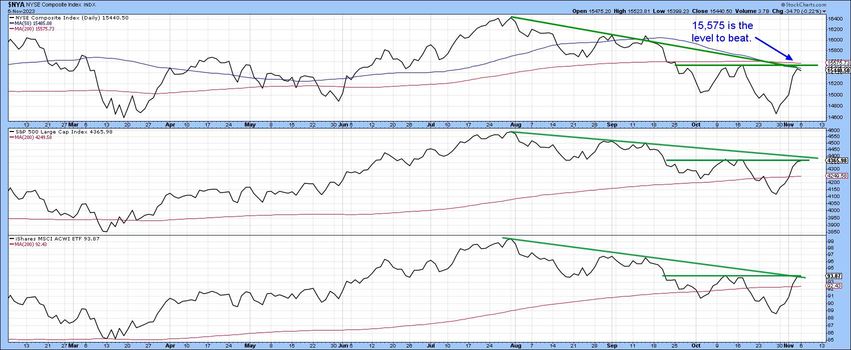 Chart 6 Chart 6
Good luck and good charting,
Martin J. Pring
The views expressed in this article are those of the author and do not necessarily reflect the position or opinion of Pring Turner Capital Group of Walnut Creek or its affiliates.
|
| READ ONLINE → |
|
|
|
|
|
| ChartWatchers |
| Stock Market Still Has Legs, Bitcoin Sees a Breakthrough Rally: Is the Market On the Mend? |
| by Jayanthi Gopalakrishnan |

It was quite the week in the stock market.
Things started out well, with the broader market indexes rallying higher. By Thursday, investors were gearing up for the S&P 500 index ($SPX) to notch a nine-day winning streak. Alas, that didn't happen, and instead the index gave up all its weekly gains.
The Nasdaq Composite ($COMPQ) also snapped its winning streak. But Friday saw the stock market regain strength, with the S&P 500 and Nasdaq Composite closing above their previous highs. The Nasdaq saw its best trading day since May.
If you look beneath the surface of this week's action, you can see that market breadth was weak earlier on, but, by Friday, showed slight improvement (see chart below). However, it was still not at a level that would confirm the bullish move in the broader indexes.
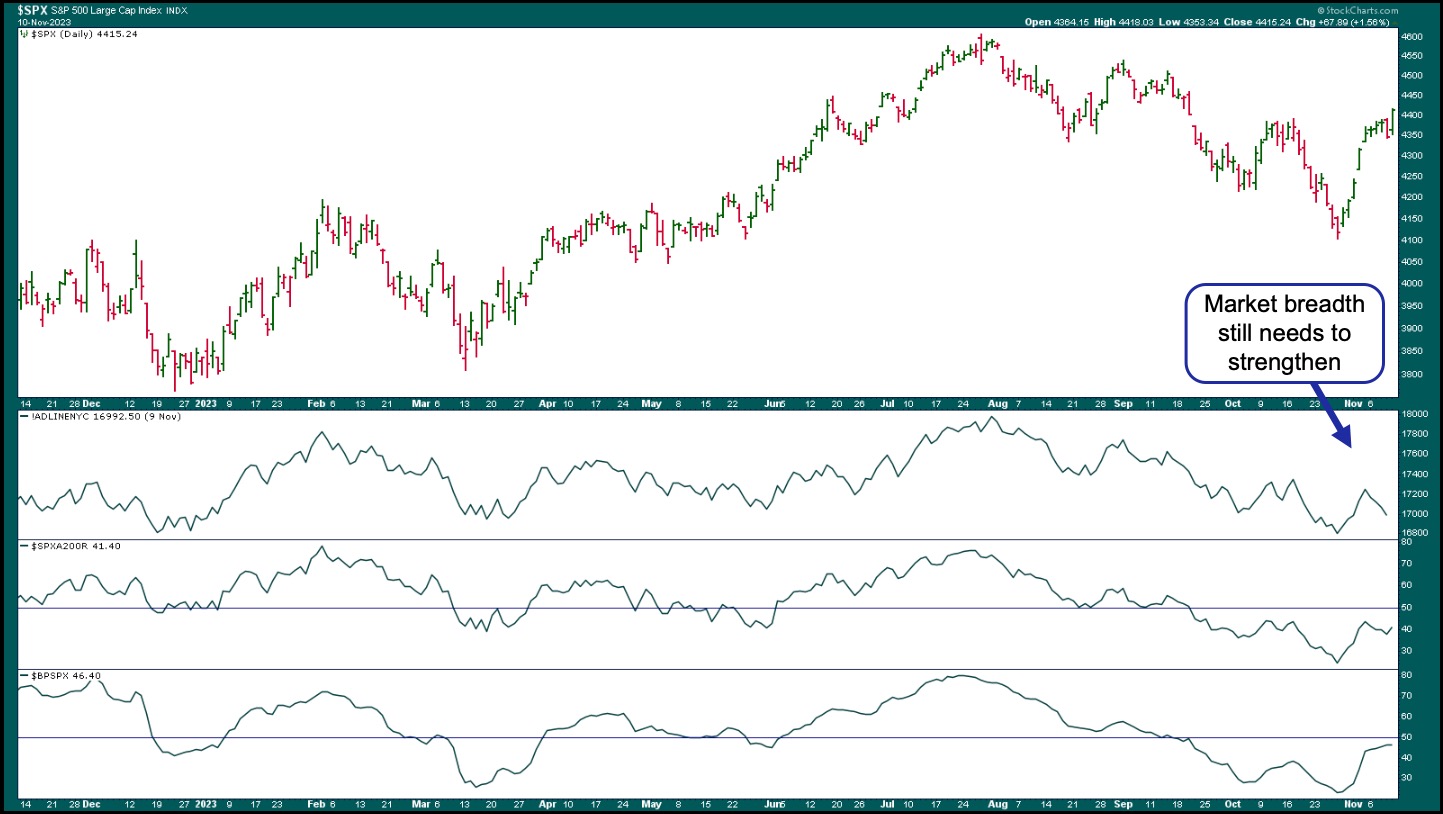
CHART 1: S&P 500 RALLIES, BUT BREADTH NEEDS TO CATCH UP. Although the S&P 500 closed above its previous high, breadth is still weak. Watch the advances-declines, percentage of stocks trading above the 200-day moving average, and bullish percent index. Chart source: StockCharts.com. For educational purposes.
The NYSE Common Stock Advance-Decline Issues ($NYAD) is still trending lower, the percentage of stocks above their 200-day moving average shows slight improvement, and the S&P 500 Bullish Percent Index is getting close to the 50-level threshold.
Small- and mid-cap stocks, which couldn't hold on to their short-lived up moves, gained a little strength, but not enough to confirm a broad market rally. Materials, Consumer Staples, Health Care, and Energy are still weak. If those areas start showing strength, it would be much more optimistic.
What About Bonds?
Fed Chairman Powell's comments this week suggested that more work needs to be done to lower inflation. His more hawkish tone could have been the main reason the market fell on Thursday. Another reason was the weak Treasury auction, indicating that demand for US Treasuries has weakened in the US and abroad.
Treasury yields are a major focus among investors, so it's natural to focus on the 10-year Treasury yield chart. After rallying close to 5%, the 10-Year US Treasury Yield Index ($TNX) pulled back, tested the 4.5% level, and reversed (see chart below). It's now trading at its 50-day moving average.
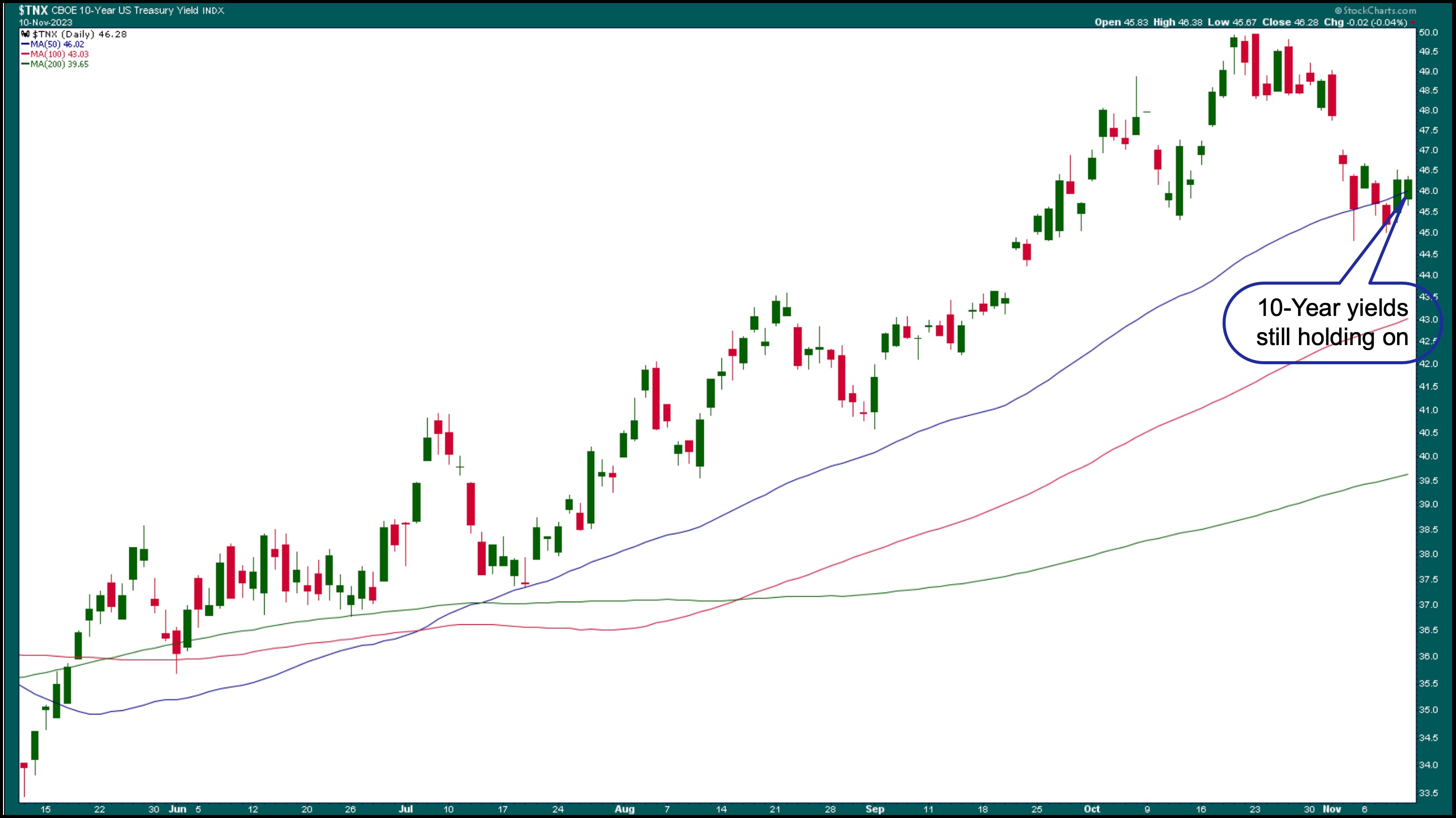
CHART 2: THE 10-YEAR TREASURY YIELDS AT 50-DAY MOVING AVERAGE. The 10-year yields tested 4.5% and reversed. Chart source: StockCharts.com. For educational purposes.
Rising yields tend to instill fear among investors, especially in the Tech sector. So, when yields pulled back, investors gravitated towards the larger, safer big tech stocks. But remember, fear can flip the stock market on a dime, and we're seeing a lot of flip-flopping going on in the stock market right now.
And Let's Not Forget Bitcoin
No discussion of this week's stock market would be complete without touching on Bitcoin. The daily chart of $BTCUSD below shows a dramatic rise in the cryptocurrency. 37,000 is considered a significant threshold, so a close above this level could mean more bullish movement. As of now, Bitcoin is not correlated to any other asset, which makes it a potential asset for diversification.
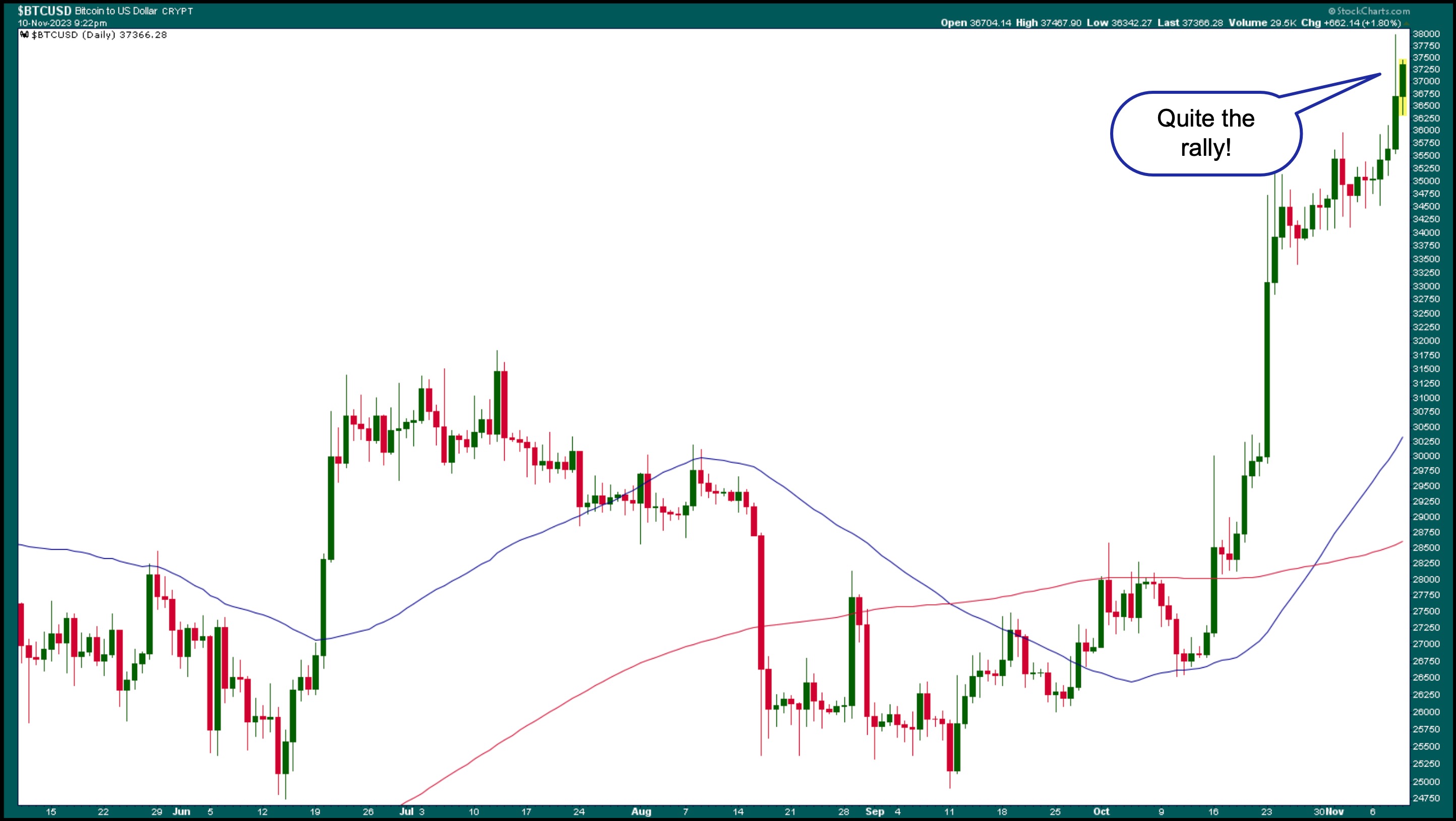
CHART 3: DAILY CHART OF BITCOIN TO US DOLLAR. Bitcoin rallied and ended the week higher than the 37,000 threshold level. Where to next? Chart source: StockCharts.com. for educational purposes.
So, what was behind the massive move in Bitcoin? The catalyst could be the hope that regulators would approve a spot Bitcoin exchange-traded fund. But with any fast move up, you want to identify how far it could keep moving higher. Looking at a weekly chart, the next possible resistance level would be at the 47,000 level, which is quite a bit higher than where Bitcoin is trading.
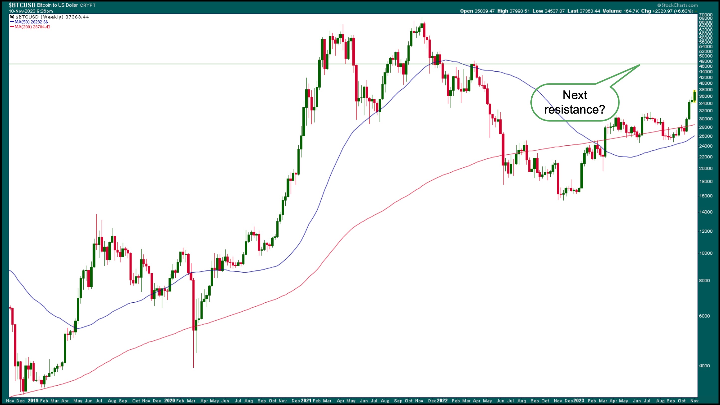
CHART 4: WEEKLY CHART OF BITCOIN TO US DOLLAR. Looking at the weekly chart, the next possible resistance level for the cryptocurrency could be around the 47,000 level. Chart source: StockCharts.com. For educational purposes.
What's On Deck?
Next week, investors will find out October's inflation CPI and PPI numbers. These data points have had an impact on the stock market's direction. Hotter-than-expected inflation numbers usually cause a selloff in equities. In an environment where investors are unsettled, not knowing whether the Fed will raise rates at least one more time, it's not unusual to see wild swings in either direction. But generally, investors aren't fearful, as can be seen in the chart of the CBOE Volatility Index ($VIX).
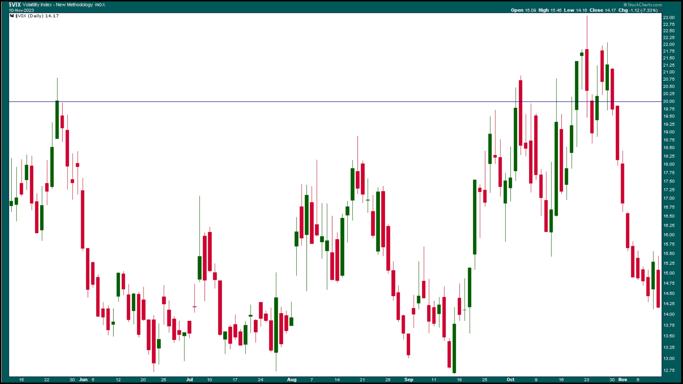
CHART 5: VIX KEEPS GOING LOWER. Investors aren't showing any signs of fear in spite of the indecisiveness. Chart source: StockCharts.com. For educational purposes.
Anything can bring back investor nervousness, but until that happens, it may be safe to reenter the market with small positions and be prepared to offload them if signs of fear resurface.
End-of-Week Wrap-Up

US equity indexes up; volatility down
- $SPX up 1.56% at 4415.24, $INDU up 1.15% at 34283.10; $COMPQ up 2.05% at 13798.11
- $VIX down 7.33% at 14.17
- Best performing sector for the week: Technology
- Worst performing sector for the week: Energy
- Top 5 Large Cap SCTR stocks: Vertiv Holdings, LLC (VRT); Palantir Technologies, Inc. (PLTR); Applovin Corp. (APP); New Oriental Education & Technology Group, Inc. (EDU); Super Micro Computer, Inc. (SMCI)
On the Radar Next Week
- October CPI
- Fed speeches
- October PPI
- October Retail Sales
- October Housing Starts
Disclaimer: This blog is for educational purposes only and should not be construed as financial advice. The ideas and strategies should never be used without first assessing your own personal and financial situation, or without consulting a financial professional.
|
| READ ONLINE → |
|
|
|
| The MEM Edge |
| Nasdaq's Leadership Is Clear - Here's What Needs to Happen for Further Upside |
| by Mary Ellen McGonagle |
On Friday, the Nasdaq Composite posted its best day in more than five months, with a 2% rally that pushed this Index further into an uptrend. The S&P 500 had a good day as well, with all eleven sectors advancing higher. The sharp advance was led by a pronounced move into Growth stocks led by the Magnificent Seven, which each outperformed the broader markets. The growth-heavy Technology sector was the top-performing, followed by Communication Services and Consumer Discretionary.
As you may know, growth stocks are highly sensitive to interest rates, as they fare poorly in a rising rate environment due to the value of their future earnings being reduced. Last week, we saw interest rates pull back early on and remain steady. This was despite hawkish comments from Fed Chair Powell on Thursday that followed similar remarks from several Fed Governors this week. Below is a chart of the S&P 500 Index, with the yield on the 10-year Treasury bond overlaid on top.
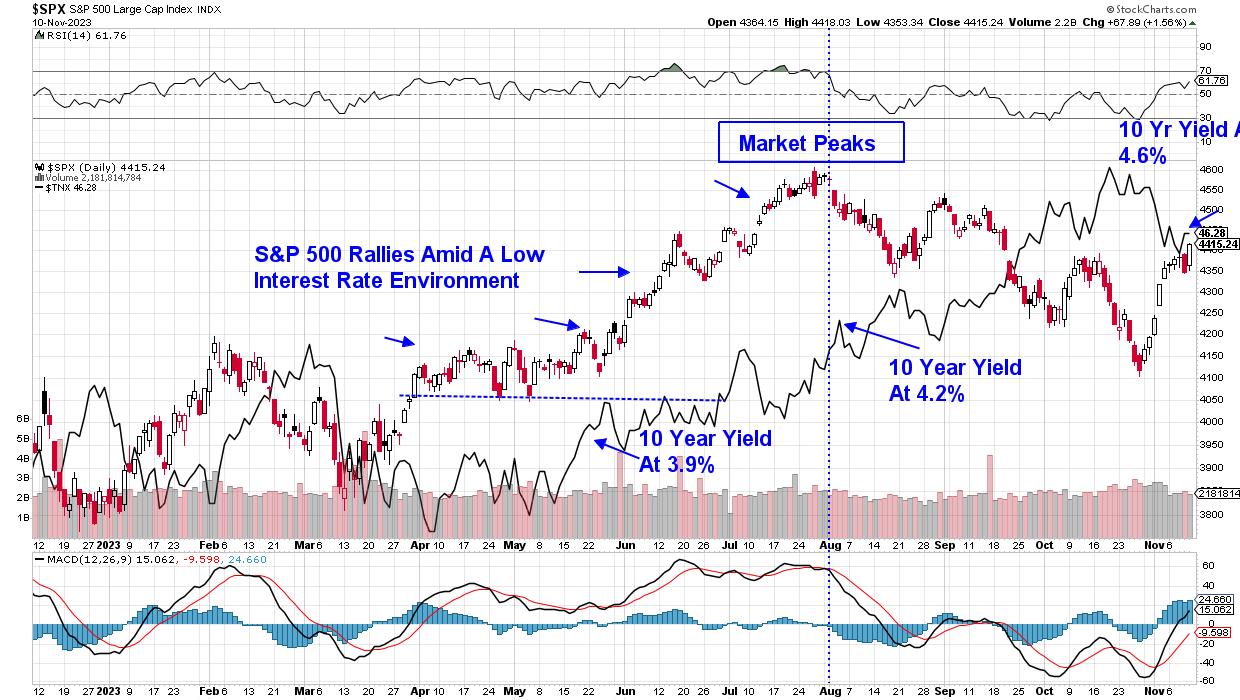 Daily Chart of S&P 500 with 10-Year Treasury Yield Daily Chart of S&P 500 with 10-Year Treasury Yield
Of note on the chart above is that the market's May-into-late-July rally took place when the yield on the 10-year Treasury was in the 3.9%-4.2% range. We're not quite in that sweet spot range at this time, but last week's stabilization of rates, despite Fed comments that point to the possibility of a higher-for-longer rate policy, was constructive. You'll want to keep a close eye on yields before jumping totally into these markets.
In addition to lower interest rates, another key to a prolonged uptrend in the markets will be broader participation beyond the Magnificent Seven and other Technology stocks. Below is a chart of the equal-weighted S&P 500 Index, with the Vanguard Growth ETF (VUG) overlaid on top.
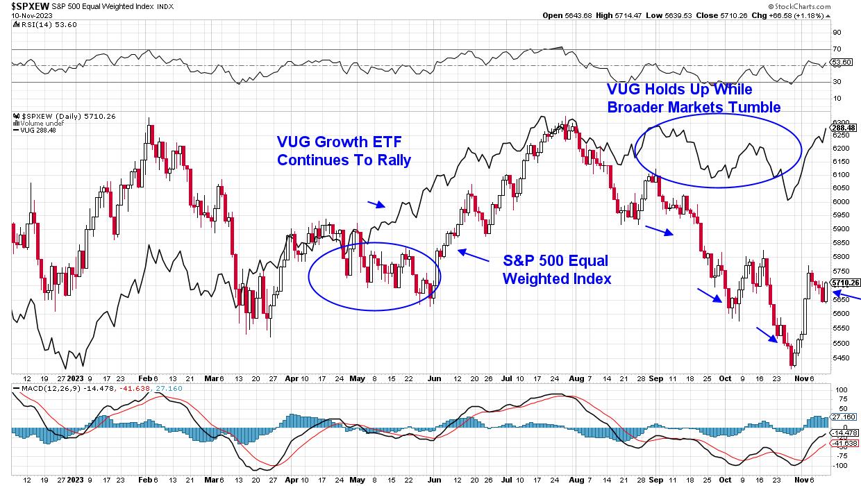 Equal-Weighted S&P 500 Index with Vanguard Growth ETF Equal-Weighted S&P 500 Index with Vanguard Growth ETF
As you can see, the May-into-late-July rally this year was given a considerable boost by a broadening out into other areas, as can be seen by the uptrend in the equal-weighted S&P 500. Gains in Industrials (XLI), Basic Materials (XLB), and Energy (XLE) sectors -- to name just a few areas -- created a firmer footing beyond just Growth. Last week, the equal-weight S&P 500 fell 0.6%.
While last week's rally in the markets keeps the near-term uptrend in place, I'm on the lookout for further confirmation that this uptrend has legs. Next week, key inflation data will be released, with core CPI and PPI reports due. Any hints of an increase will not be good for the markets. That said, there are clear-cut, long-term winners that have revealed themselves over the past 3 weeks, and venturing into them makes sense. If you'd like to be alerted to these stocks, as well as to any long-term bullish sentiment shift for the markets, use this link here to take a trial of my twice-weekly MEM Edge Report.
Warmly,
Mary Ellen McGonagle
MEM Investment Research
|
| READ ONLINE → |
|
|
|
| Wyckoff Power Charting |
| Bonds Got Clipped. Now What? |
| by Bruce Fraser |
 Last week's sharp upward reversal in the bond market followed the FOMC Interest Rate decision. A decision to not change the Fed Funds Interest Rate target. Unlike the prior meeting ‘non-action', this decision inspired robust bond and stock buying by the investment community. The downward stride of bond prices this year has been punishing to bond portfolio valuations. The regional bank crisis in the spring of this year dramatically illustrated the problem. Bond prices calmed into the beginning of summer, but trouble heated up again with the start of a new downward leg of the bond bear market. Was there a warning that a new downtrend was starting, and how far down could bond prices fall? Last week's sharp upward reversal in the bond market followed the FOMC Interest Rate decision. A decision to not change the Fed Funds Interest Rate target. Unlike the prior meeting ‘non-action', this decision inspired robust bond and stock buying by the investment community. The downward stride of bond prices this year has been punishing to bond portfolio valuations. The regional bank crisis in the spring of this year dramatically illustrated the problem. Bond prices calmed into the beginning of summer, but trouble heated up again with the start of a new downward leg of the bond bear market. Was there a warning that a new downtrend was starting, and how far down could bond prices fall?
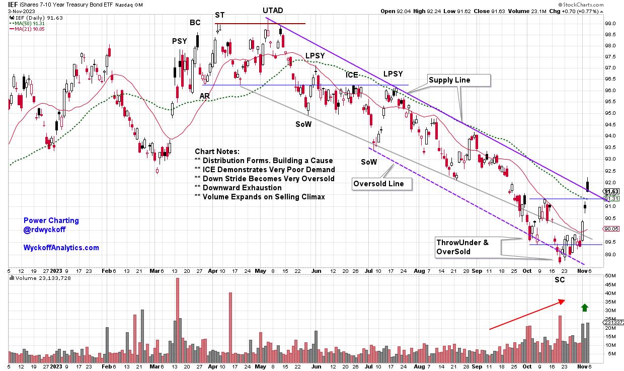
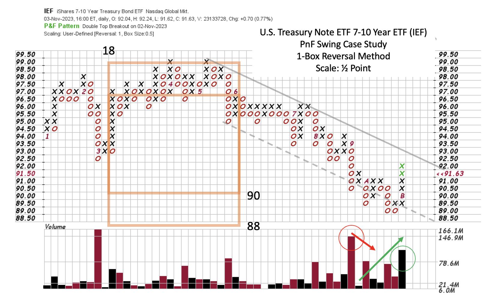
For this trend study we turn to the iShares U.S. Treasury Bond 7-10 Year ETF (IEF). Treasuries rallied following the trouble in the banking sector in March. Essentially in the 2nd Quarter of '23 a new wave of Distribution formed preparing the way for a future downward trend for bond prices. In the month of June Distribution was nearly complete as demonstrated by a very flat price structure below key Support, with no ability for price to lift. Wyckoffians call this ICE when it develops following Distribution. The Supply Trendline established the likely pace of the emerging downward stride. Once a downtrend kicks off it must be respected for the force of nature it is.

iShares U.S. Treasury Bond 7-10 Year ETF (IEF)
Chart Notes:
- Following the Regional Banking trouble bonds try to rally. Re-Distribution Follows
- UTAD & SoW decline is a warning of the presence of large supply
- LPSY & ICE indicate very weak demand, a sign of the downward stride
- PnF studies can now estimate the extent of the price potential
- Exhaustion of the trend is signaled by ThrowUnder with accompanied Climactic volume
- Confirmation of the Selling Climax is the high volume jump out of the downward channel

iShares U.S. Treasury Bond 7-10 Year ETF (IEF)
PnF Chart Notes:
- Distribution has well defined symmetry. Two tests of $99. PSY = LPSY at $97
- ICE has formed at $96 under prior Support
- Decline following UTAD pierces support on expanding volume. ICE follows
- Attempt to rally fails at new resistance. PSY=LPSY here. Take PnF count from here
- Distribution target zone is estimated as $88 / $90
- Confirmation of this target is ThrowUnder on massive spike of Volume
- Climactic volume on widening price spread stops the decline
- Watch for evidence of either an emerging Accumulation or Re-Distribution
At this time a range-bound condition is likely underway. The sharp sudden rally has good demand and short covering characteristics. Stock investors were bullishly inspired by the ripping reversal. The deep pessimism into recent lows for stocks and bonds is indicative of investors being positioned with high cash levels and short exposure. Fuel for a rally that appears to have kicked-off this past week.
All the Best,
Bruce
@rdwyckoff
Reference to Wyckoff Distribution definitions: CLICK HERE
Disclaimer: This blog is for educational purposes only and should not be construed as financial advice. The ideas and strategies should never be used without first assessing your own personal and financial situation, or without consulting a financial professional.
Announcement
Join Roman Bogomazov and me each week on the Wyckoff Market Discussions where we take a deep dive into key markets from a Wyckoffian perspective. Stocks, bonds, commodities and cryptos are among the financial markets profiled. CLICK HERE to watch a recent episode and learn more.
Power Charting TV:
Power Charting Episode for November 3, 2023: Is the Correction Over for Stocks?
|
| READ ONLINE → |
|
|
|
| RRG Charts |
| Find Great Trading Ideas By Combining SCTR Rankings and RRG |
| by Julius de Kempenaer |
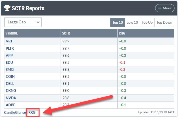
One of the several widgets/panels I have on my dashboard is SCTR Reports. To visualize the group of SCTRs, a particularly useful means is through the use of an RRG. Depending on your choice of which SCTRs you want to see, this combination of SCTR rankings and Relative Rotation Graphs can help you find great trade ideas.
In this example, I am looking at the SCTR report that shows the top 10 SCTR stocks for the large-cap universe on Friday, 10 November.

By clicking on the RRG Link in the bottom left of the panel, I can open up a Relative Rotation Graph that holds these 10 stocks and uses $SPX as the benchmark.
Unleash the Power of RRG on Top SCTRs

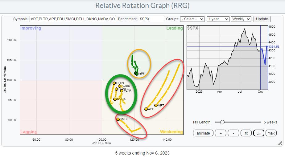
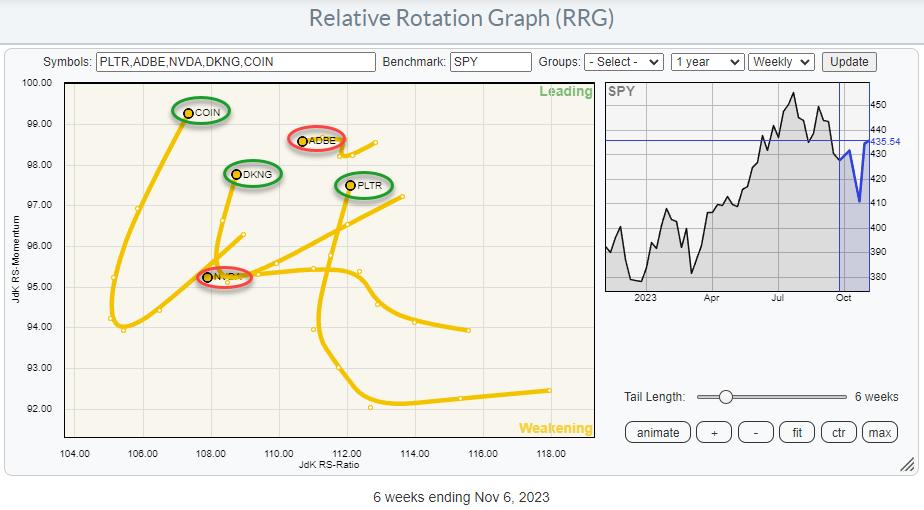
Not surprisingly, all these stocks are on the right-hand side of the RRG. They are the strongest stocks in the universe! But by plotting them on a weekly Relative Rotation Graph, you can see distinct differences between the various tails.
First, the two tails inside the leading quadrant are heading straight down towards the weakening quadrant. This does not necessarily make them bad stocks, but they are going through a setback from a relative perspective.
Second, two stocks inside the weakening quadrant are moving on a negative RRG-Heading, powered by long tails. Again, they are not necessarily bad stocks, but they are unlikely to rapidly turn around and start outperforming the universe at short notice. SMCI is a bit of an outlier, being inside the weakening quadrant and picking up in terms of JdK RS-Momentum, but still losing relative strength (JdK RS-Ratio).
The group of tails inside the green oval looks more interesting. These are tails that have completed a rotation through weakening, but are now heading back up to leading without having crossed over into the lagging quadrant.
Zooming In
Here is the RRG with these stocks isolated and fitted to the RRG to maximize screen real estate.

When zoomed in, we can see that ADBE and NVDA are moving at an RRG-Heading around 270 degrees (due West), i.e., not moving back up toward the leading quadrant (yet).
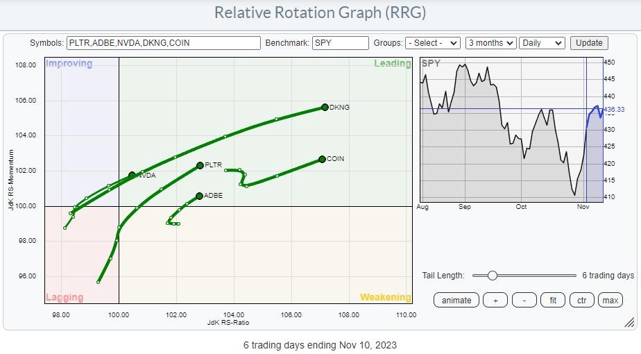
Moving to Daily RRG

The relative strength is clearly visible when plotting these five symbols on a daily RRG. All five are moving rapidly (back) into the leading quadrant at strong RRG-Headings.
Getting Up Close and "Individual"
It's time for a closer look at the price chart "up close and individual."
I started doing my analyses on the daily charts but, halfway through, realized that the weekly charts of these stocks are showing pretty strong breaks, so I decided to annotate these instead of the dailies. Just click on the weekly chart in the article and then switch to daily for a closer look. But I bet you figured that out already ;)
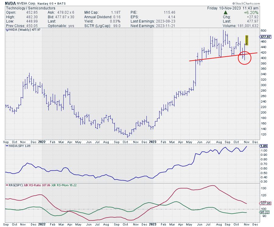
NVDA

NVDA seemed to break below the neckline, marking the bottom of a large H&S top formation two weeks ago. However, it very rapidly recovered back above the neckline. This caused a "failed H&S top," one of the strongest signals you can get.
The initial higher thrust is already well underway, and NVDA is now pushing against resistance from the previous high. When the market can hold above this level (476), an attempt to challenge the all-time high at 500 is very likely.
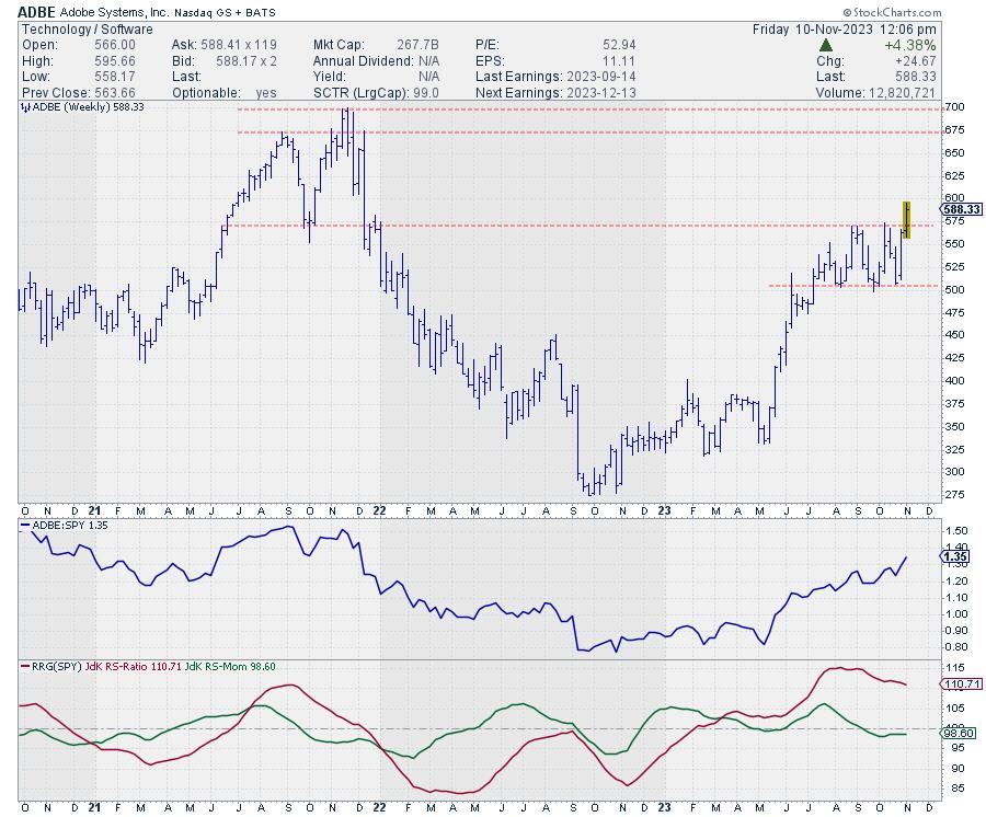
ADBE

ADBE is breaking out of the three-month sideways consolidation as it eliminates the overhead supply that has kept the stock under pressure. With that supply now gone, there is little or no hurdle to prevent ADBE from testing resistance in the area of its all-time high between 675-700.
With risk/support limited to the breakout level near 575, that is a pretty good risk/reward ratio.
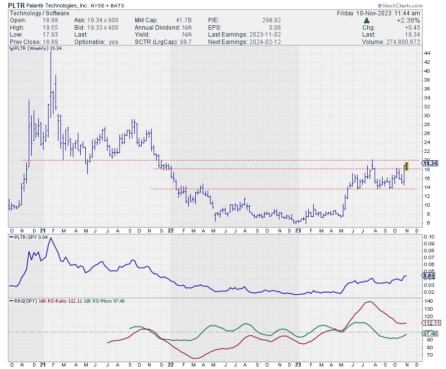
PLTR

Palantir is taking out the resistance around 18.25. The next hurdle is found near 20. Passing that area will open up the way for much more upside potential, as the stock is completing a large base.
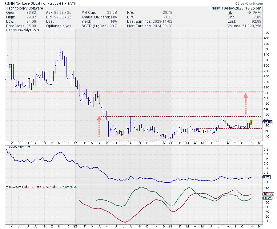
COIN

Here's another big base in the making. After losing more than 80% of its value since the IPO, Coinbase started to consolidate between 35 and 117. It's a very tradable range, but still a range in the grand scheme of things.
Since August, a narrower range has developed between 70-86. At the moment, COIN is breaking away from this range and making its way to the upper boundary of the larger base, near 117. This, in itself, is already a very tradable move: 93 to 117 with support/stop around 86.
But a more meaningful move can be expected when COIN takes out overhead supply near 117, as it will then complete the large, > 1-year base. Projecting the height of the base (117-35=82) on top of the breakout level provides a price target near 200. Which coincides with the lows of 2021 and the highs after breaking lower) of 2022.
That's an upward potential of 70%, which should be worth a bit of attention.
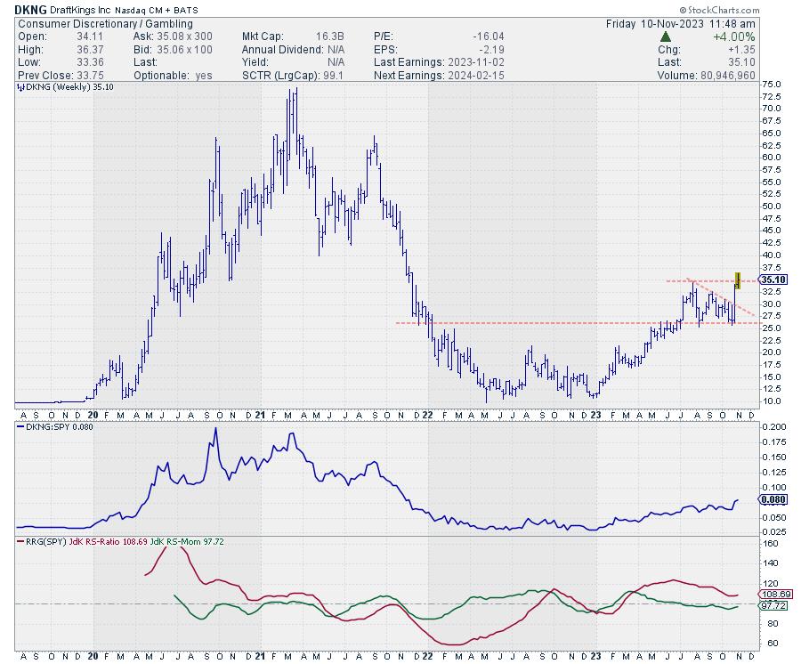
DKNG

DKNG completed its base formation in July and subsequently tested the breakout level as support twice. Initially, it threatened to form a descending triangle, but that threat was mitigated last week by a fierce rally that took DKNG back to its last high, near 34.50. And it looks as if we are breaking higher this week.
If we can hold this breakout level next week, DKNG looks ready to move further.
#StayAlert and have a great weekend. --Julius
|
| READ ONLINE → |
|
|
|
| DecisionPoint |
| Long-Term Bond Rally On the Way |
| by Carl Swenlin |
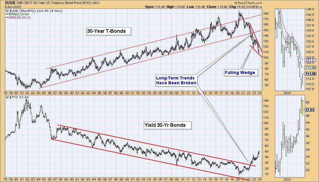
After making a major low in 1981, bonds entered a rising trend that lasted nearly 40 years. During that period, new rules and expectations were constructed and acquired that still influence decision making today -- which is unfortunate, because the game has changed.
In 2022, the long-term rising trend line was broken, and the technical implication is that bonds will continue to trend downward for many years to come. That downtrend will not, however, proceed without some relief, and such a relief rally seems to be in the immediate future.

You will note that a falling wedge has formed, and the most likely resolution of that formation is an upside breakout. This is a long-term chart, so the rally will probably last for several months, during which time the rules and expectations of the now defunct 40-year rising trend will be reinforced, setting up the bulls for failure when the downtrend resumes. I should add the caveat that my conclusion depends upon this month's price bar not making new lows. Nevertheless, a relief rally will ultimately take place, later if not sooner.
Conclusion: Bonds have broken a long-term rising trendline, and have entered a down trend that will probably last for years. Failing to recognize this change will be costly.
Learn more about DecisionPoint.com:
Watch the latest episode of DecisionPoint on StockCharts TV's YouTube channel here!

Try us out for two weeks with a trial subscription!
Use coupon code: DPTRIAL2 at checkout!
Technical Analysis is a windsock, not a crystal ball. --Carl Swenlin
(c) Copyright 2023 DecisionPoint.com
Disclaimer: This blog is for educational purposes only and should not be construed as financial advice. The ideas and strategies should never be used without first assessing your own personal and financial situation, or without consulting a financial professional. Any opinions expressed herein are solely those of the author, and do not in any way represent the views or opinions of any other person or entity.
DecisionPoint is not a registered investment advisor. Investment and trading decisions are solely your responsibility. DecisionPoint newsletters, blogs or website materials should NOT be interpreted as a recommendation or solicitation to buy or sell any security or to take any specific action.
Helpful DecisionPoint Links:
DecisionPoint Alert Chart List
DecisionPoint Golden Cross/Silver Cross Index Chart List
DecisionPoint Sector Chart List
DecisionPoint Chart Gallery
Trend Models
Price Momentum Oscillator (PMO)
On Balance Volume
Swenlin Trading Oscillators (STO-B and STO-V)
ITBM and ITVM
SCTR Ranking
Bear Market Rules
|
| READ ONLINE → |
|
|
|
| MORE ARTICLES → |
|


 Last week's sharp upward reversal in the bond market followed the FOMC Interest Rate decision. A decision to not change the Fed Funds Interest Rate target. Unlike the prior meeting ‘non-action', this decision inspired robust bond and stock buying by the investment community. The downward stride of bond prices this year has been punishing to bond portfolio valuations. The regional bank crisis in the spring of this year dramatically illustrated the problem. Bond prices calmed into the beginning of summer, but trouble heated up again with the start of a new downward leg of the bond bear market. Was there a warning that a new downtrend was starting, and how far down could bond prices fall?