| THIS WEEK'S ARTICLES |
|
|
| Trading Places with Tom Bowley |
| Seasonality Points To Higher Prices NOW |
| by Tom Bowley |
I know we're in the midst of a powerful rally that began EXACTLY when seasonality suggested it would - at the close on October 27th. I discussed the very bearish seasonality leading up to that October 27th close in my article, "Odds Favor Further Selling This Week (Maybe a LOT of it)". Check it out if you haven't already. At the end of this article, I pointed out that bullish historical tendencies would soon overpower the bears and we've seen history repeat itself once again as the bulls have dominated the bears during the latter part of October and throughout November.
Technical Price Action
Before I provide more bullish historical tendencies ahead, let's look at the S&P 500 over multiple time frames:
S&P 500 - 1 Year Daily:
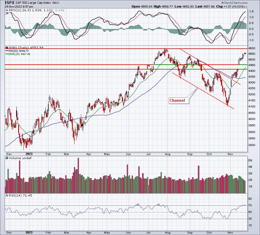
Pretty simple. We had a correction. The downtrend was broken. We're now trending higher with approaching price resistance near 4600. To the downside, a gap support zone resides from 4411-4559 and the rising 20-day EMA is conveniently located in the middle of it at 4437.
S&P 500 - 5 Years Weekly:
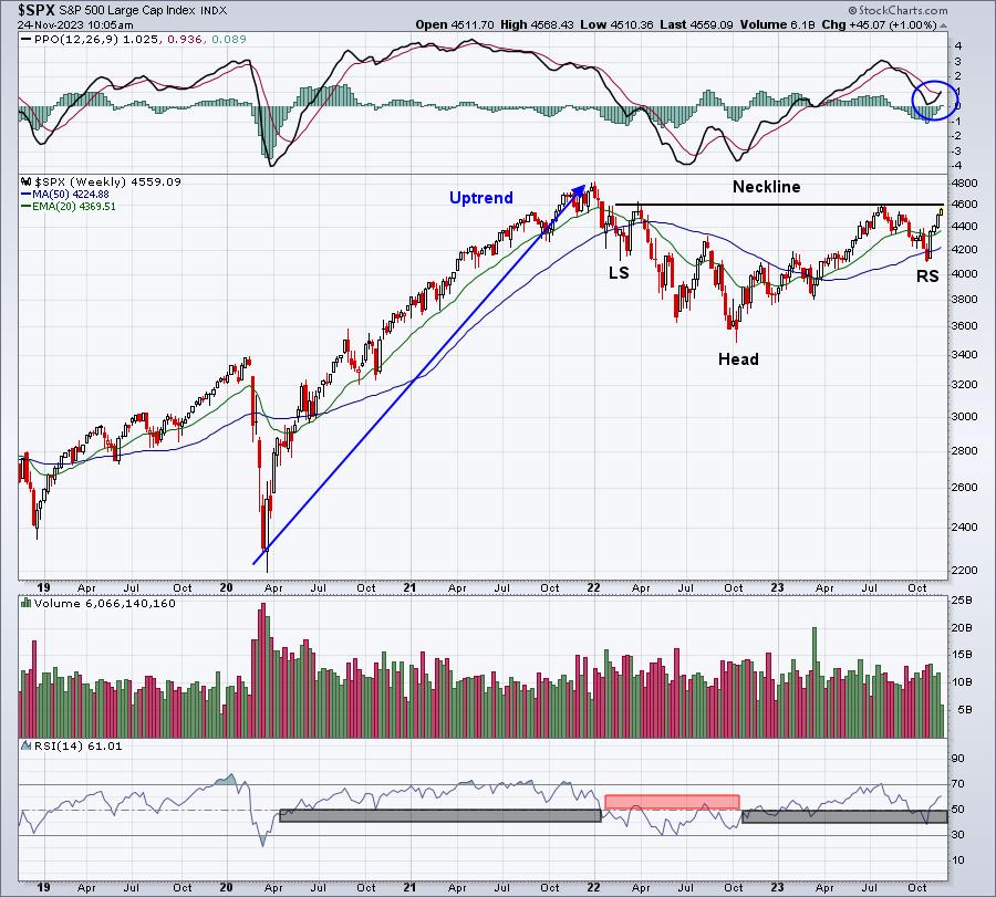
Sure looks like a bullish inverse head & shoulders continuation pattern to me. The pattern is almost perfectly symmetrical and it follows a very clear uptrend. The beauty here is that the pattern measurement is from the 4600 neckline down to the inverse head just below 3500. That's 1100 points. A breakout above 4600 would measure up 1100 points to 5700. Good luck bears! During uptrends, the RSI tends to hold the 40-50 range. Note the October low was squarely on 40. Now the RSI is back above 60. This is how the RSI unfolds during bull market advances. I also love the PPO reset at the zero line. We're now moving straight up off of that test, and that's indicative of accelerating bullish momentum.
S&P 500 - 40 Years Monthly:
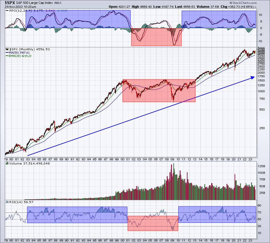
Do you see anything other than an uptrend? The red-shaded areas highlight what we typically see during secular (long-term) bear markets. From 2000 to 2013, we saw ZERO meaningful breakouts. It wasn't until April 10th, 2013 that the secular bull market began, making a definitive breakout above the 1550-1575 area. Since then, we've seen cyclical bear markets and corrections, but nothing more. Yet permabears try to call every downturn the beginning of the next collapse. And they're always wrong. We'll have scary times again, but it ain't now - at least not in my opinion. The 2030s could be a much different story, but I see the current trend higher continuing for a number of years. Note that our monthly PPO typically remains above zero and our monthly RSI remains above 40 throughout secular bull markets. Selling doesn't last long enough to take these indicators below the required zero and 40 levels, respectively. But we have to deal with the "sky is falling!" media and permabears throughout. If you need a "default", default as a bull. You'll be right much more often.
Historical Tendencies
We remain in the strongest and most bullish time of the calendar year, which I define as October 27th close through January 18th close. That's based on my 73 years of research on the S&P 500, dating back to 1950. We still have some not-so-bullish periods during November, December, and January, but the overwhelming bias is to the upside. For instance, the November 21st through December 6th period yields an annualized return of +32.97% over the past 7 decades, nearly quadrupling the average annual S&P 500 return of +9.00%. Don't misunderstand me. This doesn't guarantee us higher prices for the next couple weeks. Instead, it's simply providing us a seasonal tendency for stock prices to move higher. I use seasonality as a secondary indicator, much like PPO and RSI. The primary indicator is always price action.
I'm still offering my FREE PDF, "Bowley Trend Part 1: Long-Term Trends Since 1950". I use it to help guide me in my trading. You probably don't realize it, but there's an 11-day period of EVERY calendar month (THE SAME DAYS EVERY SINGLE MONTH), or roughly 33% of all calendar days, that has provided more than 80% of the S&P 500 gains since 1950. As a stock trader, and especially if you trade options, you MUST know these days to get a leg up on everyone else. CLICK HERE to download your FREE COPY immediately!
Happy trading!
Tom
|
| READ ONLINE → |
|
|
|
| ChartWatchers |
| The Stock Market In 3 Charts: Market Breadth, Bonds, Sentiment |
| by Jayanthi Gopalakrishnan |

Stocks are having a good November, which aligns with typical stock market behavior. According to the Stock Trader's Almanac 2023, both the Wednesday before Thanksgiving and the Friday after have a good track record. So, even though the stock market wraps up at 1 PM on Friday, it may be worth checking your portfolio value. Trading may be thin, since most traders would have taken the day off.
The Dow Jones Industrial Average ($INDU), S&P 500 ($SPX), and Nasdaq Composite ($COMPQ) all closed higher. All three of the indexes are trading close to their all-time highs. Even small- and mid-cap stocks are showing signs of strength. The S&P 600 Small-Cap Index ($SML) and the S&P 400 Mid-Cap Index ($MID) are trading above their yearly lows, but they have much catching up to do before hitting their all-time highs. All S&P sectors except Energy were in the green after Wednesday's close. There was supposed to be an OPEC meeting today to discuss oil production cuts, but it didn't happen.
Overall Market Breadth
On the equities front, it's encouraging to see market breadth strengthening (see chart below). The NYSE Common Stock Only Advance-Decline line is trending higher, the percentage of stocks trading above their 200-day moving average is at 56.4%, and the S&P 500 Bullish Percent Index at 62.4, above the 50% threshold level. Overall, the S&P 500 and other broader indexes are bullish.
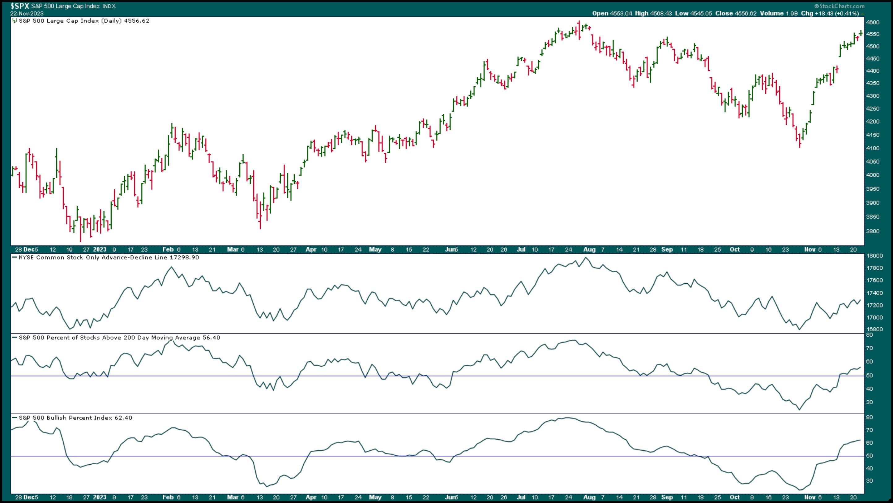
CHART 1: S&P 500 MARKET BREADTH STRENGTHENS. As the S&P 500 approaches its all-time high, it's encouraging to see market breadth widening. Advancers are greater than decliners, the percentage of S&P 500 stocks trading above their 200-day moving average is rising, and the S&P 500 Bullish Percent Index also indicates that investors are bullish.Chart source: StockChart.com. For educational purposes.
Economic data has been mixed. Jobless claims didn't show much weakness and durable goods missed the downside. Earlier in the week, the Fed minutes indicated that the "monetary policy will remain restrictive" narrative is still in play. There was no hint of cutting rates in the near future.
The economic news didn't impact the stock market too much. The November rally is still going strong, with the Nasdaq rallying almost 11%, the Dow up 6.6%, and the S&P 500 up 8.45%.
The Bond Market
The 10-year US Treasury Yield Index ($TNX) fell to its 100-day simple moving average (SMA), which is acting as a support level. The yield bounced off the SMA and closed at 4.42% (see chart below). Lower yields tend to be good for stocks.
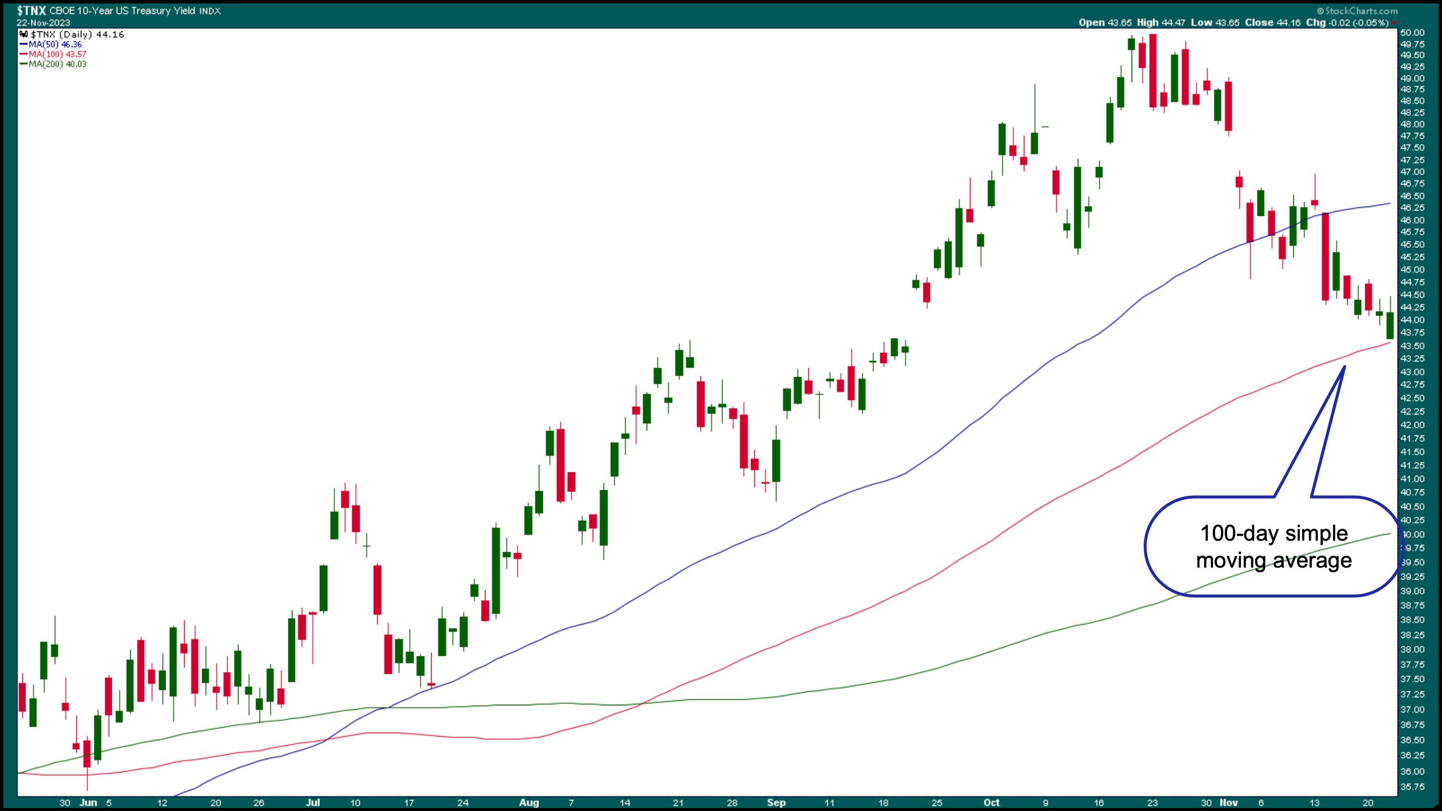
CHART 2: 10-YEAR US TREASURY YIELD INDEX. The 100-day simple moving average could be a support level to watch.Chart source: StockCharts.com. For educational purposes.
Treasury yields move inversely to bond prices, so it's not surprising to see that the iShares 20+ Year Treasury Bond ETF (TLT) has been moving higher. If you've pulled out all your fixed-income investments, now may be time to start thinking about getting back in. But there's no need to rush, since TLT is still a long way for TLT to reach its yearly highs of around $106.
Investor Complacency
Overall, investor uncertainty has eased considerably since October. The CBOE Volatility Index ($VIX) is very close to its 52-week low, and the MOVE Index, a measure of volatility in the bond market, is also trending lower (see chart below). The VIX closed at 12.85.
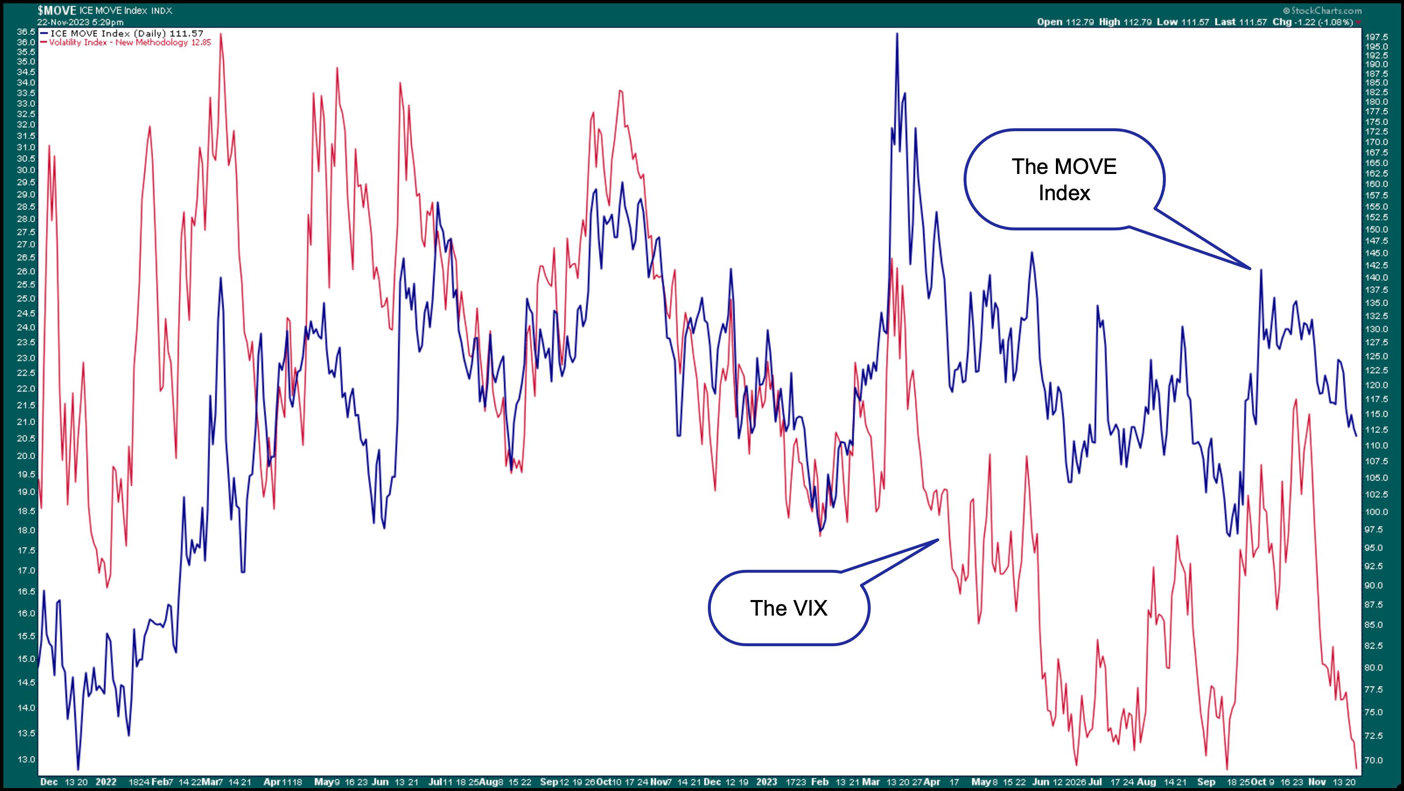
CHART 3: STOCK AND BOND VOLATILITY. The VIX (red line) and MOVE (blue line) are moving in the same direction, indicating that stock and bond investors are complacent.Chart source: StockCharts.com. For educational purposes.
Investor complacency could make investors more optimistic and be inclined to take advantage of Black Friday deals.
Black Friday shopping has already started, and retail stocks are showing mixed results. Shares of Amazon (AMZN) are trading close to its 52-week high. It's a similar scenario with Gap, Inc. (GPS) and Ross Stores (ROST). Target (TGT) saw its share price gap up on its recent earnings report. Things weren't the same for Walmart (WMT), with the stock price falling after its recent earnings report. WMT's earnings were strong, but the recent slowdown in consumer spending didn't sit well with investors. But that doesn't mean you should sell the stock. If you look at a weekly chart of WMT, the uptrend in the stock price is still intact.
In Other News
Earnings season may be coming to a close, but NVIDIA was the big one this week, closing lower today in spite of crushing Q3 earnings. Possible restrictions in China's chip exports may have had something to do with the selloff, although some profit-taking ahead of the Thanksgiving holiday shouldn't be alarming. NVDA is still a healthy company with a strong SCTR score and healthy relative strength with respect to the S&P 500.
A Thanksgiving Hope
Even though the stock market's November rally is going strong ahead of the Thanksgiving holiday, there's still a lot of turmoil in this world. Let's hope for steps toward peaceful resolutions.

Disclaimer: This blog is for educational purposes only and should not be construed as financial advice. The ideas and strategies should never be used without first assessing your own personal and financial situation, or without consulting a financial professional.
|
| READ ONLINE → |
|
|
|
| RRG Charts |
| How RRG Helps Us Find Pair Trading Opportunities |
| by Julius de Kempenaer |
The Dow Jones Industrial Index ($INDU) is reaching overhead resistance between 35.5k and 35.7k, which means that upside potential is now limited. Even if the market manages to break that area, the next resistance level is already around just 37k.
However, the relative rotation graph featuring the rotation for all 30 members of the DJ Industrials Index is showing some potentially very interesting pair trade setups.
DJ Industrials
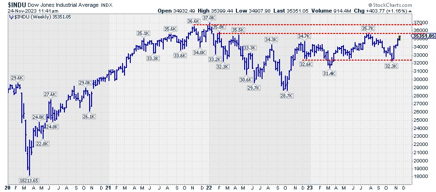
On the weekly chart above, that overhead resistance area is clearly visible. The previous highs, which define the resistance zone, date back to late 2021 and early 2022, almost two years ago. This makes it a very important resistance zone.
An upward break of that resistance will obviously be a very bullish signal. But the recent rally, coming out of the late October low, has been very steep, and it would not be strange to see some form of consolidation against the aforementioned resistance zone.
With overhead resistance nearby, the near-term risk is now to the downside. Looking at the chart, a setback after a peak against resistance could take the Dow as low as 32.3k. This would still keep $INDU within the boundaries of this year's trading range.
Opposite Tails on Weekly RRG
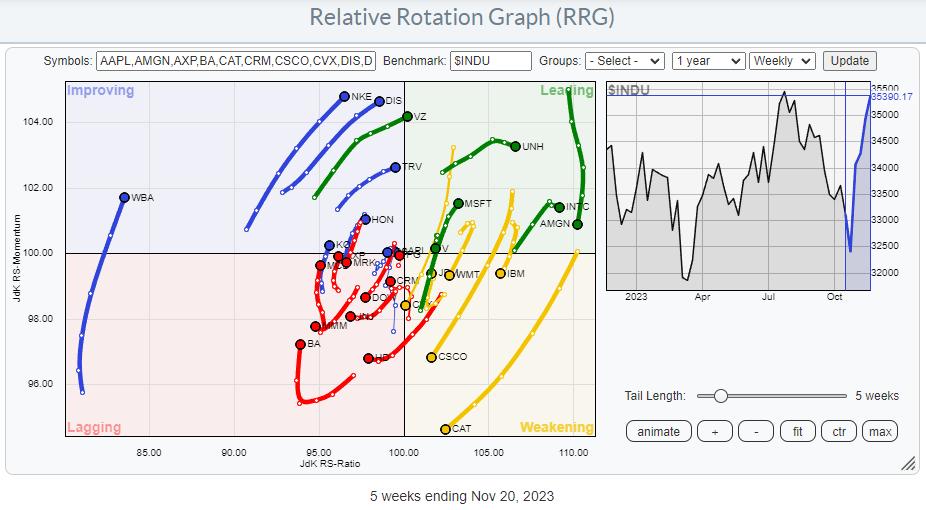
The weekly relative rotation graph above shows the rotations for all thirty stocks inside the Dow Jones Industrial Index. With the benchmark index still inside a trading range, some of the opposite rotations that are visible on the graph suggest that a few interesting pair trading opportunities are present.
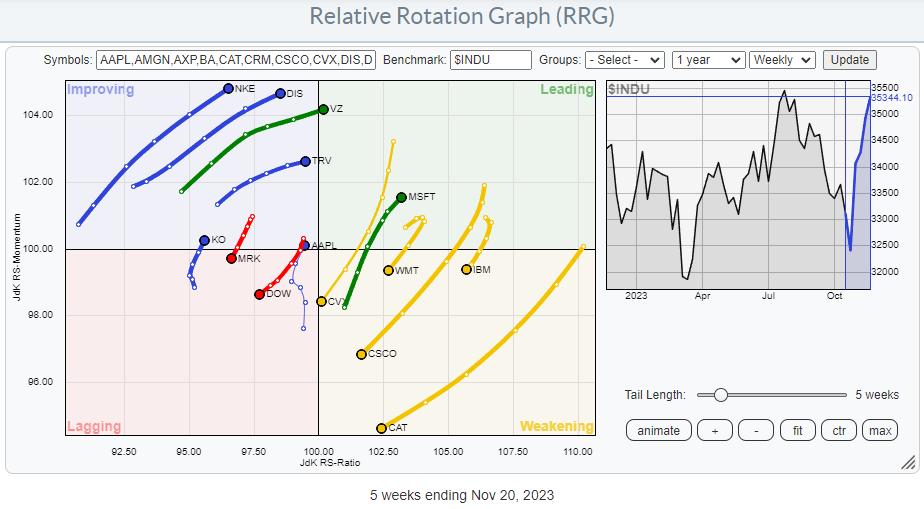
In order to clean up the RRG and put emphasis on the more interesting rotations, I have taken out the tails with less favorable characteristics.
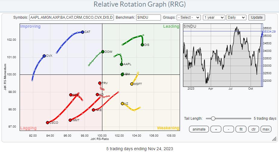
In order to see if I could get confirmation, I have run the same RRG on the daily time frame.
Given the current rotational patterns, many different pair trading opportunities can be found. I encourage you to do your own research and find out whether you have a particularly strong view of specific stocks or combinations of stocks, positive or negative. Here, I will pick two examples of potential pair trades from the RRGs above and look at the individual charts.
NKE vs. CAT
On the weekly RRG, Nike and Caterpillar's tails are rotating in opposite directions. NKE is inside the improving quadrant and rapidly heading toward leading. CAT is inside the weakening quadrant and rapidly heading toward lagging. Both tails are at the extremes of the RRG and far away from the benchmark. This indicates a big potential for alpha.
NKE
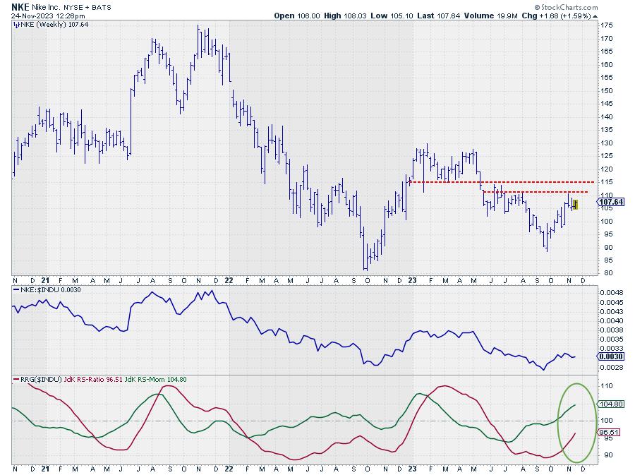
NKE is nearing resistance between 110 and 115, suggesting that there is limited upside potential left, unless NKE can clear this barrier in the coming weeks. However, as we are looking for pair trades, we need to focus more on the relative strength conditions. And these are clearly picking up for NKE.
The JdK RS-Momentum line is already well above 100 and is dragging the JdK RS-Ratio line higher. When both RRG-lines are moving up at the same time, this causes an RRG heading between 0-90 degrees, which we know is an indication of strength.
CAT
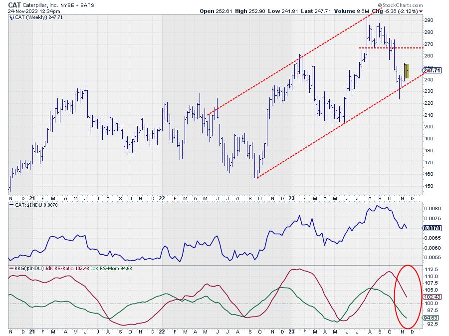
On the price chart, CAT has just bounced off its rising support line. The relative performance, however, is not looking that good. The JDK RS-momentum line already dropped below 100 a few weeks ago and is now rapidly dragging the RS-Ratio line lower. This rapid decline in relative strength suggests a further underperformance for CAT in the next few weeks.
Off-setting the relative strength of NKE against the relative weakness of CAT makes for a potentially interesting pair-trading opportunity.
MSFT vs. MRK
The weekly RRG details for Microsoft and Merck show opposite rotational patterns. MSFT has just completed a rotation from leading through weakening and is now back into leading, making it one of the strongest stocks, if not the strongest, in this universe. The opposite goes for MRK, which rotated from lagging into improving and is now crossing back into the lagging quadrant.
We know that rotations that complete on one side of the graph indicate a new up- or down-leg in an already established up or downtrend.
MSFT
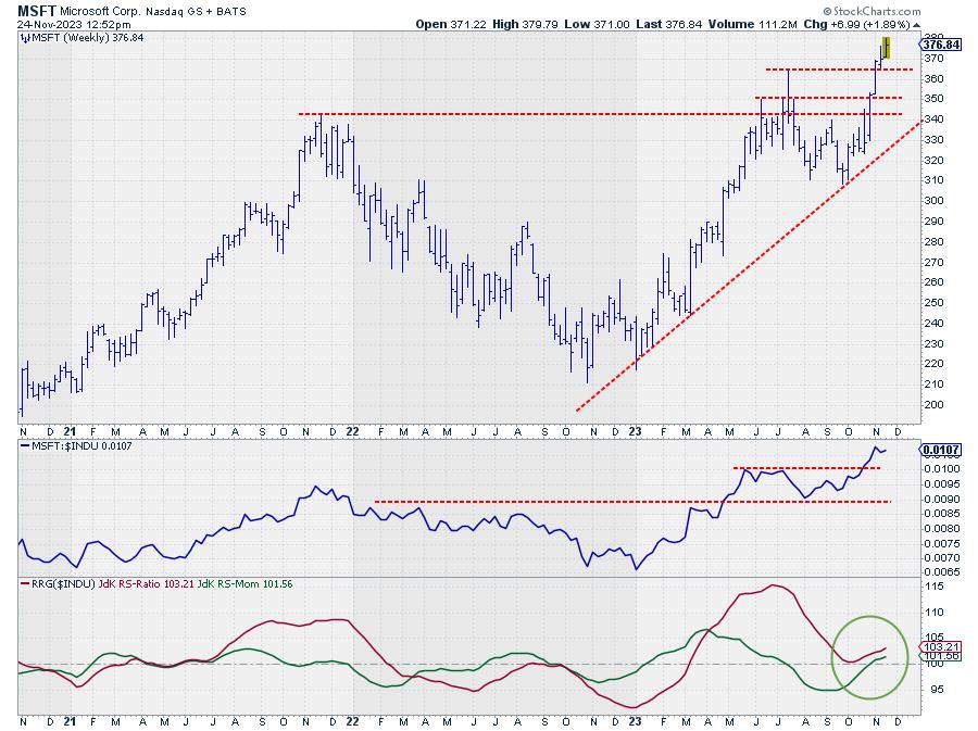
The recent break to new all-time highs is holding up well. It has also caused the raw RS-line to push to new highs where it is also holding. This is a strong combination of facts.
After a brief dip below 100, the JdK RS-Momentum line has now crossed back above that level again, dragging the RS-ratio out of its low just above 100. This causes the tail on the RRG to push back into the leading quadrant at a strong RRG-heading.
The combination of strong relative strength and a break to new highs on the price chart makes Microsoft the best chart in this universe for the time being.
MRK
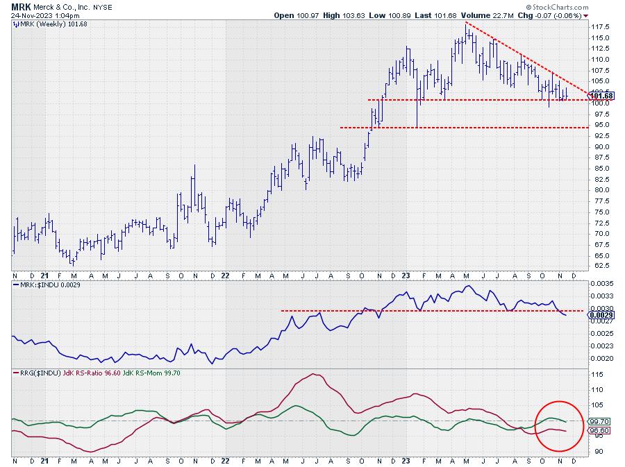
MRK reached its all-time high in May of this year, but has been in a steady downtrend since then. The price of Merck reached support just above 100 a few weeks ago and is still hovering slightly above that area at the moment. A break lower will very likely accelerate the decline, very likely, toward the next level of support, between 92.50 and 95.
The raw RS line is breaking an important horizontal support level, completing a toppish formation. The RRG lines already picked up on the new downtrend in July. The recent hiccup of the RS-Momentum line above 100 is the result of the sideways consolidation of relative strength above support.
With raw RS breaking support and the RS momentum line dropping below 100, both RRG-Lines are now once again moving lower while below 100. This is causing the tail on the RRG to move deeper into the lagging quadrant while traveling at a negative heading.
Both tails completing a rotation at the same side of the RRG suggests a continuation of the ongoing outperformance of MSFT over MRK.
Enjoy your Thanksgiving weekend, but #StayAlert, --Julius
|
| READ ONLINE → |
|
|
|
|
|
| Art's Charts |
| Charting the S&P 1500 Zweig Breadth Thrust - And More... |
| by Arthur Hill |
StockCharts users can chart the Zweig Breadth Thrust for the S&P 1500 or any other index that has Advance-Decline Percent data. All we have to do its convert the Zweig Breadth Thrust levels to their equivalents using Advance-Decline Percent.
The Zweig Breadth Thrust is based on percent advances for the NYSE. It is Advances / (Advances + Declines). If there are 800 advances and 1200 declines, then this indicator would be .40 (800/(800+1200)). If there were 1230 advances and 770 declines, then this indicator would be .615 (1230/(1230+770)).
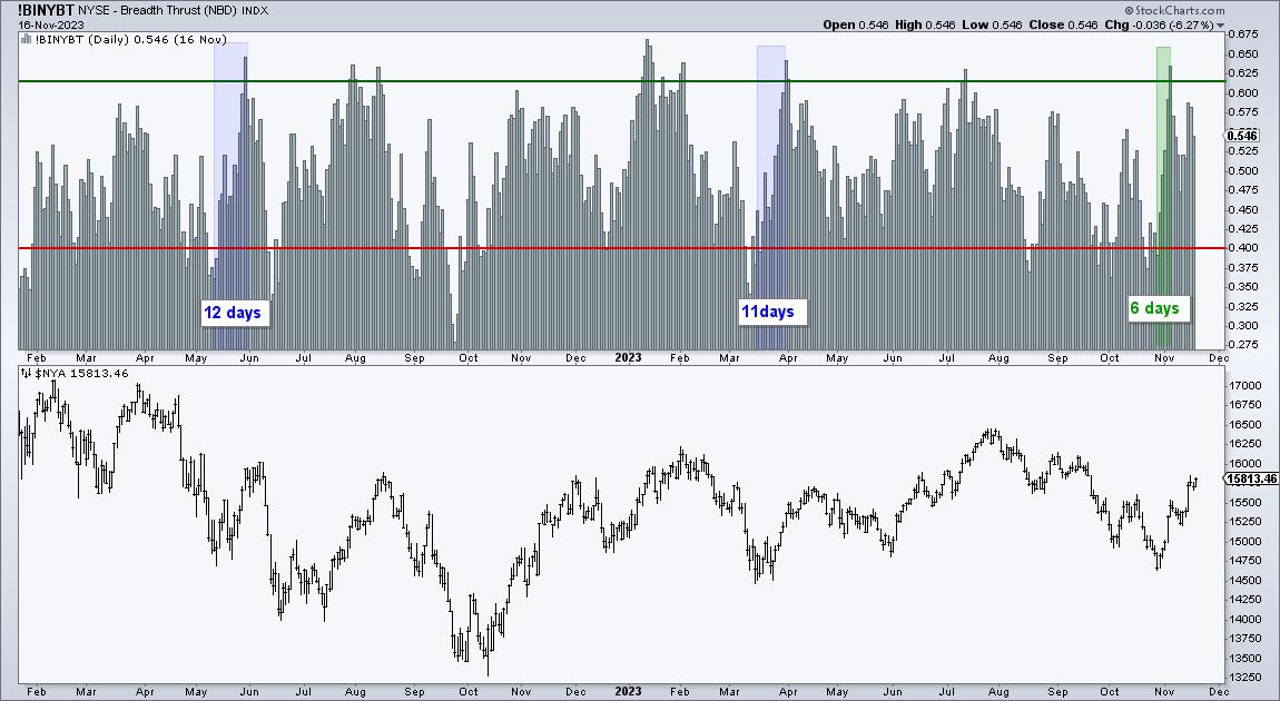
The chart above shows the key levels for the Zweig Breadth Thrust. The indicator triggers bullish when it moves from below .40 to above .615 within 10 days.
Now we can convert these levels into Advance-Decline Percent levels. Advance-Decline Percent is the percentage of advancing stocks less the percentage of declining stocks. There are 1500 stocks in this example. 600 advances would be 40% of 1500 and 900 declines would be 60%. 40% Advances less 60% declines would be -20% for Advance-Decline Percent. Thus, AD% must dip below -20% for a potential Zweig Breadth Thrust.
If there are 923 advances (61.5%) and 770 declines (38.5%), then Advance-Decline Percent would be +23% (61.5% less 38.5%). Thus, AD% must move from below 20% to above 23% within 10 days to trigger a Zweig Breadth Thrust.
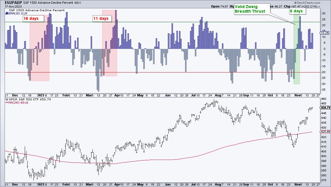
Chartists interested in charting the Zweig Breadth Thrust can do so for the following indexes with Advance-Decline Percent.
- S&P 500 AD% ($SPXADP)
- Nasdaq 100 AD% ($NDXADP)
- S&P MidCap 400 AD% ($MIDADP)
- S&P SmallCap 600 AD% ($SMLADP)
- S&P 1500 AD% ($SUPADP)
The chart below shows the Zweig Breadth Thrust using S&P 1500 AD$ ($SUPADP). Personally, I would stick with the S&P 1500 because it is the broadest of the five indexes. Zweig used NYSE breadth data in the 80s because it was the "Big Board". NYSE breadth captured a broad swath of the stock market. Today is different because the Nasdaq is now the place to be.
TrendInvestorPro tested S&P 1500 Zweig Breadth Thrust signals on the S&P 500 SPDR (SPY). This indicator is designed to identify sudden and sharp reversals that can foreshadow extended moves. It is not used for timing exits so we used a trend-following indicator to time the exit. Results are promising with a 67% win rate and a much lower drawdown than buy-and-hold.
We are not publishing Chart Trader reports and videos during Thanksgiving week (20-24 November). However, there is still plenty to learn from our education reports and trading strategies. Subscribers get immediate access to:
- The Essential Breadth Indicator ChartList (with report and video)
- Building a Strategy around the Zweig Breadth Thrust
- Momentum Rotation Strategy for NDX and SPX Stocks
- Mean-Reversion Strategy for Russell 1000 Stocks
Special Action for StockCharts Extra and Pro Members
Get the edge with inside information, information inside the indexes and sectors, that is. TrendInvestorPro put together a comprehensive chart list focusing on breadth indicators. There are over 100 customized charts covering over 50 breadth indicators organized in a logical manner. A full report and comprehensive video accompany this list. Note that you must be an Extra or Pro subscriber to have more than one ChartList at StockCharts.
Click here to sign up for TrendInvestorPro and get this invaluable ChartList!
//////////////////////////////////////////////////
|
| READ ONLINE → |
|
|
|
| Don't Ignore This Chart! |
| Gap's Stock Defies Gravity: Time To Exploit Its Dynamic Surge? |
| by Karl Montevirgen |

Gap Inc.'s (GPS) blowout earnings report last week not only signaled the end of its summer slumber, but catapulted its share price to two-year highs. Last Friday, its shares jumped more than 30%, opening the day with a massive runaway gap.
For a company whose sales have been declining for years, its reported earnings per share of $0.59 blew the doors off analysts' expectations of a mere $0.19 per share.
But does this signal a comeback or a blip for Gap's stock price? Can the stock sustain this momentum and possibly move higher? And if it does continue its trend higher, how high can it go before running into major technical headwinds?
First, let's look at what happened last week (and the price action leading up to it).
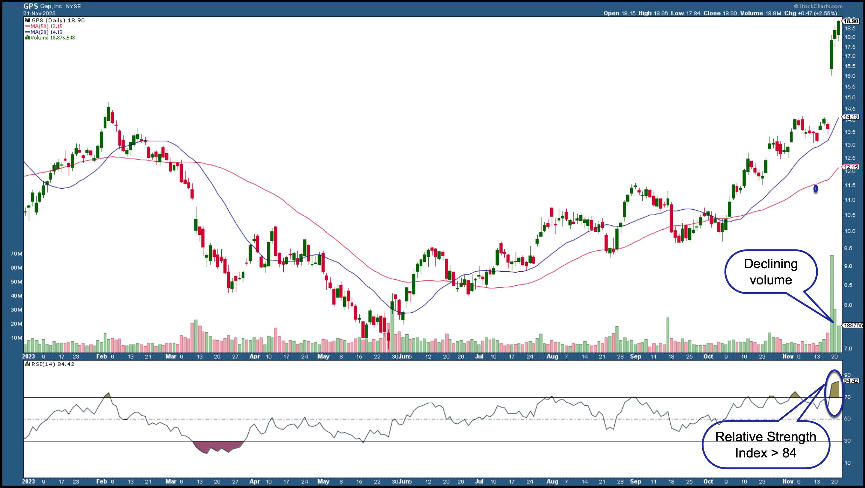
CHART 1: DAILY CHART OF GAP STOCK PRICE. After hitting a low in May, Gap's stock price started showing signs of life, but that post-earnings runaway gap was something else.Chart source: StockCharts.com. For educational purposes.
Gap's runaway gap is quite pronounced, as it leapt above its 52-week high. However, both the Relative Strength Index (RSI) and volume are indicating that Gap's momentum is waning, and rapidly so.
The RSI is giving us a reading over 84—placing Gap's stock price well within overbought territory. And volume since Friday has pulled back significantly, indicating that the buying activity that gave price its upward momentum is quickly drying up. Both indicate the likelihood of a pullback. And if price does decline, we can expect support at the 20-day simple moving average line, which currently coincides with the top price range prior to the post-earning runaway gap.
Scanning for Stocks Gaining Volume
From Your Dashboard or Charts & Tools tab, scroll to the Sample Scan Library and run the Strong Volume Gainers scan. The scan will filter out all the stocks and ETFs that meet the scan criteria.
But there's another caveat to consider: According to (technical analyst) Thomas Bulkowski's studies, runaway gaps toward the upside tend to close (or get filled) only 8% of the time within a one-week period. In other words, stocks that experience runaway gaps to the upside have a tendency to keep running.
And if it does, at what level (or range) might Gap's stock price hit a ceiling? A weekly chart can tell us.
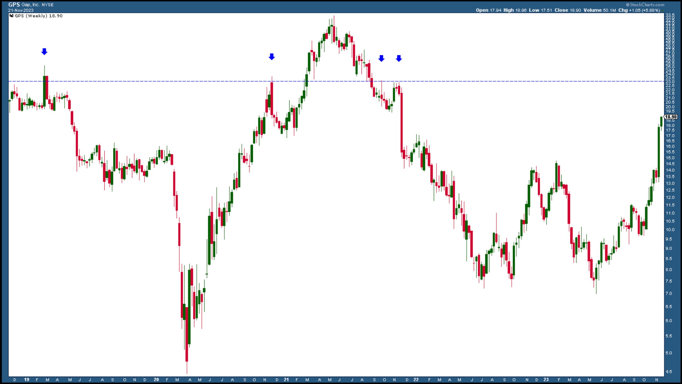
CHART 2: WEEKLY CHART OF GPS. Over a five-year period, the stock hasn't demonstrated any significant long-term trends.Chart source: StockCharts.com. For educational purposes.
The price level of $23 marks the beginning of a range (extending up to $25) that will likely serve as major resistance to Gap's upward trajectory, should it manage to go that high. It served as resistance in November 2019 and repelled repeated attempts to close above it in November 2020, and twice again in September and November of 2021. So this is a price level to watch, especially if you happen to be long the stock.
The Bottom Line
Gap's near-term outlook is mixed-to-negative, with the company expecting Q4 sales to fall year-over-year. But lower commodity costs and the company's cost-cutting strategies may be enough to see its profits rise over the coming quarters. From the above charts, you can see the lower and upper limits, where prices are likely to bounce either way.

Disclaimer: This blog is for educational purposes only and should not be construed as financial advice. The ideas and strategies should never be used without first assessing your own personal and financial situation, or without consulting a financial professional.
|
| READ ONLINE → |
|
|
|
| Mish's Market Minute |
| Economic Modern Family -- Home for the Holidays |
| by Mish Schneider |
In the 1995 film, Home for the Holidays, family reunions are explored using both drama and comedy. The film illustrates how we outsiders looking in never really know the love and the madness that goes on inside any one family's home during Thanksgiving.
Happily, our Economic Modern Family tends to be transparent.
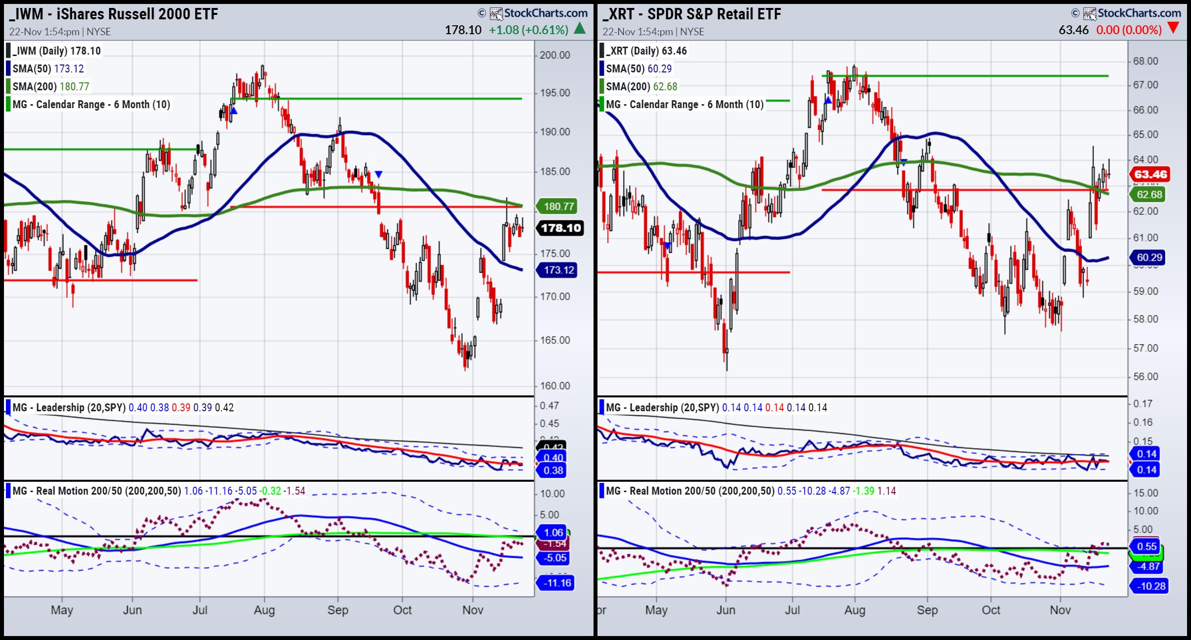
Beginning with our patriarch and matriarch, we see 2 different phases, similarities in leadership and divergent momentum. The Russell 2000 (IWM) is in a recovery or recuperation phase, trailing behind the SPY. Its momentum matches the price movement; both momo and price are struggling to clear key resistance. Furthermore, Granddad remains under the July 6-month calendar range low, certainly not a bullish sign. Gramps' holiday leans more to underscoring the market madness we see in NASDAQ.
Granny Retail (XRT), has fared better since October 2023. Granny is in an accumulation phase, slightly outperforming the SPY, her momentum gaining traction. Granny is well beneath the July 6-month calendar range high, but has managed to clear back above the July 6-month calendar range low.
The consumers' holiday mindset is one of cautious optimism.
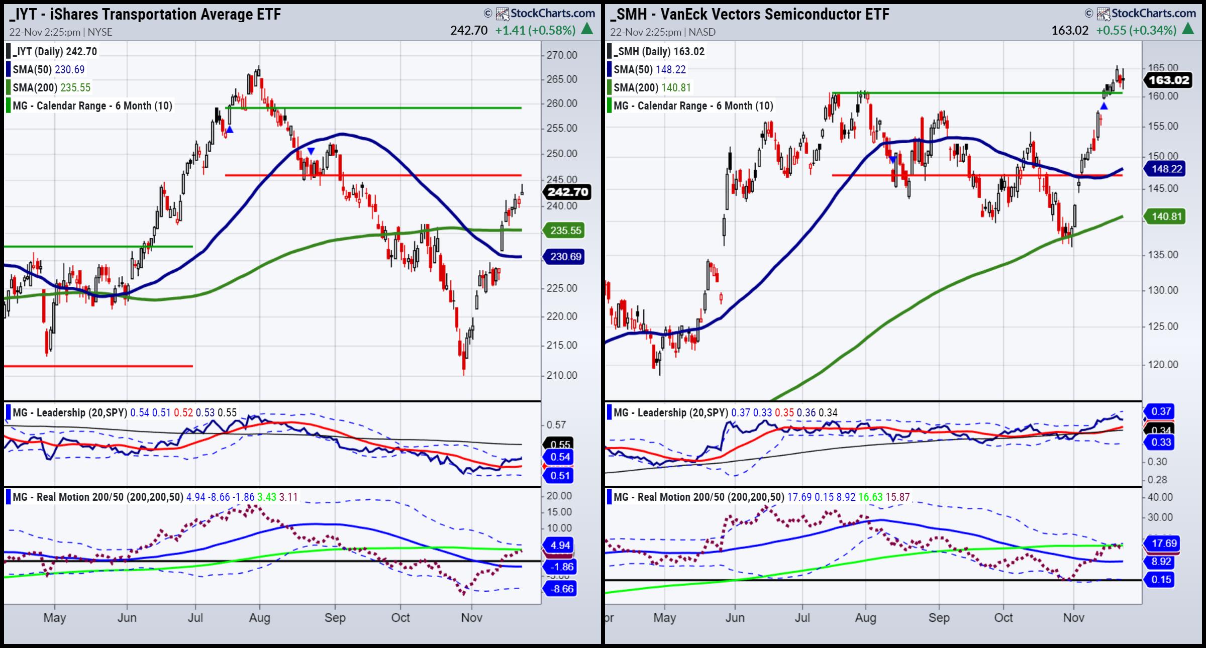
In Home for the Holidays, it is up to the mom and dad to hold the family together. Hence, if we look to Granddad and Grandma to hold our economic modern family together, we must also examine the impact, or lack thereof, that relationship has on some of the other key family members or their grandkids.
Conveniently, Tommy in the film is a good representative for our Transportation (IYT) brother. Side note: the dad in the film is a retired airport maintenance man.
Tommy is complicated. His cracked sense of humor disguises a softer heart. IYT, our "Planes, Trains, and Automobiles" (speaking of movies), is also complicated. Through strikes, inflation, higher rates, and economic slowdowns, IYT is looking for love.
In an accumulation phase, IYT has a way better performance relative to the SPY. Yet IYT remains in a downtrend, under the July 6-month calendar range low. Momentum is in a bearish divergence to price, as it has yet to clear its 200-DMA while price has. Is IYT more inclined to lead or follow from here? That is a big question and one that we should watch for the answer to so we can assess if this rally is sustainable.
Sister Semiconductors SMH can be compared to the Holly Hunter character in Home for the Holidays. In the film, Holly Hunter supplies the point of view, and, like SMH, she tells us that the mania we see is not anything new. SMH is rallying beyond the rest of her Family, clearly NOT for the first time. The question is, can SMH continue holding up, given her grandparents and sibs remain mixed up?
SMH is in a bullish phase. It is trading in an uptrend above its July 6-month calendar range high. SMH is outperforming SPY, but momentum shows us a bearish divergence.
On Real Motion, the phase is recuperation, as opposed to bullish in price. Furthermore, the red dots which exhibit momentum, are below the 200-DMA and having a sell side mean reversion.
If you put these four charts all together, we get a reunion that is filled with the makings of a family breakdown. While Granny XRT and Sister Semiconductors SMH give us investors reasons to feel good about gorging ourselves, the rest of the Family (IWM & IYT) remind us not to eat what we cannot digest.
This is for educational purposes only. Trading comes with risk.
If you find it difficult to execute the MarketGauge strategies or would like to explore how we can do it for you, please email Ben Scheibe at Benny@MGAMLLC.com, our Head of Institutional Sales. Cell: 612-518-2482.
For more detailed trading information about our blended models, tools and trader education courses, contact Rob Quinn, our Chief Strategy Consultant, to learn more.

Traders World Fintech Awards

Get your copy of Plant Your Money Tree: A Guide to Growing Your Wealth.
Grow your wealth today and plant your money tree!
 "I grew my money tree and so can you!" - Mish Schneider "I grew my money tree and so can you!" - Mish Schneider
Follow Mish on Twitter @marketminute for stock picks and more. Follow Mish on Instagram (mishschneider) for daily morning videos. To see updated media clips, click here.
Mish and Maggie Lake cover inflation, technology, commodities and stock picks in this interview with Real Vision.
Mish talks trading range, fundamentals, and how to think about commodities right now on Yahoo! Finance.
In this appearance on BNN Bloomberg, Mish covers the emotional state of oil and gold, plus talks why small caps are the key right now. She also presents a couple of picks!
Learn how to trade commodities better with Mish in this interview with CNBC Asia!
Mish and Charles Payne discuss why the small caps, now in mid range still have a chance to rally in this appearance on Fox Business' Making Money with Charles Payne.
Mish talks about Tencent Music Entertainment on Business First AM.
Mish talks bonds with Charles Payne in this clip from October 27, recorded live in-studio at Fox Business.
Coming Up:
November 28: Your Daily Five, StockCharts TV
November 30: Live Coaching
December 3-December 13: Money Show Webinar-at-Sea
Weekly: Business First AM, CMC Markets
ETF Summary
- S&P 500 (SPY): 450 support, 465 resistance.
- Russell 2000 (IWM): 181 resistance, 174 support.
- Dow (DIA): 360 resistance, 346 support.
- Nasdaq (QQQ): 388 now pivotal support.
- Regional banks (KRE): 45 big resistance.
- Semiconductors (SMH): 160-161 pivotal support.
- Transportation (IYT): 235 support.
- Biotechnology (IBB): 120 pivotal.
- Retail (XRT): 65 resistance and 60 pivotal support.
Mish Schneider
MarketGauge.com
Director of Trading Research and Education
|
| READ ONLINE → |
|
|
|
| MORE ARTICLES → |
|


 "I grew my money tree and so can you!" - Mish Schneider


