| THIS WEEK'S ARTICLES |
| The Mindful Investor |
| S&P 4300 by End of February? |
| by David Keller |
We kicked off the new year of 2024 with an overheated stock market, excessively bullish breadth indicators, and euphoric sentiment levels. While the first week in January felt like a "wake-up call" pullback for awestruck bulls, this last week saw the S&P 500 push right back up to all-time highs.
On that note, leading growth names like META are making new all-time highs. But will the S&P 500 and Nasdaq 100 follow suit, or is this the last gasp higher in a double top pattern for the major market averages?
Today, we're going to revisit a concept called "probabilistic analysis", where we lay out four different potential scenarios for the S&P 500. There are three things I hope you take away from this exercise.
- It's important to have a thesis as to what you think will come next for stocks. This should be based on a meaningful combination of four key pillars: fundamental, technical, macroeconomic, and behavioral. And your portfolio should be positioned to reflect what you see as the most likely outcome.
- It's also important to consider alternative scenarios. What if the market is way more bearish than you'd expect? What if some five-standard-deviation event pops up, and stocks suddenly shoot higher? The best way to break out of your predetermined biases is to actively consider alternative points of view. This exercise forces you to do just that.
- It's incredibly important to think about how you would adapt to one of those alternate scenarios. How would your portfolio perform in a risk-off environment in the coming months? Are you prepared for a sudden spike in risk assets, and at what point would you need to change your positions to match this new reality? By thinking through these potential outcomes now, you'll be much better equipped to deal with what actually plays out.
I have found that the most successful investors don't know all the answers, but they ask the best questions. So let's broaden our horizons a bit, and consider four potential future paths for the S&P 500 over the next six to eight weeks. But first, we'll highlight some key levels to watch in the coming weeks.
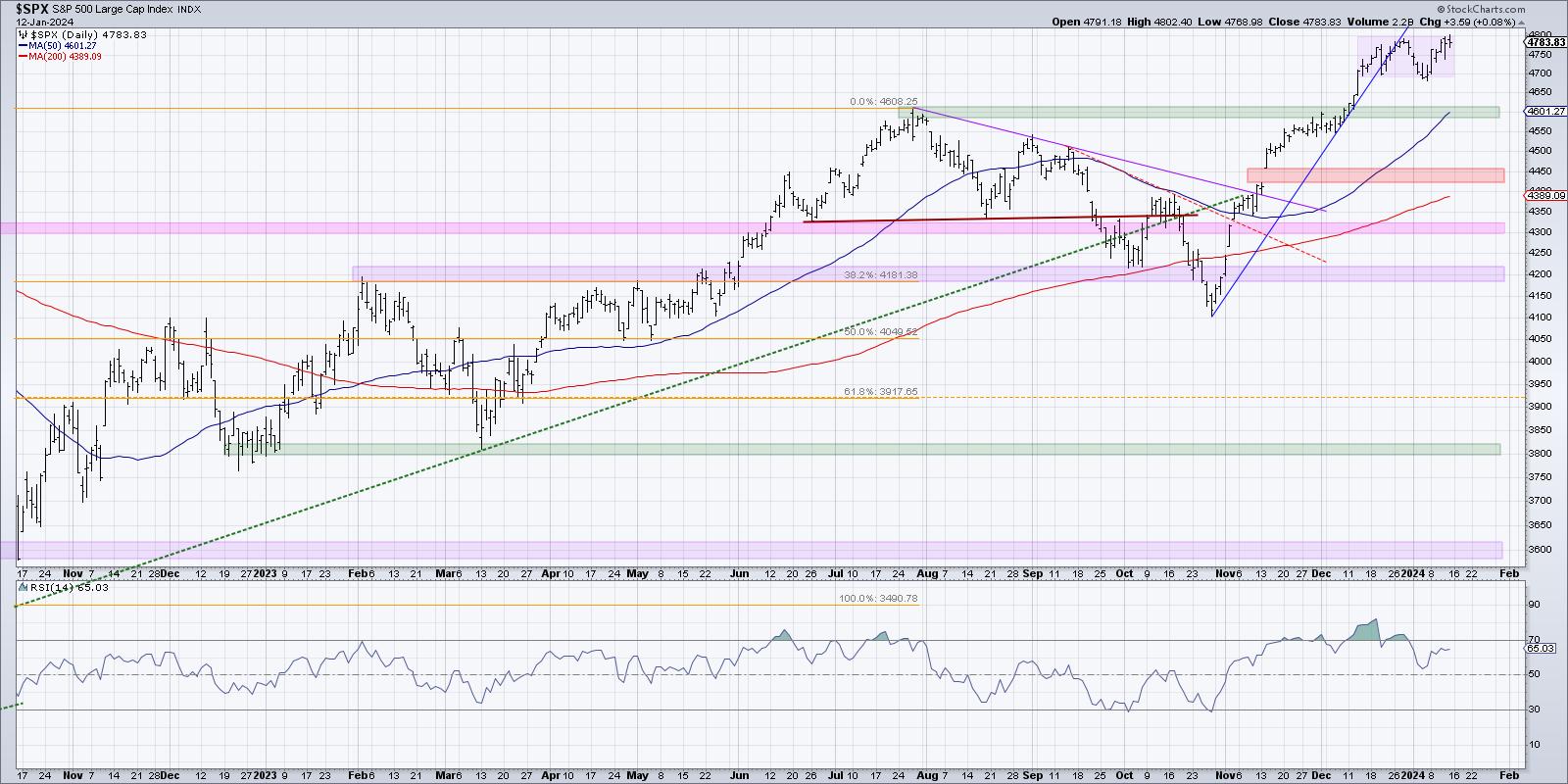
After a strong rally off the October 2023 low, the SPX has now settled into a short-term range between 4700 and 4800. Any time a market settles into a range like this, we know two things. First, a breakout is likely happening fairly soon. Second, whichever way the price breaks, there will most likely be some further move in that same direction.
If the S&P pushes out of this range to the upside, then we will have broken to a new all-time high, and that "big round number" of 5000 will finally be within our grasp. What's striking about a bullish scenario here is that the S&P has followed the seasonal patterns incredibly well over the last 18 months. Further strength here would absolutely go against normal seasonal weakness in Q1 of an election year.
Author's note: I did indeed promise to play the trumpet on my show, The Final Bar, if and when the S&P 500 breaks above 5000. I will uphold that promise -- and have already pulled out the horn to polish it up a bit.
If the market turns lower in the coming weeks, then I'd be watching two key levels below short-term support around 4700. 4600 was the market peak in July 2023, and I would not be surprised if that market follows the technical analysis concept called "polarity", where previous resistance becomes support. Below that, we have an important price gap around 4450. To me, this represents the "line in the sand" for bulls, and if the S&P 500 would fail to hold that level (see the Super Bearish scenario below), then we may be in for plenty of pain into Q2.
Let's get to the four potential scenarios, and remember, the point of this exercise is threefold:
- Consider all four potential future paths for the index, think about what would cause each scenario to unfold in terms of the macro drivers, and review what signals/patterns/indicators would confirm the scenario.
- Decide which scenario you feel is most likely, and why you think that's the case. Don't forget to drop me a comment and let me know your vote!
- Think about each of the four scenarios would impact your current portfolio. How would you manage risk in each case? How and when would you take action to adapt to this new reality?
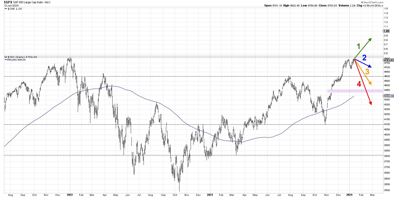
Let's start with the most optimistic scenario, involving new all-time highs as soon as next week.
Scenario #1: The Very Bullish Scenario
In this first potential outcome, the pullback in early January was just a brief reset. Buying power that we observed this week continues, leading names like META and NVDA push onward and ever upward, and it's risk-on across the board.
The Fed meeting later this month, in this scenario, probably leaves investors with a dovish sense of comfort, as the goldilocks scenario championed by the Fed is priced in with a broad and powerful advance well above the 5000 level.
Scenario #2: The Mildly Bullish Scenario
Perhaps a break to new all-time highs is a little much for investors to digest, given the sky-high valuations we're already experiencing and the excessive bullish breadth and sentiment readings we've observed.
The second scenario, then, means that any break above 4800 is short-lived, the uptrend fails to follow through as momentum wanes, and the SPX ends February between 4600 and 4800. This could also mean that the equity markets experience more of a time correction than a price correction, not losing much ground but retrenching in the current range.
Scenario #3: The Mildly Bearish Scenario
The bearish scenarios involve a push below that 4600 level we mentioned earlier, and the third scenario would mean we don't lose much more than that. This would be more of a price correction than scenario #2, but the SPX would importantly remain above that price gap around 4450.
It's worth noting that the normal seasonal playbook for an election year suggests weakness through March, with a likely market low in March providing a launching pad into a strong Q2. Scenario #3 would mean we follow that playbook pretty closely.
Scenario #4: The Super Bearish Scenario
Here's where things get really interesting. The last scenario is the "doomsday scenario," meaning the market takes on a big-time change of character. Breadth conditions begin to turn down quickly, and the VIX spikes way above 20 as anxiety spreads among investors.
Perhaps the Fed meeting and press conference end up focusing more on persistent inflationary pressures. Maybe this earnings season ends up being way more negative than investors expect. The US Dollar could push higher and resume its former role as a "wrecking ball for risk assets." By late February, we're discussing a retest of the October 2022 low around 4100.
Have you decided which of these four potential scenarios is most likely based on your own analysis? Head over to my YouTube channel and drop a comment with your vote and why you see that as the most likely outcome.
Also, we did a similar analysis on the S&P 500 back in September 2023. The "mildly bearish" scenario ended up matching the market action pretty closely. Which scenario did you vote for?
Only by expanding our thinking through probabilistic analysis can we be best prepared for whatever the future may hold!
RR#6,
Dave
P.S. Ready to upgrade your investment process? Check out my free behavioral investing course!
David Keller, CMT
Chief Market Strategist
StockCharts.com
Disclaimer: This blog is for educational purposes only and should not be construed as financial advice. The ideas and strategies should never be used without first assessing your own personal and financial situation, or without consulting a financial professional.
The author does not have a position in mentioned securities at the time of publication. Any opinions expressed herein are solely those of the author and do not in any way represent the views or opinions of any other person or entity.
|
| READ ONLINE → |
|
|
|
| Martin Pring's Market Roundup |
| MEMBERS ONLY |
| Is it Prime Time for Small Caps? |
| by Martin Pring |
|
A couple of weeks ago, I took note of the widespread interest in small caps amongst the technical community...
|
| READ ONLINE → |
|
|
|
| Art's Charts |
| Putting a Mean-Reversion Strategy Into Practice |
| by Arthur Hill |
 Mean-reversion strategies typically buy stocks when they are oversold, which means catching the falling knife. These declines are often rather sharp, but the odds favor some sort of bounce after reaching an oversold extreme. While there are no guarantees, chartists can mitigate risk by insuring that the stock is still in a long-term uptrend. Today's chart will show one such setup. Note that this stock is currently a setup for the mean-reversion trading strategy for System Trader at TrendInvestorPro. Mean-reversion strategies typically buy stocks when they are oversold, which means catching the falling knife. These declines are often rather sharp, but the odds favor some sort of bounce after reaching an oversold extreme. While there are no guarantees, chartists can mitigate risk by insuring that the stock is still in a long-term uptrend. Today's chart will show one such setup. Note that this stock is currently a setup for the mean-reversion trading strategy for System Trader at TrendInvestorPro.
The chart below shows Cadence Design System (CDNS) surging to new highs with a big move in November and trading above its rising 200-day SMA (long-term uptrend). CDNS recently fell below the mid December low with an 8% decline the last two weeks. Despite breaking the mid December low with a sharp decline, the stock is trading in a support-reversal zone marked by broken resistance and the 50-62 percent retracements (blue shading). I explained the significance of support-reversal zones in Saturday's commentary featuring Apple (AAPL).
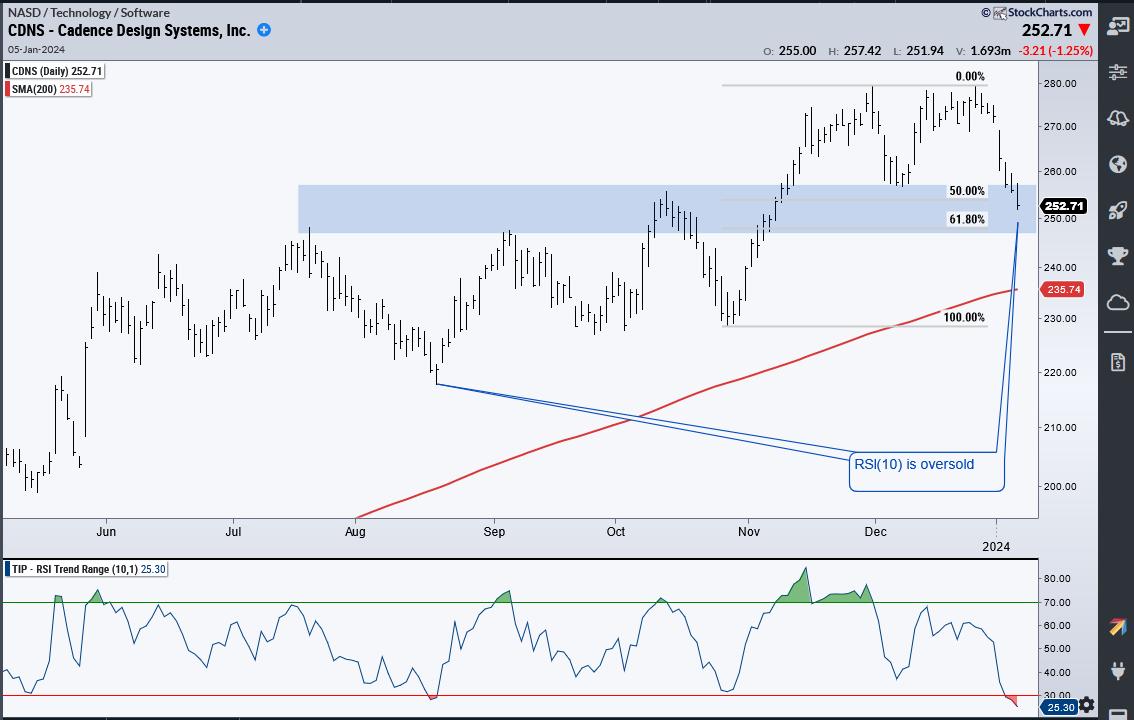 We do not need an indicator to understand that a stock is short-term oversold after an 8% decline in two weeks. Nevertheless, we can quantify oversold conditions using RSI(10) which moved below 30 (red shading). CDNS is both oversold and weak as long as RSI remains below 30. This is important to note because stocks can become oversold and remain oversold. An RSI move above 30 would signal improving momentum and could lead to a bounce. This occurred in mid August. We do not need an indicator to understand that a stock is short-term oversold after an 8% decline in two weeks. Nevertheless, we can quantify oversold conditions using RSI(10) which moved below 30 (red shading). CDNS is both oversold and weak as long as RSI remains below 30. This is important to note because stocks can become oversold and remain oversold. An RSI move above 30 would signal improving momentum and could lead to a bounce. This occurred in mid August.
The System Trader offering at TrendInvestorPro runs a mean-reversion strategy that trades stocks in the Russell 1000. This strategy identifies short-term oversold stocks, buys into weakness and sells on the first bounce. It is a short-term hit-and-run strategy that seeks to complement our momentum-rotation strategies. Click here to see performance metrics and learn more.
//////////////////////////////////////////////////
|
| READ ONLINE → |
|
|
|
| The Traders Journal |
| Common Lessons Amongst Corporate, Sports & Investment Portfolio Turnarounds! |
| by Gatis Roze |

My many decades of business, investing, and sports experience has shown me time and time again that parallel lessons in all three arenas are remarkably worthy teachers. One essential lesson today (January 2024) is to not allow yourself to become a "legend in your own mind." Yes, you likely achieved spectacular investing results in 2023. But before you embrace the mantle of the next Warren Buffett, please remember that the S&P 500 was up over 24%. Whichever popular cliche you care to embrace, ("a rising tide lifts all boats", perhaps?), you need to stay humble. If you don't, the market will inevitably oblige and remind you that indeed you are not Warren Buffett.
I am prompted by these observations as I read the Wall Street Journal article (Jan 6, 2024) about football turnaround coach, Jim Harbaugh at the University of Michigan. Even business schools are studying his methods. Because successful turnarounds in different arenas have strikingly similar attributes.
Coach Harbaugh makes it sound straightforward (which of course it is not). He claims it simply takes the following:
- Hard work.
- Make sure you improve and get better everyday.
- Acknowledge the improvements as they compound and reinforce winning results.
Sure, there are many obvious differences between distressed companies, discouraged sports teams and anguished investors. But my point is that regardless of your 12-0 investment season in 2023, when it comes to money management, Harbaugh's 3 simple rules should guide and motivate you into the new year.
I've written pretty much the same lines to myself in my own trading journal. I had many of my biggest positions — such as ADBE, AMZN, MSFT and COST — nicely outperform the market, but I had to remember what Marty Zweig used to preach. "The trend is your friend." In 2023, it was my best friend! I assure you that the script will be different in 2024. Don't start to coast.
Therefore, I implore you to embrace Harbaugh's 3 rules and rededicate yourself to our craft.
I write this to myself as much as to all of you — my investor friends. As Coach reminds us, always get back to the fundamentals. Fundamentals matter. With that in mind, I'd like to suggest you revisit the investor roadmap to success being the 10 essential stages of stock market mastery (from our book Tensile Trading). It provides the foundation for consistently profitable investing.

Here's why these 10 stages are essential. Without an orderly roadmap to regiment and organize one's analysis, our investment decisions can be easily tainted by the excitement and influences of the moment. Impulsive investing is poisonous. The 10 stages provide you with an understanding and justification for buying an equity, or help you decide if you should buy it at all.
The bottom line is that when you adopt the 10 stages and develop the appropriate discipline and skill set, your experience will compound. Each stage contributes to increasing the probability of achieving a profitable trade. The result being not only improvement and "a higher batting average", but a consistency and understanding of your methodology which you can replicate over and over again.
Yes — you can achieve consistent profits and understand how you did it. 2024 here we come!
Trade well; trade with discipline!
-- Gatis Roze
|
| READ ONLINE → |
|
|
|
| ChartWatchers |
| Stock Market Was Tentative This Week: S&P 500 Tested New High But Pulled Back |
| by Jayanthi Gopalakrishnan |

Earnings, Bitcoin ETFs, inflation data, geopolitical tensions—lots of activity at the tail end of the trading week. And the pesky S&P 500 ($SPX) stopped short of closing at a new high.
Earnings season kicked off this week with JPMorgan Chase (JPM), Citigroup (C), Wells Fargo (WFC), and Bank of America (BAC) reporting Q4 results. Overall, earnings were a mixed bag with some misses and some beats, but that was because of Q4 charges some of the banks faced. Beneath the surface, the earnings may not be as bad as they appear. However, there is concern about how banks will perform in a lower interest rate environment. C shares closed higher.
Delta Airlines (DAL) also announced earnings, and although its earnings came in better than expected, weak forward guidance brought the stock lower. The stock fell over 8% on Friday, and the effects of this report rippled through the airline industry.
Another notable event this week was the SEC's approval of spot Bitcoin exchange-traded funds (ETFs). These ETFs will give investors more access to the cryptocurrency. When the news broke out, Bitcoin rallied, hitting a high of $49,435, but pulled back since then, ending the week at around $43,600. Many traders expected a "buy the rumor, sell the news" scenario to play out, so the pullback in Bitcoin isn't surprising.
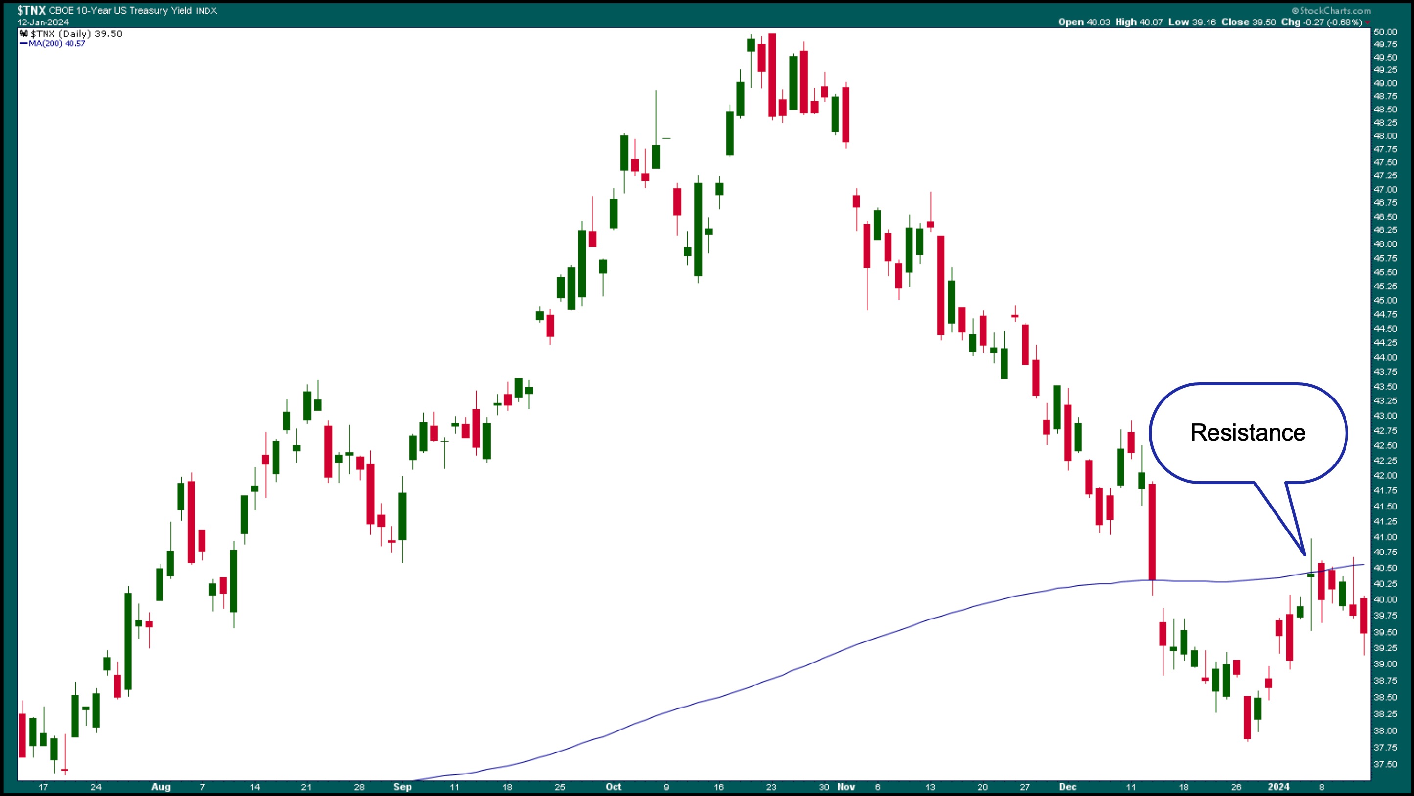
We also got inflation data this week. December CPI came in higher than expected, suggesting that inflation is still hot. But the PPI fell 0.1% and came in below expectations, which calmed investors, though they still seem hesitant. Wages are still rising, but energy and raw material costs are declining. The 10-year Treasury Yield ($TNX) pulled back after hitting resistance at its 200-day moving average (see chart below).

CHART 1. TREASURY YIELD PULLS BACK. The 10-year Treasury Yield moved higher, but pulled back after hitting resistance at its 200-day simple moving average.Chart source: StockCharts.com. For educational purposes.
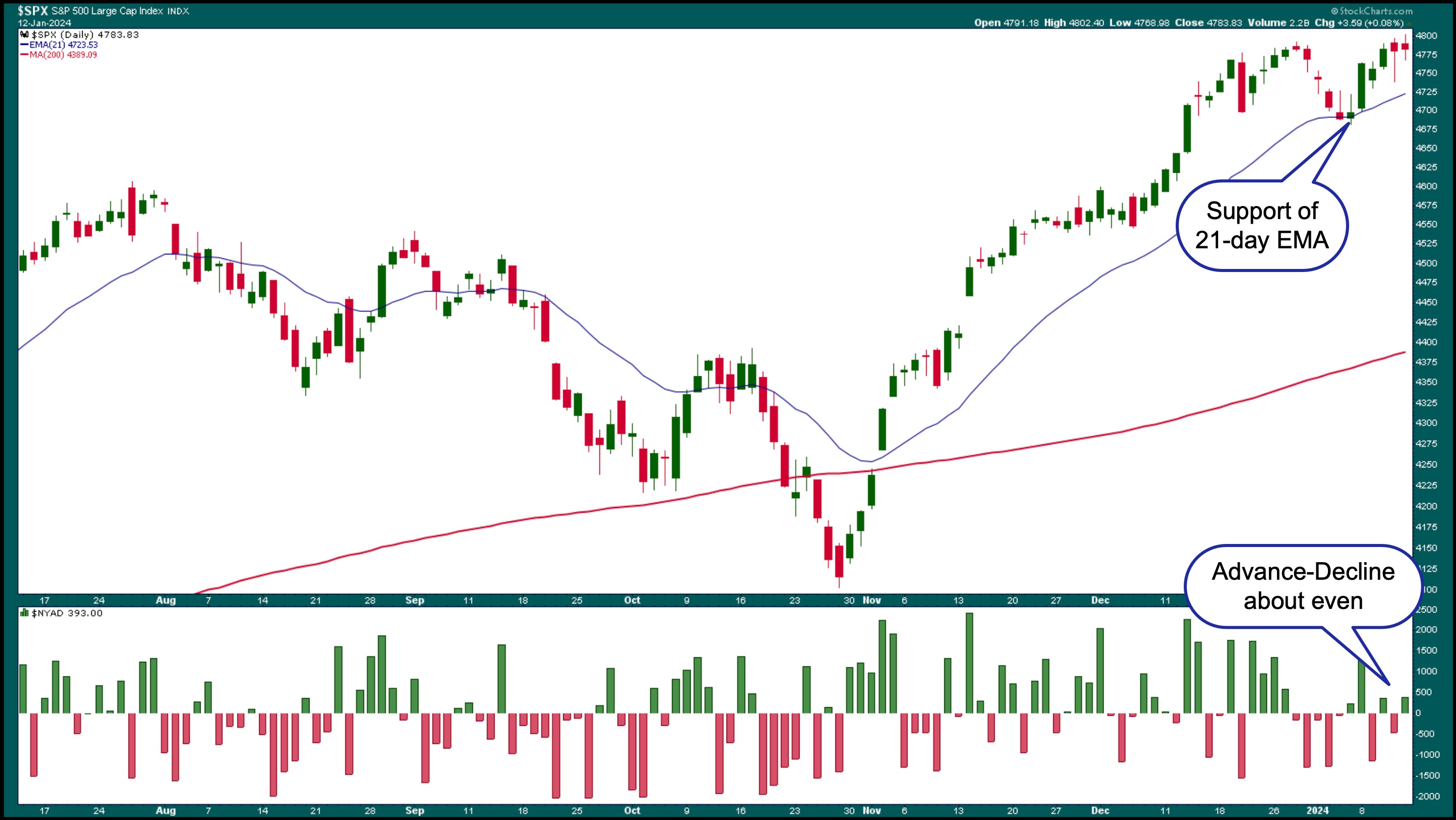
So far this year, there's been some up and down movement in the stock market, but if you look at a daily chart of the S&P 500 ($SPX), it has held on to the support of its 21-day exponential moving average (EMA) and is close to reaching its all-time high. During Friday's trading, the S&P 500 hit a high above 4800, but pulled back. It isn't unusual for an index like the S&P to test a key resistance level. If earnings come in strong next week, there's a chance the index could close at an all-time high.

CHART 2. S&P 500 HOLDS SUPPORT. Even though the S&P 500 didn't close at a new high, it's still holding support, and the NYSE advance-decline line is showing even sentiment between bulls and bears.Chart source: StockCharts.com. For educational purposes.
The market internals are also holding steady. In the above chart, the NYSE Advance-Decline Line in the lower panel indicates that the number of advances vs. declines is pretty balanced. The CBOE Volatility Index ($VIX) climbed higher the first week of the month, but the index has settled back to below 13. This indicates that investors are still calm.
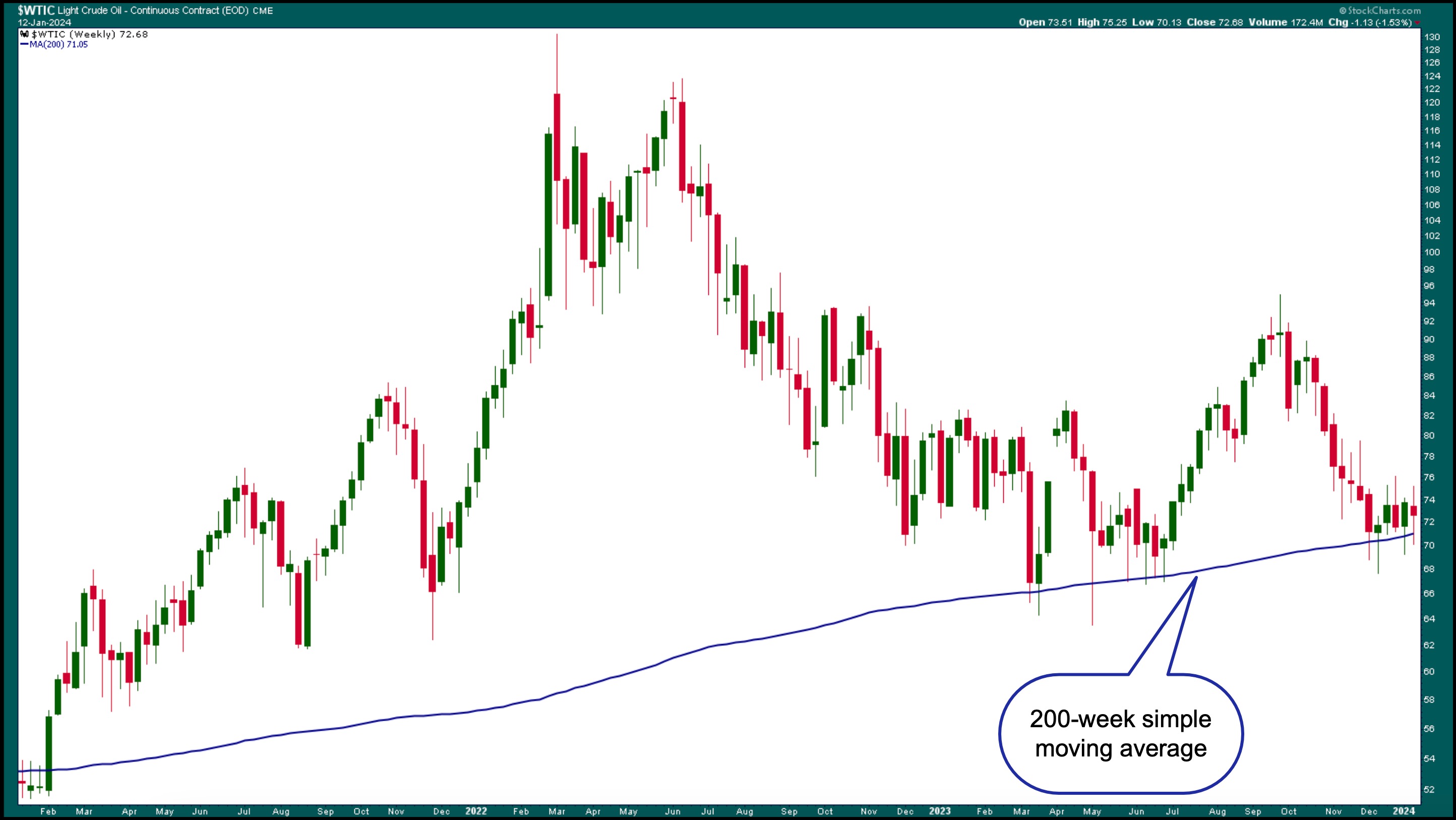
Given the further escalation of geopolitical tensions in the Red Sea, it wouldn't be out of reach for investors to be hesitant to add positions ahead of the holiday weekend. Crude oil prices moved higher and broke above $75 per barrel on this news, but pulled back. Looking at the weekly chart of crude oil below, it's holding support at the 200-week simple moving average (SMA).

CHART 3. CRUDE OIL HOLDS SUPPORT AT 200-WEEK MOVING AVERAGE. Crude oil prices rose on news of tensions in the Red Sea, but pulled back.Chart source: StockCharts.com. For educational purposes.
Shipping stocks also rose today on the news. Many shipping exchange-traded funds (ETFs) such as SonicShares Global Shipping (BOAT), US Global Sea To Sky Cargo (SEA), and Breakwave Tanker Shipping (BWET) gapped higher on Friday.
The S&P 500 is getting a little toppy, so it's not surprising that investors are extra cautious. If conditions are stable and the stock market moves higher next week, it may be time to keep your eyes peeled for any signs of market weakness. Even the stock market can't anticipate geopolitical tensions, so it's best to stay alert.
End-of-Week Wrap-Up

- $SPX up 0.08% at 4783.83, $INDU down 0.31% at 37592.98; $COMPQ up 0.02% at 14972.76
- $VIX up 2.09% at 12.70
- Best performing sector for the week: Technology
- Worst performing sector for the week: Energy
- Top 5 Large Cap SCTR stocks: Affirm Holdings (AFRM); USX-US Steel Group (X); Crowdstrike Holdings, Inc. (CRWD); Karuna Therapeutics, Inc. (KRTX); Vertiv Holdings (VRT).
On the Radar Next Week
- Earnings week continues, with Goldman Sachs (GS), Morgan Stanley (MS), Charles Schwab (SCHW), Taiwan Semiconductor (TSM), and American Airlines (AAL) reporting.
- December Housing Starts
- December Existing Home Sales
Disclaimer: This blog is for educational purposes only and should not be construed as financial advice. The ideas and strategies should never be used without first assessing your own personal and financial situation, or without consulting a financial professional.
|
| READ ONLINE → |
|
|
|
| Don't Ignore This Chart! |
| XLV's Record Rally: The Must-Know Investment Move of the Year |
| by Karl Montevirgen |

If you ran a StockCharts scan for New All-Time Highs on January 9, one of the exchange-traded funds (ETFs) you would have come across is XLV, the Healthcare Select SPDR Fund. XLV is an index ETF that represents the Healthcare sector. A defensive gameplay, XLV's performance over the last few months has been spectacular, with a 16% rise from its October low of 122.04 to last Tuesday's high of 141.56.
So, are we seeing a sector rotation gaining enough momentum for longer-term growth? And with attractively lower valuations, new weight-loss drugs coming into the market, and a potential increase in healthcare utilization, is it time to jump in?
A One-Year Snapshot of Sector Performance

CHART 1. SECTOR SUMMARY. Note XLV's one-year performance, which is relatively tepid.Chart source: StockCharts.com. For educational purposes.
If you head to the StockCharts Sector Summary section and view sector performance over one year, you'll see that XLV has returned 5.87% over the last 12 months. Compared to Technology, Communications, and Consumer Discretionary—the year's top performers—Healthcare (XLV) has room to run.
XLV also has a StockCharts Technical Rank (SCTR) score of 89, which is relatively strong. What's important about this? Well, using six technical indicators, SCTR compares the technical strength of one stock or ETF against all others in its peer group. It does a lot of the technical work for you by comparing its technical strength.
But before looking at XLV's current price action, let's add something else. Let's take a look at its seasonal performance over the last 10 years, relative to itself and the S&P 500 ($SPX). This is to give a better context to its current price action and possibly to determine whether to enter a position now or wait.
XLV's 10-Year Seasonal Snapshot
Here's what XLV's seasonal performance looks like over a 10-year period.

CHART 2. XLV'S 10-YEAR SEASONAL PERFORMANCE. Note the difference between higher closing rates versus market returns.Chart source: StockCharts.com. For educational purposes.
We can see that November is a relatively strong month for XLV. On average, its rate of higher closes stands at 78% (see number on top of the bar), and its average return stands at 3.6%, which is also the highest "average" return on a 10-year basis.
The rate of higher closes and average returns have historically dwindled after November; see the average January return of 0% despite its high rate of higher closes, which stands at 60%. So, according to this chart, July and November are XLV's strongest months in terms of returns and higher close rates.
Now, let's compare XLV's seasonal performance against the S&P 500 ($SPX).
XLV's 10-Year Seasonal Performance Against the S&P 500
The picture changes quite drastically when looking at XLV's performance relative to the S&P 500.

CHART 3. XLV SEASONAL PERFORMANCE VS S&P 500. Depending on whether you're looking to outperform the broader market or diversify your holdings within the broader market, this seasonal chart highlighting relative (seasonal) strength paints a slightly different picture from the one in the earlier chart.Chart source: StockCharts.com. For educational purposes.
When it comes to outperforming the S&P 500, XLV's strongest month is December (historically outperforming the broader index by 1.1%) and June (outperforming the S&P by 0.8%). While July may be SLV's second strongest month when viewed in relation to its performance, the S&P 500 has tended to outperform SLV in the same month.
So, what does XLV look like now? Let's start with a longer-term view (see weekly chart below).

CHART 4. WEEKLY CHART OF XLV. Note how Volume-by-Price and the 50-period SMA converge near the same range, indicating potential support.Chart source: StockCharts.com. For educational purposes.
While XLV has barely clawed its way to an all-time high, note the significant change in the Chaikin Money Flow (CMF), which averaged net positive over the last four years and is now slightly above the zero line following months in the red. The increase in selling pressure indicates bearishness. However, that's not necessarily what the price action is telling us.
The 200-period simple moving average (SMA) shows a steady upward trajectory. But look at the 50-period SMA and how prices have fluctuated above and below it in a wide trading range for over two years. If the current breakout fails but retains a fundamentally bullish stance, then look to the 50-period SMA for a potential bounce. This relative range also coincides with the longest Volume-by-Price bar, presenting a strong case for anticipating support.
Let's take an even closer look by looking at the daily chart (see below).

CHART 5. DAILY CHART OF XLV. Note how the daily chart suggests the same support range as the longer-term weekly chart above.Chart source: StockCharts.com. For educational purposes.
The Relative Strength Index (RSI) confirms the likelihood that XLV may experience some near-term weakness, giving the RSI's "overbought" reading. The 200-day SMA and Volume-by-Price both converge on the $130 to $131 range for potential support (similar to the weekly chart). The Ichimoku cloud adds another layer of confirmation of potential support within that range.
Below the chart, note XLV's relative performance against the S&P 500 (remember that earlier seasonal chart). XLV's recent underperformance suggests that, given the right economic factors, the Healthcare sector could have plenty of room to run.
But when might we expect this, or where would be a good tactical entry point if we can't entirely predict it?
Using Seasonality to Evaluate an Entry Point

While some investors look to Healthcare stocks to diversify their return sources, others do so in anticipation of a turn in the business cycle. Right now, analyst expectations for 2024 remain mixed.
So, looking at seasonality to provide context to a potential entry point (assuming you're bullish on XLV), we know that February is a historically poor month for XLV (in terms of higher-close rates and return), both on its own and compared to the S&P 500.
Some investors may find underperforming months the ideal time to buy in anticipation of XLV's stronger seasonal months, around June through November. If you share this thesis, waiting for XLV's prices to reach the $130–$131 range may provide the ideal opportunity to open a position for a longer-term trade. You will want to set a price alert for $131 in this case.
View Seasonality Charts For a Wider Context
Some stocks tend to shine brighter in certain months of the year. With StockCharts' interactive Seasonality Chart tool, you can dive into this aspect of technical analysis. This tool allows you to explore how often any security has gone up during each month of the year. Select a stock and see if there's a seasonal pattern to its performance. If you're unfamiliar with this method or tool, check out this tutorial.
How To Set a Technical Price Alert
Setting a technical alert at these support and resistance levels will be helpful as you weigh your potential entry points against any market developments that may influence your decision.
To access the Technical Alert Workbench, follow these steps:
- Log in to your account.
- At the top of any page, click on Your Dashboard.
- Click the Alerts button or the New button in the Your Alerts panel.
- Choose which type of alert you want to create from the Alert Type buttons at the top left. To create a price alert, select "Price Alert" as the alert type.
- Add COST in the symbol box and set your price trigger.
- Choose how you wish to be notified and then click the Save Alert button.
Disclaimer: This blog is for educational purposes only and should not be construed as financial advice. The ideas and strategies should never be used without first assessing your own personal and financial situation, or without consulting a financial professional.
|
| READ ONLINE → |
|
|
|
| DecisionPoint |
| Dramatic Bearish Bias Shift on Major Market Indexes This Week |
| by Erin Swenlin, Carl Swenlin |
(This is an excerpt from the subscriber-only DecisionPoint Alert on DecisionPoint.com)
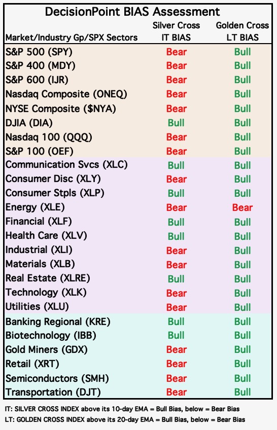
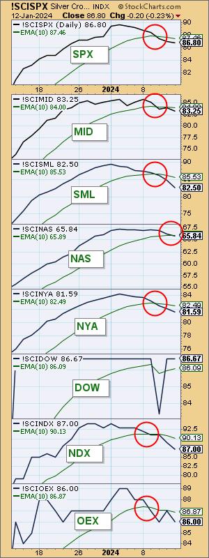
This week, the markets experienced a dramatic bias shift. We measure the Intermediate-Term Bias using our Silver Cross Index (SCI). The SCI measures how many stocks within an index, sector, or industry group hold "silver crosses", as in a 20-day EMA above the 50-day EMA.
When the SCI moves below its signal line, it shifts the Bias to BEARISH. This week, we saw every major market index we follow, with the exception of the Dow Industrials, move to Bearish Biases. We've also seen similar activity among the sectors and industry groups we follow.

To reiterate, the bias shift is due to a Silver Cross Index crossing down through its 10-day EMA, which means that some stocks within the given market index are experiencing 20/50-day EMA downside crossovers. When the 20-day EMA is below its 50-day EMA, the stock is, at the very least, in correction mode. The chart below is one that we use daily to track bias shifts. Clearly, most indexes still have a high percentage of stocks that still have a Silver Cross, but their bias is now bearish because of the shift below the moving average.

Conclusion: Based on the Silver Cross Indexes moving below their EMAs, we have new Bearish Biases on nearly every market index we follow. These Bear Shifts often precede longer declines. The weakness within these indexes implies a more concerted decline to follow.
Be sure to take advantage of our free trial if you want to know the Bias in all three timeframes daily. As a subscriber, you also have access to our exclusive ChartLists. Just use coupon code: DPTRIAL2 at checkout.
Learn more about DecisionPoint.com:

Try us out for two weeks with a trial subscription!
Use coupon code: DPTRIAL2 at checkout!
Technical Analysis is a windsock, not a crystal ball. --Carl Swenlin
(c) Copyright 2024 DecisionPoint.com
Disclaimer: This blog is for educational purposes only and should not be construed as financial advice. The ideas and strategies should never be used without first assessing your own personal and financial situation, or without consulting a financial professional. Any opinions expressed herein are solely those of the author, and do not in any way represent the views or opinions of any other person or entity.
DecisionPoint is not a registered investment advisor. Investment and trading decisions are solely your responsibility. DecisionPoint newsletters, blogs or website materials should NOT be interpreted as a recommendation or solicitation to buy or sell any security or to take any specific action.
Helpful DecisionPoint Links:
DecisionPoint Alert Chart List
DecisionPoint Golden Cross/Silver Cross Index Chart List
DecisionPoint Sector Chart List
DecisionPoint Chart Gallery
Trend Models
Price Momentum Oscillator (PMO)
On Balance Volume
Swenlin Trading Oscillators (STO-B and STO-V)
ITBM and ITVM
SCTR Ranking
Bear Market Rules
|
| READ ONLINE → |
|
|
|
| Dancing with the Trend |
| The Hoax of Modern Finance - Part 4: Misuse of Statistics and Other Controversial Practices |
| by Greg Morris |
Note to the reader: This is the fourth in a series of articles I'm publishing here taken from my book, "Investing with the Trend." Hopefully, you will find this content useful. Market myths are generally perpetuated by repetition, misleading symbolic connections, and the complete ignorance of facts. The world of finance is full of such tendencies, and here, you'll see some examples. Please keep in mind that not all of these examples are totally misleading -- they are sometimes valid -- but have too many holes in them to be worthwhile as investment concepts. And not all are directly related to investing and finance. Enjoy! - Greg
The Deception of Average
The World of Finance is fraught with misleading information.
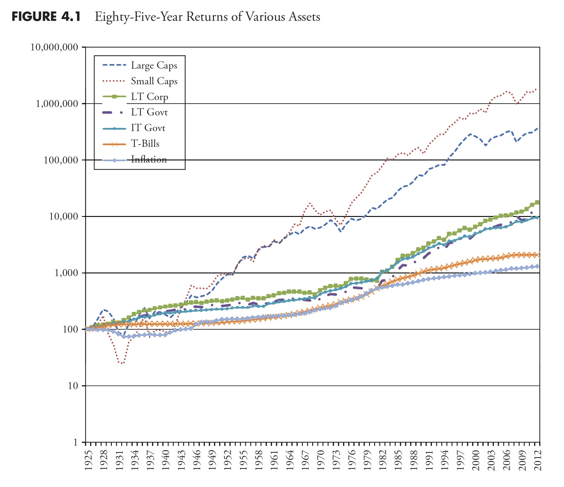
The use of averages, in particular, is something that requires discussion. Figure 4.1 shows the compounded rates of return for a variety of asset classes. If I were selling you a buy-and-hold strategy, or an index fund, I would love this chart. Looking at the 85 years of data shown here, I could say that, if you had invested in small-cap stocks, you would have averaged 11.95 percent a year, and if you had invested in large-cap stocks, you would have averaged 9.85 percent a year. And I would be correct.
 Figure 4.1 Figure 4.1
I think that most investors have about 20 years, maybe 25 years, in which to accumulate their retirement wealth. In their 20s and 30s, it is difficult to put much money away for many reasons, such as low incomes, children, materialism, college, and so on. Therefore, with that information, what is wrong with this chart? It is for an 85-year investment, and people do not have 85 years to invest. As said earlier, most have about 20 years to acquire their retirement wealth. and there are many 20-year periods in this chart where the returns were horrible. The bear market that began in 1929 did not fully recover until 1954, a full 25 years later; 1966 took 16 years to recover, 1973 took 10 years, and, as of 2012, the 2000 bear still had not recovered.
Table 4.1 shows the performance numbers for the asset classes shown in Figure 4.1 (LT—Long Term, IT—Intermediate Term). The cumulative numbers in Table 4.1 begin at 1 on December 31, 1925.
 Table 4.1Hint: Be careful when someone uses inappropriate averages; or more accurately, uses averages inappropriately. Table 4.1Hint: Be careful when someone uses inappropriate averages; or more accurately, uses averages inappropriately.
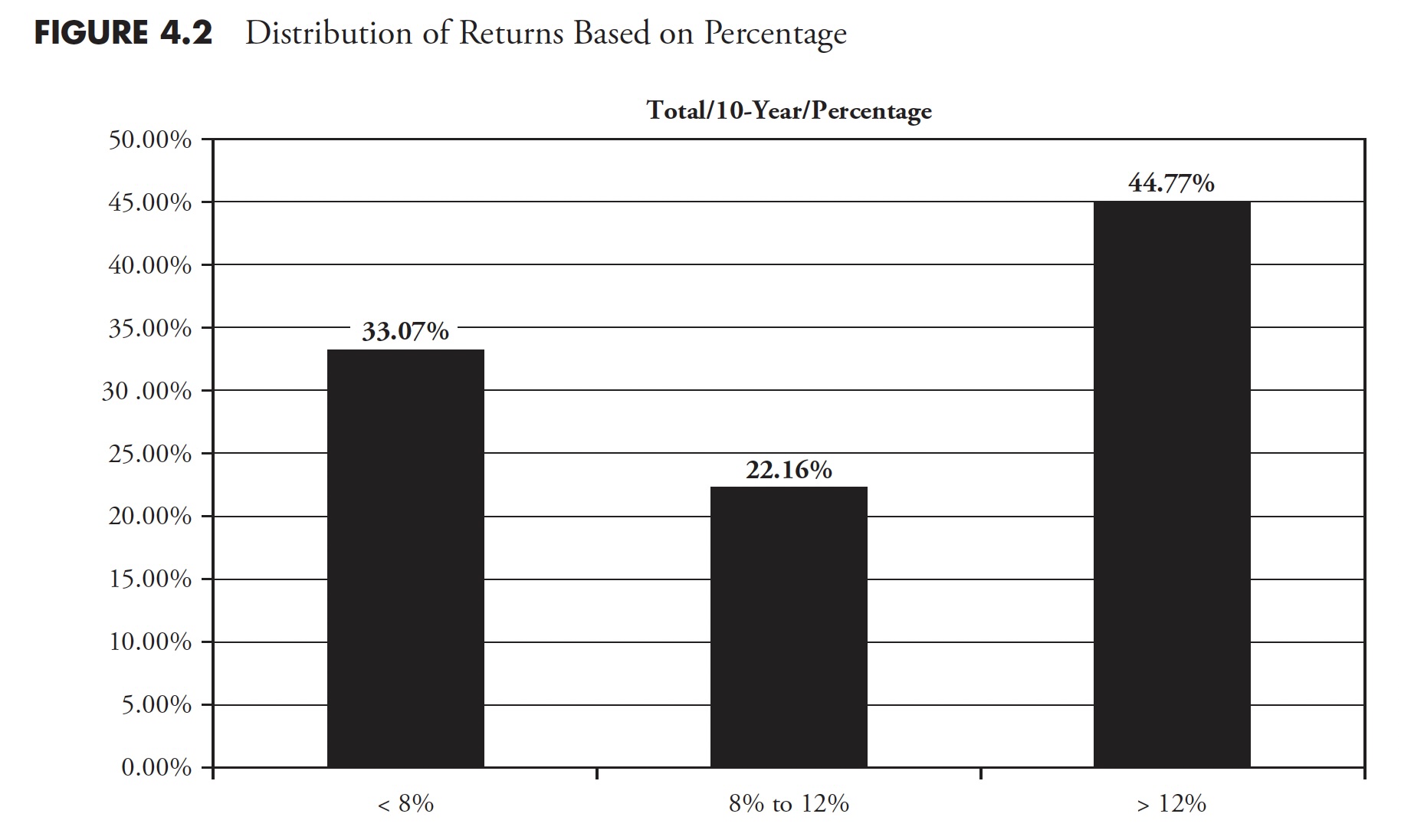
In Table 4.1, recall how the small-cap and large-cap compounded returns were about 12 percent and 10 percent, respectively. Figure 4.2 shows rolling 10-year returns by range since 1900. A rolling return means it shows the periods 1900–1909, 1901–1910, 1902–1911, and so on. You can clearly see that the small stock and large stock returns depicted in Table 4.1 fall within the middle range (8 percent–12 percent) in Figure 4.2, yet, of all the 10-year rolling periods, only 22 percent of them were in that range. Often, average is not very average. It reminds me of the story of the six-foot-tall Texan that drowned while wading across a stream that averaged only three-feet deep.
 Figure 4.2 Figure 4.2
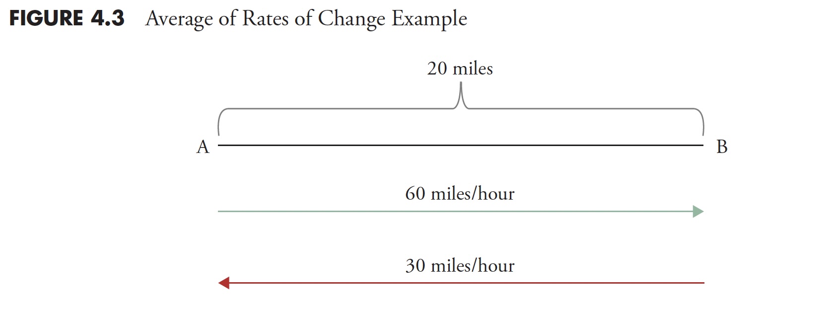
Another (and final) example shows how easily it is to be confused over what is average. And, of course, this time it is intentional. This example should put it in perspective. You cannot relate rates of change linearly. In Figure 4.3 , point A is 20 miles from point B. If you drive 60 mph going from point A to point B, but returning from point B to point A, you drive 30 mph. What is his average speed for the time you were on the road?
A. 55 mph
B. 50 mph
C. 45 mph
D. 40 mph
 Figure 4.3 Figure 4.3
Many will answer that it is 45 mph ((60mph + 30mph)/2). However, you cannot average rates of change like you can constants and linear relationships. Distance is rate multiplied by time (d = rt). So time (t) is distance (d)/rate (r). The first leg from A to B was 20 miles divided by 60 mph or one-third of an hour. The second leg from B to A was 20 miles divided by 30 mph or two-thirds of an hour. Adding the two times (1/3+2/3 = 1 hour) will mean you traveled for one hour and covered a total distance of 40 miles, which has to mean the average speed was 40mph. Look up harmonic mean if you want more information on this, as it is the correct method to determine central tendency of data when it is in the form of a ratio or rate.
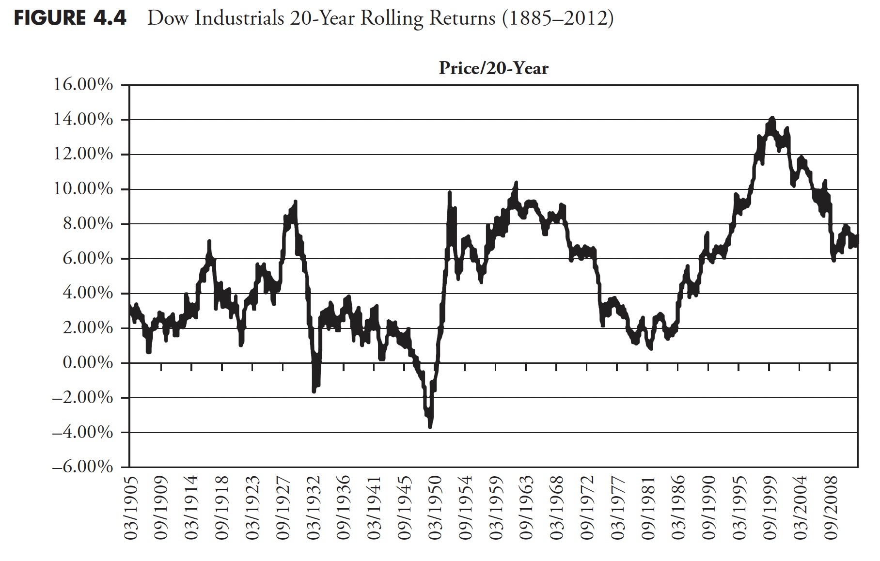
Figure 4.4 shows the 20-year rolling price returns for the Dow Industrials. The range of returns in this 127-year sample (1885–2012) is from a low on 08/31/1949 (of .3.71) percent to a high on 3/31/2000 (of 14.06 percent), a 17.77 percent range.
To help clarify rolling returns, if investors were in the Dow Industrials from 9/30/1929 until 8/31/1949 (the low mentioned previously), they had a return of .3.71 percent. Complementary, if they invested on 4/30/1980, then, on 3/31/2000, they had a return of 14.06 percent. The mean return is 5.2 percent and the median return 4.8 percent. When median is less than mean, it simply means more returns were less average. If you recall the long-term assumptions that are often used in the first part of this chapter (Figure 4.1), you can see there is a problem. The magnitude of errors in assumptions of long-term returns cannot be overstated and certainly cannot be ignored. This variability of returns can mean totally different retirement environments for investors who use these long-term assumptions for future returns. It can be the difference between living like a king, or living on government assistance. Institutional investors have the same problems if using these long-term averages.
 Figure 4.4 Figure 4.4
One of the primary beliefs developed by Markowitz in the 1950s as the architect of Modern Portfolio Theory was the details on the inputs for the efficient investment portfolio. In fact, his focus was hardly on the inputs at all. The inputs that are needed are expected future returns, volatility, and correlations. The industry as a whole took the easy approach to solving this by utilizing long-term averages for the inputs -- in other words, one full swing through all the data that was available, and the average is the one used for the inputs into an otherwise fairly good theory. Those long-term inputs are totally inappropriate for the investing horizon of most investors; in fact, I think they are inappropriate for all human beings. While delving into this deeper is not the subject of this book, it once again brings to light the horrible misuse of average. These inputs should use averages appropriate for the investor's accumulation time frame.
One If by Land, Two If by Sea
Sam Savage is a consulting professor of management science and engineering at Stanford University, and a fellow of the Judge Business School at the University of Cambridge. He wrote an insightful book, The Flaw of Averages, in 2009, wherein he included a short piece called "The Red Coats" that fits right into this chapter.
Spring 1775: The colonists are concerned about British plans to raid Lexington and Concord, Massachusetts. Patriots in Boston develop a plan that explicitly takes a range of uncertainties into account: The British will come either by land or by sea. These unsung pioneers of modern decision analysis did it just right by explicitly planning for both contingencies. Had Paul Revere and the Minutemen planned for the single average scenario of the British walking up the beach with one foot on the land and one in the sea, the citizens of North America might speak with different accents today.
Incidentally, Dr. Savage's father, Leonard J. Savage, wrote the seminal The Foundation of Statistics in 1972 and was a prominent mathematical statistician who collaborated closely with Milton Friedman.
Everything on Four Legs Is a Pig
Although this is unrelated to investments and finance, it is a story about averages that offers additional support to this topic. Doctors use growth charts (height and weight tables) for a guide on the growth of a child. What folks do not realize is that they were created by actuaries for insurance companies and not doctors. As doctors began to use them, the terms overweight, underweight, obese, and so on were created based on average. So if your doctor says you are overweight and you need to lose weight, he is also saying you need to lose weight to be average. And from a Wall Street Journal article by Melinda Beck on July 24, 2012, "The wide variations are due in part to rising obesity rates, an increase in premature infants who survive, and a population that is growing more diverse. Yet the official growth charts from the Centers for Disease Control (CDC) and Prevention still reflect the size distribution of U.S. children in the 1960s, 1970s, and 1980s. The CDC says it doesn't plan to adjust its charts because it doesn't want the ever-more-obese population to become the new norm." And now you know.
During my last physical examination, I told my doctor about how these charts on height and weight were just large averages created by actuaries for insurance companies, and that I did not mind being above average. The chapter that follows focuses on the multibillion-dollar industry of prediction. I rarely am invited to be on the financial media anymore because I refuse to make a prediction; it is a fool's game.
Thanks for reading this far. I intend to publish one article in this series every week. Can't wait? The book is for sale here.
|
| READ ONLINE → |
|
|
|
| MORE ARTICLES → |
|


 Mean-reversion strategies typically buy stocks when they are oversold, which means catching the falling knife. These declines are often rather sharp, but the odds favor some sort of bounce after reaching an oversold extreme. While there are no guarantees, chartists can mitigate risk by insuring that the stock is still in a long-term uptrend. Today's chart will show one such setup. Note that this stock is currently a setup for the
  We do not need an indicator to understand that a stock is short-term oversold after an 8% decline in two weeks. Nevertheless, we can quantify oversold conditions using RSI(10) which moved below 30 (red shading). CDNS is both oversold and weak as long as RSI remains below 30. This is important to note because stocks can become oversold and remain oversold. An RSI move above 30 would signal improving momentum and could lead to a bounce. This occurred in mid August.


