| THIS WEEK'S ARTICLES |
| The Mindful Investor |
| What's the Downside Risk for QQQ? |
| by David Keller |
The Nasdaq 100 ETF (QQQ) is beginning to show further signs of deterioration, from bearish momentum divergences between price and RSI to weakening breadth using the Bullish Percent Index. How can we determine whether a pullback could turn into something more disastrous for stocks? Let's look at how the 50-day moving average, Chandelier exits, and Fibonacci retracements can help anticipate downside risk for the QQQ.
To kick things off, we need to acknowledge how the QQQ has a place of distinction on the growing list of charts showing bearish momentum divergences.
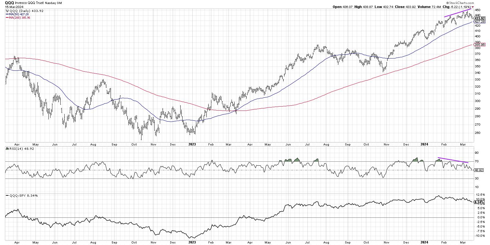
This classic sign of a bull market top is when price continues to trend higher while the RSI (or some other momentum indicator) begins to slope downwards. Think of this pattern as a train running out of steam as it reaches the top of a hill. This weakened momentum usually occurs at the end of a bullish phase, when buyers are exhausted and there just isn't enough momentum left to push the markets much higher.
But it's not just about weakening momentum. Breadth conditions, which remain fairly constructive for the broader equity space, have really deteriorated in the past ten weeks.
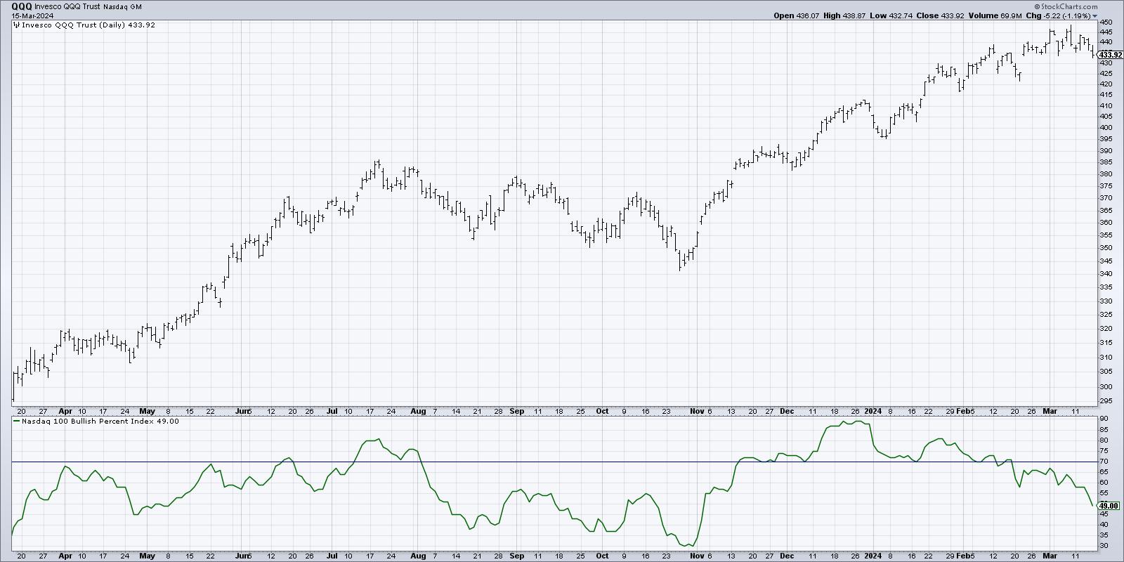
Here, we're showing the Bullish Percent Index for the Nasdaq 100. This is a market breadth indicator based on point & figure charts, and basically measures how many stocks in a specific index are currently showing a bullish point & figure signal.
Note how, in late December, this indicator was around 90%, meaning nine out of every ten Nasdaq 100 members were in a bullish point & figure phase. This week, we saw the indicator finished just below 50%. This shows that about 40% of the Nasdaq 100 members generated a sell signal on their point & figure charts in 2024.
What's very interesting about that particular development is that point & figure charts usually have to show quite a bit of price weakness to generate a sell signal. So names like TSLA, AAPL, and others are breaking down, which suggests that further upside for the QQQ would be limited until this breadth indicator improves.
Are you prepared for further downside for the QQQ and leading growth names? The first item in my Market Top Checklist has already been triggered. Join me for my upcoming FREE webcast on Tuesday, March 19th, where I'll share the other six items on the checklist and reflect on what signals we'll be watching for in the coming weeks. Sign up HERE for this free event!
So what if the Nasdaq 100 does continue lower? At what point can we confirm that a corrective phase has truly begun? I like to keep things simple, so, in terms of an initial trigger for a tactical pullback, I always start with the 50-day moving average.
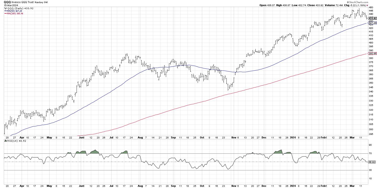
The 50-day moving average currently sits about $6 below Friday's close, and also lines up pretty well with the February swing low around $425. So as long this level would hold, the short-term trend actually remains in good shape. A break below that 50-day moving average would tell me there is a much higher likelihood of further price deterioration.
But the 50-day moving average, while a simple and straightforward situation, is perhaps not the most effective way to gauge a new downtrend phase. Alexander Elder popularized the Chandelier Exit system in his books, and it represents a more nuanced version of a trailing stop because it is based on Average True Range (ATR).
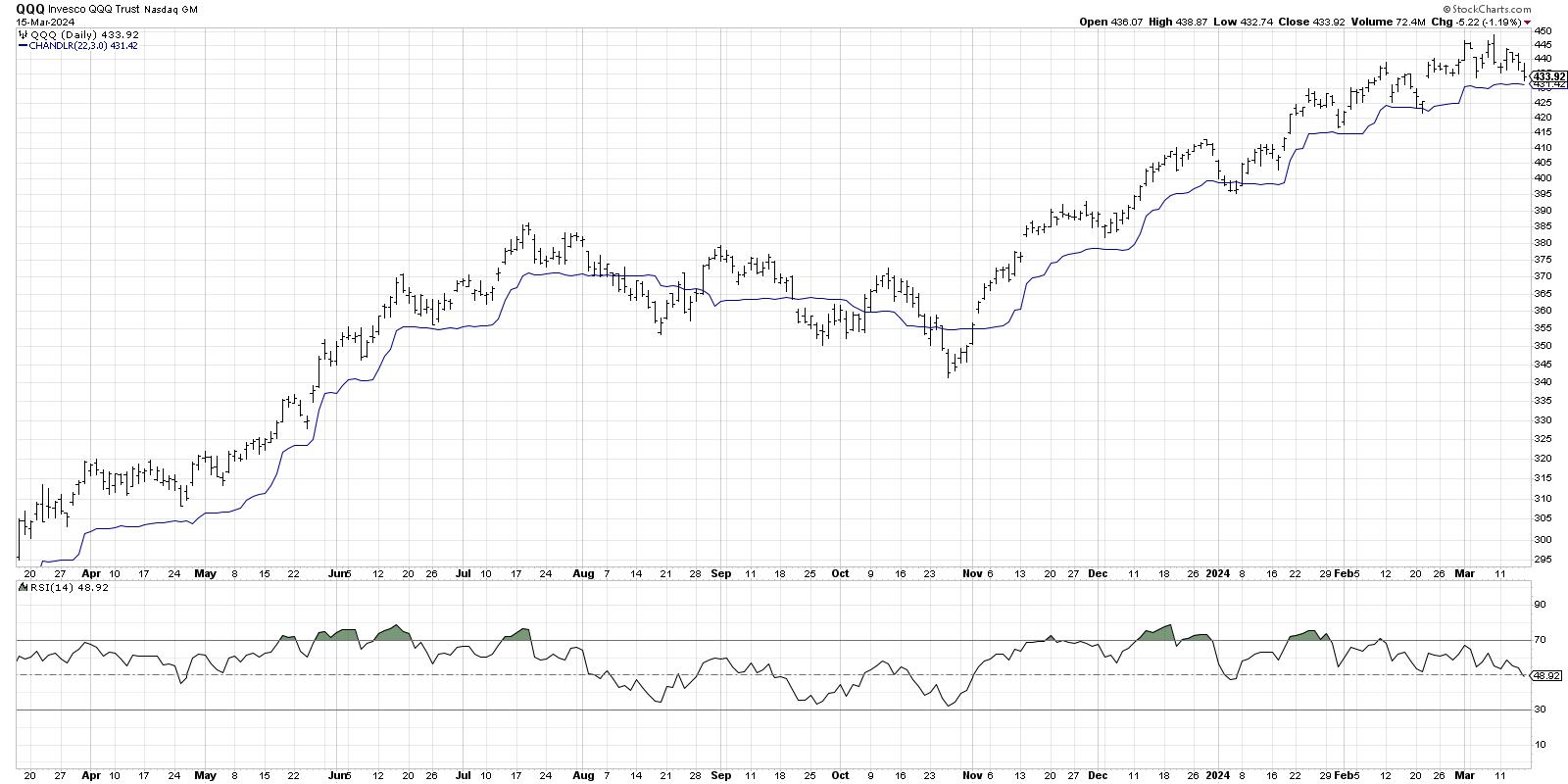
Look back at the price peak in July 2023, and notice how the price remained above the Chandelier Exit through that price high. Soon after, the price violated the trailing stop to the downside, suggesting the uptrend phase was over and a corrective move had begun. Since the October 2023 low, the QQQ has consistently remained above the Chandelier Exit on pullbacks, as the price achieved higher highs and higher lows into March. After Friday's drop, the Nasdaq 100 remains just above this effective trailing stop indicator.
So what if the Chandelier Exit is violated next week, and the QQQ begins to drop to a new swing low? What's next for the Nasdaq 100?
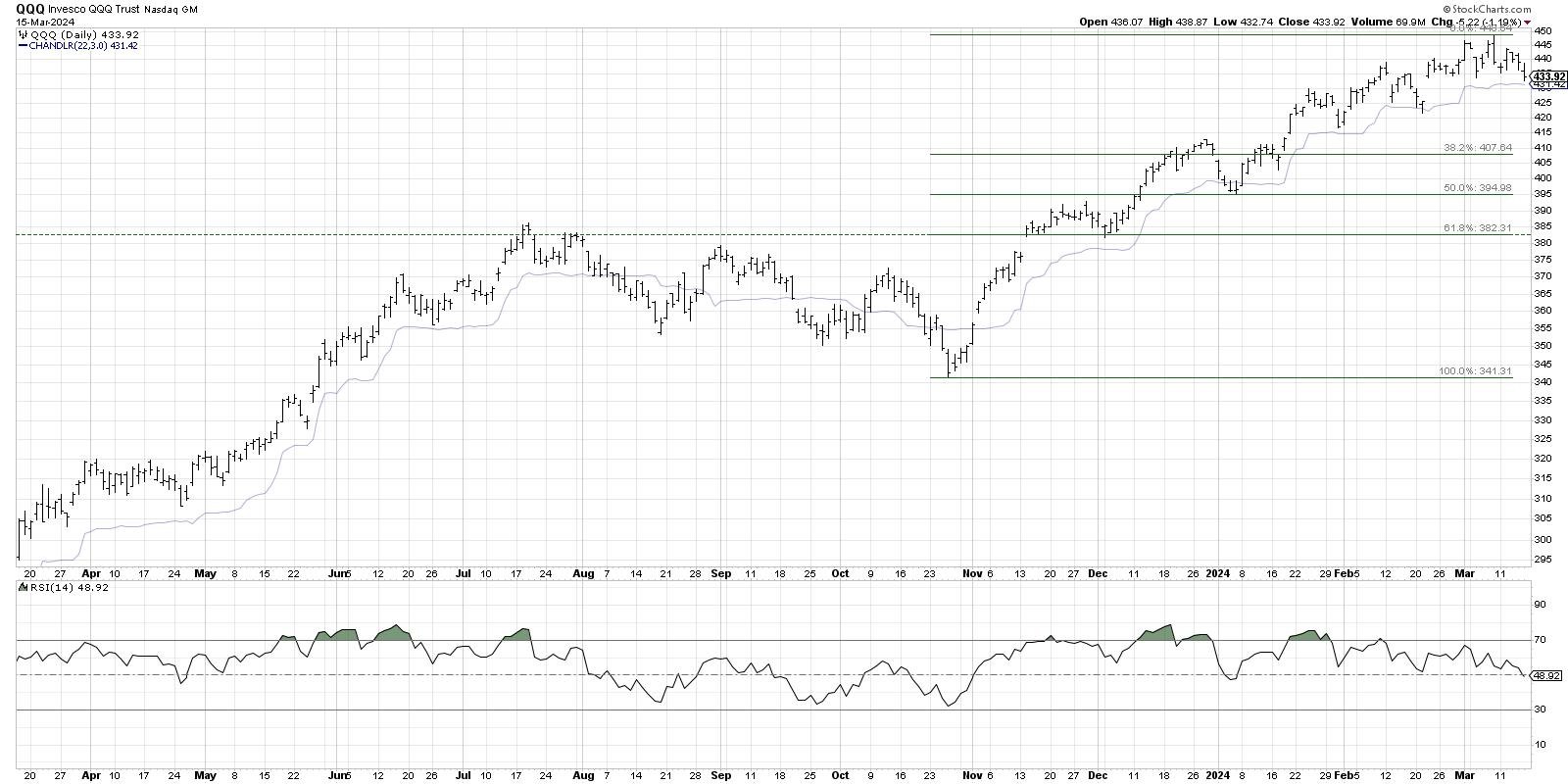
Fibonacci Retracements can be so helpful in identifying assessing downside risk, because they measure how far the price may pull back in relationship to the most recent uptrend. Using the October 2023 low and the March 2024 high, that would give an initial downside target around $408. Further support could be at the 50% level ($395) and the 61.8% level ($382).
Note how well these levels line up with previous swing lows, especially the 61.8% retracement level. That last support level lines up with the swing low in December 2023, as well as the price peak in July 2023. I refer to that sort of level as a "pivot point" because it has served as both support and resistance, and these are often important levels to monitor.
A number of the mega-cap growth stocks, such as TSLA and AAPL, have broken down in recent weeks. But the latest patterns of bearish momentum divergences and declining breadth conditions tell us that there may be further downside in store for the Nasdaq 100. By keeping a watchful eye on trailing stops and potential support levels, we can perhaps navigate choppy market waters using the power of technical analysis.
RR#6,
Dave
P.S. Ready to upgrade your investment process? Check out my free behavioral investing course!
David Keller, CMT
Chief Market Strategist
StockCharts.com
Disclaimer: This blog is for educational purposes only and should not be construed as financial advice. The ideas and strategies should never be used without first assessing your own personal and financial situation, or without consulting a financial professional.
The author does not have a position in mentioned securities at the time of publication. Any opinions expressed herein are solely those of the author and do not in any way represent the views or opinions of any other person or entity.
|
| READ ONLINE → |
|
|
|
| Martin Pring's Market Roundup |
| MEMBERS ONLY |
| The Business Cycle is Edging its Way to a More Inflationary Stage |
| by Martin Pring |
|
Last week, I pointed out the inflationary consequences of the recent gold breakout, as gold market participants initially expect prices to firm up in the commodity pits and later the CPI itself...
|
| READ ONLINE → |
|
|
|
| The MEM Edge |
| How To Profit From Bullish Gap-Down Reversals |
| by Mary Ellen McGonagle |
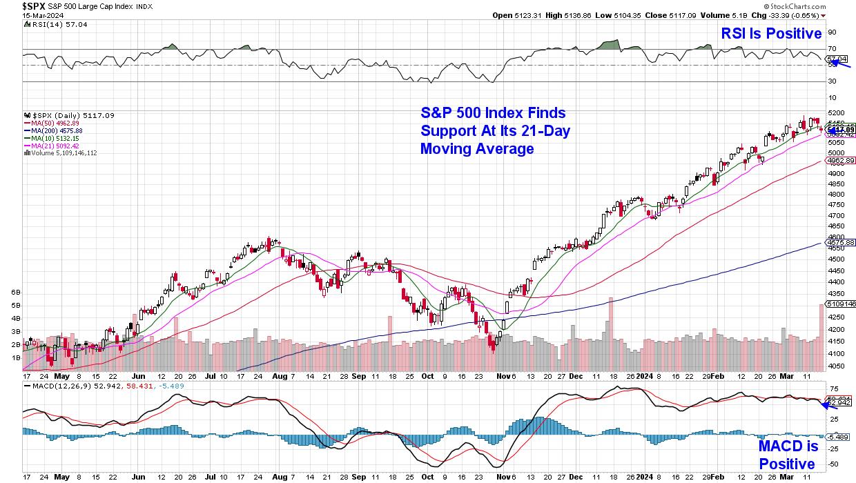
The S&P 500 ended the week with a slight pullback that has this Index closing below its key 10-day simple moving average, but above its 21-day moving average. With the RSI and MACD in positive territory, the near-term uptrend in this Index remains in place. While last week's orderly price action is in line with four other nominal pullbacks we've seen so far this year, there's been plenty of turbulent price action beneath the surface, as investors have responded sharply to several high-profile companies after the release of their earnings reports.
 Daily Chart of S&P 500 Index Daily Chart of S&P 500 Index
For many who follow my work, you'll know that I'm quite bullish on gaps up in price after earnings, as they often lead to further upside after a period of consolidation to digest the large gain. A prime example would be Shake Shack (SHAK), which gapped up in price after the release of strong earnings in mid-February, which pushed the stock out of a base and into an uptrend. SHAK was a part of my MEM Suggested Holdings List just prior to the release, and it remains on our buy list as it's in an uptrend.
Today, we're going to focus on stocks that gap down after earnings but then go on to reverse that gap down. These stocks will generally have more work to do before entering a new uptrend; however, shorter-term investors can take advantage of any reversal if using the proper intraday chart to guide your entry.
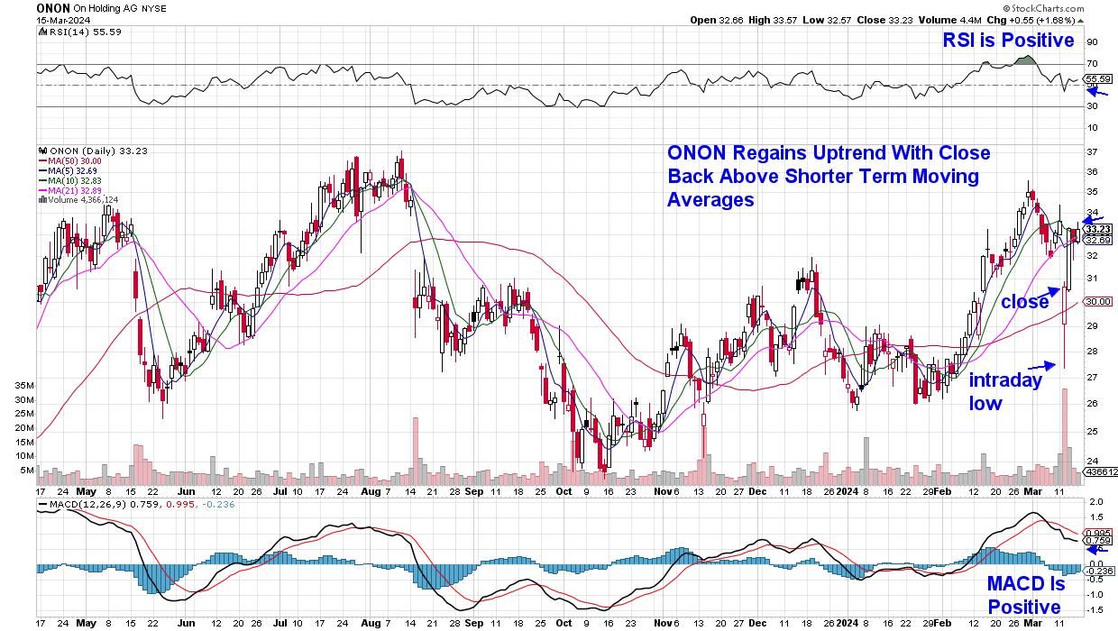
Let's take a look at Switzerland-based footwear company On Holding (ONON). The stock gapped down 18% on Tuesday after reporting earnings that were below estimates. As you can see on the daily chart below, investors came in on the dip so that it closed the day down 8%. The stock has continued to trade higher, and ONON is now in an uptrend.
 Daily Chart of On Holding (ONON) Daily Chart of On Holding (ONON)
As investors begin to buy the stock on the dip, shorter-term investors will want to keep a close eye on a 15 minute/intraday chart. Using the same indicators as on a daily chart, the first positive signal would be a close above the 5 and 13 simple moving averages. From here, you'll be on the lookout for confirmation of an uptrend by way of the RSI moving above 50 and into positive territory. For ONON, this took place in the $30 range. In order to stay with the trade, both signals would need to remain in place which, in this case, would have netted 10%.
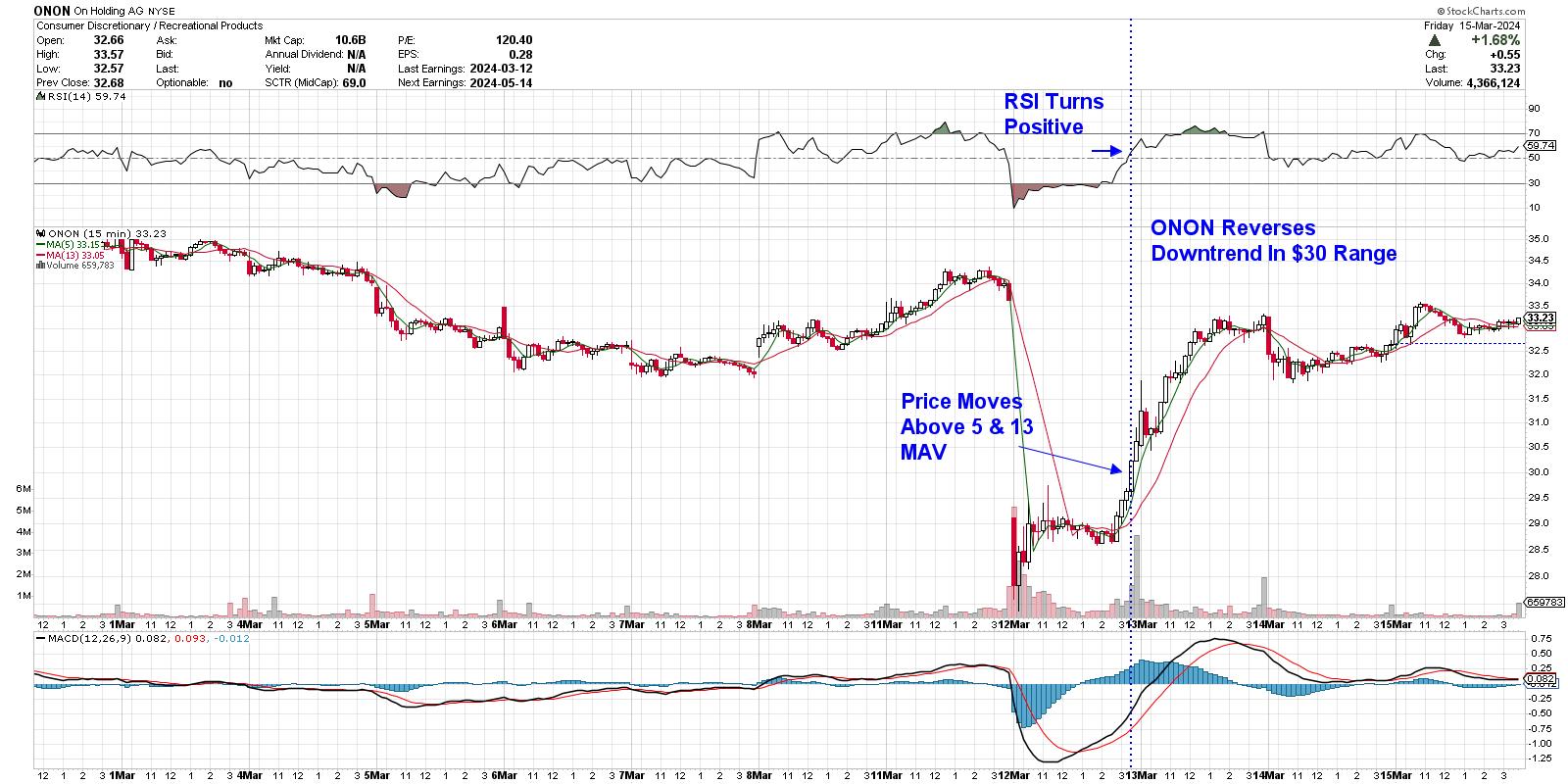 Intraday/15-Minute Chart of On Holding (ONON) Intraday/15-Minute Chart of On Holding (ONON)
As noted earlier, the broader markets are in an uptrend and, while constructive, the Technology sector is close to turning negative after several heavyweight areas came under selling pressure last week. For those who'd like insight into what's taking place within this leadership area of the markets, use this link here to take a four week trial of my twice-weekly MEM Edge report at a nominal fee. You'll also receive information relating to rotation taking place elsewhere in the markets, as well as alerts to a reversal of the current market uptrend.
Warmly,
Mary Ellen McGonagle
|
| READ ONLINE → |
|
|
|
| Art's Charts |
| Oil & Gas Equipment & Services ETF Resumes its Uptrend |
| by Arthur Hill |
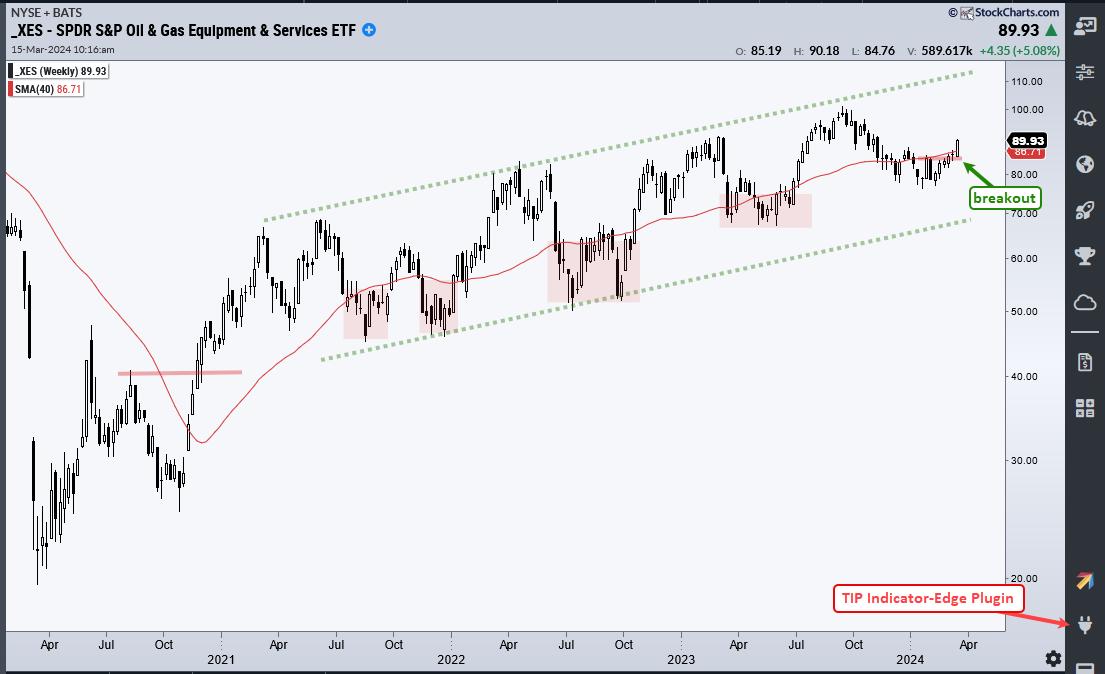
 The Oil & Gas Equipment & Services ETF (XES) is showing strength here in March as it breaks back above its 40-week SMA. More importantly, the long-term trend is up and this week's breakout argues for a continuation of this uptrend. The Oil & Gas Equipment & Services ETF (XES) is showing strength here in March as it breaks back above its 40-week SMA. More importantly, the long-term trend is up and this week's breakout argues for a continuation of this uptrend.
The chart below shows XES with a big breakout surge in the fourth quarter of 2020. Even though this move reversed the long-term downtrend, the advance over the last three years is quite choppy. The green dashed lines show a rising channel with the 40-week SMA (red line) in the middle. XES crossed this moving average several times as it slowly zigzagged higher. Despite choppy trading, the long-term trend is clearly up on this chart.

Short-term, I am seeing a breakout after a pullback. The red shadings show prior dips below the 40-week and each dip represented more of an opportunity than a threat. XES dipped below the 40-week SMA in December and remained below from early January to early March. The ETF turned up the last few weeks and surged above its 40-week SMA this week. This move reverses the downswing within the rising channel and argues for a continuation of the bigger uptrend. The upside target is around 110 and a closes below 81 would argue for a re-evaluation.
TrendInvestorPro offers two services - and a limited time offer for both. First, System Trader provides data-driven momentum strategies for Nasdaq 100 and S&P 500 stocks, and a mean-reversion strategy for Russell 1000 stocks. Second, Chart Trader reports and videos focus on stocks and ETFs with uptrends and tradeable patterns. Each week we cover the overall market environment and then feature highly curated trading ideas. Click here to learn more and get immediate access.
//////////////////////////////////////////////////
|
| READ ONLINE → |
|
|
|
| Don't Ignore This Chart! |
| WFC Stock: A Step-By-Step Analysis to Better Time Your Entry |
| by Jayanthi Gopalakrishnan |

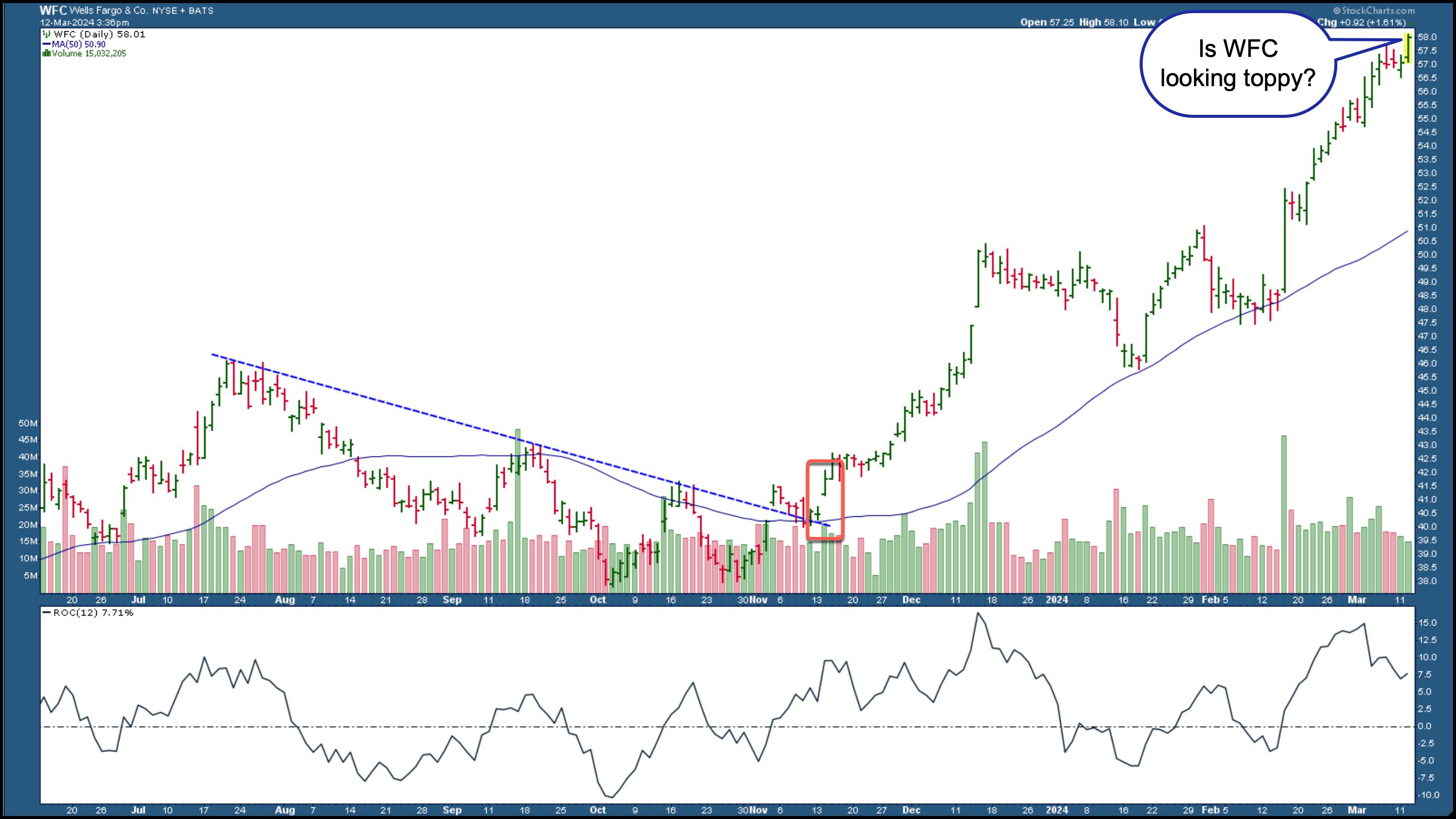
Wells Fargo (WFC)'s stock price has been trending higher since November 2023, after it broke out above a downward-sloping trendline. The company has had its share of woes, which is evident in its stock price's choppy movement. Overall, though, the stock, along with other big banks, has been trending higher and has hit a new all-time high.
So is the stock worth buying? Let's analyze the Financial sector and dive into WFC's stock charts.
Bullish Percent Index
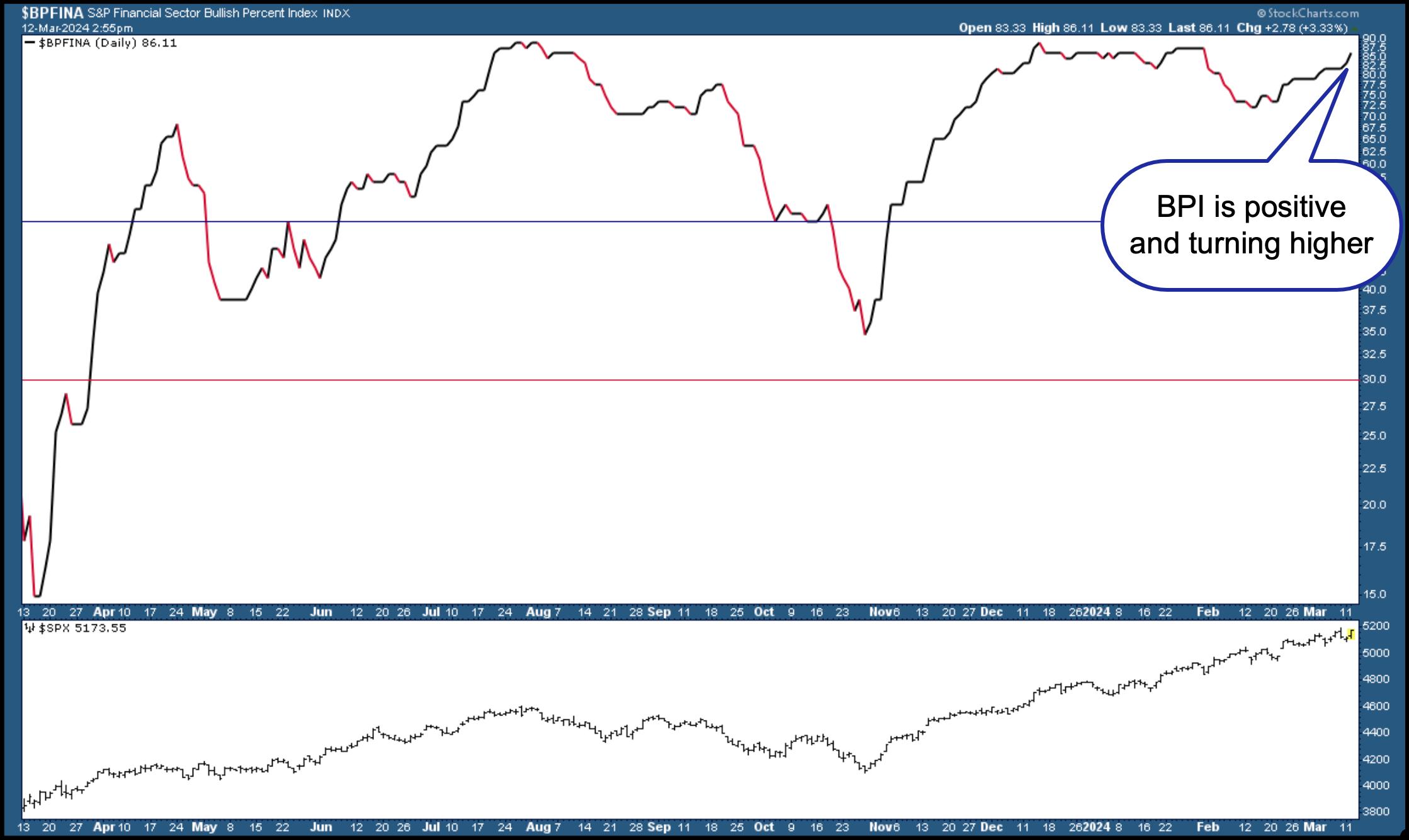
The chart below of the S&P Financial Sector Bullish Percent Index ($BPFINA) shows it's at 86.11, indicating the Financial sector is bullish. The indicator is turning higher, which suggests that financials may still continue to trend higher.

CHART 1. S&P FINANCIAL SECTOR BULLISH PERCENT INDEX (BPI). The Financial sector is bullish and could remain that way for an extended period of time.Chart source: StockCharts.com. For educational purposes.
Sector Summary
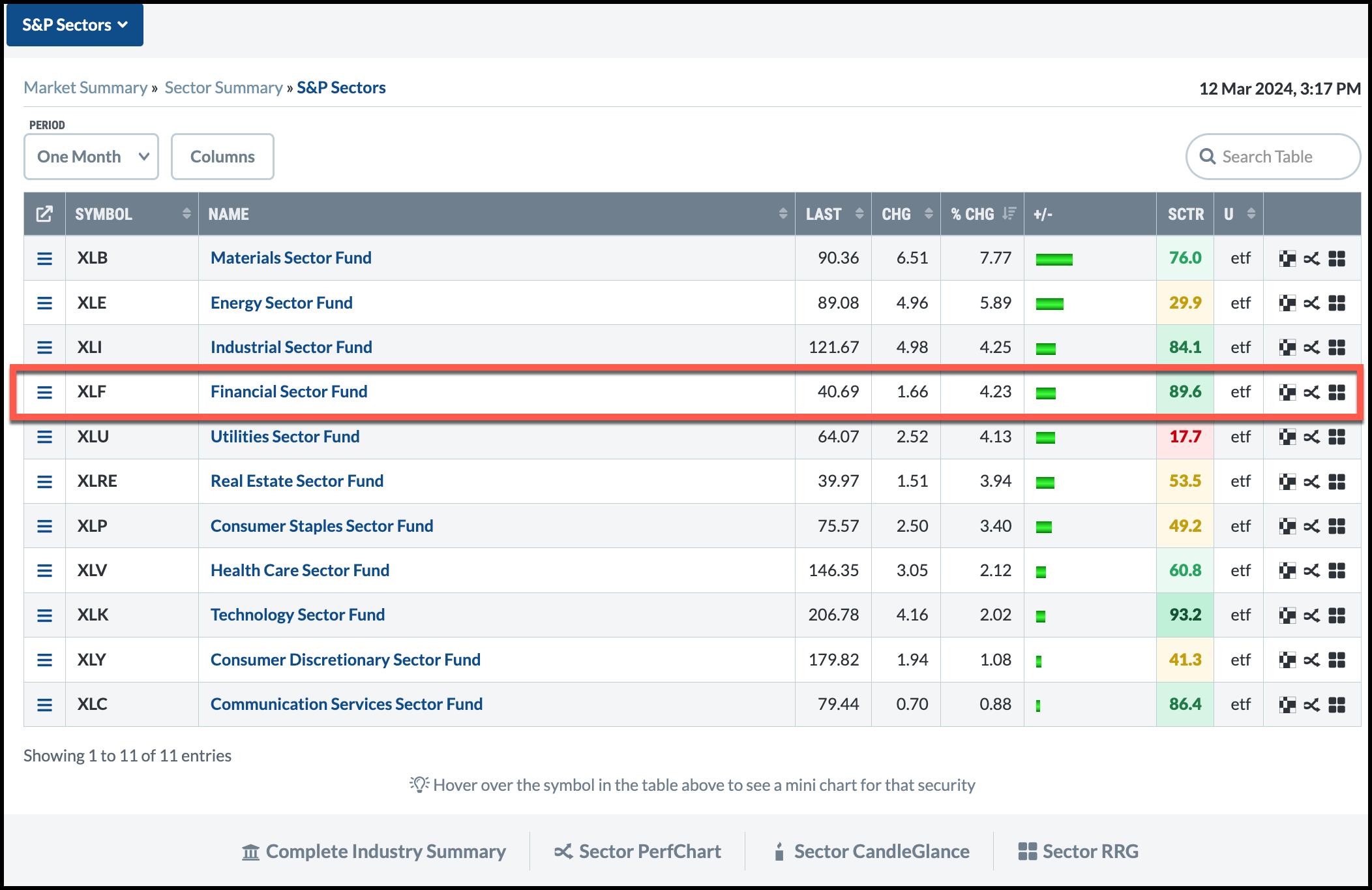
If you look at the one-month sector performance using the StockCharts Sector Summary, the Financial Select Sector SPDR (XLF), a proxy for the sector, isn't the highest performer, but it has the second highest StockCharts Technical Ranking (SCTR) score of 89.

CHART 2. ONE-MONTH SECTOR SUMMARY. The Financial sector may not be the top sector performer, but it has the second-highest SCTR score, which makes it a strong-performing sector.Chart source: StockCharts.com. For educational purposes.
Both data points suggest that the Financial sector is strong and that it is worth checking out WFC stock.
Symbol Summary
The Symbol Summary tool in StockCharts gives you a bird's-eye view of a stock or exchange-traded fund. Enter WFC in the symbol box and review WFC's stock chart, fundamental data, technical data, earnings history, SCTR rank, and the predefined scans with WFC. As of this writing, WFC was filtered in four scans—New 52-week Highs, Moved Above Upper Price Channel, P&F Ascending Triple Top Breakout, and P&F Double Top Breakout. The stock appears to be technically strong and gaining strength.
Monthly Chart of WFC Stock
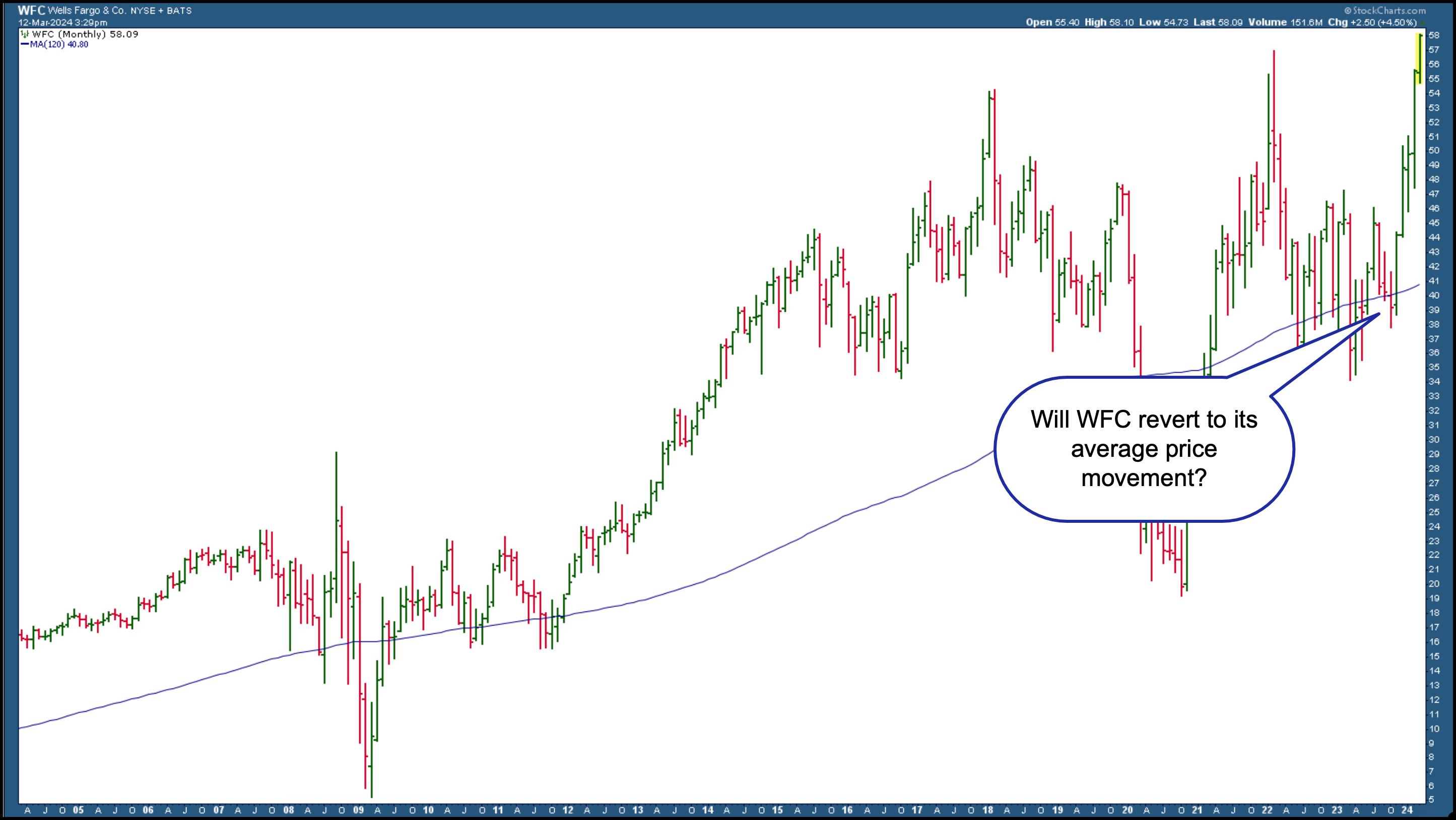
Looking at a 20-year monthly chart, you can see that WFC had its share of choppy movement.

CHART 3. MONTHLY CHART OF WELLS FARGO STOCK. The stock is trending higher, but will it pull back?Chart source: StockCharts.com. For educational purposes.
Overlaying the 120-month simple moving average (SMA) on the monthly chart (representing 10 years), you see that despite the choppy price movement, WFC has been gently trending higher, with the price reverting to average price movement. Since the stock is trading much higher than average, is it likely to pull back?
Daily Chart of WFC Stock
The daily chart of WFC below has a 50-day SMA overlaid on price. The pattern of price movement is similar, in that price tends to revert to the SMA after it deviates from it. So is WFC too toppy, or is it worth the investment after a pullback?

CHART 4. DAILY CHART OF WELLS FARGO STOCK. The stock may be looking toppy, but, if the momentum is still strong, the stock could continue to rise.Chart source: StockCharts.com. For educational purposes.
When a stock hits an all-time high, there's a reason it's moving higher. The stock will continue rising as long as the momentum supports the price move. This is why it helps to add a momentum indicator. There are several to choose from—Moving Average Convergence/Divergence (MACD), Relative Strength Index (RSI), Average Directional Index, and Rate of Change (ROC), to name a few.

In this example, the ROC is added to the lower panel below the price chart. Notice the indicator fluctuates above and below the zero line. When the ROC is above the zero line, it indicates positive momentum. The ROC has pulled back, and could reverse and move higher. If ROC moves below the zero line, that's a signal that momentum is slowing. Note how, in previous pullbacks to the 50-day SMA, the ROC went below the zero line, reversed, and moved back higher.
The Bottom Line
Even though WFC stock is hitting all-time highs, the momentum hasn't shown signs of slowing down. If you're nervous about buying a stock that looks toppy, the charts show that WFC could pull back. As long as it stays above its 50-day moving average on the daily chart, you could enter a long position as long as the Financial sector remains healthy and the upward momentum is strong in the stock. If you want to wait till WFC pulls back, it may require some patience—a necessary trait for successful traders and investors.
Disclaimer: This blog is for educational purposes only and should not be construed as financial advice. The ideas and strategies should never be used without first assessing your own personal and financial situation, or without consulting a financial professional.
|
| READ ONLINE → |
|
|
|
| DecisionPoint |
| Decisive Long-Term Breakout for Gold |
| by Carl Swenlin |
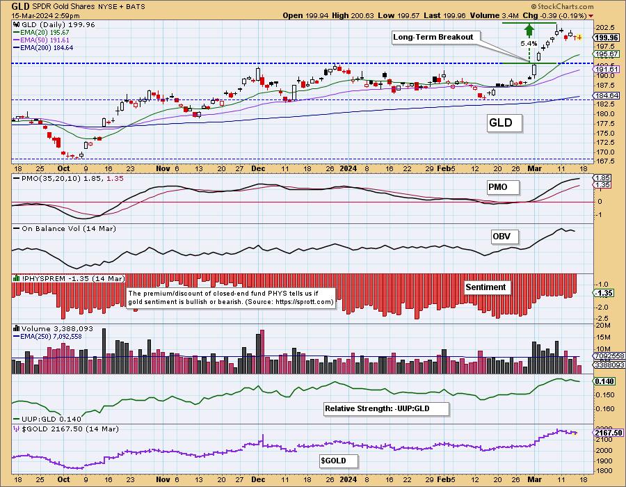
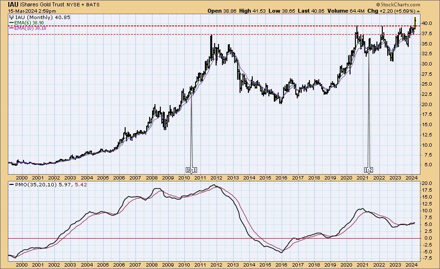
This month, the SPDR Gold Shares (GLD) broke out to new, all-time highs. That was a significant long-term move, which we will discuss when we get to the monthly chart.
Of more immediate interest is the fact that sentiment is still bearish, which bodes well for a continued advance. We gauge sentiment based upon whether closed-end fund Sprott Physical Gold Trust (PHYS) is selling at a premium (bullish sentiment) or discount (bearish sentiment). Currently, PHYS is selling at a discount to NAV.

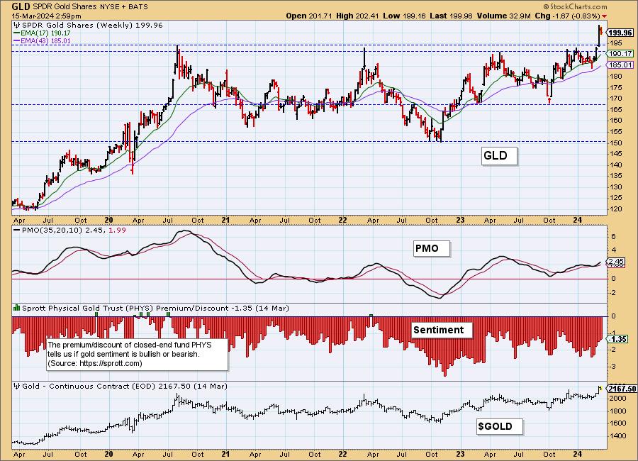
The weekly chart gives a better perspective of the significance of the breakout, which was decisive. The overhead resistance has held GLD back for more than three years, and has now become support.

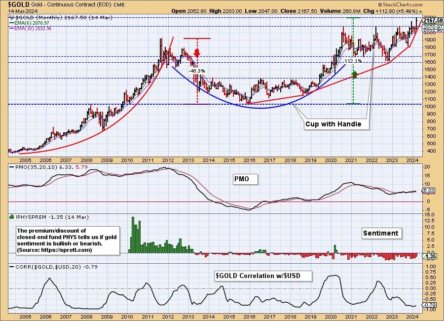
But the monthly chart shows that it has been a much longer wait than three years. Gold made all-time highs back in 2011, following which it declined nearly fifty percent. It finally recovered to new, all-time highs in 2020, but it has been stalled until this month. Practically speaking, gold investors have been waiting about 13 years for this encouraging move. The positive side is that gold has established a solid high-level base at around 2,000 to provide future support. Also note how bullish sentiment got (a premium of about +14%) during the parabolic advance on the left side of the chart.

Investing in gold presents some difficulties that must be considered. (Disclaimer: This is information, not a recommendation.) If you buy physical gold, you have to have a safe place to store it. A safe deposit box can be accessed/frozen by the government, and an adequate safe is expensive, difficult to move, and entails some vulnerability. Some ETFs, like GLD, do not actually own physical gold. An alternative is iShares Gold Trust (IAU), which is a closed-end fund that owns physical gold. Sprott Physical Gold Trust (PHYS) is similar to IAU, but it is a foreign entity based in Canada. Consider the implications of all options available.

Conclusion: Gold's recent breakout was a long time coming and appears to have positive long-term implications. Also, the long period of consolidation has created an impressive base of long-term support.
Learn more about DecisionPoint.com:
Watch the latest episode of the DecisionPointTrading Room on DP's YouTube channel here!

Try us out for two weeks with a trial subscription!
Use coupon code: DPTRIAL2 at checkout!
Technical Analysis is a windsock, not a crystal ball. -- Carl Swenlin
(c) Copyright 2024 DecisionPoint.com
Disclaimer: This blog is for educational purposes only and should not be construed as financial advice. The ideas and strategies should never be used without first assessing your own personal and financial situation, or without consulting a financial professional. Any opinions expressed herein are solely those of the author, and do not in any way represent the views or opinions of any other person or entity.
DecisionPoint is not a registered investment advisor. Investment and trading decisions are solely your responsibility. DecisionPoint newsletters, blogs or website materials should NOT be interpreted as a recommendation or solicitation to buy or sell any security or to take any specific action.
Helpful DecisionPoint Links:
Trend Models
Price Momentum Oscillator (PMO)
On Balance Volume
Swenlin Trading Oscillators (STO-B and STO-V)
ITBM and ITVM
SCTR Ranking
Bear Market Rules
|
| READ ONLINE → |
|
|
|
| Don't Ignore This Chart! |
| Missed Out on Micron's 112% Surge? Here's Your Second Chance! |
| by Karl Montevirgen |

Micron Technology, Inc. (MU) hit an all-time high of $101.85 last week, but it couldn't sustain or surpass it.
Leading up to its apex was a solid year-and-a-half of gains, returning 112% from September 2022 to the present. The latest narrative fueling the stock's bullish case is that MU has joined the AI party. Having already been selected by Nvidia (NVDA) to provide high-bandwidth memory (HBM) components for its next-gen AI chips, analysts note that this might extend to Advanced Micro Devices (AMD).
An opportunity for future growth? Fundamentally speaking, yes. But does MU look a little toppy? Possibly. Let's take a closer look.

CHART 1. MONTHLY CHART OF MICRON TECHNOLOGY (MU). Note the shooting star, a harbinger for a pullback.Chart source: StockCharts.com. For educational purposes.
Overlaying the 60-month simple moving average (SMA) representing five years, you can see that prices have often bounced off this average price level. Prices have also reversed twice (in 2021 and 2022) from the resistance range that marked its most recent record high. As MU pulls back, how close might it get to its average five-year price before advancing again?
Also, note the shooting star, which strongly indicates the likelihood of a bearish reversal (a 59% occurrence based on technical analyst Thomas Bulkowski's historical stats).
Using a Bearish Technical Scan on a Strong Stock to Find a Bullish Signal
On Wednesday, MU came up as a scan result for a bearish Parabolic SAR Sell Signals scan using the StockCharts scan engine. With an SCTR score above 78 (meaning, not super bullish but not bearish either) and a strong fundamental case as mentioned above, the bearish scan was an effective way to find a potentially strong "long" prospect in the midst of pulling back.
And that's what the chart revealed.

CHART 2. DAILY CHART OF MICRON TECHNOLOGY. Running a bearish scan on a fundamentally strong stock can sometimes help you identify prospects for a bullish position.Chart source: StockCharts.com. For educational purposes.
When MU's price broke below the Parabolic SAR's trailing stop, there was a clear bearish divergence between the price surge and the drop in buying pressure, as indicated by the Chaikin Money Flow (CMF).
Given MU's strong fundamental prospects, investors might be looking for entry points. In that case, the 50-day, 100-day, and 200-day simple moving averages (SMAs) have been plotted to anticipate potential reversals toward the upside. In addition to this, notice how the Stochastic Oscillator's reading coincides well with MU's cyclical movements.

The idea is to look to both the Stochastic Oscillator and the SMAs to anticipate and identify a reversal that might serve as a long entry point. The reversal candlestick should be supported by substantial volume and momentum. The Stochastic Oscillator, whose cyclical fluctuations seem very much in sync with MU's swings, and the SMAs can both help you time a favorable entry.
The Bottom Line
Having used a bearish scan (Parabolic SAR Sell Signals) to uncover a bullish opportunity, Micron Technology Inc (MU) presented itself as a potential trade prospect. Having reversed from its all-time high, the fundamental case for MU remains strong. The bearish scan initially suggested a sell, revealing the opposite—a buying opportunity amidst a pullback. This approach underscores the value of a nuanced analysis, where bearish technical signals in the context of solid fundamentals can identify opportune moments for strong trade. In the case of MU, you'll have to see if this thesis pans out as it dips further down.
How to Run a StockCharts Scan
Finding the right stocks and exchange-traded funds (ETFs) to trade can be tricky. But with a little work, you can create a strategy identifying a few promising prospects.
Fortunately, it isn't too hard to learn how. Just stick to these steps:
- Select (or create) a few different scan criteria
- Be sure to run these scans regularly
- Analyze the stocks (or ETFs) that your scan has identified
- Determine your overall trading setup (including your entry and exit criteria)
The StockCharts Scan Engine is helpful in narrowing down stocks and ETFs that match specific requirements. It comes with many ready-made scans that are a good starting point. As you get the hang of these scans, you can adjust them or create new ones that align with your trading goals.
For example, this article was prompted by a Parabolic SAR Sell Signals scan. As you can imagine, there are plenty more scans you can run. Try out the StockCharts Sample Scan Library (Charts & Tools > Sample Scan Library)
Disclaimer: This blog is for educational purposes only and should not be construed as financial advice. The ideas and strategies should never be used without first assessing your own personal and financial situation, or without consulting a financial professional.
The author does not have a position in mentioned securities at the time of publication. Any opinions expressed herein are solely those of the author and do not in any way represent the views or opinions of any other person or entity.
|
| READ ONLINE → |
|
|
|
| Larry Williams Focus On Stocks |
| MEMBERS ONLY |
| Larry's LIVE "Family Gathering" Webinar Airs NEXT WEEK - Tuesday, March 19th at 2:00pm EDT! |
| by StockCharts Team |
|
Larry is going LIVE! Don't miss the upcoming "Family Gathering" webinar with Larry Williams, airing live through Zoom on Tuesday, March 19 at 2:00pm Eastern Daylight Time...
|
| READ ONLINE → |
|
|
|
| MORE ARTICLES → |
|


 The Oil & Gas Equipment & Services ETF (XES) is showing strength here in March as it breaks back above its 40-week SMA. More importantly, the long-term trend is up and this week's breakout argues for a continuation of this uptrend.