| THIS WEEK'S ARTICLES |
| The Mindful Investor |
| Which Magnificent 7 Stock Would You Pick for Q2? |
| by David Keller |
This article represents an exercise I like to call the "Single Stock Portfolio". In this scenario, you can only own one stock in your portfolio for the next three months, and you can pick any one of the following eight stocks. Which one would you select, and why?
The beauty of this exercise is that it forces you to consider eight different charts, some with similar characteristics, yet some showing dramatic differences. In the end, you have to decide whether to stick with a top-performing name like NVDA, fresh off new all-time highs in March but showing the dreaded bearish momentum divergence, or you could opt for AAPL, testing price and Fibonacci support after failing to make new all-time highs.
Let's review each of these charts in turn and lay out a good technical framework for our decision.
Nvidia Corp. (NVDA)
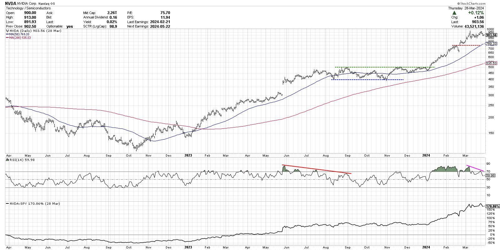
Nvidia is the top-ranked of the group using the StockCharts Technical Rating (SCTR), with its trend scoring in the top 2% of all large cap stocks. NVDA also features a bearish momentum divergence, with higher closing prices in March but lower highs in momentum based on the RSI indicator. This stock currently sits around 69% above its 200-day moving average, suggesting it could be quite overextended here.
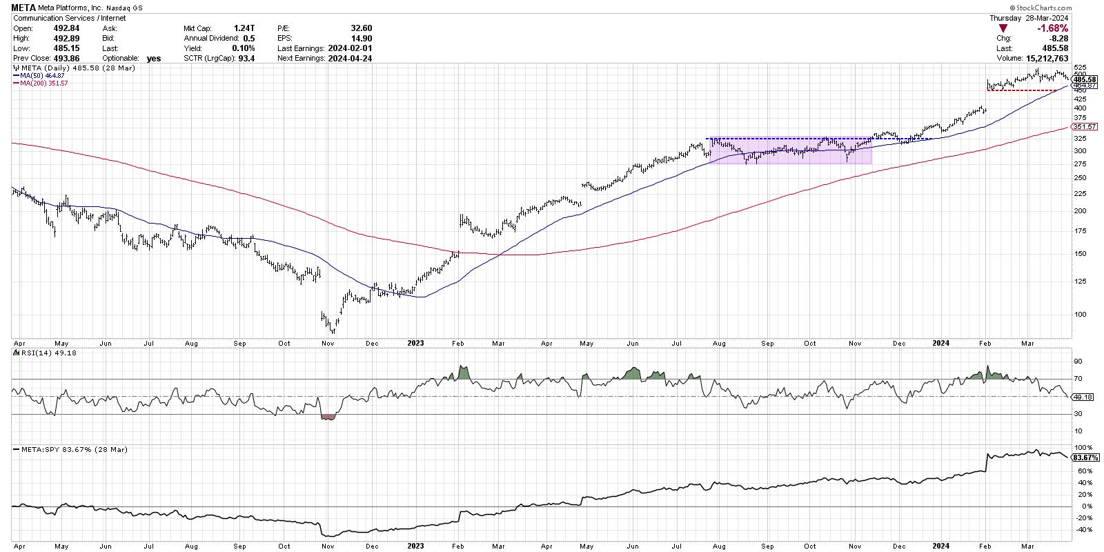
Meta Platforms, Inc. (META)
META is featuring weakening momentum characteristics as well, with RSI dipping below 50 this week for the first time since December 2023. Both of these stocks still remain above two upward-sloping moving averages, suggesting the long-term uptrend is very much intact.
Netflix, Inc. (NFLX)
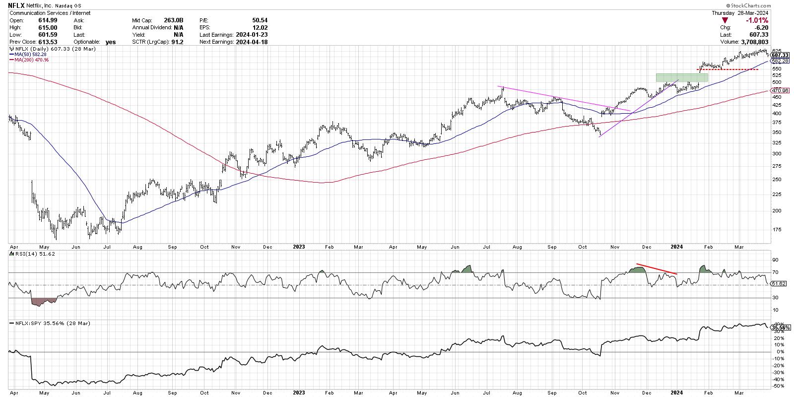
Our third chart again demonstrates a classic bearish momentum divergence, with highs in January, February, and March all marked by lower peaks in the RSI. This suggests less and less upward momentum behind these successive new highs. The relative strength, however, remains quite strong, as NFLX has consistently outperformed the S&P 500.
Amazon.com, Inc. (AMZN)
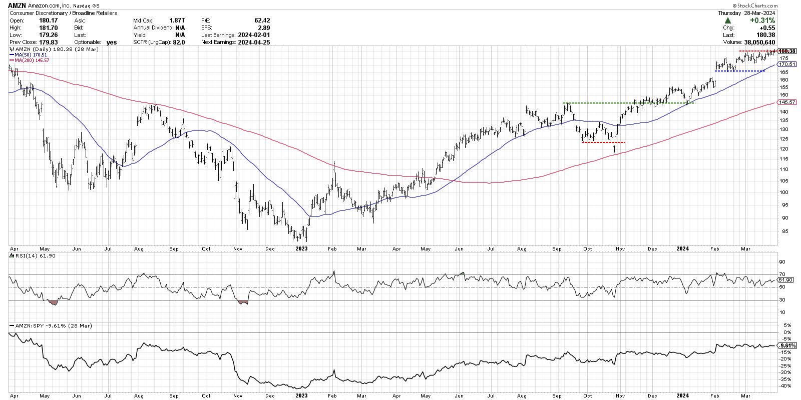
Here, we have the first chart that actually made a new 52-week high to finish this shortened holiday week. AMZN has perhaps the most consistent uptrend, with a stepwise motion of higher highs and higher lows since the October 2023 low. The RSI remains strong but not excessive, indicating that further upside potential is very much a possibility.
Microsoft Corp. (MSFT)
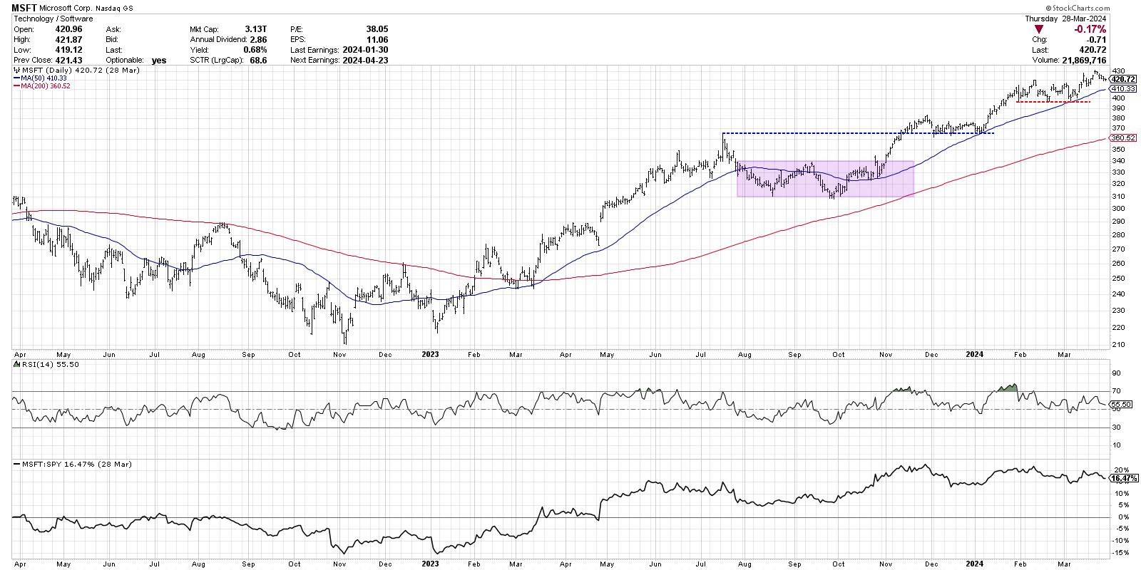
We're now at five straight charts with a bearish momentum divergence. Can you see why I've been skeptical of further upside for the Nasdaq 100, given these persistent signs of weakening momentum? Despite the downward-sloping RSI, MSFT remains firmly trending up above an upward-sloping 50-day moving average, which served as short-term support in January and March.
Alphabet Inc. (GOOGL)
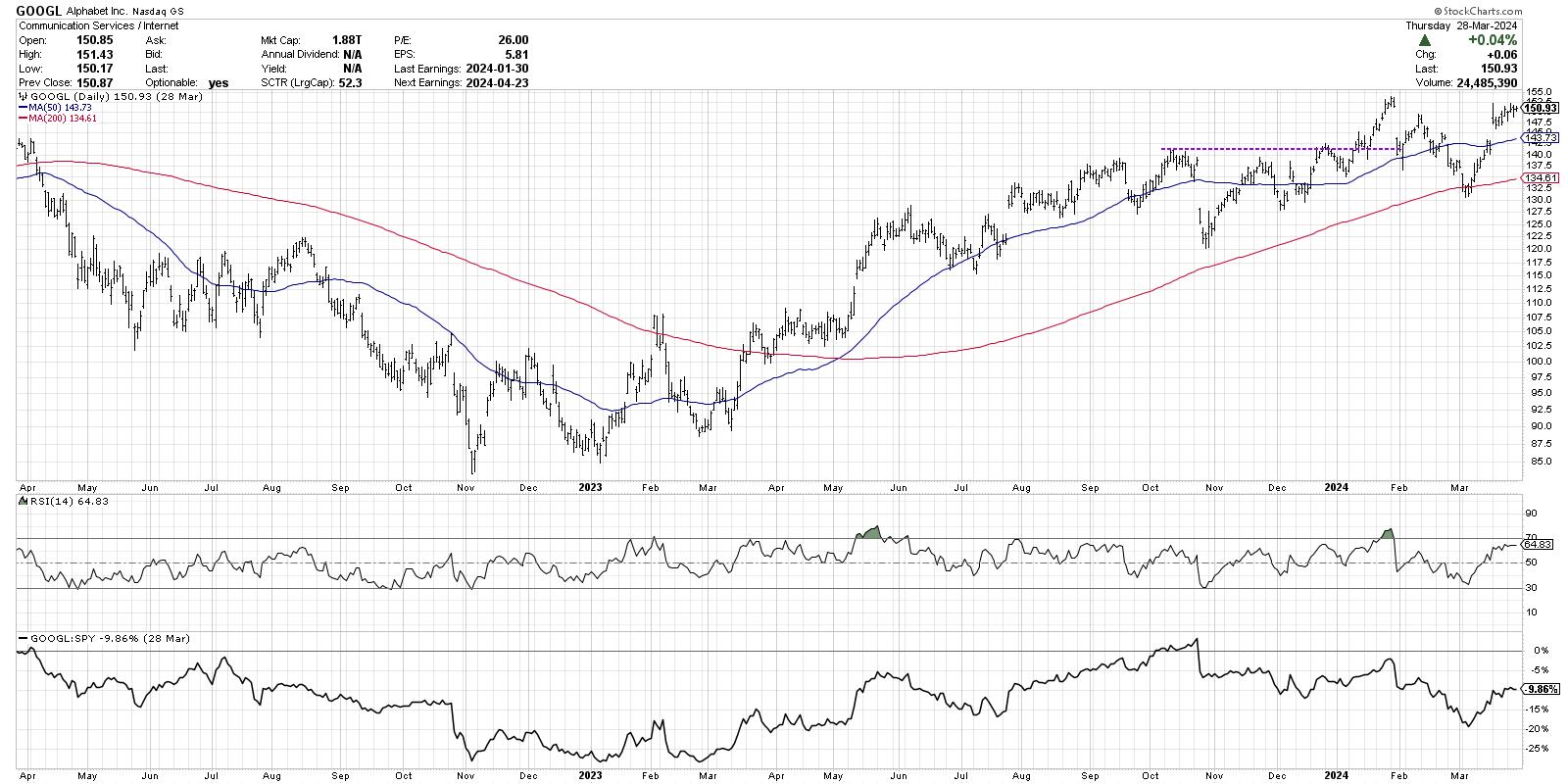
Here is where we start to see some differentiation between these leading growth names. Alphabet gapped higher in mid-March, and has seen additional upside since that price gap. Now we are observing a retest of all-time highs around $154. Will this second attempt to breakout above the $155 actually succeed? GOOGL has broken its 50-day moving average in 2024, and actually tested the 200-day in early March before bouncing higher.
Apple, Inc. (AAPL)
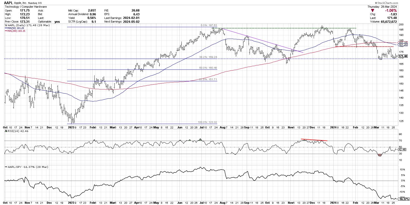
With AAPL, we're now getting to the weakest of the group in terms of their 2024 performance. Apple scores a 9.1 in the large cap SCTR rankings, meaning it's in the bottom 10% of US large cap stocks as ranked by their trends. This chart is currently testing price and Fibonacci support, and a break below this key support could open the door to further downside for AAPL.
Tesla Inc. (TSLA)
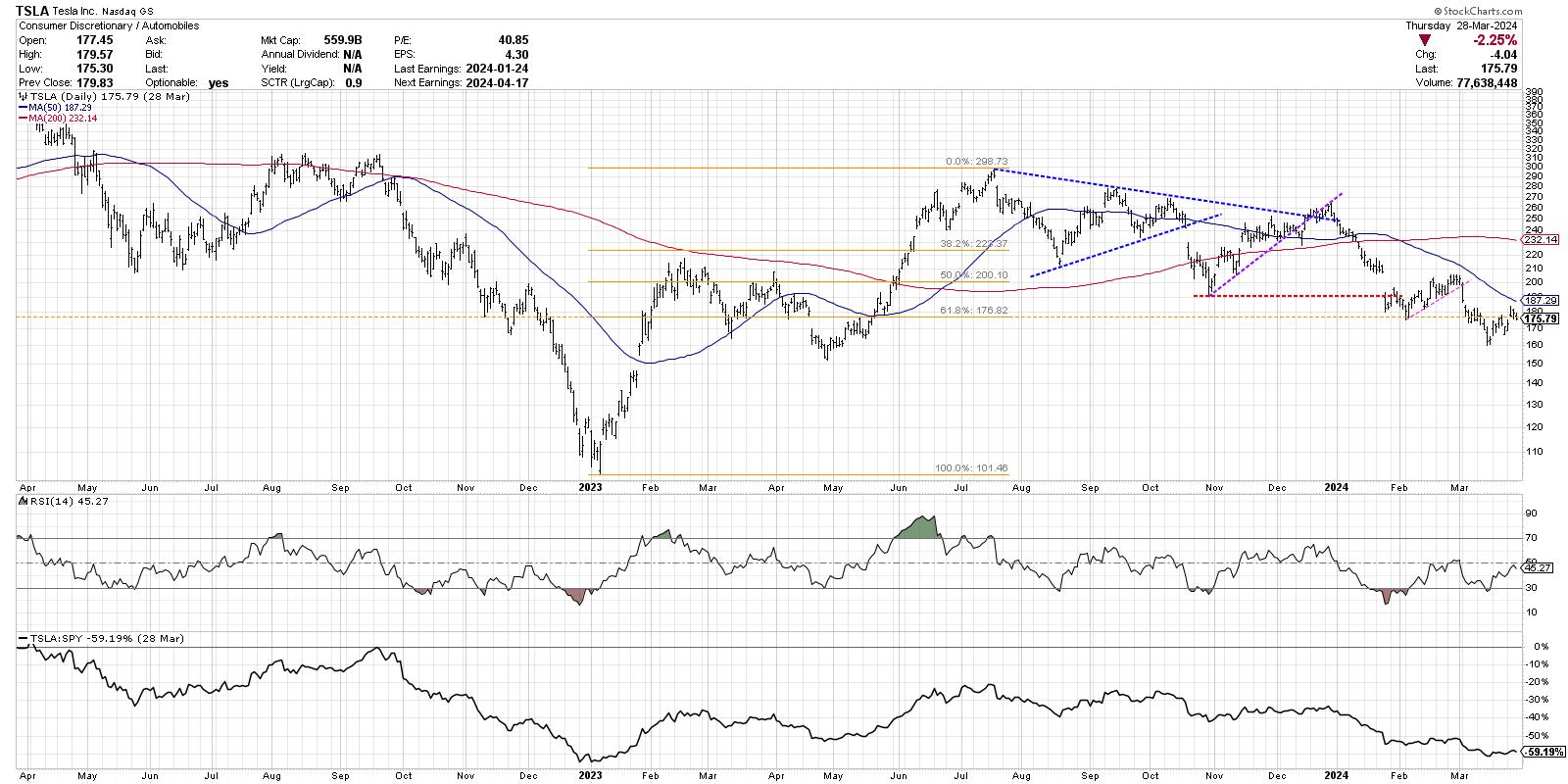
If you're looking for classic example of a stock in a confirmed downtrend, look no further than TSLA. Here we can observe lower highs and lower lows, price below two downward-sloping moving averages, and RSI consistently below the 50 level. TSLA even broke below Fibonacci support earlier in March. A vote for Tesla would be an optimistic leap of faith on a name that certainly has not impressed in Q1.
There are your eight stocks, with a brief technical analysis summary of each chart. Which stock do you see as the best opportunity in Q2, and why? Watch the video below, then drop a comment with your vote and your reasoning!
RR#6,
Dave
P.S. Ready to upgrade your investment process? Check out my free behavioral investing course!
David Keller, CMT
Chief Market Strategist
StockCharts.com
Disclaimer: This blog is for educational purposes only and should not be construed as financial advice. The ideas and strategies should never be used without first assessing your own personal and financial situation, or without consulting a financial professional.
The author does not have a position in mentioned securities at the time of publication. Any opinions expressed herein are solely those of the author and do not in any way represent the views or opinions of any other person or entity.
|
| READ ONLINE → |
|
|
|
| Martin Pring's Market Roundup |
| MEMBERS ONLY |
| Don't Bet on Lower Rates |
| by Martin Pring |
|
To paraphrase the late great contrarian Humphrey Neil: When everyone thinks alike, it's usually time to look for a turn in the market...
|
| READ ONLINE → |
|
|
|
| Art's Charts |
| An Indicator to Define the Trend and Quantify Momentum |
| by Arthur Hill |
 The 200-day SMA is perhaps the most widely used long-term moving average. As its name implies, it is a simple indicator that chartists can use for trend-following and momentum strategies. For trend-following, we just need to know where prices stand relative to the 200-day SMA. For momentum, we need to measure the distance between price and the 200-day SMA. Let's look at examples from two Nasdaq 100 stocks. The 200-day SMA is perhaps the most widely used long-term moving average. As its name implies, it is a simple indicator that chartists can use for trend-following and momentum strategies. For trend-following, we just need to know where prices stand relative to the 200-day SMA. For momentum, we need to measure the distance between price and the 200-day SMA. Let's look at examples from two Nasdaq 100 stocks.
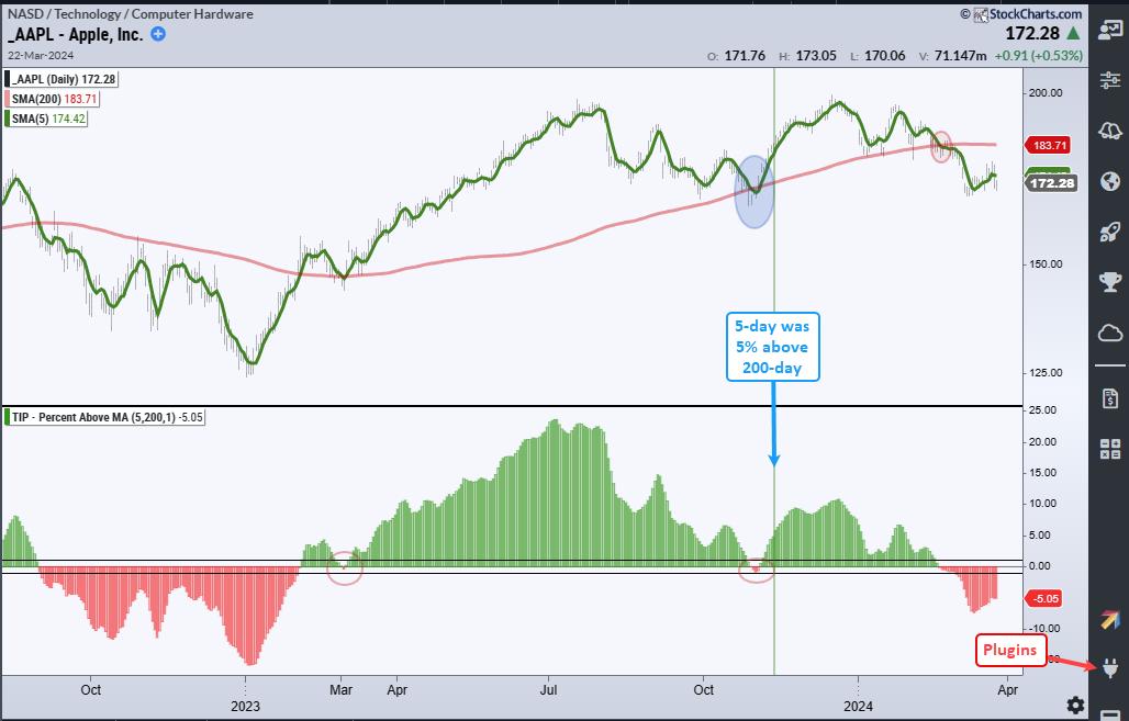
The first chart shows Apple (AAPL) with the 200-day SMA in red and the 5-day SMA in green. I also like to smooth closing prices with a 5-day SMA to reduce whipsaws (bad signals). The blue circle on the chart shows a whipsaw in late October. "Reduce" is the key word here because we can not fully eliminate whipsaws. The red circle shows the 5-day SMA breaking decisively below the 200-day SMA in late February. AAPL is in a downtrend and not being considered for our dual-momentum strategies.

The indicator window shows the percentage distance between the 5-day SMA and 200-day SMA. This indicator can further filter signals and reduce whipsaws by adding a bullish threshold at +1% and a bearish threshold at -1%. An uptrend signals when the 5-day is more than 1% above the 200-day and a downtrend signals when the 5-day is more than 1% below the 200-day. This little filter would have avoided the whipsaws in late October and mid March (red circles).
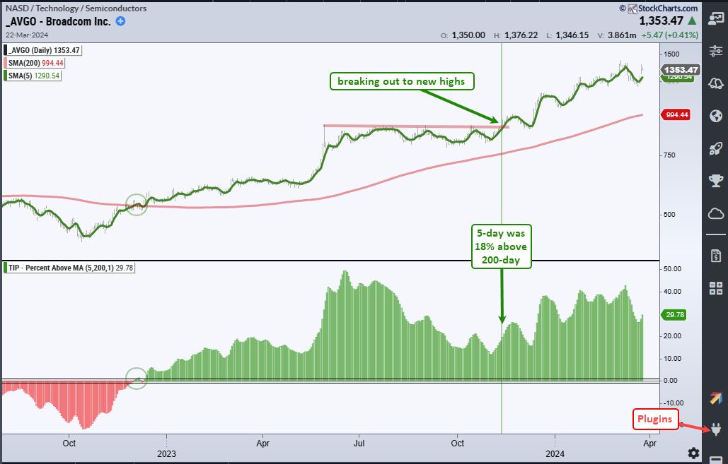
Chartists can also use Percent above MA (5,200) to quantify the strength of the trend. AAPL was still in an uptrend in early November, but the 5-day was only 5% above the 200-day SMA on November 9th (green line). Keep this number in mind as we move to the second chart, Broadcom (AVGO). The chart below shows AVGO triggering bullish in December 2022 as the 5-day SMA was more than 1% above the 200-day SMA (green circles). Note that this indicator is part of the TIP Indicator Edge Plugin for StockCharts ACP.

The green line marks November 9th and the 5-day SMA was 18% above its 200-day SMA on this date. This means it was much stronger than AAPL, which was only 5% above its 200-day. AVGO clearly won the momentum contest in early November. The stock was also breaking out to new highs in early November (red line). AVGO remains one of the leaders in the Nasdaq 100 because its 5-day SMA is almost 30% above its 200-day SMA. Chartists trading momentum strategies would still be focused on AVGO because it is in an uptrend and leading. This is the essence of dual-momentum.
TrendInvestorPro offers momentum-rotation strategies that trade stocks in the Nasdaq 100 and S&P 500. These strategies are fully systematic and trade on a weekly basis. Rankings and signals are posted every Saturday morning for subscribers. Click here to see performance metrics and learn more.
//////////////////////////////////////////////////
|
| READ ONLINE → |
|
|
|
| RRG Charts |
| When These Levels Break, The S&P 500 is Going to Explode Higher |
| by Julius de Kempenaer |

Summary
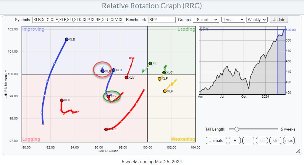
The Relative Rotation Graph for US Sectors for this week mainly shows a continuation of the rotations as they were underway last week.
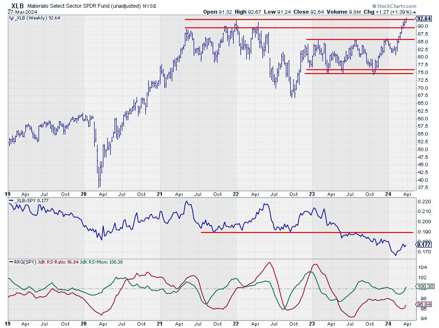
XLB: This is moving from lagging into improving at a strong RRG-Heading, underscoring the building up of relative strength for this sector.
XLC: This is stable inside the leading quadrant on a short tail.
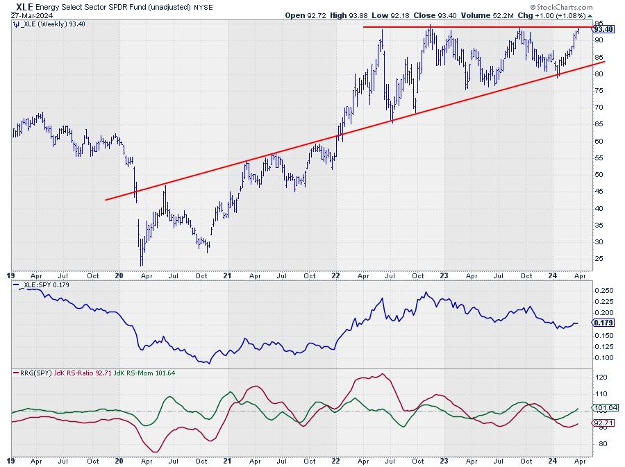
XLE: This is adding a long new segment to the tail, pushing it further into the improving quadrant at the highest JdK RS-Momentum reading in the universe.
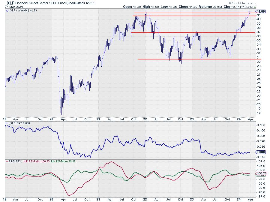
XLF: This is inside the weakening quadrant, but at a very short tail, indicating a stable relative uptrend that is going through a pause.
XLI: This is pushing into the leading quadrant now at a strong RRG-Heading while moving away from the center (benchmark) of the chart. That suggests an improvement in relative strength.
XLK: This week, the tail is accelerating at a negative RRG, heading toward the lagging quadrant, urging (more) caution in the tech sector.
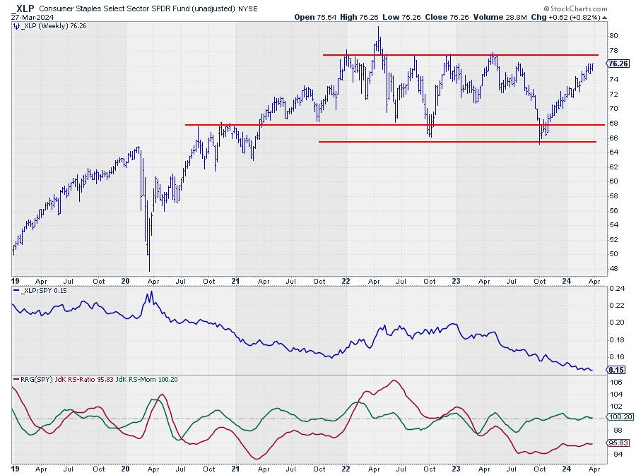
XLP: This one remains stable, just above 100 on the JdK RS-Momentum scale on the left side of the RRG. Relative strength slowly drifting lower.
XLRE: The raw RS-line dropped below horizontal support, which will likely ignite a new acceleration lower, pushing the XLRE tail deeper into the lagging quadrant.
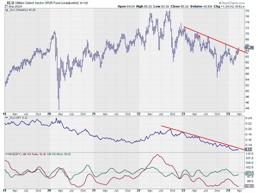
XLU: The tail picked up some relative momentum this week, but no relative strength yet. This suggests it is more of a temporary move. This makes sense, as XLU has the lowest RS-Ratio reading in the universe.
XLV: The tail is crossing back into the lagging quadrant from improving. With the raw RS-Line dropping below horizontal support, more relative weakness is expected, pushing XLRE further into lagging.
XLY: This is starting to improve slowly while inside the lagging quadrant. Not at a positive RRG-Heading yet.
Discretionary Beating Staples
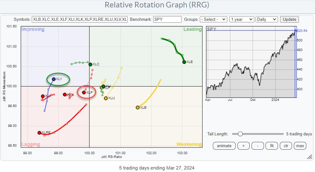
One interesting observation that can be made from the RRG above is the Consumer Staples sector (XLP) slowly rotating out of favor, while the Consumer Discretionary sector has started to pick up relative momentum inside the lagging quadrant and has now started to move back up.

When we zoom in on that relationship, using a daily RRG, it becomes visible that this rotation is now getting traction.
Let's just say that discretionary beating staples in relative terms is NOT a characteristic of a bear market.
Sectors Pushing Against Major Resistance Levels
Another thing that caught my eye is that many sectors are pushing against or nearing major resistance levels. This includes defensive sectors like Staples and Utilities; Healthcare has already broken higher.


It ain't over until its over. When these sectors convincingly break their overhead resistance levels, they will likely provide new fuel to power the rally even further.
#StayAlert, --Julius
|
| READ ONLINE → |
|
|
|
| The MEM Edge |
| Core PCE Data Has Powell Pleased - May Set Tone For Q2 |
| by Mary Ellen McGonagle |
The Fed's preferred gauge of inflation was released today and, according to Fed chief Jerome Powell, "it was good," as there were no ugly surprises. This news could boost the markets, as sticky inflation data has had investors on edge amid interest rates that have remained relatively high. The stock and bond markets were of course closed today, however, so we won't see a response from traders until next week.
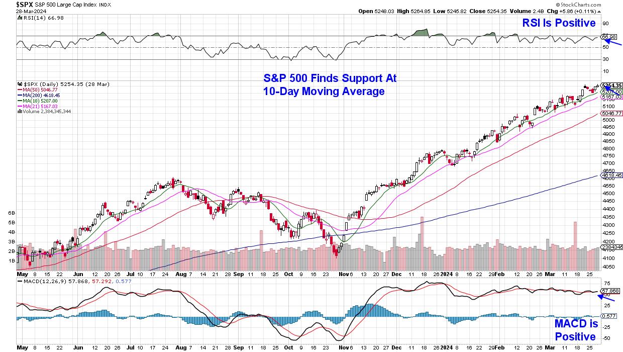
Overall, we're heading into next week on good terms, with the Dow, Nasdaq and the S&P 500 at new highs with small-cap stocks in an uptrend after posting an impressive 2.5%. In other positive news, we're continuing to see a broadening out of participation well beyond the Magnificent Seven stocks which dominated last year's top performance lists.
 Daily Chart of S&P 500 Index Daily Chart of S&P 500 Index
With so much bullish behavior, it may be difficult to determine where to focus your efforts so that you can outperform these strong markets. From my work, honing in on companies that have strong growth outlooks will always pay off, particularly during a bull market phase such as now.
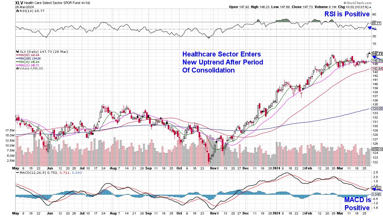
Many of these faster-growing companies -- particularly in Technology -- have seen impressive returns year-to-date already, with consolidation phases needed before another leg up. Instead, I'm looking for stocks in areas such as Healthcare, which have entered a new uptrend after trending sideways over the past 3 weeks. While normally viewed as a defensive area of the markets, there's plenty of fast-growing companies amid the development of new drugs and medical products.
 Daily Chart of Healthcare Sector (XLV) Daily Chart of Healthcare Sector (XLV)
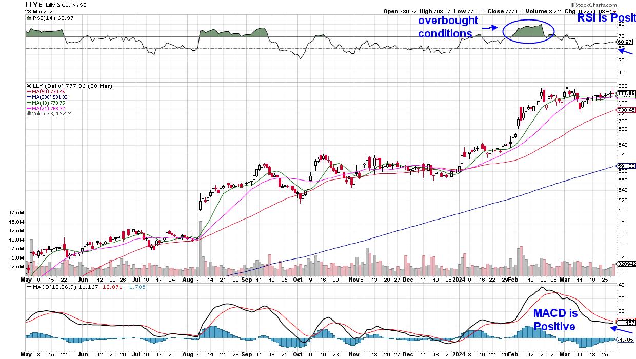
A prime example is Eli Lilly (LLY) which was added to my MEM Edge Report's suggested holdings list in early January. In addition to the company's popular weight loss drug Zepbound, which was approved late last year, The company is on track to see their Alzheimer's drug approved next quarter.
LLY has been trending upward in a tight trading range in anticipation of this FDA approval, and this recent period of consolidation has allowed the stock to recover from an overbought condition during February. A close above its recent high of $800, coupled with a bullish MACD crossover, would put the stock into a strong buy zone.
 Daily Chart of Eli Lilly (LLY) Daily Chart of Eli Lilly (LLY)
Other newer areas are also beginning to emerge, and if you'd like to be alerted to new buy ideas in these areas, use this link here to trial my twice weekly MEM Edge report. You'll also receive in-depth information regarding broader market conditions as well as sector rotation that's taking place and why. I hope you'll take advantage of this offer!
Warmly,
Mary Ellen McGonagle
MEM Investment Research
|
| READ ONLINE → |
|
|
|
| DecisionPoint |
| One Month of Positive Seasonality Remaining -- OBV Says, "Maybe Not." |
| by Carl Swenlin |
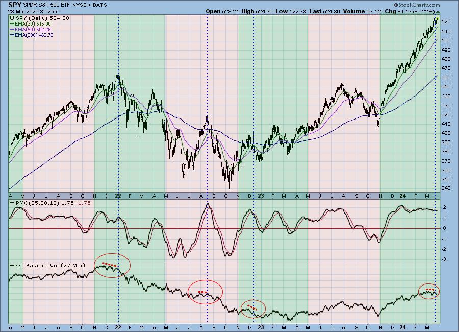
The late Yale Hirsch (Stock Trader's Almanac) has long been known for identifying the six-month periods of positive and negative seasonality in the stock market. The positive period is November through April, and the negative period is May through October. We are currently in a positive period, which has one more month to go. Unfortunately, the OBV (On-Balance Volume) chart is saying that April may not be all that positive.
The chart below shows the positive periods (green), and the negative periods (pink), and we can see that the market rarely accommodates that rigid schedule. It loosely fits positive and negative behavior within those brackets, but those periods begin and end pretty much when they feel like it. The current positive period, however, has been exceptionally compliant, beginning at the end of October and continuing with unrelenting positivity through March. Can this possibly continue for another month? Of course it can, but there are signs on the OBV chart that say it may end sooner than that.

OBV (On-Balance Volume) is a cumulative line to (or from) which the day's total volume is added or subtracted based upon whether price closes up or down. Normally, OBV will merely confirm price movement, making lows or highs that match price movement. Boring. What we look for are instances where OBV fails to confirm price. A good example of that on the chart is at the end of 2021, when SPY was making a series of higher tops, but OBV only made a series of lower tops, failing to confirm price movement. Basically, price moved higher, but volume began to thin out. I have marked three other instances where OBV failed to confirm price, and one of them is for the current period.
Conclusion: There are six-month periods of positive and negative seasonality that appear to influence the direction of prices. During the current positive period, beginning in November, the stock market has been unrelentingly positive, but the OBV chart shows that volume has been trending negatively. It could be that the rising trend in prices is about to end.
Learn more about DecisionPoint.com:
Watch the latest episode of the DecisionPointTrading Room on DP's YouTube channel here!

Try us out for two weeks with a trial subscription!
Use coupon code: DPTRIAL2 at checkout!
Technical Analysis is a windsock, not a crystal ball. --Carl Swenlin
(c) Copyright 2024 DecisionPoint.com
Disclaimer: This blog is for educational purposes only and should not be construed as financial advice. The ideas and strategies should never be used without first assessing your own personal and financial situation, or without consulting a financial professional. Any opinions expressed herein are solely those of the author, and do not in any way represent the views or opinions of any other person or entity.
DecisionPoint is not a registered investment advisor. Investment and trading decisions are solely your responsibility. DecisionPoint newsletters, blogs or website materials should NOT be interpreted as a recommendation or solicitation to buy or sell any security or to take any specific action.
Helpful DecisionPoint Links:
Trend Models
Price Momentum Oscillator (PMO)
On Balance Volume
Swenlin Trading Oscillators (STO-B and STO-V)
ITBM and ITVM
SCTR Ranking
Bear Market Rules
|
| READ ONLINE → |
|
|
|
| Trading Places with Tom Bowley |
| You Need To Understand NOW What Changed After The Fed Announcement |
| by Tom Bowley |
I've always liked to look at certain points during a bull market or bear market where the character of the market could change based on key fundamental news. We were at one of those points on Wednesday as 2 o'clock approached. The Fed was about to deliver their latest policy statement and traders were on pins and needles. Questions were swirling about what the Fed might say, and do, given the February Core CPI and Core PPI numbers that were reported higher than expected. The Fed already has squashed the bulls once recently, when they shot down the possibility of a March 2024 rate cut after expectations were building for exactly that. There were still the 3 rate cuts supposed to occur in 2024, but the Fed told us that higher rates would remain a bit longer.
Most traders are not blessed with great patience. Things could have turned ugly this past Wednesday at 2pm ET if the Fed decided to wait even longer to lower rates, possibly cutting the expected number of rate cuts from 3 down to some lower number. And what might happen if the Fed did an "about face" and said something that might indicate they'd have to reconsider hiking again? After all, this Fed hasn't exactly been consistent in its discussion about interest rates.
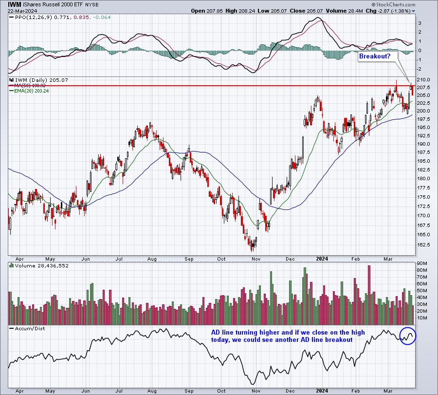
Well, a lot of that anxiety came to an end on Wednesday as the Fed stuck to its previous guidance, despite the higher inflation reports the week prior. The stock market NEVER performs well when uncertainty is rising, but it generally does quite well when that anxiety is diminished. So at the moment the Fed indicated that nothing had really changed in their view, the stock market screamed higher, with the small cap IWM quickly testing overhead price resistance:

This was the chart I sent to EB members in my Daily Market Report on Thursday. Small caps received the news it was looking for and reacted according - to the upside. But the closing breakout never occurred on Thursday and that false breakout led to some profit taking on Friday. It'll be interesting to see where small caps head this week. Since 1987, the annualized return for the IWM over the next 7 days is 41.20%, more than 4 times its average annual return. This tells us that history suggests a strong week ahead for small caps. But nothing is more important than the combination of price and volume. Before we grow overly excited about IWM's prospects, we need to clear candle body price resistance, currently at 208.21.
Major Index and Sector Rotation
With this new information (basically the same as the old), and with inflation fears subsiding further, where did the money go from Wednesday 2pm ET through Friday's close? Shouldn't we be interested in what the big Wall Street firms were doing with their money after this fundamental announcement? Well, this is what the big boys were favoring after the announcement.
Major Indices
- NASDAQ 100 (QQQ): +1.74%
- Russell 2000 (IWM): +1.73%
- S&P 400 Mid Cap (MDY): +1.55%
- S&P 500 Large Cap (SPY): +1.11%
- Dow Jones (DIA): +0.92%
Sectors
- Industrials (XLI): +1.49%
- Communication Services (XLC): +1.46%
- Technology (XLK): +1.34%
- Consumer Discretionary (XLY): +0.84%
- Energy (XLE): +0.74%
- Financials (XLF): +0.73%
- Health Care (XLV): +0.48%
- Materials (XLB): +0.42%
- Real Estate (XLRE): +0.16%
- Utilities (XLU): +0.05%
- Consumer Staples: -0.08%
Clearly, money rotated and benefited "risk on" areas of the stock market, which is secular bull market behavior. Aggressive sectors led by a wide margin over defensive sectors. Money also returned to growth as most growth vs. value ratios turned higher after Wednesday 2pm ET as well.
Industry Group Rotation
We now know that money rotated in bullish fashion and to more growth-oriented areas, though industrials' leadership and the S&P 500's break to yet another all-time high after the Fed announcement is further evidence of wide participation in this latest advance. And with small caps right up there with the NASDAQ 100, all those breadth arguments can be tossed right out of the window.
Here's what we should take away from industry group performance after the Fed meeting:
- Semiconductors ($DJUSSC) was #1 among ALL industry groups - not too shocking
- The Top 10 industry group performers belonged to either technology (XLK), consumer discretionary (XLY), or industrials (XLI)
- Heavy construction ($DJUSHV) had broken out a few weeks ago and the Fed announcement saw momentum increase significantly within this group
- Trucking ($DJUSTK) bounced off 50-day SMA support and is poised to break further into all-time high territory, a very bullish development for transportation stocks ($TRAN) in general
- Gold mining ($DJUSPM) and mining ($DJUSMG) both saw bullish initial reactions, but then gave back most of those gains by Friday
Big Loser
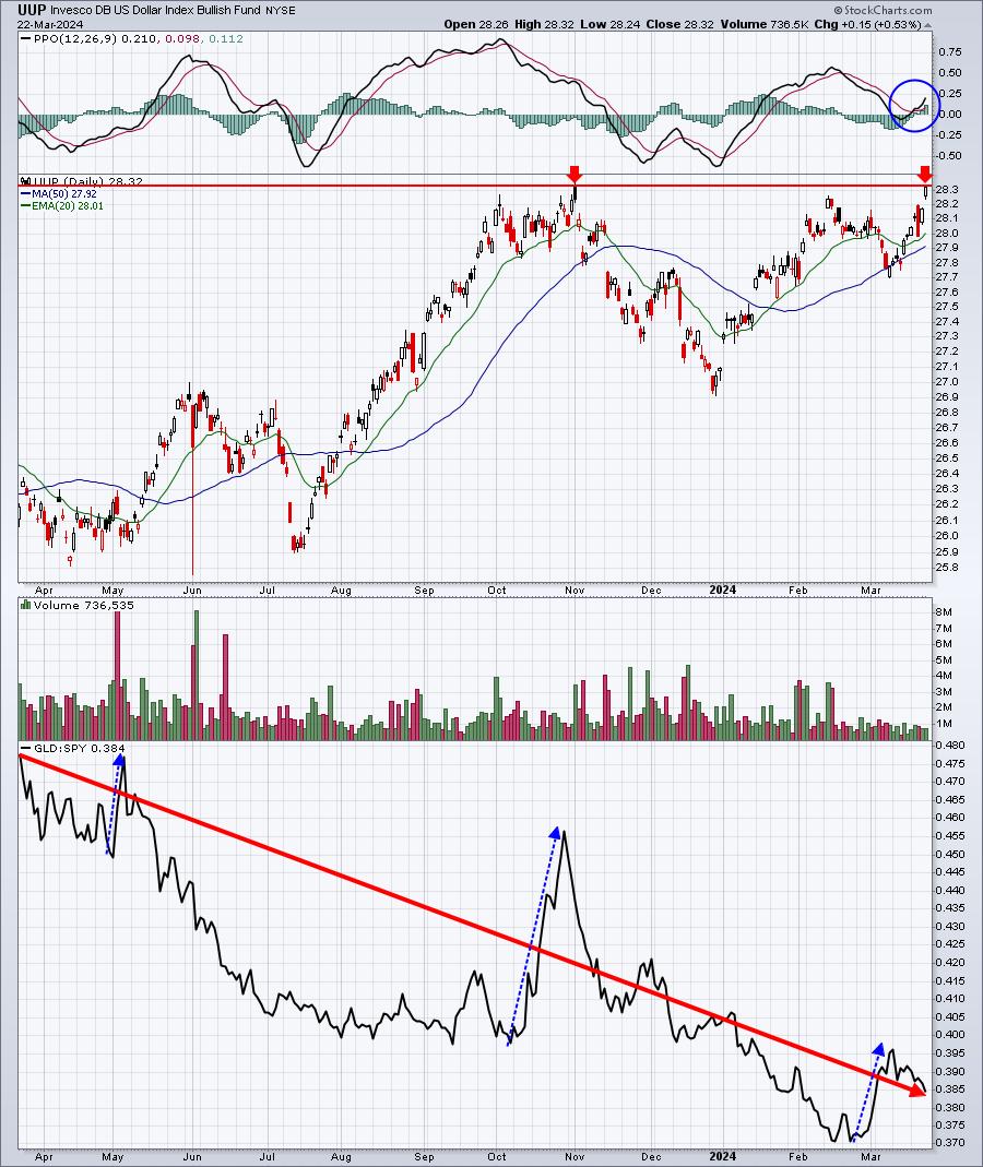
In my mind, it's once again gold ($GOLD). I think many traders believed that falling rates ahead would trigger a drop in the U.S. Dollar (UUP). Not gonna happen. Any weakness in the dollar of late has been triggered by potential erosion by inflation. The Fed essentially said that inflation isn't a problem, despite the higher CPI and PPI readings recently. Our economy remains quite resilient and unemployment remains low, especially compared to foreign economies. That's why the UUP is strong. Another breakout in the UUP could be at hand:

I know many keep pointing to the recent breakout in GLD, but I want to OUTPERFORM the S&P 500 and the above chart shows you that, outside of a few short-term pops to the upside (blue-dotted directional lines), the overall RELATIVE performance line is going down, down, down in a very big way. No thank you.
A Rapidly-Improving Heavy Construction Small Cap Stock
I was focusing on the heavy construction area ($DJUSHV) this weekend, because of its recent strength and then the surge after last Wednesday's Fed meeting and policy statement. There are a number of stocks that caught my attention, but one in particular that I believe has a LOT more upside given its current technical outlook. I'll be sending it out to our FREE EB Digest subscriber community before the market opens tomorrow morning. If you're not already a subscriber, you can CLICK HERE to sign up with your name and email address. There is no credit card required and you may unsubscribe at any time!
Happy trading!
Tom
|
| READ ONLINE → |
|
|
|
| ChartWatchers |
| Return of the Meme Stock Frenzy: Is Now the Time to Shift Your Investment Focus? |
| by Jayanthi Gopalakrishnan |

Today's stock market action uncovered some unusual activity. While the broader stock market indexes rose—the S&P 500 hit a record close, and the Dow Jones Industrial Average snapped a three-day losing streak—it was interesting that Communication Services and Technology were the worst-performing S&P 500 sectors.
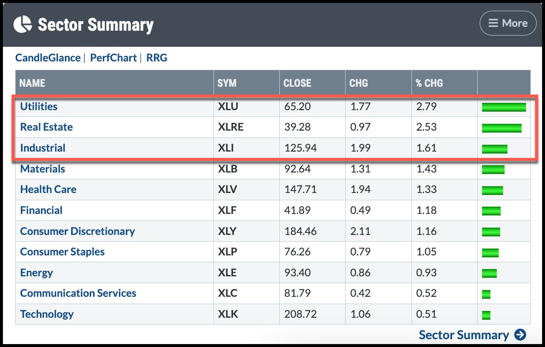
The Sector Summary below shows that all 11 S&P 500 sectors were green at the close on Wednesday. However, Utilities, Real Estate, and Industrials were the top three leading sectors. One day doesn't make a trend; however, if it continues, it would indicate that investors are getting more comfortable with the overall market and are not afraid to diversify their investments among different asset types.

CHART 1. SECTOR SUMMARY FOR WEDNESDAY, MARCH 27. All S&P 500 sectors are positive, but Communications Services and Technology fell to the bottom.Chart source: StockCharts.com. For educational purposes.
A Broad Rally
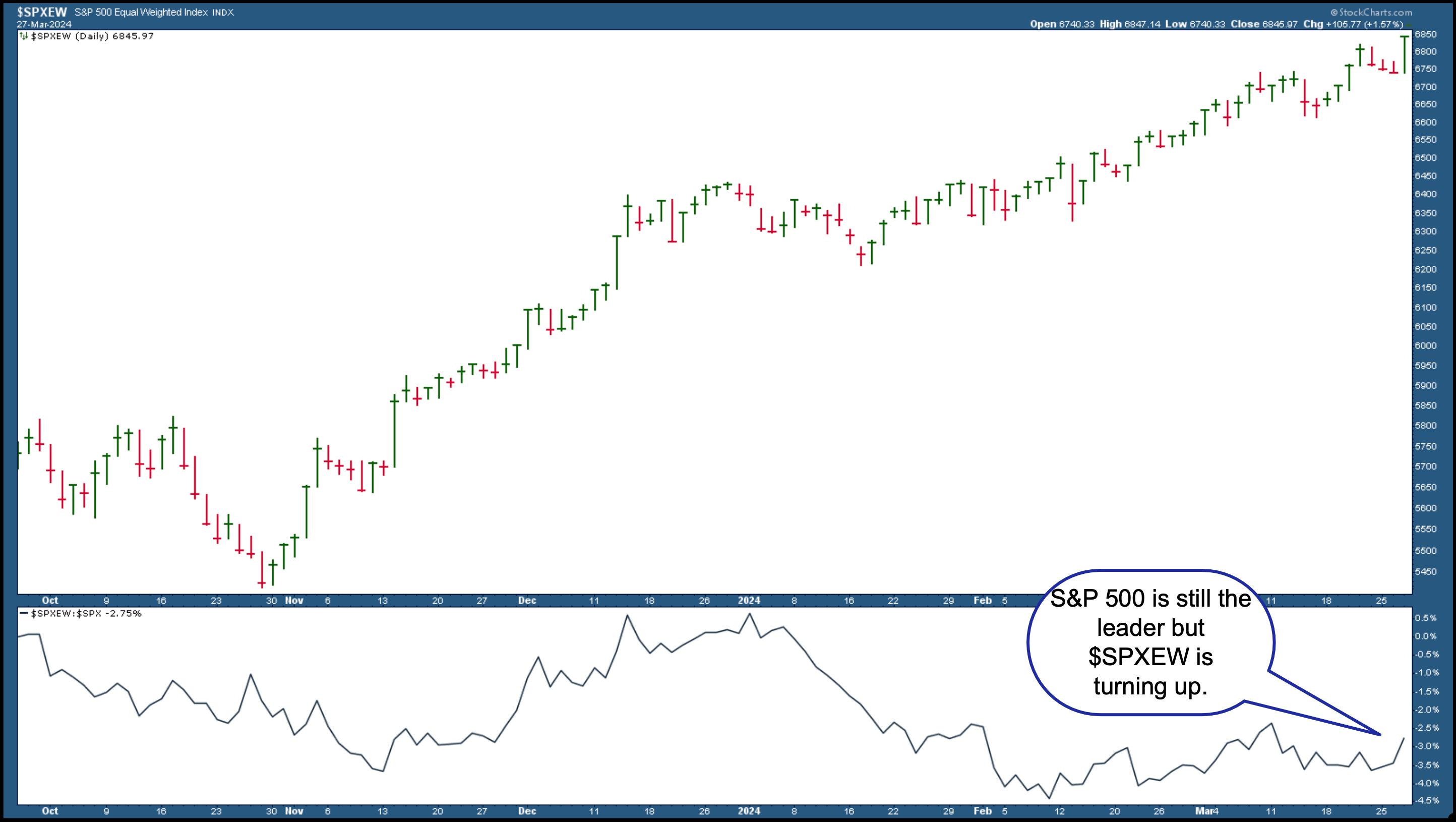
If you run the New All-Time Highs scan, one of the scans in the StockCharts Sample Scan Library, there were over 40 stocks and exchange-traded funds representing different sectors and market caps. The S&P 500 Equal-Weighted Index ($SPXEW) closed higher (see chart below), confirming that Wednesday's rally was broad.

CHART 2. THE S&P 500 EQUAL WEIGHTED INDEX CLOSES HIGHER.
Keep an eye on this chart to see if $SPXEW continues to trend up. When comparing the performance of $SPXEW to the S&P 500 ($SPXEW:$SPX), which is displayed in the bottom panel, it's clear $SPXEW is still underperforming the S&P 500 by a wide margin, but $SPXEW is starting to turn higher. If it continues in that direction, there could be increasing market participation from investors.
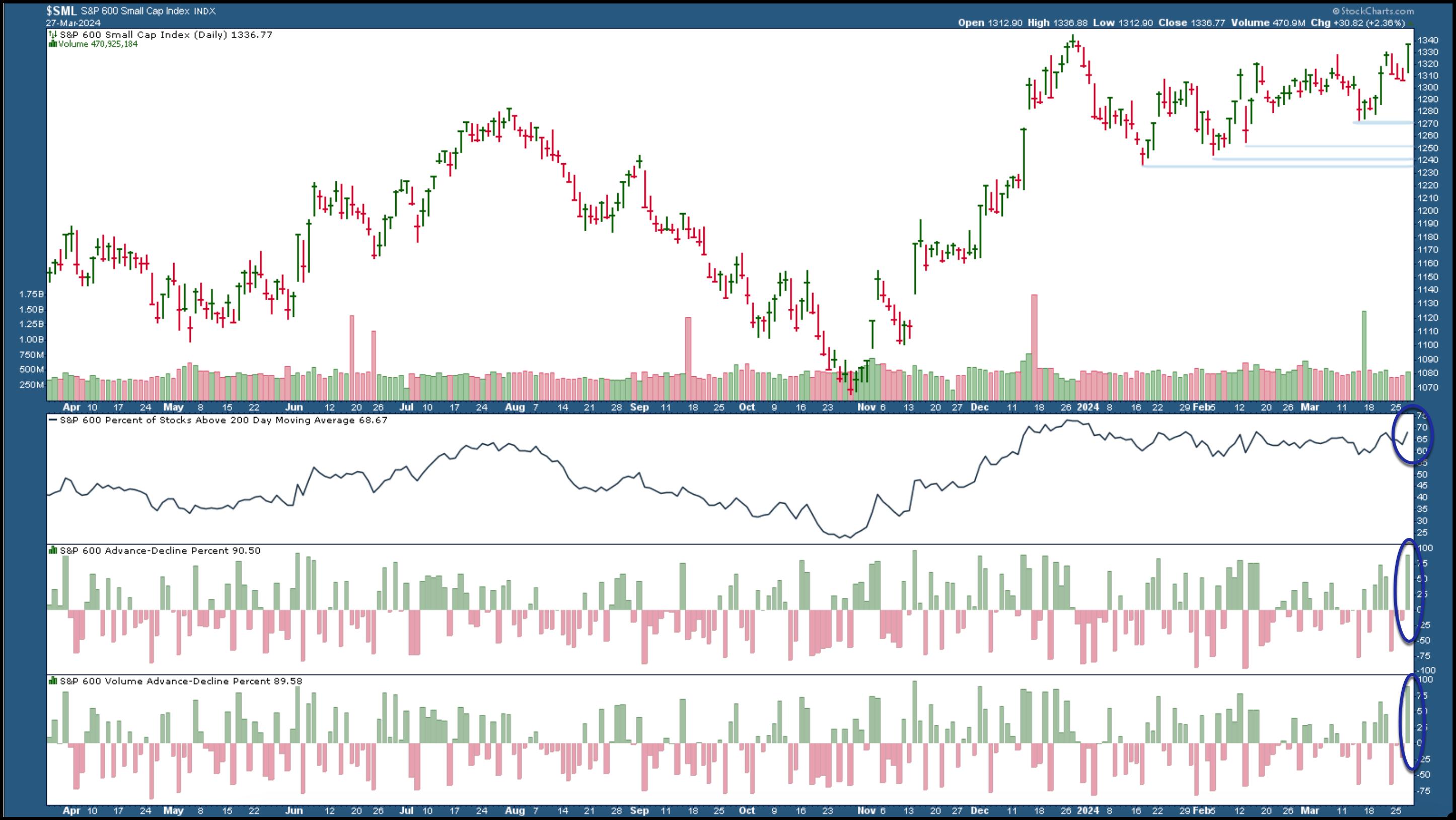
Small- and mid-caps also saw strong breadth. The S&P 600 Small Cap Index ($SML) closed higher and shows strong market breadth (see chart below).

CHART 3. S&P 600 SMALL CAP INDEX CLOSES HIGHER. A breakout above the December 2023 high could be an indication of further strength in small-cap stocks. Market breadth in small caps is also strong.Chart source: StockCharts.com. For educational purposes.
The percentage of S&P 600 stocks trading above their 200-day moving average is almost 70%, with advancers far greater than declines. If you brought up a chart of the S&P 400 Mid Cap Index ($MID), you'll see it hit an all-time high with market breadth similar to that of $SML.
Gold Soars
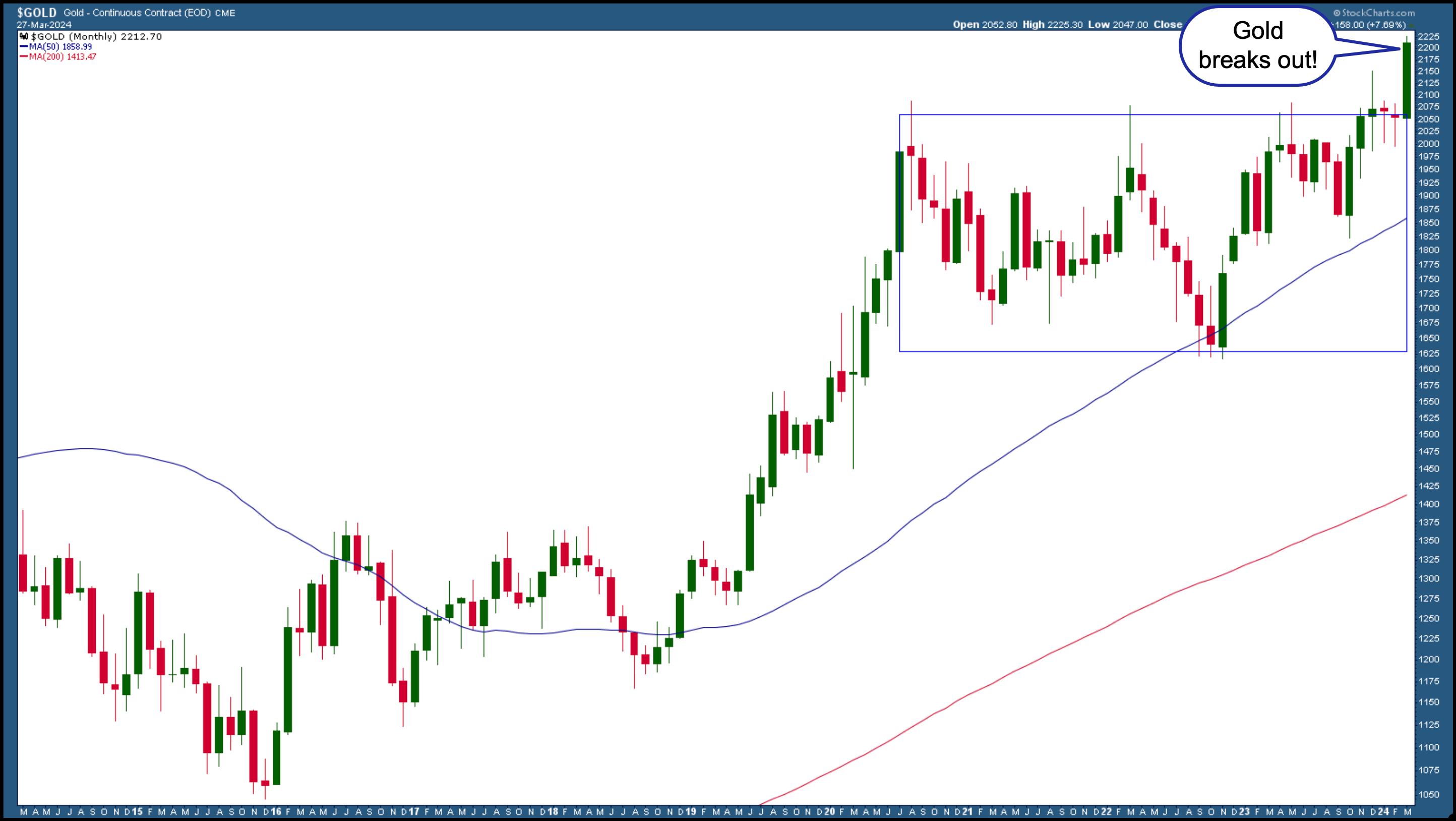
Another area not to ignore is gold. Gold prices have been on a tear. The monthly chart of gold futures ($GOLD) below shows that gold's price has broken above its trading range and is now above $2212 per ounce.

CHART 4. GOLD PRICES SURGE. This could be a short-term rally, but gold prices could rise much higher if there is momentum. Chart source: StockCharts.com. For educational purposes.
Gold continues to hit new highs, which is interesting because investors usually turn to gold as a hedge. But why hedge when inflation is cooling? It's hard to say. Perhaps gold traders felt left behind and thought it was time to get in the spotlight. So, it may be a short-term rally, but if the momentum remains, you could take advantage of the rally by investing in an ETF like GLD.
Meme Stock Craze
Gold traders aren't the only ones who are feeling left out. Some elements of meme stock mania show its presence in the stock market. Two stocks that have gained significant investor attention after a few days of trading are Reddit (RDDT) and Truth Social (DJT).
Is this a sign that investors are comfortable with where the stock market is now and are looking to make quick gains? It's possible that we could see more investor participation as investors become more complacent. But this type of manic action can also signify a market reaching its peak. This doesn't mean there'll be a stock market crash. It does mean, though, that when there's a shift in investor sentiment, it's time to have your antennas up.
The Bottom Line
While a broad market rally is encouraging, it doesn't mean you should get complacent. Trade with a risk management strategy and closely monitor the different sectors and asset classes. Seeing a big-picture view of the stock market enables you to navigate the stock market strategically so that you can see your investment returns grow.

Disclaimer: This blog is for educational purposes only and should not be construed as financial advice. The ideas and strategies should never be used without first assessing your personal and financial situation or consulting a financial professional.
|
| READ ONLINE → |
|
|
|
| ChartWatchers |
| The Fourth Bitcoin Halving Is Upon Us: Is Now the Time to Go Long? |
| by Karl Montevirgen |

Bitcoin is about to undergo its fourth halving on April 19. For crypto enthusiasts, it's well known that this halving occurs every four years and is a critical event that can significantly alter Bitcoin's market dynamics as it affects the coin's supply mechanism.
How Has Bitcoin Halving Affected Price?
The following significant strides followed each price halving:
- First halving in 2012 saw Bitcoin's price rise from $12 to $900 in the years following.
- Second halving in 2016 saw the price climb from around $600 to $2,500 in a year.
- Third halving in 2020 saw prices surge from approximately $8,000 to $40,000 in less than a year.

CHART 1. MONTHLY CHART OF BITCOIN. Here you see the price action following the second and third halving. How much will price rise after the fourth halving?Chart source: StockCharts.com. For educational purposes.
Still, correlation is not causation, and these halvings might simply be reference points marking surges driven by various other factors.
But what if Bitcoin's post-halving supply does play a significant role in its price surge? What if a decrease in supply stokes demand to the point of FOMO? Is it a good time to jump in now, or how can you time an entry?
A Strange Concept: Bitcoin Seasonality
Some cryptanalysts will argue that Bitcoin is seasonal. But while it does have seasonal data, seasonality is another matter altogether, as it implies internal supply/demand mechanisms happening consistently within a calendar year.
Still, the context is something you might want to be aware of in your attempt to time an entry.

CHART 2. BITCOIN'S 10-YEAR SEASONAL PERFORMANCE. Most of the months have exhibited strength in returns and higher closes (mainly because Bitcoin has constantly been subject to hype and FOMO).
Chart source: StockCharts.com. For educational purposes.
Using StockCharts' Seasonality tool, Bitcoin's 10-year seasonal performance shows that October and February tend to be its strongest months, with a higher-close rate near or at 90% and an average return rate of 24% (October) and 14.4% (February).
But the combination of April, May, and June, three consecutive months, also presents an appealing opportunity. How does Bitcoin's 10-year seasonal performance compare with the S&P 500?

CHART 3. 10-YEAR PERFORMANCE OF BITCOIN AGAINST THE S&P 500. Note how October and February remain the most vital months compared to the broader market.Chart source: StockCharts.com. For educational purposes.
Like the chart above, October and February are Bitcoin's strongest months. While April through July are relatively strong, April stands out as the strongest among the months in Spring.
How to Access the Seasonality Tool
There are different ways to access the seasonality tool in StockCharts.
- Click the Charts & Tools tab at the top of the StockCharts page, enter a symbol in the Seasonality panel, and click Go.
- Enter the symbol in the ChartBar at the top of the page and select "Seasonality" from the dropdown menu on the left.
- From Your Dashboard, in Member Tools, click on Seasonality.
- Below the seasonality chart, you'll find links to instructions and quick tips that give more detailed instructions.
So, what does the price action look like today? Let's turn to the daily chart of Bitcoin to US dollar.

CHART 4. DAILY CHART OF BITCOIN. Note the decrease in momentum and the potential support levels serving as possible entry points for those looking to go long.
Chart source: StockCharts.com. For educational purposes.
Note Bitcoin's five-day sell-off from March 14 to 19. Perhaps in light of the April halving event, Bitcoin bulls jumped in as prices approached the most recent swing low of just below $60,000. This level also coincides with the 38.2% Fibonacci Retracement drawn from the January 2024 low of $38,512 to the March high of $73,802.

However, note that the bounce lacks momentum, as the Money Flow Index (MFI) and the Chaikin Money Flow (CMF) signal a rapid decrease in buying pressure. However, the MFI is nowhere near "oversold" territory, and the CMF is still above the zero line, which is a bullish sign that buyers still have the technical advantage.
Even if the present rally falters, Bitcoin's uptrend will remain viable. If a decline as painful as the $56,000 range occurs, the uptrend would remain intact. The Kumo (Ichimoku Cloud) has also been plotted to confirm this "support level" thesis. Notice how the price bounced off the Kumo back in January. The current price action gives a wider range of support-level expectations.
The Bottom Line
While the fourth halving event on April 19 will likely stir up some FOMO, watch the current swing to see whether it continues or pulls back. The coming months are seasonally strong, but seasonality may play second fiddle to the halving event. If it does pull back, you can see the levels where Bitcoin is likely to bounce, serving as a strategic entry point for those looking to go long.
Disclaimer: This blog is for educational purposes only and should not be construed as financial advice. The ideas and strategies should never be used without first assessing your personal and financial situation or consulting a financial professional.
|
| READ ONLINE → |
|
|
|
| MORE ARTICLES → |
|


 The 200-day SMA is perhaps the most widely used long-term moving average. As its name implies, it is a simple indicator that chartists can use for trend-following and momentum strategies. For trend-following, we just need to know where prices stand relative to the 200-day SMA. For momentum, we need to measure the distance between price and the 200-day SMA. Let's look at examples from two Nasdaq 100 stocks.