| THIS WEEK'S ARTICLES |
| Larry Williams Focus On Stocks |
| MEMBERS ONLY |
| Business Confidence and Stocks | Focus on Stocks: April 2024 |
| by Larry Williams |
|
Here comes the answer to a very old question, "Do stocks lead the economy, does the economy lead the stock market, or is there something else?" My work has shown numerous times that GDP is not a good predictor of the Dow Jones...
|
| READ ONLINE → |
|
|
|
| The Mindful Investor |
| VIX Spikes Above 16 - Is This the End? |
| by David Keller |
The VIX ended the week just above 16, bringing it to its highest level in 2024. What does this tell us about investor sentiment, and how does this compare to previous market cycles?
Let's take a quick tour of market history through the lens of the VIX, focusing on which levels have tended to be good signals of market reversals, and then relate that back to our current setup with a VIX around 16 as we move further into the 2nd quarter of 2024.
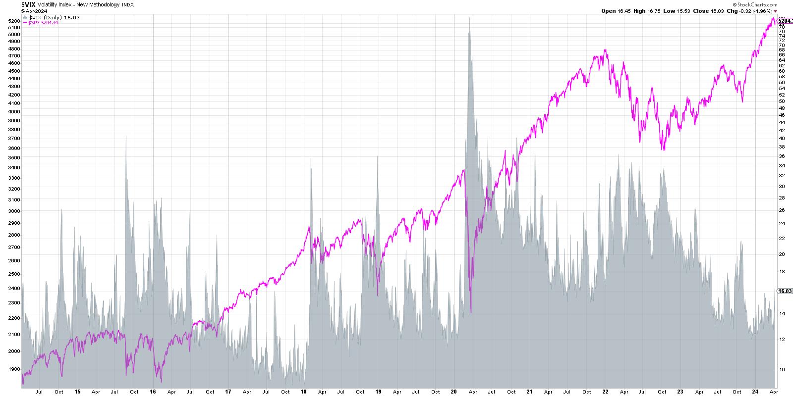
We're starting with a ten-year chart of the S&P 500 index (shown in pink) and comparing that to the VIX (shaded in gray). You'll probably be drawn to the spikes in the VIX in 2020, 2019, and 2015, each of which represented significant drawdowns for the S&P 500.
Why does the VIX tend to push higher when the SPX drops lower? This goes back to one of my favorite market maxims, "The market goes up the escalator and down the elevator." Basically, bull markets are marked by slow-and-steady accumulation on the way up, as investors add positions over time. But when investors get nervous, fearing a drop in stock prices, they tend to panic and sell very quickly. Indeed, there is often a feedback loop where selling drives prices lower, which then begets further selling, which drives down prices even further.
The VIX is often called the "fear gauge" because of this inverse relationship to stock prices, but I prefer the term "uncertainty gauge" as a better reflection of what the series is actually designed to measure.
Let's look at the inverse relationship in more detail.
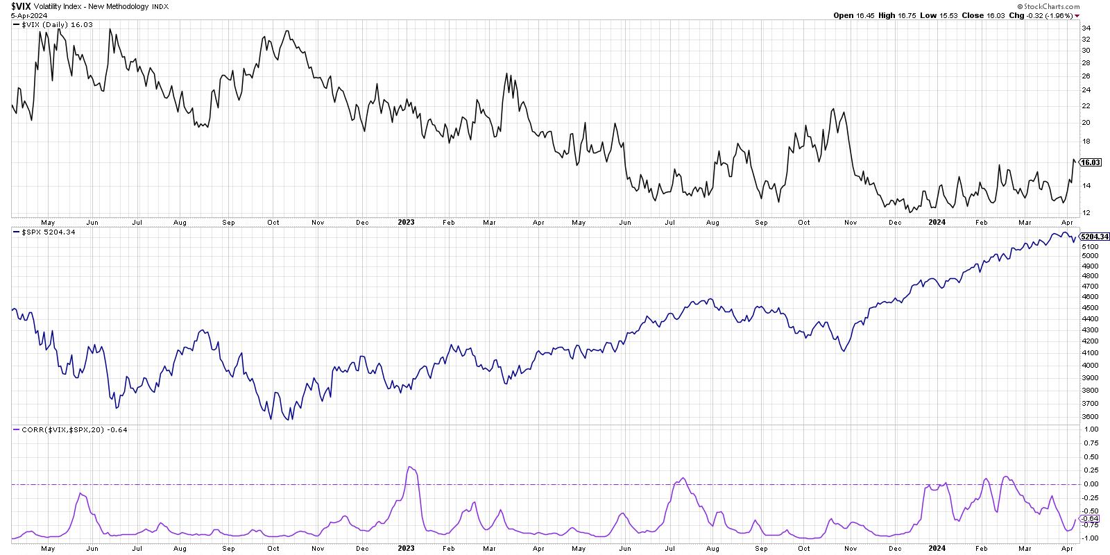
Here we're showing the VIX in the top panel, the S&P 500 in the middle, and then the 20-day rolling correlation between the two data series. Notice how there is often a strong inverse relationship between the two? While there have occasionally been spikes in the correlation to around the zero level (basically, no relationship between the two data series), the correlation has usually remained in the -0.7 to -1.0 range.
When I'm considering two series with an inverse relationship, it can be helpful to invert one of the data series.
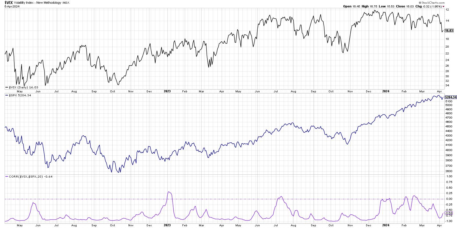
Now we're showing the VIX upside down in the top panel, which makes it easier to recognize how drops in the S&P 500 usually coincide with spikes in the VIX. So have we seen enough of a rise in the VIX to raise a red flag on this bull market? Not quite, in my opinion. But I do have some key levels I'll be watching through Q2.
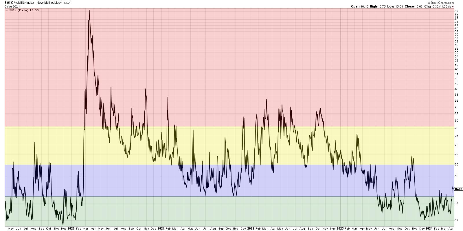
In a low-volatility environment like the one we've seen in the last eight months, similar to 2019 and 2017, the VIX spends a great deal of time below the 15 level (green-shaded area). Thus, a VIX below 15 represents a low-volatility bull market phase. When the VIX pushes above 15 but remains below 20 (blue-shaded area), this suggests that the long-term trend is still positive, but we are likely entering a pullback phase within that bullish trend. When we see a VIX push above 20 but not above 28.5 (yellow-shaded area), that would mean we are now in a high-volatility environment. The S&P 500 is probably in a clear pullback by now, and investors will be questioning whether it's the beginning of a much deeper bearish phase.
The last time we broke above 20 was heading into the October 2023 market low. I was fairly bearish at the time, because the VIX pushing above 20 usually means we're just getting started with a market decline. The strength of price action off the October low, along with bullish rotations in breadth and momentum indicators, told us that the VIX above 20 was a false alarm.
Now, if the VIX pushes above the 28.5 level (red-shaded area), then the S&P 500 has essentially entered a confirmed bearish phase. This is a level I learned about from Tim Hayes at Ned Davis Research, based on research they had conducted on a deep history of the VIX. The last two times we saw a rotation above that key 28.5 level? November 2021 just before the 2022 market top, and February 2020 at the beginning of the COVID era. A VIX above 28.5 is actually fairly uncommon, and I've learned to treat extremes in the VIX as a major red flag and a good reason to rotate to risk-off positions.
A quick review of market history tells us that a VIX around 16 indicates a likely pullback scenario within a bullish phase. However, it also tells me to be prepared for a higher VIX, which would mean higher levels of uncertainty. As we've seen with these charts, higher uncertainty usually means a higher risk that the market takes the elevator down to much lower levels!
RR#6,
Dave
P.S. Ready to upgrade your investment process? Check out my free behavioral investing course!
David Keller, CMT
Chief Market Strategist
StockCharts.com
Disclaimer: This blog is for educational purposes only and should not be construed as financial advice. The ideas and strategies should never be used without first assessing your own personal and financial situation, or without consulting a financial professional.
The author does not have a position in mentioned securities at the time of publication. Any opinions expressed herein are solely those of the author and do not in any way represent the views or opinions of any other person or entity.
|
| READ ONLINE → |
|
|
|
| Art's Charts |
| Overbought Conditions Reflect Strength and Said Strength Drives Momentum Rotation Strategies |
| by Arthur Hill |
 Momentum and trend strategies are off to a roaring start here in 2024. More often than not, these strategies buy leading stocks that appear overbought. Buying stocks that appear overbought often goes against our "gut feel", but overbought conditions reflect strong buying pressure and this is clearly more bullish than bearish. Let's look at recent examples using the broader market and UBER. Momentum and trend strategies are off to a roaring start here in 2024. More often than not, these strategies buy leading stocks that appear overbought. Buying stocks that appear overbought often goes against our "gut feel", but overbought conditions reflect strong buying pressure and this is clearly more bullish than bearish. Let's look at recent examples using the broader market and UBER.
Stocks surged in early November with an S&P 1500 Zweig Breadth Thrust signal and seemed to be overbought by the end of November. The S&P 500 and Nasdaq 100 were up 8.9 and 11.4 percent, respectively. TrendInvestorPro's Composite Breadth Model then turned bullish in early December and stocks again appeared overbought in late December. The S&P 500 was up 4.4% and the Nasdaq 100 was up 5.5% in December. Note that the Composite Breadth Model is 14 indicator breadth model used for broad market timing a TrendInvestorPro.
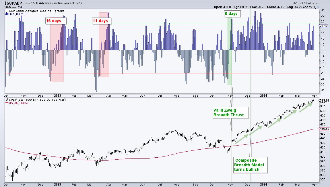
Despite big moves in November and December, stocks did not stop rising at the end of 2023. Instead, the advance continued in January-February with the Nasdaq 100 leading. This advance then broadened out in March with the S&P 500 taking the lead. The Nasdaq 100 rose 1.2% in March and the S&P 500 surged 3.1% this month. Again, the market appears to be overbought and ripe for a correction period. While I cannot argue with this assessment, I cannot predict a pullback, especially in a strong uptrend. There will be a correction at some point, but I do not know when. Perhaps we should stop using the term "overbought" when the trend is up and accept overbought conditions at face value. Overbought is really just another way of saying "strong".
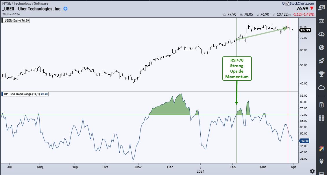
Dual Momentum Rotation strategies are designed to take advantage of leading stocks with strong price moves. The methodology buys the top performing stocks and sells when they drop below a certain rank. The chart below shows a trade example using Uber Technologies (UBER). UBER entered the model portfolio as a top ranked stock on February 5th, and RSI was above 70 (green vertical line). RSI is considered overbought when above 70. In truth, a move above 70 reflects strong upside momentum and this is more bullish than bearish. Price moved higher and UBER's rank then dropped by the end of March (red line). UBER no longer made the cut and this triggered an exit signal.
Focusing on the strongest stocks within the Nasdaq 100 and S&P 500, the Dual Momentum Rotation Strategies at TrendInvestorPro are up double digits so far this year. Be careful chasing performance because it is not all roses when trading the leaders and there will be drawdowns along the way. These strategies were down in 2022, they recovered nicely in 2023 and there were also drawdowns in 2023 (September). These strategies are fully systematic and trade on a weekly basis. Rankings and signals are posted every Saturday morning for subscribers. Click here to see performance metrics and learn more.
//////////////////////////////////////////////////
|
| READ ONLINE → |
|
|
|
| Wyckoff Power Charting |
| Trifecta of Trouble |
| by Bruce Fraser |
 The Markup Phase of a Bull Market is glorious to behold and participate in. But they do ebb and flow. The bullish run in the major stock indexes has been persistent in 2024. We often discuss the quarter-end effect for stock index trends and the upward trend has persisted into the end of the first quarter with diminishing momentum. Let's turn our attention to some classic and powerful Wyckoff chart studies to determine the present position and possible future direction of the indexes as the second quarter begins. The Markup Phase of a Bull Market is glorious to behold and participate in. But they do ebb and flow. The bullish run in the major stock indexes has been persistent in 2024. We often discuss the quarter-end effect for stock index trends and the upward trend has persisted into the end of the first quarter with diminishing momentum. Let's turn our attention to some classic and powerful Wyckoff chart studies to determine the present position and possible future direction of the indexes as the second quarter begins.
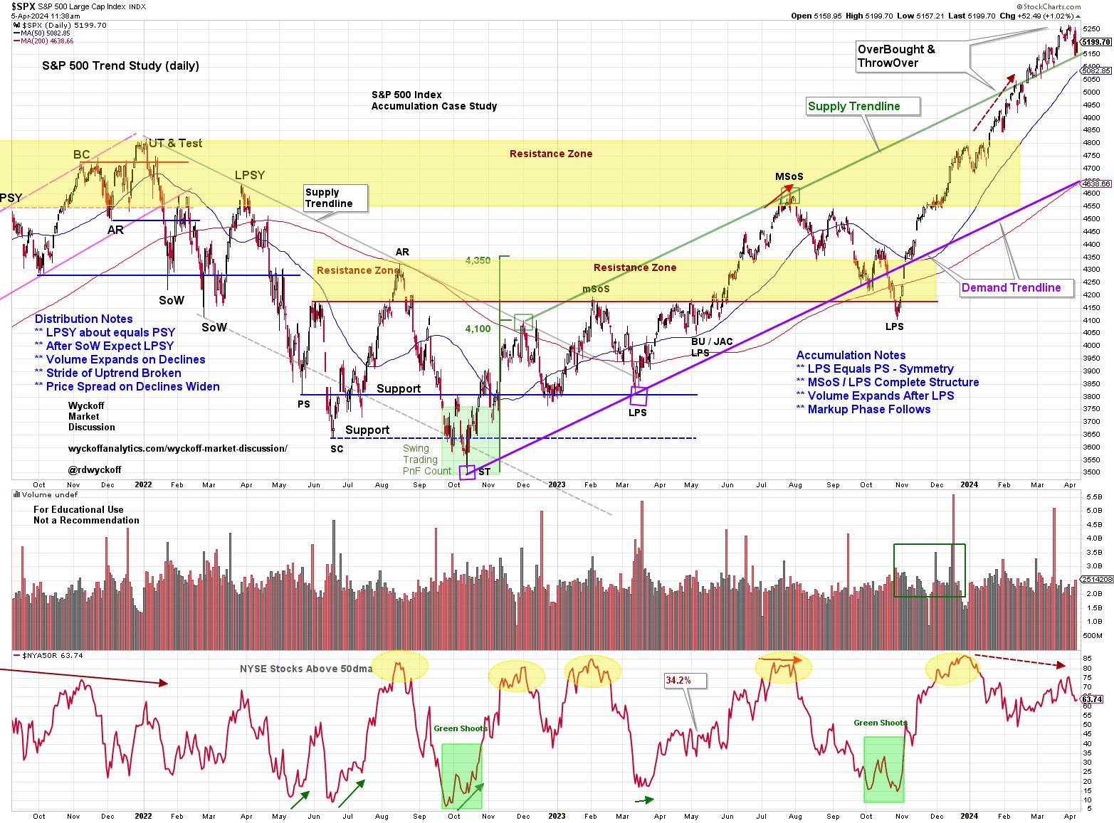 S&P 500 Index with Wyckoff Markups. 2021-2024 S&P 500 Index with Wyckoff Markups. 2021-2024
This daily chart of the S&P 500 should be familiar to regular readers. It is our Wyckoffian record of market structure going back to the bull market peak of 2021. It is a real-time journal of our Wyckoff Analysis through the Distribution Structure, the Markdown, the Accumulation Phase of 2022-23 and now the Markup. The Markup finally exceeded the rangebound condition of the Accumulation with the advance that began in October of '23. We had been making the case for the unfolding Accumulation here and in the Wyckoff Market Discussions (every Wednesday with Roman Bogomazov) throughout the Accumulation period.
Recently the S&P 500 climbed above the well defined Markup channel into a Throwover and OverBought condition. This OverBought / ThrowOver has arrived as the First Quarter was coming to a conclusion. Thus suggesting ‘Window Dressing' shenanigans by institutional types. Often strong trends in the indexes (both upwards and downwards) can follow through and persist for a few weeks into the new quarter. We will watch for a change of character in the behavior of the indexes in the Second Quarter. An example of this would be a reversal of the S&P 500 back into the upward striding Trend Channel. A sudden and sharp break back into the channel would be labeled an Automatic Reaction (AR) and would represent an important confirmation of the upward trend exhaustion. Until such an event the upward trend must be respected.
We expect the upward stride of a Markup phase to be broad and strong and such is the case here. Recall that Accumulation is a zone of deepening pessimism where the public and institutions become progressively more cautious. Such caution manifests as portfolio defensiveness (higher levels of cash, lower beta stocks and more bond type assets). Meanwhile the ‘Composite Operator' types are absorbing stocks with good growth and value features for the next bull market. This puts stocks in very strong hands. This Supply to Demand imbalance can result in stock indexes launching higher following the preparation phase of Accumulation. As Accumulation concludes broad pessimism is observed in the extreme pessimism readings of various sentiment gauges (which were profiled in Power Charting and on WMD at the time).
Point and Figure Price Objectives
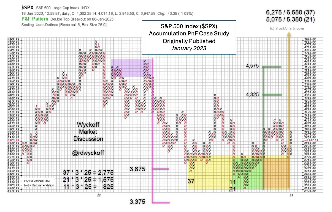
 S&P 500 Point & Figure Study. January 2023 S&P 500 Point & Figure Study. January 2023
This PnF legacy chart was first profiled in January of 2023. It estimated the downside potential of the bear market, which was fulfilled with a Selling Climax and a Secondary Test. The Climax initiated Accumulation (detailed in the vertical chart above) that continued throughout the second half of 2022. In January of '23 the upside of the nearly completed Accumulation was estimated in three segments. The first two segments have now been fulfilled. Note the Count Line was 3,775 and the $SPX was at 4,000 when this projection was made and published. Pessimism at the time was such that this study was met with much disbelief, a very good sign for the higher prices yet to come as the indexes began climbing the ‘Wall of Worry'.
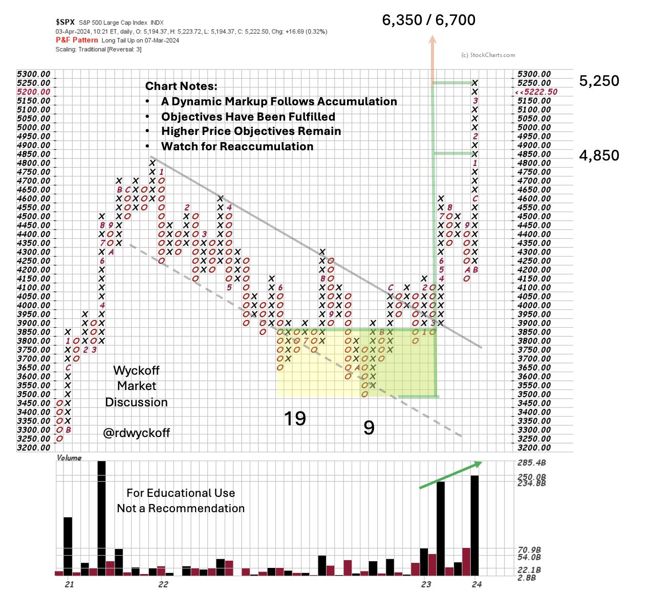
Below is a PnF update with the Markup phase. Second phase price objectives are now being fulfilled. New price highs above the 2021 bull market peak have markedly swelled bullish sentiment. Analyst types are now rushing to make projections for the $SPX above 6,000 and even 7,000. This bulge of optimism is a warning sign that caution is warranted.
 S&P 500 Point & Figure Study, 50 Point Scale. April 2024The current interpretation of the 2022-23 Accumulation shows the robust Markup following the Accumulation (50 point scaling slightly changes the price objectives). Once the downward trend channel was broken and tested from above the upward stride was dramatic. Index prices have now Upthrusted the bull peak of 2021 where a Backup to old resistance is likely. S&P 500 Point & Figure Study, 50 Point Scale. April 2024The current interpretation of the 2022-23 Accumulation shows the robust Markup following the Accumulation (50 point scaling slightly changes the price objectives). Once the downward trend channel was broken and tested from above the upward stride was dramatic. Index prices have now Upthrusted the bull peak of 2021 where a Backup to old resistance is likely.
Trifecta of Trouble (a summary)
1) The S&P 500 is now above the upward stride of its trend channel. This OverBought condition could lead to a correction and would be confirmed by return into the channel. Old resistance from the 2021 bull peak would be a price level to expect support to develop.
2) Point & Figure Price Objectives generated in early 2023 are now being fulfilled. Watch for classic signs of stopping action such as an Automatic Reaction and range-bound sideways trading. This would generate PnF count potential for either ReAccumulation or Distribution. Higher price objectives remain and there is good seasonality in the second half of this election year. We will watch the tape for further indications.
3) Sentiment has flipped from bearish to bullish. High readings from the NAAIM, AAII, CNN Fear & Greed and other important gauges are frothy. This is normal and typical in a Bull Market as the upward stride of the trend ebbs & flows. Corrections of the uptrend bring back caution and even pessimism which builds cash for higher prices in the future.
A dynamic Markup is very exciting, important, and not to be missed. Corrections along the way are inevitable. They often represent rotation of leadership as the economy matures and changes character and that appears to be the case here (subject for future WPC blog posts).
All the Best,
Bruce
@rdwyckoff
Disclaimer: This blog is for educational purposes only and should not be construed as financial advice. The ideas and strategies should never be used without first assessing your own personal and financial situation, or without consulting a financial professional.
Announcement
Wyckoff Market Discussion – Free Open Door Session. Wednesday April 10, 2023, 3pm PT
Join Roman Bogomazov and me for a FREE session of the Wyckoff Market Discussion. From a Wyckoffian perspective we discuss the current state of key financial markets.
Register to attend this free session (CLICK HERE)
To Learn more about the WMD series (click here)
|
| READ ONLINE → |
|
|
|
| Martin Pring's Market Roundup |
| MEMBERS ONLY |
| DJT Has Closed Last Week's Gap, But is It Enough? |
| by Martin Pring |
|
Sometimes, simple indicators like bar or candlesticks operate just as the textbooks tell us they should...
|
| READ ONLINE → |
|
|
|
| RRG Charts |
| Energy is on Fire |
| by Julius de Kempenaer |
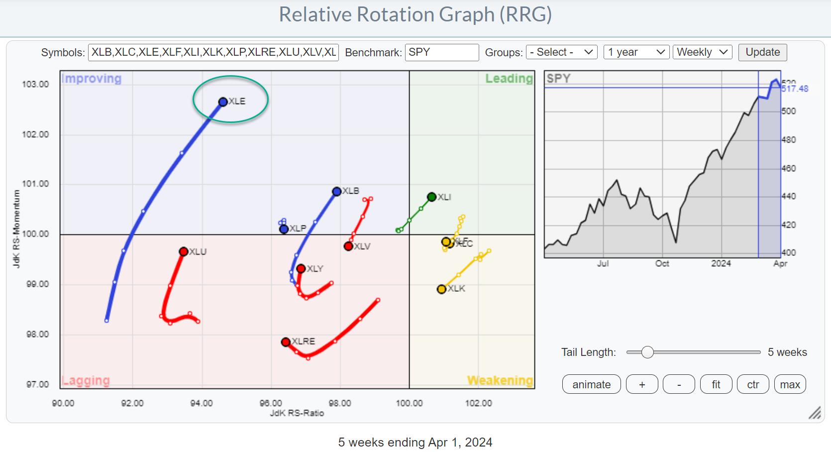
Strong Rotation on the Weekly RRG

For a few weeks now, the improvement in the energy sector (XLE) is becoming increasingly visible in the lengthening of the XLE tail on the Relative Rotation Graph. The recent rotation from lagging into improving on the weekly RRG is now starting to pick up steam and also move higher on the RS-Ratio scale, indicating a further improvement of relative strength.
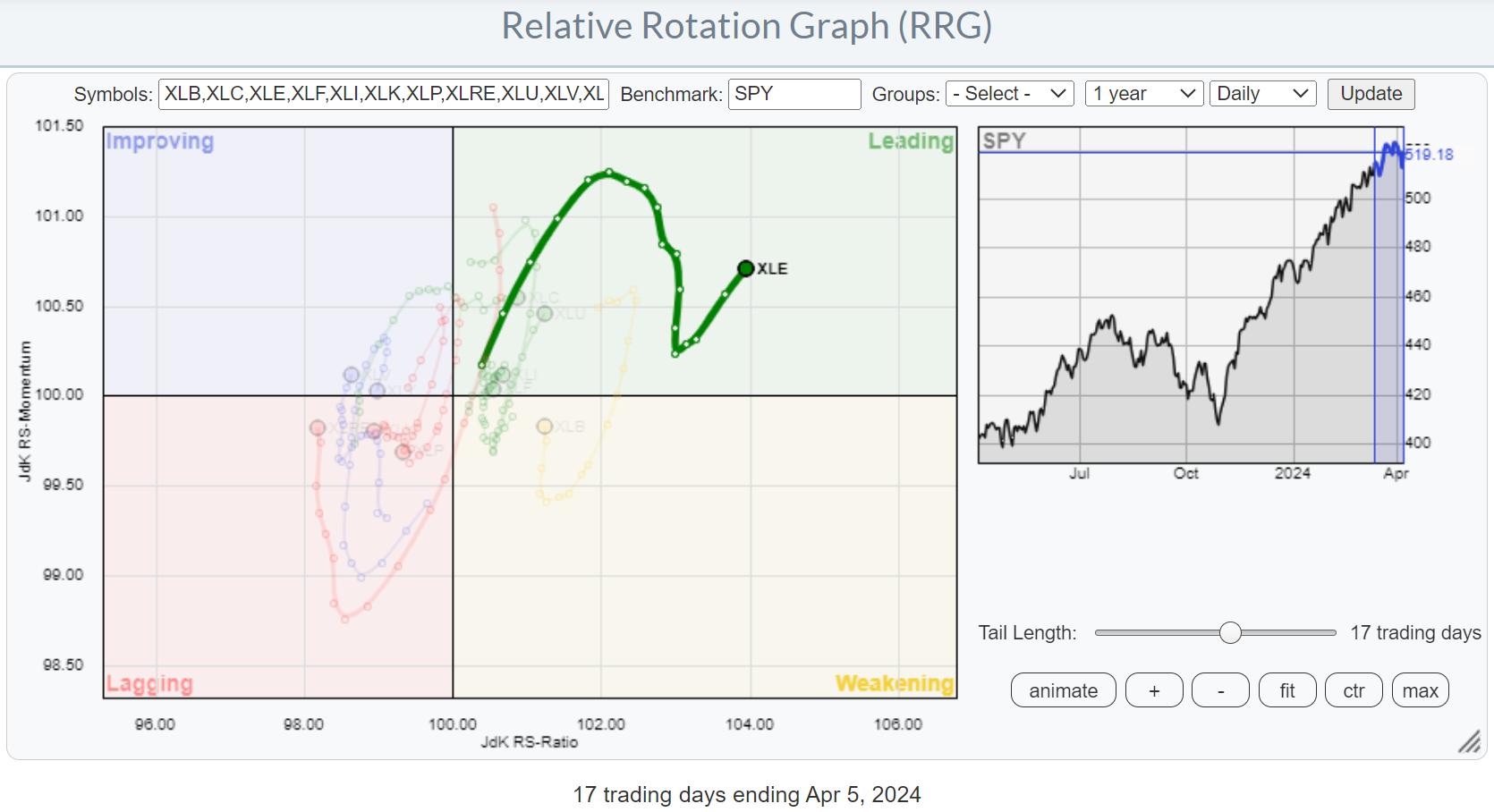
Daily Rotation is Confirming Strength

This improvement is further emphasized on the daily RRG, where we find the XLE tail well inside the leading quadrant with a recent "hook" back up, following a dip in relative momentum.
Clockwise vs. Counter-Clockwise
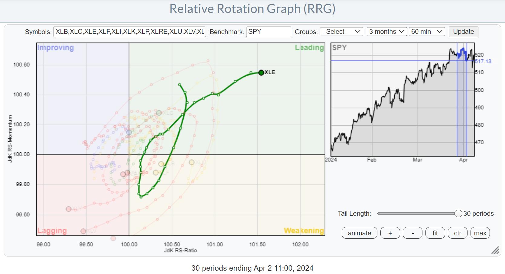
As a side note, this is a good example where a tail "seems" to be making a counter-clockwise rotation. But in reality, under the hood, on a smaller time frame, you can see there is a clockwise rotation visible.
In this case, the pivot on the daily tail was on 4/1 (no joke). When I zoom in on 4/1 and the surrounding days using an hourly RRG, a clear clockwise rotation shows up.

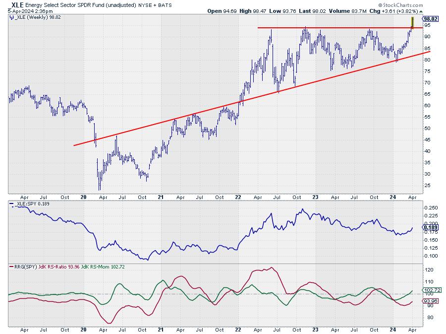
Price Breaking Major Resistance
The energy sector was also mentioned in my previous article as one of the sectors that was close to breaking a major overhead resistance level.

This is now happening. With the excess supply of around $94 now out of the way, new upside potential was unlocked. This will certainly help further improve the relative strength of this sector.
Industries

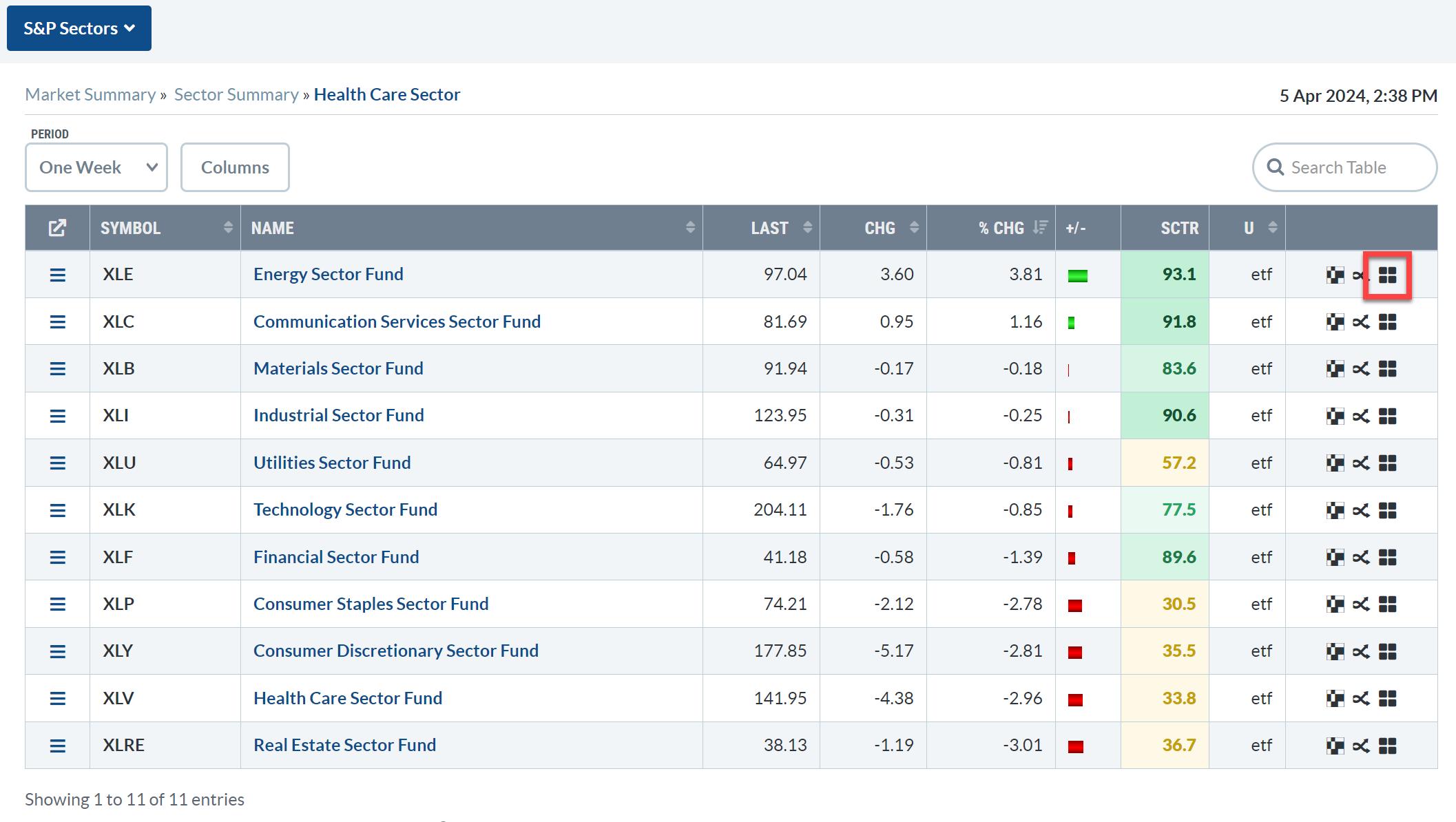
From the Sector Summary page, we can dive deeper into the energy sector by opening up an RRG that shows the rotations for the various industries inside the sector. Just click on the small RRG icon at the end of the line.

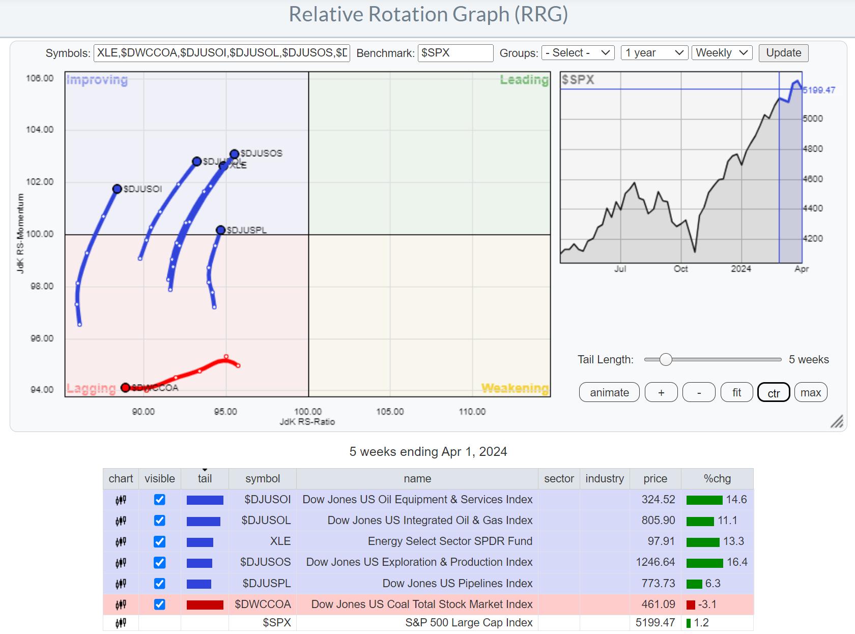
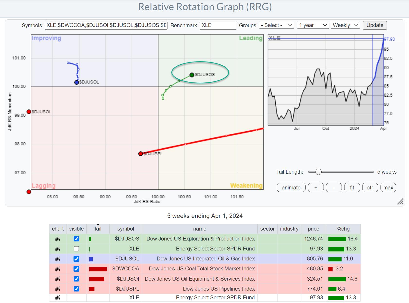
Initially, this RRG will use the $SPX index as the benchmark. The overall strength of the sector is clearly visible in all groups (except Coal), moving inside the improving quadrant at a positive RRG-Heading.
However, things change when we switch the benchmark to XLE, which allows us to see the rotation of these groups within their own universe. We already know that the sector is doing well, but which industries should we focus our attention on?
Exploration & Production Stands Out

This changes the picture tremendously and immediately shows that there is really ONE group that is leading the Energy sector, and that is Exploration and Production.

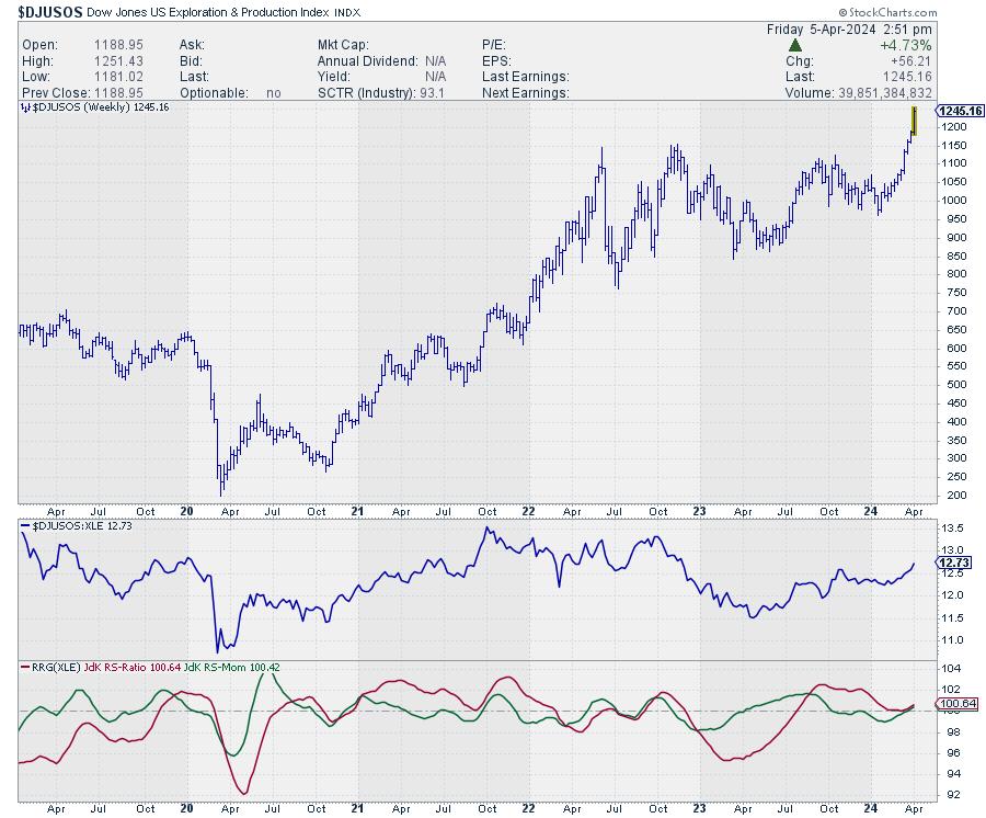
The price chart for this group speaks volumes. The upward break already happened a few weeks ago, and now relative strength is really picking up the pace, with both RRG lines turning higher above the 100 level and pushing the tail further into the leading quadrant on the RRG.
Zooming in on Individual Stocks

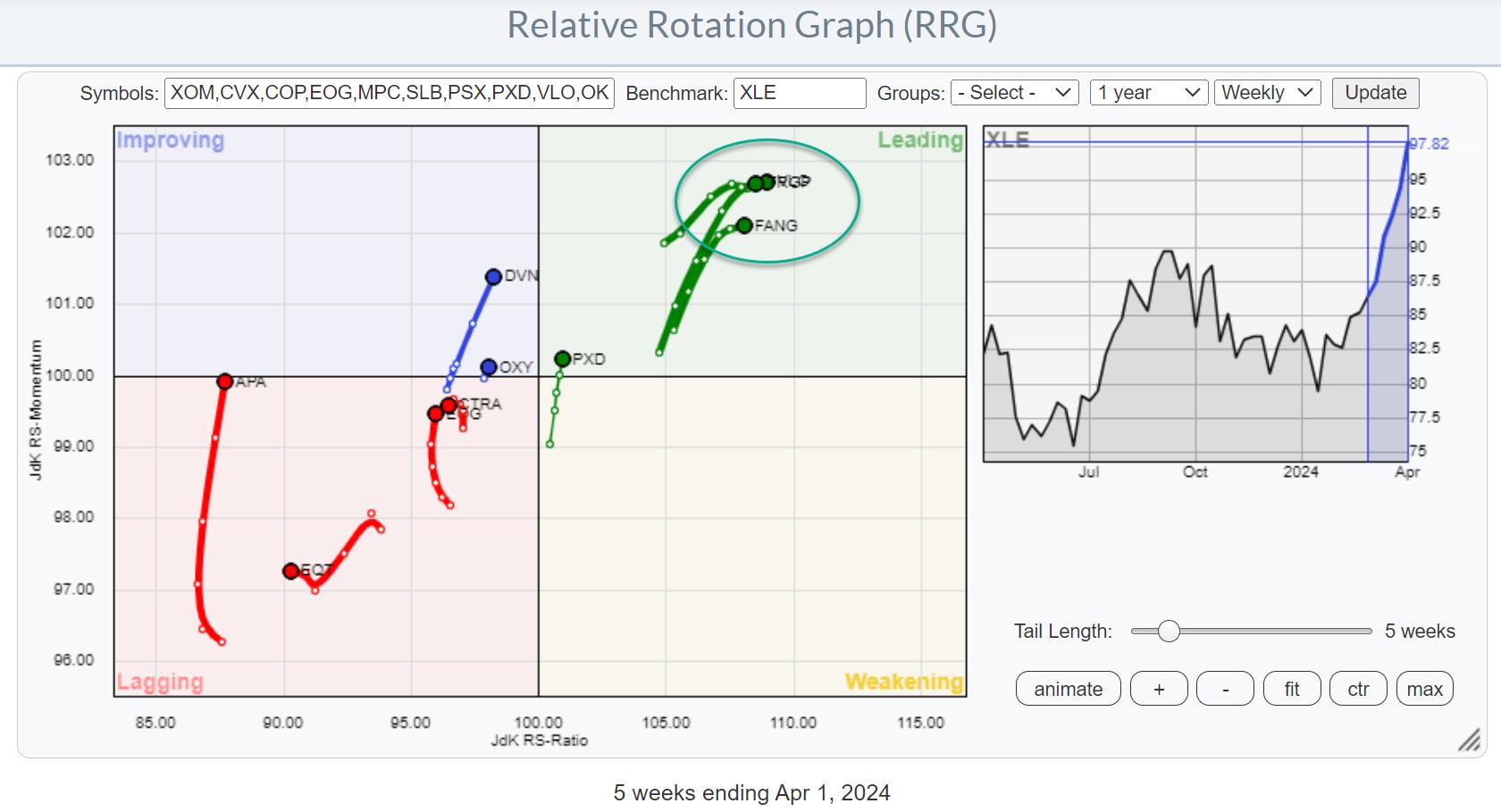
Loading the predefined RRG for members of the Energy sector and then hiding tails/stocks that are not in exploration and production gives the RRG above. Going over the individual price charts reveals that the stocks inside the leading quadrant, the cluster in green, have already made a significant move higher in price terms. They have been leading the initial rally for this group.
When looking for better risk/reward opportunities, the tails a little more to the left and even inside the lagging quadrant probably offer better probabilities. Remember, the sector and the group are already doing well, so these stocks are well inside the improving or leading quadrant and traveling at a strong heading when you use $SPX as the benchmark.

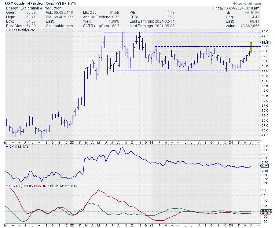
One of these stocks is OXY. Its tail has just moved into the improving quadrant; though still a short tail, it's moving in the right direction. The upward break in the price chart this week will certainly help a further improvement in relative strength and likely make this one of the new leaders in this industry.
#StayAlert and have a great weekend, --Julius
|
| READ ONLINE → |
|
|
|
| Trading Places with Tom Bowley |
| Q1 Ends With A Small Cap Attack! One Small Cap Sector is EXPLODING Higher! |
| by Tom Bowley |
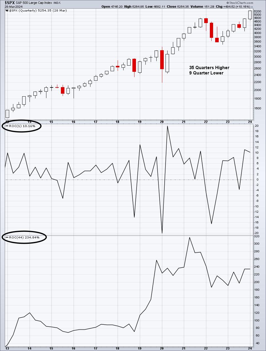
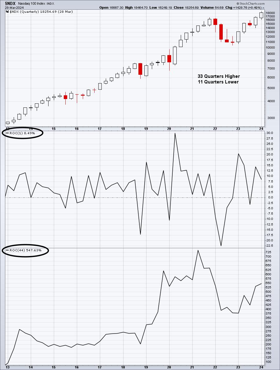
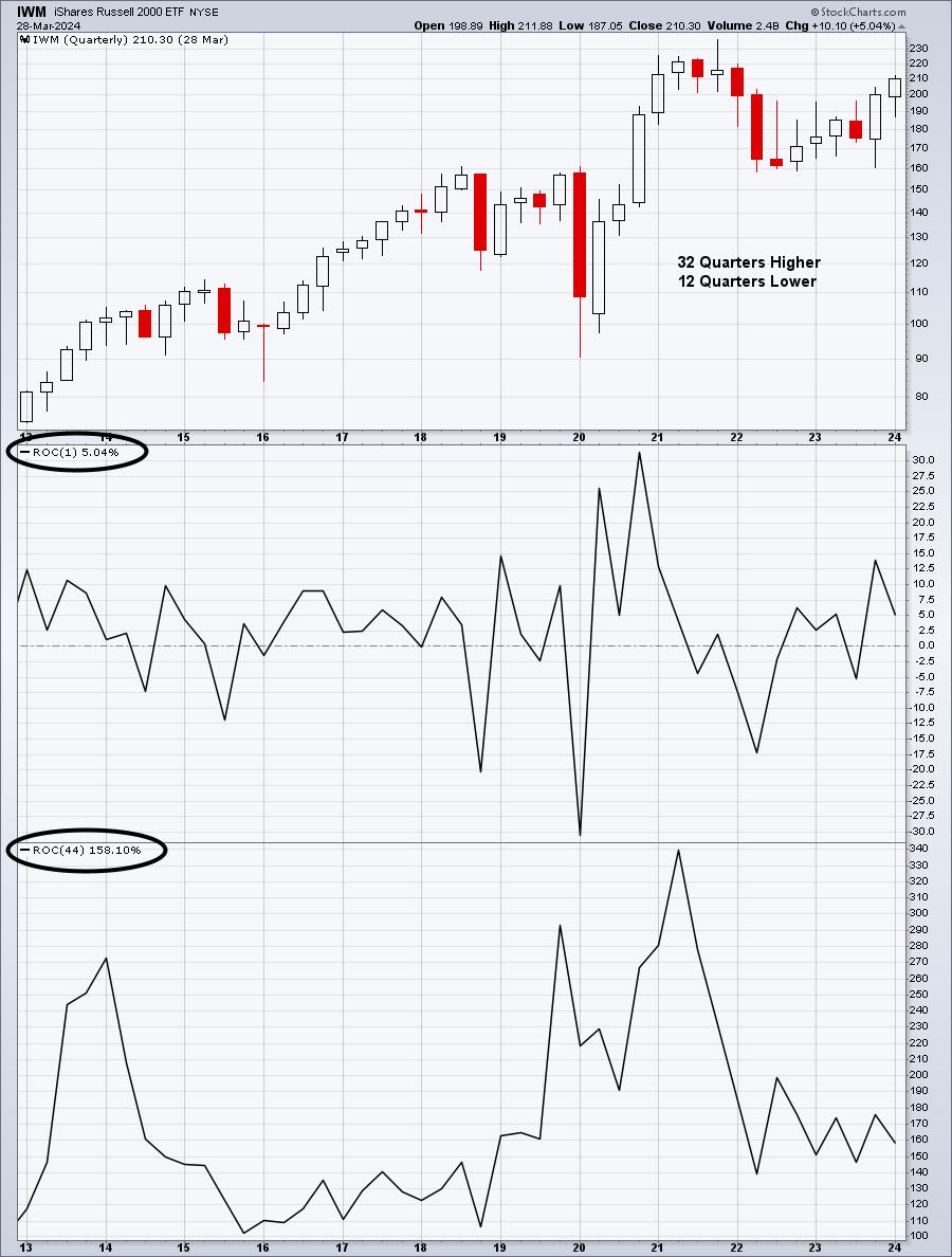
Let's start off by reviewing a quarterly chart of the S&P 500 ($SPX), NASDAQ 100 ($NDX), and Russell 2000 (IWM) since this secular bull market began in early-April 2013 (44 quarters ago):
S&P 500:

NASDAQ 100:

Russell 2000:

When you look at these 3 charts, an obvious first conclusion can be made. If we're in a bull market, we want to be invested in the NASDAQ 100 stocks, which have dominated both the S&P 500 and Russell 2000. The 44-quarter rate of change (ROC) provides us roughly the gains made on each of these indices since the secular bull market began in 2013, 11 years ago.
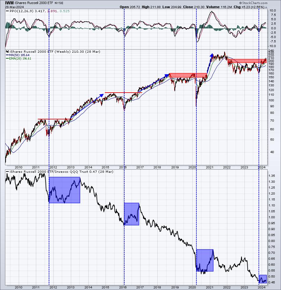
Before we write off the small cap stocks, however, we need to use some perspective and understand that this asset class moves into and out of favor. Because it's underperformed the NASDAQ 100 badly these last 11 years, it makes sense to stick with NASDAQ 100 stocks until small caps tell us otherwise. They could be telling us otherwise right now. Check out this 11-year weekly absolute price chart of the IWM and note when it has outperformed the NASDAQ 100 in the past:

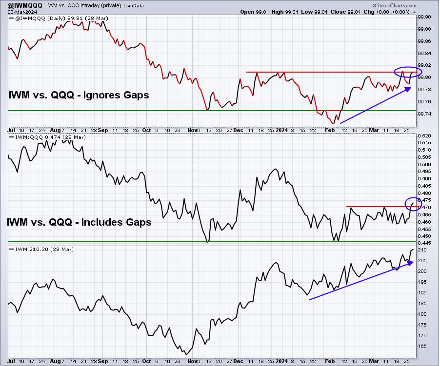
When we see key breakouts in the IWM, the group generally shows relative strength vs. the NASDAQ 100 - at least for several months up to a year. That relative strength sometimes will turn higher at bottoms just before key breakouts. The current pattern seems to be looking very similar to prior periods when the IWM went on a relative tear to the upside. While the IWM has yet to show a ton of relative strength, I created a User-Defined Index (UDI) that tracks the relative INTRADAY performance of the IWM vs. the QQQ (ETF that tracks the NASDAQ 100) and it's currently near its highest level since this huge advance began in October 2023. In other words, current rotation is favoring the small cap IWM, which supports my theory that we'll see outperformance by the IWM over the next few months to a year. Check out this chart:

The IWM has performed well since 2013, but we all have investment decisions to make and we want the BEST performers, or at least I hope that's what everyone else wants. If I'm invested in something that's going up, but underperforming, I feel like I'm leaving money on the table. So if I'm going to overweight an area of the market, I need to see signals that suggest it's a wise move. Right now, the IWM is showing those signals. If and when those signals reverse, then moving back to an overweight position in the NASDAQ 100 makes a ton of sense.
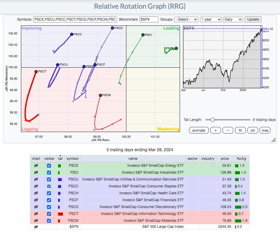
So now that we're finally seeing some relative strength from the beaten-down small cap group, let's review where that small cap relative strength is coming from using an RRG and the Invesco small cap sector ETFs:

Small cap energy (PSCE) and small cap industrials (PSCI) are the best two small cap sectors right now as they're the only two in the upper right leading quadrant, when compared to the S&P 500. Let's look at both these charts:
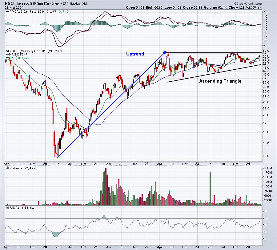
Energy (PSCE):

It's hard not to like small cap energy right now, especially inside this bullish ascending triangle continuation pattern. Ultimately, on a breakout, this would measure to 76-77.
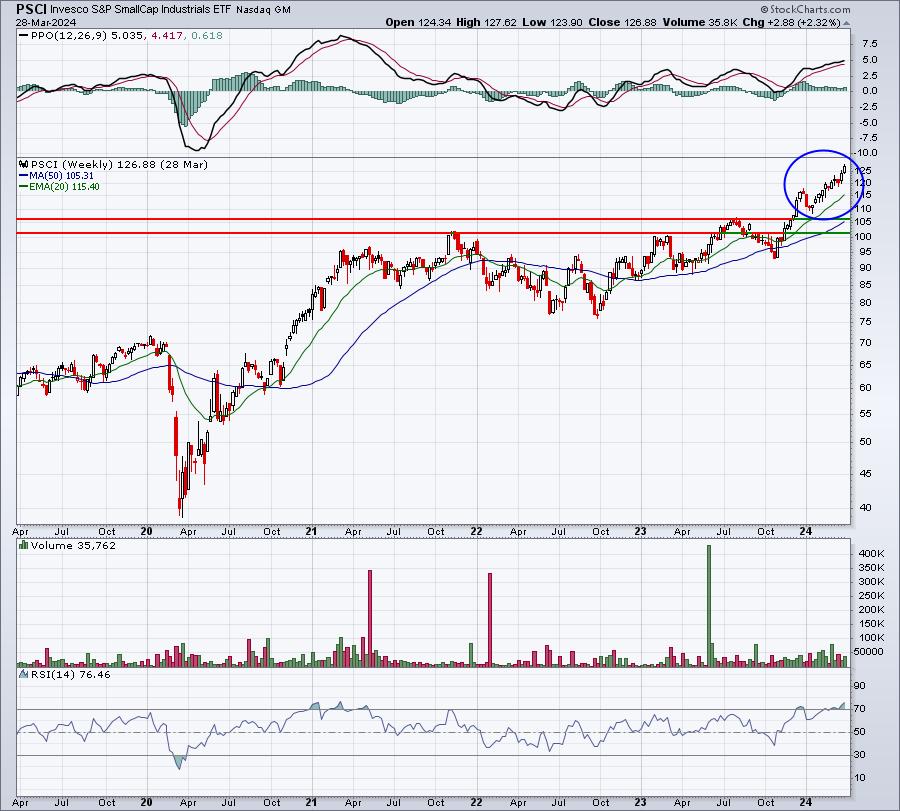
Industrials (PSCI):

The PSCI has already broken out and looks extremely bullish, especially if small caps, as a whole, continue strengthening.
In my Saturday, March 30th Weekly Market Recap, I discuss many stocks in this space, with several just beginning what appears to be a very strong uptrend. To tune in and watch this Weekly Market Recap video, simply CLICK HERE. If you like the video, please help us out by hitting that "Like" button and subscribing to our channel so that you don't miss future videos. Thanks!
Happy trading!
Tom
|
| READ ONLINE → |
|
|
|
| ChartWatchers |
| Jobs In the Spotlight: Stock Market Reverses Course After Massive Selloff |
| by Jayanthi Gopalakrishnan |

One day doesn't make a trend—that's one lesson we learned from this week's stock market action.
The March non-farm payrolls data revealed that the US economy added 303,000 jobs, which is higher than the estimated 200,000. Additionally, the unemployment rate dropped to 3.8%, down from 3.9%. After yesterday's massive selloff—mainly due to comments from Fed officials suggesting interest rate cuts may not happen this year—you'd think today's strong jobs report would have made investors jittery. It would extend the narrative that interest rates will remain on hold for longer.
But that's not what happened. Investors celebrated the strong jobs report, with equities and Treasury yields rising. The broader indexes closed higher, and the VIX pulled back to 16.13, which was a little high but not too alarming. Although the indexes were down for the week, seeing the broader markets close higher was encouraging after the selling pressure we saw on Thursday.
It's possible the stock market was blowing off some steam. Nothing goes up in a straight line, and investors should expect an extended market to pull back. Yesterday's pullback, although massive, was only about a 1% decline. Given that economic data is healthy, investors have no reason to worry. This week, we had good manufacturing and jobs data, so there's no reason for any panic.
Several stocks made all-time highs, as can be seen by the extensive list of stocks that made the StockCharts New All-Time Highs scan. Some notable names filtered in the scan are Meta Platforms (META), ConocoPhillips (COP), and Exxon Mobil (XOM). Several companies in the Energy sector were filtered in this scan.
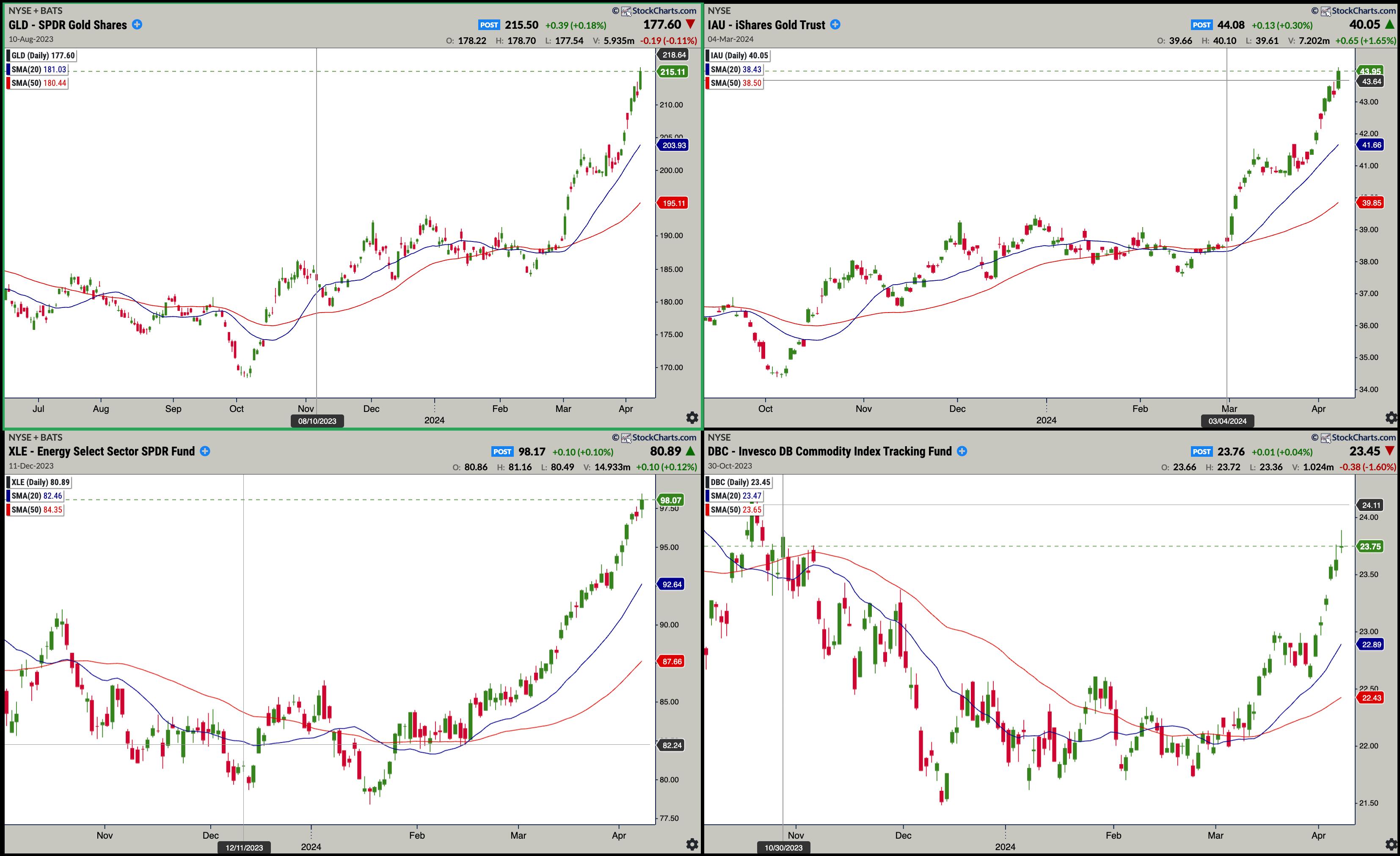
Energy stocks have been on a tear. The Energy Select Sector SPDR ETF (XLE) reached a new high again, and its steep ascent is still in play. And it's not just oil prices that are going up—the SPDR Gold Shares ETF (GLD) and iShares Gold Trust ETF (IAU) also hit new all-time highs. Commodities continue to show strength, as seen in the Invesco DB Commodity Index Tracking Fund (DBC).

CHART 1. COMMODITY PRICES CONTINUE TO RISE, ESPECIALLY OIL AND GOLD. Oil prices have climbed higher in a short time. Gold and other commodity prices are also rising.Chart source: StockChartsACP.com. For educational purposes.
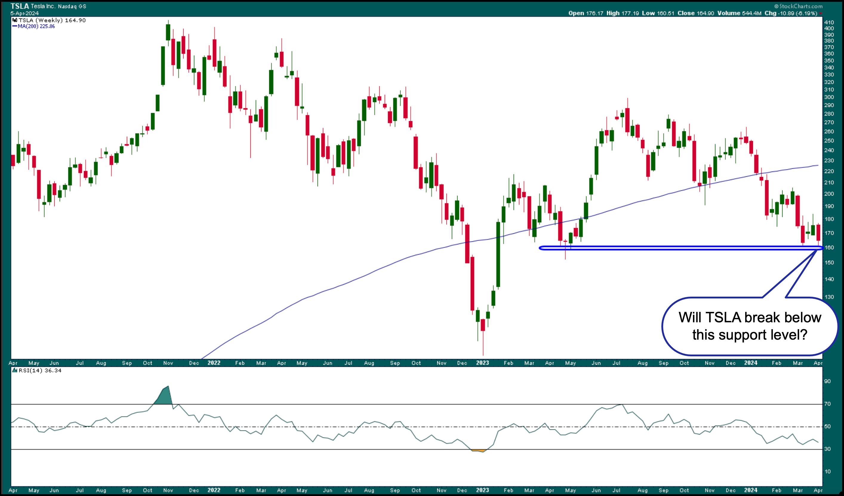
But it wasn't a great day for all stocks. One stock that got hit hard today was Tesla, Inc. (TSLA). It was one of the most active stocks in the S&P 500, closing lower by 3.59%. The stock is trading below its 200-day simple moving average with a declining relative strength index (RSI), which is getting close to oversold territory. Looking at the weekly chart of TSLA below, the stock is at a support level, but there's room for it to drop much further before seeing any signs of reversal.

CHART 2. TSLA STOCK COULD BREAK SUPPORT. TSLA's stock price could fall to its next support level at around $102.Chart source: StockCharts.com. For educational purposes.
It's encouraging to see a recovery at the end of the trading week, but what would be even better would be to see a broad-based rally. We may get that as earnings week kicks off. A rotation into Industrials, Financials, and Materials would positively impact the stock market. So watch the StockCharts Sector Summary panel to identify when the rotation begins.
Earnings Showdown
Earnings season kicks off at the end of the week of April 8, starting with the big banks. That means the focus will be on corporate earnings in the next few weeks. According to FactSet, Q1 year-over-year earnings growth rate for the S&P 500 is expected to be 3.6%. If companies report higher-than-expected earnings and revenues, the market will probably continue trending higher.
As long as companies generate positive cash flow and show higher profit margins, investors have no reason to sell their investments.
Important inflation data will also be released next week. The March CPI and PPI will be reported on Wednesday and Thursday. So fasten your seatbelts! Next week could see some choppy trading activity. But don't let a little choppiness make you change your investment strategies, unless there's catastrophic news beyond anyone's control.
End-of-Week Wrap-Up

- S&P 500 closes up 1.11% at 5,204.34, Dow Jones Industrial Average up 0.80% at 38,904; Nasdaq Composite up 1.24% at 16,248.52
- $VIX down 1.96% at 16.03
- Best performing sector for the week: Energy
- Worst performing sector for the week: Health Care
- Top 5 Large Cap SCTR stocks: MicroStrategy Inc. (MSTR); Super Micro Computer, Inc. (SMCI); Coinbase Global Inc. (COIN); Vistra Energy Corp. (VST); Vertiv Holdings (VRT)
On the Radar Next Week
- March Consumer Price Index (CPI)
- March Producer Price Index (PPI)
- More Fed speeches
- Earnings from Citigroup (C), JP Morgan Chase (JPM), Wells Fargo (WFC), Delta Airlines (DAC)
Disclaimer: This blog is for educational purposes only and should not be construed as financial advice. The ideas and strategies should never be used without first assessing your own personal and financial situation, or without consulting a financial professional.
|
| READ ONLINE → |
|
|
|
| MORE ARTICLES → |
|


 Momentum and trend strategies are off to a roaring start here in 2024. More often than not, these strategies buy leading stocks that appear overbought. Buying stocks that appear overbought often goes against our "gut feel", but overbought conditions reflect strong buying pressure and this is clearly more bullish than bearish. Let's look at recent examples using the broader market and UBER.

 The Markup Phase of a Bull Market is glorious to behold and participate in. But they do ebb and flow. The bullish run in the major stock indexes has been persistent in 2024. We often discuss the quarter-end effect for stock index trends and the upward trend has persisted into the end of the first quarter with diminishing momentum. Let's turn our attention to some classic and powerful Wyckoff chart studies to determine the present position and possible future direction of the indexes as the second quarter begins.
 S&P 500 Index with Wyckoff Markups. 2021-2024