| THIS WEEK'S ARTICLES |
| The Mindful Investor |
| S&P 500 Makes a New All-Time High By End of June? |
| by David Keller |
We've been covering the signs of weakness for stocks, from the bearish divergences in March, to the mega-cap growth stocks breaking through their 50-day moving averages, to even the dramatic increase in volatility often associated with major market tops. While Q1 was marked by broad market strength and plenty of new 52-week highs, Q2 has so far provided a much different playbook for investors. Both bulls and bears have felt validated by the recent choppiness for the major market averages.
Over the last week, the S&P 500 managed to gain about 2.7%, despite some hotter-than-expected inflation data and a mixed bag of earnings for the Magnificent 7 stocks. Does this set us up for much further gains, and a potential break to new all-time highs, as we continue through the second quarter? Or are we currently experiencing the "dead cat bounce" phase with a countertrend move to the upside before the great bear market continues?
Psst! Check out the January 2024 edition of this exercise, and guess which scenario actually played out!
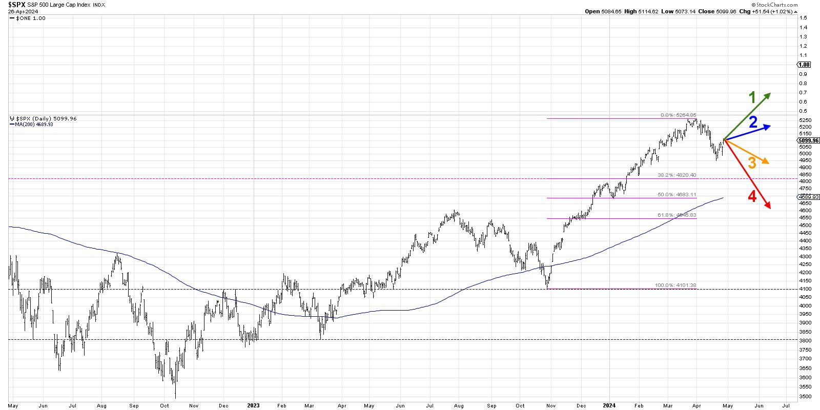
Today, we'll lay out four potential outcomes for the S&P 500 index. As I share each of these four future paths, I'll describe the market conditions that would likely be involved, and I'll also share my estimated probability for each scenario. And remember, the point of this exercise is threefold:
- Consider all four potential future paths for the index, think about what would cause each scenario to unfold in terms of the macro drivers, and review what signals/patterns/indicators would confirm the scenario.
- Decide which scenario you feel is most likely, and why you think that's the case. Don't forget to drop me a comment and let me know your vote!
- Think about how each of the four scenarios would impact your current portfolio. How would you manage risk in each case? How and when would you take action to adapt to this new reality?
Let's start with the most optimistic scenario, involving a move to new all-time highs over the next six to eight weeks.
Option 1: The Very Bullish Scenario
If you think the April pullback was just another buyable dip within a primary bullish trend, then the Very Bullish Scenario is for you. This scenario would be made possible only if the Magnificent 7 stocks returned to their former magnificent ways, with stocks like AMZN and NVDA following GOOGL in making new all-time highs.
We'd need to see economic indicators, especially inflation readings, come in much weaker, which would give the Fed confidence to begin cutting rates at the June Fed meeting. By the end of June, we'd be talking about the S&P 500 breaking above 5500, and even 6000 could be on the table.
Dave's Vote: 10%

Option 2: The Mildly Bullish Scenario
What if the S&P manages to hold the April low around 4950, but is unable to push to new all-time highs? Scenario 2 could mean that value-oriented sectors like industrials and materials experience a resurgence, outpacing the growth leadership stocks from Q1. But since these sectors are much lower weight in the S&P 500, it's just not enough market cap to move the needle on the major benchmarks.
Perhaps the rest of earnings season yields mixed results, and by the end of Q2 we are left with more questions than answers as the Fed is unable to commit to aggressive rate cuts. Interest rates remain elevated, which creates a major headwind for growth stocks.
Dave's vote: 30%
Option 3: The Mildly Bearish Scenario
Now we get to two scenarios that would mean a more bearish picture emerges in the coming weeks. Scenario 3 would mean the S&P 500 is unable to hold the April low around 4950, but we remain above a 38.2% retracement level around 4820. The Fed either delays its first rate cut or uses language that exudes little confidence in multiple additional rate cuts in 2024.
The Magnificent 7 stocks would be choppy at best, and as they stall out attempting to return to new all-time highs, investors see that as a signal of limited upside. Gold and gold stocks become the trade of the day, as investors are looking for anything other than stocks to try and generate positive returns.
Dave's vote: 45%
Option 4: The Super Bearish Scenario
You always have to include a doomsday scenario, and our final option would mean the April selloff was indeed just the beginning. May and June are marked with lower lows and lower highs, and Q2 feels very similar to September and October of 2023. The S&P 500 breaks through Fibonacci support around 4820, and even pushes below the 200-day moving average for the first time since the October 2023 low.
What could cause this last scenario? Economic data could come in way higher than expected, and the Fed could then become unwilling to cut rates while the economy shows signs of renewed strength. The market braces for "higher for longer" interest rates, growth-oriented sectors like technology and communication services begin the lead the way lower, and defensive sectors bump higher as investors ignite the "flight for safety" trade.
Dave's vote: 15%
What probabilities would you assign to each of these four scenarios? Check out the video below, and then drop a comment with which scenario you select and why!
RR#6,
Dave
P.S. Ready to upgrade your investment process? Check out my free behavioral investing course!
David Keller, CMT
Chief Market Strategist
StockCharts.com
Disclaimer: This blog is for educational purposes only and should not be construed as financial advice. The ideas and strategies should never be used without first assessing your own personal and financial situation, or without consulting a financial professional.
The author does not have a position in mentioned securities at the time of publication. Any opinions expressed herein are solely those of the author and do not in any way represent the views or opinions of any other person or entity.
|
| READ ONLINE → |
|
|
|
| Martin Pring's Market Roundup |
| MEMBERS ONLY |
| Are We There Yet? |
| by Martin Pring |
|
Back in early February, I wrote an article entitled "Only a Fool Would Try to Call a Correction in a Bull Market, So Here Goes"...
|
| READ ONLINE → |
|
|
|
| Art's Charts |
| Getting Perspective and Dealing with Volatility |
| by Arthur Hill |
 The S&P 500 is down 5.5% this month and volatility is rearing its ugly head. This is a good time to get some perspective by putting the move into context. My goal is to see the forest, as opposed to a few trees. First, we need to know if we are in a long-term uptrend or long-term downtrend. Once we know this answer, we can answer the second question. Is the current decline a primary or secondary move? Let's start with the long-term trend. The S&P 500 is down 5.5% this month and volatility is rearing its ugly head. This is a good time to get some perspective by putting the move into context. My goal is to see the forest, as opposed to a few trees. First, we need to know if we are in a long-term uptrend or long-term downtrend. Once we know this answer, we can answer the second question. Is the current decline a primary or secondary move? Let's start with the long-term trend.
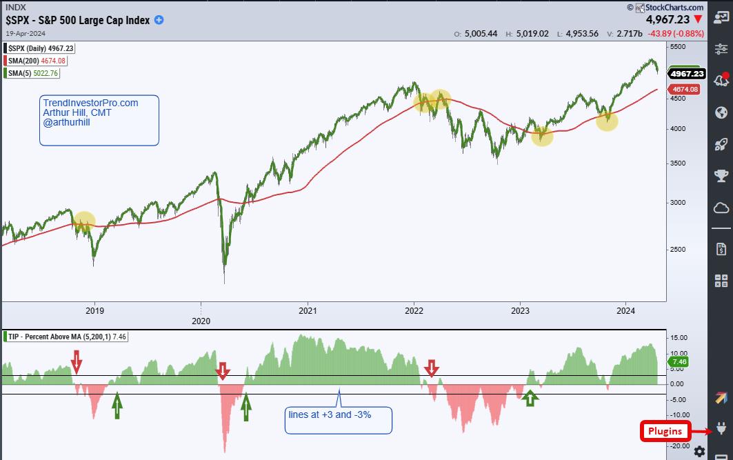
The chart below shows the S&P 500 with the 5-day SMA (green) and 200-day SMA (red). First, note that the index hit a new all time high in March. For those keeping score at home, this is less than a month ago! SPX is also well above the rising 200-day SMA and the 5-day SMA is 7.5% above the 200-day. These items suggest we are in a long-term uptrend.

The indicator window shows Percent Above MA (5,200) with signal lines at +3% and -3%. This indicator shows the percentage difference between the two moving averages. First, I am smoothing the close with a 5-day SMA. This smoothing significantly reduces the number of whipsaws, but there are still quite a few since 2022 (see the yellow ovals on the price chart).
For the signal filter, I am requiring the 5-day SMA to be 3% or more above/below the 200-day SMA for a signal. As the indicator shows, Percent Above MA turns green when the 5-day crosses above the 200-day and red when it crosses below. There were at least 17 crosses since late 2018. Applying the signal filter reduced the number of crosses to just six (red and green arrows). These thresholds filter out noise and short-term volatility. Note that this strategy turned bullish in early February 2023 and remains bullish. Percent Above MA is one of 11 indicators in the TIP Indicator Edge Plugin for StockCharts ACP.
Charles Dow notes that there are three types of price movements: primary, secondary and daily fluctuations. Based on the chart above, the primary move is up (long-term uptrend). SPY fell sharply in April and the secondary move is down. A secondary decline within a primary uptrend is a correction, and corrections within uptrends are opportunities. Nobody knows how long the correction will last or how far it will extend. Thus, marking future support is largely guesswork. Chartists would be better off focusing on price action and breadth, and looking for signs of improvement to suggest that the correction is ending.
TrendInvestorPro will analyze price action, 4-week High-Low Percent, Percent above 50-day and other breadth indicators to monitor this correction and time a reversal. This is part of our ChartTrader reports and videos. Our SystemTrader offering runs Dual Momentum Rotation Strategies for the Nasdaq 100 and S&P 500. After big gains in the first quarter, these moved into drawdown in April. Drawdowns are like corrections in that they provide opportunities. Click here to learn more and get immediate access.
Photo by Lukasz Szmigiel on Unsplash
//////////////////////////////////////////////////
|
| READ ONLINE → |
|
|
|
| ChartWatchers |
| S&P 500 & Nasdaq Composite Approach Critical Resistance; Watch for These Important Levels! |
| by Jayanthi Gopalakrishnan |

A tug-of-war with no clear winner—that's what the stock market seemed to be playing this week. With a Fed meeting, key economic data, and more earnings on top, will a winner emerge next week?
It was an interesting week in the stock market. Economic data shows that growth is slowing, while inflation isn't showing signs of slowing down. This possible "stagflation" scenario paves a path towards more uncertainty, especially when it comes to interest rates. And with next week's Fed meeting, investors are becoming even more cautious about making any trading or investing decisions.
Looking back at last week, we can see how Tesla (TSLA) bounced higher after it missed earnings. Meta Platforms (META) beat earnings estimates, but its stock price gapped lower on weak Q2 guidance. That was a concern, since META has been enjoying a bullish rally since the end of 2022. It remains to be seen if the gap up in META's stock price on February 2, 2024 will get filled. The stock is trading at its 100-day simple moving average (SMA), which could be a support level the stock bounces from; however, META could also end up breaking below it and sliding further.
Investors were concerned by META's weak guidance, as they were looking for Tech earnings to be the catalyst that pushes the market higher. After META took most of the market lower, the next worry was whether the other Tech stocks would follow the same path. Fortunately, that didn't occur. Microsoft (MSFT), Alphabet (GOOGL), and Snap (SNAP) all beat earnings, and their stock prices moved higher, reversing the downtrend.
Is this Reversal Sustainable?
The positive earnings excited the bulls, but it felt like they hit a wall. There wasn't enough follow-through to push the stock market indexes higher, and the bears didn't seem to be interested in putting up much of a fight.
While the S&P 500 ($SPX), Dow Jones Industrial Average ($INDU), and Nasdaq Composite ($COMPQ) traded higher on Friday, the weekly chart shows the S&P 500 and Nasdaq didn't close above last week's high. The Dow did close slightly higher, though.
Follow the live chart here.
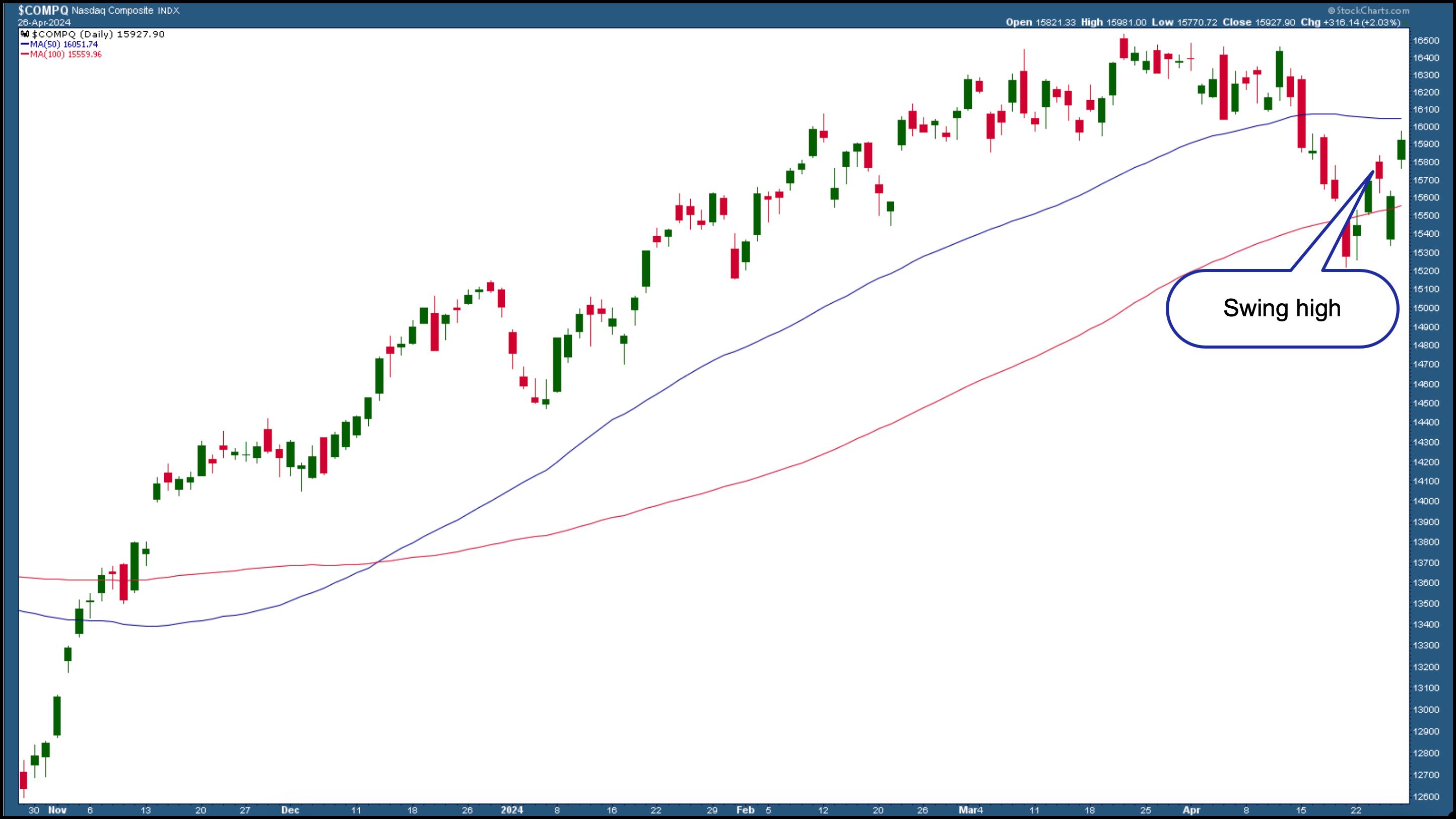
The daily charts are more attractive. Below is the daily chart of the Nasdaq Composite, which shows that, after last Friday's low, the index moved higher, then fell on Thursday before recovering those losses at the close of the trading day. Today (Friday, April 26), the Nasdaq gapped higher and closed above Wednesday's swing high.
CHART 1. DAILY CHART OF NASDAQ COMPOSITE. After closing higher than the last swing high, there's hope the Nasdaq could rally higher depending on what unfolds next week. Chart source: StockCharts.com. For educational purposes.
The Nasdaq Composite is getting close to its 50-day SMA, which would be a strong resistance level for the index.
Follow the live chart here.
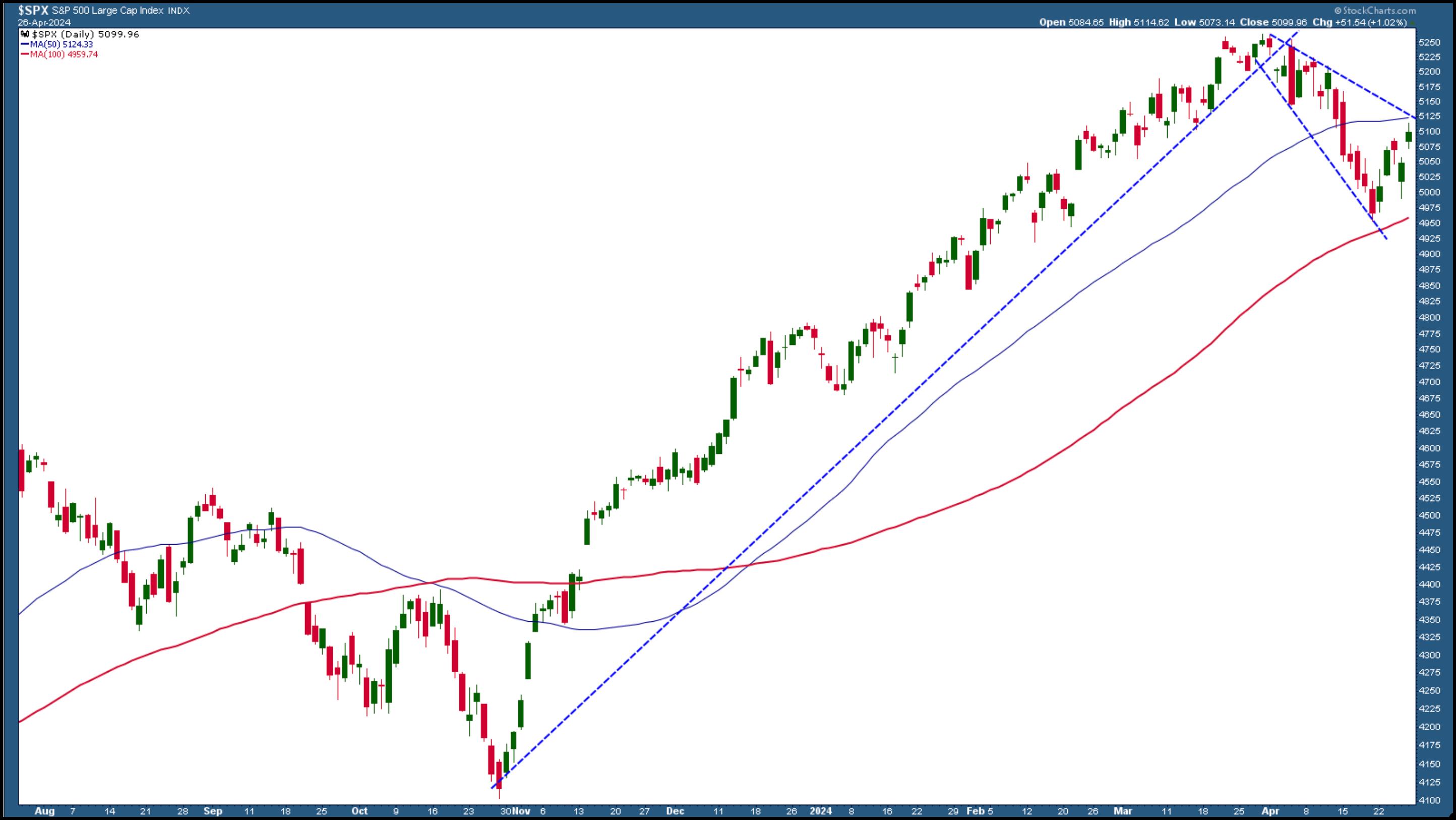
Moving on to the S&P 500, the index is up against resistance from its 50-day SMA, which coincides with a downward-sloping trendline.

CHART 2. DAILY CHART OF S&P 500 INDEX. If the S&P 500 breaks above the downward sloping trending on the top of the channel and its 50-day moving average, there could be upside follow-through. Chart source: StockCharts.com. For educational purposes.
Follow the live chart here.
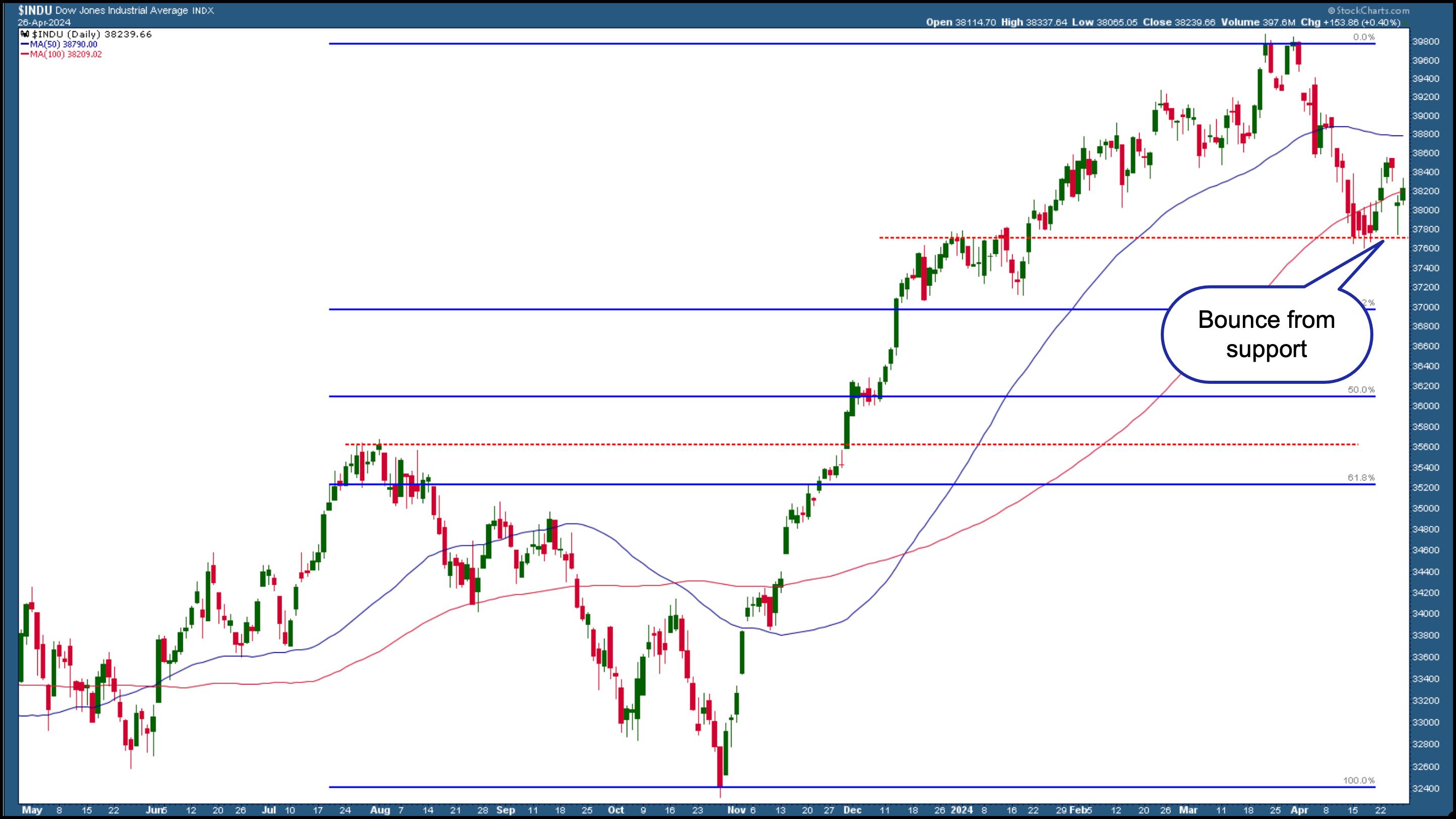
The Dow is the most bullish of the three broad indexes. It has seen a clear reversal from a support level (red dashed line), and any bullish news next week will likely move the index higher.

CHART 3. DAILY CHART OF THE DOW JONES INDUSTRIAL AVERAGE. A clear bounce from a significant support level could mean the Dow has more buying than selling pressure. Chart source: StockCharts.com.
Which Way Will the Stock Market Move?
It looks like the bulls are hungry to be the more dominant player. If any news blocks the bulls from taking this market any higher, the bears will be quick to take over. Remember, the market takes the stairs up and the elevator down. The market will probably continue to see some choppiness until Wednesday afternoon, when the Fed makes its interest rate decision. That will probably be what will take the stock market down or up.
End-of-Week Wrap-Up

- S&P 500 closes up 1.02% at 5,099.96, Dow Jones Industrial Average closes up 0.4% at 38,239.66; Nasdaq Composite closes up 2.03% at 15,927.90
- $VIX down 2.28% at 15.02
- Best performing sector for the week: Technology
- Worst performing sector for the week: Materials
- Top 5 Large Cap SCTR stocks: Super Micro Computer, Inc. (SMCI); Coinbase Global Inc. (COIN); Vertiv Holdings (VRT); MicroStrategy Inc. (MSTR); Vistra Energy Corp. (VST)
On the Radar Next Week
- April ISM Manufacturing PMI
- Fed interest rate decision
- Fed Chairman Powell's Press Conference
- March JOLTS Job Openings report
- April Non Farm Payrolls (Jobs) Report
- April ISM Services
- Earnings season continues with Amazon (AMZN), Advanced Micro Devices (AMD), Eli Lilly (LLY), Barrick Gold (GOLD) and Booking Holdings (BKNG) reporting.
Disclaimer: This blog is for educational purposes only and should not be construed as financial advice. The ideas and strategies should never be used without first assessing your own personal and financial situation, or without consulting a financial professional.
|
| READ ONLINE → |
|
|
|
| RRG Charts |
| 10% Downside Risk For Stocks as Value Takes The Lead |
| by Julius de Kempenaer |
Value Taking the Lead from Growth

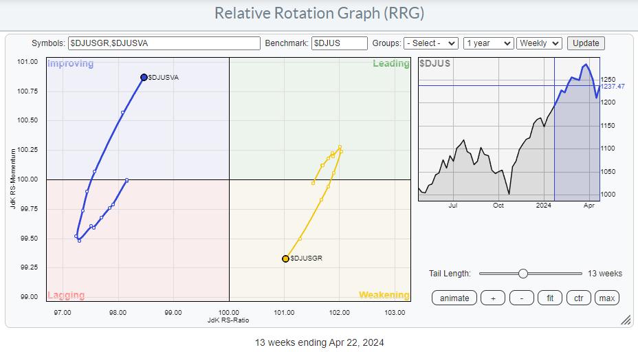
The weekly RRG above shows the rotation for Growth vs. Value stocks, with the DJ US index as the benchmark. The recent rotation clearly shows the rotation out of growth into value taking shape and picking up steam. For now, Growth is still positioned on the right-hand side of the RRG, but the $DJUSGR tail is rapidly heading toward the lagging quadrant at a negative RRG-Heading.

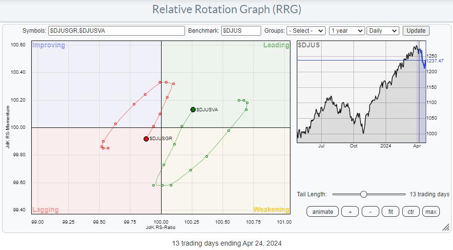
The daily version of this RRG underscores the preference for Value stocks.
The $DJUSVA tail dropped into the weakening quadrant after a rotation through leading since mid-March, and sharply hooked back up after one day inside the lagging quadrant, now returning into the leading quadrant. This supports a further strengthening for the Value tail on the weekly time-frame.
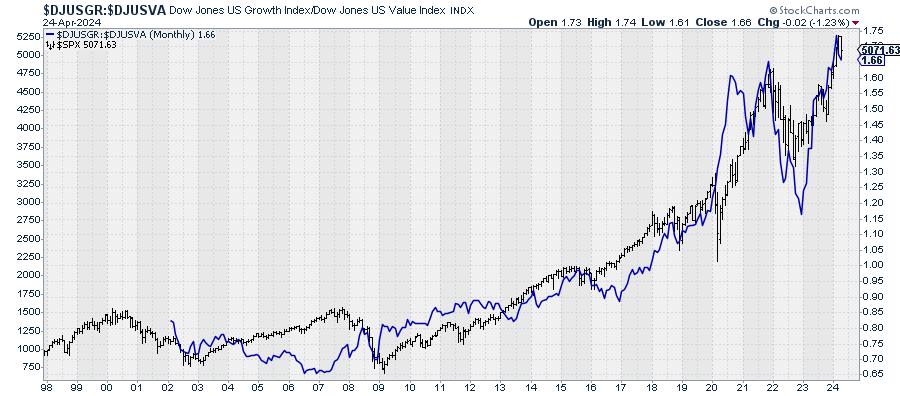
$SPX Usually Tracks Growth/Value Ratio Well

Plotting the Growth/Value ratio on top of the price chart for $SPX shows that they have tracked each other quite well over time. This is a monthly chart, so we're discussing long-term trends here. The main takeaway here is that the S&P usually does well when the growth/value ratio goes up and less well when the ratio moves lower.
With the RRG currently showing a strong preference for Value stocks, caution is warranted, as this might be the precursor for a further decline in the S&P 500 itself.
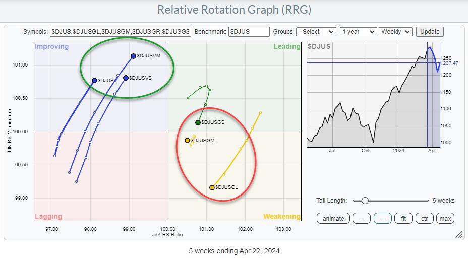
Preference for Value over Growth Appears Across All Size Segments

When we break down the Growth and Value segments into their respective size buckets, we get the RRG above. This shows that value beats growth across all size segments. Large-, mid-, and small-cap Value tails are all inside the improving quadrant and moving at a positive RRG-Heading.
The Growth tails are slightly more divided, but all three are on a negative RRG-Heading, with large-cap Growth showing the fastest deterioration. Mid-cap is the most stable, with its short tail just inside the weakening quadrant, while small-cap Growth stocks have rolled over inside the leading quadrant and are starting to head lower on both scales.
All in all, this underscores the need for caution regarding price developments for the S&P 500 in the coming weeks.
5%-10% Downside Risk within Long-Term Uptrend

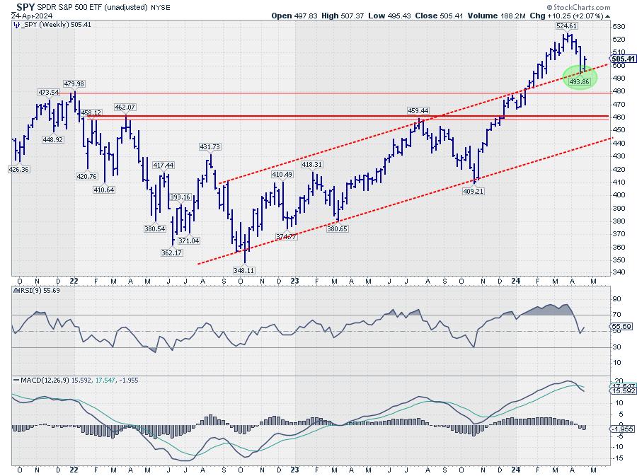
On the weekly chart, SPY found support at the level of the former rising resistance line at around 494. More important support is found at the level of the January 2022 peak at 480, and, in case that breaks, the area around 460 will provide another solid support area. With the current longer-term trend of higher highs and higher lows still firmly in place, we have to conclude that the uptrend is still in play.
At the same time, however, we have to realize that, within that uptrend, a 5-10% decline is perfectly possible.

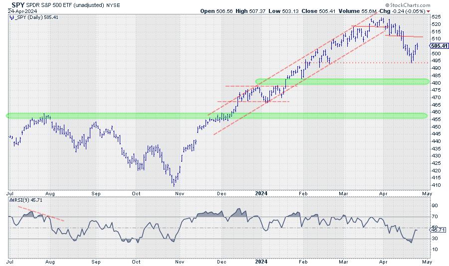
The more detailed daily chart of SPY shows that the decline from the recent peak at 524 back to the low near 495, which is one move lower on the weekly chart, is already showing lower highs and lower lows, which means that rallies now have to be seen as up-ticks within a downtrend until this structure changes again.
The green-shaded areas represent the support levels mentioned on the weekly chart. New buying opportunities within the long-term uptrend should start to arise in these ranges.
Rotation into Defensive Sectors Confirms Risk-Off

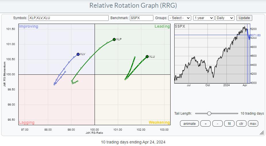
Finally, the daily RRG for defensive sectors shows a rapid rotation into Healthcare, Consumer Staples, and Utilities in the last two weeks of trading, which confirms the need for caution in the coming weeks.
#StayAlert, --Julius
|
| READ ONLINE → |
|
|
|
|
|
| Don't Ignore This Chart! |
| Analyzing Alphabet's Surge — Here's How to Get In Earlier Next Time |
| by Karl Montevirgen |

Using technical indicators to identify stocks fundamentally undervalued but technically strengthening is a common practice. But, using indicators to find fundamentally strong stocks that happen to be technically undervalued (or contested) is probably less common, especially if you lean toward technicals.
That was certainly the case with Alphabet Inc (GOOGL), leading to Friday's 15% spike and price gap, the sharpest rally since 2015. Alphabet's earnings and revenue results soared past Wall Street's expectations. But the extraordinary news was the declaration of the company's first-ever dividend (20 cents per share) and a $70 billion buyback, providing substantial benefits to shareholders.
The dividend and buyback part was unpredictable. But the case for having bought (and held) GOOGL was present in the fundamentals and technicals, notably when the technicals indicated significant weakness.

FIGURE 1. DAILY CHART OF ALPHABET SINCE 2023. The Communications sector outperformed the S&P 500 consistently, while Alphabet began underperforming the sector toward the end of 2023.Chart source: StockCharts.com. For educational purposes.
Alphabet's StockCharts Technical Rank (SCTR) scores at the beginning of 2023 were quite dismal, though the stock began picking up steam shortly after. Alphabet had a big earnings miss in February 2023, yet analysts would argue that the miss was "baked-in."
The SCTR line started trending downward in October 2023, hitting consecutive lows in December of that year and, most recently, March, where the SCTR score plunged to a 10, an exceedingly bearish technical reading.
Relative performance against its sector (XLC), would have confirmed Alphabet's relative weakness, as it grossly underperformed it by -10%. Meanwhile, XLC (the Communications sector proxy) steadily outperformed the S&P 500, as you can see in the chart above.
All signs read "bearish" in bold letters, except for a couple of things:
- Fundamentally, its earnings performance after Feb 2023 had shown nothing but consecutive strength.
- Technically, Alphabet was in a strong uptrend (and a long one) despite its sector underperformance and various other indications of technical weakness.
So, was it technically undervalued, save for the one thing that perhaps mattered the most: the direction of the larger trend?
Running Bullish Scans
For context, Alphabet came up on a scan for Outperforming SPY: 52-Week Relative Highs. It wasn't there yesterday. But if you did a quick Symbol Summary search on Friday morning, you would have seen GOOGL pop up on several bullish scans.

FIGURE 2. PREDEFINED SCAN LISTING IN THE STOCKCHARTS SYMBOL SUMMARY TOOL. What a difference a day makes!Chart source: StockCharts.com. For educational purposes.
So, now that the retail crowd is joining those who have long been "long," is it too late to jump in?
It's a Wait-and-See Moment

FIGURE 3. DAILY 6-MONTH CHART OF ALPHABET. Huge gap but mixed signals.Chart source: StockCharts.com. For educational purposes.
As a continuation gap, the odds of it getting filled within the week is around 8% (according to analyst Thomas Bulkowski's studies).
Looking at the candle, you'll notice heavy selling (profit-taking?) occurred immediately after Friday's market opening. If you look at the coinciding volume bar, you'll see that selling activity outpaced buying activity.
The Stochastic Oscillator shows a slight divergence between it and the two consecutive highs in April. But the Chaikin Money Flow (CMF) paints a bullish picture of surging pressure among buyers.
Given the mixed signals, it's a wait-and-see moment. If the gap gets filled, how close will the price get to $160, the previous high that may serve as support? If it falls through that level, what's the likelihood it might find support at the most recent swing low range near $150? And if Alphabet bounces in either spot, will there be enough volume and momentum to field its next leg upward?
The Bottom Line
If you've been bullish on Alphabet, the green light for loading up on the stock flashed well before the latest earnings shocker—complete with its inaugural dividend and hefty buyback. Strangely enough, perhaps the apparent technical inconsistencies highlighted Alphabet's underlying strength. At this juncture, it's a game of watchful waiting to pinpoint the perfect entry point.

Disclaimer: This blog is for educational purposes only and should not be construed as financial advice. The ideas and strategies should never be used without first assessing your own personal and financial situation, or without consulting a financial professional.
|
| READ ONLINE → |
|
|
|
| DecisionPoint |
| META's Reverse Island - Two More Mag Seven Islands to Monitor |
| by Erin Swenlin, Carl Swenlin |
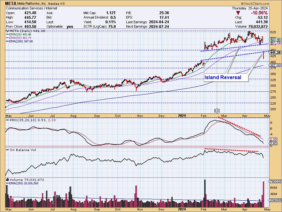
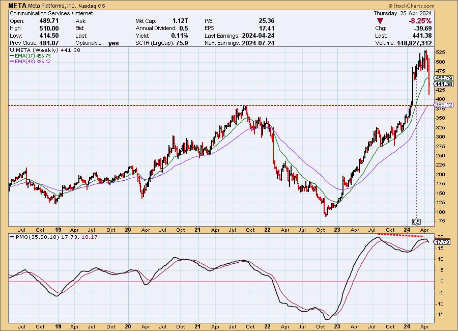
Whenever we see price gapping up or down, as happened with META in February, we prepare for the possibility of an island reversal. After the gap up, price forms a cluster, the island, and we ponder the possibility of a gap down to complete the reversal. During the formation of META's island, news coverage was very positive, but yesterday's earnings report made investors unhappy, and META really took a dive, jumping down across the gap.
While some might have been surprised by the final resolution, the chart gave ample clues, as there were negative divergences on both the PMO (price) and OBV (volume).

There was also a PMO negative divergence on the weekly chart.

Island reversals can happen to the downside as well as the upside.
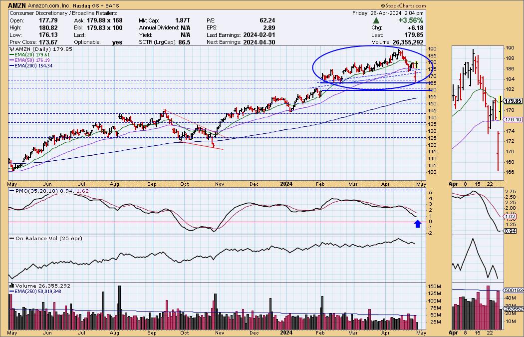
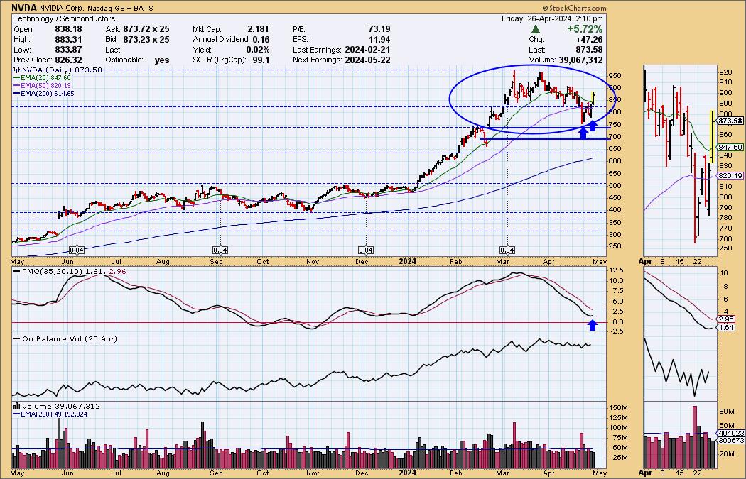
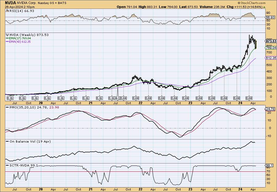
However, we have two more island formations to monitor in the intermediate term. Neither appears that dangerous, as the clues we had on META are not visible on Amazon (AMZN) and NVIDIA (NVDA).
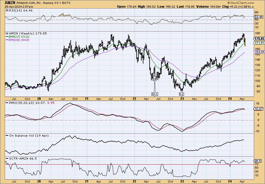
AMZN shows a large island formation, but do note we saw a gap down yesterday. That turned into its own reverse island only to the upside. The PMO has since begun to turn up on today's rally. There is no OBV negative divergence. We would just be careful with earnings being reported next week, as that was the catalyst for META's reverse island.

The weekly PMO looks suspect, but we do not have a negative divergence as we did with META.

NVDA has a large island formation to monitor as well, and is set up far better than META and even AMZN. The PMO has already turned back up on the short-term resolution of a double bottom formation. There is no OBV negative divergence; we don't expect a gap down resolution at this time.

In addition, we don't really see a strong negative divergence on PMO tops, and the weekly PMO has bottomed above the signal line in bullish fashion. NVDA isn't necessarily out of the woods, but the hype surrounding it will likely push price higher after its recent correction.

Conclusion: META experienced a reverse island execution on earnings. Now we watch and wait to see what AMZN will do going into earnings as it is vulnerable to a gap down. NVDA doesn't report again until next month and thus is not as vulnerable to a reverse island decline.
Learn more about DecisionPoint.com:
Watch the latest episode of the DecisionPointTrading Room on DP's YouTube channel here!

Try us out for two weeks with a trial subscription!
Use coupon code: DPTRIAL2 at checkout!
Technical Analysis is a windsock, not a crystal ball. --Carl Swenlin
(c) Copyright 2024 DecisionPoint.com
Disclaimer: This blog is for educational purposes only and should not be construed as financial advice. The ideas and strategies should never be used without first assessing your own personal and financial situation, or without consulting a financial professional. Any opinions expressed herein are solely those of the author, and do not in any way represent the views or opinions of any other person or entity.
DecisionPoint is not a registered investment advisor. Investment and trading decisions are solely your responsibility. DecisionPoint newsletters, blogs or website materials should NOT be interpreted as a recommendation or solicitation to buy or sell any security or to take any specific action.
Helpful DecisionPoint Links:
Trend Models
Price Momentum Oscillator (PMO)
On Balance Volume
Swenlin Trading Oscillators (STO-B and STO-V)
ITBM and ITVM
SCTR Ranking
Bear Market Rules
|
| READ ONLINE → |
|
|
|
| MORE ARTICLES → |
|


 The S&P 500 is down 5.5% this month and volatility is rearing its ugly head. This is a good time to get some perspective by putting the move into context. My goal is to see the forest, as opposed to a few trees. First, we need to know if we are in a long-term uptrend or long-term downtrend. Once we know this answer, we can answer the second question. Is the current decline a primary or secondary move? Let's start with the long-term trend.