| THIS WEEK'S ARTICLES |
| Larry Williams Focus On Stocks |
| MEMBERS ONLY |
| Larry's "Family Gathering" May 16, 2024 Recording |
| by Larry Williams |
|
Certainty is needed for a trader's actions. Good judgment comes from experience, and experience is gained from poor judgment. The key to improving your trading is to really, truly study the losing trades...
|
| READ ONLINE → |
|
|
|
| The Mindful Investor |
| The One Chart to Watch as S&P 500 Makes New All-Time Highs |
| by David Keller |
As the S&P 500 and Nasdaq 100 have once again made new all-time highs, and the Dow Jones Industrial Average has briefly broken above the 40,000 level for the first time, how should we think about further upside for our equity benchmarks?
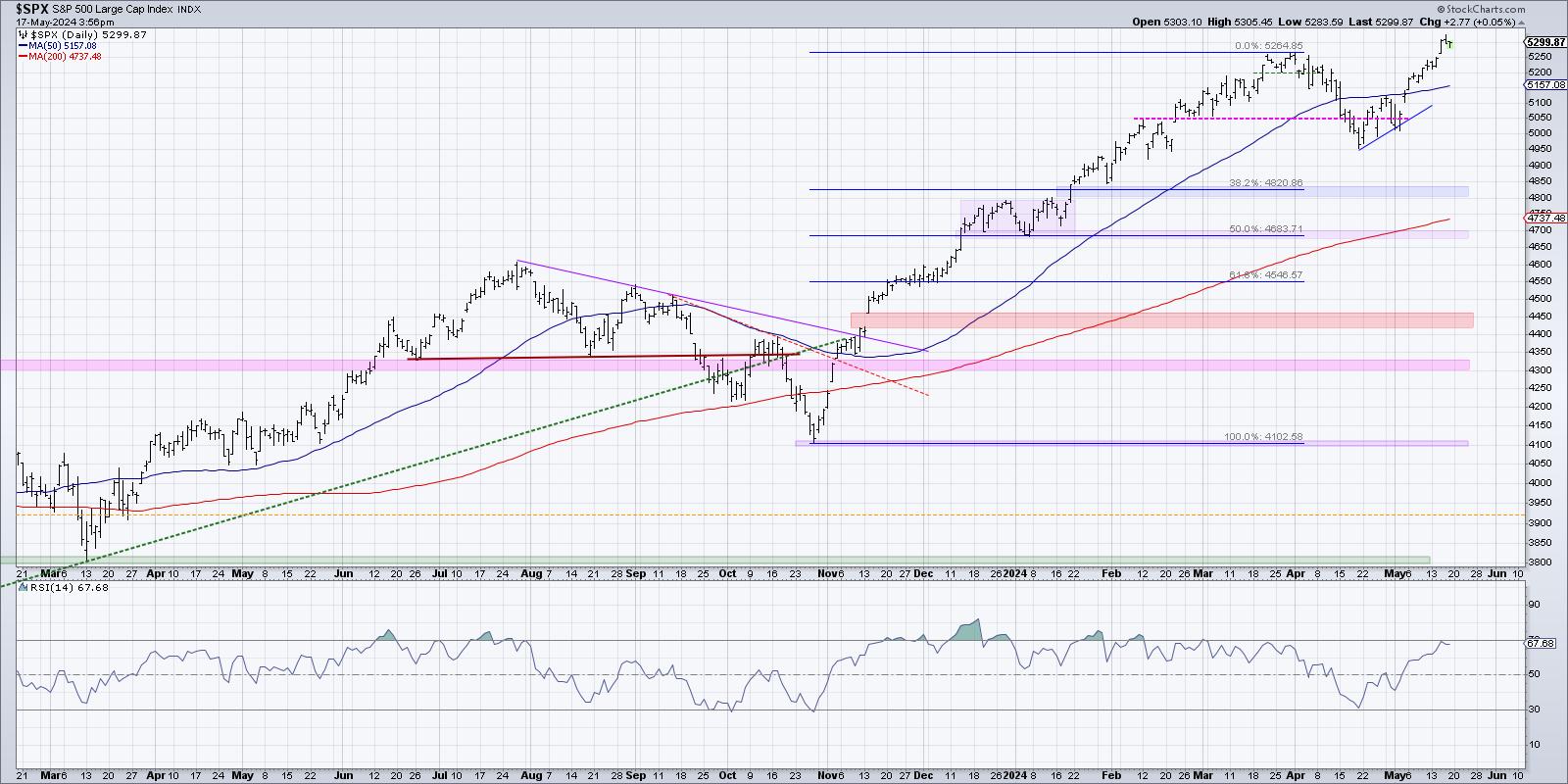
There are two general ways to play a chart pushing higher into uncharted territory, pun intended. First, we can use technical tools to identify potential upside objectives, using things like Elliott Wave or Gann or pattern measurements. I tend to avoid this sort of approach, only because I've learned that when something is working, you want to keep it working as long as possible!
Peter Lynch famously compared this approach to growing a garden. If you're selling your winners and doubling down on your losers, it's like pulling your flowers and watering your weeds! To grow a beautiful garden, you want to pull the weeds and water your flowers. So in a portfolio context, that means riding winning stocks higher as long as they continue to help your portfolio.
So the second general approach is to become a trend-follower, tracking the uptrend and looking for signs of any change in that trend. Here's one chart I'm using now to make that general assessment for the S&P 500.
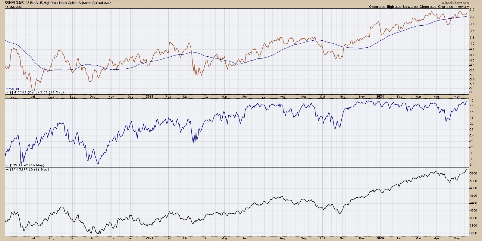
This chart has three series, starting with a high yield index option-adjusted spread from Bank of America. If you're confused by that wordy title, allow me to simplify. Bonds are quoted in terms of a spread above a risk-free rate. So US Treasury bonds are considered a "risk-free investment" because it is highly unlikely that the US government would be unable to pay interest on their debt obligations. Any corporate bond, issued by a particular company, by definition will bear additional risk than a Treasury bond. So a corporate spread of any kind tells you the additional yield you should expect to receive for taking on that additional risk.
Lots of corporate bonds include call options, meaning the bond can be redeemed by the company before maturity. In this case, we're using an "option-adjusted spread", which means you are stripping out those options to compare bonds on more of an apples-to-apples basis. And this spread is based on high-yield or "junk" bonds, meaning the bonds of risky companies with lower credit scores.
So to summarize, we are tracking how much of a spread bond investors are demanding for taking on the risk of junk bonds. I've plotted this series upside down because wider spreads mean additional risk, which usually means bad news for equities. You can see that when spreads are widening (the line is going lower on this chart), that tends to coincide with downtrends for the S&P 500 (bottom panel). Conversely, narrowing spreads tend to coincide with uptrend for the major equity indexes.
High-yield spreads are currently at the lowest levels in years, suggesting that bond investors are expecting a low-risk environment for the foreseeable future. If and when we see spreads start to widen, as they did in early April, that would be a bearish sign for stocks.
The middle series shows the VIX, because markets tend to rise on low volatility and stocks tend to drop with much higher volatility conditions. I've plotted this series upside-down as well, because it makes it easier to compare volatility to the S&P 500 trend. The VIX is also at its lowest levels that we've seen in the last two years, demonstrating what I would describe as a low-volatility environment. If and when the VIX would increase above 15, and especially if it would eclipse the 20 level, that would indicate a much more bearish environment for risk assets like the S&P 500 and Nasdaq 100.
To be clear, this chart is currently quite bullish, with the S&P 500 trending higher along with narrow high-yield spreads and very low volatility. If and when we see a widening of credit spreads, and if and when volatility begins to increase, that could be a great opportunity for equity investors to really question the sustainability of the bull market phase.
RR#6,
Dave
P.S. Ready to upgrade your investment process? Check out my free behavioral investing course!
David Keller, CMT
Chief Market Strategist
StockCharts.com
Disclaimer: This blog is for educational purposes only and should not be construed as financial advice. The ideas and strategies should never be used without first assessing your own personal and financial situation, or without consulting a financial professional.
The author does not have a position in mentioned securities at the time of publication. Any opinions expressed herein are solely those of the author and do not in any way represent the views or opinions of any other person or entity.
|
| READ ONLINE → |
|
|
|
| The MEM Edge |
| Major Shifts Taking Place As Lower Rate Bets Increase |
| by Mary Ellen McGonagle |
Both the S&P 500 and the NASDAQ are sitting at new highs as we wind down a very positive earning season. So far, almost 80% of S&P 500 companies have reported a positive earnings surprise, with the year-over-year earnings growth rate at the highest level since Q2 of 2022.
Amid this corporate growth, we're now seeing interest rates pull back following Wednesday's core CPI data, which came in lower than expected. In response, the yield on the key 10-year treasury bond fell to as low as 4.3% before ticking higher into today's close.
This is great news for growth stocks such as Technology, which have been struggling as the markets march to new highs. A rising rate environment is a negative for growth stocks such as Technology.
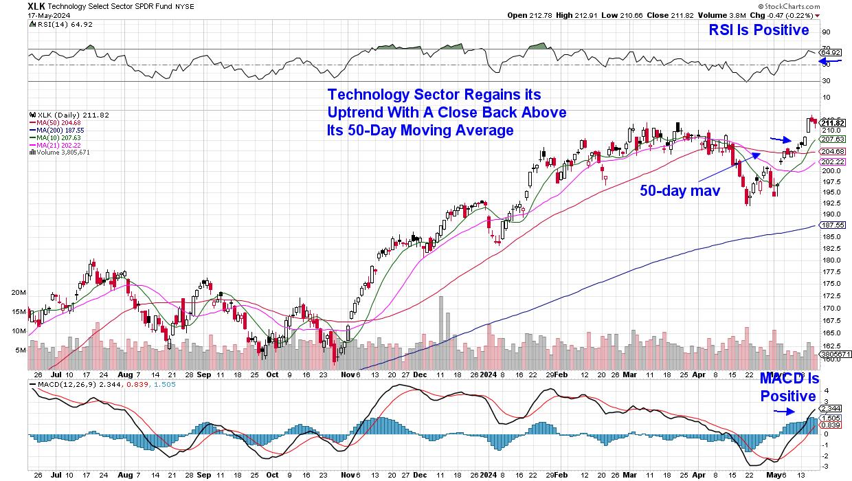 Daily Chart of Technology Sector (XLK) Daily Chart of Technology Sector (XLK)
While Apple's (AAPL) 12% advance following the release of their earnings 3 weeks ago is certainly a factor in Technology's new uptrend, a reversal in both Semiconductor and Software stocks this past week is poised to be the latest driver.
As subscribers to my MEM Edge Report are aware, I've been on the lookout for renewed interest in these high growth areas, as our watchlist had top Semi and Software names that have now been added to the suggested holdings list.
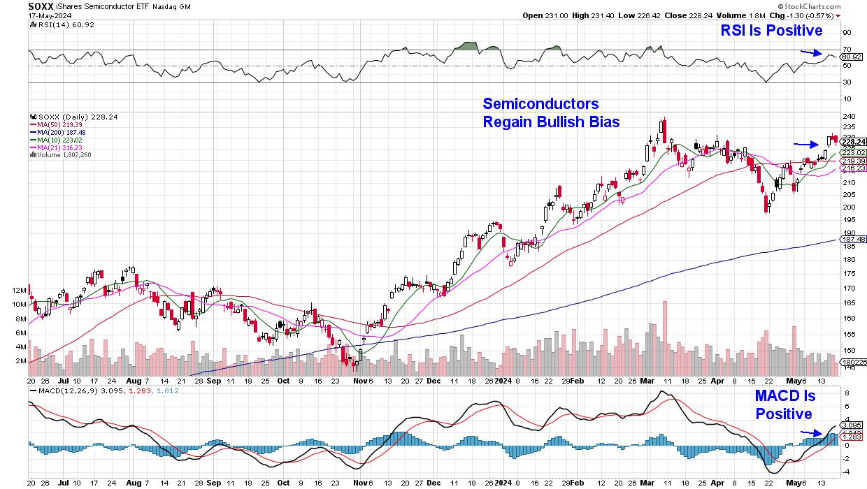 Daily Chart of Semiconductor Group (SOXX) Daily Chart of Semiconductor Group (SOXX)
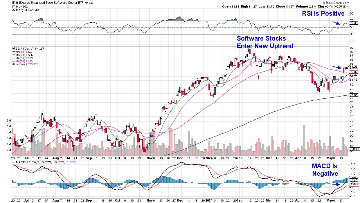 Daily Chart of Software ETF (IGV) Daily Chart of Software ETF (IGV)
Next week could prove to be pivotal for these groups amid earnings reports from key players. Most impactful will be Nvidia (NVDA), which is due to report earnings next Wednesday after the markets close. Going into the report, analysts are anticipating significant revenue growth, driven primarily by their data center segment due to AI demand.
Among Software stocks, Palo Alto (PANW) is due to release their quarterly results after the market closes on Monday. The Software Security stock is recovering from a gap down in price after their last quarterly report, where management announced a product release shift. PANW has entered a new uptrend as it moves closer to closing its gap lower.
Other non-growth sectors have also been moving into favor amid increased AI growth prospects and a lower interest rate possibility. If you'd like to be tuned into these newer areas, as well as the stocks best positioned to take advantage, use this link here to trial my twice-weekly MEM Edge Report for a nominal fee.
Warmly,
Mary Ellen McGonagle
MEM Investment Research
|
| READ ONLINE → |
|
|
|
| OptionsPlay |
| Salesforce Falls Out of Favor: Trade the Bear Put Spread Options Strategy |
| by Tony Zhang |
 Once a darling of the tech industry, Salesforce (CRM) had fallen out of favor until recently, when it hit a new all-time high earlier this year. Since then, though, investors have continued to shy away from this cloud computing stock as they focus on more pure AI-related companies, and Salesforce is at risk of turning lower again. As CRM matures and growth rates moderate, it simply cannot continue to command the industry-leading valuations it once did, and has to face the reality of its fundamentals. Once a darling of the tech industry, Salesforce (CRM) had fallen out of favor until recently, when it hit a new all-time high earlier this year. Since then, though, investors have continued to shy away from this cloud computing stock as they focus on more pure AI-related companies, and Salesforce is at risk of turning lower again. As CRM matures and growth rates moderate, it simply cannot continue to command the industry-leading valuations it once did, and has to face the reality of its fundamentals.
Analyzing Salesforce
If you look at a five-year chart of CRM, you will see that the stock has traded within a significantly wide range of $130 to $310. Earlier this year, it revisited the upper bound of the range and attempted to break out higher to a new all-time high (see chart below). This quickly failed, and the stock reversed back into the range, with momentum recently turning negative. This suggests that CRM will likely continue to trade back towards the midpoint of the range, i.e., in the $210–220 area.
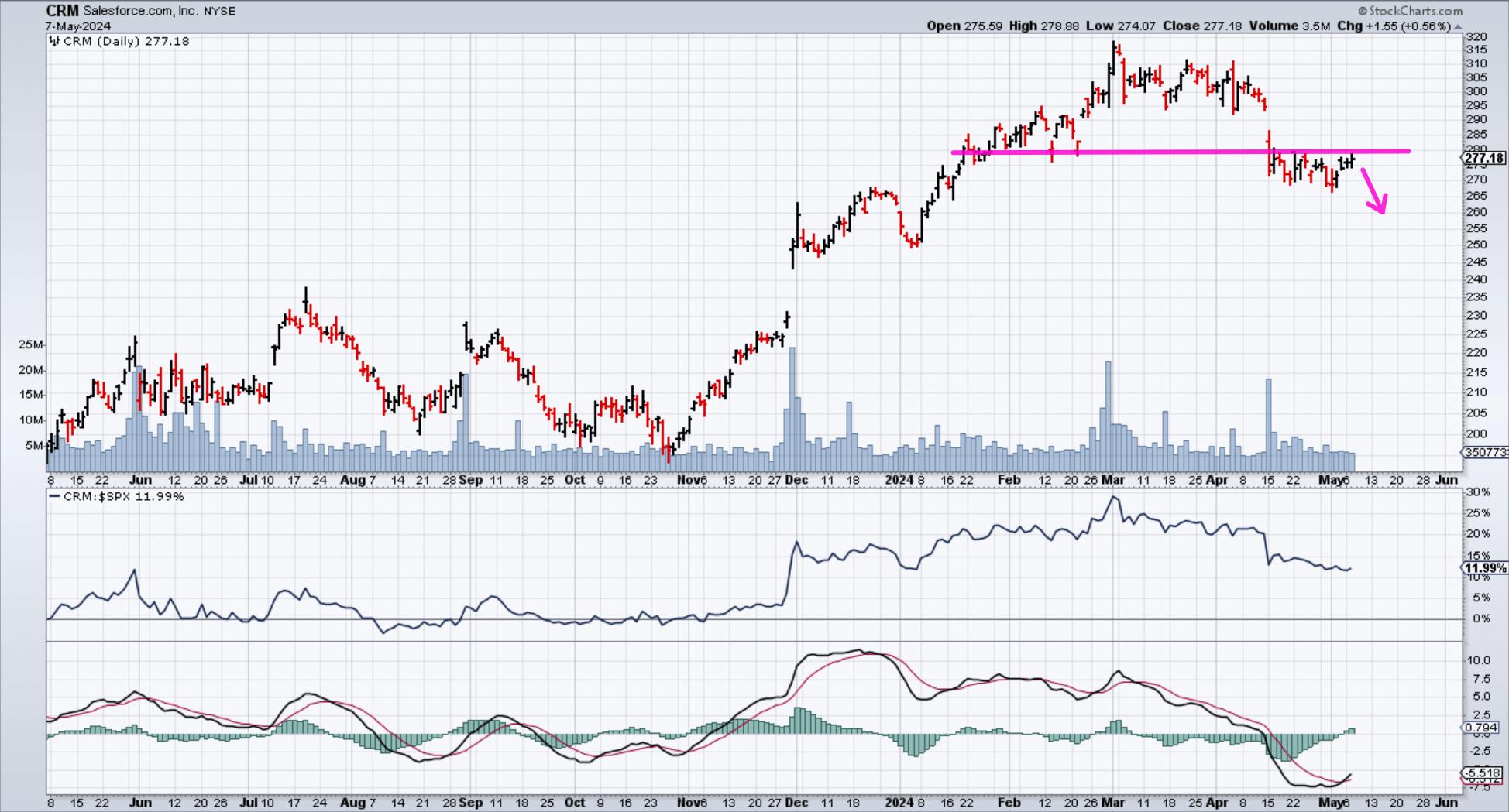
CHART 1. DAILY CHART OF SALESFORCE (CRM) STOCK. CRM's stock price tested a resistance level and turned lower. Momentum is also negative, which means the stock is likely to move lower.Chart source: StockCharts.com. For educational purposes.
CRM currently trades at over 28x forward earnings, which flies in the face of growth rates that have moderated significantly over the past 12 months. After averaging EPS growth of over 45% over the past three years, future EPS growth is expected to slow to just a third of that at 16%. Revenue growth is expected to drop to under 10%. This makes a valuation that is 40% higher than the S&P 500 harder to justify when growth rates are slowing down significantly.
A Bear Put Vertical Spread For Salesforce
When you have a bearish outlook on a stock, a bear put spread can be a viable options strategy to implement. The strategy involves buying a put option with a strike price at the current stock, and then selling a put option with a lower strike price with the same expiration. Your maximum risk is the net premium paid between the two legs. The risk graph below illustrates the profit and loss scenario of a bear put vertical spread.
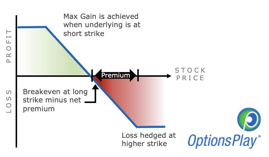 RISK GRAPH OF A BEAR PUT SPREADIf the stock declines below the lower strike price, the strategy will realize the maximum profit potential of the distance between the two strikes minus the premium paid. Also, if the stock were to stay above the higher strike price, you would realize the maximum loss potential. RISK GRAPH OF A BEAR PUT SPREADIf the stock declines below the lower strike price, the strategy will realize the maximum profit potential of the distance between the two strikes minus the premium paid. Also, if the stock were to stay above the higher strike price, you would realize the maximum loss potential.
With earnings in three weeks, CRM options prices are slightly elevated and warrant using a spread to lower the cost of seeking bearish exposure. I'm going out to the July expiration and buying the $280/$250 put vertical @ $10.70 debit. This entails:
- Buying July $280 puts @ $15.43
- Selling July $250 puts @ $4.73
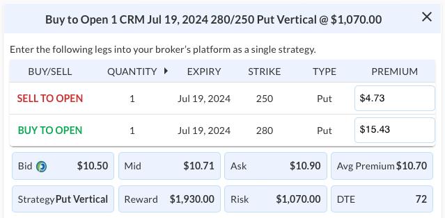
This would risk $1070 per contract if CRM is above $280 at expiration, while potentially making $1930 per contract if CRM is below $250 at expiration.
The Takeaway
If you want to profit from a potential decline in a stock's price, you could trade a bear put spread. It limits your risk, has reasonable profit potential, and is cost-effective.

|
| READ ONLINE → |
|
|
|
| Martin Pring's Market Roundup |
| MEMBERS ONLY |
| Four Reasons Why Emerging Markets are Headed Higher |
| by Martin Pring |
|
Last February, I wrote an article on emerging markets, using the iShares MSCI Emerging Markets ETF (EEM) as my benchmark. I pointed out that this sector was close, but had not quite broken out to the upside...
|
| READ ONLINE → |
|
|
|
| Art's Charts |
| Bitcoin Sets Up with Classic Continuation Signal |
| by Arthur Hill |
 There is a certain ebb and flow in uptrends. Often we see some sort of stair step higher with big advances and smaller corrections along the way. In Dow Theory terms, the primary trend is up and declines within a primary uptrends are considered secondary price moves. Also called corrections. Corrections and subsequent reversals offer traders a chance to partake in the uptrends. Today's report will focus on the Bitcoin ETF (IBIT). ChartTrader at TrendInvestorPro specializes in such setups and IBIT was featured in Thursday's report and video. There is a certain ebb and flow in uptrends. Often we see some sort of stair step higher with big advances and smaller corrections along the way. In Dow Theory terms, the primary trend is up and declines within a primary uptrends are considered secondary price moves. Also called corrections. Corrections and subsequent reversals offer traders a chance to partake in the uptrends. Today's report will focus on the Bitcoin ETF (IBIT). ChartTrader at TrendInvestorPro specializes in such setups and IBIT was featured in Thursday's report and video.
The chart below shows IBIT doubling with a move from 22 to 44 (January 23rd to March 12th). Bitcoin, the underlying asset, hit a new high in March so I will assume this is a new high for IBIT, even though it started trading in January. Despite its short history, we can see the classic ebb and flow of an uptrend on the price chart. The 100% advance is part of the primary uptrend and the decline back the low 30s is a secondary move, or correction.
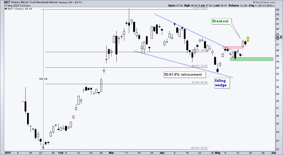
Also notice that this correction retraced 50-61.8 percent of the prior advance and formed a falling wedge. This retracement amount is normal for a correction. Think two steps forward and one step backward. The falling wedge is also typical for corrections and provides us with clear resistance levels to watch for breakouts. IBIT broke the upper trendline and exceeded the early May high with a surge this week. This breakout signals a continuation of the bigger uptrend and targets a move to new highs. The green shading marks re-evaluation support at 34.
I featured this IBIT chart in the ChartTrader report and video this past Thursday. We are also seeing a similar setup in a related ETF and this was posted on Friday (17-May). ChartTrader reports and videos focus on tradable setups within bigger uptrends. Recently we highlighted Vertex (VRTX), Oracle (ORCL), Crowdstrike (CWRD), the Cybersecurity ETF (CIBR) and the Home Construction ETF (ITB). Click here to learn more.
--------------------------------------------
|
| READ ONLINE → |
|
|
|
| ChartWatchers |
| Thrilling Week for the Stock Market: Dow Jones Makes Strong Close Above 40,000 for the First Time |
| by Jayanthi Gopalakrishnan |

It made it! The Dow Jones Industrial Average ($INDU) closed above 40,000 for the first time, another record close for the index. What an exciting week!
And most of that excitement came in the last few minutes of the trading week. We'll take it. After a few weeks of lethargic activity in the stock market, the optimism is back.
Get the live chart.

CHART 1. DOW JONES INDUSTRIAL AVERAGE CLOSES ABOVE 40,000. Investors will be looking for the upside momentum to continue next week.Chart source: StockCharts.com. For educational purposes.
A Recap of Stock Market Activity
The stock market regained its mojo on Wednesday, when inflation data came in cooler than expected. It then took a bit of a breather on Thursday and, for the most part, on Friday, but the last few minutes of the trading day did reinject some optimism, which is unusual for end-of-week trading. The stock market got what it wanted, reacted, and then decided to get a head start on the weekend.
Next week, investors will be focused on looking for upside follow-through. Now that interest rate hikes are off the table and it looks like cuts will happen sometime this year, investors have renewed their confidence in the stock market.
Get the live chart here.
The CBOE Volatility Index ($VIX) continues to be low, further confirming that investors are complacent. $VIX is close to its December 2023 lows, when investors' confidence in equities reignited following the October 2023 lows.

CHART 2. DAILY CHART OF THE VIX. The VIX is close to its December lows, coinciding with the time investors renewed their confidence after the pullback in October.Chart source: StockCharts.com. For educational purposes.
While equities have trended toward the upside, commodities have also broken out. The daily chart of the Invesco DB Commodity Tracking Index Fund (DBC) shows the index has broken out above a downward trending channel, suggesting that the pullback in commodities may be behind us.
Follow the live chart.
Commodities are inflation-sensitive, and, given that inflation may be cooling, commodities may be breaking out of the flag pattern you see in the chart below.

CHART 3. COMMODITIES BREAKING OUT. Commodities are also showing strength as they break out from a flag pattern.Chart source: StockCharts.com. For educational purposes.
Get your live chart here.
Copper and silver prices soared on Friday, and gold looks like it's on its way to revisit its all-time highs. Silver saw a significant breakout on Friday. It's worth looking at the chart of iShares Silver Trust ETF (SLV) to get a sense of the breakout magnitude.

CHART 4. SILVER SEES SIGNIFICANT BREAKOUT. The iShares Silver Trust ETF (SLV) has broken above its 2021 high. How much higher can it go? The next resistance is at around $35.Chart source: StockCharts.com. For educational purposes.
SLV has broken out above its February 2021 high. The price action on Friday suggests that price will continue higher next week. The next resistance level could be the 2012 highs, which is around $35, so there's room for upside movement in SLV. If you want to get in on the silver rally, opening a position in SLV may be something to consider. However, be sure to identify your stop losses before entering a trade. Although SLV seems poised to move higher, anything can reverse the move. Make sure you're comfortable with the risk/reward ratios.
SLV is well above its 20-week exponential moving average, and the Percentage Price Oscillator (PPO) shows that momentum is rising. If the trend continues, then SLV could see a strong rally. It's been a while since silver got some love.
And There's NVIDIA
Next week should be interesting. The highlight is NVIDIA's earnings—the company reports on Wednesday after the close. Analysts estimate earnings to come in at $5.57 and revenues at $24.57 billion. If NVIDIA (NVDA) beats, it could be a big catalyst for the markets to move higher. But the worry would be if NVDA misses expectations. A downside move would be of a much greater magnitude than an upside move. NVDA has had a significant impact on the stock market's performance, so just about every investor will be tuned in to the news after the close on Wednesday.
End-of-Week Wrap-Up

- S&P 500 closes up 0.12% at 5,303.27, Dow Jones Industrial Average up 0.34% at 40,003.59; Nasdaq Composite down 0.07% at 16,685.97
- $VIX down 3.46% at 11.99
- Best performing sector for the week: Technology
- Worst performing sector for the week: Industrials
- Top 5 Large Cap SCTR stocks: MicroStrategy Inc. (MSTR); Vistra Energy Corp. (VST); Super Micro Computer, Inc. (SMCI); Robinhood Markets (HOOD); Vertiv Holdings (VRT)
On the Radar Next Week
- Earnings from Nvidia (NVDA)
- Fed speeches
- April Existing Home Sales
- New Home Sales
- May Michigan Consumer Sentiment
Disclaimer: This blog is for educational purposes only and should not be construed as financial advice. The ideas and strategies should never be used without first assessing your own personal and financial situation, or without consulting a financial professional.
|
| READ ONLINE → |
|
|
|
| DecisionPoint |
| Gold Is Doing Great! |
| by Carl Swenlin |
While we don't typically begin with a monthly chart, it seems like a good place to start, as most of the good news is present there.
Beginning on the left side, we can see how gold made a parabolic advance into an all-time high in 2011. Parabolic advances beg for correction, and boy did gold correct. It declined almost -50% into a low in 2015, then advanced for over three years into a new all-time high in 2020. During that time, a bullish cup formation emerged. After that, it consolidated for over three years (the handle), ultimately breaking out of a 12-year consolidation.
I think it is an important point that gold took over 12 years to digest the huge advance into the 2011 top. In my opinion, it puts a solid floor under the most recent advance.
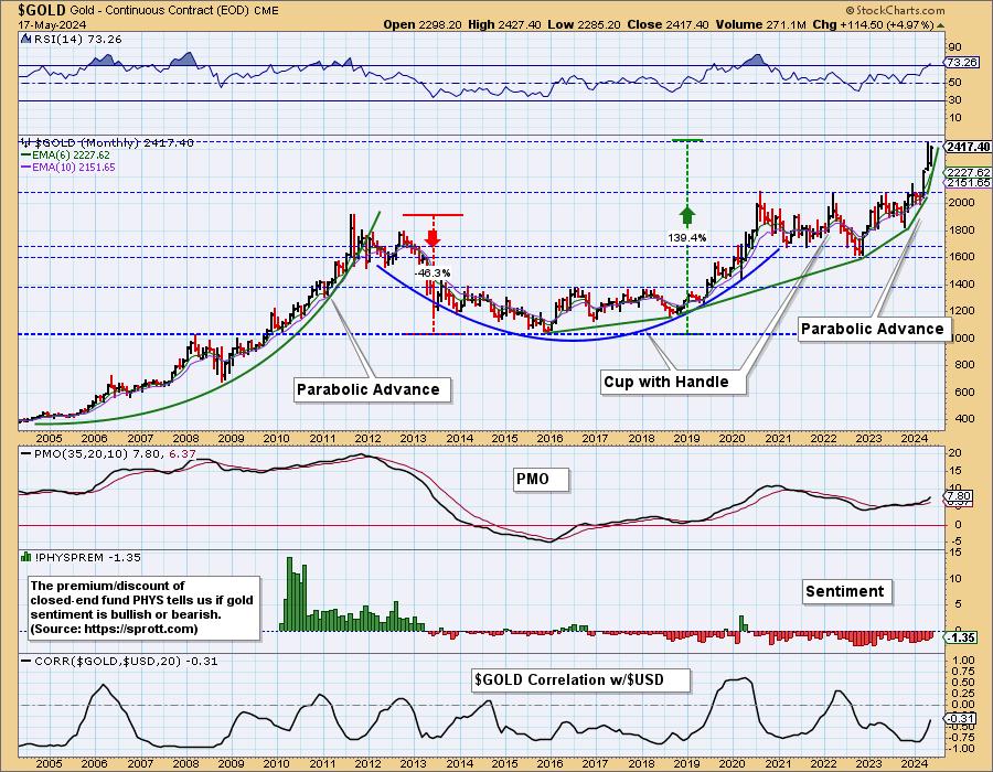
Currently, we can see that gold has gone parabolic again, and it is hard to know when it will top. The preferable resolution to this vertical move would be a sideways consolidation, but we'll just have to wait and see. In my opinion, we shouldn't see any kind of parabolic crash.
Another bullish sign is that sentiment is still bearish. We assess sentiment by seeing if the closed-end Sprott Physical Gold Fund (PHYS) is selling at a discount or a premium. As you can see, it has been selling mostly at a discount for 11 years, clearly showing that the public is still not yet excited about owning gold. We think this is because cryptocurrencies are attracting a lot of the money that might otherwise be moving into gold. In any case, bearish sentiment is bullish for gold.
Looking at the daily candlestick chart below, we can see that the Gold ETF (GLD) closed at an all-time high today, just above a solid level of support. To clarify, GLD is a vehicle that can be used to trade/invest in gold, while the symbol $GOLD is a continuous contract dataset used to track the price of gold, but it cannot be owned.
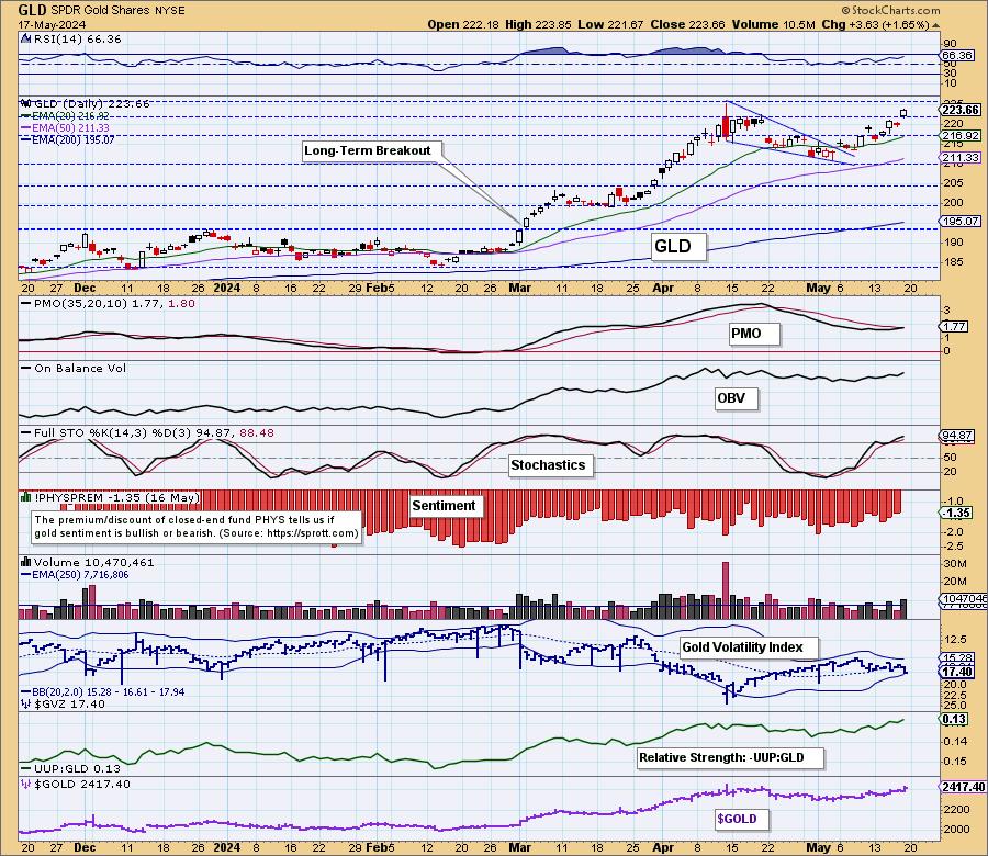
Conclusion: Gold spent a long time, over 12 years, consolidating huge gains in the early part of the century. It recently broke out decisively from that trading range, and it appears to be at the start of another strong, long-term rally.
Learn more about DecisionPoint.com:
Watch the latest episode of the DecisionPointTrading Room on DP's YouTube channel here!

Try us out for two weeks with a trial subscription!
Use coupon code: DPTRIAL2 at checkout!
Technical Analysis is a windsock, not a crystal ball. --Carl Swenlin
(c) Copyright 2024 DecisionPoint.com
Disclaimer: This blog is for educational purposes only and should not be construed as financial advice. The ideas and strategies should never be used without first assessing your own personal and financial situation, or without consulting a financial professional. Any opinions expressed herein are solely those of the author, and do not in any way represent the views or opinions of any other person or entity.
DecisionPoint is not a registered investment advisor. Investment and trading decisions are solely your responsibility. DecisionPoint newsletters, blogs or website materials should NOT be interpreted as a recommendation or solicitation to buy or sell any security or to take any specific action.
Helpful DecisionPoint Links:
Trend Models
Price Momentum Oscillator (PMO)
On Balance Volume
Swenlin Trading Oscillators (STO-B and STO-V)
ITBM and ITVM
SCTR Ranking
Bear Market Rules
|
| READ ONLINE → |
|
|
|
| RRG Charts |
| Is This the Magic Upward Break Everybody Was Waiting For? |
| by Julius de Kempenaer |
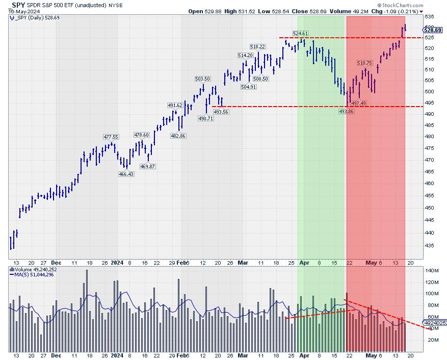
No Confirmation In Volume
This week, the S&P 500 is breaking out above its previous high, undeniably a bullish sign. After the initial break on Wednesday, the market held up well on Thursday. However, a few things are holding me back from getting overly enthusiastic.
One of the issues is the volume pattern, as can be seen on the above SPY chart. The lower pane holds the volume combined with its moving average (the blue line). During the decline from the 525 peak at the end of March, all the way down to 494 in the second half of April, the volume rose slightly. So, we had a declining price on rising volume.
The rally out of the low has taken place on declining volumes. The technical rule is that volume should increase in the direction of the trend. So, if we were in a full-fledged uptrend, I would have expected the volume to decline during the move lower, and then rise again from 494 to current levels. Also, higher volumes do not accompany the break above resistance, which usually makes upward breaks (more) reliable.
Sector Rotation Not Supportive
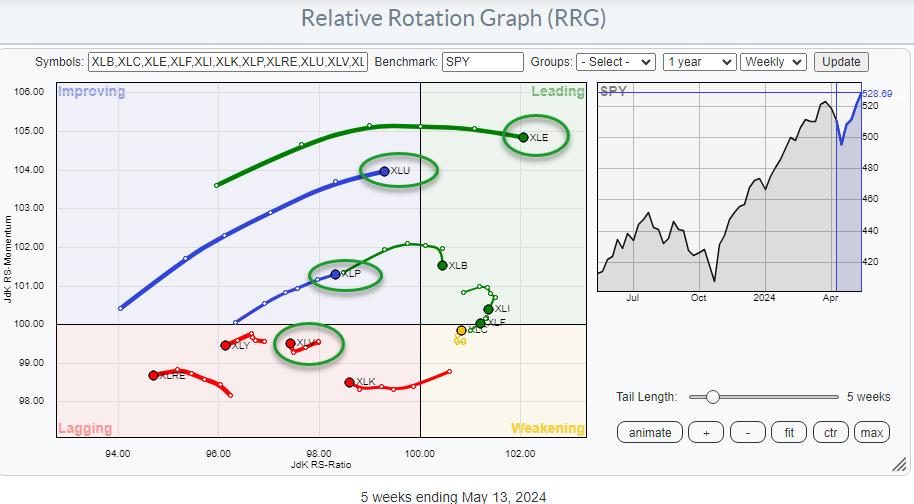
The relative rotation graph above shows long and strong tails for defensive sectors. As you know, the traditionally defensive sectors are utilities, consumer staples, and healthcare. Utilities and staples are inside the improving quadrant and on a strong RRG-Heading toward leading. The healthcare sector is inside the lagging quadrant and has just started to curl back up.
Reading from the JdK RS-Ratio axis, energy is the strongest sector at the moment. Although it is not considered a really defensive sector, it has a low beta compared to other sectors, which is also a defensive characteristic. On the other hand, we see a really offensive sector like consumer discretionary inside the legging quadrant and moving further into it. Other sectors inside the lagging quadrant are technology and real estate. Both moved lower on the JdK RS-ratio scale at a stable negative RS-momentum level.
Other, more offensive or cyclical sectors, like materials, industrials, and financials, are inside the leading quadrant. Still, they have rolled over and are now out of the zero to 90-degree RG heading. Overall, this combination of rotations is not what you would expect during a strong rally in a bull market.
A strong rally in the S&P 500 is not in line with this type of sector rotation.
Obviously, there are two ways this situation can be resolved. The first one is that the sector rotation will move to a more offensive trajectory in the coming weeks, matching and catching up with the rally in the S&P 500. The second one is that the S&P 500 gets back in line with a more defensive rotation.
Asset Class Rotation Turning Towards Bonds
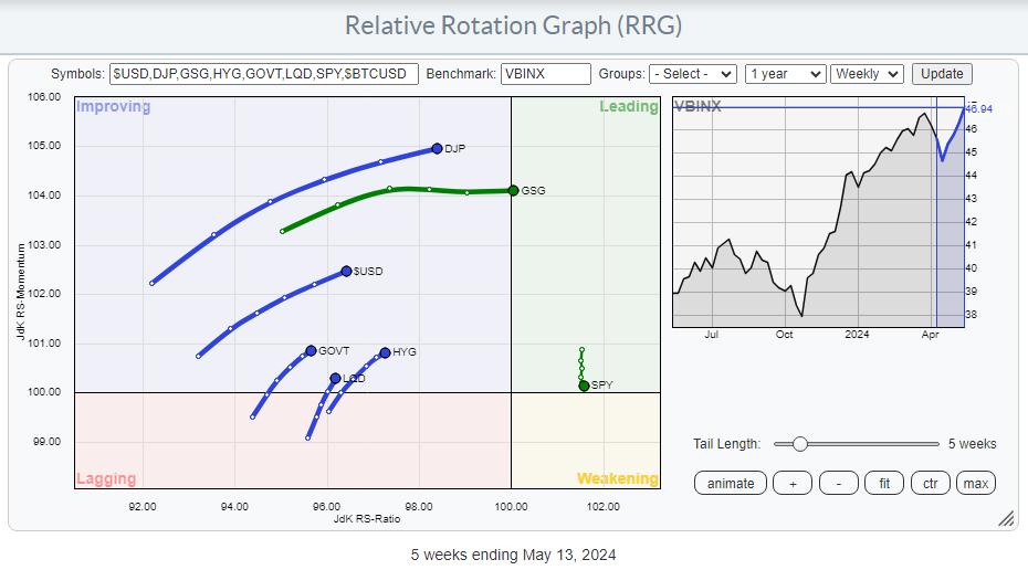
Finally, the third observation that makes me cautious is the current state of asset class rotation. as seen in the RRG above.
The tail for SPY is inside the leading quadrant, but has been moving lower on the RS momentum scale for a few weeks already, almost crossing over into the weakening quadrant. The tails for fixed-income-related asset classes, government bonds, corporate bonds, and high-yield bonds are inside the improving quadrant, and all are moving at a positive RRG-heading.
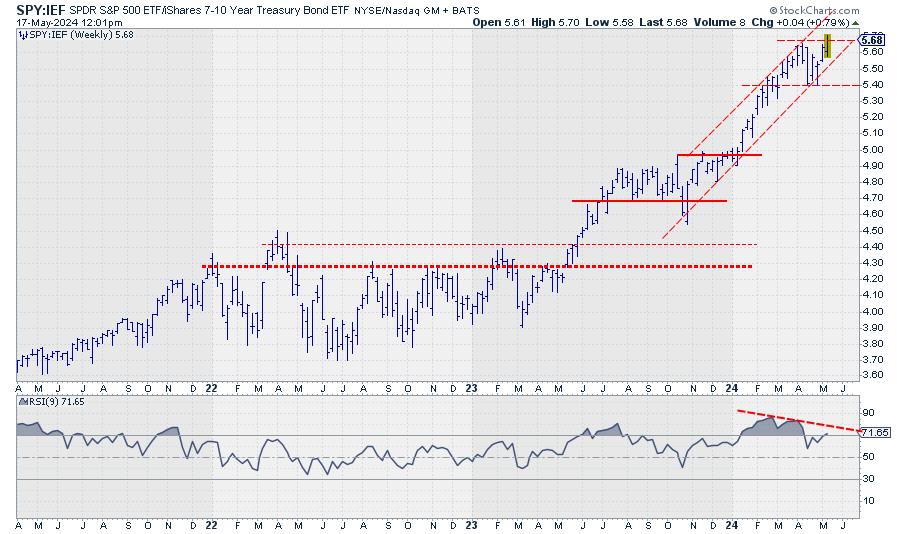
Bringing that relationship back to the SPY:IEF chart shows us that this ratio is struggling with the resistance offered by the previous peak, around 5.7. At the same time, the RSI plotted below the price chart shows a buildup of negative divergence. As you know, this is usually a sign of, at least, a pause or a turn in the existing trend.
A clear reversal of this trend would mean that bonds are taking over the leadership role from stocks. And this usually happens when stocks are moving lower.
All in All
All in all, these three observations make me very cautious regarding the quality of the upside break in the S&P 500.
#StayAlert. Have a great weekend, --Julius
|
| READ ONLINE → |
|
|
|
| Don't Ignore This Chart! |
| Gold and Silver Set to Smash Records: Could 2024 Be Their Biggest Year Yet? |
| by Karl Montevirgen |

Gold is on the verge of breaking into all-time high territory, and silver is poised to challenge its four-year highs. Both metals are rallying, and it seems probable that both assets will rise above the current threshold levels.
Supposing they do, what's next?
In terms of analyst price forecasts, most consensus targets for 2024 have already been reached, well ahead of schedule. From a technical standpoint, both metals could trend higher, disregarding any potential short-term dip. However, what economic factors might be driving this trend?
The World Bank Predicts an 8% Rise in Gold and 7% Rise in Silver
According to the World Gold Council, central banks worldwide bought nearly 300 tonnes of gold in the first quarter alone in 2024. Although data on silver purchases is hard to come by, the Silver Institute expects total industrial demand for silver to reach a record of 690 million ounces in 2024, not counting investment demand (as silver is also a "monetary" metal).
Overall, several factors are expected to drive both metals higher:
- Heightened geopolitical tensions.
- Central banks' gold purchases as a hedge against economic instability and currency depreciation.
- Persistently high inflation rates and expectations of lower interest rates.
- Rising industrial demand for silver, particularly in light of solar energy project expansion.
So, what might this look like in terms of today's charts?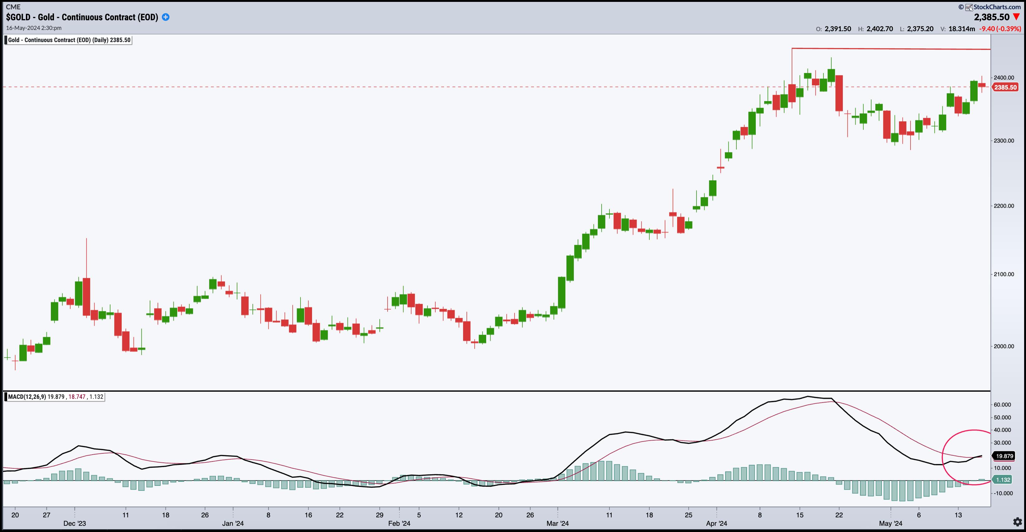 CHART 1. DAILY CHART OF $GOLD. Gold is gaining momentum as it approaches record-high territory.Chart source: StockChartsACP. For educational purposes. CHART 1. DAILY CHART OF $GOLD. Gold is gaining momentum as it approaches record-high territory.Chart source: StockChartsACP. For educational purposes.
Looking at gold ($GOLD), watch the resistance level at $2,448.80 (see red line); a break above this price marks an all-time high for the yellow metal. Note that the Moving Average Convergence Divergence (MACD) line is about to cross over the signal line, and the histogram is about to rise above the centerline, both indicating bullish momentum.
The dotted blue line at the $2,585 range approximates the World Bank's 8% price target. If you follow gold news, you're probably aware that a few analysts predict gold prices will exceed this level. However, the higher levels depend on geopolitical variables, which, although conceivable, are too distant to be certain (at least for now).

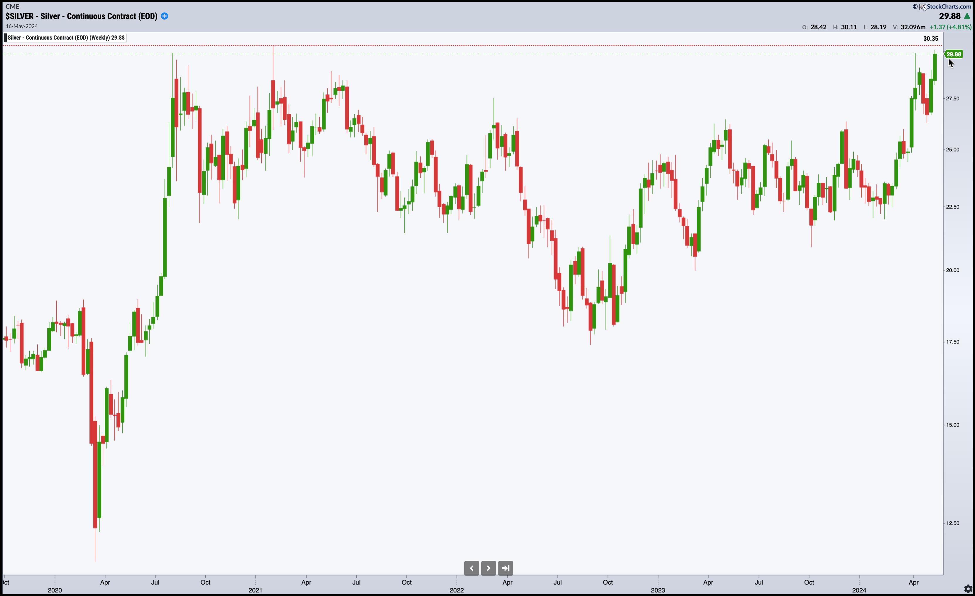
CHART 2. WEEKLY CHART OF $SILVER. Can silver's price increase break through its two significant technical challenges? Chart source: StockCharts.com. For educational purposes.
JPMorgan, Commerzbank, and Citigroup set their silver price targets to $30, which the metal had reached on Thursday. Silver is just a few points away from challenging its four-year high at $30.35. Above that, you can see an approximation of the World Bank's 7% target at the $31.80 range.
Could silver reach its 2011 highs—the $50 per ounce range? A few analysts maintain that target, but, considering the now-tempered expectations of aggressive rate cuts by the Federal Reserve, especially following the latest Consumer Price Index (CPI) and Producer Price Index (PPI) readings, several analysts who had previously set higher targets for silver have now revised them lower.
But if silver has a reputation for volatility, it's because the factors driving its price as a monetary and industrial metal are also subject to volatility. Just look at how analysts have underestimated the timing of the price forecasts and the now-downward revision of silver's price target.
The Takeaway

If you've followed gold and silver price forecasts over the last year, you might have noticed how targets have adjusted in response to incoming economic data (particularly inflation data), Fed rate cut expectations, and geopolitical factors. Gold negatively reflects the erosion of purchasing power and dwindling sentiment in monetary policy. Silver does, too, to a certain extent, but it's also driven by industrial demand. So, if you're a gold or silver bug, it's important to consider all of these developments—technical levels, dynamics in momentum, inflation, geopolitical developments (particularly the BRICS bloc), and industrial supply and demand.
Most importantly, does it make sense to open long positions now? If you're hedging your purchasing power (in light of persistent inflation and global de-dollarization) by allocating a small percentage of your portfolio to gold, it may be. If you're seeking growth driven by silver's industrial consumption (and less so as a safe haven), you should be more skeptical in the near term. But these conditions change; ultimately, it depends on your long-term goals and percentage allocations.
Disclaimer: This blog is for educational purposes only and should not be construed as financial advice. The ideas and strategies should never be used without first assessing your own personal and financial situation, or without consulting a financial professional.
|
| READ ONLINE → |
|
|
|
| MORE ARTICLES → |
|


 Once a darling of the tech industry, Salesforce (CRM) had fallen out of favor until recently, when it hit a new all-time high earlier this year. Since then, though, investors have continued to shy away from this cloud computing stock as they focus on more pure AI-related companies, and Salesforce is at risk of turning lower again. As CRM matures and growth rates moderate, it simply cannot continue to command the industry-leading valuations it once did, and has to face the reality of its fundamentals.


 There is a certain ebb and flow in uptrends. Often we see some sort of stair step higher with big advances and smaller corrections along the way. In Dow Theory terms, the primary trend is up and declines within a primary uptrends are considered secondary price moves. Also called corrections. Corrections and subsequent reversals offer traders a chance to partake in the uptrends. Today's report will focus on the Bitcoin ETF (IBIT). ChartTrader at TrendInvestorPro specializes in such setups and


 CHART 1. DAILY CHART OF $GOLD. Gold is gaining momentum as it approaches record-high territory.