| THIS WEEK'S ARTICLES |
| The Mindful Investor |
| Hindenburg Omen Flashes Initial Sell Signal |
| by David Keller |
While the S&P 500 did manage to finish the week above tactical support at 5250, one of the most widely-followed macro technical indicators recently registered an initial sell signal for the second time in 2024. Today we'll explain the three components of the Hindenburg Omen, show why this pattern is common at major market tops, and discuss the additional signals we'd need to observe to confirm a bearish outlook for the S&P 500 using this powerful indicator.
The Hindenburg Omen was created and popularized by market strategist Jim Miekka, and is based on three factors that he discovered were quite common at major market tops. It's worth noting that a number of different versions of the Hindenburg Omen are used in the present day; here, we're describing the version used on StockCharts.com.

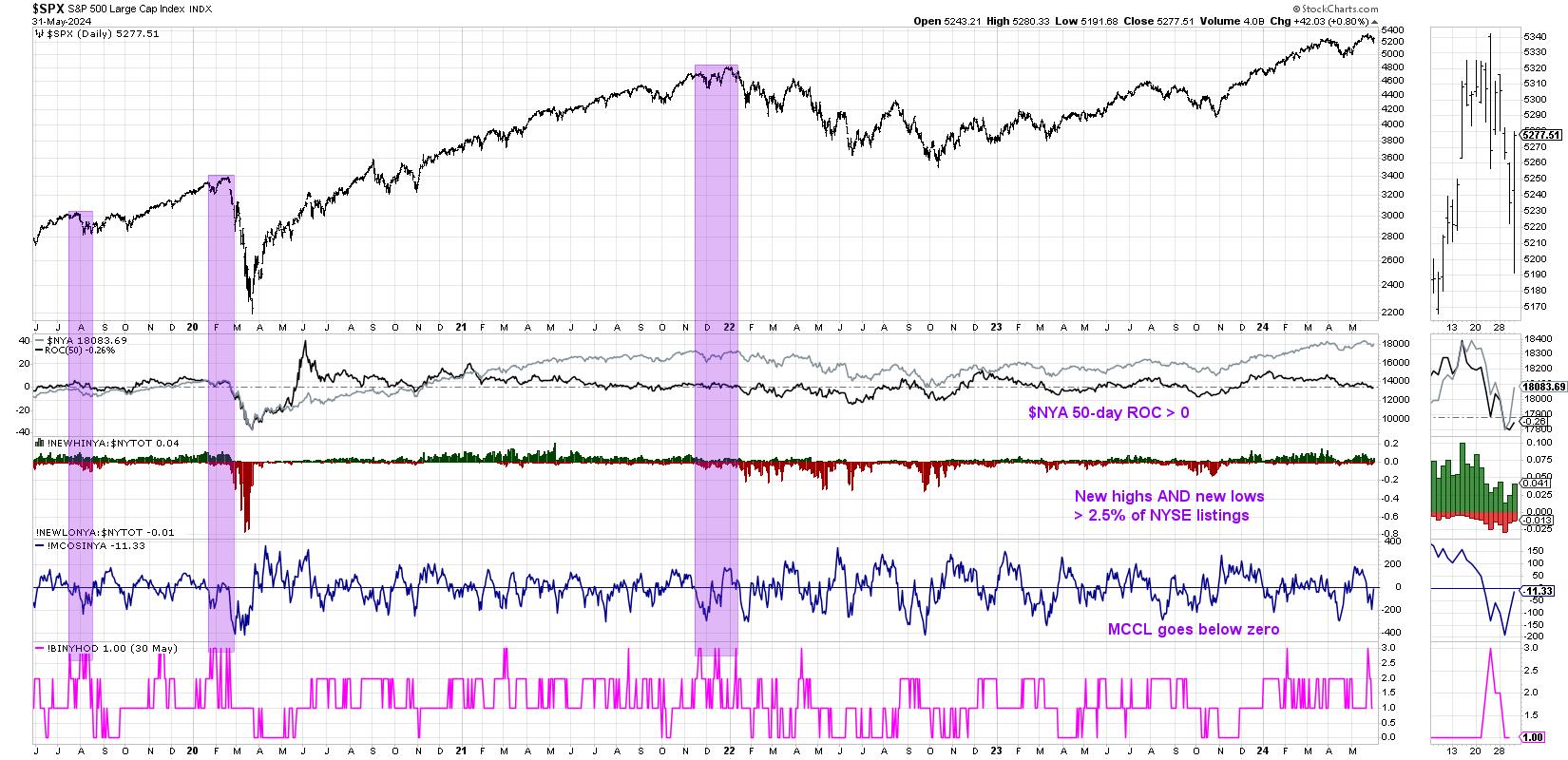
First, the NYSE Composite Index ($NYA) needs to be in an uptrend. In this case, we want to see the 50-day rate-of-change to be greater than zero. This is an important first step, because we're only looking for a potential market top if the market is already in an established uptrend!
The 50-day ROC for the NYSE Composite Index turned positive in November 2023, soon after the October 2023 market low. This rate-of-change has remained above zero until just this week.
Second, there needs to be at least 2.5% of NYSE members making new 52-week highs and at least 2.5% of NYSE members making new 52-week lows on the same day. You may initial think that an extreme number of new highs would suffice, as that would imply some sort of "overbought" market condition. Or perhaps an expansion in new lows would make sense, because then the market would have moved higher with weaker breadth conditions.
But Miekka's analysis showed that market tops are usually marked by indecision, and, by looking for a situation where there are a healthy number of both new 52-week highs and new 52-week lows, we can confirm this unstable market state. We can see in the chart that we saw 2.5% of new highs and new lows on the same day earlier in the month of May.
One quick note: this is where different charting providers have used different settings for the Hindenburg Omen, ranging from 2.2% to 2.8% of NYSE listings as the threshold for this second factor.
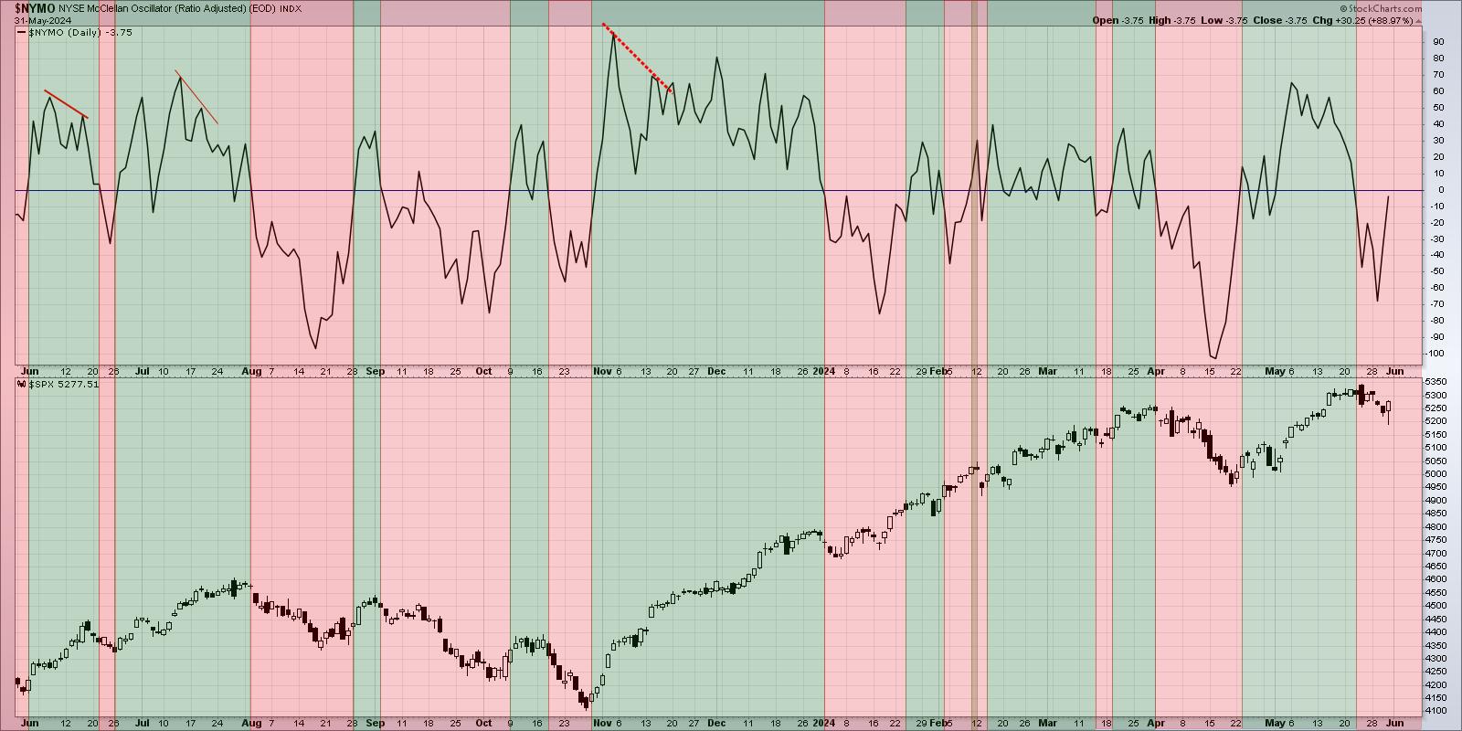
Finally, the McClellan Oscillator needs to turn negative, that is, break below the zero level. This tactical market breadth indicator is based on the cumulative advance-decline line, and a break below zero represents a short-term bearish rotation in breadth conditions.

I've color-coded this chart green to highlight positive breadth and red for negative breadth conditions over the past 12 months. Note how we recently rotated back below the zero level, providing the final piece of evidence for an initial reading on the Hindenburg Omen.
So what would make this a complete and confirmed Hindenburg Omen, similar to what we've seen a previous major market tops? It's important to observe a second signal within one month of trading, as Miekka found that multiple signals in a relatively short period of time tended to further validate the indicator.

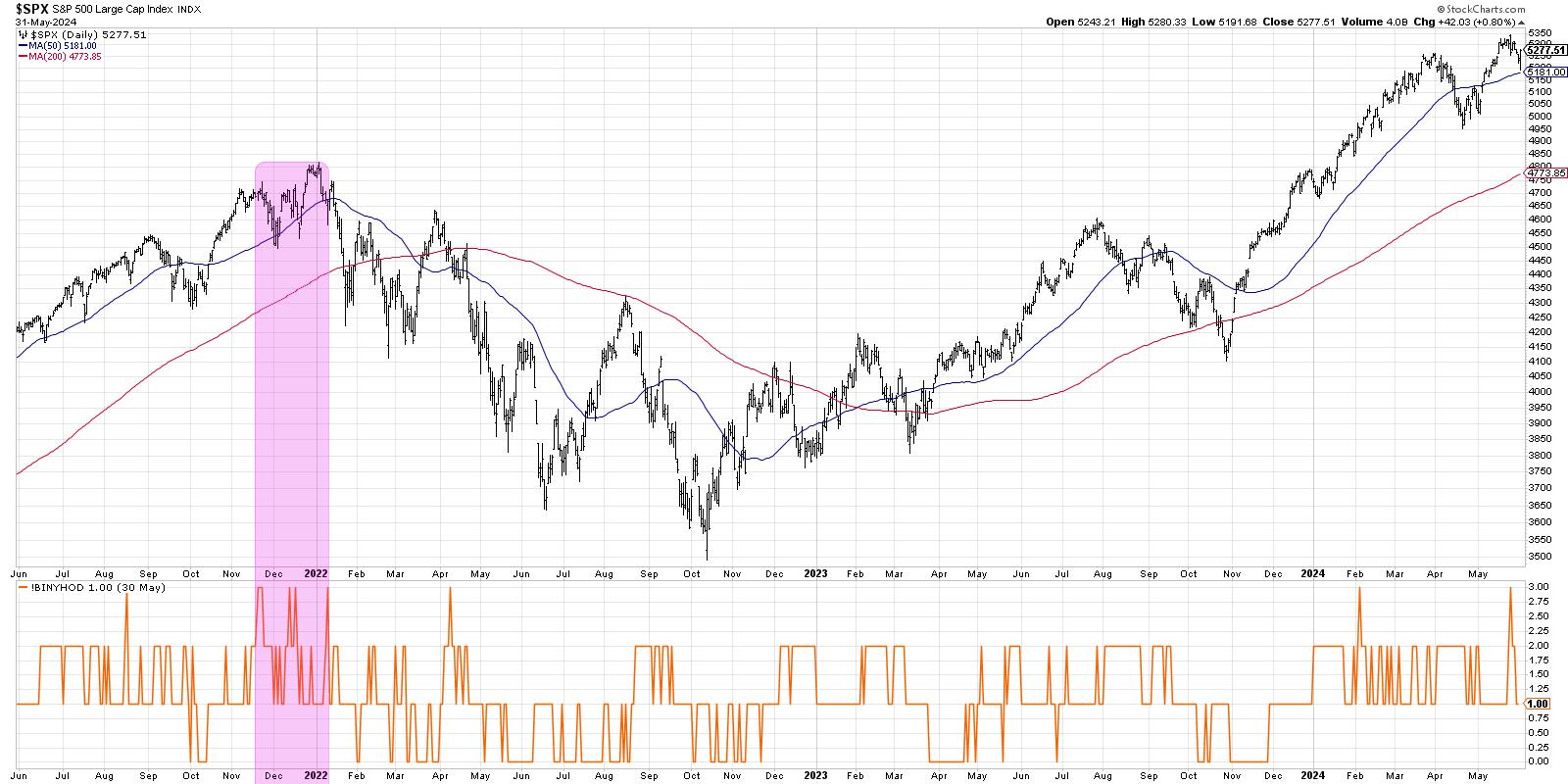
Here, I've isolated a "composite" indicator that tracks the three components outlined above. When all three are firing, the indicator reads +3.0. You'll notice the signal from last week, as well as the previous signal from February 2024. Note that we never received that second confirmatory signal in February, so the Hindenburg Omen was never confirmed.
When was the last time we had a valid and confirmed Hindenburg Omen? In December 2021, just before the January 2022 market top, we experienced two sets of confirmed factors within one month. Before that, the next previous signal was during the COVID peak in February 2020!
So while this initial reading from last week does not fully confirm a Hindenburg Omen top, it should alert investors to be ready for the downside that often comes after a confirmed sell signal. And while the indicator does not necessarily imply potential downside targets, a brief history lesson of the S&P 500 shows the previous signals have often preceded major market declines!
RR#6,
Dave
P.S. Ready to upgrade your investment process? Check out my free behavioral investing course!
David Keller, CMT
Chief Market Strategist
StockCharts.com
Disclaimer: This blog is for educational purposes only and should not be construed as financial advice. The ideas and strategies should never be used without first assessing your own personal and financial situation, or without consulting a financial professional.
The author does not have a position in mentioned securities at the time of publication. Any opinions expressed herein are solely those of the author and do not in any way represent the views or opinions of any other person or entity.
|
| READ ONLINE → |
|
|
|
| Larry Williams Focus On Stocks |
| MEMBERS ONLY |
| The Sky is Not Falling | Focus on Stocks: June 2024 |
| by Larry Williams |
|
A note to the Cassandras who are now out in full force... Led by "Rich Dad, Poor Dad" Robert Kiyosaki's warning of "Be careful, it's the biggest crash in world history," the bears have come out of their winter caves. "We can't make it past 2025" warns Patrick Bet-David...
|
| READ ONLINE → |
|
|
|
| ChartWatchers |
| Stock Market Shows Its Magic: An Exciting Finish |
| by Jayanthi Gopalakrishnan |

What a turnaround! Today's PCE data, which was in line with expectations, initially sent the stock market higher. Then, it experienced a significant selloff, but things changed in the last 30 minutes. Equities pushed higher into the close, revealing that investor optimism isn't dead. The S&P 500 ($SPX) and Dow Jones Industrial Average ($INDU) closed higher, and the Nasdaq Composite ($COMPQ) was flat.
Today's stock market behavior shows how it can turn on a dime, and there's no way to anticipate what it'll do. The PCE came in as expected, which, realistically, shouldn't have altered investor sentiment. The expectation of possibly getting one rate cut in 2024 is still in play, so it made sense to see the selloff for most of the trading day. But that big push higher shortly before the close makes it difficult for an investor to be pessimistic.
A Closer Look at the Trading Action
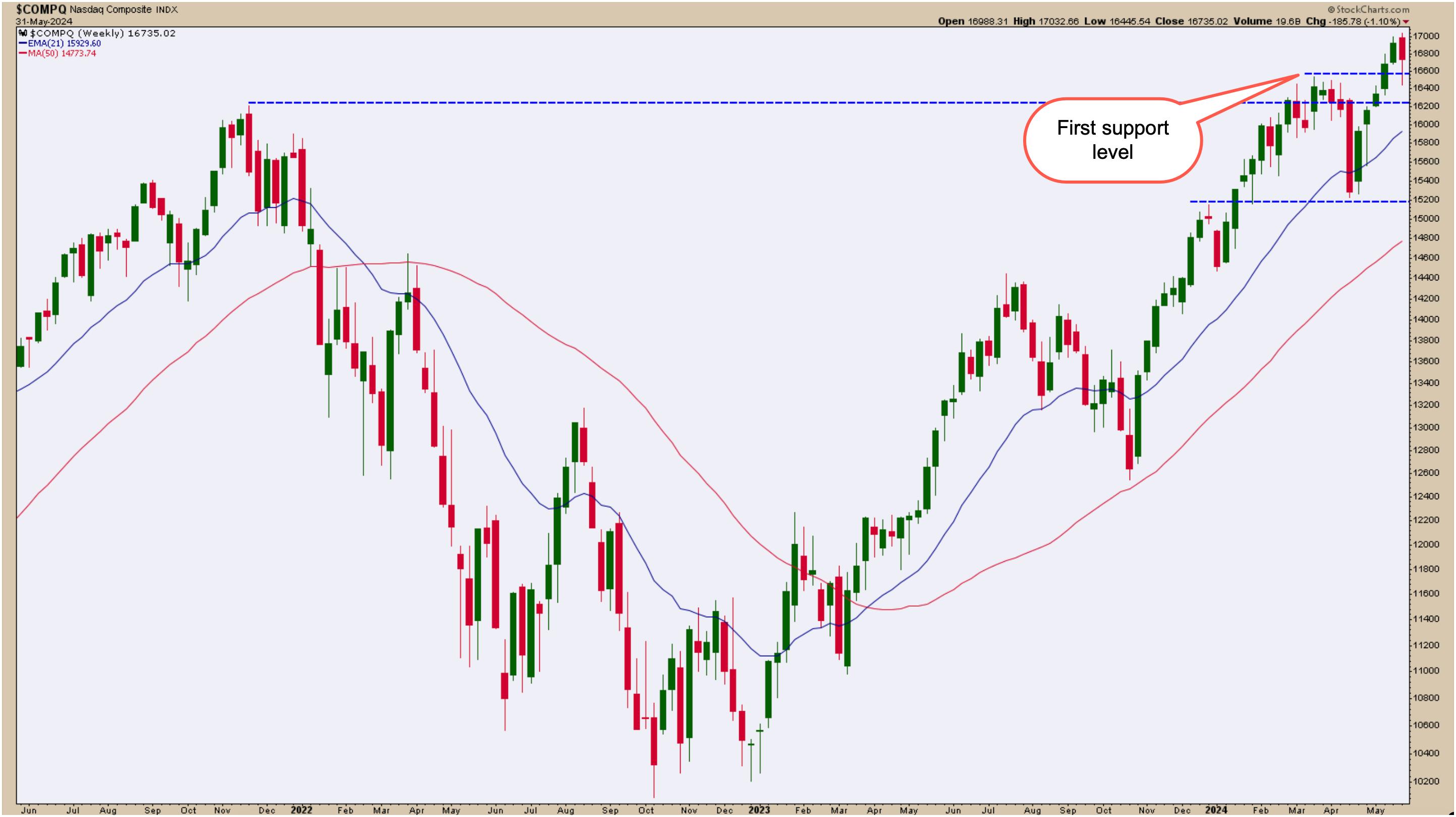
For most of the day, Tech stocks sold off significantly. The weekly chart of the Nasdaq Composite (see below) shows that, if it hadn't been for the rise at the end of the trading day/week/month, the index could have closed below its first support level (blue dashed line). Instead, it was able to close well above the support level.
Follow the live chart.
Could that mean the index will try hitting a new high next week? It's something to anticipate, but always be prepared for the market to go either direction.

CHART 1. WEEKLY CHART OF NASDAQ COMPOSITE. The index looked like it would close below its first level, but buying pressure dominated, and the index closed for the week on a relatively optimistic note.Chart source: StockCharts.com. For educational purposes.
Not much has changed. The Nasdaq is trading above its 21-day exponential moving average (EMA), which is trending upward, as is the 50-day simple moving average (SMA).
Follow the live chart.
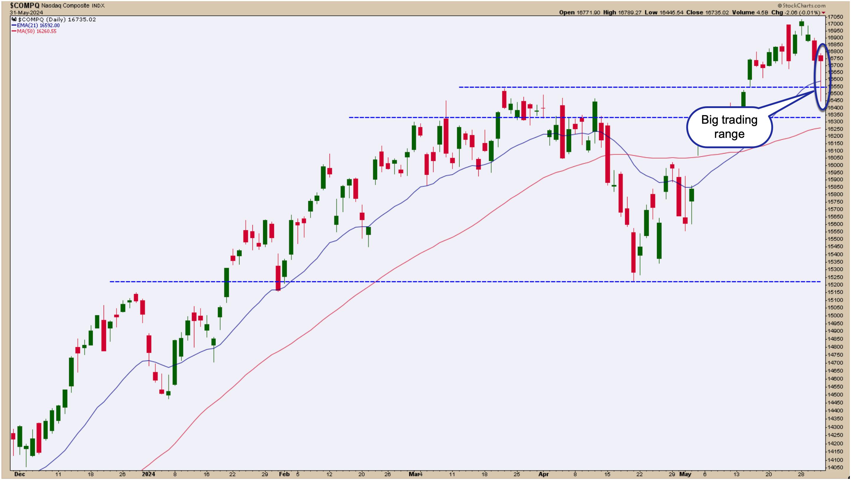
Like the weekly chart, the daily chart of the Nasdaq Composite also shows some clear lines in the sand. Today's range was significant and, while it looked like there could have been some short-term technical support breaks, the index ended the week without much to worry about.

CHART 2. DAILY CHART OF NASDAQ COMPOSITE. There are clear lines of sand in the daily chart of the Nasdaq, and there is enough buying interest to keep the index above the initial support levels.Chart source: StockCharts.com. For educational purposes.
Follow the live chart.
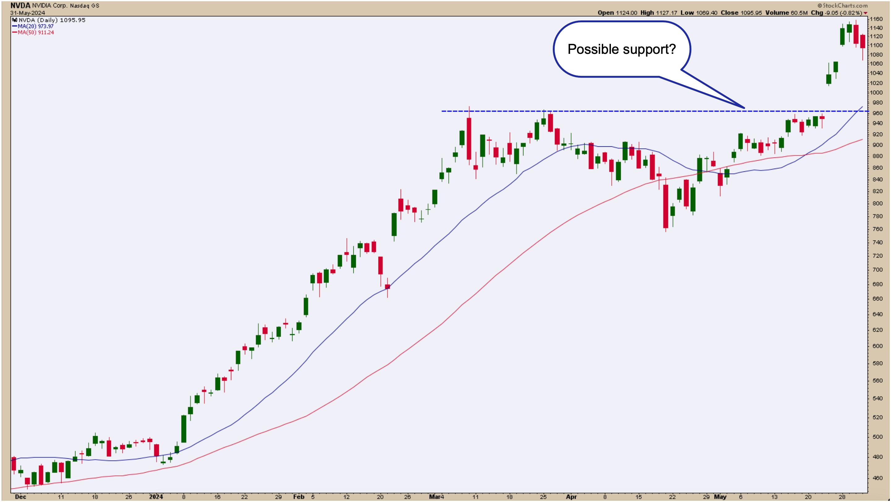
You can blame the tech stock selloff on semiconductors. To understand this better, it makes sense to bring up a chart of NVIDIA (NVDA), since the price action of the stock tends to correlate with the price action in the Nasdaq and S&P 500.
The daily chart of NVDA below shows a clear resistance level. From March to May, NVDA's stock price hit resistance at around $965 and a few times before it gapped higher.

CHART 3. DAILY CHART OF NVDA. Could the stock fall to its previous resistance level?Chart source: StockCharts.com. For educational purposes.
NVDA's recent earnings saw the stock price surge higher, but the buying seems to have exhausted. The question is whether NVDA's stock price will retrace back to the $965 level. For a while, it looked like that could happen. We'll have to wait until next week to see which way investor sentiment leans.
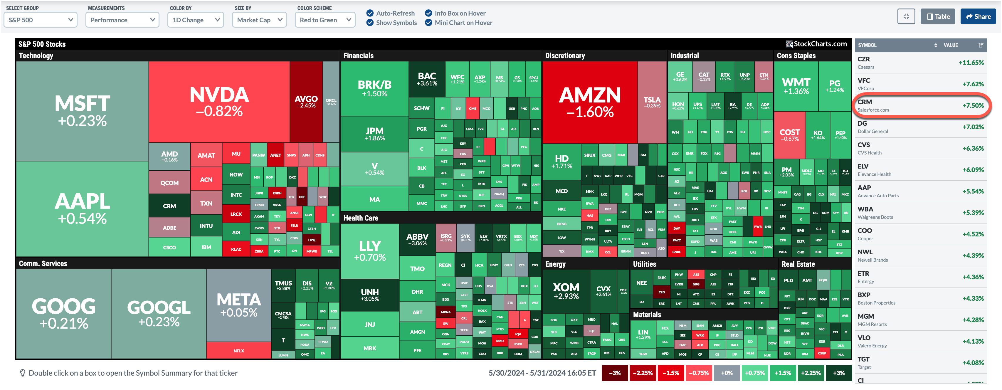
A look at the StockCharts MarketCarpet gives a good visual of today's market action. You can clearly see that NVDA and Amazon, Inc. (AMZN) experienced the largest losses, but, overall, there was a lot of green. The dark green squares represent the largest percentage gainers, and one that stands out in the Tech sector is Salesforce.com, Inc. (CRM). After falling almost 20% on Thursday after a dismal earnings report, the stock gained 7.5% on Friday.

CHART 4. THE BIG PICTURE. The StockCharts MarketCarpet gives a good overview of how the market performed.Chart source: StockCharts.com.
Follow the live chart.
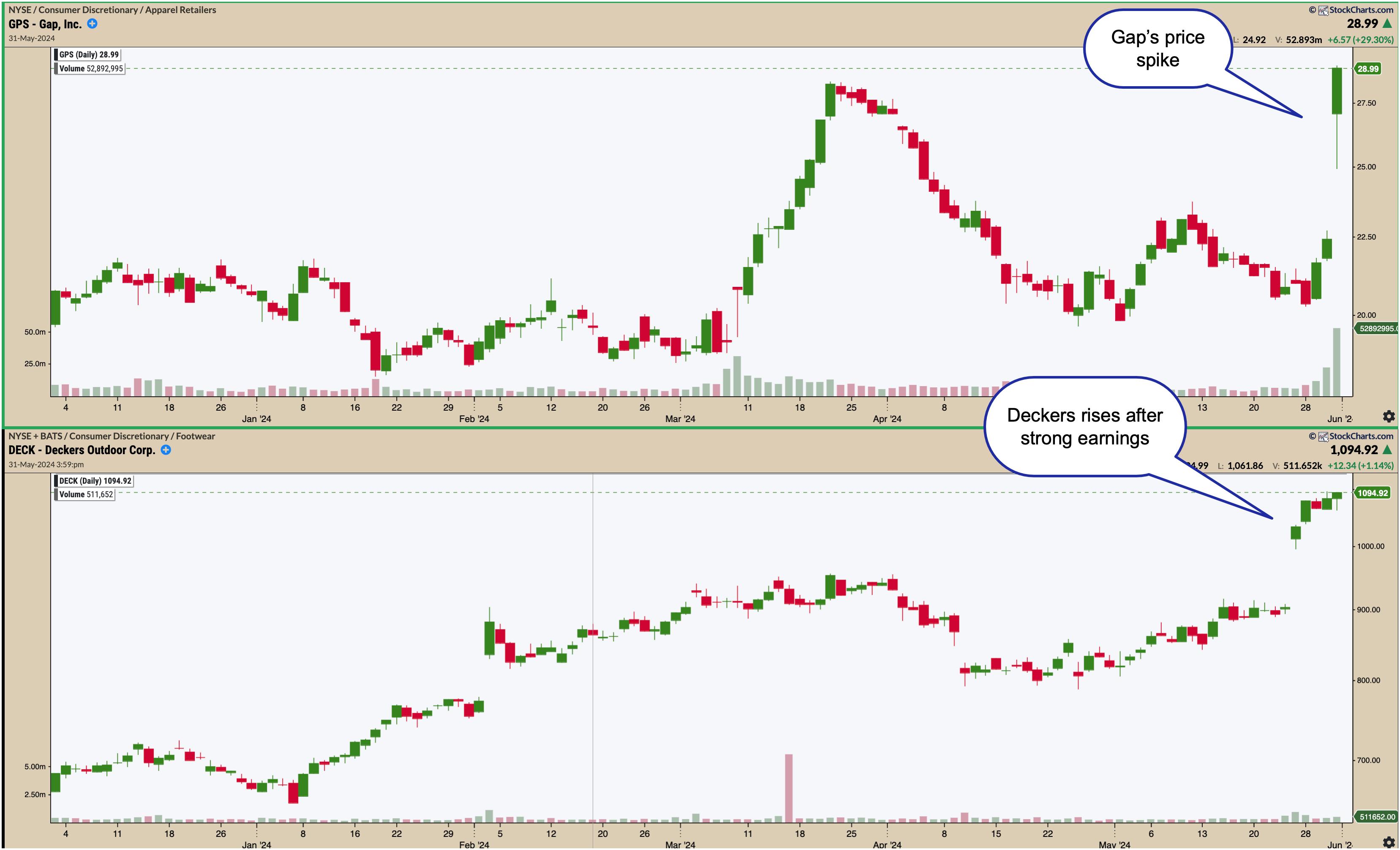
Interestingly, it wasn't so green in the Tech and Communications Services sectors. But the other sectors were doing relatively well. Two stocks that should be on your radar are Gap Stores (GPS) and Deckers Outdoor Corp. (DECK).

CHART 5. RETAIL STOCKS SURGE. Gap, Inc. (GPS) and Deckers Outdoors (DECK) are seeing significant strength. These two stocks should be on your radar.Chart source: StockChartsACP. For educational purposes.
GPS rose on strong Q1 earnings and strong guidance. DECK's shares have been rising on the popularity of their Hoka shoes. The rise in these stocks indicates the retail sector continues to be strong.
The Takeaway
Overall, May ended on a positive note. Maybe the "Sell in May and go away" strategy will have to wait. Next week, there will be some earnings, but the focus will be on macro data. Will the data be enough to move the needle? The jobs number will probably have the largest impact if it comes in hot.
End-of-Week Wrap-Up

- S&P 500 closes up 0.80% at 5,277.51, Dow Jones Industrial Average up 1.50% at 38,686.32; Nasdaq Composite down 0.01% at 16,735.02
- $VIX down 10.71% at 12.92
- Best performing sector for the week: Energy
- Worst performing sector for the week: Technology
- Top 5 Large Cap SCTR stocks: MicroStrategy Inc. (MSTR); Vistra Energy Corp. (VST); NVIDIA (NVDA); Super Micro Computer, Inc. (SMCI); Robinhood Markets (HOOD)
On the Radar Next Week
- May Manufacturing PMI
- May Services PMI
- April JOLTS Job Openings
- May Non-Farm Payrolls
- Earnings from CrowdStrike Holdings (CRWD), Hewlett Packard (HP), and Lululemon Athletica (LULU)
Disclaimer: This blog is for educational purposes only and should not be construed as financial advice. The ideas and strategies should never be used without first assessing your own personal and financial situation, or without consulting a financial professional.
|
| READ ONLINE → |
|
|
|
| Trading Places with Tom Bowley |
| Here Are 4 Steps To Improve Your Trading Process and Results |
| by Tom Bowley |
Let's jump right in. For me, everything starts at the TOP. I take a top-down approach to trading. And when I say "the TOP", I mean market direction.
Step 1: Is it a Bull or Bear Market?
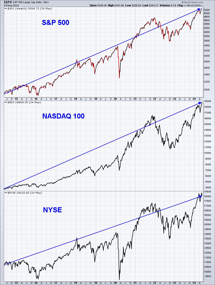
Listen, this is a very easy step to me. Look at a LONG-TERM chart of the S&P 500. Are prices moving UP from left to right? Or are they moving DOWN from left to right? It's that simple. Stop trying to figure out why it's going up or down. Don't interject your own personal biases into it. Just look at the chart and answer the question:

I have stripped out nearly all technical indicators. There's no volume. There are no momentum indicators like the PPO, MACD, RSI, or Stochastic. There are no moving averages. This is nothing more than a 10-year weekly price chart of the S&P 500, NASDAQ 100, and the broader NYSE. What do you see as you look across this chart from left to right? Is there a debate here? The stock market has been moving higher for YEARS (with occasional weakness)!!!! If you find yourself constantly being in cash or, worse yet, trying to short sell stocks, because YOU think stocks are overvalued, you have missed out on creating enormous personal wealth. STOP doing that!
We are heavily influenced by listening to news, whether you believe so or not. I remember my parents talking about the enormous debt of the U.S. back in the 1970s and that discussion has never ended. Meanwhile, $1 invested in the S&P 500 on January 1, 1980, is now worth $50 (prior to adjusting for inflation). So the absolute FIRST STEP in becoming a better investor/trader is to understand that your odds of making money are MUCH, MUCH BETTER on the long side than on the short side. Shorting stocks should be considered very infrequently and only when the chart is moving DOWN from left to right. Calling for repeated tops in a bull market is financial suicide. The trend is your friend, right?

Step 2: Sectors, Industries, and Stocks Are Not Created Equal
The Semiconductors Index ($DJUSSC) is an industry group loaded with high-octane, growth companies. As our economy and GDP grow, many of these companies find very exciting growth opportunities and take full advantage of them. This allows the LEADERS within this rising group to post gains that make accumulating massive wealth in the stock market possible. But not every group is high-growth like the semiconductor group. Companies in those slower-growth areas will never post that type of sustainable earnings growth. Yet we put way too much faith that the short-term growth rate in other industries will evolve into long-term growth like the semiconductors. It simply doesn't happen that way and we lose money waiting for it.
Let's compare semiconductors to several other industry groups within the aggressive sectors (XLK, XLY, XLC, XLI, and XLF) over a 20-year period. The 9 "other" industries are software ($DJUSSW), specialty retailers ($DJUSRS), gambling ($DJUSCA), internet ($DJUSNS), broadcasting & entertainment ($DJUSBC), fixed line communications ($DJUSFC), airlines ($DJUSAR), insurance brokers ($DJUSIB), and banks ($DJUSBK). The chart below is a 20-year weekly chart and each industry is shown as a ratio chart, relative to the benchmark S&P 500. See if you notice differences:

Look at these 10 different industry group RELATIVE charts. If you were to trade a stock in one of these industry groups, would it matter to you which of the industry groups above that it belonged to?
If I looked at the above charts and I was contemplating a trade in one or more of them, the very first question I'd consider is "what's my time frame?". If I'm thinking about a long-term swing trade, I would very much prefer for the stock to be in one of those industry groups in BLUE above - those showing much better long-term track records. If I were to look at a trade in say gambling, it would very likely be a quick, short-term trade. And if I did let the stock run, because it was performing well, I'd absolutely want to keep a trailing stop in play. The falling relative strength lines tells me that money is rotating AWAY from this RED group and into groups like those above in BLUE.
So, short-term I could trade stocks in any of the 10 groups, but from a longer-term perspective, I'd clearly be much more interested in the BLUE groups that are uptrending vs. the benchmark S&P 500.
I think that makes common sense, but I would bet that most traders don't consider this.
Step 3: Trade Leading Stocks
There are a number of ways to evaluate relative strength, but one simple way that's already a part of the StockCharts.com trading platform is to view top SCTRs (acronym for StockCharts Technical Rank). Personally, I would only tend to use the SCTR if I was looking at very recent performance. If you study the formula for the SCTR calculation, you'll quickly realize that none of the formula is based on performance beyond 5-6 months. It's a very near-term relative strength indicator, but a powerful one nonetheless, especially for those that are trading momentum in the very near-term.
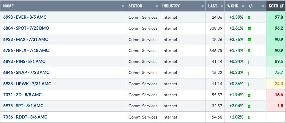
You can pull up ChartLists using the Summary view and add the SCTR column. For instance, on our Raised Guidance ChartList (RGCL) that we research for our EarningsBeats.com members, here is how I can look for internet stocks that have raised their guidance in the past quarter, while also listing their SCTR score in order from strong to weak:

Personally, I'd concentrate much more on trading the above stocks with SCTRs at or above 75 and ignoring the rest. Remember, leading stocks in leading industry groups. That's how you'll improve your trading success.
Step 4: Exercise Patience and Use Great Timing Techniques
An impatient trader that simply wants to have money invested at all times is generally a bad trader. Buy stocks at YOUR price, not the price market makers want you to buy. In my experience, "chasing" trending stocks has resulted in my biggest and quickest losses. Many times, a stock becomes a leading stock after an excellent quarterly earnings report that's accompanied by a gap higher in price. Chasing such a stock can be a big problem, especially if that stock "fills its gap", or returns to the prior closing price before the gap. We try to coach our members to "stalk" stocks. Find stocks you like and then wait, wait, and wait a little bit longer. Buy them at key price/moving average support with tighter stops. That won't eliminate poor trades, but it'll certainly reduce your risk at the time of purchase.
Conclusion: Examples
Every weekend (or nearly every weekend), I provide my Fab 5 on YouTube, which is essentially 5 trade setups. Keep in mind that the risk of any trades you make is yours and yours alone, but I believe if you time your trades similar to these setups, you'll experience better trading results over time. Check out this video:
Fab 5: 5 Stocks You Should Be Stalking Right Now
If you like these setups and would like additional setups more often, please SUBSCRIBE to our FREE EB Digest newsletter with only your name and email address. We provide "Charts of the Day" 3 times per week and the newsletter is absolutely 100% free! You may unsubscribe at any time.
Have a great holiday-shortened week ahead and happy trading!
Tom
|
| READ ONLINE → |
|
|
|
| DecisionPoint |
| Textbook Double Top on Silver (SLV) |
| by Erin Swenlin |
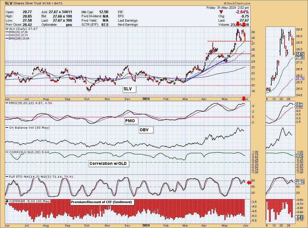
Gold is struggling, moving mostly sideways. Silver has technically been moving sideways as well, only it has formed a textbook double top chart pattern. Textbook double tops show even tops and a clear confirmation line delineated at the middle of the "M" formation. What is good about these formations is that they give us a minimum downside target.
The downside target is determined by the length of the pattern subtracted from the confirmation line. In the case of Silver, that would bring it down to prior gap support. But remember, this is a "minimum" downside target. It could fall further.
The Price Momentum Oscillator (PMO) has topped for a second time in overbought territory. Stochastics are falling. The technicals are failing on Silver, so we should be prepared for this decline to catch fire.

Conclusion: We have a bearish double top on Silver (SLV) that predicts a minimum downside target around 25.00. Prepare for more downside on SLV.
Learn more about DecisionPoint.com:
Watch the latest episode of the DecisionPoint Trading Room on DP's YouTube channel here!

Try us out for two weeks with a trial subscription!
Use coupon code: DPTRIAL2 at checkout!
Technical Analysis is a windsock, not a crystal ball. -- Carl Swenlin
(c) Copyright 2024 DecisionPoint.com
Disclaimer: This blog is for educational purposes only and should not be construed as financial advice. The ideas and strategies should never be used without first assessing your own personal and financial situation, or without consulting a financial professional. Any opinions expressed herein are solely those of the author, and do not in any way represent the views or opinions of any other person or entity.
DecisionPoint is not a registered investment advisor. Investment and trading decisions are solely your responsibility. DecisionPoint newsletters, blogs or website materials should NOT be interpreted as a recommendation or solicitation to buy or sell any security or to take any specific action.
Helpful DecisionPoint Links:
Trend Models
Price Momentum Oscillator (PMO)
On Balance Volume
Swenlin Trading Oscillators (STO-B and STO-V)
ITBM and ITVM
SCTR Ranking
Bear Market Rules
|
| READ ONLINE → |
|
|
|
| GoNoGo Charts |
| Top 5 Stocks in "Go" Trends | Fri May 31, 2024 |
| by Tyler Wood |
Top 5 Stocks in "Go" Trends
Trend Continuation on Rising Momentum
GoNoGo Charts® highlight low-risk opportunities for trend participation with intuitive icons directly in the price action. The resurgence of momentum in the direction of the underlying price trend is an excellent entry opportunity, or the chance to scale up positions.
GoNoGo Icons® illuminate these events on the chart with green solid circles (or red circle to highlight continuation of NoGo trends). When GoNoGo Trend® is painting blue or aqua bars, a green solid circle will appear below price each time GoNoGo Oscillator® finds support at zero.
Below are the top 5 stocks/ETFs in "Go" trends with surging momentum by volume in the S&P 500 as of the daily closing price action:
 StockCharts Scan for GoNoGo "Go" Trend Continuation StockCharts Scan for GoNoGo "Go" Trend Continuation
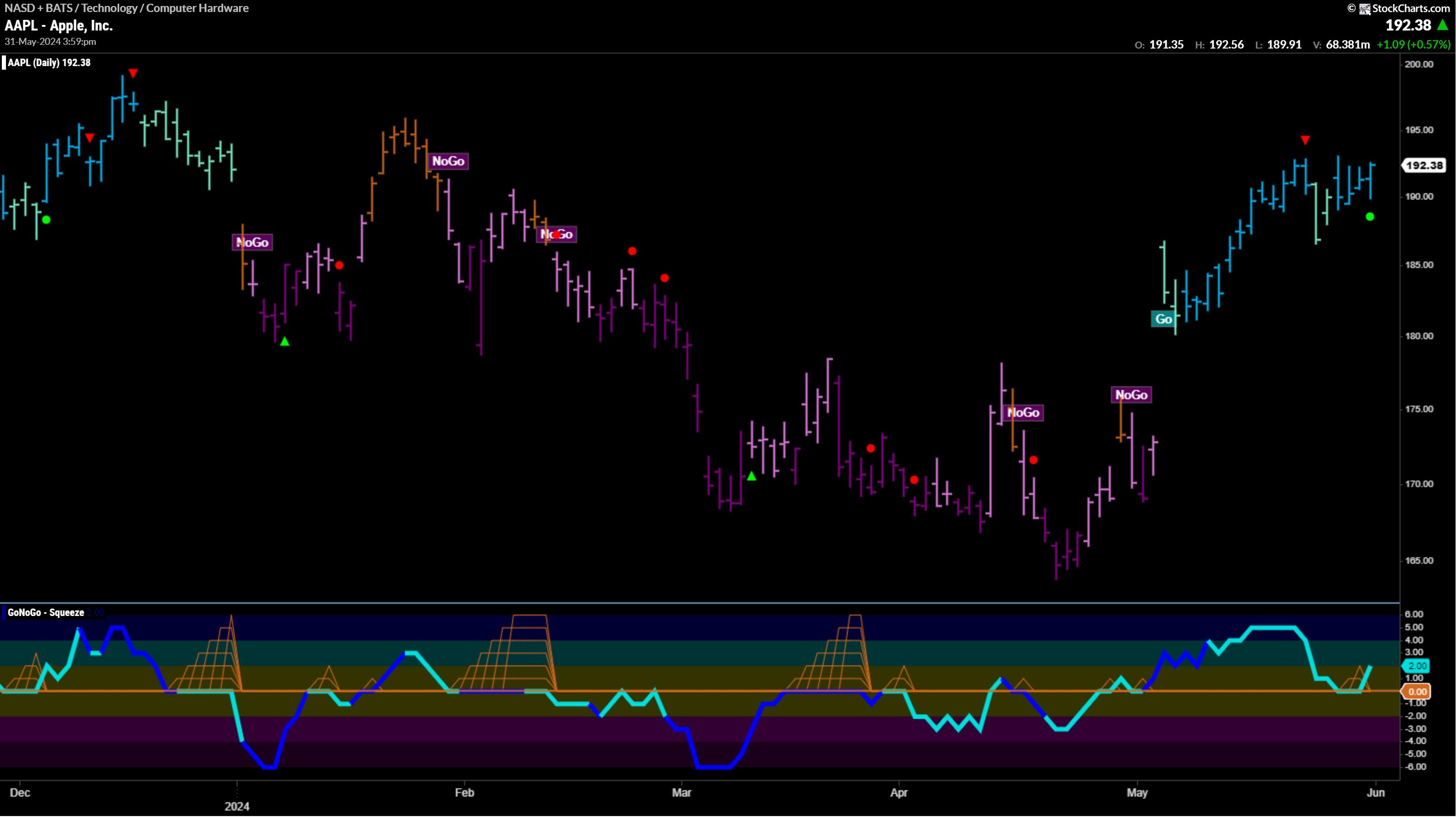
Apple, Inc. (AAPL)

§ GoNoGo Icons signaled a trend continuation on Friday (05/31/24).
§ After a sharp reversal last Friday, price climbed higher finishing the week on strong "Go" conditions painting blue bars back at prior highs.
§ GoNoGo Oscillator found support at the zero line this week, building a small squeeze before rising positive on Thursday and Friday.
§ AAPL has traded on light relative volume for the past three weeks.
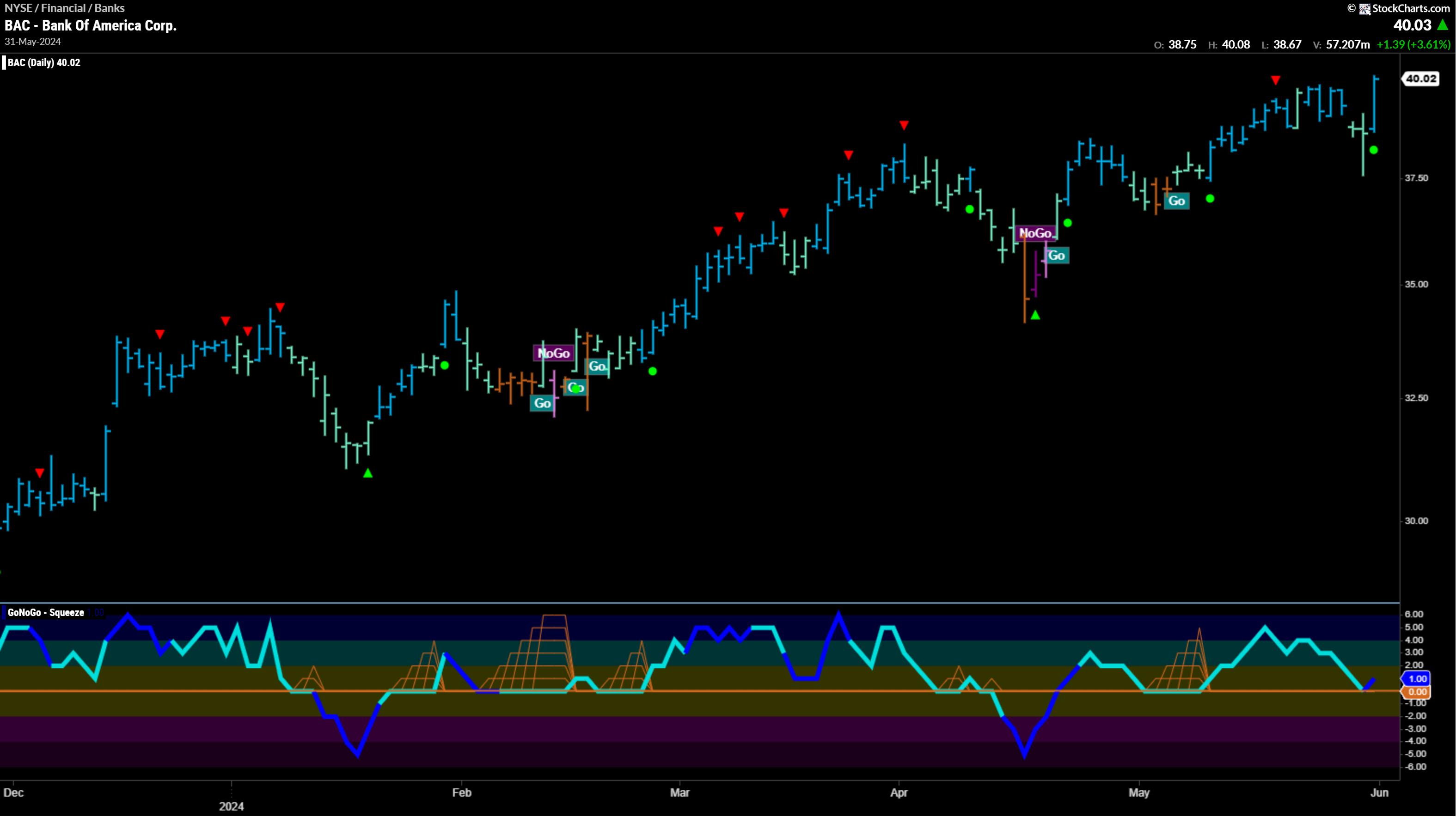
Bank of America Corp. (BAC)

§ GoNoGo Trend returned to strong blue "Go" conditions to conclude the trading week just above prior highs at $40/share.
§ After a heavy wide range of trading Thursday, price closed right back up at the open.
§ GoNoGo Icons signaled a trend continuation on Friday (05/31/24).
§ GoNoGo Oscillator ended the week in positive territory finding support at zero.
§ Volume picked up during Friday's strong rally.
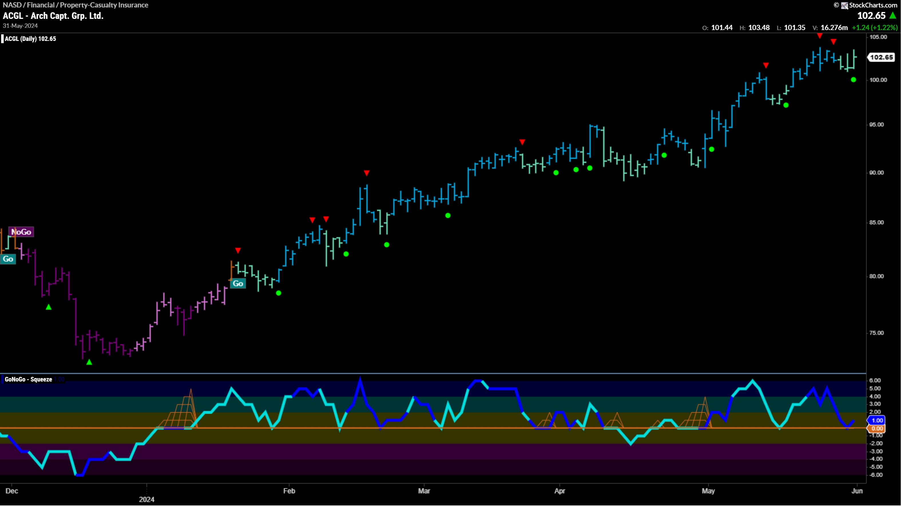
Arch Capt. Grp. Ltd. (ACGL)

§ GoNoGo Trend sustained "Go" conditions, though it softened to weak form aqua bars the second half of the trading week.
§ GoNoGo Icons signaled a trend continuation on Friday (05/31/24).
§ GoNoGo Oscillator ended the week in positive territory after testing the zero line on heavy relative volume.
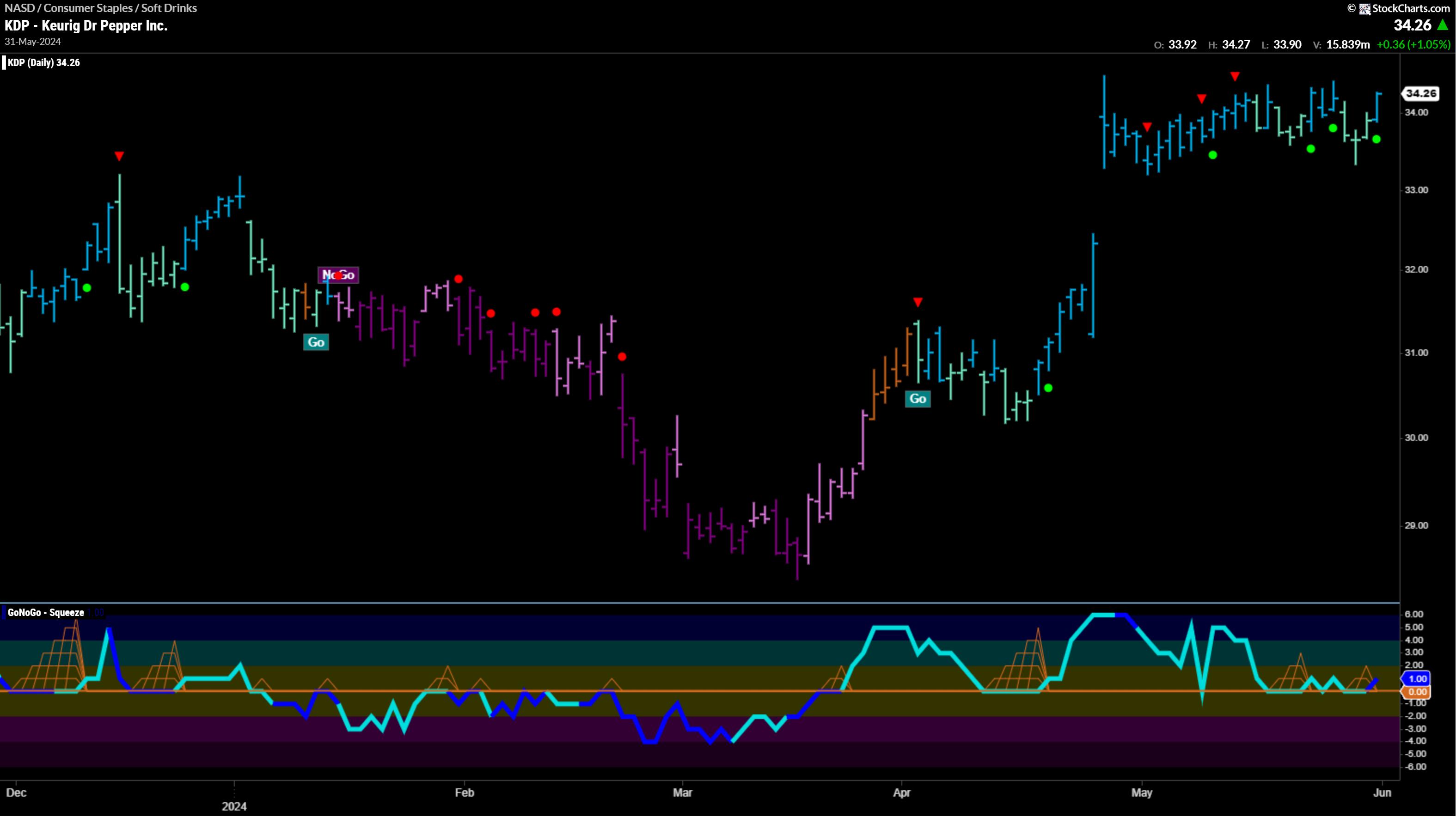
Keurig Dr Pepper Inc. (KDP)

§ GoNoGo Trend returned to strong blue "Go" conditions to end this trading week.
§ This recovery follows weakening trend conditions and corrective price action.
§ GoNoGo Icons signaled a trend continuation on Friday (05/31/24).
§ GoNoGo Oscillator retested and found support at the zero line for the 4th time in May showing a cluster of continuation icons.
§ GoNoGo Squeeze® built small grids as momentum compressed at the neutral zero line for the 2nd time in the past two trading weeks.
§ Momentum broke to positive territory on Friday – this time rallying on heavy relative volume.
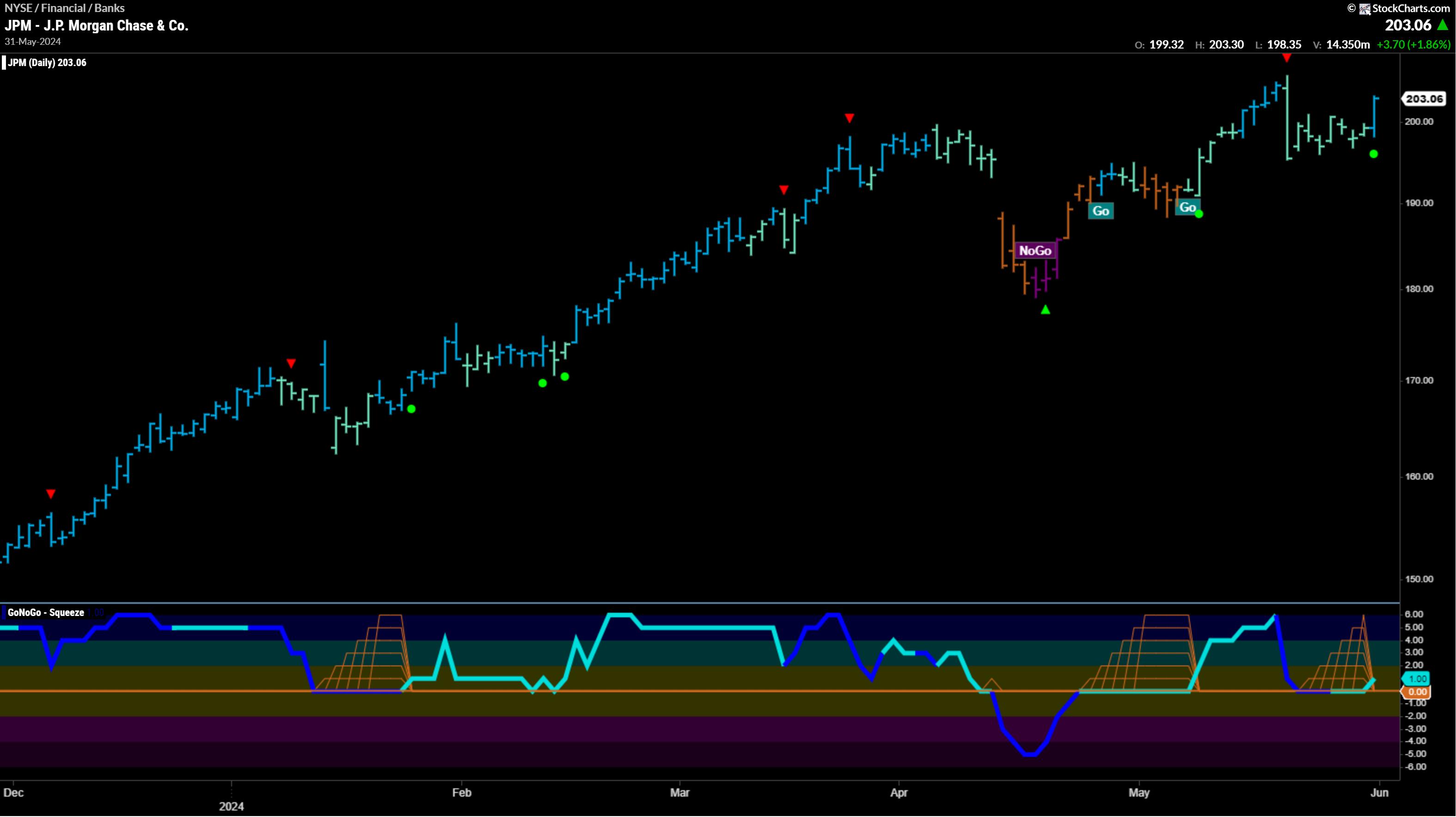
J.P. Morgan Chase & Co. (JPM)

§ GoNoGo Trend ended the trading week on strong blue "Go" conditions.
§ GoNoGo Icons signaled a trend continuation on Friday (05/31/24).
§ GoNoGo Oscillator entered the trading week at the neutral zero line, building a squeeze, before breaking back into positive territory again on Friday.
§ JPM is trading on light relative volume.
Add the GoNoGo Plug-In for StockCharts Here
|
| READ ONLINE → |
|
|
|
| ChartWatchers |
| From Summer Doldrums to Year-End Surge: How to Profit from Seasonal Trends in Precious Metals and Bitcoin |
| by Karl Montevirgen |

Safe-haven investments like gold, silver, and now Bitcoin have had a bumpy and uncertain rise, but they've all ascended despite mixed opinions from analysts. This rise is due to fears of inflation (or slow growth with inflation), record-high US national debt, changing Fed rate expectations, and record purchases by central banks, especially among the BRICS nations.
Except for Fed rate cuts, which might happen sometime toward the end of the year, much of everything mentioned above is likely to continue in the direction they've been going—which is against the US dollar('s value of).
Bearish Near-Term, Bullish Long-Term
Aside from interest rates remaining steady, if not another hike (depending on the upcoming trio of inflation reports), there's another reason to anticipate a potential dip before the next leg up: seasonality.
Gold, silver, and Bitcoin all experience summer doldrums. So, based on this expectation, should this seasonal pattern repeat this year, let's assume there might be a dip in the near-term followed by a potential bullish surge toward the end of the year. If you want to get into any of these safe havens, might this summer be a time to load up on positions?
Tools for Analysis
The objective is to examine the seasonality outlook and compare it to the current price context. To do this, it helps to look at StockCharts' Seasonality tool and the tools in StockChartsACP to fine-tune your analysis. This article will use the Fibonacci Retracement tool and the Money Flow Index (MFI) to fine-tune its analysis.
Seasonal Hot Summer "Dips" in Gold, Silver, and Bitcoin
Since you're likely a stock trader or investor, let's not just look at each asset's seasonality by itself, but compare its seasonal performance against the S&P 500 ($SPX) to see its historical performance against the broader market (which may bear similarity to your portfolio).
Using StockCharts' Seasonality tool, pay attention to the following two figures and note that we're looking at a 10-year seasonality cycle:
- The bars (and numbers above them) represent the % frequency of the asset closed higher, in this case, relative to the S&P.
- The % figure at the bottom of the bar reflects the average return over 10 years relative to the S&P 500.

CHART 1. SEASONAL 10-YEAR CHART OF BITCOIN AGAINST THE S&P 500. Note the higher-close rate versus the average returns.
Bitcoin's higher close rates and returns in June and July are decent, with August being the worst-performing month (summer doldrums). But almost all months tend to get dwarfed by the October higher close rates and returns (89% higher closes and a 22.5% average return).
Now, let's look at silver's ($SILVER) performance.

CHART 2. SEASONAL 10-YEAR CHART OF SILVER AGAINST THE S&P 500. Note the weakest performances in June and November vs. its outperformance in December.
Not quite as brilliant as Bitcoin, but silver ($SILVER) is the neglected sibling among the three. Compared to the S&P 500 (remember, we're not looking at each asset's seasonality on its own), June through November tend to hover from negative to almost no movement despite the higher closing rates in August and October. November is the worst month for silver, but December is the month the white metal tends to outshine the broader market, with a 67% higher close rate and a 4% return. Again, this supports the bearish to bullish pattern that the market tends to be expecting on a fundamental basis.
And finally, gold.

CHART 3. SEASONAL 10-YEAR CHART OF GOLD AGAINST THE S&P 500. December and January are the strongest months for gold compared to the broader market.
Relative to the S&P, gold's ($GOLD) performance looks similar to that of silver's, with November being the worst month and December (but also January) exhibiting the strongest relative performance, with a 67% higher close rate and a 2.3% average return over the last 10 years.
So, if you reshuffle your portfolio with these safe-haven assets, you'd have to figure out which assets you'd be overweight and when while maintaining your broader market portfolio.

CHART 4. DAILY CHART OF BITCOIN. The crypto is in a trading range, but momentum is declining.
According to some analysts, during the traditionally slower summer months, prices may seek a new catalyst, potentially causing Bitcoin to drop below $50,000. Also, note the slight bearish divergence in the declining Money Flow Index (MFI) line and the almost flat range, signaling a drop in buying momentum. Assuming that's the case, prices would first have to break below support a few points above the 38.2% Fibonacci retracement level (see blue arrow). A drop below this level would likely find support above the 50% Fib level (see blue arrow), below which we see the $50,000 price mark.
There's likely to be some technical buying activity near this level. However, should prices continue drifting lower, the range between 50% and 61.8%, an ideal buying range, would also coincide with a four-week historical congestion range (see blue rectangle) above which there may be strong support. You should reassess your bullish outlook if the price falls below this level.

CHART 5. DAILY CHART OF SILVER. Note the strong surge in silver. Is it topping or does it have more room to run?
The slight divergence in the MFI shows a stronger price surge against slightly weakening momentum. Still, it makes you wonder if silver may be topping. As an industrial metal, in addition to being a monetary metal, silver has a different fundamental path. Nevertheless, it has a similar seasonality profile to Bitcoin and gold—summer weakness and end-of-year strength.
If prices top at the current highs, silver would have to break below its swing low (see blue dotted line), coinciding with the 23.6% Fib level. A break below this would likely find support at the 38.2% line coinciding with former resistance (see blue arrow). The next swing low, also an ideal buying range for those looking to go long, would be near $26.25, where the 61.8% Fib level sits.

CHART 6. DAILY CHART OF GOLD. Gold looks like it's topping. But there's plenty of clear support below it.
It looks like an intermediate-term double-top pattern, but whether this ends up being a correction or a much longer decline depends on several factors, one of which is the Federal Reserve's rate actions.
Assuming a correction, the blue arrows indicate clear market-based support (and potential resistance-turned-support) levels. These coincide with the 38.2%, 50%, and 61.8% Fib retracements. Similar to the Bitcoin example above, you can also see a downsloping MFI line from the overbought range, indicating a slight weakening in buying pressure. If you're following the seasonal narrative, near-term weakness followed by a bullish run toward the end of the year, the range between the 50% and 61.8% Fib levels may be a favorable entry. Just be sure to buy when technical conditions, from patterns to momentum, indicate a strong bullish reversal.
The Takeaway
When "buying the dip," identify strong reversal patterns and signs of bullish momentum. Despite the mixed opinions analysts may have on these three safe-haven assets, they have all responded to inflation, changing Fed rate expectations, and strong central bank buying (concerning gold, but also as an indication of challenges in the global economy and the US dollar).
Seasonality-wise, these assets often experience summer doldrums, potentially leading to near-term dips before a bullish surge towards the end of the year. If you're considering going long, this summer might present an opportunity to buy. Keep an eye on the Fib levels.
How to Access the Seasonality Tool
There are different ways to access the seasonality tool in StockCharts.
- Click the Charts & Tools tab at the top of the StockCharts page, enter a symbol in the Seasonality panel, and click "Go."
- Enter the symbol in the ChartBar at the top of the page and select "Seasonality" from the dropdown menu on the left.
- From Your Dashboard, in Member Tools, click on Seasonality.
- Below the seasonality chart, you'll find links to instructions and quick tips that give more detailed instructions.

Disclaimer: This blog is for educational purposes only and should not be construed as financial advice. The ideas and strategies should never be used without first assessing your own personal and financial situation, or without consulting a financial professional.
|
| READ ONLINE → |
|
|
|
| MORE ARTICLES → |
|
