| THIS WEEK'S ARTICLES |
| The Mindful Investor |
| Tracking the Three Signs of the Bear |
| by David Keller |
There is no denying that the primary trend for the S&P 500 remains bullish as we push to the end of Q2 2024. But what about the conditions "under the hood" of the major benchmarks? Today, we'll highlight three "signs of the bear" we're looking for, of which two may have already triggered, and what sort of confirmation could indicate a bearish reversal into the summer.
The first thing I've noticed about major market tops is that we tend to observe a proliferation of bearish momentum divergences. As prices push higher, we begin to see weaker momentum readings using an indicator like RSI. Let's check out how the recent upswing for the S&P 500 has looked from a momentum perspective.
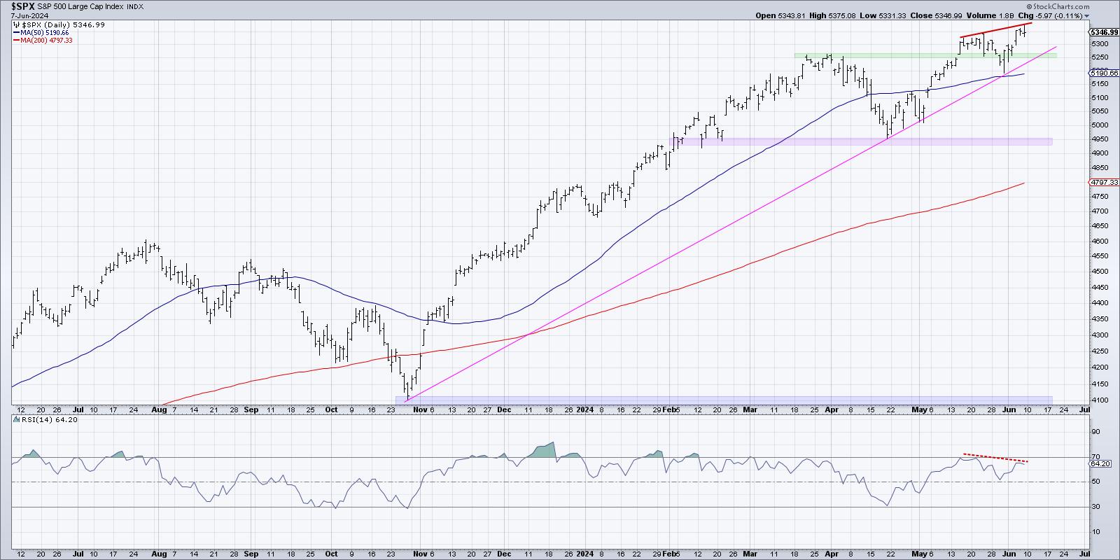
Here, we can see that the S&P 500's RSI was around 70 when it first closed above 5300 in mid-May, but only around 65 on the recent push above 5350. Higher highs on weaker momentum indicates a potential exhaustion of buyers, with less emphasis on the most recent upswing.
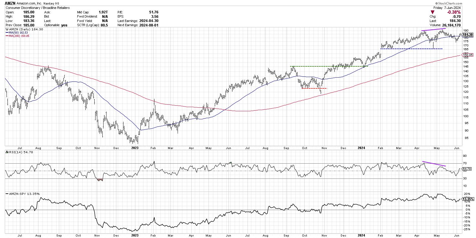
And it's not just about the S&P 500. Check out the daily chart of Amazon.com (AMZN), for a similar example in mid-May.
We can also see the bearish momentum divergence on stocks in the industrial sector, such as Northeast Ohio's own Eaton Corp. (ETN).
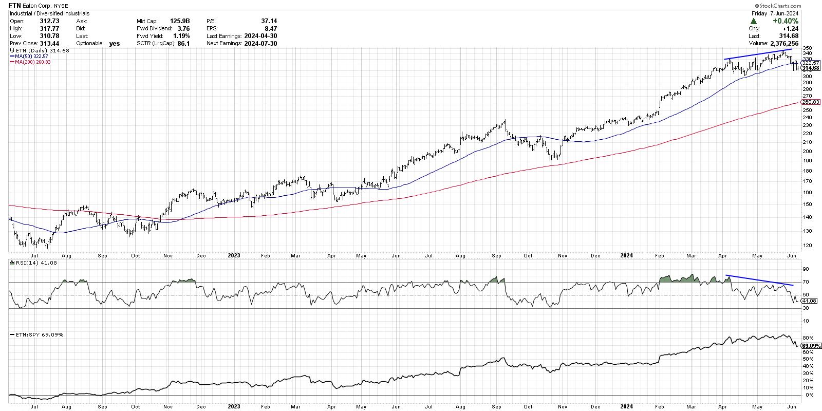
While I would say next week is crucial for the S&P 500, to see if there's another push above 5350 on stronger momentum, overall, the move higher in June generally speaking has been marked with lower momentum readings.
These "signs of the bear" are all part of a larger list that I call my Market Top Checklist, which is coming in super handy right about now! Want to follow along as we track each of the items on the checklist to gauge a potential market top in the summer? You need to be a Market Misbehavior premium member! Don't forget to use code STOCKCHARTS for 20% off your first 12 months!
Another sign of the bear that I'd argue is very much in play is a lack of confirmation from market breadth indicators. Here's a chart of the S&P 500 on a closing basis, along with the cumulative advance-decline lines for the New York Stock Exchange, S&P 500 large-caps, S&P 400 mid-caps, and S&P 600 small-caps.
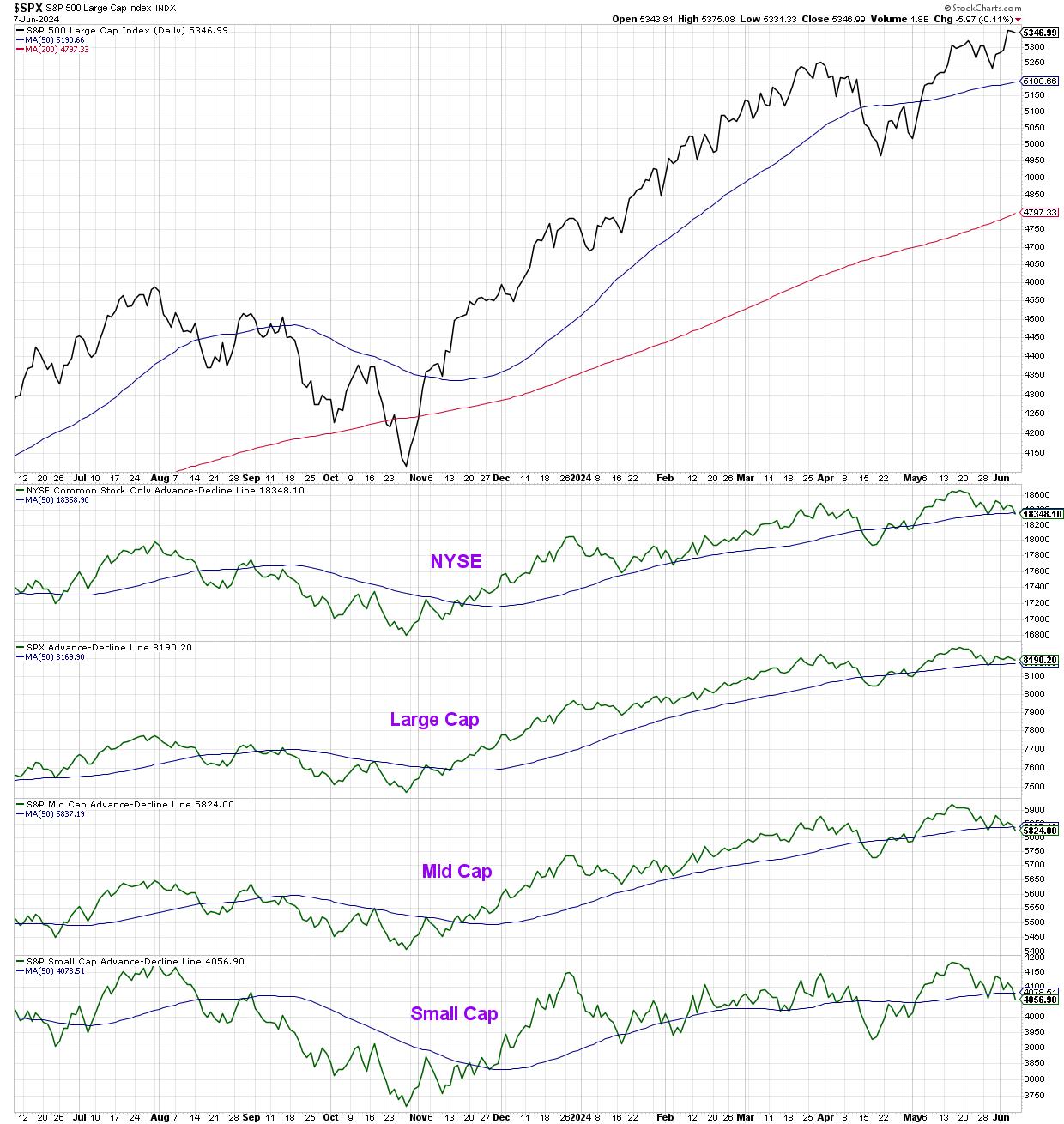
Note that not only are all four of those advance-decline lines sloping lower over the last three weeks, but three of them finished this week below their 50-day moving averages. When a market moves higher, but breadth conditions fail to confirm those new highs, this suggests narrow leadership and potential toppy conditions.
I know what you're thinking: "But Dave, isn't that just because the Magnificent 7 stocks are dominating again?" And yes, you would be correct. And while our major benchmarks can indeed move higher driven by those mega-cap growth stocks, market history has shown that a healthy bull market phase tends to be marked by improving breadth readings. I'd feel way more optimistic about market conditions if I observed more stocks participating in the uptrend!
Now we come to the third sign of the bear, which is the breaking of "lines in the sand" for the major averages. Going back to our daily S&P 500 chart, do you see the pink trendline using the major lows since October 2023?
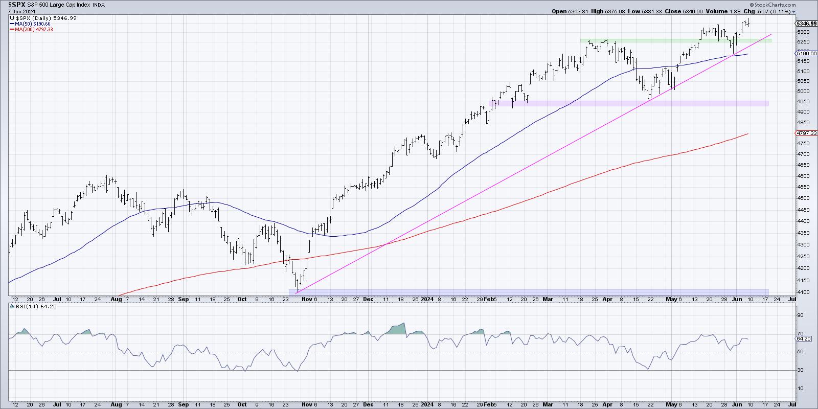
If you connect the October 2023 low to the mid-April low around 4950, you'll see that trendline connects almost perfectly with subsequent lows in April and May. As long as the S&P 500 remains above this trendline, then the primary bull trend would remain largely intact. But if and when the SPX fails to hold this trendline, and perhaps if it would break below price and moving average support around 5200, then I would strongly consider planning for much further downside for risk assets.
In established bull market phases, mindless investors tend to think only of potential upside, as they believe the bull market will never end. Mindful investors know that, by looking for signs of a potential rotation, you can better protect your previous gains in the event of a downside correction!
RR#6,
Dave
P.S. Ready to upgrade your investment process? Check out my free behavioral investing course!
David Keller, CMT
Chief Market Strategist
StockCharts.com
Disclaimer: This blog is for educational purposes only and should not be construed as financial advice. The ideas and strategies should never be used without first assessing your own personal and financial situation, or without consulting a financial professional.
The author does not have a position in mentioned securities at the time of publication. Any opinions expressed herein are solely those of the author and do not in any way represent the views or opinions of any other person or entity.
|
| READ ONLINE → |
|
|
|
| Martin Pring's Market Roundup |
| MEMBERS ONLY |
| It's Time to Take a Look at the Canadian and Australian Dollars and What They Imply for Inflation |
| by Martin Pring |
|
The Canadian and Aussie dollars have been confined between two converging trendlines since the beginning of the century, as we can see from Chart 1. The moment of truth appears to be close at hand, as both are approaching the apex of a giant potential symmetrical triangle...
|
| READ ONLINE → |
|
|
|
| OptionsPlay |
| A Practical Options Strategy to Trade Home Depot |
| by Tony Zhang |

America's largest home improvement store, Home Depot, Inc. (HD), has benefited from a long period of investor interest and traded at a premium valuation for several years. However, the recent environment of slowing consumer spending and higher interest rates has finally caught up with HD; the risks are to the downside, below $300.
After rallying toward its all-time highs just shy of $400, HD has pulled back below its key $350 and $335 support levels and is at risk of continuing lower. HD's relative performance recently reached a new 52-week low. This suggests further downside risks, with targets at the next support lower, just below $300.
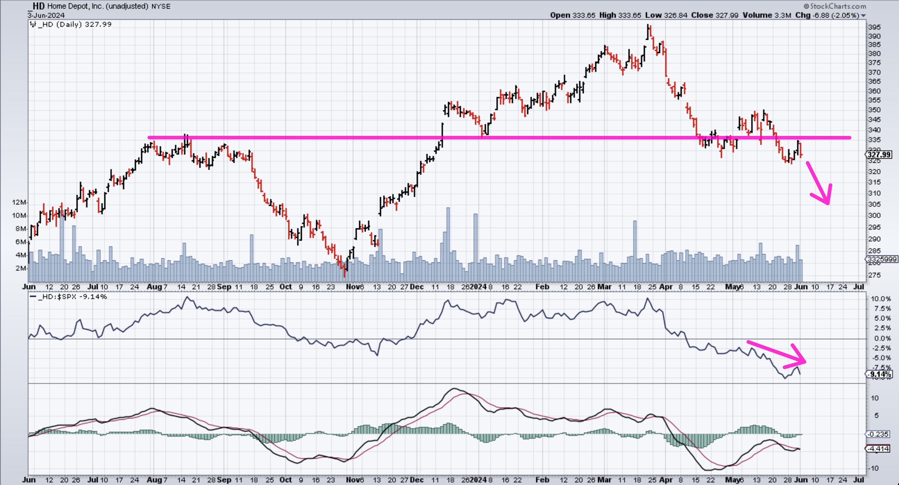
FIGURE 1. DAILY CHART OF HOME DEPOT (HD). The price of HD stock has broken below a key support level and could see further downside.Chart source: StockCharts.com. For educational purposes.
Trading at 21x forward earnings, HD is still trading at a premium, given that analysts are only expecting Earnings-Per-Share (EPS) and Revenue to grow at low single-digit levels, while net margins sit below 10%. The reality is that with relatively thin margins and consumer spending further slowing down, HD will have a tougher time commanding the same type of premium valuation relative to the market.
Options are inexpensive now, so buying downside exposure is cheap, and can be done by going out to August and buying the $325/300 Put Vertical @ 6.50 debit. This entails buying a higher strike put and selling a lower strike one (see below).
- Buying the Aug $325 Puts @ $9.35 Debit
- Selling the Aug $300 Puts @ $2.85 Credit
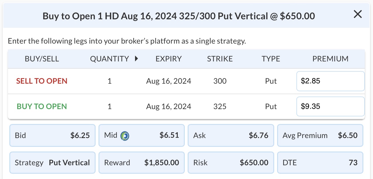
FIGURE 2. EXAMPLE OF A PUT VERTICAL SPREAD OPTIONS TRADE FOR HD.
This would risk a total of $650 ($935 - $285) per contract if HD is above $325 at expiration, while potentially making nearly three times that of $1,850 per contract if HD is below $300 at expiration.

|
| READ ONLINE → |
|
|
|
| Art's Charts |
| Visualizing the Holdings for a Dual Momentum Rotation Strategy |
| by Arthur Hill |
As the name suggests, Dual Momentum Rotation Strategies focus on stocks that are in absolute and relative uptrends. This is a two-step process. First, filter out stocks that are in long-term downtrends and only focus on stocks in uptrend. Second, rank the stocks by a performance indicator and focus on the strongest. Note that TrendInvestorPro runs two Dual Momentum Rotation Strategies.
Traditional trend-following indicators, such as the 200-day SMA, measure absolute momentum. For example, a stock is in a long-term uptrend when above its 200-day SMA. Stocks trading below their 200-day SMAs are in long-term downtrends and do not make the cut for the second step.
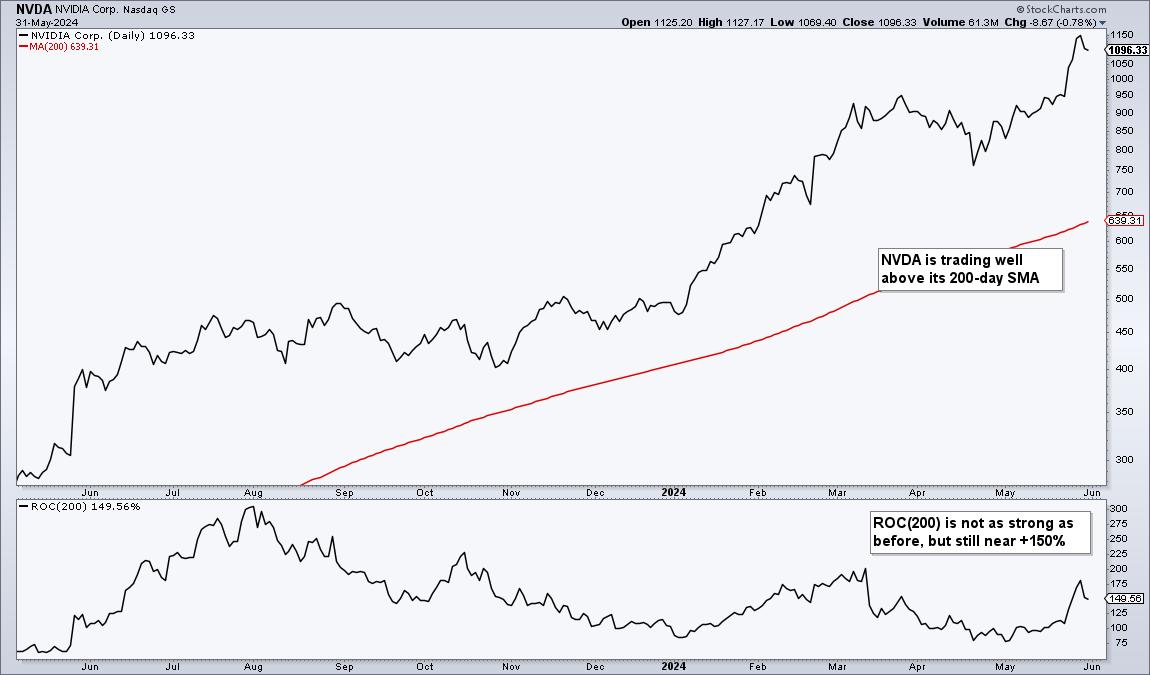
For stocks in long-term uptrends, chartists can then quantify performance using the 200-day Rate-of-Change and comparing values to find the strongest. A stock with a 49% Rate-of-Change is stronger than a stock with a 19% Rate-of-Change.
The image below shows CandleGlance charts for the top Nasdaq 100 stocks. They are ranked by the 200-day Rate-of-Change (ROC(200)). "Add indicator" is Rate-of-Change 200 and "Sort by Indicator" is Descending (red outline). These 12 are also above their 200-day SMAs (red lines) and in long-term uptrends.
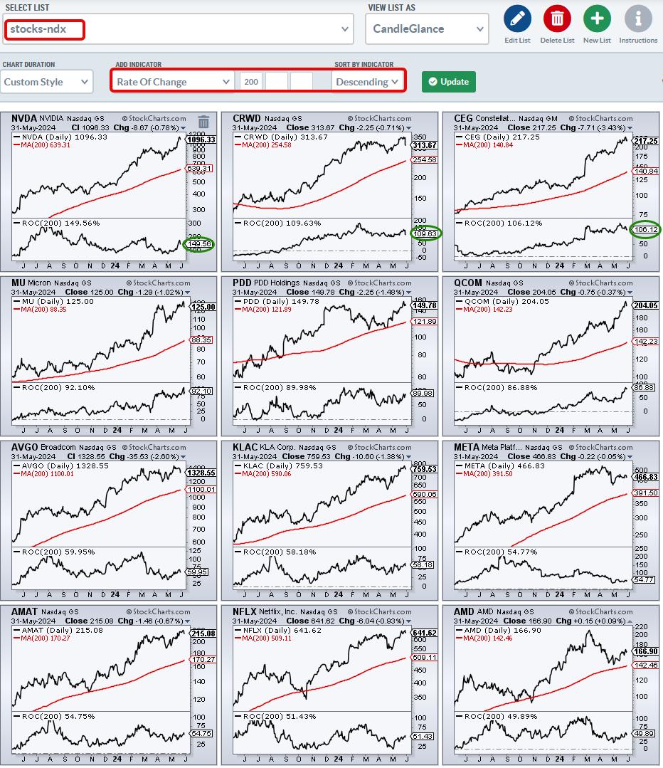
As the green ovals show, Nvidia (NVDA), Crowdstrike (CRWD) and Constellation (CEG) are up over 100% the last 200 days and the other nine are up 50% or more. Chartists running a Dual Momentum Rotation Strategy would be focused on these leading names when constructing a portfolio. Strength begets strength.
We use a similar process for our Dual Momentum Rotation Strategies at TrendInvestorPro. Instead of raw Rate-of-Change, we use a volatility-adjust version to level the playing field. NVDA, CRWD and CEG are part of the current portfolio for the Nasdaq 100 strategy. We also have a separate strategy for S&P 500 stocks. Both strategies are off to a great start this year and you can view full performance metrics here.
///////////////////////////////////
|
| READ ONLINE → |
|
|
|
| ChartWatchers |
| S&P 500 Still Bullish: This Is What You Should Watch For |
| by Jayanthi Gopalakrishnan |

It was a bit of a seesaw week in the stock market, but, overall, the market seems to think everything is looking good.
The May employment report indicated that the change in Non-Farm Payrolls (NFP) was stronger than expected. It came in at 272,000, significantly higher than the estimated 190,000. The unemployment rate climbed to 4%, and wages rose 4.1% in the past year.
The market's initial reaction? Well, treasury yields spiked after the report was released, and equity futures turned sharply lower. However, that didn't last long. At one point, the S&P 500 reached a new all-time high but closed lower. The number of added jobs weakens the probability of an interest rate cut. But isn't that what the market is expecting? Long-term, things are looking fine. Let's take a closer look.
Starting with the weekly chart of the S&P 500 ($SPX), it's clear the trend is still bullish, as is momentum (see chart below). Until this changes, there's no reason to think equities are setting up for a significant selloff.
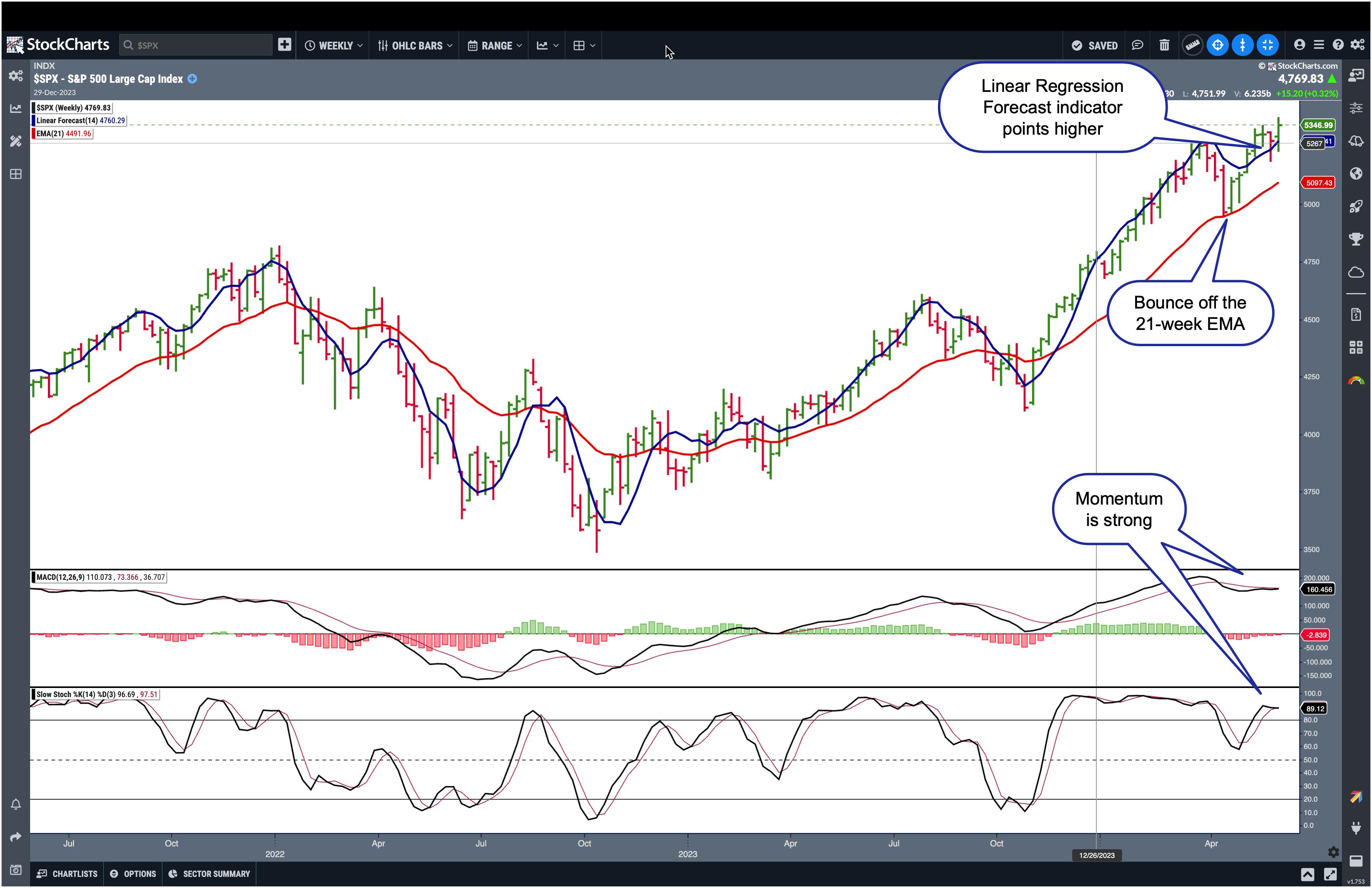
CHART 1. WEEKLY CHART OF THE S&P 500 INDEX. The bullish trend is still intact and momentum continues to be strong.Chart source: StockChartsACP. For educational purposes.
The weekly perspective remains strong, with the S&P 500 trading above its 21-week exponential moving average (EMA). The index bounced off its 21-week EMA (red line), and, with the exception of a reversal last week—which didn't put much of a dent in its bullish path—it continues to trend higher.
The Linear Regression Forecast (LRF) indicator (blue line) also indicates an upward trend. Since the LRF is based on the line of best fit, it can be considered a good indicator to measure the near-term trend. The last point of this indicator forecasts price direction, which, in the weekly chart, points higher.
Momentum also seems strong, with the moving average convergence/divergence trending higher and the stochastic oscillator well in overbought territory. So, from a weekly perspective, the S&P 500 looks bullish.
Does the picture change on the daily chart? Let's take a look.
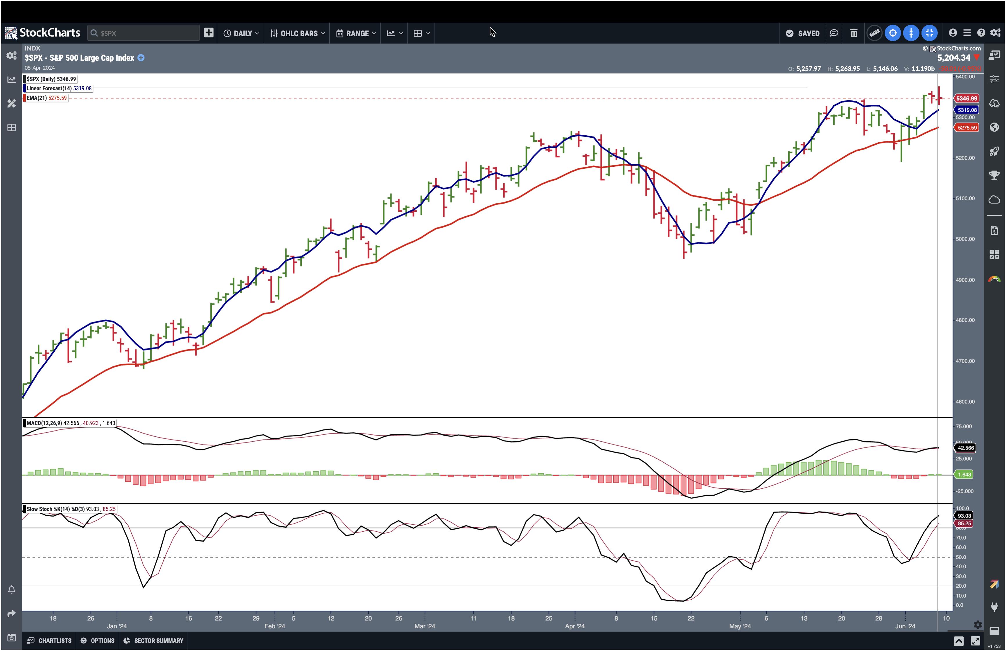
CHART 2. DAILY CHART OF THE S&P 500 INDEX. It may be a little more choppy than the weekly chart, but the trend is still bullish, and the momentum is strong.Chart source: StockChartsACP. For educational purposes.
The daily chart is a little more choppy than the weekly one, but it still suggests the S&P 500 is trending higher. The market had a bumpy ride at the end of May, but it recovered.
Watching a breadth indicator to see if it supports the trend is a good idea. There are several breadth indicators available in StockCharts.com, such as the Advance-Decline Line, McClellan Oscillator, and the Bullish Percent Index (BPI).
The chart below displays the BPI for the S&P 500. When the BPI is above 50, it indicates that bulls have the edge, with 70 representing overbought levels and 30 oversold, although you can use different thresholds.
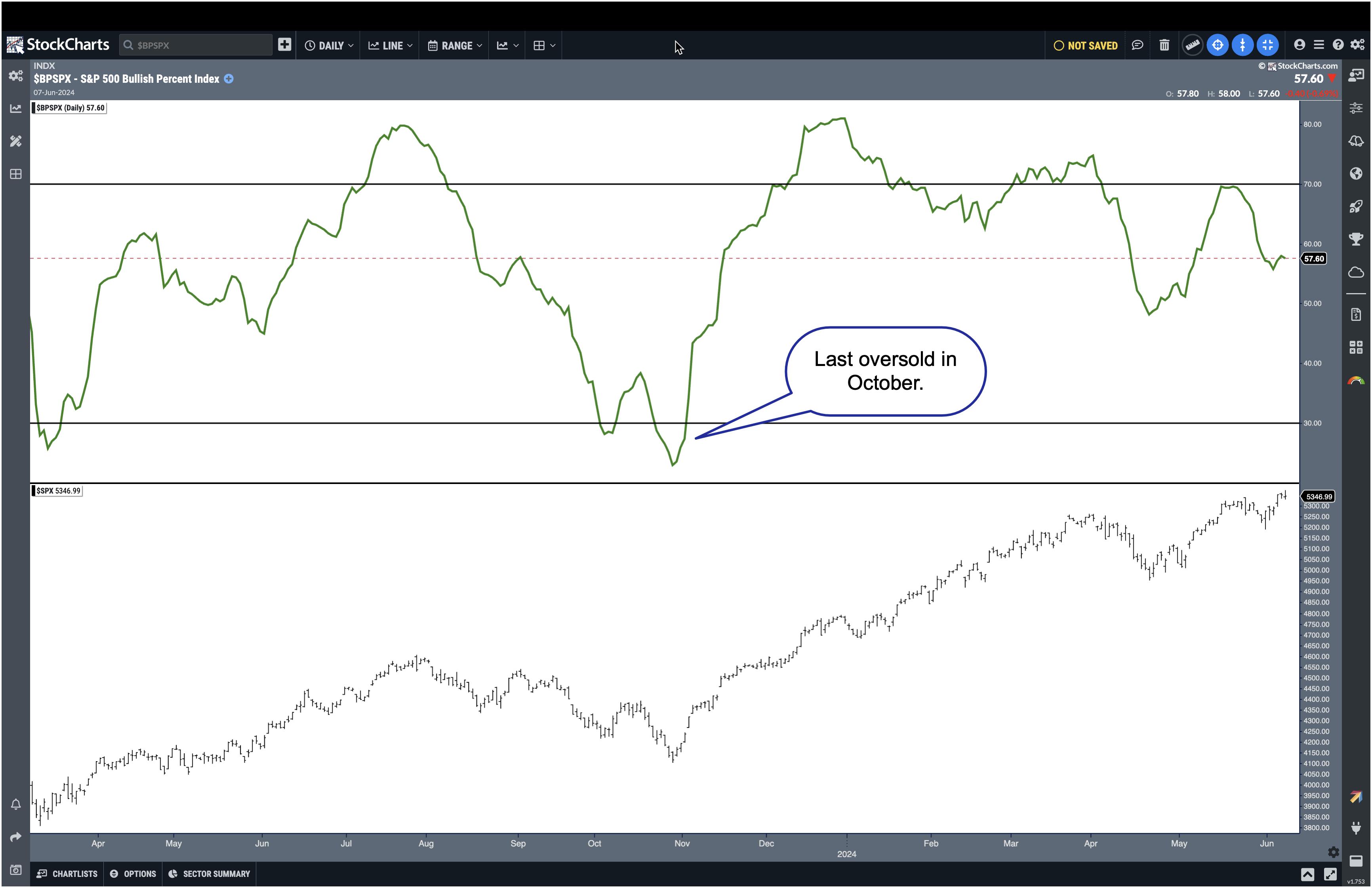
CHART 3. S&P 500 BULLISH PERCENT INDEX. The BPI indicates the S&P 500 is still bullish.Chart source: StockChartsACP. For educational purposes.
It's interesting to note that the S&P 500's BPI hasn't been below 30 since the end of October. This suggests that the overall market continues to be bullish.
Another confirming indicator is the Volatility Index ($VIX), which continues to be low. Investors are not showing any signs of panic.
Bond Market Action
One interesting piece of the stock market puzzle is the bond market, which tends to move on the jobs data. With yields coming down, bond prices started to move up. The daily chart of the iShares 20+ Year Treasury Bond ETF (TLT) below shows that TLT broke out above its downward-sloping trendline and broke above its last significant high (May 16). But Friday's price action sent Treasury yields higher, and bond prices fell below their May high.
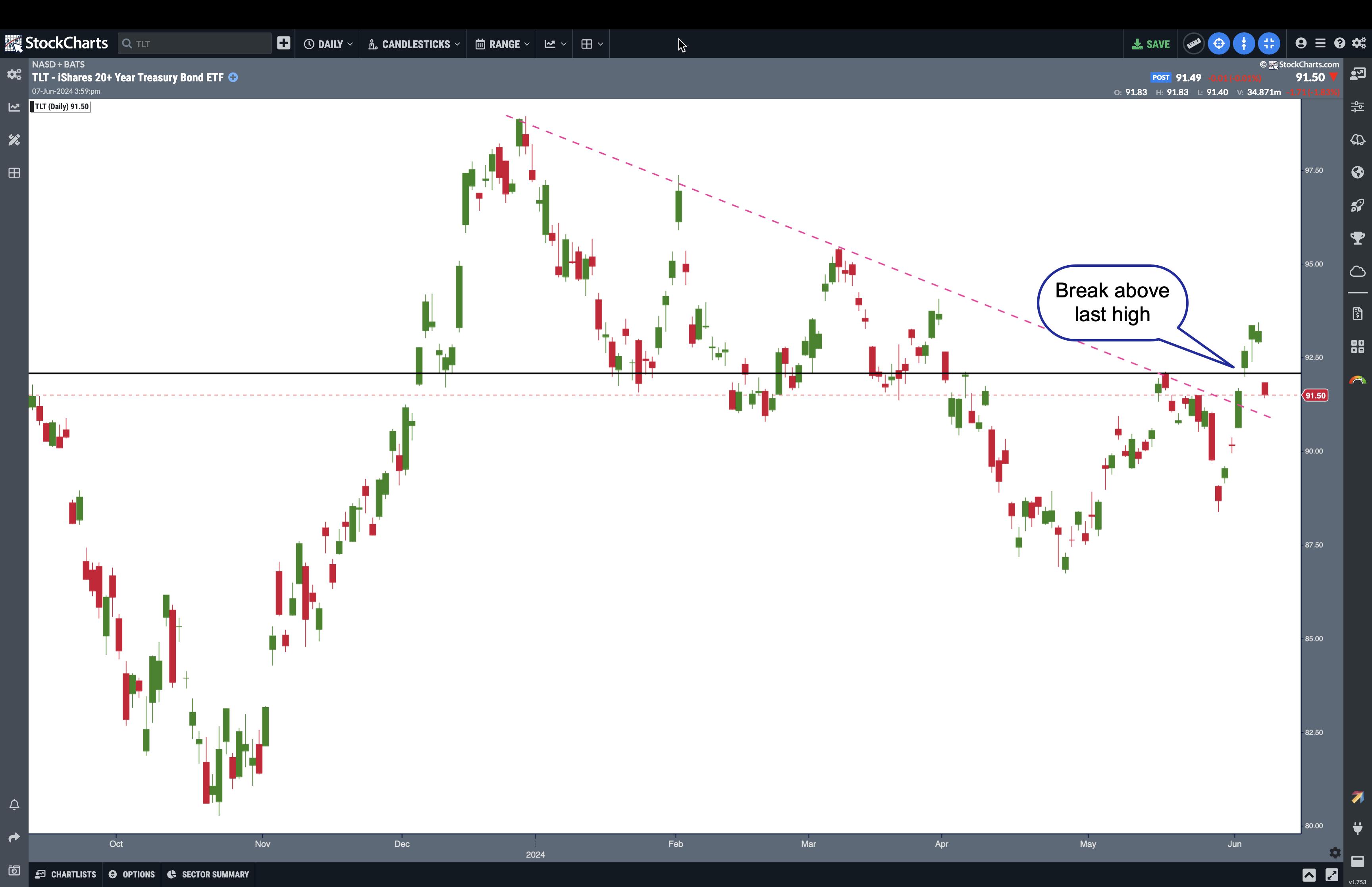
CHART 4. DAILY CHART OF ISHARES 20+ YEAR TREASURY BOND ETF (TLT). After breaking above its last high, bond prices declined. It remains to be seen if this is a correction or a sign that bonds are still struggling.Chart source: StockChartsACP. For educational purposes.
While one day's action doesn't signify a trend reversal, it's a good idea to watch the action in the bond market. Add this chart to your ChartLists and keep an eye on whether TLT breaks above its May high. If it does, it could further confirm that bonds are trying to come off their lows.
Another point not to be missed is the action in the US dollar, another asset that reacts to jobs data. The greenback spiked in today's trading. So, we have a situation where bond yields spiked, the dollar spiked, and equities were relatively flat. On the other end of the spectrum, metals got clobbered. Do metal traders know something about the inflation data?
Everything rests on next week's action, which is a data-heavy week. There's the Consumer Price Index (CPI) and FOMC meeting. Given that today's jobs data showed that wages data came in higher, you can bet the CPI data will be watched closely.
Let's see what the Fed says next week. The CME FedWatch Tool shows a small probability of a rate hike in the September meeting, but that could change. The key point to listen for is whether inflation is coming down at the rate the Fed wants to see. The market has priced in one rate cut possibility this year. If we hear otherwise, the market could react either way.
The Takeaway
Technical indicators look good, which suggests that the stock market is still bullish. But watch market breadth and the VIX. If they start to turn—it has to be a significant reversal—then you can start worrying. In other words, if you think the stock market is toppy and it'll sell off, wait for the confirming indicators to show you the market will sell off.
End-of-Week Wrap-Up

- S&P 500 closes down 0.11% at 5,346.99, Dow Jones Industrial Average down 0.22% at 38,798.99; Nasdaq Composite down 0.23% at 17,133.13.
- $VIX down 2.86% at 12.22
- Best performing sector for the week: Technology
- Worst performing sector for the week: Utilities
- Top 5 Large Cap SCTR stocks: NVIDIA (NVDA); MicroStrategy Inc. (MSTR); Super Micro Computer, Inc. (SMCI); Vistra Energy (VST); Applovin Corp. (APP)
On the Radar Next Week
- May CPI
- Federal Reserve's interest rate decision and press conference
- May PPI
- June mortgage rates
- June Preliminary Michigan consumer and inflation expectations
- Fed speeches (Goolsbee, Cook)
Disclaimer: This blog is for educational purposes only and should not be construed as financial advice. The ideas and strategies should never be used without first assessing your own personal and financial situation, or without consulting a financial professional.
|
| READ ONLINE → |
|
|
|
| DecisionPoint |
| Technology Sector Participation Is Fading |
| by Carl Swenlin |
The Technology Sector (XLK) continues to dominate and drive the rally, but fewer and fewer stocks within the sector are participating in the rally. We know this because our Silver Cross Index (SCI), which shows the percent of stocks in the Technology Sector with Silver Cross BUY Signals (20-day EMA is above the 50-day EMA), is only at 54.60%. Almost half of the stocks are not on BUY Signals.

Further, looking at the seven years of data we have on the SCI (chart below), we were unable to find another case where XLK was making all-time highs with a Silver Cross Index reading so low that didn't lead to price weakness. Of course, we owe this dislocation to the magic of cap-weighting. While fewer and fewer Technology stocks are participating in the rally, the mega-cap stocks are the ones making new highs, and driving up the price of every price index of which they are a component. The numerous negative divergences we can see are telling us that this probably won't continue for long.

Conclusion: Participation within the Technology Sector has been fading since the beginning of the year. Mega-cap stocks are keeping prices elevated for now, but that probably won't last.
Learn more about DecisionPoint.com:
Watch the latest episode of the DecisionPointTrading Room on DP's YouTube channel here!

Try us out for two weeks with a trial subscription!
Use coupon code: DPTRIAL2 at checkout!
Technical Analysis is a windsock, not a crystal ball. --Carl Swenlin
(c) Copyright 2024 DecisionPoint.com
Disclaimer: This blog is for educational purposes only and should not be construed as financial advice. The ideas and strategies should never be used without first assessing your own personal and financial situation, or without consulting a financial professional. Any opinions expressed herein are solely those of the author, and do not in any way represent the views or opinions of any other person or entity.
DecisionPoint is not a registered investment advisor. Investment and trading decisions are solely your responsibility. DecisionPoint newsletters, blogs or website materials should NOT be interpreted as a recommendation or solicitation to buy or sell any security or to take any specific action.
Helpful DecisionPoint Links:
Trend Models
Price Momentum Oscillator (PMO)
On Balance Volume
Swenlin Trading Oscillators (STO-B and STO-V)
ITBM and ITVM
SCTR Ranking
Bear Market Rules
|
| READ ONLINE → |
|
|
|
| RRG Charts |
| Only One Pocket of Strength Left in US Stock Market |
| by Julius de Kempenaer |
Breaking Down Into Growth / Value
Using Relative Rotation Graphs to help break down the US stock market into various segments can help us identify pockets of strength or weakness. In this first RRG below, we can examine the relationship between value and growth stocks.
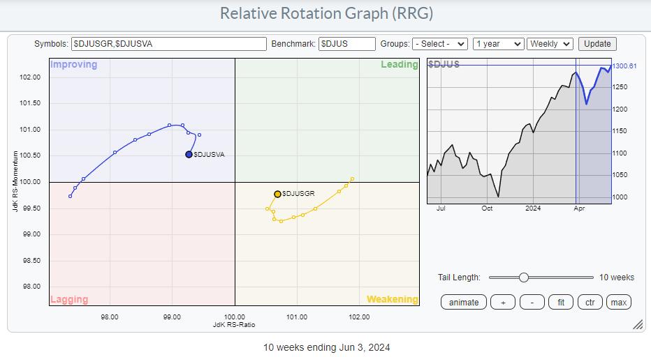
The first important observation is that the growth tail is still on the right-hand side of the graph, inside the weakening quadrant, while the value tail is on the left side of the graph, inside the improving quadrant. This indicates the continuing strength of growth stocks.
However, since mid-March, there has been a strong improvement for value stocks, which pushed the tail into the improving quadrant at a strong heading. By default, the growth tail moved in the opposite direction into the weakening quadrant at a negative heading. Over the last three to four weeks, though, that temporary countertrend move seems to have ended, and the preference is now back to growth stocks.
Breaking Down Into Size
Another way to break down the US stock market is to use size segments: large-cap, mid-cap, and small-cap stocks. The relative rotation graph below shows this breakdown and the rotation of the various tails over the last 10 weeks.
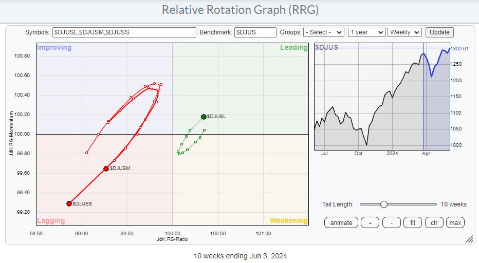
The rotation for these size segments shows characteristics similar to those we have seen in growth and value. Large-caps have predominantly been on the right-hand positive side of the graph, while mid- and small-caps were positioned on the left-hand negative side of the RRG.
Here also, a countertrend move was traced out since mid-March, when mid- and small-caps turned to a positive heading at large-caps' expense. Over the last few weeks, this counter-trend move has ended, and the outperformance for large caps is back in full swing.
Combining Style & Size
By splitting the growth and value segments into their respective size segments, we can see a more granular rotation that combines the two ways of dividing the stock market on one RRG.
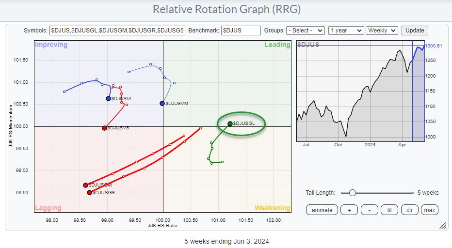
Now things are getting interesting. Out of the six tails on the graph, only ONE is inside the leading quadrant and moving at a positive RRG-Heading. All other tales are traveling in a negative heading.
The strongest negative rotations are found for mid- and small-cap growth stocks. Both tails are further into the lagging quadrant in an almost straight line; a clear offset against the positive rotation for large-cap growth stocks.
The value tails across all size segments have rolled over, and they are now all rotating back toward the lagging quadrant after a brief stint through improving.
These rotations indicate that currently, only one market segment is traveling at a positive RRG heading, which is a large gap in growth stocks. Although this segment contains all the biggest market-cap names, it also inhibits a risk, as the base is very narrow.
Chart-by-Chart
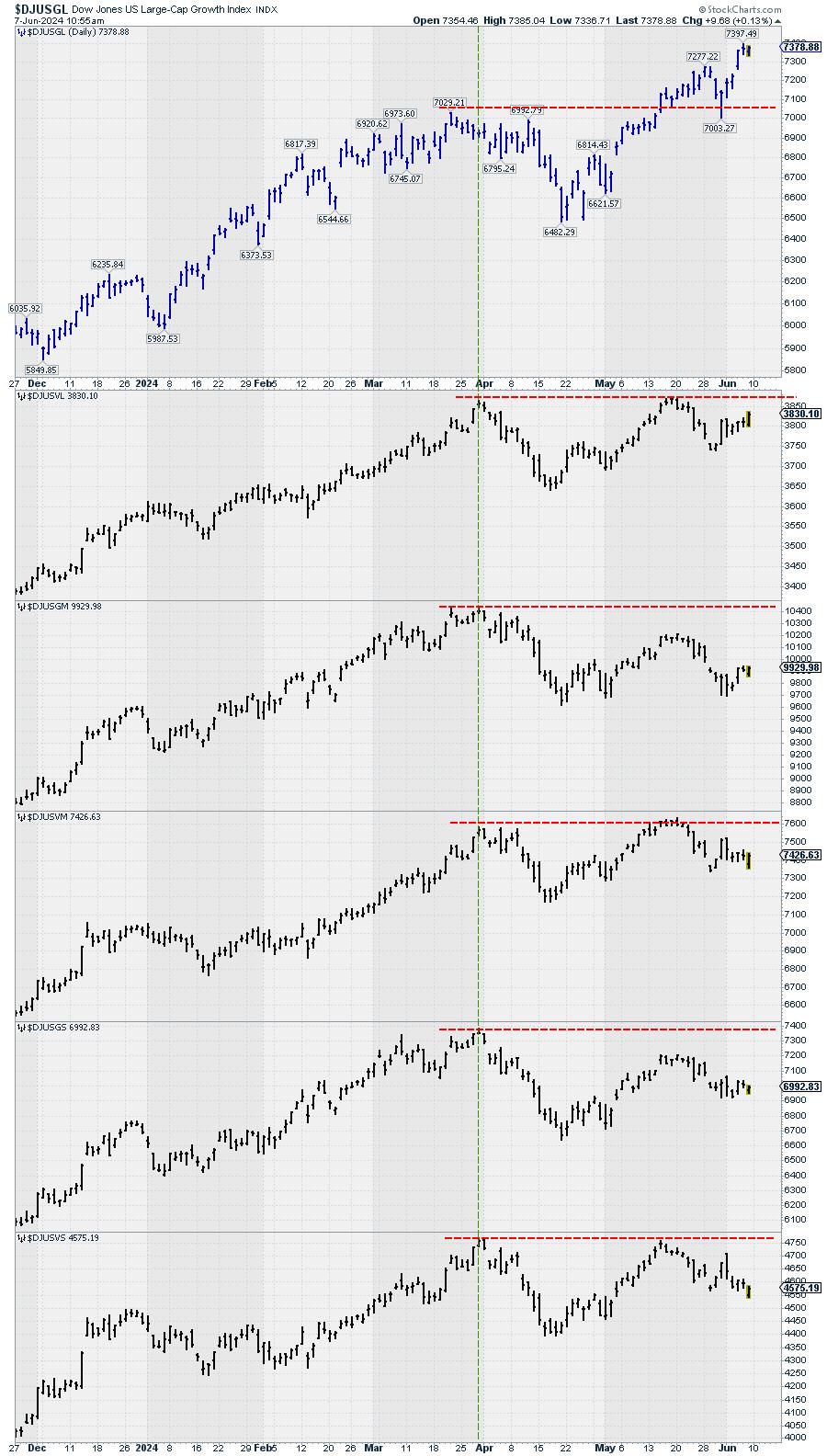
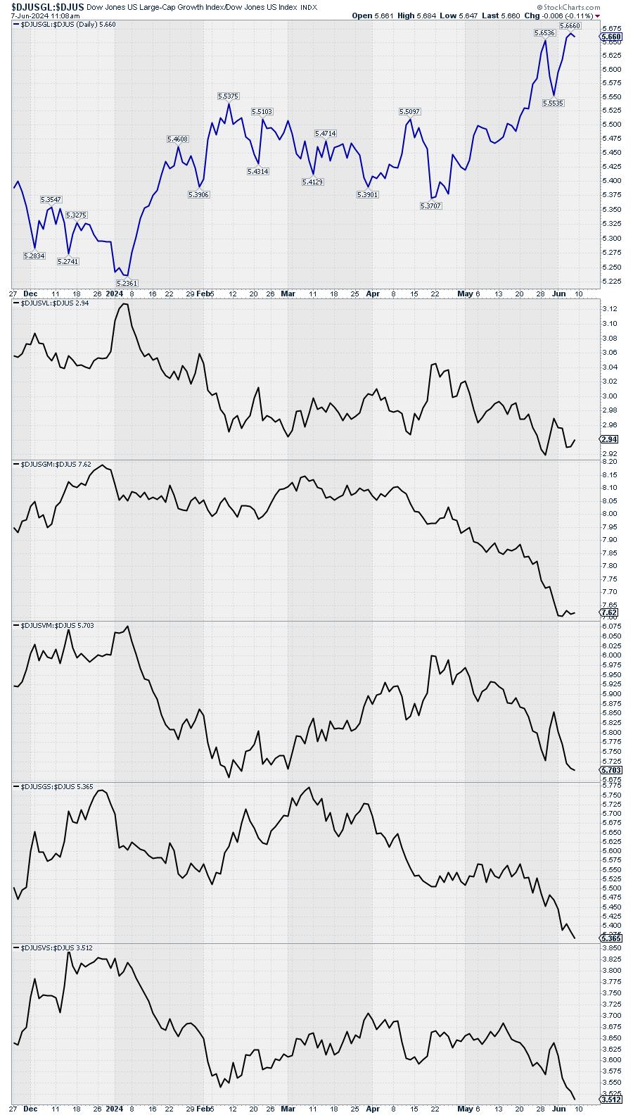
Simply plotting all the price charts of these six segments under each other reveals that ONLY large-cap growth has surpassed the late March peak where all charts lined up. And changing the price bars to relative lines (vs. $DJUS) makes things even clearer.
The Only Pocket of Strength Left
As always, price pays, or in terms of RRG; You must check the price chart before making any decisions.
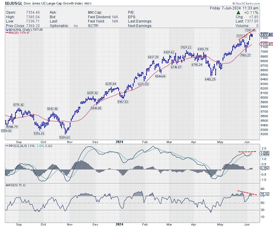
Despite the still visible uptrend, the build-up of negative divergences between price and RSI / PPO keeps me alert. This type of setup usually occurs at the end of a trend and, at the very least, signals a pause in that trend or a reversal.
The only caveat is that we need to get a confirmation in the price chart in the form of a break of support, completion of a top formation, etc. And that has not happened yet.
So, the music is still playing, but the noise from outside of people leaving the party is getting louder.
#StayAlert, have a great weekend. --Julius
|
| READ ONLINE → |
|
|
|
| Wyckoff Power Charting |
| Wyckoff at Work in the Intraday Timeframe |
| by Bruce Fraser |
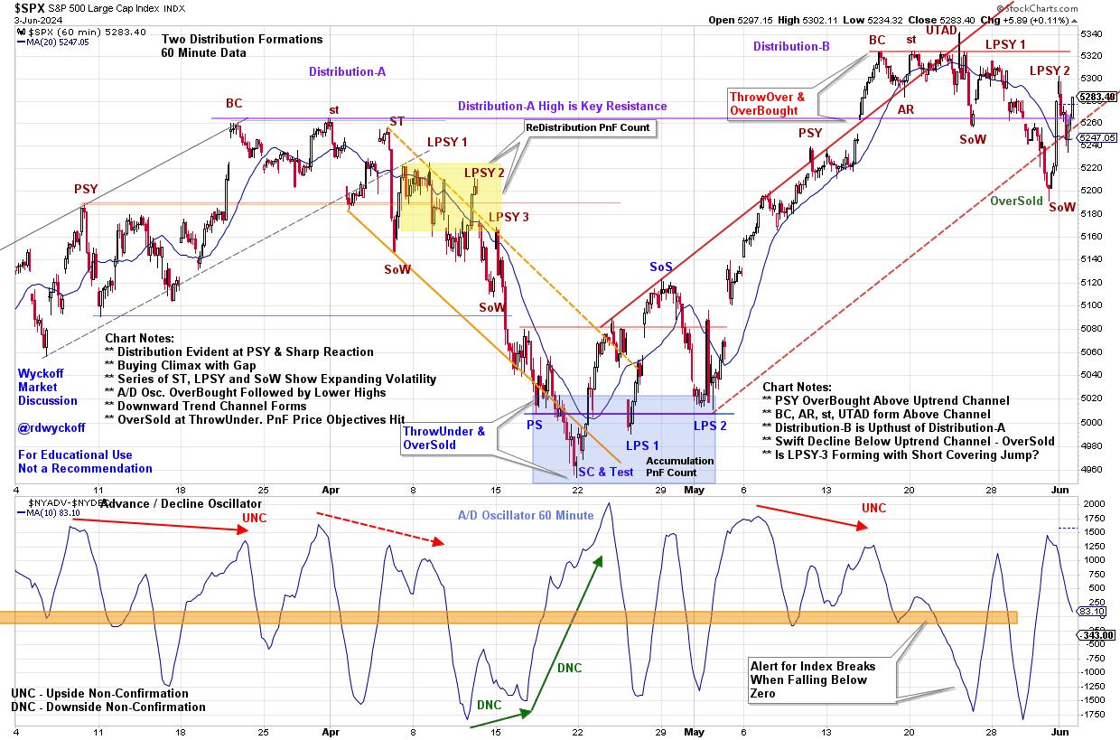
 It is well known that stock market indexes are fractal. Demonstrating repeatable price structures in all timeframes. In the intraday timeframe these price structures repeat frequently. The Wyckoff characteristics of Accumulation, Markup, Distribution and Markdown are constantly at work in smaller periods of time. Wyckoff students will study such structures to sharpen analytical and trading skills. In the example below of the S&P 500 Index the 60-minute timeframe reveals an unfolding Distribution and Markdown through March and April. Followed by a period of swing trading Accumulation. In May, once again Distribution appears to be forming. In the most recent weekly Wyckoff Market Discussion, we evaluated these unfolding structures. Let's review this intraday study. It is well known that stock market indexes are fractal. Demonstrating repeatable price structures in all timeframes. In the intraday timeframe these price structures repeat frequently. The Wyckoff characteristics of Accumulation, Markup, Distribution and Markdown are constantly at work in smaller periods of time. Wyckoff students will study such structures to sharpen analytical and trading skills. In the example below of the S&P 500 Index the 60-minute timeframe reveals an unfolding Distribution and Markdown through March and April. Followed by a period of swing trading Accumulation. In May, once again Distribution appears to be forming. In the most recent weekly Wyckoff Market Discussion, we evaluated these unfolding structures. Let's review this intraday study.

Distribution-A Notes:
- Preliminary Supply (PSY) warns of accelerating selling in uptrend. Watch for continuation of the uptrend.
- ReAccumulation, after the PSY, carries the index into a Gap and Buying Climax (BC). We draw a Resistance Line.
- Secondary Tests (ST) are rejected at BC Resistance. Reactions result in Lower Lows referred to as Signs of Weakness (SoW).
- Volatility and Gaps are manifesting on declines with expanding volume. Supply is overwhelming the index and increasing.
- Three Last Point of Supply rallies fail each at lower highs. Downtrend channel becomes evident while Distribution is still forming. This sets the stride of the impending decline.
- Markdown engulfs the $SPX Index. Volatility expands as prices fall.
- See the PnF study for estimates of downside price objectives for this intraday structure.
- ThrowUnder and OverSold below the bottom of the Trend Channel just as PnF count objectives are being fulfilled. Note the Selling Climax into the lower PnF objective. A Trifecta of Bullish conditions!
Swing Accumulation Notes:
- Advance Decline Oscillator generates a higher low or Downside Non-Confirmation (DNC) prior to the SC. The A/D Oscillator also rallies sharply prior to the SC low. Positive internals bode well for a rally in the $SPX.
- Accumulation forms and generates a PnF count (blue shaded box). A rally follows.
Distribution-B Notes
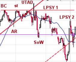
- A gap kicks off the final rally into the BC. The AR is the sharpest reaction since Accumulation. BC is seen as future resistance level. A ST and Upthrust After Distribution (UTAD) are rejected at BC resistance level. UTAD often results in aggressive reaction to support. This is a sign of weakness.
- LPSY-1 is a brief rally of poor quality and is unable to return to BC resistance. SOW reaction follows with expanding and aggressive supply character and breaks the upward trend channel.
- LPSY-2 has the character of a ‘short covering rally' which is brief and sharply rising. They normally fail suddenly and weakness resumes.
- PnF count objective is taken and could become larger.
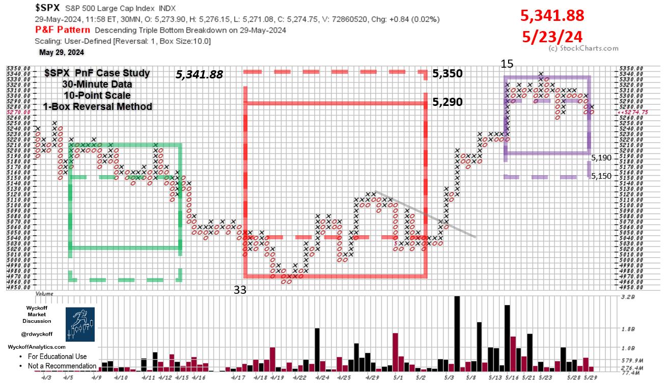
 S&P 500 Point & Figure Case Study (30-Minute Data) S&P 500 Point & Figure Case Study (30-Minute Data)
PnF Chart Notes (PnF data through May 29th):
- Intraday PnF Useful for Early I.D. of Price Swings
- Redistribution PnF (green box) counts to the low where....
- Accumulation forms (red box) and is fulfilled ($SPX - 5,341.88)
- Latest Structure has Distribution Character
- Current PnF Count is Likely not Complete
Conclusion
Distribution-A and Distribution-B are adjacent to each other. They are evidence on the smaller intraday timeframe of the Composite Operator (C.O.) actively distributing stock at the top of a trading range. The fractal nature of markets demand that we zoom out to the daily and weekly timeframes to see if there is an emerging Distribution character forming. An impending clue to this will be any attempt to decline to the April low. Also, the speed and volatility of that decline. The intraday timeframe can help develop a nuanced view of the intentions of the indexes and sharpen tactics in all timeframes.
All the Best,
Bruce
@rdwyckoff
Disclaimer: This blog is for educational purposes only and should not be construed as financial advice. The ideas and strategies should never be used without first assessing your own personal and financial situation, or without consulting a financial professional.
Helpful WPC Blog Links:
Trifecta of Trouble (Click Here)
Distribution Definitions (Click Here)
Wyckoff Power Charting. Let's Review (Click Here)
Wyckoff Resources:
Additional Wyckoff Resources (Click Here)
Wyckoff Market Discussion (Click Here)
|
| READ ONLINE → |
|
|
|
| Don't Ignore This Chart! |
| Retail Stocks Caught in Limbo: Will RTH Break Free and Soar? |
| by Karl Montevirgen |

VanEck Vectors Retail ETF (RTH) is a peculiar beast. It holds 26 retail stocks, 70% in the Consumer Discretionary sector and 30% in Consumer Staples. It's tilted toward cyclical growth, but occupies enough "defensive" space not to get hammered too badly when the economy undergoes a downturn.
On Wednesday, RTH popped up on a StockCharts scan—"Entered Ichimoku Cloud." With a not-so-great, but improving, SCTR score of 64.1 (the following day), this particular scan effectively finds potentially "good" stocks in decline.

Retail: The Macro Picture
Let's take a look at the weekly chart of RTH over the last 10 years.

CHART 1. 10-YEAR CHART OF RTH. On a wide time scale, it's nothing short of pure uptrend.
Following the 2020 pandemic crash, RTH's swings became wider and more volatile. Still, the 50-period and 200-period simple moving averages (SMAs) held steady in their decade-long uptrend.
Looking at relative performance, RTH, again comprising 70% Consumer Discretionary and 30% Consumer Staples stocks, is outperforming the former by 26% and the latter by 68% (see panels below price chart display relative performance of RTH:XLY and RTH:XLP). The Chaikin Money Flow (CMF), in the lowest panel, has shown a steady stream of positive flow and buying pressure, fueling RTH's ascent.
So, what does this mean for RTH today?
RTH's Range Reflecting Broader Retail Uncertainties
The daily chart of RTH shows that the ETF pulled back in April and has traded within a small range since then.

CHART 2. SIX-MONTH DAILY CHART OF RTH. A closeup of support and resistance levels mirroring the general fundamental uncertainty of retail discretionary forecasts.
Its sideways movement between support and resistance (roughly $196 to $205; see dotted blue line) reflects the limbo that the broader retail industry is somewhat caught in, much of it focused on whether the Federal Reserve will hold, cut, or even hike interest rates. Nevertheless, traders and investors will jump the gun (as they typically do), speculating on the outcome that fundamentals will either validate or deny later. We'll see these actions clearly when price breaks above the two levels of resistance or below near-term support.
While the CMF suggests that buyers may have the technical upper hand, note that the Ichimoku Cloud (specifically, the Kumo) has turned from a bullish green to a bearish red; its top level suggests resistance and coincides with the market-based resistance levels we currently see. If price breaks above the current resistance level, RTH will challenge its high of $213.
But what if it breaks below $196? Take a look at the chart below.

CHART 3. EIGHT-MONTH DAILY CHART OF RTH. If price breaks below support, how far down can it sink?
If there's no bullish economic news driving discretionary retail, then you can expect price to break below support at $196. While some bullish might attempt to jump in at $193, the 38.2% Fibonacci Retracement level, the 50% ($187) and 61.8% ($180) levels are more likely to see stronger buying activity, as the latter roughly coincides with RTH's 2022 and 2023 highs (as you can see in the weekly chart above).
All eyes are on the Fed, along with other economic reports and conditions that will likely affect market sentiment.
The Takeaway
VanEck Vectors Retail ETF (RTH) presents a balanced mix of consumer discretionary and consumer staples stocks. Despite recent volatility, its long-term uptrend remains intact. The key will be watching how it reacts to upcoming economic news and Federal Reserve decisions. Whether RTH breaks above or below its current levels, mapped out before you are the levels in which you can anticipate market action.
How to Run an Ichimoku Scan (or any technical scan)
- Log in to your StockCharts account
- Go to Your Dashboard, and in the Member Tools window, scroll down to Reports & More, and click on Sample Scan Library.
- The Ichimoku Patterns are in the Candlestick Patterns section.
- Click the Run button next to the scan (in this case, Entered Ichimoku Cloud) and see a list of the filtered stocks and ETFs.
Why This Scan?
As mentioned above, you might want to run this scan, particularly when the broader market is rallying, to see if any strong stocks are pulling back. Depending on the stock, the Ichimoku Cloud can often serve as a support range, making it an ideal tool for identifying "buy-the-dip" opportunities.
Also, you'll want to look at other indicators in addition to the price action, in order to avoid catching a falling knife when you intend to buy the dip.

Disclaimer: This blog is for educational purposes only and should not be construed as financial advice. The ideas and strategies should never be used without first assessing your own personal and financial situation, or without consulting a financial professional.
|
| READ ONLINE → |
|
|
|
| MORE ARTICLES → |
|


 It is well known that stock market indexes are fractal. Demonstrating repeatable price structures in all timeframes. In the intraday timeframe these price structures repeat frequently. The Wyckoff characteristics of Accumulation, Markup, Distribution and Markdown are constantly at work in smaller periods of time. Wyckoff students will study such structures to sharpen analytical and trading skills. In the example below of the S&P 500 Index the 60-minute timeframe reveals an unfolding Distribution and Markdown through March and April. Followed by a period of swing trading Accumulation. In May, once again Distribution appears to be forming. In the most recent weekly Wyckoff Market Discussion, we evaluated these unfolding structures. Let's review this intraday study.