| THIS WEEK'S ARTICLES |
| Martin Pring's Market Roundup |
| MEMBERS ONLY |
| Did We Just See a False Breakdown in Crude Oil? |
| by Martin Pring |
|
Using West Texas Crude, Chart 1 features one of my favorite techniques for identifying changes in long-term trends, which is simply a PPO using the 6- and 15-month parameters. When it is above zero, it's bullish, and when below, bearish...
|
| READ ONLINE → |
|
|
|
| The Mindful Investor |
| Three Thoughts on Risk Management for October 2024 |
| by David Keller |
Even though the S&P 500 index appears to be relentlessly pursuing new all-time highs, the traditional seasonal weakness in October leads me to be very focused on risk management right about now.
After my latest conversation with fellow StockCharts contributor Joe Rabil, in which I got to hear his thoughts on risk management, I wanted to share some reflections on what risk management could mean for investors as we get into the meat of the 4th quarter.
Watch the S&P 500's "Line in the Sand"
My general approach to technical analysis is to determine the current trend, then identify what level or signal would convince me that the trend had reversed. I call this the "line in the sand" technique, because you literally draw a line on the chart, and then don't give the chart a second thought until and unless that line is violated.
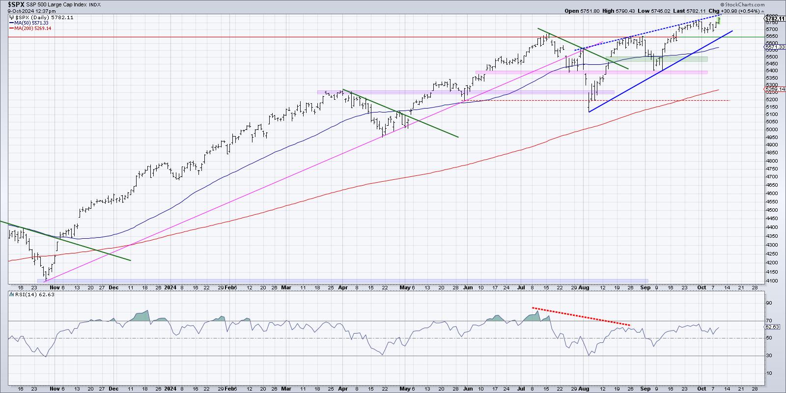
For the S&P 500, that means I'm laser-focused on the 5650 level. The July peak was right around this level, along with the subsequent peaks in mid and late August. The September breakout above 5650 was a key bullish move for the benchmark, and I would expect a break back below this price point could signal the end of the current bull run.
So until and unless we see the S&P 500 break below 5650, then the current bullish trend appears to be alive and well!
Breadth Indicators Could Provide an Early Warning
Now even if the S&P is still holding key support, plenty of individual names could break down before the benchmarks. In fact, this happens quite often during major market tops like 2007! Market breadth indicators are perhaps the best way to analyze and track this potential divergence, where individual stocks start to break down.
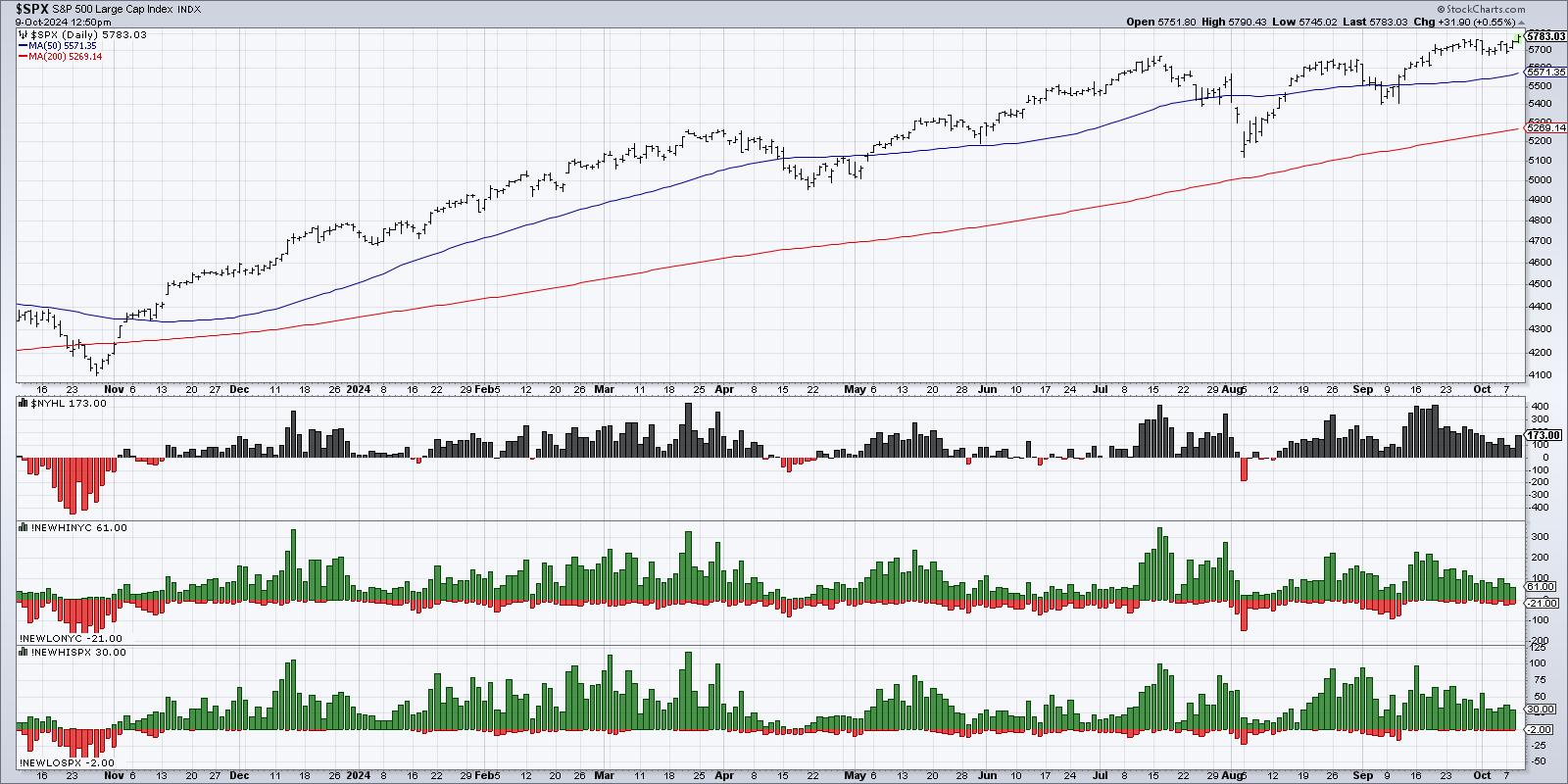
Here, we can see the S&P 500 for the last 12 months, along with the new 52-week highs minus new 52-week lows, the new highs and lows for the entire NYSE, and the new highs and lows for the S&P 500 members.
Did you notice how all three of these data series topped out in mid-September, and have been steadily declining since then? A healthy bull market phase usually sees an expansion in new 52-week highs, as the leading names are powering to the upside. But, in the last few weeks, we're seeing a significant breadth divergence that tells me to be skeptical of the current uptrend phase.
Keep Your Position Size Manageable
In my latest podcast episode with fellow StockCharts contributor Joe Rabil, he shared some words of wisdom on how to think about risk management. I particularly appreciated his thoughts on position sizing, sharing that he usually risks about 1% of his portfolio on each new idea.
Options expert Price Headley once quipped, "If you're having trouble sleeping at night, your position size is too big!" By being thoughtful and intentional about how much capital we risk on each new idea, we can minimize the pain in case some of the bearish signs we're observing actually play out in the days and weeks ahead!
Mindless investors ignore risk management, focusing instead on how much they stand to gain if they're proven right. Mindful investors recognize that they will often be wrong, and by managing risk, they can survive to invest another day.
RR#6,
Dave
P.S. Ready to upgrade your investment process? Check out my free behavioral investing course!
David Keller, CMT
President and Chief Strategist
Sierra Alpha Research LLC
Disclaimer: This blog is for educational purposes only and should not be construed as financial advice. The ideas and strategies should never be used without first assessing your own personal and financial situation, or without consulting a financial professional.
The author does not have a position in mentioned securities at the time of publication. Any opinions expressed herein are solely those of the author and do not in any way represent the views or opinions of any other person or entity.
|
| READ ONLINE → |
|
|
|
| Don't Ignore This Chart! |
| Tech vs Semiconductors: Which One Should You Be Trading? |
| by Karl Montevirgen |
As an investor and a technical analyst, there are numerous tools available for you on StockCharts that you can use to find tradable opportunities.
One idea is to begin with a survey of top-performing sectors. It's Wednesday morning; the Dow jumped 400 points, the S&P 500 ($SPX) hit a record high, and technology stocks spearhead the rally. To begin, under the Charts & Tools tab on Your Dashboard, select Sector Summary (under Research Tools).
If you switch from the default Intraday setting to One Week, you'll see that the Technology sector is leading the pack.

FIGURE 1. ONE WEEK SECTOR SUMMARY. The Technology sector is in the top position.Image source: StockCharts.com. For educational purposes.
It's interesting that tech also held the top spot for the last month. Now, let's zoom in on the industry level by clicking "Technology Sector Fund." Semiconductors are on top.

FIGURE 2. ONE WEEK INDUSTRY SUMMARY. Semiconductors lead the pack at the industry level.Image source: StockCharts.com. For educational purposes.
Looking at this information, it makes sense to identify exchange-traded funds (ETFs) that follow Tech or semiconductor stocks.
To begin your analysis, let's compare three charts (one that represents the sector, another that represents the industry, and one that focuses on stocks within the industry. We'll use the Technology Select Sector SPDR Fund (XLK), Dow Jones US Semiconductors Index ($DJUSSC), and VanEck Vectors Semiconductor ETF (SMH).
Tech Sector, Semiconductor Industry, and Semiconductor ETF

FIGURE 3. ACP COMPARISON DAILY CHART OF XLK, $DJUSSC, AND SMH. They look identical, but are they?Chart source: StockChartsACP. For educational purposes.
The charts are nearly identical, which makes sense as chip stocks were a significant driver in tech. Given the similarity in performance, perhaps XLK provides a more diversified alternative to concentrating on the semiconductor industry. Let's take a look at XLK's daily chart.

FIGURE 4. DAILY CHART OF XLK. A rising smaller trend within a larger swing outlines a wide range of support and resistance.Chart source: StockCharts.com. For educational purposes.
Looking at the broader tech proxy, XLK, you can see a smaller rising trend within a large swing that outlines a wide range of support and resistance. Drawing a Quadrant Line from the bottom to the top, you can gauge where this trend is relative to the intermediate-term highs and lows. For the trend to continue, price has to break above the Quadrant Line at $237.50, while staying preferably above the bottom quadrant (see blue arrow), where it last bounced, at $202.50.
The High-Low Percent breadth indicator above the chart shows modest bullishness, as the number of 52-week highs outnumber 52-week lows, giving you a slightly bullish reading of 15.38%.
Look at the relative performance between XLK and $DJUSCC in the panel below the chart (comparing the sector to the industry). The sector has been underperforming the semiconductor industry since December 2023 (see zero line) and is currently at -32.79%.
Perhaps a semiconductor ETF might be the way to go. But which one? You have a choice of the following:
- VanEck Vectors Semiconductor ETF (SMH), which is the most liquid
- iShares Semiconductor ETF (SOXX), another popular ETF, and
- SPDR S&P Semiconductor ETF (XSD), the smallest of them all by market cap.
Let's compare their performance to $DJUSSC using StockCharts PerfChart.

FIGURE 5. PERFCHART OF $DJUSSC, SMH, SOXX, SXD. There's a huge difference in performance between the four.Image source: StockCharts.com. For educational purposes.
All three ETFs are tightly correlated to $DJUSSC, but their relative performances are worlds apart. The best-performing ETF is SMH, which happens to be the most liquid and largest by market cap.
Let's switch to a daily chart of SMH. In the panel above the chart, you'll notice the sideways-moving On Balance Volume, indicating that buying/selling pressure is virtually at a standstill as if the asset is waiting for something. What might that be? Notice how the last move down from the July high to the August low corresponds with heavy selling pressure, as shown by the Chaikin Money Flow (CMF). Also, notice how the CMF is trending up.

FIGURE 6. DAILY CHART OF SMH. The first top quadrant is one to watch closely.Chart source: StockCharts.com. For educational purposes.
It makes you wonder how many traders were short SMH or how many just dumped their shares. If some are still short, where will they close to avoid a squeeze? It will likely be close to the first quadrant, which, for the bears, would break the 75% line if you're measuring from the top down (magenta circle).
Bullish traders jumped in at the bounce near the bottom, and the real action is likely in the top quadrant. That's where we'll see if the trend continues (it would need to break resistance at $281.70) or if things go sideways until a major catalyst shakes it up and out of its range.
At the Close
When deciding what stock or ETF to trade, start with the big picture by looking at top-performing sectors. Then, zoom in on the industries driving them. In this case, tech stocks lead the way, with semiconductors at the forefront. Despite their visual similarities in performance, each asset showed different relative performance, especially between the $DJUSSC index and the three semiconductor ETFs that were nearly 100% correlated with it.

Disclaimer: This blog is for educational purposes only and should not be construed as financial advice. The ideas and strategies should never be used without first assessing your own personal and financial situation or without consulting a financial professional.
|
| READ ONLINE → |
|
|
|
| RRG Charts |
| It's Large-Cap Growth Stocks (Mag 7) Once Again |
| by Julius de Kempenaer |

Where is the Recent Performance in the S&P 500 Coming From?
Let's start with the relative rotation graph (RRG) for growth and value sectors, dissected by size to get a clearer picture. The first RRG reveals a standout performer: the large-cap growth group. These stocks, which include major tech and communication services players, started their journey of outperformance in March 2023 when they moved to the right side of the RRG. Since then, they have completed multiple Leading-Weakening-Leading rotations and significantly contributed to the performance of the S&P 500.
The large-cap growth group, which includes the influential Mag-7 stocks, is currently in the weakening quadrant of the RRG. However, it's showing signs of curling up—a positive indication of a new upswing in an already established relative uptrend. In contrast, the other sectors, particularly the value ones across all sizes, are losing momentum and moving down on the JdK RS-momentum scale.
The mid-cap and small-cap growth groups are also lagging, with the lowest readings on the RS-ratio scale. They're far to the left, meaning they are still in relative downtrends, and the recent rally has to be judged as a recovery rally within a downtrend.
From this, the clear conclusion is that large-cap growth stocks are once again propelling the market upward.
Dissecting the Mag-7
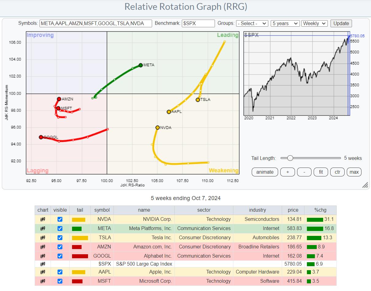
When we zoom in on the Mag-7 stocks and place them on an RRG, the disparity in their performance becomes evident. Meta and NVIDIA are the stars, with NVIDIA mirroring the large-cap growth index's position—inside the weakening quadrant but curling upwards, signaling another potential rise. Meta has made a full rotation and is now pushing deeper into the leading quadrant.
Apple and Tesla are on the right side of the graph. Tesla has outperformed the S&P 500 over the last five weeks, while Apple has not reached that level.
Amazon, Microsoft, and Google are in the lagging quadrant, with Google moving left, indicating a weak relative trend.
The Narrow Breadth of Market Performance is Back
This type of performance, driven by a small group of stocks, is a recurring theme. Over the last five weeks, the Mag-7 stocks have contributed over 2.9% to the S&P 500's 6.8% performance. That's a staggering 40% coming from just seven stocks—a clear example of a market with a narrow breadth.
This concentration continues to pose a risk, showing a market heavily reliant on a few key players.
SPY and its Divergences

Turning to the S&P 500 charts, the weekly SPY chart shows signs of breaking the negative divergence in the RSI, which is a positive sign. However, the negative divergence with the MACD persists, indicating we're not out of the woods yet.

The daily chart suggests caution, as the S&P 500 is still within a potential rising wedge, and the RSI peaks are not showing the strength we'd like to see. The support level to watch remains 565.
A Closer Look at Individual Mag-7 Stocks

AAPL is still below overhead resistance, around the 230-235 area.
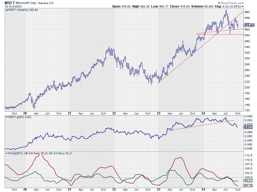
Microsoft has broken its uptrend, forming a potential head-and-shoulders top, The raw RS-Line is already in a downtrend.

NVIDIA has broken out of a large consolidation pattern, indicating significant upside potential.

Amazon is below its all-time high and has recently marked a lower high on the weekly price chart, while raw-RS has broken its rising support line.

Meta has broken out to a new all-time high, signaling a strong and intact trend.
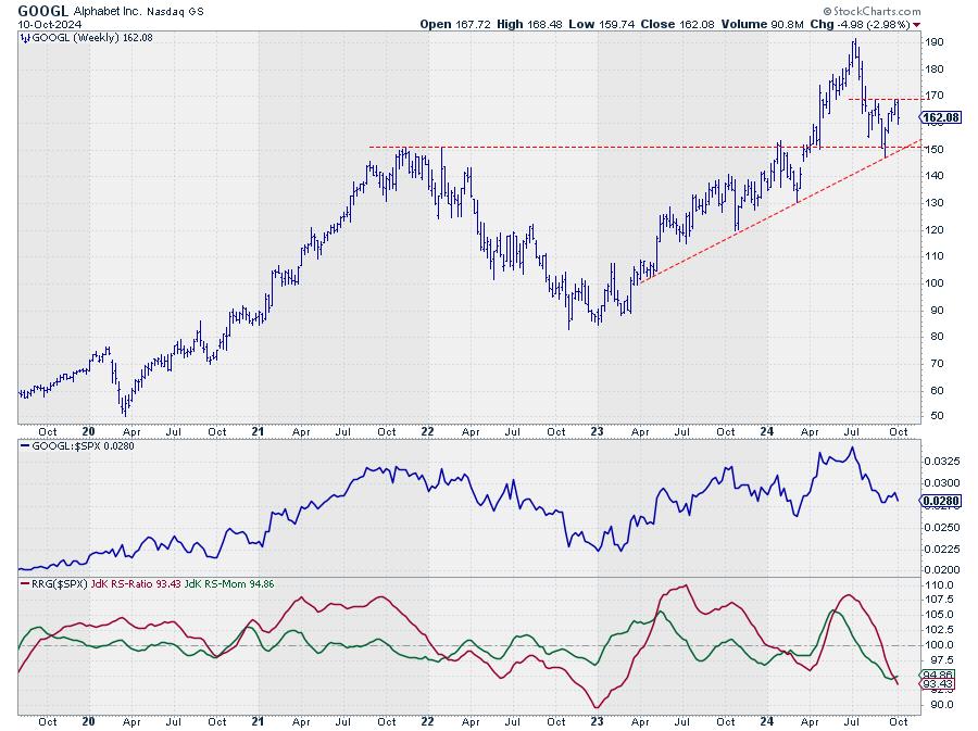
Google is rapidly heading into the lagging quadrant, with $150 as a critical support level.

Tesla is in a volatile range below overhead resistance, which currently comes in around 270-275. This barrier needs to be taken out to trigger a new rally.
Conclusion: The Narrow Path to Market Gains
In summary, the large-cap growth stocks, particularly within the Mag-7, are driving the market higher on a very narrow foundation. Some divergences remain, but the S&P 500's ability to overcome the negative divergence between price and RSI is a small positive. The market's shape is improving as long as SPY remains above the 565 support level.
For a more sustained rally, we need broader participation from stocks outside the Mag-7. Until then, we will watch closely as Meta and NVIDIA lead the charge, while Google, Microsoft, and potentially Apple could dampen the S&P 500's performance.
It's still a tricky market, but with (some) large-cap growth stocks and their big impact on the broader indices, there are still opportunities to participate on the upside.
#StayAlert, --Julius
|
| READ ONLINE → |
|
|
|
| |
| Don't Ignore This Chart! |
| Oil Prices Soar Amid Middle East Tensions – What's Next for Gas Prices? |
| by Karl Montevirgen |
 Monday saw something of a bloodbath on Wall Street, with the Dow ($INDU) plunging over 500 points at its worst and the S&P 500 ($SPX) and Nasdaq ($COMPQ) falling over 1%. Monday saw something of a bloodbath on Wall Street, with the Dow ($INDU) plunging over 500 points at its worst and the S&P 500 ($SPX) and Nasdaq ($COMPQ) falling over 1%.
Higher oil prices, triggered by tensions in the Middle East, played a big hand in Monday's market mayhem. In the blogosphere, other topics like a historic crude oil short squeeze and fears of a looming Israeli attack on Iranian oil and gas infrastructure made the headlines.
Is it time to go long? With oil spiking, could there be an opportunity to ride the wave with gasoline, given the usual lag? How high could oil climb? And with the current geopolitical tension, could we see a longer uptrend in oil or gas? What levels should you keep an eye on?
Let's pause and break down what's happening with oil and gas prices in technical terms.
What's Going On with Oil Prices?
Below is a weekly chart presenting a five-year lookback on oil, using the US Oil Fund (US) as a proxy.

CHART 1. WEEKLY FIVE-YEAR CHART OF USO. Zooming out a bit, the level of fear in the market might not seem dramatic when you look at price action. USO is trading sideways with clear support and resistance levels.Chart source: StockCharts.com. For educational purposes.
Following the dramatic 2020 drop and 2022 peak, crude oil has traded sideways. The range may have been rather wide, but, directionally, it's been sideways nevertheless.
- The magenta rectangle highlights a stabilizing range of support and resistance.
- Price has moved above and below the 50-week simple moving average (SMA) in a whipsaw fashion.
- In terms of momentum, the Money Flow Index (MFI) is showing a dip in buying pressure, just like the Chaikin Money Flow (CMF), even with the recent uptick in buying (check out the magenta circle).
The broader structure here shows that the current price surge is still relatively minuscule compared to the structure itself. But that doesn't mean geopolitical events can't drive prices above the current resistance level of around $83 or lower to its support at $64.
A close below either level would signal a broader fundamental driver and potentially the beginning of a longer-term trend.
Let's switch to a daily chart for a more near-term view.

CHART 2. DAILY CHART OF USO. If the price continues higher, there will be a lot more resistance up ahead. Note the multiple support levels as well. These could trigger a price bounce.Chart source: StockCharts.com. For educational purposes.
This might not be unusual for wide long-term trading ranges, but you can spot plenty of ceilings (and floors) ahead.
- The Relative Strength Index (RSI) is rising and not quite yet at overbought territory, meaning there's still room to run. But how much higher can it go?
- Look at the volume spike toward the bottom of the chart. It's quite significant, but what's perhaps more critical is the follow-up in volume as well as price, and so far, it isn't there (yet).
- The CMF reading doesn't show anything extraordinary in measuring buying pressure.
- If you're curious as to the effect of crude oil prices on the broader energy sector, the energy sector's Bullish Percent Index (BPI), a breadth indicator, tells us that over 60% of energy stocks are displaying P&F (Point & Figure) buy signals, which is, as you might guess, bullish.
Watch this: Focus on the multiple levels of resistance. Will volume and momentum drive USO beyond these levels? That's a matter of geopolitical developments, none of which anyone can predict. However, sentiment can drive prices higher even without fundamental validation. And if this happens, it can last beyond the coming election, particularly if the question of an attack on Iranian energy infrastructure remains at the forefront of investors' minds.
Also, mind the multiple levels of support (see black dotted lines), as several are likely to trigger a bounce.
What's Going On with Gas Prices?
So, how might the rise in oil prices affect gas prices? Here's a daily chart of the US Gasoline Fund (UGA) for comparison (UGA will be the proxy for gas).
The answer is, nothing yet.

CHART 3. DAILY PRICE OF UGA. Note the correlation in the indicator window above the chart. It's showing a 99% correlation between UGA and USO.Chart source: StockCharts.com. For educational purposes.
When it comes to gasoline prices, there are two things to consider:
- Lag time. There's a relative lag time between oil prices and gasoline prices. This can take two to four weeks, depending on supply chains, refining processes, and distribution networks.
- Market sentiment. Futures traders, especially, can push prices up in anticipation of a significant rise in crude oil, disruption to supply chains, refining, and distribution.
If this is what's happening in UGA, there's hardly any volume behind the move (see magenta circle). The lack of buying pressure, as displayed by the OnBalance Volume (OBV) indicator, agrees with this.
Another thing to watch: Investors wonder if the recent spike in crude oil will lead to a rise in gas prices. In other words, did crude oil and gasoline temporarily de-correlate? Looking at the StockCharts Correlation Coefficient indicator above the chart, you'll notice that both commodities are still at a 99% correlation.
So, if you were hoping to take advantage of the lag between gasoline and crude oil prices, then price-wise, it isn't there as of this moment (according to the indicator).
At the Close
To wrap things up, oil is spiking in the near term. In the bigger picture, however, it's still trading sideways, and resistance levels are about to be tested. While gas prices usually lag, its price remains correlated to oil's price surge, and, to date, there's no significant volume driving it up (unlike crude oil). The big question is whether geopolitical risks will push prices higher. Sentiment can drive up prices even if that means getting ahead of fundamentals. Thus, you should keep an eye on the current technical levels and indicators. You're likely to see a sharp response in those, as you would in any news item that might cause investors to jump.
Disclaimer: This blog is for educational purposes only and should not be construed as financial advice. The ideas and strategies should never be used without first assessing your own personal and financial situation or without consulting a financial professional.
|
| READ ONLINE → |
|
|
|
| MORE ARTICLES → |
|


 Monday saw something of a bloodbath on Wall Street, with the Dow ($INDU) plunging over 500 points at its worst and the S&P 500 ($SPX) and Nasdaq ($COMPQ) falling over 1%.


