| THIS WEEK'S ARTICLES |
| Martin Pring's Market Roundup |
| MEMBERS ONLY |
| Four Sectors That Have Just Experienced Bearish Weekly Action |
| by Martin Pring |
|
Most weekends, I flip through a chartlist featuring weekly bars and candles for sectors, country ETFs, currencies, bonds and some commodities. The idea is to see whether any of these entities are showing signs of bullish or bearish reversals...
|
| READ ONLINE → |
|
|
|
| The Mindful Investor |
| Top Ten Charts to Watch for November 2024 |
| by David Keller |
With the Magnificent 7 stocks struggling to hold up through a tumultuous earnings season, what sort of opportunities are emerging on the charts going into November? Today, we'll break down some of the names we've included in our Top Ten Charts to Watch for November 2024.
Some of these charts are overextended, having already logged significant gains in the last month. Others have already experienced short-term pullbacks and may provide actionable entry points around an ascending 50-day moving average. Still others may be worth following less as an investment candidate, but more as a good measure of overall risk appetite for investors.
Let's start with one of the sectors that I have found investors to be generally underweight, even though the relative performance has really begun to shine in recent months.
Stifel Financial Corp. (SF)
In my recent podcast interview with Ari Wald of Oppenheimer, we talked about emerging strength in the capital markets group, fueled by likely Fed rate cuts into early 2025. Stifel Financial Corp. (SF) has made a new 52-week high pretty much every month in 2024, October included.
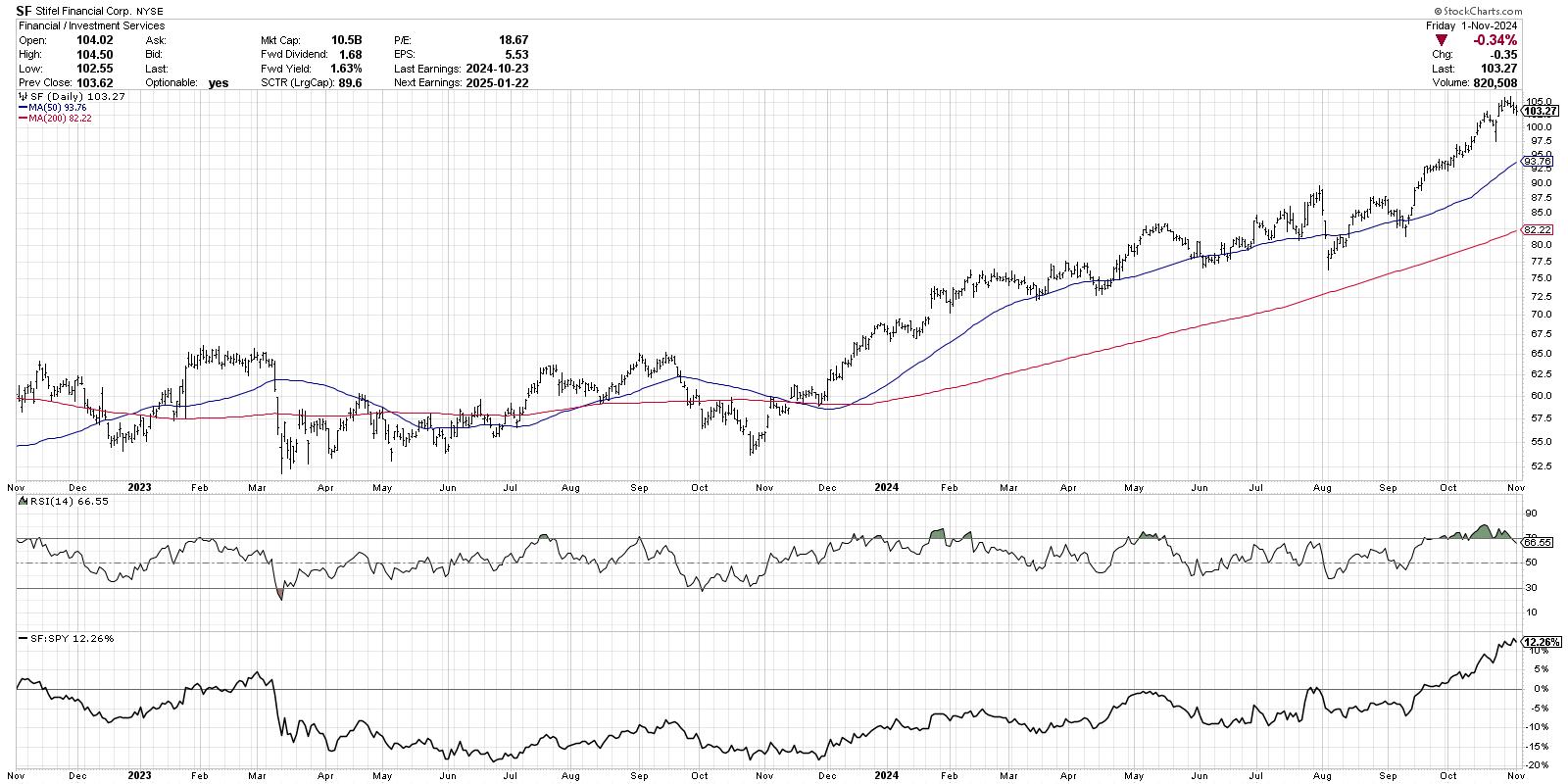
After recently pushing above the $105 level, the stock has now pulled back enough to bring the RSI back below the overbought level. While the overbought condition speaks to the strength of the long-term uptrend, we can see that previous pullbacks in May and February featured a very similar configuration with price and momentum indicators.
This is the type of chart in a clear long-term uptrend of higher highs and higher lows. But given the recent drop in the RSI after the October peak, I'd be looking for a tactical pullback which could provide a new higher low. The 50-day moving average is often an area where this sort of pullback could occur, similar to frequent tests earlier this year.
Home Depot, Inc. (HD)
The chart of Home Depot (HD) may provide a perfect example of the "fat pitch" chart, marked by a short-term pullback within a long-term uptrend. The stock broke above its March high around $390 in September, and, after peaking around $420, the price has pulled back to that same pivot point.
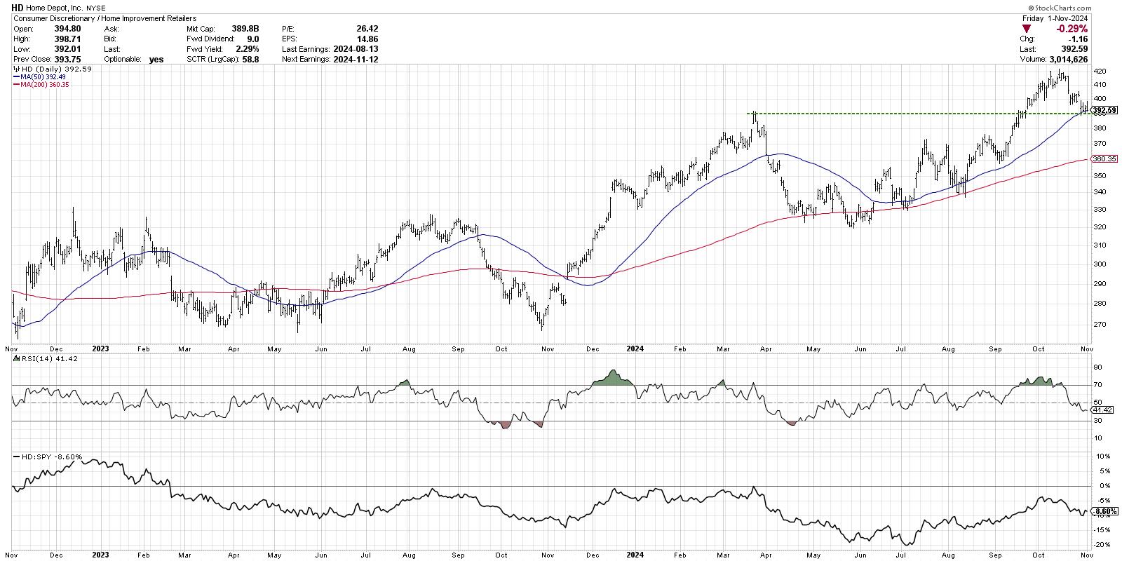
This chart provides a clear illustration of the technical analysis concept of "polarity", where resistance later becomes support. Given that HD has pulled back to this pivot point around $420, as well as an ascending 50-day moving average, I'm inclined to label this as an actionable pullback within a long-term uptrend phase. Also note the RSI just above 40, which is often the lower end of the range for RSI when the stock is in a bullish phase.
Alphabet Inc. (GOOGL)
The Magnificent 7 stocks all deserve our attention given their significant weights in our equity benchmarks. But Alphabet (GOOGL) in particular may be the most important to watch in November, given its meager follow-through after earnings this week.
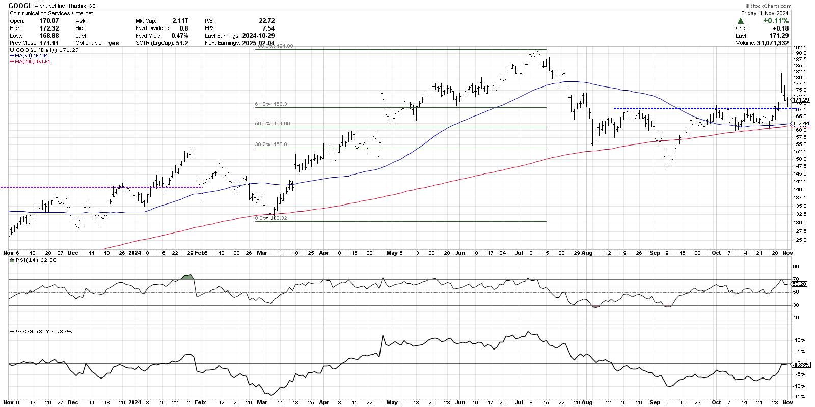
Alphabet has been building up an inverted head-and-shoulders bottoming pattern since August. The recent breakout above the neckline around $168 seemed to complete this pattern and indicate a high likelihood of further upside. On Wednesday, we saw a gap higher on earnings, but, by that day's close, the stock was down by the lows of the day.
I've found that during bull market phases, breakouts tend to persist, as there are usually plenty of willing buyers interested in taking on additional risk for the possibility of greater returns. But, during bear markets, breakouts often will fail, as investors sell strength because they're way more concerned with downside risk than upside potential.
Looking for the other seven charts to watch? Check out the full video on my YouTube channel!
RR#6,
Dave
P.S. Ready to upgrade your investment process? Check out my free behavioral investing course!
David Keller, CMT
President and Chief Strategist
Sierra Alpha Research LLC
Disclaimer: This blog is for educational purposes only and should not be construed as financial advice. The ideas and strategies should never be used without first assessing your own personal and financial situation, or without consulting a financial professional.
The author does not have a position in mentioned securities at the time of publication. Any opinions expressed herein are solely those of the author and do not in any way represent the views or opinions of any other person or entity.
|
| READ ONLINE → |
|
|
|
| ChartWatchers |
| Election-Related Market Swings: How to Stay Ahead |
| by Jayanthi Gopalakrishnan |
 After yesterday's "trick," investors received a "treat" at the end of the trading week, as the stock market regained its footing and bounced back a bit. After yesterday's "trick," investors received a "treat" at the end of the trading week, as the stock market regained its footing and bounced back a bit.
Even though the October nonfarm payrolls were much weaker than expected—up by 12,000 when the Dow Jones estimate was for an increase of 100,000 jobs—the market shook it off. The decline is attributed to Boeing's strike and two major hurricanes. According to a recent Barron's report, the Bureau of Labor Statistics survey responses were below average, so the data may be skewed. Unemployment is steady at 4.1%, and wages grew by 4.4% annually.
Stocks Bounce Back
The data doesn't indicate the US economy is heading toward a recession. The major stock market indexes bounced back, with the Nasdaq Composite ($COMPQ) gaining the most after Thursday's spooky selloff. However, Friday's bounce didn't change the Nasdaq's big picture (see daily chart below).

FIGURE 1. NASDAQ COMPOSITE SHOWS DOWNSIDE MOVEMENT. Friday's selloff didn't change the technical picture. The index needs to close above its 21-day EMA to reverse the downside move.Chart source: StockCharts.com. For educational purposes.
The Nasdaq broke above its tight consolidation range on Monday, but, after Thursday's selloff, it closed well below its 15-day exponential moving average (EMA). Friday's rebound didn't change the technical picture. The index went as high as the 15-day EMA, but closed below it in what resembles an inverted hammer, although it didn't close lower than Thursday's close.
There is a weakening in market breadth, as displayed by the breadth indicators—Bullish Percent Index, Percentage of Nasdaq stocks trading above their 200-day moving average, and the Advance/Decline Line—displayed in the lower panels.
Small Caps Ain't Getting Much Love
With interest rate cuts already in play and with more to come, you would think that small-cap stocks would start getting some attention. But we haven't seen that yet. Even though the S&P 600 Small Cap Index ($SML) broke above a trading range on the weekly chart, there's not enough buying pressure to send the index into an uptrend.

FIGURE 2. SIDEWAYS FOR SMALL-CAP STOCKS. The high probability of a 25-basis-point interest rate cut at the next FOMC meeting isn't helping small-cap stocks, which continue to trade in a consolidation.Chart source: StockCharts.com. For educational purposes.
Treasury Yields Jump
Yields fell after the weak jobs report, but that was short-lived. Treasury yields reversed and climbed higher, with the 10-year US Treasury yield closing at 4.36% on Friday (see chart below). $TNX is trading above its 15-day EMA. The question now is whether $TNX will reach its July 1 high.

FIGURE 3. 10-YEAR US TREASURY YIELD INDEX ($TNX) KEEPS ON RISING. $TNX has been on a steady rise since the end of September, when it broke above its 15-day EMA.Chart source: StockCharts.com. For educational purposes.
Treasury yields have been trending up after breaking above the 15-day EMA at the end of September. The rise in yields doesn't help bond prices, which move in the opposite direction.
The iShares 20+ Year Treasury Bond ETF (TLT) has been trading below its 15-day EMA since September 19, and Friday's price action was very bearish (see chart below).

FIGURE 4. BOND PRICES SINK. The iShares 20+ Year Treasury Bond ETF (TLT) has been cascading lower since mid-September when it broke below its 15-day EMA.Chart source: StockCharts.com. For educational purposes.
While Treasury yields climb, the economic data shows the economy is growing while the labor market is cooling. This supports the narrative of an interest rate cut. The CME FedWatch Tool shows a 99.7% probability of a 25-basis-point interest rate cut on November 7.
Next week could bring some volatile action to the market, although given the way the stock market has been acting in the last two weeks, there's no telling what it will do. The best you can do is take it one day at a time.
End-of-Week Wrap-Up
- S&P 500 closed down 1.37% for the week, at 5728.80, Dow Jones Industrial Average down 0.15% for the week at 42,052.19; Nasdaq Composite closed down 1.50% for the week at 18,239.92
- $VIX up 7.62% for the week, closing at 21.88
- Best performing sector for the week: Communication Services
- Worst performing sector for the week: Real Estate
- Top 5 Large Cap SCTR stocks: Summit Therapeutics (SMMT); Reddit Inc. (RDDT); Ubiquiti, Inc. (UI); Applovin Corp. (APP); Carvana (CVNA)
On the Radar Next Week
- US Presidential Election
- October ISM Services PMI
- Fed Interest Rate Decision
- Fed Press Conference
- November Michigan Consumer Sentiment Index
- Earnings from Palantir Technologies (PLTR), Marathon Petroleum Corp. (MPC), Novo Nordisk (NVO), Arm Holdings (ARM), Gilead Sciences (GILD), Applovin Corp (APP), among many others.
Disclaimer: This blog is for educational purposes only and should not be construed as financial advice. The ideas and strategies should never be used without first assessing your own personal and financial situation, or without consulting a financial professional.
|
| READ ONLINE → |
|
|
|
| RRG Charts |
| Market Rotation Fueled by Large-Cap Growth (Again) |
| by Julius de Kempenaer |
Following the recent market fluctuations, with a sharp decline and a subsequent rally, it's crucial to examine these movements' underlying factors.
Utilizing relative rotation graphs (RRGs), we can gain insights into the current trends between growth and value stocks and their performance across different-size segments.
Growth vs. Value on Daily RRG
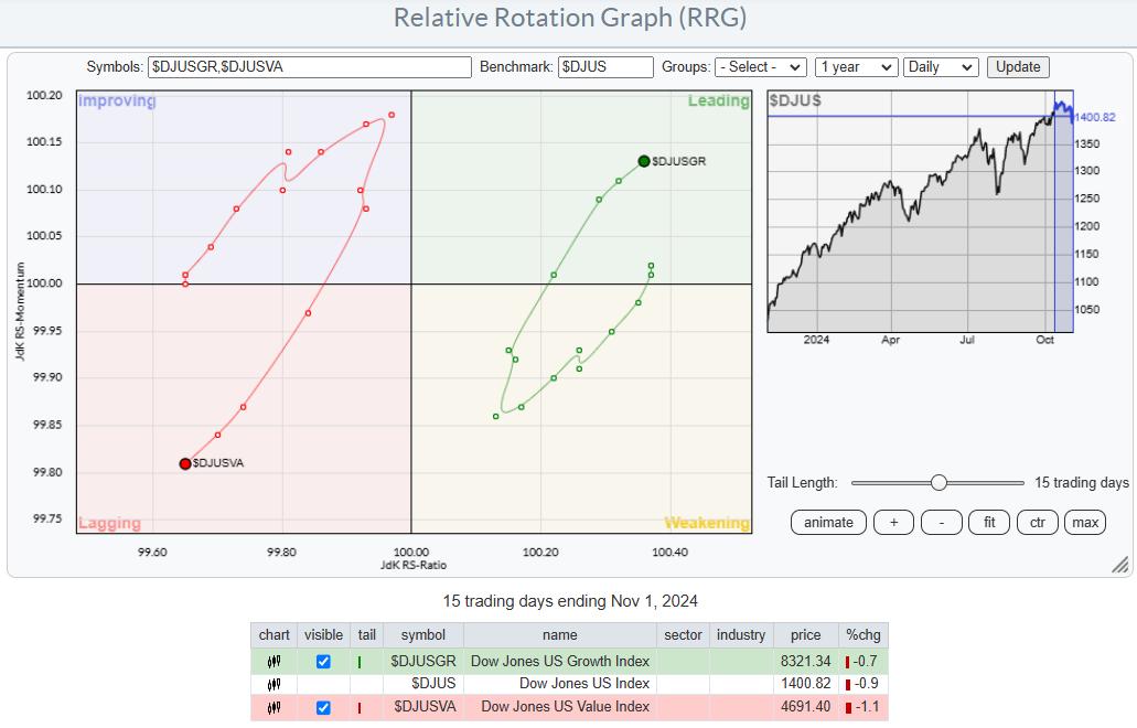
The daily RRG clearly prefers growth stocks over value stocks. The Dow Jones US Growth Index is advancing into the leading quadrant, indicating strong momentum, while the Dow Jones US Value Index is retreating into the lagging quadrant.
This rotation shows the recent shift towards growth stocks.
Large-Cap Leads the Way
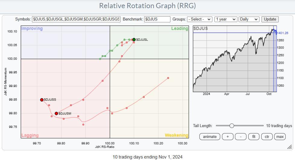
When we dissect the market by size rather than growth or value, we observe that large-cap stocks are positioned within the leading quadrant, albeit with a moderate trajectory. Conversely, mid- and small-cap stocks are lagging, with mid-caps experiencing the most unfavorable rotation. This pattern indicates that large-cap stocks are currently outperforming their smaller counterparts.
A Closer Look at Growth and Value Across Sizes
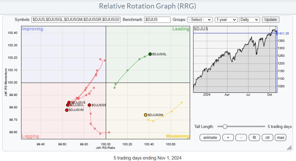
The third RRG offers a detailed view of growth and value stocks by size. Here, large-cap growth stocks stand out as they ascend within the leading quadrant. Mid-cap growth stocks show signs of recovery in the weakening quadrant, and small-cap growth stocks are gaining momentum in the lagging quadrant. However, all value stocks, regardless of size, are declining, with large-cap value stocks also moving toward the lagging quadrant. This separation underscores the near-term dominance of large-cap growth stocks.
The Influence of Large-Cap Growth Stocks
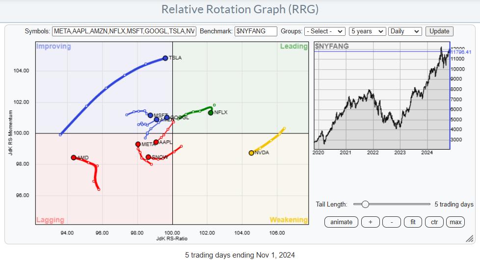
Using the New York FANG index as a proxy for large-cap growth stocks further illustrates where the market's strength lies. A cluster of these stocks, including Tesla, Google, Amazon, and Netflix, are positioned in the leading quadrant, with Tesla exhibiting particularly high momentum. Microsoft is on the cusp of joining the leading quadrant, while Meta rebounds from the lagging quadrant. Apple and NVIDIA, despite weaker tails, remain strong in relative strength, and AMD and Snowflake are also noteworthy, though they are currently lagging.
This concentration of a few stocks driving the market suggests a narrow foundation, which is a recurring theme for the US stock market. Examining the charts of four significant market influencers—Apple, Tesla, Nvidia, and AMD—reveals potential risks.
NVDA
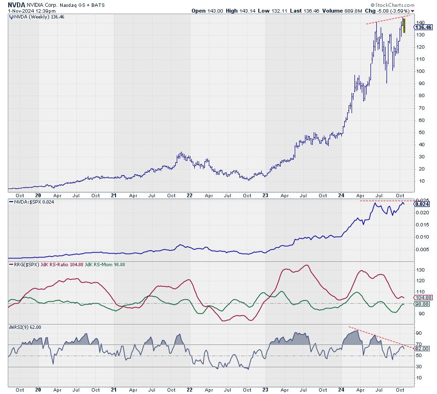
After surpassing its June high, NVIDIA is now struggling to advance, as indicated by a negative divergence in the RSI and price. A break below the support level of 130 could trigger further declines.
AMD
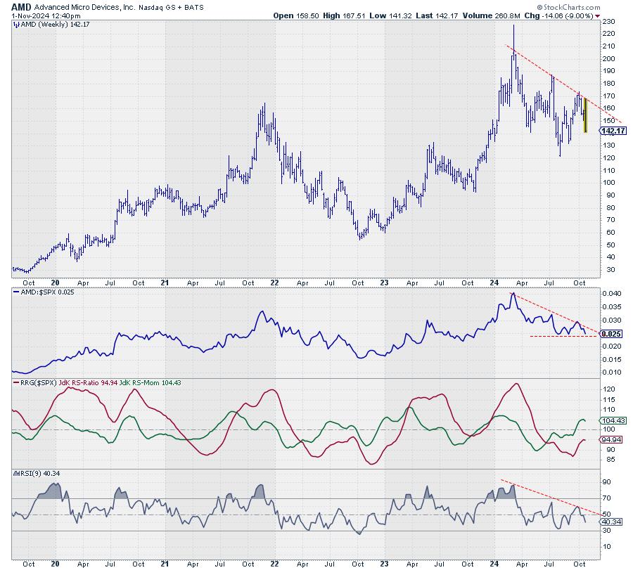
AMD's chart shows a series of lower highs and lower lows, with a potential break in raw relative strength on the horizon. If the price downtrend continues, it will very likely trigger the start of a new down leg in an already-established relative downtrend.
TSLA
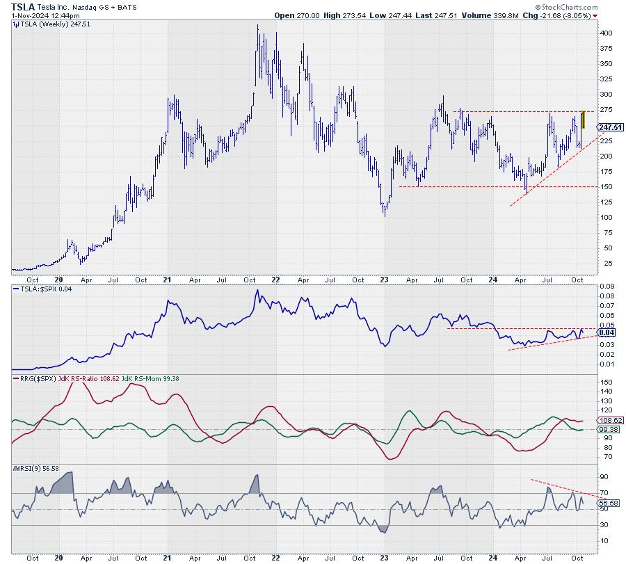
Tesla's inability to overcome resistance between 270 and 275, coupled with a negative RSI divergence, suggests limited upside potential.
AAPL
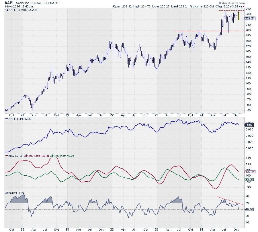
Apple, which peaked in mid-July, has since experienced a downward trend. A break below the crucial support level around 213 could lead to further losses and trigger a continued weakness in its relative strength.
Conclusion: The Market's Narrow Foundation
The market is back at a narrow foundation, as we have seen it before. The risk remains high, especially if these four stocks fail to advance and begin to decline, and when the observed divergences come into play. Such a scenario would undoubtedly challenge the S&P 500's ability to climb higher.
#StayAlert and have a great weekend, --Julius
|
| READ ONLINE → |
|
|
|
| Art's Charts |
| Two Indicators to Improve Your Edge |
| by Arthur Hill |
There are no magic bullets, but we can improve our trading edge by starting our selection process with two proven concepts: trend and momentum. These are perhaps the two most powerful forces in the market. The idea is relatively simple: stay on the right side of the trend and focus on the leaders. This is basically dual-momentum. Starting our process with these two steps will increase the odds of success. We will first choose the timeframe and then select two indicators.
When it comes to trend-momentum strategies, my research suggests that longer timeframes work better than shorter timeframes. This means 200 days works better than 50 days. Short timeframes, such as 20 and 50 days, are better suited for mean-reversion strategies, which trade pullbacks within uptrends. 200 days covers around nine months. This is long enough to absorb a 2-3 month correction and short enough to allow for extended trends.
Next, we need a trend-following indicator. While there are dozens of options out there, a simple 200-day SMA works quite well for long-term trend identification. The idea is to filter out stocks that are in downtrends and only focus on stocks in uptrends (above their 200-day SMAs). Negative outcomes are more likely when below the 200-day SMA and positive outcomes are more likely when above. It is as simple, and effective, as that.
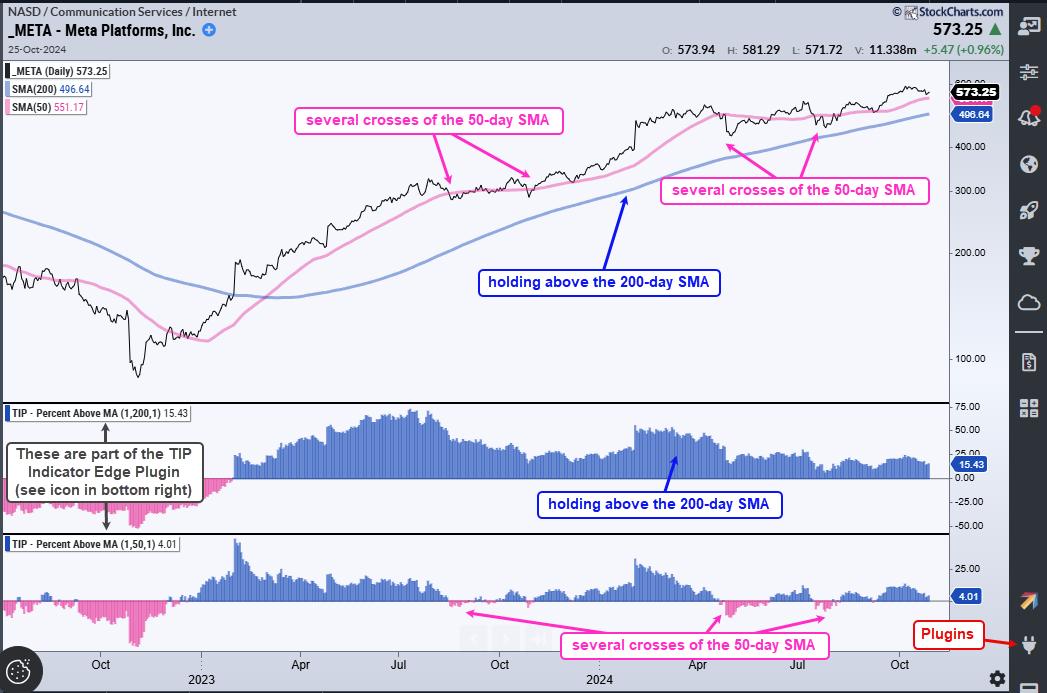
The chart above shows META with the 50 and 200 day SMAs. In the indicator windows, we can see the Percent above MA indicators, which show the distance between the close and the moving average. META broke the 50-day SMA several times, but none of these breaks resulted in a trend reversal. These breaks simply marked tradable pullbacks within the bigger uptrend. It would have been more profitable to accumulate on breaks of the 50-day as the stock held the 200-day and extended higher.
After filtering for stocks in uptrends, we then need a momentum indicator to quantify performance. Here again we have dozens of choices. Rate-of-Change is the purest momentum measure and also works quite well. As with the SMA, I will use the 200-day Rate-of-Change to capture long-term performance. We can then rank stocks and focus on those with the strongest momentum.
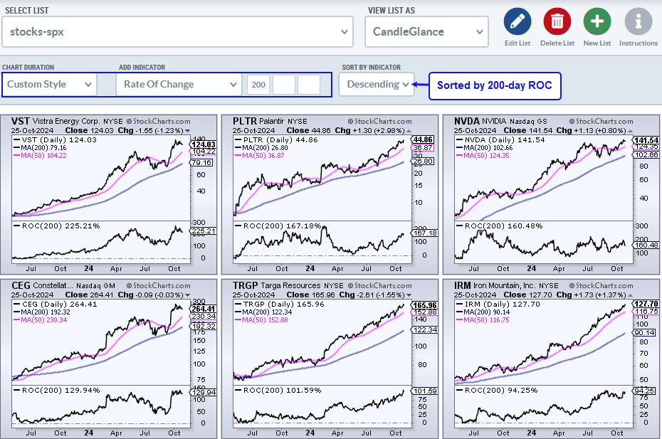 The CandleGlance charts above show the top performing S&P 500 stocks. I created a ChartList with S&P 500 stocks, viewed the list as CandleGlance and sorted by the ROC(200). This puts the top performing stocks at the top and I can then scroll through this list to create a short-list for further analysis. The CandleGlance charts above show the top performing S&P 500 stocks. I created a ChartList with S&P 500 stocks, viewed the list as CandleGlance and sorted by the ROC(200). This puts the top performing stocks at the top and I can then scroll through this list to create a short-list for further analysis.
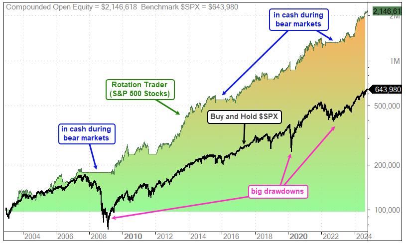
This coming week at TrendInvestorPro we are introducing two new rotation strategies using variations of these concepts. These strategies are fully systematic and trade once per week. They are aimed at investors because they trade less frequently than our rotation trader strategies. Note that our S&P 500 rotation trader strategy is up 38 % in 2024. The image below shows the equity curve for this strategy (green line) and buy-and-hold for the S&P 500 (black line). This strategy is up more than 3 times buy-and-hold and the drawdowns are much lower because of the market regime filter. Click here to learn more.
Rotation Trader for S&P 500 Stocks (+38% in 2024)
Rotation Trader for Nasdaq 100 Stocks (+17% in 2024)
Rotation Investor for S&P 500 Stocks (debuting next week)
Rotation Investor for Nasdaq 100 Stocks (debuting next week)
/////////////////////////////////////
|
| READ ONLINE → |
|
|
|
| DecisionPoint |
| Price Momentum Oscillator (PMO) Internals Still a Problem |
| by Erin Swenlin |
We noticed on Thursday evening how poor the internals were for the SPY, based on Price Momentum Oscillator (PMO) internals. These internals are the percent of stocks with rising PMOs and the percent of stocks with PMO Crossover BUY Signals. The accompanying short-term Swenlin Trading Oscillators (STOs), along with IT Breadth Momentum (ITBM) and IT Volume Momentum (ITVM), are also in decline.
Currently a mere 18% of stocks hold rising momentum. This is not a good foundation for a rally. At the same time, I know that things get as bad as they are going to get before they start getting as good as they can get. These are oversold readings that could see an upside reversal. For now, they are puny readings. Note also that the STOs turned down in negative territory.
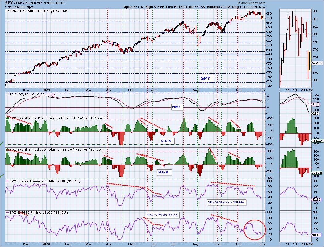
We currently have less than one quarter of stocks with PMO BUY Signals where the PMO is above its signal line. We note that this indicator also saw a top below the signal line, which is also quite bearish. Both the ITBM and ITVM continue to decline out of overbought territory. They still have plenty of real estate to fall further.
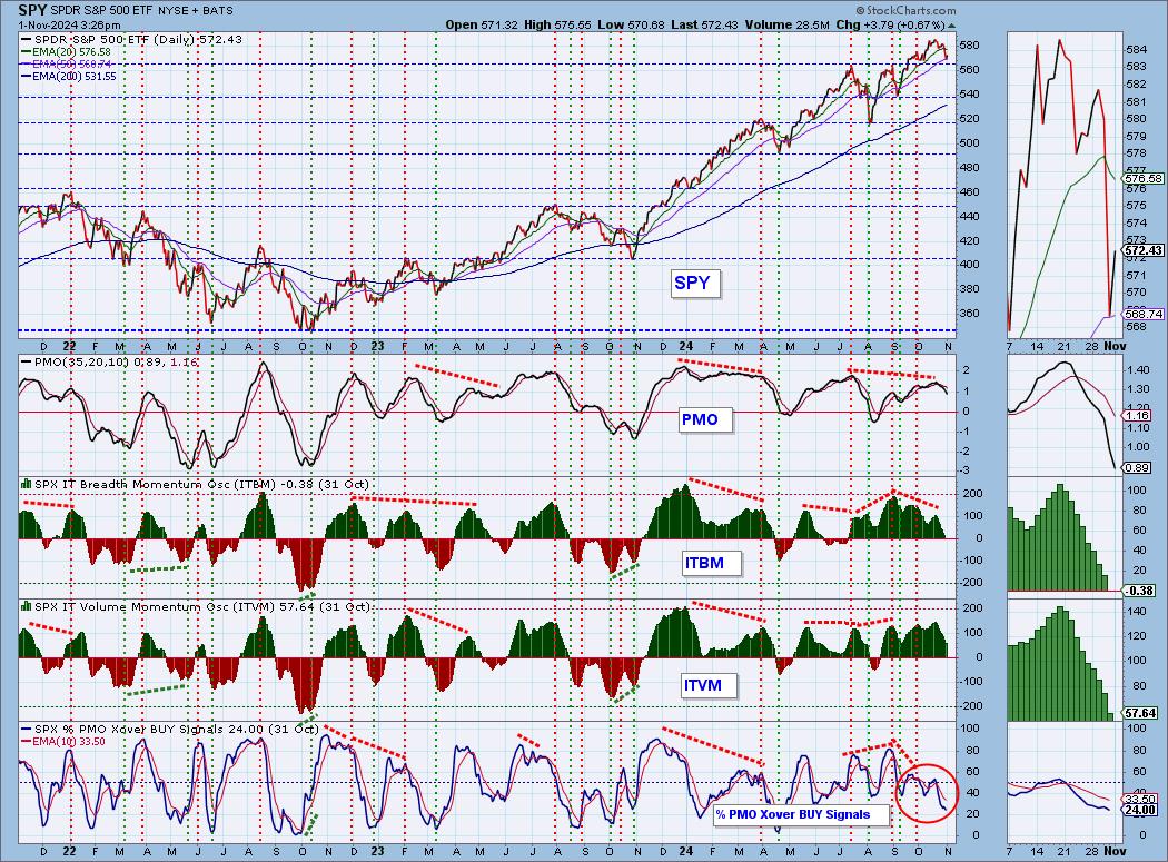
Conclusion: While the rally on Friday could change the face of some of these indicators, the PMO indicators won't likely see a significant upside reversal. Even if they do, they are still likely to be reading below our bullish 50% threshold. Considering how close we are to all-time highs, we should have stronger internals. Beware.
Good Luck & Good Trading,
Erin Swenlin
Introducing the new Scan Alert System!
Delivered to your email box at the end of the market day. You'll get the results of our proprietary scans that Erin uses to pick her "Diamonds in the Rough" for the DecisionPoint Diamonds Report. Get all of the results and see which ones you like best! Only $29/month! Or, use our free trial to try it out for two weeks using coupon code: DPTRIAL2. Click HERE to subscribe NOW!
Learn more about DecisionPoint.com:
Watch the latest episode of the DecisionPointTrading Room on DP's YouTube channel here! Or join us live at 9am PT every Monday by registering HERE.

Try us out for two weeks with a trial subscription!
Use coupon code: DPTRIAL2 Subscribe HERE!
Technical Analysis is a windsock, not a crystal ball. --Carl Swenlin
(c) Copyright 2024 DecisionPoint.com
Disclaimer: This blog is for educational purposes only and should not be construed as financial advice. The ideas and strategies should never be used without first assessing your own personal and financial situation, or without consulting a financial professional. Any opinions expressed herein are solely those of the author, and do not in any way represent the views or opinions of any other person or entity.
DecisionPoint is not a registered investment advisor. Investment and trading decisions are solely your responsibility. DecisionPoint newsletters, blogs or website materials should NOT be interpreted as a recommendation or solicitation to buy or sell any security or to take any specific action.
Helpful DecisionPoint Links:
Trend Models
Price Momentum Oscillator (PMO)
On Balance Volume
Swenlin Trading Oscillators (STO-B and STO-V)
ITBM and ITVM
SCTR Ranking
Bear Market Rules
|
| READ ONLINE → |
|
|
|
| Don't Ignore This Chart! |
| Homebuilding Rebound: How to Catch the Trend Early On |
| by Karl Montevirgen |
 Homebuyers are still on the sidelines, waiting for better mortgage rates, while homebuilders are gearing up for a potentially strong 2025. Despite mortgage rates hitting two-year lows, buyers are holding back, expecting rates and prices to drop further. Homebuyers are still on the sidelines, waiting for better mortgage rates, while homebuilders are gearing up for a potentially strong 2025. Despite mortgage rates hitting two-year lows, buyers are holding back, expecting rates and prices to drop further.
Here's the big question: Are we seeing the bottom of a downward cycle about to turn up? In other words, are we seeing the early stages of an uptrend in homebuilders? And if so, which homebuilding stock might you want to add to your ChartLists?
Let's start by analyzing the homebuilders using SPDR S&P Homebuilders ETF (XHB) as a proxy. Take a look at the weekly chart.

FIGURE 1. WEEKLY CHART OF XHB. Note how XHB has been reacting to the 50-week exponential moving average envelope.Chart source: StockCharts.com. For educational purposes.
Since XHB crossed above the 50-week exponential moving average envelope (EMA envelope) in early 2023, note the ETF's bullish reaction, bouncing within range of the channel's uptrend. You can also use the EMA envelope channel to gauge the strength of the uptrend (the further away it is toward the upside, the stronger the trend).
The big question: Can XHB keep riding its current uptrend? The ETF has bounced off the 50-week EMA envelope three times in the past two years, hinting at a possible trend continuation.
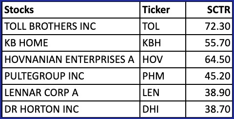
But not all of XHB's holdings are pure homebuilders—companies like Home Depot and Lowe's are in the mix too. That means you'll need to pick your stocks wisely. So, let's pick the most liquid and recognizable homebuilder stocks and check their technical strength by looking at their StockChartsTechnicalRank (SCTR) scores.
Homebuilding Stocks Ranked by SCTR
The following table lists the six most well-known stocks in the XHB fund and their corresponding SCTR score.

What might this look like on a year-to-date basis in terms of market performance? To get a perspective on this, take a look at each stock using PerfCharts:

FIGURE 2. PERFCHARTS YEAR-TO-DATE VIEW OF ALL STOX STOCKS' MARKET PERFORMANCE. Note that TOL, KBH, and PHM outperformed XHB.Chart source: StockCharts.com. For educational purposes.
Year-to-date, TOL, XBH, and PHM were the top performers, but, since TOL's SCTR score was significantly higher, perhaps it's best to zero in on TOL, letting the other ones go for the moment. Still, add all six to your ChartLists in anticipation of a broad homebuilder recovery. Once the industry turns upward, their SCTRs will likely show changes that might make some of them more suitable for a "long" opportunity.
We'll begin with a long-term view of TOL's weekly chart.
TOL: Three Year Look-Back
Similar to XHB, but perhaps even more so, TOL is exhibiting a clear uptrend that is gaining strong traction. Note the pin bar this last week, signaling strong rejection from the weekly session lows.

FIGURE 3. WEEKLY CHART OF TOL. There's a clear uptrend in the weekly price action and the stock is outperforming XHB.Chart source: StockCharts.com. For educational purposes.
Above the chart, you can see TOL's relative performance against XHB. Looking at how far the line has risen above the zero level, you can see that TOL is outperforming its homebuilding peers by over 68%. Let's shift to a daily chart.
TOL's Daily Price Action

FIGURE 4. DAILY CHART OF TOL. The Raff Regression Line best captures TOL's cyclical movement within an uptrend.Chart source: StockCharts.com. For educational purposes.
For TOL, you might consider plotting a Raff Regression Line for the following reasons:
- It identifies the trend direction.
- It captures TOL's wide cyclical movement while projecting a wide range of potential support and resistance.
- It plots a clear channel to identify breaks and reversals.
With the regression line providing a clear picture of TOL's trend, it's best to use the On Balance Volume (OBV) to see the extent to which momentum supports (or diverges from) the price movement. In the example above, buying pressure aligns with TOL's continued uptrend (see magenta line).
If you plan to go long, the best buying opportunity within the Raff Regression Channel typically occurs near the lower boundary (which attests to its recent bounce), as this area often serves as dynamic support and reflects potential price bounces. For risk management, placing a stop loss just below the lower boundary or beneath the most recent swing low is probably your best bet. This ensures protection in case the price closes below the channel, which could indicate a break in support and a potential trend reversal.
At the Close
Homebuilders are gearing up for a rebound despite homebuyers standing on the sidelines. If the industry begins showing green shoots of capital inflows (keep an eye on XHB to monitor this), it might present an opportunity to get in early on a potentially strong uptrend. But, until then, keep several homebuilding stocks on your ChartLists and monitor them regularly. For now, TOL is showing considerable strength, but, once the industry's tide rises, it'll take the strongest stocks up with it, so be ready.

Disclaimer: This blog is for educational purposes only and should not be construed as financial advice. The ideas and strategies should never be used without first assessing your own personal and financial situation, or without consulting a financial professional.
|
| READ ONLINE → |
|
|
|
| MORE ARTICLES → |
|


 After yesterday's "trick," investors received a "treat" at the end of the trading week, as the stock market regained its footing and bounced back a bit.


 The CandleGlance charts above show the top performing S&P 500 stocks. I created a ChartList with S&P 500 stocks, viewed the list as CandleGlance and sorted by the ROC(200). This puts the top performing stocks at the top and I can then scroll through this list to create a short-list for further analysis.


 Homebuyers are still on the sidelines, waiting for better mortgage rates, while homebuilders are gearing up for a potentially strong 2025. Despite mortgage rates hitting two-year lows, buyers are holding back, expecting rates and prices to drop further.
