| THIS WEEK'S ARTICLES |
| The Mindful Investor |
| Semiconductors Have More to Prove Before Breakout is Believed |
| by David Keller |
Despite the strength in some key growth stocks in January, semiconductors have been decidedly rangebound for most of the last six months. While this week's breakout of the range appears to be a significant bullish signal, the bearish candle pattern on Friday indicates investors may be best served by being patient for upside confirmation.
Big Base Breakouts Are Bullish
After reaching a swing low around $200 in early August, the VanEck Vectors Semiconductor ETF (SMH) made a series of higher highs to reach a new peak in mid-October around $260. The SMH ended up retesting this resistance area two more times through early January, with a number of pullbacks finding support at the 200-day moving average.
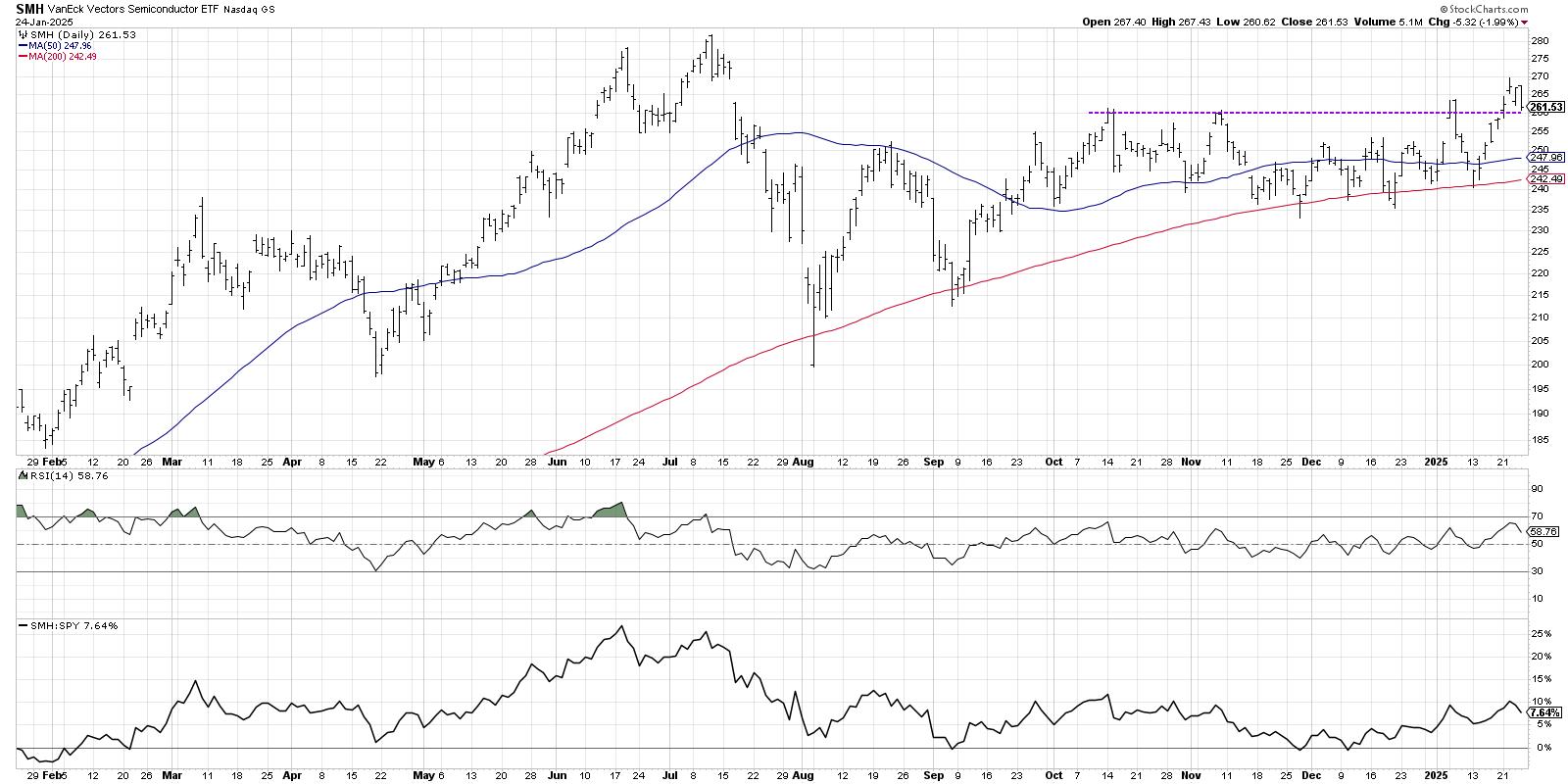
The failed breakout in the first week of 2025 was noteworthy in that it was punctuated by a bearish engulfing pattern, representing short-term distribution according to candlestick chart aficionados. On Tuesday of this week, we saw another breakout above the $260 level, and an upside follow-through day suggested that this breakout may finally have staying power.
What is the first market-related thing you look at every morning? If the answer is "financial television" or "my brokerage account" then we have some work to do! In his upcoming FREE webcast on Wednesday, January 29th, Dave will share the actual morning coffee routine that he uses every morning to clearly define market trends, identify shifts in investor sentiment, and check in on market action.
You'll leave this session with plenty of ideas on how to upgrade your own daily market analysis routine to improve your market awareness. Sign up for this free event HERE and learn how better routines lead to better decisions!
Semis Have Finally Closed the Gap
While this week's breakout did confirm a breakout above the recent consolidation pattern, a closer look reveals that SMH may have just simply closed the price gap from July 2025.
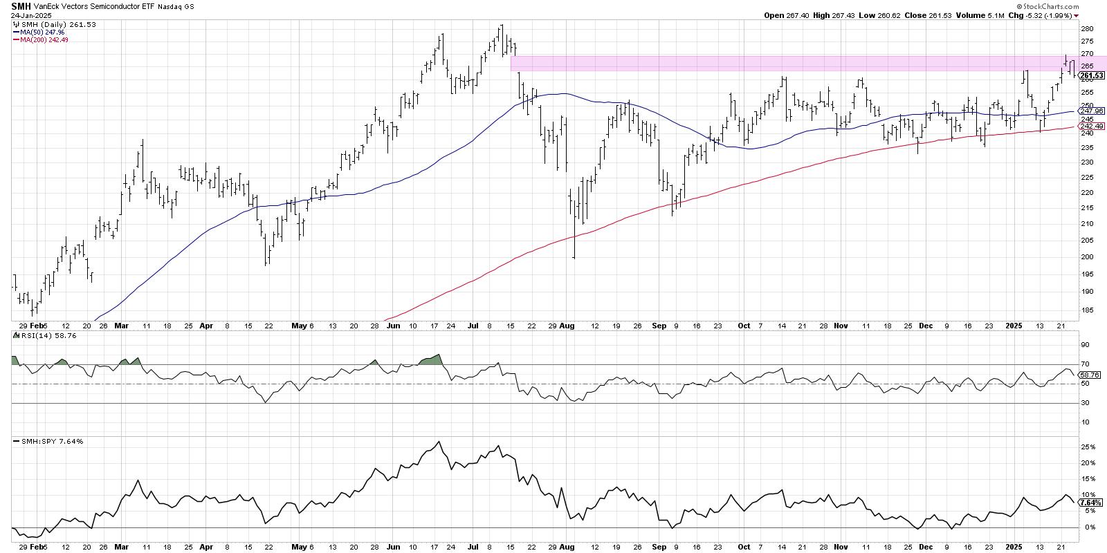
I often get asked about how I use price gaps in my analysis, and my general answer is that I treat them as support and resistance zones. I've found that the market has memory, and investors tend to gravitate toward price gaps as meaningful levels of interest, considered a "pivot point" for future potential reversals. Thus, while the move above $260 appears to be a good breakout, the fact that we're still in the price gap from last summer suggests that perhaps there is still more to prove before we can sound an "all clear" for semiconductors.
Bearish Engulfing Pattern Suggests Another Peak
Candle charts can be so helpful in understanding the short-term sentiment shifts within the context of the longer-term market trends. And Thursday and Friday brought us the dreaded bearish engulfing pattern, a two-candle reversal pattern that suggests a bearish shift in short-term sentiment.
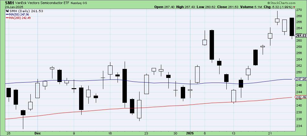
What's so fascinating about SMH is that we had another bearish engulfing pattern on the previous test of $260 from earlier in January, resulting in a pullback to the 200-day moving average. If you look closely at the first chart we shared in this article, you may notice bearish engulfing patterns at a number of price peaks over the last 12 months!
While the bearish engulfing pattern doesn't necessarily negate the recent "big base breakout", it does suggest that semis have lost some upside momentum. I look for breakouts with improving momentum, improving volume, and improving price action. Unfortunately for semiconductors, it looks like investors may have to watch for more confirmation before believing in this latest attempt to find a new high!
RR#6,
Dave
P.S. Ready to upgrade your investment process? Check out my free behavioral investing course!
David Keller, CMT
President and Chief Strategist
Sierra Alpha Research LLC
Disclaimer: This blog is for educational purposes only and should not be construed as financial advice. The ideas and strategies should never be used without first assessing your own personal and financial situation, or without consulting a financial professional.
The author does not have a position in mentioned securities at the time of publication. Any opinions expressed herein are solely those of the author and do not in any way represent the views or opinions of any other person or entity.
|
| READ ONLINE → |
|
|
|
| Martin Pring's Market Roundup |
| MEMBERS ONLY |
| Stocks are Facing an Important Test |
| by Martin Pring |
|
I have been expecting a bull market correction for about a month, but it's not been as deep as I expected. Now, however, several indexes have completed small bullish two-bar reversal patterns on the weekly charts...
|
| READ ONLINE → |
|
|
|
| OptionsPlay |
| Lowering the Bar: Why Lowe's Could Head South |
| by Tony Zhang |
 Despite periodic rallies that have buoyed the home improvement retail sector, Lowe's (LOW) is showing signs of potential weakness. Recent price action in Lowe's stock and lagging growth metrics suggest that its latest attempt to sustain a breakout may run out of steam. Despite periodic rallies that have buoyed the home improvement retail sector, Lowe's (LOW) is showing signs of potential weakness. Recent price action in Lowe's stock and lagging growth metrics suggest that its latest attempt to sustain a breakout may run out of steam.
Below, we'll explore the technical and fundamental factors behind this bearish thesis and outline a limited-risk options strategy to take advantage — discovered automatically through the OptionsPlay Strategy Center within StockCharts.com.
Technical Analysis of Lowe's Stock Price
After initially breaking above $260 resistance, LOW has spent the past two months attempting to build on its bullish momentum. However, it has since:
- Confirmed a false breakout. LOW has since fallen back below the $260 support, negating the breakout and signaling a bearish trend change.
- Underperformed the S&P 500. During its failed breakout, the stock has lagged the broader market, suggesting weakness ahead.
- Retest of Resistance. Recently, LOW rallied back to the $260 level, which now acts as resistance, providing a strong risk/reward for adding bearish exposure.

FIGURE 1. DAILY CHART OF LOWE'S STOCK. The stock is showing signs of weakness after a false breakout and a retest of its resistance level.Chart source: StockCharts.com. For educational purposes.
Fundamental Analysis of Lowe's
From a fundamental standpoint, LOW also appears vulnerable:
- Premium Valuation, Tepid Growth. While Lowe's trades at around 21x forward earnings, its projected EPS and Revenue growth metrics remain in the low single digits — well below market averages.
- Weak Profitability. Net margins of only 8% compare unfavorably to the S&P 500's average of 12%. This relatively thin profitability questions the justification for LOW's high valuation multiple.
In essence, the stock's elevated valuation doesn't align with its modest growth prospects and subpar margin profile.
Options Strategy for Trading Lowe's Stock
The OptionsPlay Strategy Center highlights selling a bear call spread to capitalize on this potentially neutral to bearish view on LOW by selling the March 7 $265/$275 Call Vertical @ $4.20 Credit. This entails:
- Selling the March 7, 2025, $265 Call at $7.38
- Buying March 7, 2025, $275 Call at $3.21
- Net Credit: $4.20 per share (or $420 total per contract)

FIGURE 2. RISK CURVE FOR A BEAR CALL VERTICAL. The strategy has a max reward of $420 and max risk of $580.Image source: OptionsPlay Strategy Center at StockCharts.com. For educational purposes.
Trade Details
- Maximum Potential Reward: $420
- Maximum Potential Risk: $580
- Breakeven Point: $269.20
- Probability of Profit: 64.70% (if LOW closes below $269.20 by March 7, 2025)
If LOW remains below the $269.20 breakeven level at expiration, this strategy will be profitable. It's a high probability of success strategy to express a bearish view with defined risk.
Unlock Real-Time Trade Ideas with OptionsPlay Strategy Center
This bearish opportunity in Lowe's was uncovered in seconds using the OptionsPlay Strategy Center on StockCharts.com. The platform's Bearish Trend Following scan highlighted LOW as a prime candidate, then automatically structured the optimal options trade, helping you skip hours of research.

FIGURE 3. BEARISH TREND FOLLOWING SCAN FILTERED LOW AS A CANDIDATE FOR A BEAR CALL SPREAD.Image source: OptionsPlay Strategy Center at StockCharts.com. For educational purposes.
By subscribing to the OptionsPlay Strategy Center, you can:
- Automate Your Scans. Find high-probability opportunities based on real-time market data and technical signals.
- Optimize Trade Structures. Receive clear, tailored strategies designed around your market outlook and risk tolerance.
- Save Time & Energy. No more sifting through countless charts—let the tool do the heavy lifting, delivering insights straight to you.
Don't let profitable setups pass you by. Subscribe to the OptionsPlay Strategy Center today and harness powerful scanning and strategy-building tools that put you a step ahead in the market every day.
|
| READ ONLINE → |
|
|
|
| RRG Charts |
| The Best Five Sectors, #4 |
| by Julius de Kempenaer |
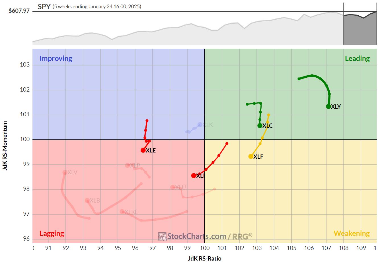
No changes in the top-5
At the end of this week, there were no changes in the ranking of the top-5 sectors.
- (1) XLY - Consumer Discretionary
- (2) XLF - Financials
- (3) XLC - Communication Services
- (4) XLI - Industrials
- (5) XLE - Energy
- (6) XLK - Technology
- (7) XLU - Utilities
- (11) XLB - Materials
- (8) XLRE - Real Estate
- (9) XLP - Consumer Staples
- (10) XLV - Health Care
In the bottom of the ranking, a few changes are showing up.
Materials rose from #11 to #8. XLRE dropped from #8 to #9. And XLP and XLV both dropped one position to #10 and #11.
As a refresher, this ranking is done based on a combination of RRG metrics on both the daily and the weekly RRGs.
Based on the positions of XLE and XLK on the weekly RRG, it may seem strange that XLE is above XLK. However, looking at the daily RRG, it can be seen that XLE made a huge move into and through leading with a very high RS-ratio and RS-momentum reading, which dragged the sector above XLK.
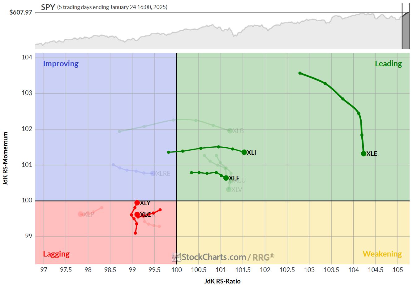
Consumer Discretionary
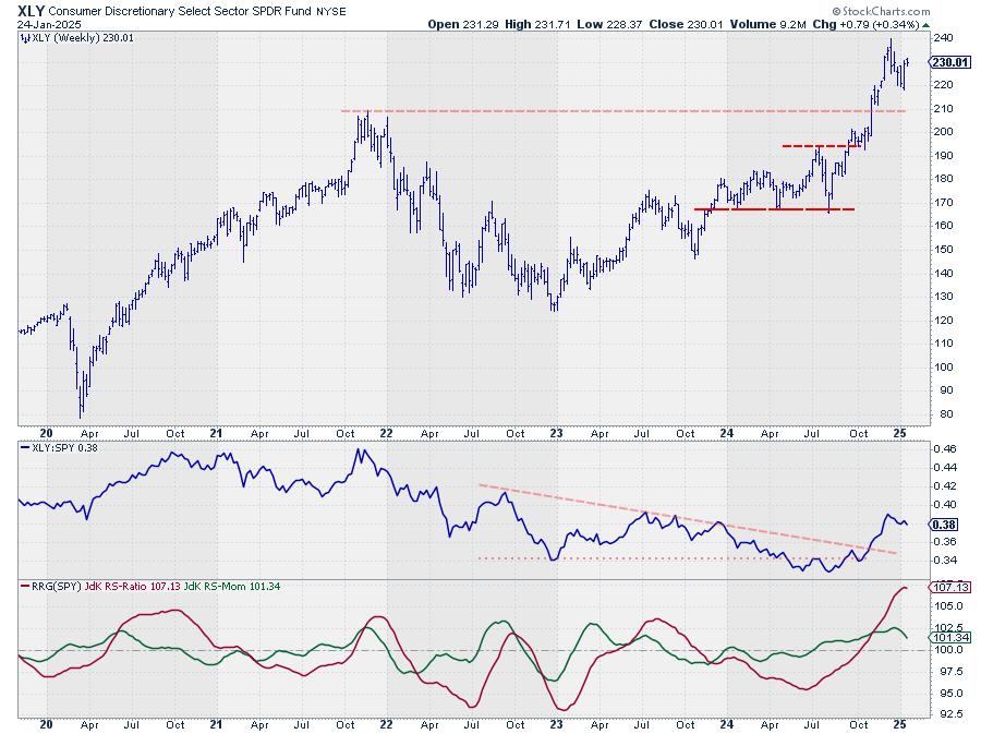
XLY has put a new higher low into place which underscores the current strength of this sector. The newly formed low at 218 is now the first support level to watch for XLY.
The first target to the upside is the level of the previous peak around 240. The uptrends in both price and relative strength are still intact.
Financials
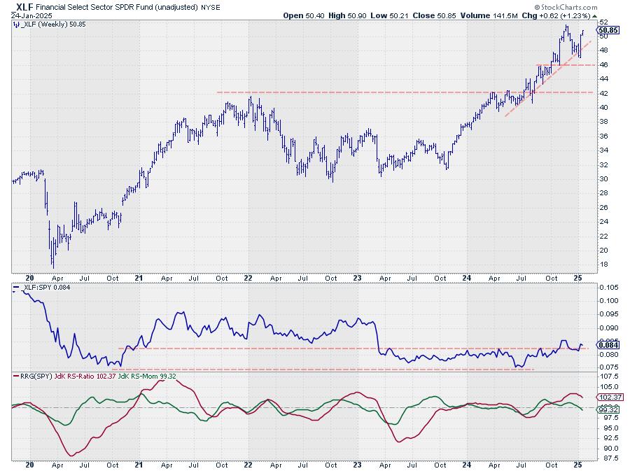
The Financials sector now also has a new higher low in place at 47, which should also be seen as the first support level for XLF.
51.6 is the first target and resistance level on the upside. An upward break will unlock more upside for financial stocks.
Communication Services
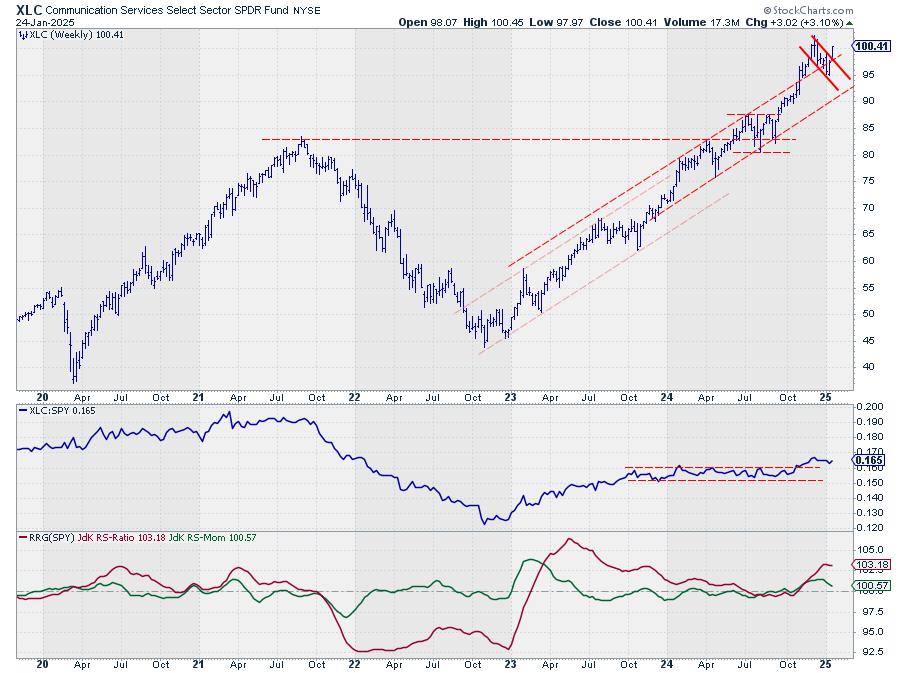
Out of the top-5 sector charts, XLC is probably the strongest.
This week's upward break out of the flag-like consolidation pattern must be seen as very strong and the signal for a further rally. Taking out the previous high at 102.40 will be the confirmation.
Industrials
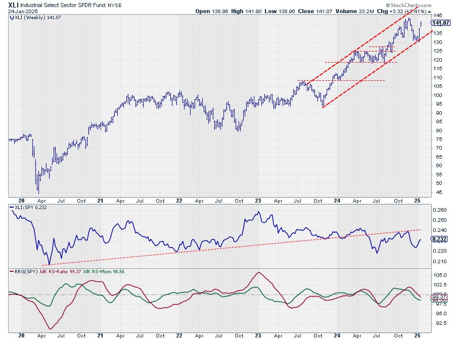
XLI continues its bounce of support and is underway to the upper boundary of its rising channel. Intermediate resistance is expected around 144.
Relative strength remains under pressure but is still stronger than the other sectors and therefore keeping XLI inside the top 5.
Energy
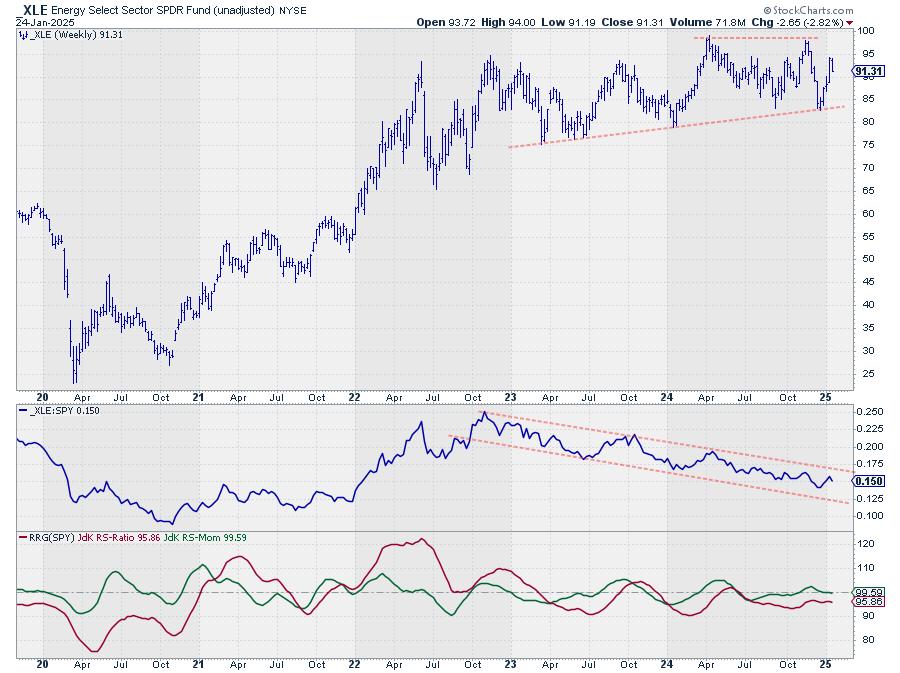
Energy dropped back a bit after its rally in the last few weeks but remains solidly in the middle of its range. Here also relative strength remains under pressure.
Performance
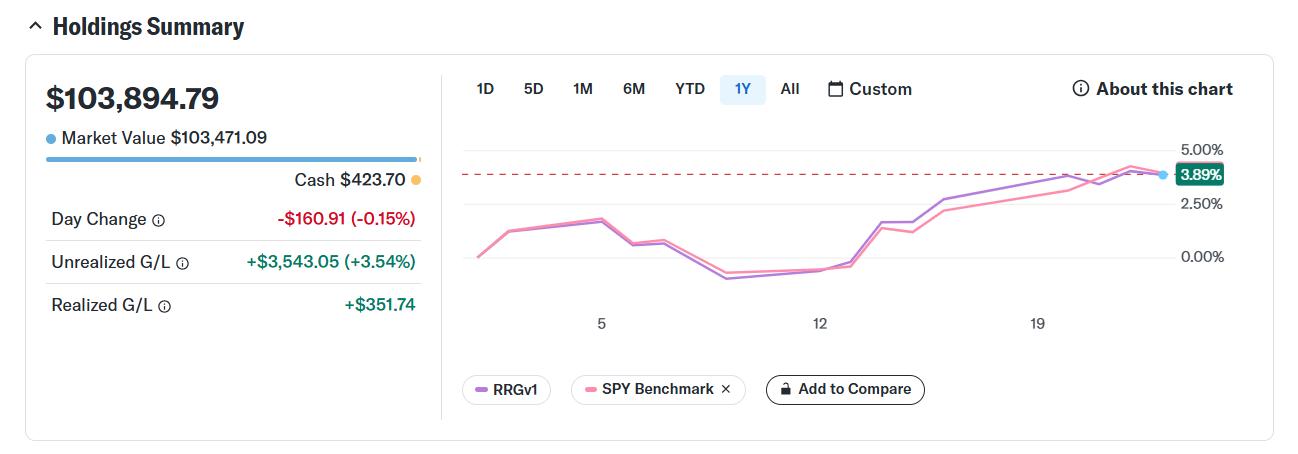
As of the close on 1/24 the top-5 portfolio gained 3.89%, keeping up with SPY which gained 3.99% over the same period.
#StayAlert, and have a great weekend. -- Julius
|
| READ ONLINE → |
|
|
|
| Don't Ignore This Chart! |
| Cisco Systems' Stock Keeps Hitting All-Time Highs: Investment Tips to Maximize Your Success |
| by Jayanthi Gopalakrishnan |
 When you think of Cisco Systems, Inc. (CSCO), you associate the company with hardware — networking, routers, and security. However, its investment in artificial intelligence (AI) makes it a stock worth monitoring. When you think of Cisco Systems, Inc. (CSCO), you associate the company with hardware — networking, routers, and security. However, its investment in artificial intelligence (AI) makes it a stock worth monitoring.
President Donald Trump's announcement of the Stargate project — up to $500 billion investment to build cutting-edge AI infrastructure — is helping companies with a significant investment in AI. One stock that shouldn't be ignored is CSCO. It may not be part of the Stargate joint venture or the first stock that comes to mind when thinking about AI, but it's got legs.
We have covered CSCO stock in past blog articles, but with its recent price action, the stock deserves another look. CSCO's stock price has been hitting new all-time highs of late; you likely have seen CSCO regularly appear in the New Highs dashboard panel under the ATH category. And given that CSCO's stock price is under $100, it's an investment to consider.
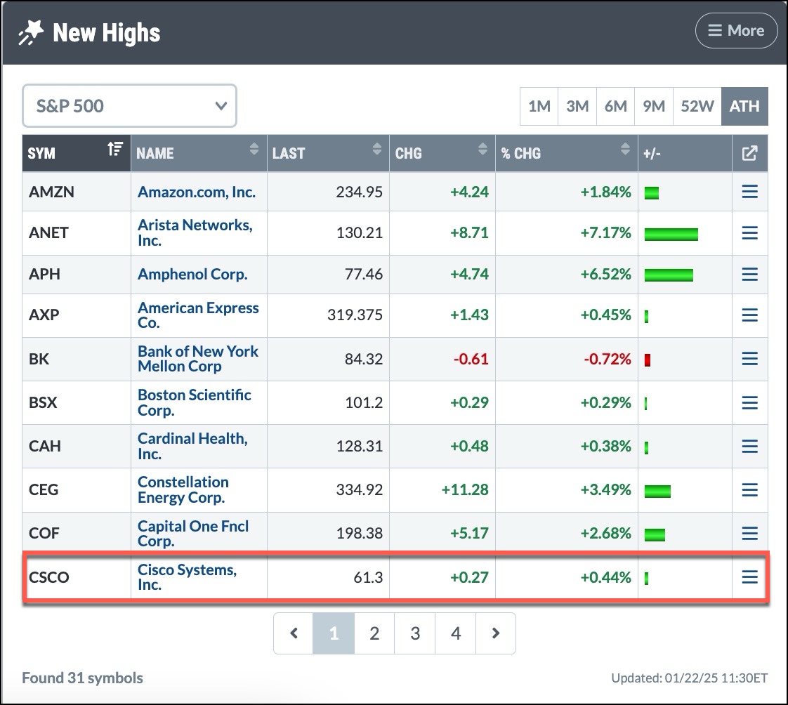
FIGURE 1. CISCO SYSTEMS' STOCK KEEPS HITTING NEW ALL-TIME HIGHS. It's worth pulling up a chart of CSCO's stock price and observing its price action.Image source: StockCharts.com. For educational purposes.
A Deep Dive Into CSCO Stock
The weekly chart of CSCO (see chart below) shows that the uptrend is still in play.
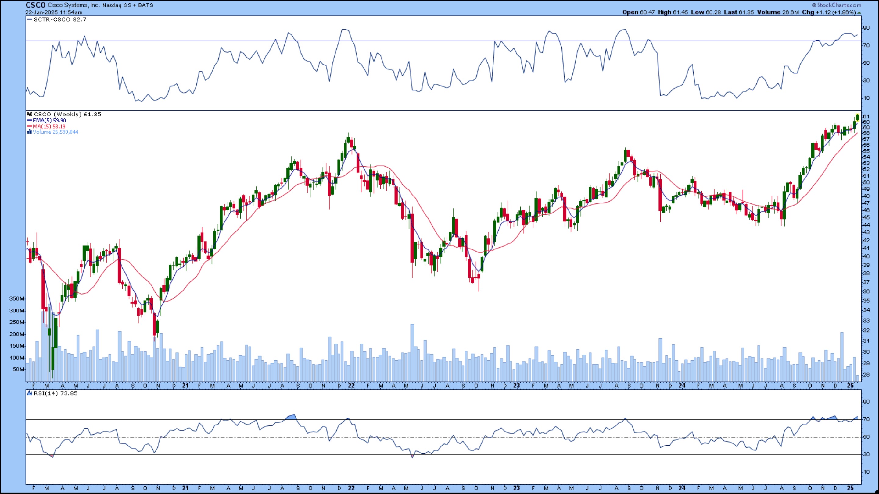
FIGURE 2. WEEKLY CHART OF CSCO STOCK. The longer-term uptrend is still in play, indicating the rally has legs.Chart source: StockCharts.com. For educational purposes.
The daily chart of CSCO also confirms the positive trend.
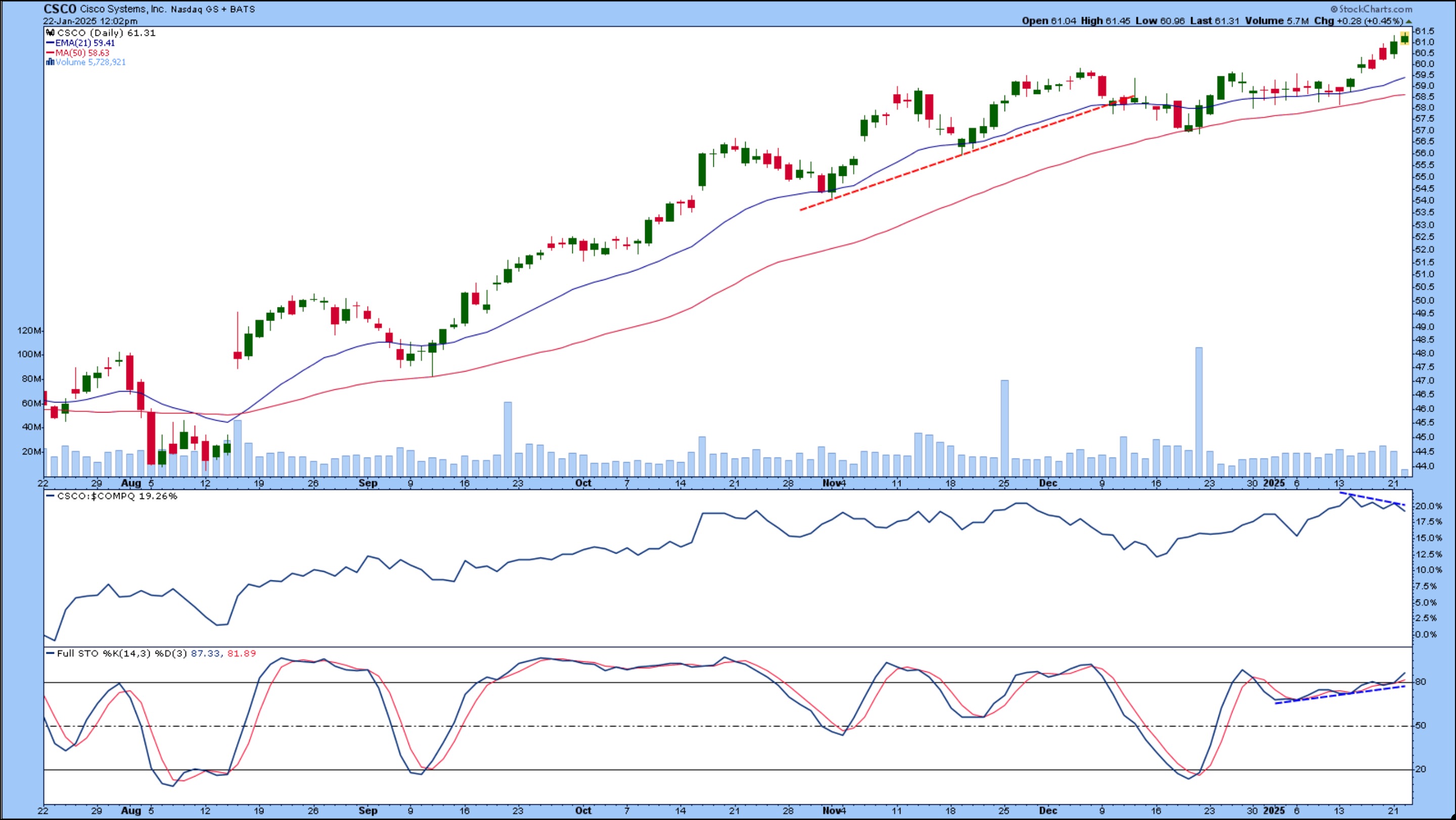
FIGURE 3. DAILY CHART OF CSCO STOCK. After pulling back to its 50-day SMA, CSCO's stock price reversed, paused, and is now back to rallying higher.Chart source: StockCharts.com. For educational purposes.
Between December 17 and December 23, CSCO's stock price dipped below its 21-day EMA and found support at its 50-day simple moving average. After that, it climbed higher and stalled for several days — between December 30 to January 13. From January 14, the stock started climbing higher.
- CSCO's performance relative to the S&P 500 ($SPX) is declining slightly. This isn't surprising given the Nasdaq's recent rise.
- The full stochastic oscillator in the lowest panel is above 80, putting it just into overbought territory. Remember, the oscillator can remain in overbought territory for an extended period.
Your Game Plan
CSCO's stock price may be losing a little momentum since volume looks like it's declining. If you didn't take advantage of the opportunity to open a long position in CSCO, you may have another chance. The stock could dip back to its 21-day EMA. If it does and reverses with follow-through, it would be another opportunity to pick up some shares.
The bottom line: Add CSCO to your ChartList and set an alert to notify you when the stock price hits its 21-day EMA (alert provided below). Note: You can modify the scan with a different closing condition instead of the 21-day EMA.
Cisco Systems announces quarterly earnings on February 12 (see our Earnings Calendar). Volatility in the stock price could increase as earnings day approaches.

Set Alert
[symbol = ‘CSCO']
and [close = EMA(21, close)]
Disclaimer: This blog is for educational purposes only and should not be construed as financial advice. The ideas and strategies should never be used without first assessing your own personal and financial situation, or without consulting a financial professional.
|
| READ ONLINE → |
|
|
|
|
|
| Trading Places with Tom Bowley |
| What's the Secret to Crushing the S&P 500? |
| by Tom Bowley |
Remember that old commercial, "It's not nice to fool Mother Nature?" Well, there should be another one pertaining to the stock market, "Don't bet against a secular bull market advance!" We're all trained, or brainwashed, if you will, to believe that the next major stock market top is at hand or just around the corner. It completely immobilizes us when it comes to having belief in the major advance at hand. Give us a bit of selling and we'll quickly point out the likely recession and swift stock market drop ahead. Two weeks ago, reigniting inflation was a major concern and the S&P 500 was 5% off its high. Today, we're in all-time high territory after the ACTUAL inflation data said that inflation is NOT a problem. Or we can just be blindfolded and keep tuning into the circus that is CNBC.
Drown out the noise and all the bearish rhetoric, and instead focus on one of my favorite charts. This is a 100-year monthly chart of the S&P 500:
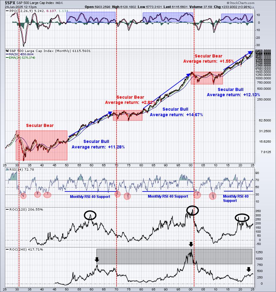
I show this chart to our EarningsBeats.com members at least once per week. It's that important to recognize and understand long-term perspective. The next time you think, "is this the start of the next secular bear market?", I want you to remember one thing. There have been TWO starts to secular bear markets in my entire lifetime - the early 1970s and the turn of the century as the dot com bubble popped. That's it. Just stop trying to call the 3rd one. There have only been 14 cyclical bear markets since 1950, which means that, on average, we see only one of these lesser bear markets every 5-6 years. Since 2018, we've had 3 of them (2018, 2020, 2022). That's waaaaay more than our fair share. Let the bulls do their thing.
The following chart is the HERE AND NOW, not the bears' wishful thinking and hoping. Yep, it's another all-time high on the S&P 500:
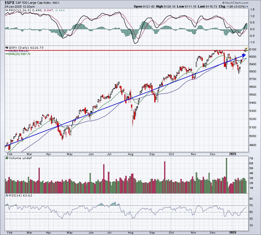
If you look back above to the 100-year chart, you'll see that the S&P 500's monthly PPO is accelerating to the upside, telling us that long-term bullish momentum just keeps building. Bear markets don't begin until that monthly PPO moves into negative territory. That sure seems like a long time from now based on the 100-year chart. Get on the right side of the trade, which is the long side. Not only is the S&P 500 monthly PPO nowhere near negative territory, none of our 11 sectors are anywhere close either. Every sector currently has a monthly PPO above 4. Our aggressive sectors have monthly PPOs residing near 10 or 11.
At EarningsBeats.com, we stress the importance of owning leading stocks in leading industry groups, which is the exact strategy we use to beat the S&P 500 in our portfolios. Our flagship Model Portfolio has now gained more than 300% since its inception on November 19, 2018. It's crushing the benchmark S&P 500 as you can see below:
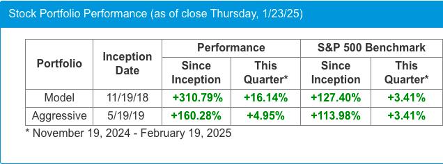
The current quarter is showing tremendous outperformance again. Growth stocks tend to power secular bull market advances, so taking advantageous of that helps in terms of relative performance. Stocks like PLTR, CLS, and TPR are providing us excellent leadership and direction.
Time to Relax
At 4:15pm ET today, our EarningsBeats.com team is hosting a virtual Friday Happy Hour. Everyone is invited! Grab your favorite beverage and join us as we celebrate another all-time S&P 500 high 2025-style! Simply CLICK HERE to join the event, but remember, it won't start until 4:15pm. Be sure to stop by and meet our entire team!
Happy trading!
Tom
|
| READ ONLINE → |
|
|
|
| ChartWatchers |
| Investors are Pouring Into Gold Miners—Here's What You Need to Know! |
| by Karl Montevirgen |
 Gold mining stocks have been climbing since the end of December, a trend that usually goes unnoticed unless gold — often dismissed as an "old relic" — undergoes one of its periodic shifts into a timely and relevant asset. Gold mining stocks have been climbing since the end of December, a trend that usually goes unnoticed unless gold — often dismissed as an "old relic" — undergoes one of its periodic shifts into a timely and relevant asset.
Recently, gold has been in the public spotlight, shedding its "relic" skin to reveal itself, once again, as a safe haven asset. If you haven't been following the yellow metal, here's what you might have missed:
- Gold prices have been rising, making mining a profitable venture.
- Central banks worldwide have ramped up gold purchases, driving prices higher.
- Several mining mergers have taken place, improving efficiency.
- Safe-haven demand, driven by geopolitical and economic uncertainties, has fueled gold investment.
- Gold mining can also mean silver extraction (along with other metals), which is in short supply.
A glance at the5-day MarketCarpets' Bullish Percent Index (BPI) view on Thursday shows that next to healthcare, gold miners have the second largest lead over other indices and sectors.

FIGURE 1. MARKETCARPERTS BPI CHART. Gold miners have the second-highest BPI reading among other sectors and indices.Image source: StockCharts.com. For educational purposes.
This 5-day BPI reading tells you that over 41% of gold mining stocks exhibit Point & Figure buy signals. This suggests a surge in buying activity relative to the other sectors on the list.
As StockCharts' PerfCharts below show, rising gold and silver prices have been fueling gold mining activity and investment (note that this isn't always the case, as various operational factors can impact mining companies independently of the metal prices they produce). We'll use the VanEck Vectors Gold Miners ETF (GDX) as our industry proxy.

FIGURE 2. PERFCHARTS OF GDX,GLD, AND SLV. The metals are leading miners and driving mining activity and investment.Image source: StockCharts.com. For educational purposes.
Taking a look at GDX's weekly chart, you can see the relative performance between gold mining stocks and the yellow metal.

FIGURE 3. WEEKLY 5-YEAR CHART OF GOLD MINERS. Note how gold prices are now leading the collective performance of the gold mining industry.Image source: StockCharts.com. For educational purposes.
For years, gold mining stocks led the price of gold (represented by the blue line), but, over the past year, gold has begun outperforming miners. This suggests a few possibilities:
- Investors might have been concerned about rising operational costs and weaker profit margins in the mining sector, favoring gold over the companies that produce it.
- Now, the renewed interest in mining stocks suggests that investors might be anticipating improved profitability in miners as gold prices continue to rise.
But is investing in miners a wise move or a trap? As the daily chart below shows, it can be either. It all depends on how the index reacts at critical technical levels.

FIGURE 4. DAILY CHART OF GDX. Keep a close eye on resistance at $38 and support at $33.Image source: StockCharts.com. For educational purposes.
GDX has pulled back from its high of $43.71. Is this a pullback or the beginning of a more significant trend reversal Whether the rally continues or reverses into a downtrend depends on whether the price breaks above resistance at $38 or falls below support at $33.
This notion rests on the simple principle that an uptrend consists of consecutive higher highs and lows and that a downtrend consists of consecutive lower lows and highs. The ZigZag line effectively highlights this trend movement, especially the current swing high ($38) and low ($30).
In terms of technical strength, volume, and momentum:
- The StockCharts Technical Rank (SCTR) line is rising but still below the initial bullish threshold of 76. This is a promising indication, but not yet confirmed bullish.
- Buying pressure, according to the Chaikin Money Flow (CMF), is above the zero line, indicating buyers are starting to take control of the market.
- The Relative Strength Index (RSI) is rising yet below the 70 threshold, indicating there's still room for GDX to run before entering overbought territory.
The main point is to add GDX to your ChartLists, watch how it responds to the key support and resistance levels, and monitor volume and momentum readings for confirmation.
At the Close
Gold mining stocks have gained momentum alongside rising gold prices. While this signals renewed interest in the industry, the technicals, in this case, can give you a much clearer picture of the underlying dynamics of price and market sentiment. Keep an eye on those levels to help you make a sound decision and pinpoint optimal timing.

Disclaimer: This blog is for educational purposes only and should not be construed as financial advice. The ideas and strategies should never be used without first assessing your own personal and financial situation, or without consulting a financial professional.
|
| READ ONLINE → |
|
|
|
| MORE ARTICLES → |
|