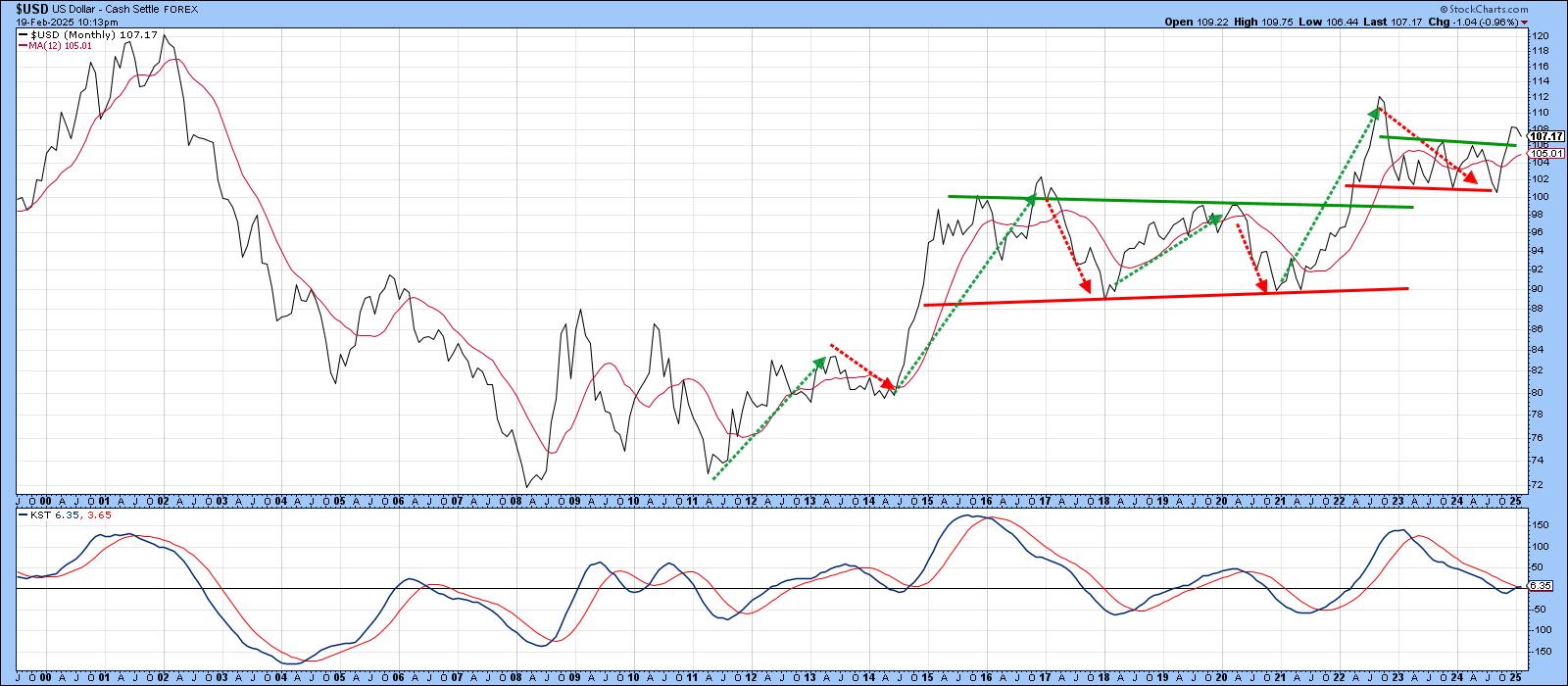
Treasury yields also fell. The benchmark US 10-year Treasury yield slipped by 1.78%, closing at 4.42%. With fears of a weakening economy back on the table, show bonds some love. The good news is you don’t have to understand all the fundamentals. You can get by knowing the basics.
In a nutshell, the yield curve comes in three shapes — normal, inverted, and flat.
- Normal yield curve: Shorter-term yields are lower than longer-term ones.
- Inverted: Shorter-term yields are higher than longer-term ones.
- Flat: Shorter-term and longer-term yields are similar.
The Dynamic Yield Curve in StockCharts makes it simple to monitor the yield curve (see image below). The x-axis of the yield curve (chart on the left) represents the different maturities starting with the three-month Treasury bills on the left and progressing to the longer-term 30-year bond on the right.
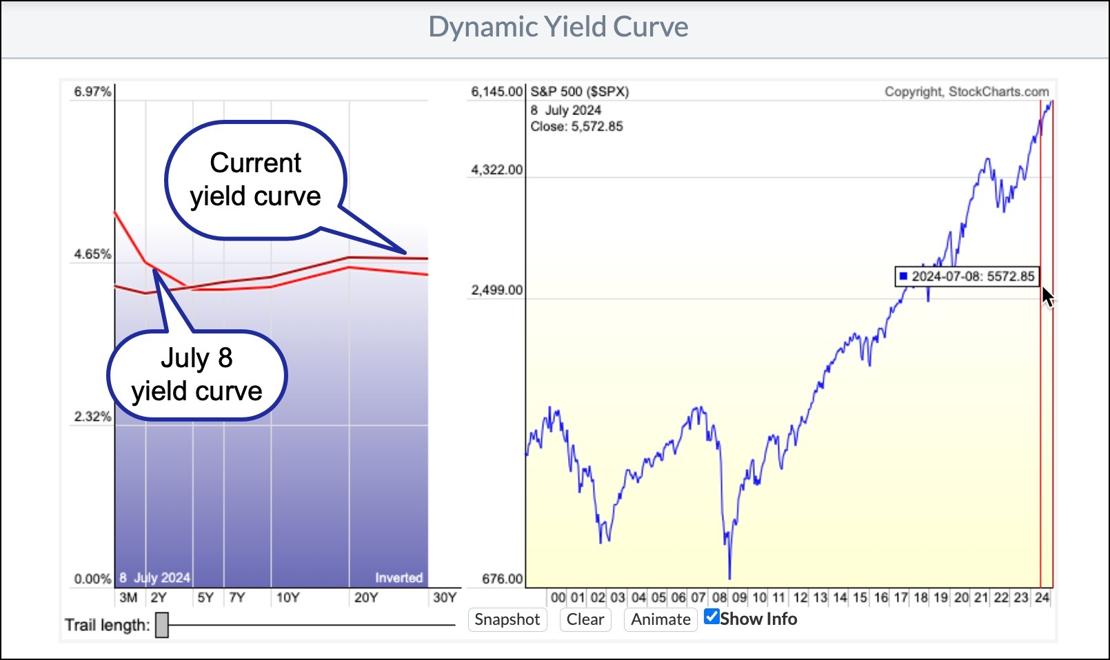
The current yield curve is normal, so no alarm bells yet. I compared it to the yield curve from July 8, 2024, the last time the yield curve was inverted.
You can do this by clicking the Snapshot button for the current yield curve, then sliding the red vertical line on the S&P chart (chart on the right) until you see an inverted yield curve (bottom right).
An inverted yield curve is considered to be a recession indicator. Interestingly we had an inverted yield curve from July 18, 2022, to July 5, 2024, and while the US economy contracted slightly in 2022, it didn’t experience a recession. So no guarantees, but with economic growth fears rising, it may be wise to monitor the yield curve to get an idea of the economy's health.
Often, when the yield curve starts to invert, you’ll see a rotation into defensive sectors such as Utilities, Consumer Staples, and Real Estate. Looking at the past week’s Sector Summary, these three sectors are in the top four in terms of performance.
If the yield curve inverts and defensive sectors retain their leadership position for an extended period, consider it an alert to reevaluate your portfolio and allocate a portion of your assets to the defensive sectors.
The +1: To learn more about the Dynamic Yield Curve tool, check out this ChartSchool article. And while you’re at it, explore other tools such as the OptionsPlay Strategy Center, RRG Charts, and PerfCharts.