|
After a turbulent week, one which looked like it would end on a negative note, the broader stock market indexes ultimately closed higher on Friday.
The S&P 500 recovered most of Thursday’s loss and closed higher by 1.59%. The Nasdaq Composite, which was hit hard on Thursday, also recovered, closing higher by 1.63%. Both indexes still closed lower for the week, but the Dow managed to close higher for the day and week.
Despite the negative weekly performance of the S&P 500 and Nasdaq, the long-term view for the broader equity market isn’t so bleak. You can see this for yourself if you pull up a weekly chart of the S&P 500 ($SPX) and overlay the 26-week simple moving average, which represents six months. Give it a try! Note that the index is trading above the moving average, and the uptrend is still in play. For investors, the long-term trend is much more useful for gauging the market’s overall strength.
Speaking of long-term, with a new administration in Washington, now is a good time to revisit the Four-Year Presidential Cycles charts available in the StockCharts Historical Chart Galleries. The chart below shows the cycle for President Trump’s second term so far.
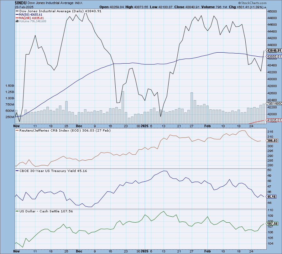
Note that the chart begins in November, immediately following Trump’s election, as the cyclical patterns begin at that point. Trump’s term officially began on January 20, and you can see on the chart that the Dow Jones Average broke above its 50-day moving average. In the second half of February, however, the index traded below the average, though it closed above it on Friday. Historically, the stock market tends to perform poorly in the second half of February, especially in post-election years, so it may not be time to panic.
You can see charts of previous presidential terms going back to—history buffs will love this—1900. Compare the performance of two-term presidents and identify how their second term differed from the first. How does Trump’s first term compare to his second? What was the state of the market at the beginning of a president’s term? There may be some other useful nuggets you can find, so explore away.
Here’s how you can access the charts:
- From Your Dashboard, select the Charts & Tools tab.
- Under Reports & More, select Historical Chart Gallery.
- Select the Four-Year Presidential Cycles gallery.
Feel free to check out the other galleries: Key Market Indexes, Market Breadth Indicators, and Market Fundamentals.
There’s no end to how much you can learn and analyze in the stock market. And speaking of learning, we have some exciting news.
Our next OptionsPlay webinar is on March 4 at noon EST. If you have an interest in options, you won’t want to miss this educational webinar. Tony Zhang, Chief Strategist for OptionsPlay, will walk you through our new OptionsPlay Add-On. The webinar is free, but, in order to attend, you must register using this link.
We hope to see you there.
|