| THIS WEEK'S ARTICLES |
| The Mindful Investor |
| My Downside Target for the S&P 500 |
| by David Keller |
Things heated up this week on my daily market recap show, with support levels being busted without delay across the growth sectors. Despite a decent up day on Friday for the S&P 500 and Nasdaq 100, the damage through most of the week brought both indexes face-to-face with the ultimate long-term trend barometer, the 200-day moving average.
It Started With a Break of Our Line in the Sand
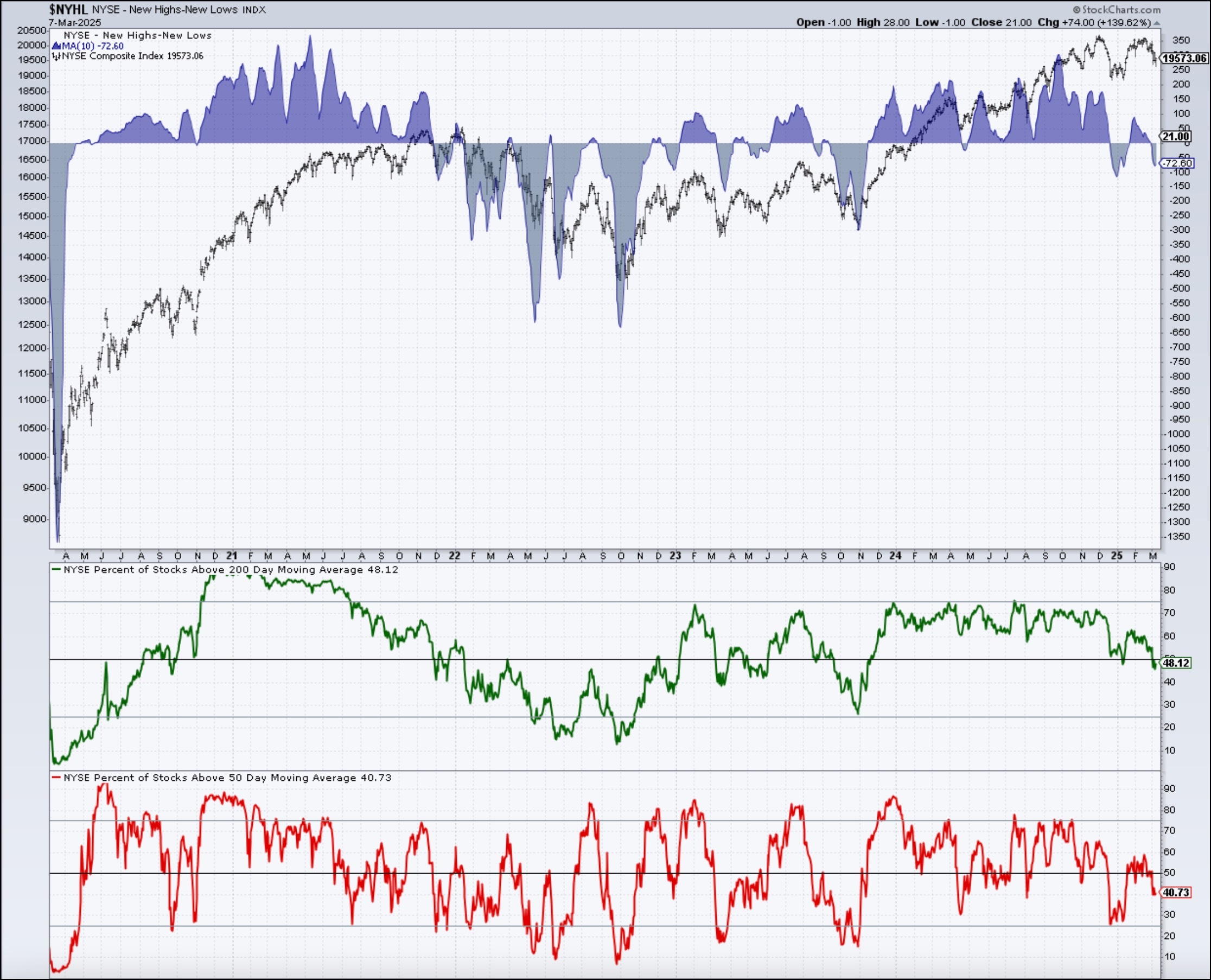
We've been tracking the signs of internal deterioration for months, from a confirmed Hindenburg Omen signal in December to weakening breadth and momentum signals for leading stocks. But until the S&P 500 broke below our "line in the sand" of 5850, there didn't seem much to be concerned about. That all changed over the last week.

Why was 5850 so important? This price level represents a pivot point, or a level which has been tested as both support and resistance. And without the S&P 500 breaking below a confirmed level of support, the building signs of bearishness just wasn't leading to enough price deterioration to get us very concerned.
Don't miss the latest episodes of our Market Misbehavior podcast, featuring interviews with Kristina Hooper of Invesco, Keith Fitz-Gerald of The Fitz-Gerald Group, and Jordan Kimmel of Magnet Investing Insights!
Now that 5850 has been clearly violated to the downside, though, it's all about the 200-day moving average, which both the S&P 500 and Nasdaq 100 tested this week. Friday's rally kept the SPX just above its 200-day moving average, which means next week we'll be looking for a potential break below this important trend-following mechanism.
Fibonacci Retracements Suggests Downside to 5500
But what if we apply a Fibonacci framework to the last big upswing during the previous bull phase? Using the August 2024 low and December 2024 high, that results in a 38.2% retracement level at 5722, almost precisely at the 200-day moving average. So now we have a "confluence of support" right at this week's price range.
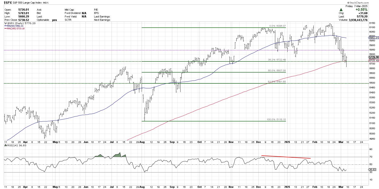
If next week sees the S&P 500 push below the 5700 level, that would mean a violation of moving average and Fibonacci support, and suggest much further downside potential for the equity benchmarks. Using that same Fibonacci framework, I'm looking at the 61.8% retracement level around 5500 as a reasonable downside target. With the limited pullbacks over the last two years, most finding support no more than 10% below the previous high, a breakdown of this magnitude would feel like a true bear market rotation for many investors.
Supporting Evidence from Newer Dow Theory
So, despite rotating to more defensive positioning in anticipation of a breakdown, what other tools and techniques can we use to validate a new bear phase in the days and weeks to come? An updated version of Charles Dow's foundational work, what I call "Newer Dow Theory", could serve as a confirmation of a negative outcome for stocks.
Charles Dow used the Dow Industrials and Dow Railroads to define the trends for the two main pillars of the US economy, the producers of goods and the distributors of goods. For our modern service-oriented economy, I like to use the equal-weighted S&P 500 to represent the "old economy" stocks and the equal-weighted Nasdaq 100 to gauge the "new economy" names.
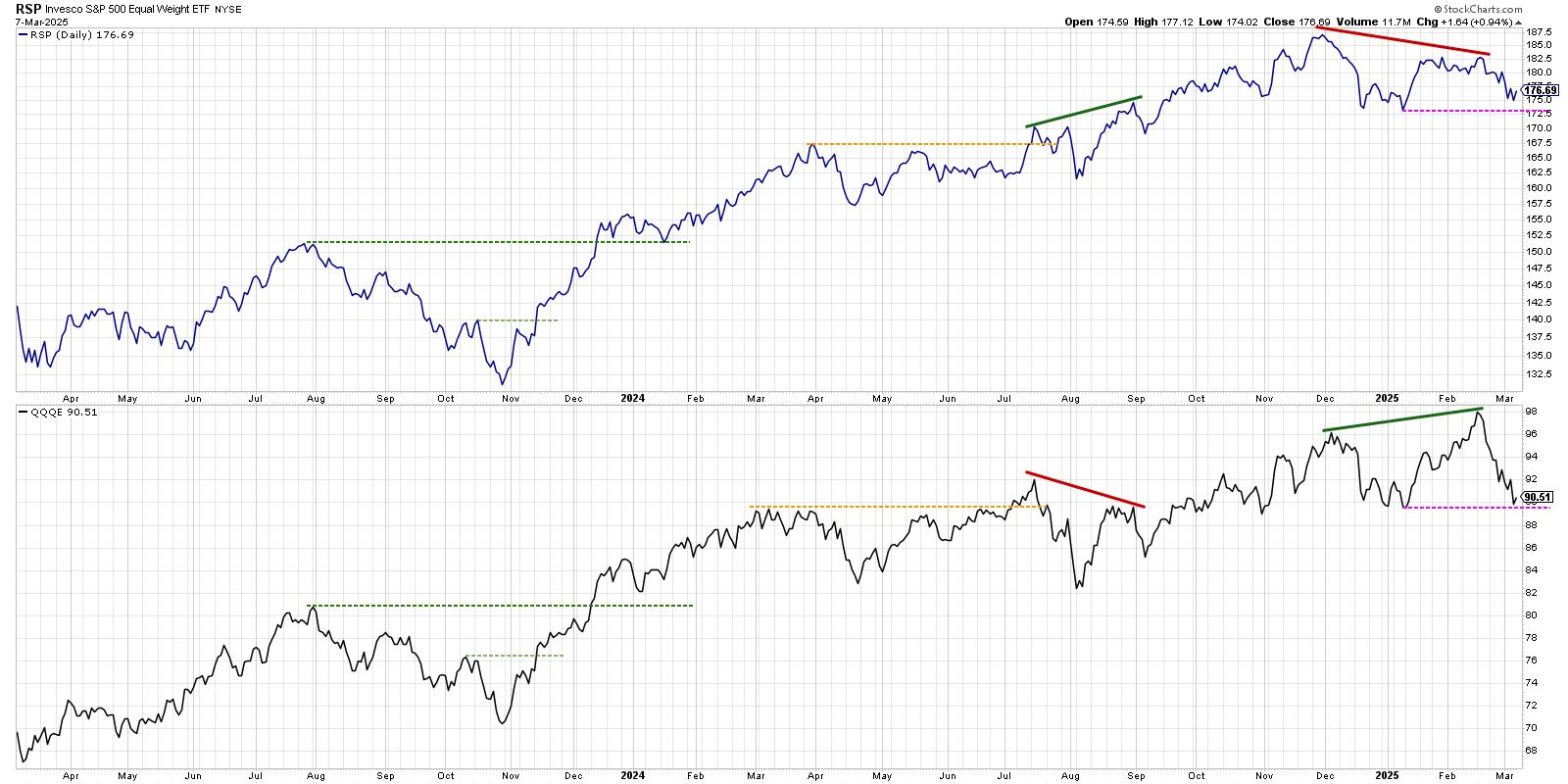
We can see a clear bearish non-confirmation last month, with the QQQE breaking to a new 52-week high while the RSP failed to do so. This often occurs toward the end of a bullish phase, and can represent an exhaustion point for buyers. Now we see both ETFs testing their swing lows from January. If both of these prices break to a new 2025 low in the weeks to come, that would generate a confirmed bearish signal from Newer Dow Theory, and imply that the bearish targets outlined above are most likely to be reached.
Many investors are treating this recent drawdown as yet another garden variety pullback within a bull market phase. And while we would be as happy as ever to declare a full recovery for the S&P 500, its failure to hold the 200-day moving average next week could be a nail in the coffin for the great bull market of 2024.
RR#6,
Dave
P.S. Ready to upgrade your investment process? Check out my free behavioral investing course!
David Keller, CMT
President and Chief Strategist
Sierra Alpha Research LLC
Disclaimer: This blog is for educational purposes only and should not be construed as financial advice. The ideas and strategies should never be used without first assessing your own personal and financial situation, or without consulting a financial professional.
The author does not have a position in mentioned securities at the time of publication. Any opinions expressed herein are solely those of the author and do not in any way represent the views or opinions of any other person or entity.
|
| READ ONLINE → |
|
|
|
| OptionsPlay with Tony Zhang |
| MEMBERS ONLY |
| How to Apply Top Options Strategies with the OptionsPlay Add-On |
| by Tony Zhang |
|
In this must-see video, Tony explains the top options strategies and shares the best practices for trade entries, exits, and optimal deployment conditions. As you watch along, you'll get a clear roadmap for confidently utilizing each option strategy...
|
| READ ONLINE → |
|
|
|
| Don't Ignore This Chart! |
| Why Investors Are Flocking to XPEV Stock: Decoding High SCTR Scores |
| by Jayanthi Gopalakrishnan |
And, the Oscar, er, top StockCharts Technical Rank (SCTR) goes to XPeng, Inc. (XPEV), a Chinese smart electric vehicle (EV) manufacturer. XPEV has silently crept its way to the top of the list.

The Chinese EV industry has seen increased sales in the last month. This has made the space much more competitive for Tesla, Inc. (TSLA), which is seeing its sales in China decline. With XPeng's new SUV slated to hit the market soon, XPEV has high hopes for 2025. I'm sure we'll hear more about this when the company announces earnings on March 18, before the US market opens.
XPeng's stock price has been rising steadily since August 2024, attracting the attention of several Wall Street analysts, many of whom have upped their ratings on the stock. And for good reason. The chart below compares XPEV stock to TSLA stock. Since mid-December, TSLA's stock price (black solid line) has declined while XPEV's has risen.
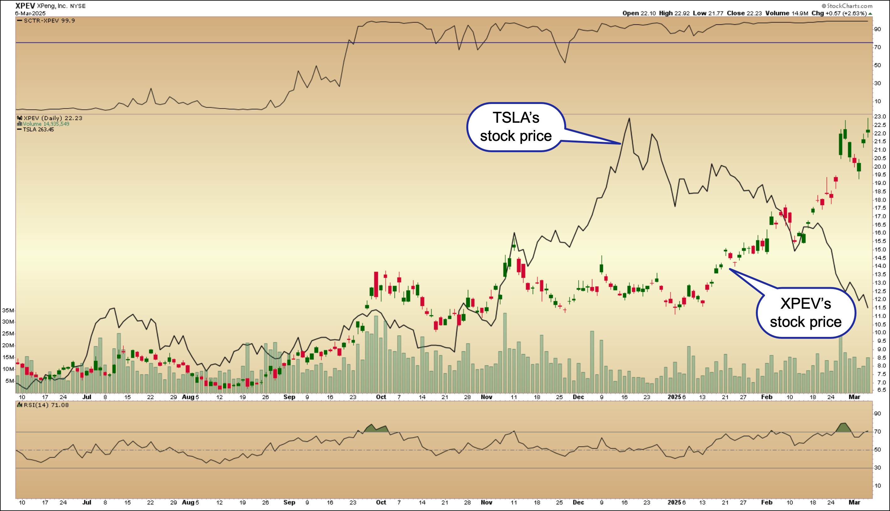
FIGURE 1. XPEV'S STOCK PRICE VS. TSLA'S STOCK PRICE. TSLA was the outperformer until mid-December, after which it started declining. In February 2025, XPEV outperformed TSLA.Chart source: StockCharts.com. For educational purposes.
Technically, XPEV has a lot going for it.
- The stock is in a steady uptrend—its one-year performance is +132.81%.
- XPEV's SCTR score of 99.9 indicates the stock is technically strong.
- The relative strength index (RSI) has just crossed 70, indicating there's room for XPEV's stock price to move higher.
The daily chart shows the stock price is trading close to its 52-week high of $22.80. A breakout above this level would be positive for the stock and could pave the way for the stock price to move toward its all-time high of $74.49. Let's switch to the weekly chart of XPEV.
The weekly chart below shows XPEV's stock price is approaching its weekly July 2023 high, which could be the more likely resistance level XPEV would have to break through.
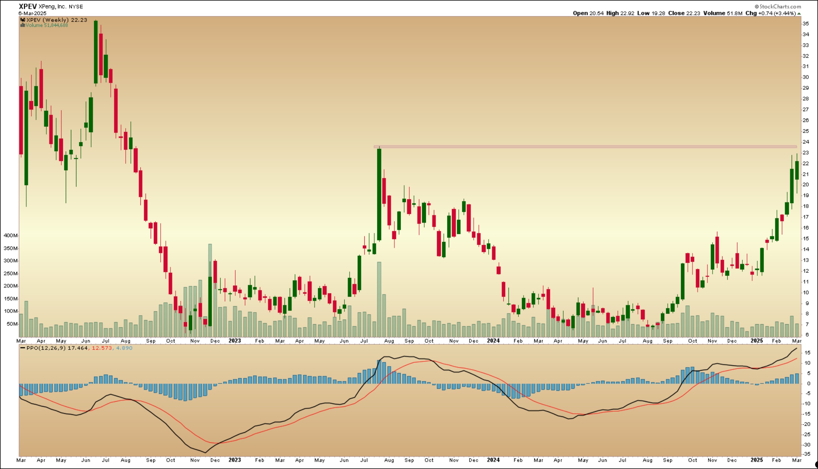
FIGURE 2. WEEKLY CHART OF XPEV'S STOCK PRICE. The stock price is approaching its 2023 weekly high, which could act as a resistance level. The percentage price oscillator in the lower panel indicates strong momentum in the stock's price.Chart source: StockCharts.com. For educational purposes.
The percentage price oscillator (PPO) in the lower panel shows the stock has had strong upside momentum and could be overbought. A pullback in the stock's price is likely to occur. If this pans out and XPEV reverses and pushes through the resistance on the weekly chart with a strong upside follow-through, it would be worth adding XPEV to your portfolio.
Keep an eye on this one. At the rate smart EVs are going, don't be surprised to find flying cars coming to dealerships.
Disclaimer: This blog is for educational purposes only and should not be construed as financial advice. The ideas and strategies should never be used without first assessing your own personal and financial situation, or without consulting a financial professional.
|
| READ ONLINE → |
|
|
|
| Martin Pring's Market Roundup |
| MEMBERS ONLY |
| Bitcoin Faces Important Technical Test |
| by Martin Pring |
|
Over the weekend, Donald Trump declared the creation of a U.S. strategic crypto reserve, which will include Bitcoin and four other cryptocurrencies...
|
| READ ONLINE → |
|
|
|
| ChartWatchers |
| Market Movers in Action: How to Identify High-Probability Dip-Buying Setups |
| by Karl Montevirgen |

If the essence of stock investing is to buy low and sell high, then buying not just low, but at a steep discount, optimizes your potential returns. This strategy is what's popularly called "buying the dip."
Aside from avoiding falling knives, buying the dip as a general approach requires three things:
- Finding tools to identify a broad range of declining stocks.
- Selecting only those strong stocks on the verge of rebounding.
- Formulating a market entry setup.
This article covers the first two steps, though I'll guide you through all three. I'm emphasizing the first two because there are numerous tools—more than I can cover in a single article—to help you identify a wide range of tradable stocks.
Finding Declining Stocks Amid a Rallying Market
As the markets recovered on Wednesday from a steep two-day decline, my first step was to check the Market Movers tool on my Dashboard to see which stocks were getting hit the hardest.

FIGURE 1. MARKET MOVERS % DOWN. Crowdstrike took the top spot for the biggest percentage loss on Wednesday morning.
Crowdstrike (CRWD) was the biggest decliner, down at the time by nearly 9%. To get a broader picture of the sector action, I switched to MarketCarpets' tech sector view. It turns out that CRWD was the worst-hit stock amid an otherwise mostly greenish landscape.

FIGURE 2. MARKETCARPETS TECH SECTOR VIEW. This tells you that CRWD was among a few tech stocks experiencing a significant drop, while others were potentially rebounding.
If you check the StockCharts' Symbol Summary page, you can see CRWD's earnings and revenue history. While the company recently missed earnings estimates despite beating revenue expectations, the real driver behind the decline was weak earnings guidance.
Let's switch to a weekly chart for a broader view of CRWD's price action.

FIGURE 3. WEEKLY CHART OF CRWD. Despite the two sharp drops, the broader trend, which is bullish, is still intact.
CRWD's uptrend began in 2023 but tumbled sharply in July 2024 after a faulty software update triggered a global IT outage. The stock rebounded later that month, rising sharply only to fall again in February due to disappointing fiscal guidance, insider selling, regulatory scrutiny, and broader macroeconomic concerns that pressured growth stocks.
Nevertheless, the uptrend, as volatile as it is, remains arguably intact. Using the Bollinger Bands® to gauge the trending action, you can see that CRWD has fallen below the middle band to rebound (you see this on the daily chart) at $340. Traders found this to be a favorable spot for entry, and I'll show you why in the next section when analyzing the price action from a closer perspective.
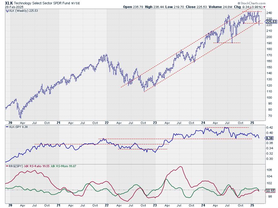
Meanwhile, CRWD's StockCharts Technical Rank (SCTR) score remains above 70 (my strength indicating threshold) though falling below the ultra-bullish 90-line. What does this look like from a broader sector perspective? Relative performance shows that CRWD is outperforming the broader tech sector (represented by XLK) by over 36%, though its lead has narrowed.
Let's switch to a daily chart to see the price action up close.

FIGURE 4. DAILY CHART OF CRWD. Accumulation appears sharp, despite the dip.
The current pullback can be effectively measured by historical support, as shown by the green highlight and a Fibonacci Retracement from the August (2024) low to the February high. I included both since traders may analyze them separately or together, especially as their proximity suggests a potential convergence.
As you can see, bullish investors jumped in at the support level of $340, though, technically, a decline to the range between $300 and $330 would still be considered a favorable dip for those looking to go long. After the initial bounce, price appears to be falling back toward $340. If it drops below the green support range, expect a deeper pullback toward the 50% and 61.8% Fib levels.
The Relative Strength Index (RSI) has declined and, although it isn't signaling oversold conditions, if CRWD does recover soon, the indicator suggests there's plenty of room on the upside to run (though momentum doesn't appear to be picking up yet).
On the volume side of things, the picture looks brighter. The Chaikin Money Flow (CMF) has declined slightly but still indicates strong buying pressure. But what pops out is the Accumulation/Distribution Line (the orange line overlaid on the price chart). While the price was falling, this ADL was rising, suggesting that buyers might have been absorbing shares sold by weaker hands.
At the Close
Although I took a deep dive into CRWD, the main takeaway here is how I used Market Movers and MarketCarpets to spot potential buy-the-dip opportunities. These tools help identify stocks experiencing sharp declines while also providing a sector-wide perspective to gauge their position among peers.
If you're looking to widen your dip-buying strategy, test these tools under different market conditions and across various stocks and sectors. The more you use them, the better you'll become at distinguishing between a real opportunity and a falling knife.

Disclaimer: This blog is for educational purposes only and should not be construed as financial advice. The ideas and strategies should never be used without first assessing your own personal and financial situation, or without consulting a financial professional.
|
| READ ONLINE → |
|
|
|
|
|
| DecisionPoint |
| American Association of Individual Investors (AAII) Hitting Bearish Extremes |
| by Erin Swenlin |
One thing to understand about sentiment measures is that they are contrarian. If investors are too bullish or too bearish, everyone has jumped on the bandwagon and now it is time for the wheels to fall off. Right now we are seeing extraordinarily bearish sentiment coming out of the American Association of Individual Investors (AAII).
We have well over 50% of participants bearish on the market. As you can see that is a comparatively high reading, something we don't see very often. This has brought the Bull/Bear Ratio down to 0.34! That is extremely low!
What does this mean? It means we may be arriving at an inflection point. You can see from past readings how the market does tend to turn back up when sentiment gets too bearish. Could this be what is setting up after the big declines that we've seen on the major indexes?
We do think that we'll see some upside next week after Friday's comeback rally and the fact that price is now sitting on important support and reversing. However, we don't think that this pullback, almost correction, is over. There is still too much confusion and uncertainty over tariff talks and geopolitical concerns. The market hates uncertainty.
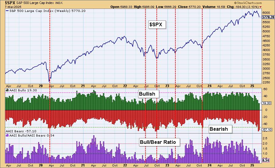
Conclusion: We have bearish extremes being hit on the AAII sentiment chart that does imply that we could see an upcoming rally. However, we don't believe it will amount to much given the overall geopolitical environment. The market is still highly overvalued and that is a problem too.
The DP Alert: Your First Stop to a Great Trade!
Before you trade any stock or ETF, you need to know the trend and condition of the market. The DP Alert gives you all you need to know with an executive summary of the market's current trend and condition. It not only covers the market! We look at Bitcoin, Yields, Bonds, Gold, the Dollar, Gold Miners and Crude Oil! Only $50/month! Or, use our free trial to try it out for two weeks using coupon code: DPTRIAL2. Click HERE to subscribe NOW!
Learn more about DecisionPoint.com:
Watch the latest episode of the DecisionPointTrading Room on DP's YouTube channel here!

Try us out for two weeks with a trial subscription!
Use coupon code: DPTRIAL2 Subscribe HERE!
Technical Analysis is a windsock, not a crystal ball. --Carl Swenlin
(c) Copyright 2025 DecisionPoint.com
Disclaimer: This blog is for educational purposes only and should not be construed as financial advice. The ideas and strategies should never be used without first assessing your own personal and financial situation, or without consulting a financial professional. Any opinions expressed herein are solely those of the author, and do not in any way represent the views or opinions of any other person or entity.
DecisionPoint is not a registered investment advisor. Investment and trading decisions are solely your responsibility. DecisionPoint newsletters, blogs or website materials should NOT be interpreted as a recommendation or solicitation to buy or sell any security or to take any specific action.
Helpful DecisionPoint Links:
Trend Models
Price Momentum Oscillator (PMO)
On Balance Volume
Swenlin Trading Oscillators (STO-B and STO-V)
ITBM and ITVM
SCTR Ranking
Bear Market Rules
|
| READ ONLINE → |
|
|
|
| RRG Charts |
| The Best Five Sectors, #9 |
| by Julius de Kempenaer |

Sector Rotation: Financials Climb as Consumer Discretionary Slips
While the players in the top five sectors have remained the same, we can see some movement in their relative positions. Communication services continue to lead the pack, but financials have climbed to second, nudging consumer discretionary down to third. Technology and utilities are holding steady at fourth and fifth, respectively.
In the bottom half of the ranking, consumer staples has overtaken industrials, claiming sixth place. The remaining positions, from eight to eleven, have stayed the same.
- (1) Communication Services - (XLC)
- (3) Financials - (XLF)*
- (2) Consumer Discretionary - (XLY)*
- (4) Technology - (XLK)
- (5) Utilities - (XLU)
- (7) Consumer Staples - (XLP)*
- (6) Industrials - (XLI)*
- (8) Energy - (XLR)
- (9) Real-Estate - (XLRE)
- (10) Healthcare - (XLV)
- (11) Materials - (XLB)
Weekly RRG
This week's observations on weekly sector rotation:
- Communication services remain the lone wolf in the leading quadrant, with its recent node pointing back up -- a positive sign for its continued dominance.
- Financials are on the cusp of re-entering the leading quadrant, showing an apparent turnaround.
- Consumer discretionary (XLY) is in the weakening quadrant but still has the highest RS-Ratio reading, potentially giving it ample room to reverse course.
- Technology has retreated to the lagging quadrant -- not a great look, imho.
- While also in the lagging quadrant, Utilities shows a strong RRG heading and is close to moving into the improving quadrant.
Daily RRG

Switching to the daily RRG, we get some additional context for these rankings:
- Communication services is in the weakening quadrant with a negative heading, but its tail is short and its RS-Ratio remains strong.
- Financials is also in the weakening quadrant but starting to curl back up -- it'll be a close call whether it moves through lagging or not.
- Consumer discretionary is deep in the lagging quadrant, with the weakest RS-Ratio reading on the daily chart.
- Technology is in the leading quadrant but losing relative momentum.
- Utilities show strength in the leading quadrant, moving higher on the RS-Ratio scale.
Notably, consumer staples are making waves on the daily chart, with a strong move into the leading quadrant.
Spotlight on the Top Five
Let's get back into the trenches and look at the individual charts for our top performers:
Communication Services - XLC

The sector is maintaining its rhythm of higher highs and higher lows, though there's been some near-term deterioration. The old resistance line is now acting as support -- a level to watch in the coming week.
Relative strength remains robust, with the raw RS line trending higher and the RS-Ratio confirming this upward movement. The RS-Momentum line appears to be bottoming around the 100 level, which could signal a potential turnaround.
Financials - XLF

Financials had a stellar week, closing at the top of its range and flirting with all-time highs. The raw RS line has already broken to new highs, and both RRG lines are turning upward. This sector is well-positioned to claim the top spot in the coming weeks potentially.
Consumer Discretionary - XLY

Things are looking a bit dicey for consumer discretionary. We've broken below the previous low, establishing a series of lower highs and lower lows. Support levels just below 210 and around 200 are now critical. The RS line has stalled and is moving lower, dragging both RRG lines down.
This sector must hold current price levels and reverse its relative strength decline to maintain its top-five status.
Technology - XLK
Technology is in a similar boat to consumer discretionary. It's approaching a double support area around 220, with a rising support line and horizontal support from previous lows. The RS line is rolling over and breaking down -- if it breaches the lower boundary of its range, we could see more relative downside. Both RRG lines have topped out and are moving below 100, creating that negative heading on the RRG.
Utilities - XLU

Utilities are bucking the trend of technology and consumer discretionary. It's slowly but surely continuing its upward trajectory, maintaining that series of higher highs and higher lows. While still range-bound, the relative strength chart is starting to trend higher, pushing both RRG lines upward. It's still in the lagging quadrant, with both RRG lines below 100, but the heading is strong.
Portfolio Performance Update

Unfortunately, we've lost the outperformance that was built up over the last few weeks. We're now neck-and-neck with the benchmark—the RRG portfolio has gained 1.62% since inception, while the SPY has gained 1.68% over the same period.
#StayAlert, --Julius
|
| READ ONLINE → |
|
|
|
| Trading Places with Tom Bowley |
| Financials' Strong Week Lifts Them to Within a Whisker of an All-Time High |
| by Tom Bowley |
Many are watching the disaster in growth stocks unfold, including us at EarningsBeats.com, but the reality is that many other areas of the stock market represent a silver lining. When growth stocks sell off, essentially two things can happen. One, the rest of the stock market sells off as well, indicative of pure market distribution. These types of selloffs can lead to large corrections or even bear markets. The second type of growth stock selloff can be much more bullish in nature, as money simply rotates from very overbought growth stocks to much more reasonably-priced value stocks for a brief period of time. The former represents a necessary departure from current bullish trading strategies. The latter represents a need for patience. I want you to look at last week's performance by sector and decide if the selling was more like across-the-board distribution or simply bullish rotation like we've seen many times over the past 12 years of this secular bull market advance:

7 sectors rose last week while only 4 declined. It was absolutely NOT a case where everything was selling off. It may morph into that type of market environment, but that's not what we saw last week. Remember, the NASDAQ was down more than 5% last week, before Friday's rally kicked in. That 5% drop was over and above the huge Friday drop just prior to last week. The cumulative drop on the NASDAQ 100 from its all-time high was 8%, not far from correction territory, which is considered a drop of 10% or more, but less than 20%. Options expiration may have triggered the start of this 8% selloff, but it was unlikely the only reason.
A week ago Friday, there was a turning point in the stock market short-term. Money rotated very heavily, on an intraday basis, away from aggressive areas like consumer discretionary (XLY) and into defensive, value-oriented areas like consumer staples (XLP). Part of this shift can be attributed to monthly options expiration in February as there was a TON of net in-the-money call premium on key stocks like NVDA, META, PLTR, etc. Nonetheless, it was the 10th-highest bearish distribution day (between the XLY and XLP) since the financial crisis bottom in 2009. The other 9 all occurred during either cyclical bear markets or during corrections. Will this 10th occurrence be any different than the previous 9? The takeaway here is that those types of massive distribution days are NOT normal and should give us bulls reason to pause. They don't occur very often, thankfully.
But let's get back to that sector rotation last week and take a look at financials (XLF), specifically, which gained 2.82% for the week and closed one penny below its all-time closing high of 52.19. The top-performing industry group within financials was full line insurance ($DJUSIF), which broke out of a lengthy period of consolidation, as you can see below:
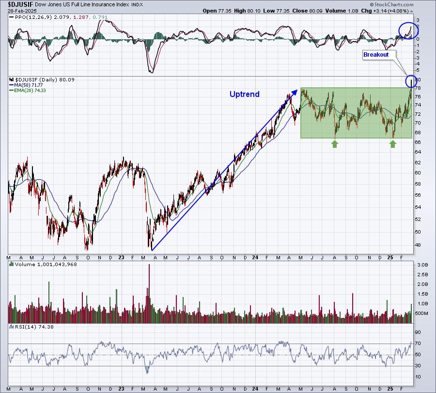
Bullish momentum is accelerating, as evidenced by the rising daily PPO. Yes, we're overbought with an RSI at 74, but overbought can remain overbought for a period of time. This is a bullish continuation pattern (uptrend followed by sideways, or rectangular, consolidation) breakout and, outside of a possible brief pullback, I'd look for higher prices down the road, ultimately reaching a measurement target of 88-89. I'll be featuring a full line insurance stock in our Monday morning EBD that is in position to benefit from this industry group breakout. If you're not already a subscriber to our FREE EB Digest newsletter, you can CLICK HERE to subscribe.
Happy trading!
Tom
|
| READ ONLINE → |
|
|
|
| MORE ARTICLES → |
|