The individual commodities each took their turn on a launch pad at Cape Canaveral it seemed. The sequence of lift offs and tops was truly remarkable. However, most of them topped and did a major retracement just as quickly. That is usually how commodity tops work out.
This is the fourth article in a series of modern day Manias. This is a specific article about all the commodity tops in 2011.
Part 1 can be found here. The Year 2000.
Part 2 can be found here. The Year 2007.
Part 3 can be found here. The Year 2011.
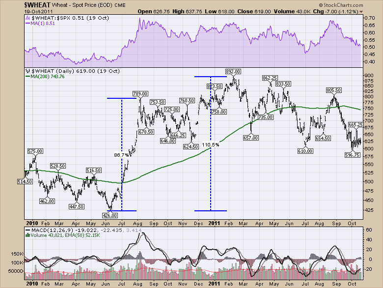
Starting with Wheat, the move to the 2011 highs was lightning fast. Within 2 months, Wheat was up 86% for a torrid pace of 40% per month!! For the entire move over 8 months Wheat rose 110%. Within another 8 months it had given half back.
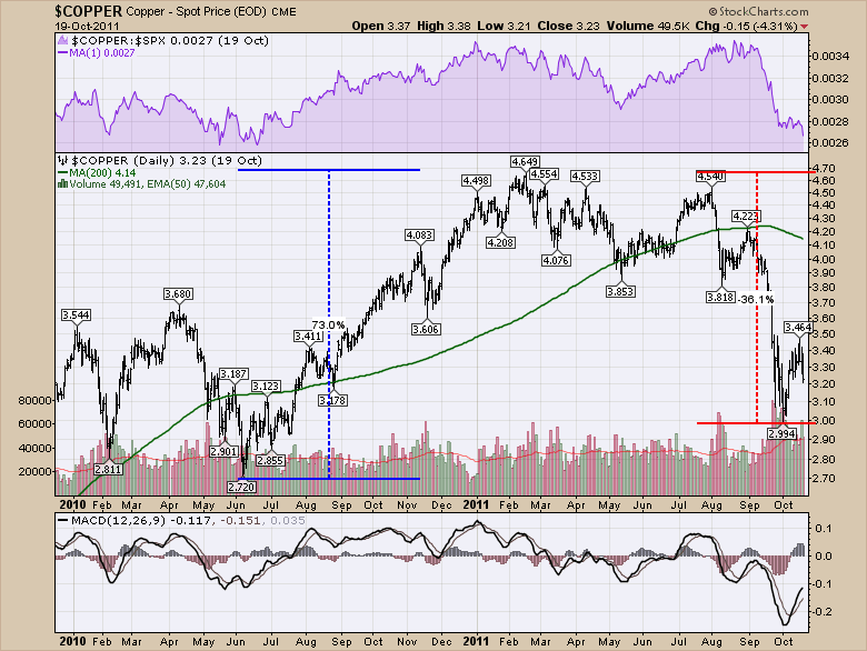
Next up was $COPPER.
It also topped in February. While the move was extreme by advancing almost 10% per month, it was also quickly retraced. You can see the same 8 month window up and 8 months later it was almost back to the start. The equity markets fell hard in July 2011 as we demonstrated in Part 3, but Copper continued to fall into October along with the equity market.
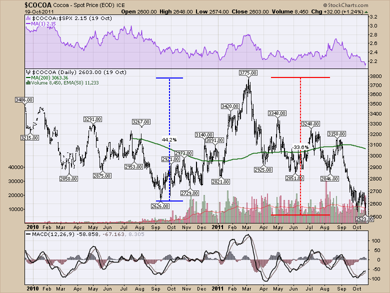
Cocoa was interesting and one we don't often talk about. It rose 44% in 6 months and lost it all and more in 8 months!
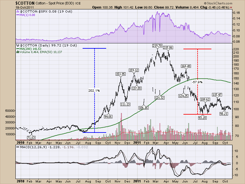
$COTTON went ballistic moving 200% in 6 months. It also lost 55% in the next 5 months! I wouldn't want to be on holidays when these were topping out! After gaining 30% a month, losing 15% a month would be very frustrating. It's a good trading world if you have the stomach for it!
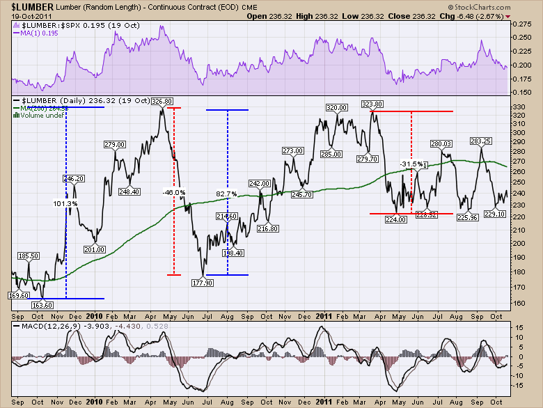
$LUMBER was literally a roller coaster through 2010 and 2011. After soaring 100% in 6 months into the March 2010 top, it quickly reversed and dumped almost the entire gain, losing 46% in 2 months! That made the ascent from June 2010 to March 2011 almost pedestrian. Lumber soared 82% or 10% per month only to drop faster than a golfer's emotions watching the Masters in April and lose 30% in 1 month.
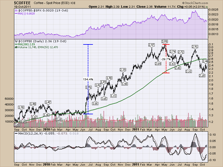
Even $COFFEE got out of bed in 2010. It soared 134% in 10 months and then proceeded to give back 30%.
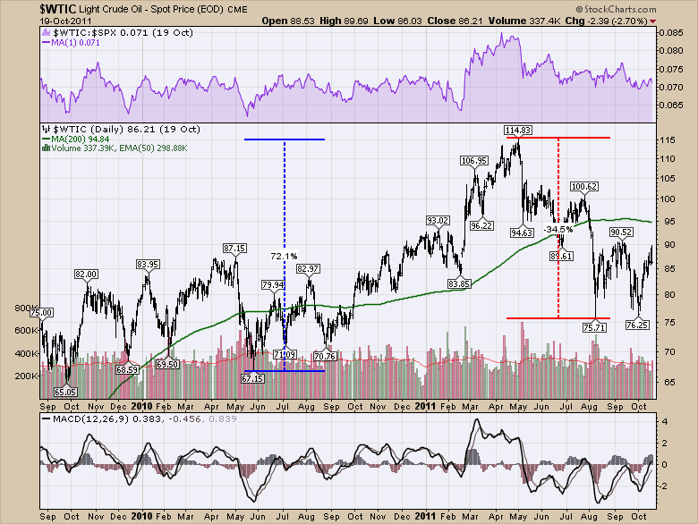
What about our good ol' steady-as-she-goes Crude Oil? Black Gold. Texas Tea. $WTIC. This one took 11 months to rise 70 % only to roll over and give the vast majority of it right back. In four months it was down 35%.
$NATGAS is a great commodity. Seems to trade with the wind. Doesn't follow currency. Doesn't follow Crude. Doesn't follow Gasoline. This one is just a huge mover every year. Except that year. After looking at all these ballistic moves in commodities, $NATGAS looked more like it was sleeping on a mattress, sending off snoring sound waves. Could not have been much more boring relative to the others. Just off the $NATGAS chart to the left and to the right are massive moves, but while everything else was exciting, $NATGAS was pausing in 2010 and 2011.

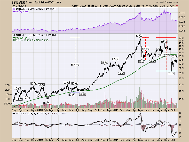
That brings us to the big story of the year. $SILVER. Silver, one of the precious metals, was being tracked by every radio, television and stock channel for the latest pricing. It was soaring. From the May lows to the April 2011 highs, Silver had almost tripled. But within a few weeks it had fallen 36 %. By October it had fallen just shy of 50%. When you are living it, you wonder if it has another leg higher coming because you remember the big uptrend. It's really hard to trade it live and not let history and the media blemish your judgement.
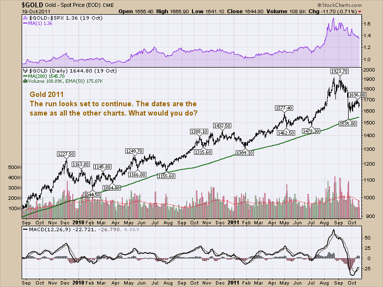
The last chart of the individual commodities is $GOLD. Gold topped in September 2011, long after every one of the other commodity charts above. So you start to grant it immunity. You start to wonder if it is different this time. Here is the shining chart of Gold.
The relative strength line had just surged in Purple in August. Silver had already lost a third of its value by August and bounced back up roughly 50 % of the move down. Gold was still running and had a 20% pullback off the highs in September. It was now migrating higher. It is the details on the chart that we have to look at to spot potential tops. Take a look then we'll work down to the next chart.
What is different enough as you move left to right to make you want to call an end to the big bull run? Let's annotate the chart and look through it. First of all, that huge MACD on the chart below is concerning after such a long controlled run. The major thing was the change in momentum on the MACD. Notice how the momentum had blown out there, well above the dashed blue line in concert with the price moving above its trend channel ceiling. Breaking above the upper trend line on the main price panel after an almost 2 year run is a good indication of final exhaustion and should be at least a warning. As the Purple SPURS and the price both started breaking extremely steep trend lines, you have to wonder about a final 'blowoff top'. The volume in the bottom of the main panel also shows significant euphoria.
.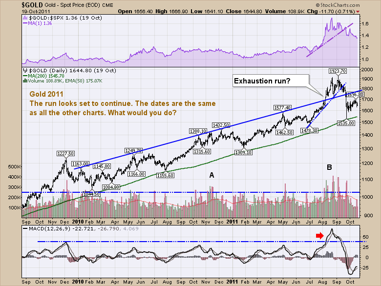
Do these signs always work? No, but as Carl Swenlin likes to say, "Technical Analysis is a windsock, not a crystal ball." So now that you see these indicators on Gold, look back up the charts. You'll see on some it was easier to tell. On some, the volume collapsed just before the final high. On some like Gold, the volume went ballistic. But the severe breakout in momentum on the MACD from a a rather long up trend is pretty important. If the stock was moving sideways and you get a good kick to break out of the sideways trend, that is a good place to look for new breakouts. But at the end of a big long up trend, it is usually a sign that the top may be getting close.
The last chart I want to show with all of this was that this was a commodity run for the ages by looking at the Commodity Research Bureau Index ($CRB). It truly was a mania as all of these commodities shot up unbelievably inside a year. Notice the purple SPURS (Comparing the price of the Index to the $SPX for relative strength) shows a major trend line break. Hindsight makes that line easier to draw. I know I would have had trouble with the big purple mound where it says "Hard". Relative strength is improving, but the $CRB is below its 200 DMA by that point. We could have also put a trend line on the actual price chart. Notice the change in behaviour from a positive MACD to a negative MACD in early May.
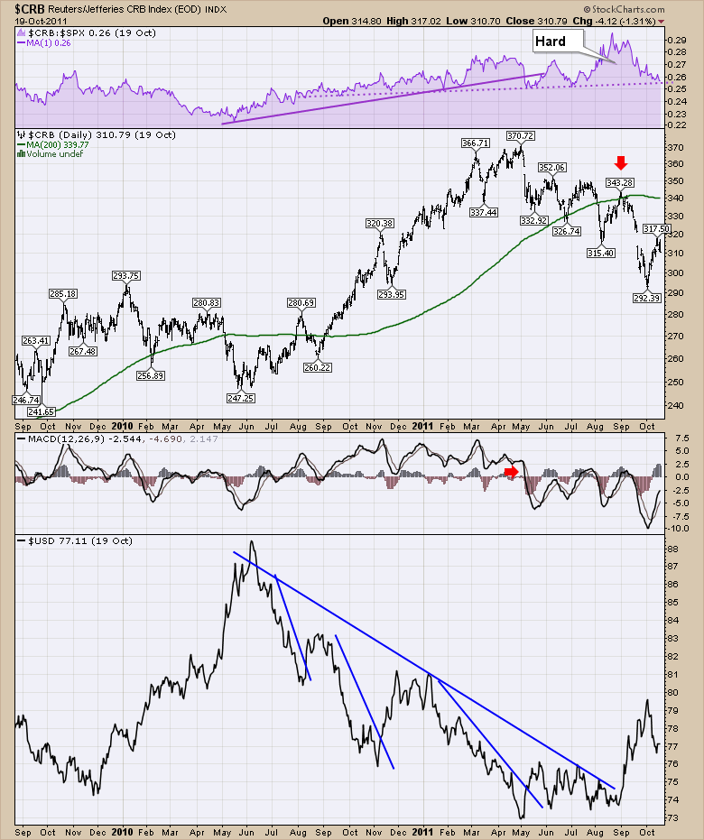
Recognizing the $USD plays a role with commodity prices, it was pretty major when the US Dollar broke lower in June 2010 on the chart above. It kicked up a rally in almost every one of these commodity charts in this article. Probably one of our best clues for $GOLD was the breakout in the $USD from the big down trend in September 2011. Clearly having all the commodities go on a major run and the $USD going the other direction is not a surprise. What is important for all of us as commodity investors is keeping track of when the trend changes. Inter market analysis can be one of the best clues to help pick at least the region of the top or help confirm why the trend might be ending. Picking the day is more difficult!
The bottom line is this was a massive commodity boom and prices have continued to retreat. This commodity mania was also a hangover in investor perceptions from the big commodity run before the financial crisis. After all the commodities topped in 2008, lots of investors came back in for the 2010 - 2011 rally expecting things going to the moon. They got each one of the commodities to go to the moon. But the mania was soon over and the price of $GOLD along with almost every other commodity has since tumbled lower. The end of another mania.
I try to cover off some of this information in the webinar series I host every Thursday at 4:30 EST. The registration link can be found on the What's New section of the homepage and at this point in time, it is open to everyone, not just subscribers. Click here to Register for Thursday January 29th, 2015. In the next article, we'll cover the BITCOIN mania and the Ice Bucket Challenge mania.
Good trading,
Greg Schnell, CMT.
