The start of every bear market is different. Sometimes it's driven by technology stocks, other times it's a financial crisis. Whatever the case, one common denominator seems to be that aggressive areas of the stock market are abandoned as final tops are made or challenged. In my last ChartWatchers article entitled "Four Reasons The Market Is Heading Higher", my third point concentrated on this idea of bull market sector rotation. As the benchmark S&P 500 moves to new highs or to challenge old highs, it's important to view what's happening "under the surface". It's not enough to simply see that the S&P 500 has moved higher. We need to focus on what's driving that strength. If it's aggressive areas of the market, it's generally a sign that the advance is sustainable because traders/investors are willing to take that greater risk. But when advances in the benchmark index occur as money moves towards defensive areas, red flags are raised and I'd be much more cautious about a continued rise.
To illustrate the flow of money away from aggressive areas of the market, take a look at what transpired in 2007 PRIOR to the start of the bear market:
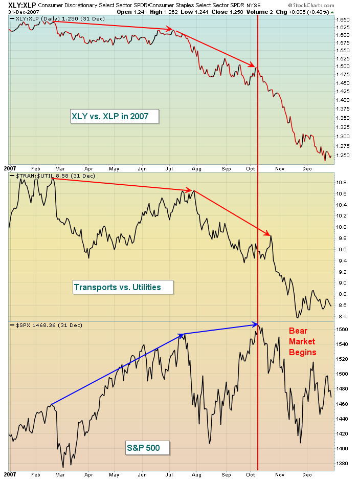
The bottom third of the chart above shows the S&P 500 making highs in July and October, but check out how money was rotating away from consumer discretionary (XLY) as the XLY:XLP ratio declined rapidly throughout 2007. A similar drop in the ratio of transports vs. utilities ($TRAN:$UTIL) also occurred. This makes little sense because a falling ratio in both of these suggests that traders are preparing for a weakening economy. The warning proved to be quite useful as the S&P 500 began a downward spiral off that October 2007 high.
At the time of my last article here, both of these aggressive ratios supported higher equity prices, but with the latest S&P 500 recovery, both ratios have begun to deteriorate. It's too early to make a bull market vs. bear market call based on the last two weeks action, but I will be watching these two ratios closely in the days and weeks ahead if the S&P 500 breaks out to fresh all-time highs. To remain bullish, I'd want to see both of these ratios climbing again, not continuing their recent decline. Here's a reprint of a chart I featured in that last ChartWatchers article:
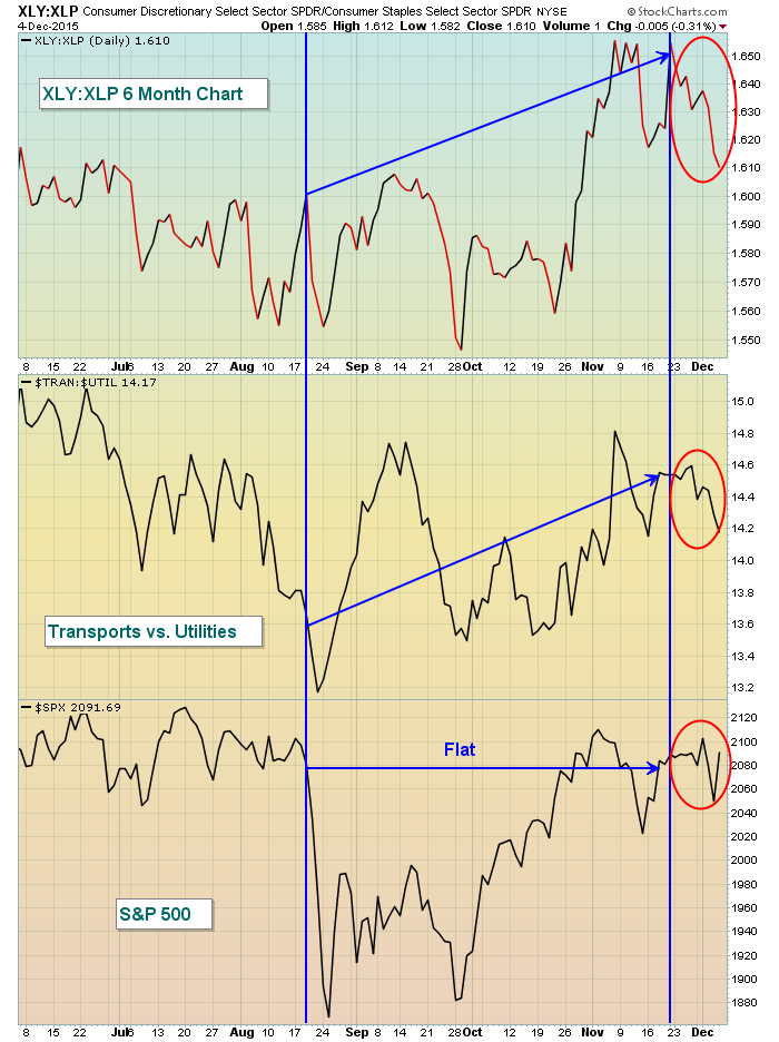
You can see that conditions have deteriorated by the red circles that I've added. Again, I'm not ready to write off the bull market based on the last two weeks, but this development bears further analysis as we move into year end and beyond.
Happy trading!
Tom
