 As I dive further into updating “The Complete Guide to Market Breadth Indicators,” I want to ensure I have laid the groundwork for a solid introduction to breadth before writing about the book’s contents. Additionally I have decided to include an occasional article about other subjects in technical analysis that I am passionate about. Over the last 40 years I have often witnessed the misuse of some technical tools and wish to explain why I think they are misused and offer what I believe is a more correct way to use them. Notice I was intentionally not “matter of fact” in that comment as I also strongly believe that technical analysis is an art and definitely not a science. I’ll even explain that also. My good friend Dr. Humphrey Lloyd used to say, “one absolutely cannot speak in absolutes.” The goal will be to make you think about the “why” more than the “how.”
Primary Breadth Components
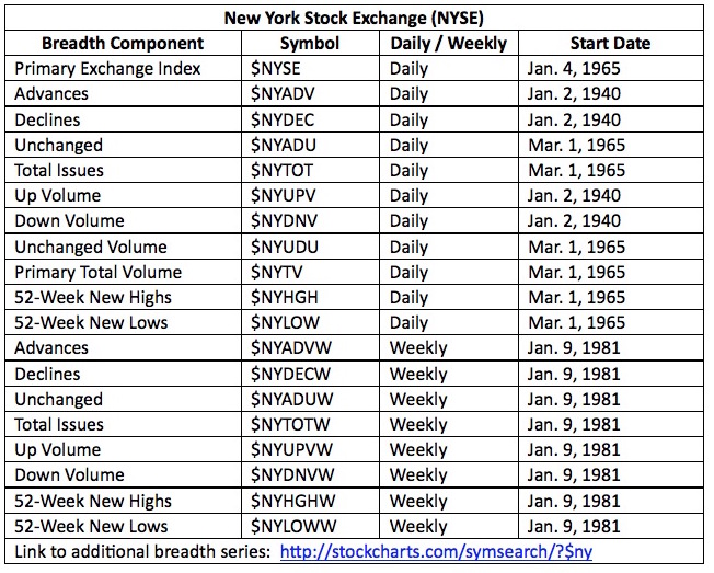
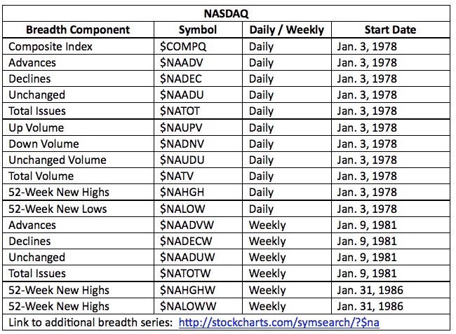
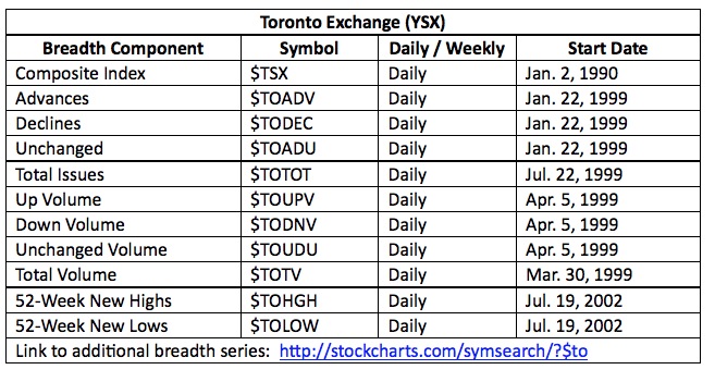
Generally, the primary components used in breadth analysis consist of advances, declines, unchanged, up and down volume, and new highs and lows. Sometimes total volume is also used, but I have moved away from it and prefer using the total of the up and down volume because it reflects the actively traded issues. When you are using breadth indicators it is wise to also use the index from which the stocks came from in the analysis. For example, if analyzing the NYSE Advance Decline Ratio, compare it to the NYSE Index. I see no value in using the breadth from one index and the price from a different one – that is, unless you are curve-fitting your analysis to make the results look better. Please don’t ever tell me if that is what you do.
Below are three tables, one for each exchange (NYSE, NASDAQ, and Toronto), showing the symbol, frequency, and start date of the primary breadth components. Please notice that the NASDAQ table does not contain any weekly up volume or down volume data and that the Toronto Exchange has no weekly breadth data.
Analog and Digital Indicators
Most technical indicators that we use are displayed in an analog format. However, when using an analog indicator that has signals associated with it, a digital version of the signals cleans up the chart. First of all some definitions from dictionary.com.
Analog - Adjective measuring or representing data by means of one or more physical properties that can express any value along a continuous scale. For example, the position of the hands of a clock is an analog representation of time.
Digital - displaying a readout in numerical digits rather than by a pointer or hands on a dial; involving or using numerical digits expressed in a scale of notation, usually in the binary system, to represent discretely all variables occurring in a problem.
Chart A below is an example of an analog indicator. Let’s say this is an indicator used to identify medium term trends and when it is above the blue line it means the trend is up and when it is below the blue line the trend is not up.
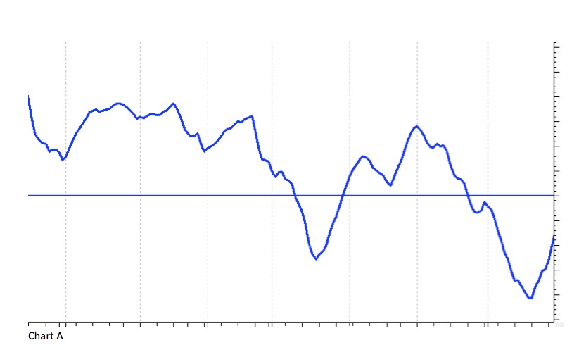
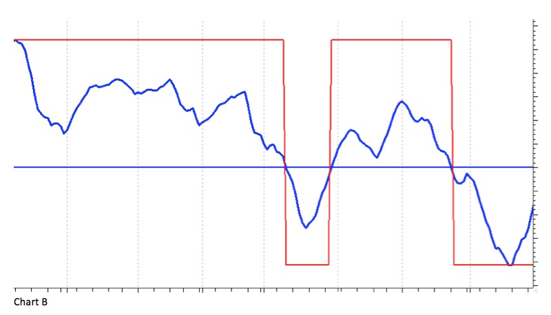
Chart B shows the indicator in Chart A with the digital signal overlaid. The digital signal is now simplified with the on / off red line (rectified wave). You can see that when the blue indicator goes above the horizontal line the red digital signal is up and when the blue indicator goes below the horizontal line the red digital is below. One could then actually remove the blue indicator and the blue horizontal line and just show the red digital line and no information would be lost. One might argue that the proximity of the blue line to its signal line (blue horizontal) is important to know, but I disagree as one should not anticipate signals if trading with real money.
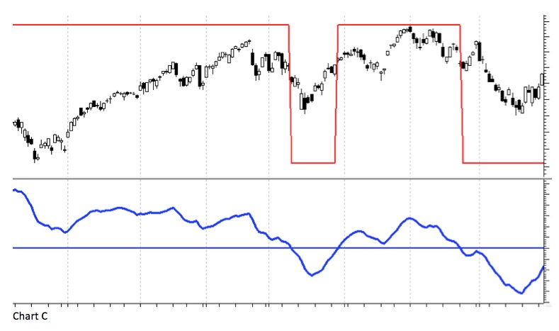
Taking this further, one could then overlay the red digital line on a trading vehicle, say a stock. Chart C does just that. The stock is shown in candlesticks with the digital signal line overlaid. The analog indicator (blue) is shown below. You can see that the blue line and the red line are essentially giving the same information.
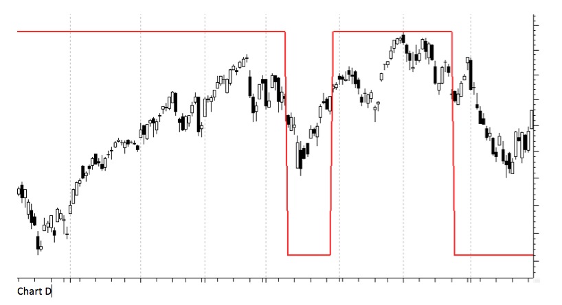
OK, let’s go one step further. Chart D shows the stock plot along with the digital signal line from the analog indicator. I have totally removed the analog indicator from the chart. If you are using a basket of indicators then this is a great way to show them by displaying only their signals and removing the noise of the analog indicator.
Weekly Breadth Data
You cannot add daily breadth data for the week to get the weekly data. Here is a scenario that will explain why.
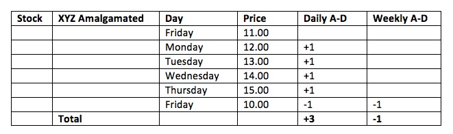
Here’s the narrative: An advance or decline for the week should be based upon its price change from the previous Friday close to the close of the current week. It has absolutely nothing to do with the daily data. Take a single stock; its previous Friday close price was $11.00. On Monday it was up $1.00 to $12.00. It went up a dollar each day for the first four days of the week and closed on Thursday at $15.00. However on Friday it dropped $5.00 to $10.00. For the week it was down $1.00, which would be one decline for the week. However, on a daily basis, it accounted for four advances and one decline, or a net three advances.
John McGinley, past editor of Technical Trends, and sidekick of the late Arthur Merrill (creator of filtered waves, often called zigzag), sent me this note about a hundred years ago: “I strongly believe that in creating weekly figures for the advance declines, one does not use the published weekly data for they disguise and hide what really went on during the week. For instance, imagine a week with 1500 net advances one day and the other four days even. The weekly data would hide the devastation which occurred that dramatic day.”
So there are two schools of thought here. One (McGinley) says the weekly data can mask a very severe day in the market, and I agree that it can, but also depends on the remaining days for that week. Personally, I think using weekly data on longer term indicators is not much different than smoothing it with moving averages, it dampens a lot of noise. I’d suggest you need to decide on using only daily breadth or if you want to look at long term data, then weekly should suffice.
Breadth Dance
Here is an attempt (possibly lame) to help you understand the longer term bullish and bearish moves in the market and how the various breadth components play their part. And yes, I’m not much of a dancer.
The big dance is about to begin (bullish up move). Some of those that showed up are the advances, the declines, the unchanged, the new highs, new lows, and the ever present volume twins (up and down). The dance partners are always the volume pair. As the music begins to play there are only a few dancers on the floor – mainly the advances and primarily with the up volume. The number of dancers is good but more show up as the evening continues. As the evening gets underway more and more advances start to dance, and almost always with the up volume. The declines, kind of a nerdy group, only dance at certain times, usually only when it is an unpopular song (short corrections).
As the evening moves on, a few of the new highs start to dance. They did not dance earlier because there have not been too many dances of late. The usual small group of the unchanged are dancing but most are without dates and just watch from the side. As the night continues the advances, who have been dancing most of the night, begin to sit out a dance here and there. They are worn out. Because of that, the unchanged are starting to dance more while the declines still are not doing much dancing.
With the beginning of the last music set (topping action in the market), the sound is high, everyone is at the dance. The advances have been totally worn out and only dance now and then when a really popular song is played (short up moves). The unchanged are doing a lot of dancing even though there just aren’t that many of them, and the declines, realizing the night is coming to an end, begin to dance more. In fact as the last few songs are played, the declines get a second wind and are doing most of the dancing. Most of the advances have gone home with the new highs. The new lows are still on the sidelines, but some of the declines are taking a second look at them. As the last couple of songs are played, the only ones dancing are the declines and the new lows, both of whom are dancing with the down volume; in fact, some of the unchanged are also dancing with the new lows. The music stops and the dance is over. On the way home (established down move) the declines do most of the driving, initially by themselves, then more and more with the down volumes, and as they get closer to home (market bottom), the declines are accompanied by the new lows. As they all approach home, the declines and the down volume are almost the only ones who are not there yet. They talk about the next dance.
Greg Morris