When everybody loves a bond to everyone hates a bond all within 6 months, it makes it hard for average investors to have any confidence in the stability of the market. That emotional roller coaster showed up in the bond market again this year.
Interestingly enough, every year is the year that pundits have reached the end of the bond bull market until it makes a lower low in yields and higher prices. So far, the last high we have on the 30-Year bond price is the highest price in this 30 year bond bull market, so it is a little early to call the end of the bond bull market. For technicians, a series of lower highs and lower lows has to be in place to create a downtrend. As investors have started to return to the income trusts and REIT's, they also appear to have stopped selling the bonds. Whether they'll start to buy them with aggression is another question.
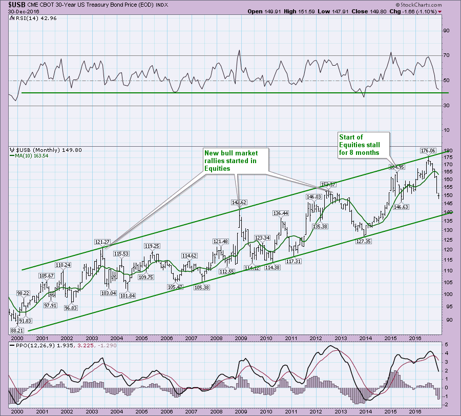
Below is the 30-Year bond price chart. On this monthly chart, you'll notice the RSI is well within its historical travel range. While it is near the low end of the range, that probably implies a reversal based on the historical trend. It is also true that the bull market in Bonds has maintained an RSI above 40 with 2 brief exceptions. At 42 currently, we are about to find out if this is finally enough to break the trend or is it simply another deeply oversold bond market to start buying again?
I will note that the wild swing from 2012 to 2014 encompasses the period where all four major central banks launched QE programs. The US program was nicknamed QE Infinity as it was launched without an end date. With that much horse power, you can make a momentum wave on the chart from one extreme to the other. This is clearly demonstrated by the Percentage Price Oscillator (PPO). Interestingly, the bounce was all the way back to the top of the range in 2014-2015. Notice how the PPO stayed above zero for most of this chart.
Inspecting the signals on the PPO, the PPO crossing below its signal line on the $USB seems to a pretty good clue for the confirmation of a bull market run for equities. I would say the signal can vary in terms of timeliness. At this point we have been rallying for 11 months from the February low in equities so that is pretty long. But this PPO just crossed below and is a long way from its signal line. Just eyeballing the PPO, there seems to be a lot of runs around 1 year long between signal crossing down and back up. That might suggest we don't get a positive cross on the PPO for a year!
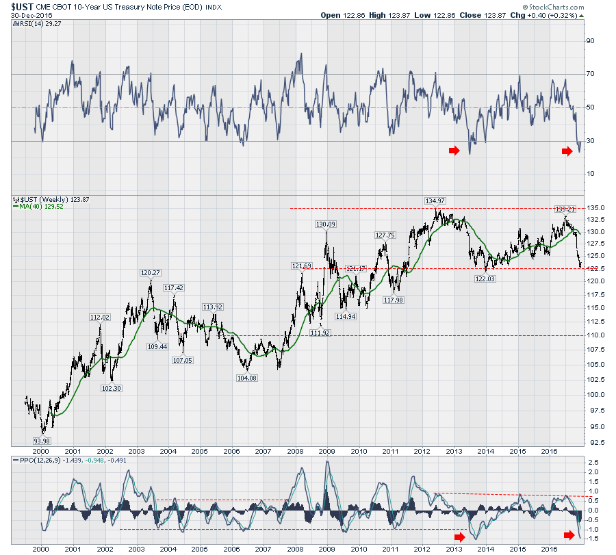
From the 30 year, let's move to the 10-Year Treasury Price. The first thing to notice on this chart is that price did not make a higher high in 2016. That should put us on notice that the trend in the 10-Year price may be changing. Examples like December 2010 where price made a lower high at $127.75, dropped sharply and then resumed the rally to higher highs suggest we still need a little caution. One of the current differences is that we actually made new 52-week lows in price unlike 2010. I have placed a dashed line on the chart that runs parallel to the line with the most touches. This line is interesting as it points out the actual tops in the equity market in 2000 and 2007.
Looking in on the RSI for the 10-Year Treasury price chart, we can see this is more volatile than the 30-Year above. The RSI has not reached 30 at any time in this whole bull market, so the secular trend is clearly up. The primary trends are more relevant, running for years at a time. We are very close to the low end of the historical range, but we are in a primary bear market as the RSI has not been able to get above 60 the last few years. Even trading the primary trend is hard. The RSI has been rising for 2.5 years, even though you are in a bear market trend as measured by the RSI.
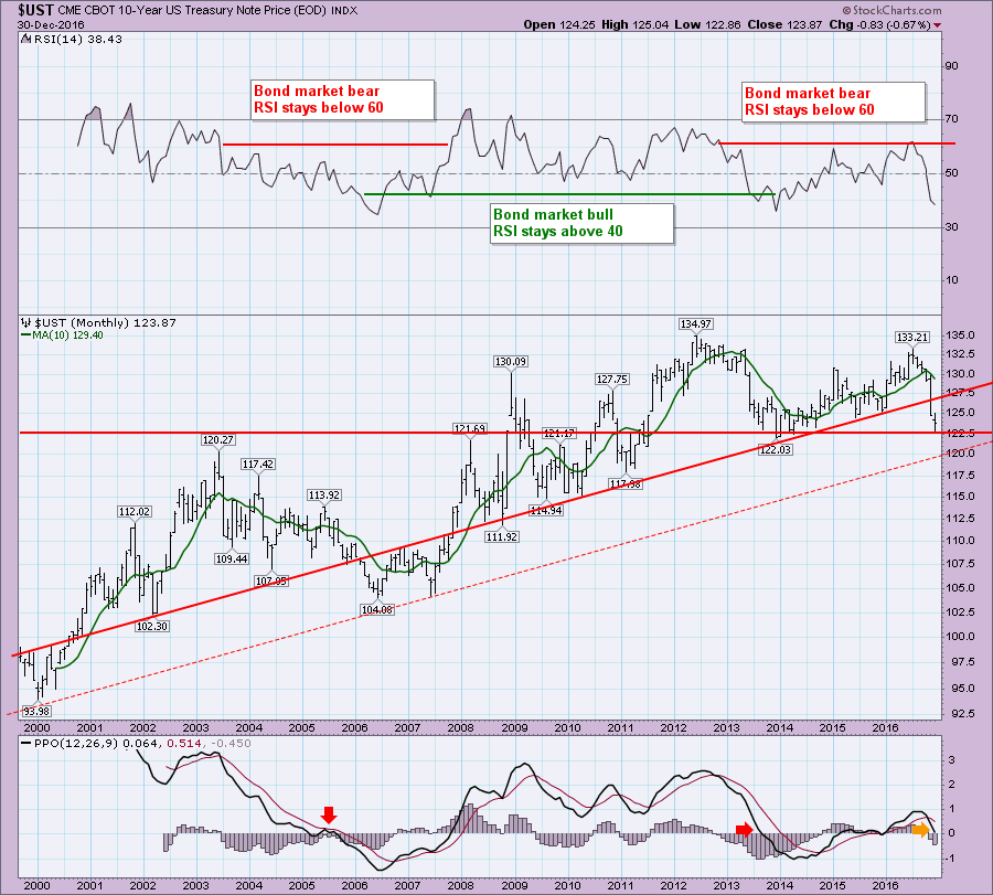 Lastly, the MACD on the chart above rolled over just above zero. We can see this is the lowest rollover point on the chart. That definitely raises the odds that this chart could spend more time in negative PPO territory, implying that the trend is changing in the bond market.
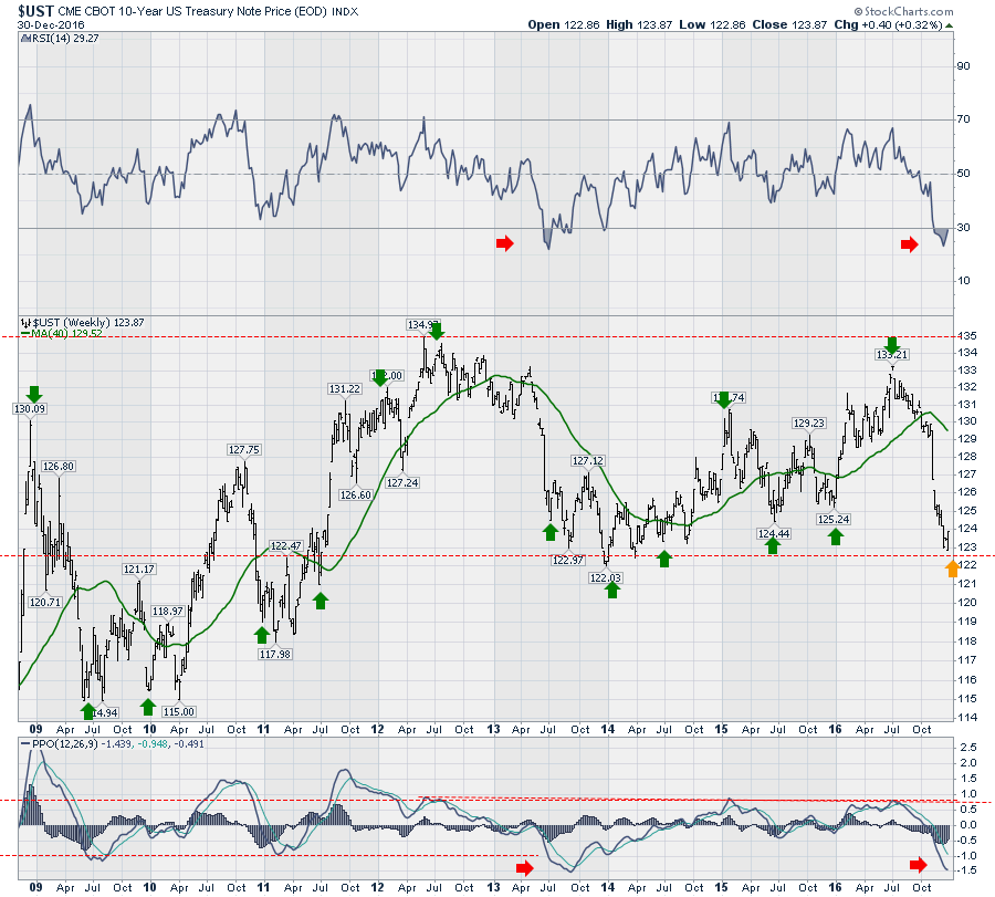
Shifting to the weekly for the 10-Year price chart, the 17 years posted has only had an RSI and PPO this low once before. However, RSI's in the low 30's have happened before. The 2003- 2007 period had lots of them. Look at the size of the rallies and the frequency. There is no hard and fast rule, but these rallies seem to swing wildly between 6- 9 months in duration from one extreme to the other. We have been going straight down for about 6 months now. On the price bars, we have been range-bound between 122.50 and 135.
Here is an 8-year weekly chart which is zoomed in from the longer time frame above. I have placed green arrows where the price reverses near year end or around July 1. Lots of times it is exactly on those dates. Other times it is close to those dates. The point of this is to suggest a reversal could be imminent.
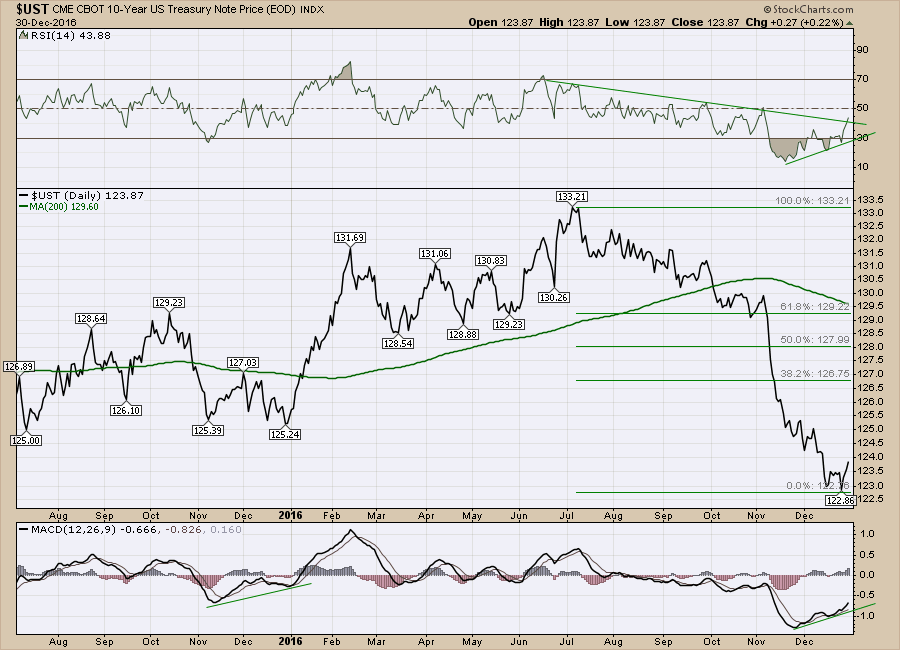
 Finally a look at the daily. Here the positive divergence is starting to play out and the price is starting to rally slightly. This is looking like a setup for bond prices to spring higher in the short term, once again near January 1st.
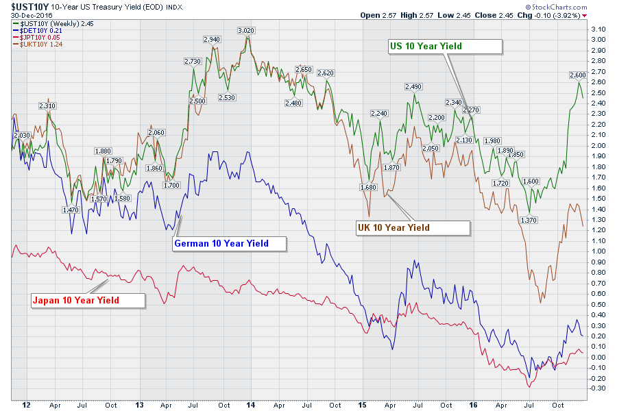
 The most amazing thing in the bond markets is going on right now. The Yield differentials for the 10 Year Treasury Yields between the US, UK, German and Japanese markets are massively dispersed. Rick Santelli has been screaming how the gap is at a record between Germany and America. This chart shows that. The main belief is that money will surge to the US for higher yields and press the US Dollar higher as investors convert their funds into US Dollars to get the US Yields. At 12 times the yield, you can see why that might be compelling. The other shocking piece of information is Japan and Germany having negative yields on a 10-year Treasury. Many believe that this inflection below zero and back above will be the marker for the final lows in yield.
 All of these charts are available to get updates any time in the future by just returning to these blog articles and clicking directly on the charts.
In summary:
The 10-Year yield finally made a higher high this year, which implies price made a lower low. For Japan and Germany, they endured negative yields on a 10-Year Treasury during the year. For me, the bonds look like they are ready to bounce from here based on technical setups, historical turns around January most years, and the stretched indicators saying most of the selling is already done. The real question for us is: Have we seen the final bottom in yields? 2017 might go a long way to confirming or denying that position. With a lot of Eurozone issues always on the plate, we will be looking to Europe more often this year. Brexit appears to be just the start of the referendums into eurozone relationships. Extreme low prices in the bond market seem to coincide or warn of potential equity market tops. Will that happen in 2017? My next article will be - 2016 in Review - Equities.
StockCharts members enjoy unique privileges. Access to the members only work by John Murphy (4 Books), Martin Pring(20 Books), Arthur Hill (1 Book), Tom Bowley and Erin Heim authors starts for basic members. Tom and Erin have some free content as well. StockCharts.com won an industry award in 2016 for the Best Technical Analysis Commentary Team. It is the lowest priced subscription to the best commentary team on the web. Our 'Basic' membership gets you access! Check out pricing at $155 annually.
If you hired an assistant to help you be aware of all of the new signals in the market, they would compile spreadsheets and major trends on your behalf and put them on your desk. StockCharts.com goes above and beyond that for only $95.00 a year. Twice a week, Erin Heim gives a "news broadcast" style webinar on signals through the Decision Point methodology and she publishes four new reports every day. The reports are a fantastic compilation for you, rather than hiring a full time assistant. This is included with your 'extra' membership to StockCharts.com. At $249.00, that is less than a dollar per trading day (253 days last year). It is only $0.40 a day more than a basic membership with four fantastic reports every day as well as a weekly report. Hard to hire staff for $0.40 a day. Crazy good value! Decision Point Reports.
Why become a Pro member at StockCharts? You can have up to 10 price panels on one chart, so you can watch all the major market clues in one place. You get 5 second automatic chart refreshes at this level. You can have 50 technical alerts at any one time, that notify you about any condition on any stock you want. StockCharts will text it to you, email it or flash it on your screen. You can look back in time, 50 years or more in some cases to see historical examples of extremes. This is very helpful in understanding stretched markets up or down. A good example is the $USB chart when it is stretched out to see the entire uptrend in price over 30 years. For less than $50/month, you can have 350 chartlists, alerts, custom scans, Decision Point reports as well as all of the commentary and webinars. Look inside our pricing module today.
StockCharts finished the year with more members than ever before. Thousands of market watchers find huge value in StockCharts.com every day. Kick off 2017 with a package that is right for you!
Good trading,
Greg Schnell, CMT, MFTA.

