| |
|
|
|
|
| |
 |
ChartWatchers
the StockCharts.com Newsletter
|
|
|
|
|
|
|
|
Hello Fellow ChartWatchers!
The last two days of last week caused everyone to pause and re-evaluate their market opinions. That includes our stable of ChartWatchers analysts. Glancing over the headlines for their articles below, you'll see lots of use of the "B"-word... "Bearish." Clearly if the market continues to drop like it did on Thursday and Friday, more and more technicians will be taking their profits and moving to the sidelines.
But before we get to all the potential gloom and doom, here is the low-down on two new features we've just added to SharpCharts...
"Legendary" and "Eventful" New Features
Pardon the puns, but we've just added more control over the information displayed in the legends of our charts as well as a new "Overlay" that displays when and where we have adjusted the data on our charts. Let's start with that second item first.
As you may be aware, we adjust our historical data to remove the "artificial" effects of splits, dividends and distributions from our charts. If we didn't do that, there would be big vertical gaps on our charts whenever a stock underwent a split (for example). Those gaps would cause misleading technical signals to appear.
For example when a stock has a 2-for-1 split, the price suddenly drops 50% on the chart. Technical indicators like the MACD would immediately turn bearish because "momentum" has dropped suddenly - but are traders really bearish on the stock because of a split? No. If anything, they might be slightly more bullish. So that big downward gap on the chart can't remain there.
To get rid of it, we divide all of the price data from prior to the split by 2 and multiply all of the corresponding volume data by 2. That eliminates the gap and gives a true picture of people's opinion of the stock.
The same thing needs to happen for all types of non-market-related adjustments including dividends and distributions. While not usually as flashy as splits, those adjustments can still cause misleading signals if their effects are not factored out.
(By the way, if you still want to see the un-adjusted data for a stock, just add an underscore to the front of the ticker symbol - e.g., "_IBM")
So all of that is just background for today's new feature - Event markers!
Event markers show you exactly on your chart where and when we made any data adjustments. To see them, just select "Events" from the "Overlays" dropdown and then "Update" your chart. Here's an example:
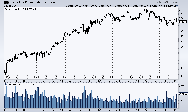
(Click the chart for a live version.)
See the small boxes at the bottom of the price area with the lines rising up? Those are the event markers that show you where splits/dividends/distributions happened and how big they were.
Note that the "Events" overlay takes one parameter which can either be "Splits", "Dividends" or "All". That controls the number of event markers that you see on your chart. Splits will have two numbers separated by a colon in the box - e.g., "2:1" or "1:3" - while dividends/distributions will show the actual amount of the event in dollars.
In addition to that addition we also have an additional addition for people that want additional control over the legends that appear on their charts. You'll now see a new dropdown labeled "Legends" on the right side of the "Chart Attributes" area on the SharpCharts workbench. It replaces the "Show Legends" checkbox and gives you two additional options - "Off" which means "completely, totally, 100% off" and "Verbose" which will show you the complete name of every ticker symbol you add to your chart.
While more control over the Legend display may not seem like a huge deal right now, it is actually the very first hint of a HUGE set of new features that is coming to StockCharts in February. Yes, they will be very useful. No, you won't need to pay extra for them. No, the website won't change in big, confusing ways. Yes, these new features are way cooler than the "Legends" dropdown. No, I can't tell you yet what these new feature will be - but I will be able to very soon!
Stay tuned...
- Chip
SITE NEWS
RECENT ADDITIONS TO STOCKCHARTS.COM
- CHARTCON 2014 ALREADY HALF FULL!
Over 200 seats for ChartCon 2014 have been sold in just 2 weeks! Given the amazing line-up of speakers, that's no surprize. But there are still lots of seats left if you want to join us on August 8th and 9th in scenic Seattle. John Murphy, Martin Pring, Alex Elder, Richard Arms, Arthur Hill, Greg Schell, Erin Heim, Tom Bowley, Gatis Roze, Chip Anderson and more. Together for 2 full days of technical analysis discussions and education. Click here for more details as well as registration information. Don't delay however - seats are going fast!
- SCU ATLANTA IS ALSO FILLING UP FAST
We are also holding our next set of SCU Seminars in Atlanta on March 14th, 15th and 16th. Unlike ChartCon, SCU Seminars are live, hand-on training presentations that go over all aspects of using StockCharts.com. If you want to learn how to use our charts and tools effectively to make better investing decisions, SCU Seminars are for you. Chip Anderson, Greg Schnell and John Murphy will be there live to show you everything you need to know. And in addition, on Sunday, Gatis Roze will spend all day showing you how he has successfully traded the stock market for years using his "Tensile Trading" approach. This is the last SCU Seminar scheduled for 2014 - don't miss it. Click here for details and registration information.
My Wednesday message showed the close correlation between weak emerging market currencies and emerging market stocks. It showed the WisdomTree Emerging Currency Fund (CEW) threatening to break an important support line. The green line in Chart 1 shows that happening. After falling sharply on Thursday and Friday, the CEW closed just below its 2012/2013 lows. While all emerging currencies tumbled, the most notable collapses took place in Turkey and South America. Argentina and Venezuela were hit especially hard, with the latter suffering a de facto currency devaluation. Why that poses a problem is because a close linkage exists between emerging market stocks and currencies (as well as bonds). Chart 1 shows that Emerging Market iShares (red line) track very close with emerging currencies. The 6-month Correlation Coefficient (below chart) has a positive correlation of .79. Emerging market bonds denominated in local currencies also fell sharply. The subsequent plunge in emerging market assets caused a high-volume selloff in developed stock markets all over the world and a flight to quality into American, German, and Japanese government bonds. Gold prices also jumped. Although the U.S. dollar bounced on Friday, most currency money went into Europe and Japan. A jump in the Japanese yen pushed Japanese stocks sharply lower.

DROP IN CHINESE STOCKS DIDN'T HELP ... My Wednesday message suggested that emerging markets needed a stronger Chinese stock market to recover from their current slump. Unfortunately, they didn't get that help. Chart 2 shows China iShares (FXI) plunging nearly 5% on the week. In so doing, the FXI tumbled to a five-month low and ended below its 200-day moving average. News that China's manufacturing sector had slipped into a contraction mode had an especially negative effect on emerging markets that export to China (mainly in Asia and Latin America). China is the world's biggest emerging market and the world's second largest economy. What happens to that economy and stock market has a big effect on markets everywhere else.

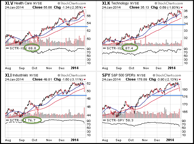
It has been a rough year for stocks and two key offensive sectors are leading the way lower. I like to group the sector SPDRs into three groups: offensive, defensive and other. The consumer discretionary, technology, finance and industrials sectors are offensive because they are key to market performance. The consumer discretionary sector is the most economically sensitive sector, the technology sector represents growth stocks, the finance sector reflects the health of the banking system and the industrials sector makes the capital goods required for capital spending. The utilities, consumer staples and healthcare sectors are defensive because they provide products we need regardless of economic circumstances. The energy and materials sectors fall into the "other" category.
The following CandleGlance charts show these nine sector SPDRs and their StockCharts Technical Rank (SCTR). This ranking system ranges from zero to one hundred with one hundred being the strongest and zero the weakest. Healthcare, technology and industrials are at the top of the list with strong SCTRs (above 75). They are stronger than the S&P 500 SPDR (SPY) and are leading the market. This third of the market is fine.
Click this image for a live chart
The other two thirds is not. The next six CandleGlance charts show sectors with SCTRs that are lower than the SCTR for SPY, which is the benchmark SCTR. The Consumer Discretionary SPDR (XLY) has underperformed the entire month and its SCTR moved to a twelve month low this week. The Finance SPDR (XLF) was holding up well last week, but broke down this week and its SCTR moved below 50 for the first time since September 2012. Relative weakness in these two offensive sectors is negative for the market and suggests that some sort of correction is underway, which means we may see a 7-10% pulled in the S&P 500.

Click this image for a live chart
Good weekend and good trading!
--Arthur Hill CMT
Recently, the IMF Leader - Christine Lagarde - talked about deflation. She announced we must do all we can do prevent deflation from occurring. In Davos, the IMF released their 2014 World Economic Outlook. Look at the trend they predict for commodities.


That report can be found here. IMF WEC Davos
Even presidents don't trust economists. Truman asked for a one armed economist so they could stop referring to 'On the other hand...'
The charts are our best tool to see the current picture in relation to the past. Unfortunately for the commodity countries and currencies, the chart patterns align with the economists views. But how many economists realize the strong negative global alignment of the currencies and the commodities ? More importantly, do they realize the macro charts are all breaking through support together? Look at the chart below with the Canadian Dollar, the Aussie Dollar, the Brazilian Real ETF, the Emerging Market Currencies ETF ,and the grey shaded area is the Commodity Research Bureau Index of 19 commodities.
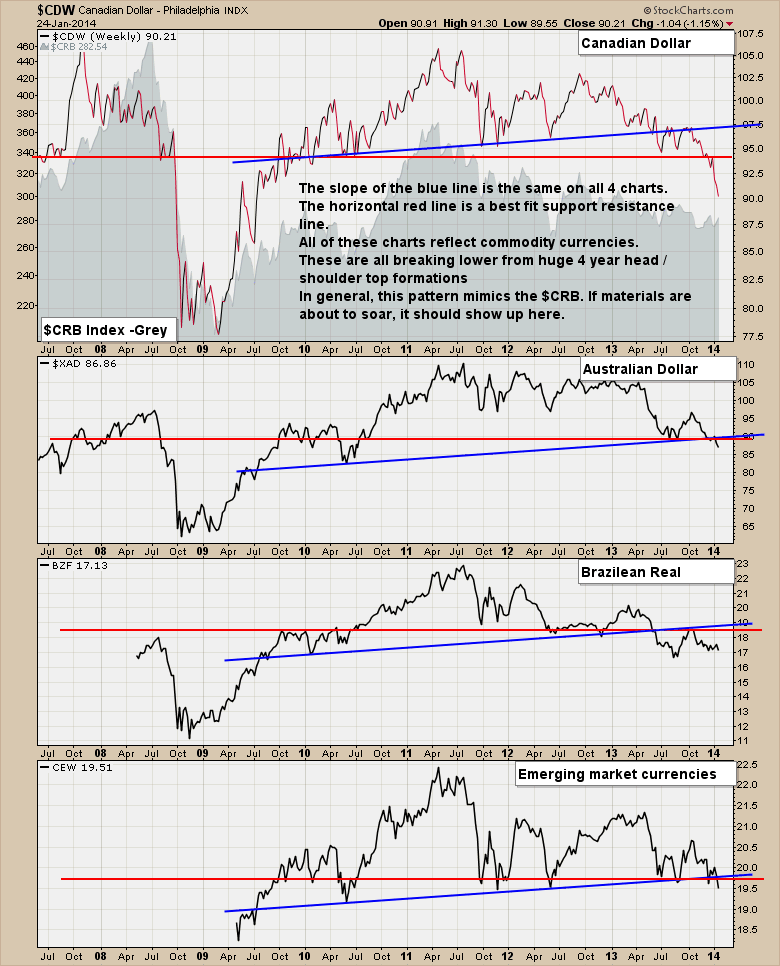
These are major support levels that are breaking whether you rely on the blue line head/shoulders patterns or just flat horizontal support and resistance lines. Are they permanent? No. But until they get bullish as a group and start reversing these long term scenarios, we have to stay with the trend we are in.
The head and shoulders pattern is frequently how a price index puts in a top, and, while it may be a bit early to start talking about it, it is one possible scenario that we can anticipate.
A few weeks ago we identified a rising wedge pattern, which believed would resolve downward because that is what that pattern usually does. The expected breakdown happened today, and now we look for signs of what may happen next.
There is a line of support drawn from the May 2013 top that has a lot of credibility because it engages three tops and two bottoms. That line is the most obvious place for prices to find at least temporary support, even if prices are destined to move lower. We can see that a left shoulder and head have already been formed, and if prices bounce off that support line (which is also the neckline), there is a good chance that a right shoulder will be formed.
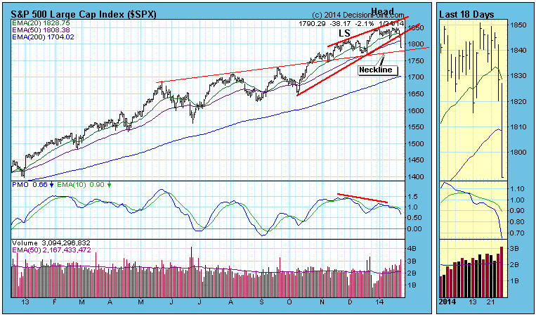
For the formation to be somewhat symmetrical the bounce would have to be fairly shallow and with a duration of several weeks. If the head and shoulders breaks down after the right shoulder has formed, the minimum downside target would be about 1700. As I said, this is only one possible scenario, but things are pretty well aligned for that outcome. But first things first. Let's see if there is a bounce next week.
This bull market has been humming along since March 2009, but we cannot ignore the storm clouds building on the horizon. The technical conditions have slowly deteriorated with the highly influential banking industry ($DJUSBK) reversing hard last week with a long-term negative divergence present on its weekly chart. Those weekly negative divergences tend to be much more significant than those found on daily or intraday charts. Have a look at the momentum issue:
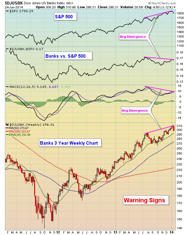
You'll notice two things on this chart. First, as prices on the DJUSBK move higher on the weekly chart, the MACD is actually moving lower, reflecting the convergence of the 12 week and 26 week EMAs. This tells us that longer-term momentum on the buy side is slowing. The other thing this chart tells us is that the bull market rally was being led by banks all the way through late summer. That has changed and the latest overall rally by the S&P 500 actually saw banks underperform on a relative basis - a form of a negative divergence and this is generally a warning sign in my view.
I also view the bond market to be much smarter than the stock market. If you look back at history, you'll see that the 10 year treasury yield and the S&P 500 tend to trend in the same direction. Temporarily, during quantitative easing, that relationship changed and the two moved inversely to one another. But over time, they've tended to trend together. You'll find that many times the 10 year treasury yield ($TNX) will change directions ahead of the S&P 500, providing us a hint of upcoming weakness in equities. That's what happened in early January. Take a look:

The reason for this relationship is quite simple. Traders and investors have a choice to make where to put their money - either in more conservative bonds ahead of an economic slowdown OR in more aggressive equities to take advantage of an expanding economy. The mentality of traders has changed over the past few weeks, especially on the heels of that awful jobs report a couple weeks ago. This could be just a temporary setback and there are plenty of reasons to remain optimistic about equities.
I can tell you one thing, though. History is NOT on the side of the bulls right now. Since 1950, stock market performance from February 1st through December 31st is HIGHLY correlated to January performance within the same year. It's that old Wall Street adage "as goes January, so goes the year". The S&P 500 is currently down 3.14% year to date. We still have a week to go in January, but if the S&P 500 ends January where it is right now, it would place January 2014 in the bottom quartile of all January's since 1950. Since 1950, January has been lower 24 times. Of those 24 years, half have been flat or lower over the next 11 months and the AVERAGE balance of year returns for those negative January years is -0.16%.
That's not a lot to look forward to.
On Tuesday evening, I will be hosting a webinar, "The January Effect", where I'll delve into history and how it's been shown to impact the direction of future equity prices. For anyone interested, CLICK HERE for details.
Happy trading!
Tom Bowley
Chief Market Strategist/Chief Equity Strategist
Invested Central/EarningsBeats.com
Last week's trade was rather bearish from a technical perspective, for many of the US and world indices forged "bearish weekly key reversals" to the downside. To us, this suggests that a larger correction is underway - perhaps -10%...but perhaps a greater percentage. For now, one can only say that a correction is warranted; it appears here - the question is only one of depth.
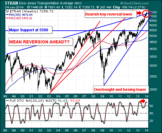
To this end, we are focused upon the Dow Jones Transportation Average ($TRAN), for it was a leader for the rally higher. Quite simply, longer-term trendline resistance connecting the 1998-2007 highs has been tested, and a bearish weekly key reversal lower has formed. Moreover, the 20-week full stochastic has turned lower from overbought levels, which supports further weakness. In terms of next-level weekly support, we have to drop all the way back to the January-2013 breakout point above the previous highs at 5500 - as well as the 180-week moving average. A return to this level would imply a rough -27% decline...which would classify as a clear bear market. A signal this scenario is underway would be a breakdown of trendline support at roughly 6500.
Hence, there is risk in being long at the present time - and rarely does one have the benefit of weekly key reversals to the downside to manage one's risk. Be prepared.
Good luck and good trading,
Richard Rhodes
|
|
|
Recent StockCharts Articles You Might Have Missed
|
|
|
|
|
UPCOMING EVENTS
|
 |
StockCharts University Seminars - Live, in-person training for Technical Investors
|
|
|
|
|
|
|
|
Are you new to StockCharts.com?
|
|
Here are some activities that will help you learn more about our website:
Do you know someone else that would appreciate this newsletter? Please feel free to forward this to other people interested in stock charting. Thanks!
|
|
|
|
|
|
|
|
|
|
|
|
|
| |
|