Hello Fellow ChartWathcers!
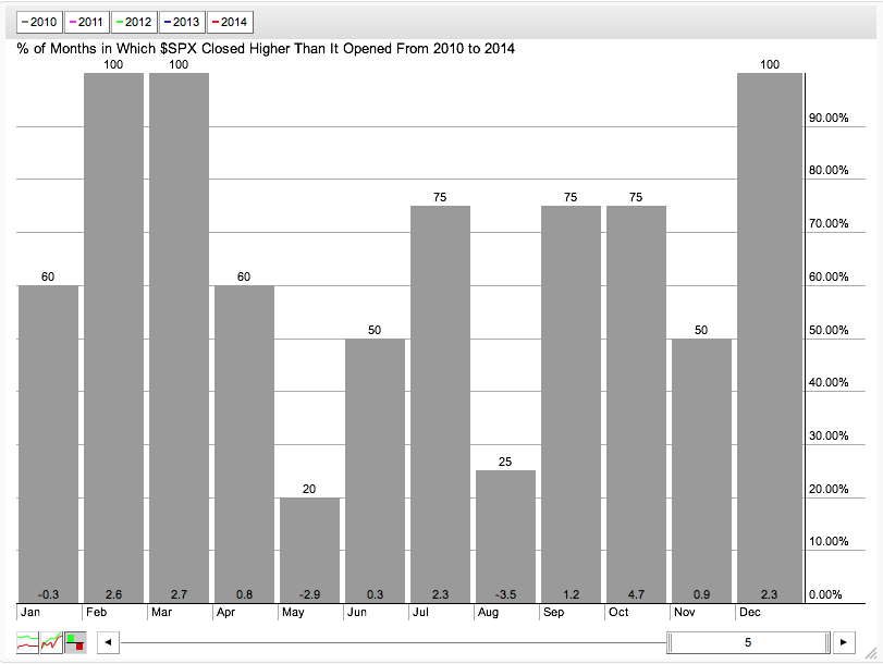
April ended on a fairly positive note with all of the major US average up about 1% for the week. That comes as we head into what has been - at least over the last 5 years - the worst month of the year for the S&P 500. Courtesy of our Seasonality charting tool, here is the phrase "Sell in May and go away" pictured in one chart:
So, to offset (partly) that not-so-cheery news, I thought I tell you about our latest addition to StockCharts.com - the DecisionPoint Tracker Reports!
Tracking Down Great Stocks with DP Trackers
For several decades now, Carl Swenlin - the driving force behind DecisionPoint's timing models - has been generating a prodigous amount of technical data about the markets and the popular stocks and ETFs that make up the market. He has been making those reports available to his members for years. Now, with the merger of DecisionPoint and StockCharts.com, those same reports are now availble to all StockCharts members!
Every day Carl's spreadsheet models crank out 14 specialized reports that summarize and rank 14 important collections of stocks and ETFs. He calls those his "Tracker" reports. Here is a list of each of the different DP Tracker reports:
- DecisionPoint ETF Tracker - 100 of the most important US ETFs
- DecisionPoint ETF Lite Tracker - 30 of the most important US ETFs (in case 100 is too many)
- DecisionPoint SPX Trackers - Six different reports that cover all of the stocks in the S&P 500
- DecisionPoint 152 Blue Chip Tracker - One report contains all stocks in DJIA, DJTA, DJUA, S&P 100 as well as several important Nasdaq large caps. This is my personal favorite (and not just because it has my name in it!).
- DecisionPoint Dow Jones US Sector Tracker - Rankings for the various Dow Jones Industry Indexes
- DecisionPoint Dow Jones 65 Tracker - Rankings for stocks in the Dow Jones 65 Index
- DecisionPoint NDX Tracker - Rankings for stocks in the Nasdaq 100 Index
- DecisionPoint OEX Tracker - Rankings for stocks in the S&P 100 Index
- DecisionPoint Dow 30 Tracker - (You guessed it) Rankings for stocks in the Dow Jones Industrial Average.
All DP Tracker reports provide their information in the same general format. Here is the organization for a typical DP Tacker report:
- A list of all the stocks in the report sorted by name along with their closing price, change, percent change, percent average daily volume, yeild, P/E ratio, and payout ratio. All the symbols are linked to their corresponding SharpChart as well.
- That same list sorted by percent change so you can quickly see the big movers.
- That same list sorted by percent average daily volume so you can quickly see which stocks had unusually high or low volume.
- That same list sorted by yield.
- That same list sorted by P/E ratio.
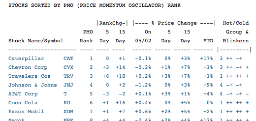
- (Now it gets interesting...) The list of stocks sorted by DecisionPoint's PMO Rank calculations. This table shows which stocks have the top PMO Rank as well as how that rank has changed over the past 5 and 15 days. It also has a collection of "+" and "-" symbols that Carl calls "Hot/Cold Blinkers." Those are too cool for me to explain here but Carl includes an explanation at the bottom of the Tracker report.
- A report about PMO Crossover signals for that group of stocks.
- A report about how that group of stocks is doing if you were trading them mechanically using Carl's Price Momentum Model. To be clear, we don't recommend mechanical trading but you can use these signals to assess the overall health of the market and the various sectors/industries in the market.
- And finally, a report comparing long-term and short-term PMO signals.
Phew! So what do these things actually look like? Here's a sample screenshot:
Now, reading DP Trackers is kind of like shopping at your local supermarket. You don't have to buy (i.e., read) everything in every report to get value. You might spend a little time up front reviewing all of the reports but you will soon discover that only one or two of them require your continued attention. And then, within each report you will soon see that only 1 or 2 sections of the report might be what you want to study closely. So, over time, you will probably develop the ability to find the key data you need very quickly.
So, now that I've piqued your interest, where can you find these amazing reports? In the new "DP Trackers" blog of course. Every day after the market closes, we will be added 14 new articles to that blog - one for each Tracker report. You can now find a link to that blog on the right side of the "Members" page. Or you can just click here to go to the DP Trackers blog.
Here are some things to remember about using DP Trackers:
- They are only available to StockCharts.com members.
- They are updated every day about two hours after the market closes.
- They are not meant to be used as real-life buy/sell signals. The onus remains on you to determine what/when to buy or sell.
- We will be adding articles in the new future to the DecisionPoint blog about how to use and interpret these reports in more advanced ways.
Notes for existing DecisionPoint.com users:
- We will soon be adding links to the associated Tracker spreadsheets to each Tracker report.
- We will soon be adding the various DecisionPoint Reports (DP Alert, etc.) to our website in a similar manner.
- Unlike on the original website, we will be archiving these Tracker reports so you can go back in time and see what things looked like in the past.
Notes to people from the future:
- In the future, we hope to make these reports easier to navigate and customize.
- In the future, we will have ChartSchool articles explaining all of the concepts in more detail.
- In the future, we will let you see more of this information directly on our charts.
- In the future, you will be able to scan most of the information in these reports.
- In the (near) future, Erin will write some more articles on how to use and interpret these reports.
Until then however, please enjoy this huge new addition to StockCharts.com!
- Chip
SITE NEWS
RECENT ADDITIONS TO STOCKCHARTS.COM
- Welcome Martin Pring! - Later this month, Martin Pring will start publishing his market commentary exclusively on StockCharts.com! We are thrilled to have the author of so many must read books on technical analysis joining StockCharts. For an example of Martin's work, check out this article for a sample.
- Something is "RANK" at StockCharts - We've just added the abililty for members to rank your scan results by any expression you want using our Advanced Scan Workbench. This is a BIG deal! Just add the phrase "RANK BY [ expression ]" to the end of your scan. You'll also see the values of the "expression" on your scan results page.
- "Top Advisors Corner" Continues to Grow - This week we're welcoming W.H.C. "Charles" Bassetti - the editor of the famous "Edwards & Magee" book - to our T.A.C. line-up. Click here to see Charles latest post along with all the latest samples from prominent technical newsletters and websites.
- 28 Things Members Need to Know - Finally, here's a great "cheat-sheet" review of key things that all StockCharts members should know about using their account effectively. How many did you know beforehand?
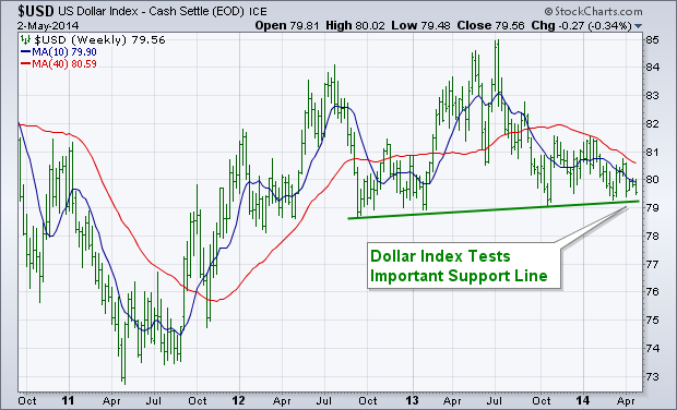
The dollar has been weakening since the start of the year, and is now in the process of testing some important chart support. The weekly bars in the chart below show the U.S. Dollar Index ($USD) testing a support line drawn under 2012-2013 lows. A decisive close below that trendline would represent a technical breakdown in the greenback. There would be at least two possible side effects if that were to happen. One would be a boost in commodity prices (like gold) which generally rise when the dollar falls. Another potential side effect of a weaker dollar is that it favors foreign stocks over U.S. stocks. That's even more true of foreign markets that produce commodities -- like Brazil and Canada. We may already be seeing that happen.
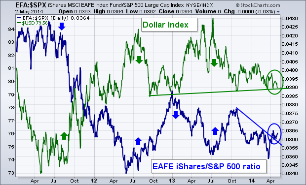
FALLING DOLLAR BOOSTS FOREIGN STOCK PERFORMANCE... The next chart compares the Dollar Index to a "ratio" of EAFE iShares divided by the S&P 500 (blue line). The ratio shows how foreign developed markets in Europe Australasia and the Far East are doing "relative" to the U.S. market. The chart shows that the two lines generally trend in opposite directions. Upturns in the U.S. dollar in the summer of 2011 and the start of 2013 coincided with weaker foreign performance (falling ratio). Dollar peaks in the summers of 2012 and 2013 strengthened foreign performance (rising ratio). The EAFE/SPX ratio has jumped over the last month as the dollar has weakened (see circles). Given that historic relationship, any serious dollar breakdown from here would give a boost to foreign currencies and foreign stock performance along with them.
CHARTCON 2014... I'm looking forward to seeing everyone in Seattle in August at ChartCon 2014. Click here if you'd like to join us.
- John
The Technology SPDR (XLK) and the Finance SPDR (XLF) remain in uptrends overall, but Friday's intraday reversal could signal a near term peak and result in a bearish wedge. The first chart shows XLK hitting a new high in early April and then declining below 35.25 with a sharp pullback. This decline seems deep and drastic, but it is not any deeper than the late January decline, which did not result in a long-term trend reversal. As with the late January decline, XLK recovered after the early April decline and moved right back towards its highs last week.
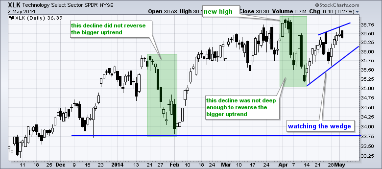
So far the bulls are still in control on this chart and I am looking for signals that would negate this thesis. Enter the bear wedge. At this point the wedge is still just potential and the short-term trend is up as long as the wedge rises. XLK formed a bearish engulfing on Friday and downside follow through would provide the first sign of trouble. As far as the wedge is concerned, a close that breaks the lower trend line would be bearish and argue for a continuation of the early April decline. This would then target a move to support in the 33.75 area.
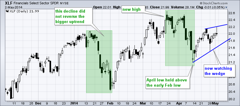
The chart above shows XLF hitting 22.2 intraday and then closing near 22 as Friday's bounce failed. This is just a minor negative so far and I will be watching for downside follow through. As with XLK, a close below the lower trend line of the rising wedge would be bearish and argue for a continuation of the early April decline. I will remain bullish as long as the wedge trend lines hold for XLK and XLF.
Good weekend and good trading!
Arthur Hill CMT
$NYSI OR $NASI, WHICH ONE IS RIGHT?
by Greg Schnell | The Canadian Technician
The summation indexes built by Sherman and Marian McClellan are almost paradoxical this week. The $NYSI and the $NASI usually track similarly.
Which one will be right? Here is the chart.
In Plot 1, the candlesticks are the $NYSI - New York Stock Exchange Summation Index and displayed behind on an area chart is the $SPX.
In Plot 2, the candlesticks are the $NASI - Nasdaq Stock Exchange Summation Index and displayed behind on an area chart is the $NDX.
Historically, when the summation indexes can't stay above zero, the stock market is very weak. When they both thrust up together its very bullish. Small candles for the week after a big move indicate the momentum is waning after moving higher or lower. The difficult period is when they pause with small candles and then continue the trend. You will also notice the lines generally seem to be important support or resistance areas. Pauses around those areas are even more difficult.
Currently, the $NYSI is near the highs, and the $NASI is making new lows. Going back through 2010 to 2014, I have circled 2 other times where the $NASI paused after hitting -300 and continued lower. The $NYSI also had to be declining from higher highs.
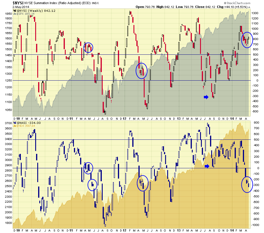
I did not mark the August 2010 occurence as this period was different for two reasons. The August 2010 pullback on $NASI moved quickly down, built a bullish candle on the bottom in early September and went straight up. It was not matched by the $NYSI staying below zero and was very bullish. The $NYSI was way up high. We also had a previous meaningful pullback to lower low levels on the $NASI in June and July 2010.
Lets cover the areas I circled as the market as the $NASI paused with small candles while in negative territory. After making a low below zero in March 2011, the $NASI bounced up to 100 around April 1 and then oscillated inside the first circle. While this happened, the $NYSI was up around 650 but making lower highs. Then the NYSI pulled back making a lower low under 500 the week of May 23. It ended up being a very weak summer. The April May 2011 period was somewhat similar to now in my eye.
Analyzing the 2012 period, the summation indexes both continued to fall, for another 2 weeks after the blue circles. However, the markets had already pulled back significantly so this was the final thrust down. It was an excellent place to get long from the June 4th, 2012 low to the September 18th high which was the Fed announcement of QE 2012. Currently, this is our first push down to -300 levels in over a year on the $NASI. We have now paused for a week and pushed lower on the $NASI to -334. What makes this so tricky is the bullish candle on the $NYSI and an equally bearish candle on the $NASI. I would say the jury is still out, but it is definitely a tricky period where mixed signals abound. The breakdown in bond yields on Friday to close the week leads me to believe we are going lower in the short term, but I could change my mind immediately should a bullish $NASI candle form.
If the May 2011 period was somewhat similar, what would we expect? A few weeks of selling would drop us to the 700 level. Looking left on the chart, when the $NASI gets into the -700/-800 area, you definitely wouldn't want to continue being short even if the market pushed lower. Most of the big selling would appear to be done. It might be more appropriate to get ready for some upside moves in strong stocks at that point unless you are in a 2008 market collapsing period.
I also found this condition of high (800) $NYSI and weak (-50) $NASI showed up in 2007. I did find often at 550 or 600 $NYSI. It was nowhere near the final market top. If you click on the chart, you can slide the date ranger back to the 2006-2008 period to see how the market was behaving. It is also insightful to see the Summation Index signals for an ultimate market top. I love using the date ranger tool. You will notice the new slider bar ( Date Ranger) beside the chart attributes. I did find the condition more often at 550 or 600 $NYSI.
To conclude, rarely are the markets this bipolar. The Summation Indexes are an interesting tool. For more information you can connect with the Chartschool article here. Summation Indexes.
Good trading,
Greg Schnell, CMT
GOLD BREAKS OUT OF FALLING WEDGE
by Carl Swenlin | DecisionPoint.com
Gold broke out of its recent falling wedge pattern, which is the normal expectation for that pattern.
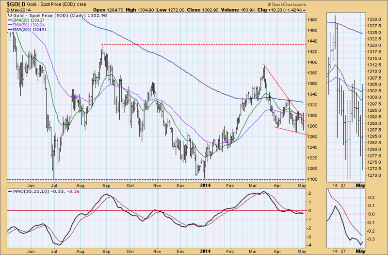
The weekly chart shows price sliding down the declining tops line. Nice that it is staying on top of the line, but it needs to reverse direction.
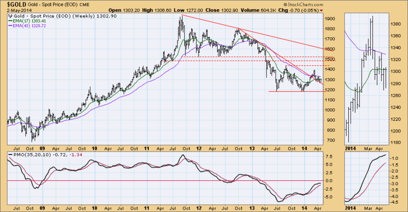
Despite the breakout, as of 4/22/2014 Gold is on a Trend Model SELL signal. The Long-term Trend Model is also on a SELL signal going back to 2/15/2013, so our long-term posture on gold remains bearish.
- Carl
CYCLICALS NOT WORTH THE GAMBLE
by Tom Bowley | InvestEd Central
In 2013, market participants couldn't get enough of cyclicals, or consumer discretionary stocks. The XLY (ETF that tracks consumer discretionary) rose more than 40% in 2013 to lead all sectors on a relative basis. But things have changed in 2014, with many of the strong industry groups in 2013 lagging badly in 2014. A prime example is the Dow Jones US Business Training & Employment Agencies index ($DJUSBE). Take a look at how quickly this industry group has fallen from power:
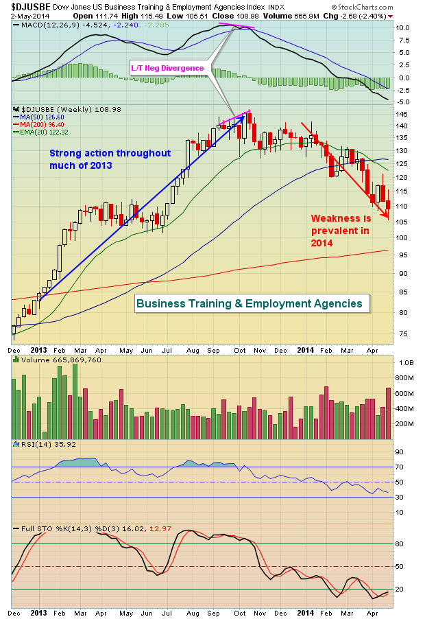
Fundamentally, it doesn't make a lot of sense. Didn't the government just report a resurgence in jobs on Friday? You'd certainly think that business training and employment agencies would benefit from a strengthening jobs picture, right? So what does the reaction to the jobs report tell us as the DJUSBE closes at yet another weekly low? It tells me to remain very cautious and not to believe the breakout threat on the Dow Jones and S&P 500. The declining 10 year treasury yield ($TNX) tells me the same thing. If the bond market doesn't believe the government report, then neither do I.
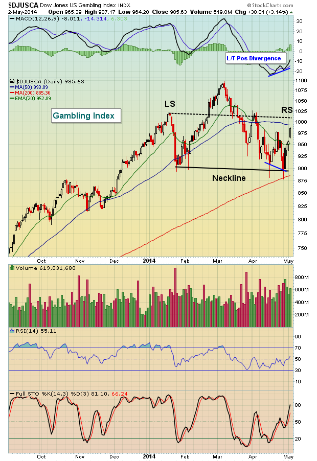
While the DJUSBE has been an obvious laggard among cyclicals in 2014, there's another consumer discretionary group where the storm clouds are beginning to gather. Gambling. We haven't seen a breakdown in this space yet, but the warning signs and topping pattern are clear. First off, last Monday's low printed a right side of a potential neckline that is downsloping from the left side of the neckline. That gives this head & shoulders topping pattern a more bearish feel. Last week's bounce in this group was strong no doubt with heavy volume. This chart is worthy of watching, however, as we await to see whether the 1025 resistance level (left shoulder) can be negotiated prior to a break of neckline support near 900. The latter would be very bearish for gambling stocks. Check out the potential head & shoulders topping pattern:
Historically, the end of April and first week of May tend to be strong and we saw that reflected last week. The same cannot be said for the next 3 weeks that follow, though. On the S&P 500 since 1950, the period from the May 5th close to the May 25th close has produced an annualized return of MINUS 15%. That's 24 percentage points below the average annualized return throughout the year of 9%. Some of this historical weakness could be attributed to profit taking as earnings season winds down. Call it what you will, but seasonal patterns begin to favor the bears after Monday's close and that will simply add to many of the technical warning signs I've discussed the past few months.
One gambling stock showing a bearish head & shoulders topping formation is our Chart of the Day for Monday, May 5th. You can learn more by CLICKING HERE.

As I've revisited my trading journals from many years ago, I've come to realize what an unbelievable transformative journey it has been from part-time investor to full-time trader. I am somewhat startled by the personal evolution I've undergone with respect to both the markets and my personal life. I can't help but feel I've become a significantly improved version of the person I used...
Read More