| |
|
|
|
|
| |
 |
ChartWatchers
the StockCharts.com Newsletter
|
|
|
|
|
|
|
|
Hello Fellow ChartWatchers!
It happened in mid-April and it happend again on the last day of May. The ominous sounding "Hindenburg Omen" signal has been given. Here's the chart:
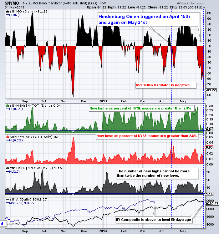
StockCharts members can click here for a live version of this chart.
Here's the definition from our ChartSchool Glossary page:
"Hindenburg Omen: Created by James Miekka, the Hindenburg Omen warns of potential weakness in the stock market. There are three criteria to activate the omen. First, NYSE new highs and new lows must both be more than 2.8% of advances plus declines. Second, the NY Composite is above the level it was 50 days ago. Third, the number of new highs cannot be more than double the number of new lows. The activation period is good for 30 days. Once active, a sell signal is triggered when the McClellan Oscillator moves below zero and negated when the McClellan Oscillator moves back above zero."
So Friday's big drop triggered the Omen signal by causing $NYLOW:$NYTOT (the ratio of NYSE Lows to NYSE Total Stocks) to spike up above 2.8% (the red area graph above).
Given that this is the second time in two months that this signal has occured, ChartWatchers would be well advised to look for additional signs of technical weakness in this market. The rest of this newsletter, unfortunately, has several.
Take care everyone,
- Chip
P.S. I'm really looking forward to seeing everyone next week at the SCU Seminar in Seattle. This will be the first time we present the SCU 102 course that focuses on how to customize your account's settings and ChartLists. There are still a few seats available if you have time to join us.
SITE NEWS
RECENT ADDITIONS TO STOCKCHARTS.COM
- Spring Special Ends Today! - Last Chance to get 2 free months with a 1 year order! Click here to renew
- Upgraded Summary View - Summary View now shows Members the performance of their stocks over 1 day, 1 week, 1 month, 3 months, 6 months and 1 year.
- Blogs Page Redesigned - We need feedback on our new Blogs page that helps you stay on top of our latest market commentary with the most popular articles listed on the right side of the page.
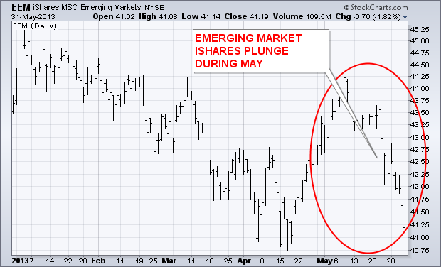
The main story of the past week has been the upside breakout in U.S. Treasury bond yields to the highest level in thirteen months, and the corresponding drop in bond prices. The jump in bond yields during the month of May contributed to heavy selling of dividend paying stocks -- mainly telecom, utilities, and REITS. The ripple effects of the jump in U.S. bond yields extends to foreign markets as well-- emerging markets in particular. Chart 1 shows Emerging Market iShares (EEM) dropping sharply during May (-3.8%). The biggest emerging market losers during 2013 have been countries tied to commodities. Since the start of 2013, Brazil and Russia (which export commodities) lost -9% and -15% respectively. China (the world's biggest importer of commodities) lost -10%. [The EEM has lost -7% during 2013, while EAFE iShares (developed markets) and the S&P 500 rise 5% and 15% respectively]. During those five months, commodity prices fell -4% while the U.S. Dollar Index gained 4%. The rising dollar has been a side-effect of expectations for higher U.S. rates. While the rest of the world is still easing (or just starting to), expectations are building that the U.S. is tapering its quantitative easing program. The stronger dollar has also had a direct negative effect on emerging market currencies, and an indirect negative impact on emerging market bonds.
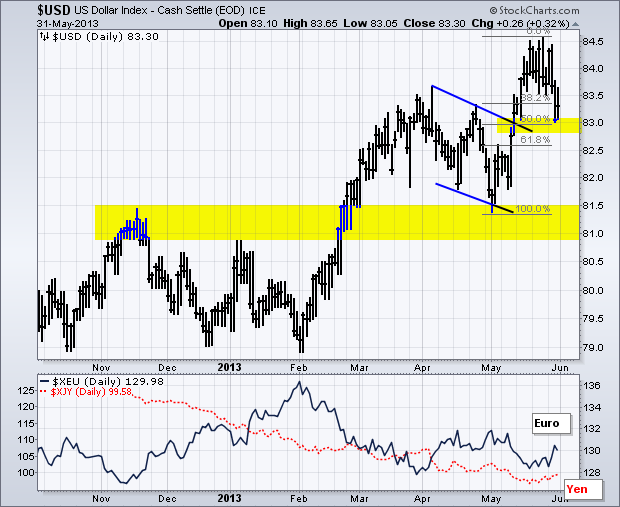
The US Dollar Index ($USD) is in a long-term uptrend, but the index pulled back this week to test the most recent breakout. A strong breakout should hold, while a weak breakout would fold. This is am important test for the greenback as we head into a big economic reporting week. The chart below shows the index basing from October to February and then breaking out with a strong move above 81.50 in late February. Broken resistance turned into support as the index fell back to the 81.50 area in early May. This fall back formed a falling flag/channel and the index then broke resistance with a surge above 83. With this week’s pullback, another test is in store as the index retraces 50% of the May surge.
Click this image for a live chart
The index pulled back this week because the Dollar fell against the Euro and the Yen, which are the two biggest components of the index. The indicator window shows the Euro Index ($XEU) moving above 130 and the Yen Index ($XJY) moving above 99.5 for the first time since early May. The Euro Index is bouncing off support from the late April low. The Yen Index is getting an oversold bounce after a sharp decline. Next week could be pivotal for the Dollar because the employment data will influence the future of quantitative easing, which in turn will affect the Dollar. Strong employment numbers would suggest a tapering in quantitative easing and be bullish for the Dollar. Weak numbers would open the door for sustained quantitative easing and be bearish for the Dollar. The current trend favors a strong employment report. The second chart shows weekly jobless claims in a clear downtrend and the four week average below 350,000.

Click this image for a live chart
Have a great weekend!
Arthur Hill CMT
Some of the most powerful,informative gauges of sentiment towards the market are the Bullish Percent Indexes.
If you are not familiar with them, you can read about them here by clicking on this link. Bullish Percent Indexes
Recently, some of the Bullish Percent Indexes reached extremes that have not been reached before.
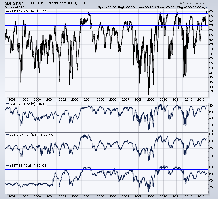
The chart below shows the Major Indexes BP readings. Click here for a link. $BPSPX
These charts are daily to see if there are any pinnacle readings, rather than weekly closes. The $SPX set a new record being above 90%.
The $SPX has never been higher. More than 450 stocks out of the 500 were on Point and Figure buy signals recently.
The NYSE composite is extremely bullish but it has been at or above this level every year for the last 5 years.
The Nasdaq Composite is surging back up to relative extreme levels above 70.
While we are all aware that commodities are out of favor, the Canadian Stock Exchange is hovering around 60%. The $TSX never enjoyed the big pushes in 2012 or 2013.
Looking at some of the individual sectors, The Consumer staples hit a record 100%. This has never been achieved before.
Consumer discretionary appears to be surging to levels not seen since 2010.
Health Care is at rare heights, but it has been up here 3 of the last 4 years.
Utilities are at levels not seen since before the financial crisis. They have recently rolled over off the highs as Staples have.
However, Financials are at 10 year highs and Industrials have only been at these levels once before.
To see the live chart, click here. $BP Sectors

So that is the definition of bullish. As long as the market holds above the 50 level, we are in a big bull market.
Each one of these daggers down or spikes up give technicians trading opportunities.
I have one more sector to show you. The gold miners index. $BPGDM.
StockCharts created a Bullish Percent Index for the miners in 2008. Notice the difference on this chart.
We are stuck in the bottom right corner of the chart.

So one of the ways to help spot a reversal in a sector is the Bullish Percent charts.
If this chart can get some upward momentum it might be time to trade some gold stocks.
Currently it is still depressed. On Friday, $GOLD was down $24 but the miners did not give up much of the gains from Thursday's push up.
A change in sentiment towards the gold mining stocks will show up on this chart. Patient technicians will be rewarded by staying tuned in.
To conclude, this bull market momentum has never been higher. If you are a contrarian, that will make you worry.
If you are a trend follower, you'll notice both the $NYA and $COMPQ bullish percent indexes got substantially weaker before the final 2000 and 2007 tops.
Good Trading,
Greg Schnell, CMT
SECTOR CHECK
by Carl Swenlin | DecisionPoint.com
The S&P 500 component stocks are divided into nine sectors. All the stocks are used, and each stock is only used once. Those sector indexes are typically tracked using the nine SPDRs, which are essentially ETFs that whereby the sectors can be traded. We thought it would be a good idea to take a quick look at charts of those nine sectors.
This article is a bit "chart intensive", but the idea is to demonstrate how you can gather information about a lot of stocks by reviewing their charts. The following charts are taken from one of our chart books.
In the first group we begin with the S&P 500 as the benchmark. It has been consolidating in the context of an extended advance. It remains above its 20-EMA, and remains steady. The seven sector charts in the group are similar to their host index in that they are consolidating above their 20-EMA. Some internal weakness is evident in that their PMOs (Price Momentum Oscillators) have topped, and a few of the PMOs have crossed down through their 10-EMAs.
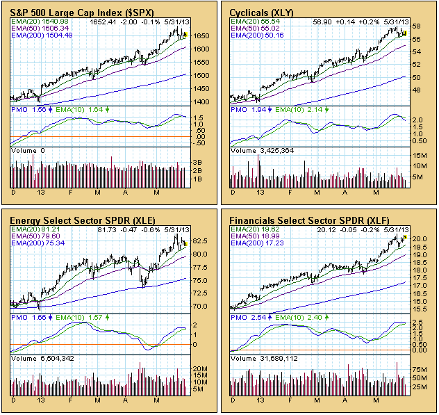

For the two remaining sectors, it is a different story. Consumer Staples has broken down through its 20-EMA and is testing support on its 50-EMA. Utilities is experiencing a serious correction. It has broken through both its 20-EMA and 50-EMA, and appears to be finding support just above its 200-EMA.

Conclusion: The S&P 500 is taking a little break, consolidating its recent advance. The price chart looks solid. Seven of the nine sectors are in similar condition and reflect no serious intermediate-term issues. Only two of the nine sectors are showing price weakness, and only one of those (Utilities) is in bad shape. In short, 78% of the sectors validate S&P 500 price action and do not reflect any serious weakness.
AFTER THE CLOSE UPDATE: So much for writing an article before the market closes. An update is in order. The SPX closed on its low for the day and broke down through its 20-EMA. Consumer Discretionary, Health Care, Energy, and Materials also broke their 20-EMAs. This has happened on most of the charts three other times in the last six months, and is still not a serious technical breach. But it is certainly not a great way to end the week.
- Carl
That's the bad news. The good news is that momentum issues are more of a short-term nature than a long-term one. Still, as traders, we need to respect them just the same.
First, let's take a look at the benchmark S&P 500 index on a weekly basis (think BIG picture):
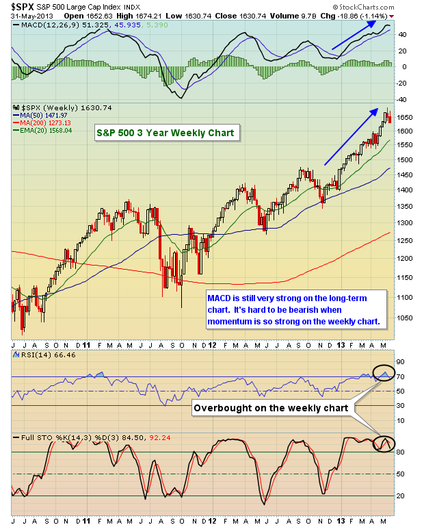
The MACD couldn't be much stronger. As S&P 500 prices have risen to new heights, so too has the weekly MACD. That suggests that the longer-term rally hasn't ended, so keep this in mind during any short-term periods that are more bearish and frustrating. The short-term may prove to be troublesome. While the long-term weekly MACD looks great, that's not the case on the daily MACD. Check out the S&P 500's daily chart and take a look at the hit the MACD has taken lately:

Last week saw a big spike in the Volatility Index ($VIX). Determining where the VIX will top is a big piece of the puzzle in determining where the S&P 500 will bottom. Take a look at this chart of the VIX and note how recent tops have marked short-term bottoms in the S&P 500:

I would look for a top in the VIX in the 18-19 area. If selling really escalates and fear spikes, perhaps we'll see a test of the downtrend line closer to 21. Over the past year, nearly every short-term bottom in the S&P 500 has occurred with a VIX somewhere in the 18-21 range. The late December 2012 period was an anomaly as fiscal cliff talks spooked investors. Once the VIX tops, though, I do expect another rally in equities based on a number of factors, but certainly that strong weekly MACD won't hurt.
I've recorded a video lesson on the MACD and would be happy to share it with anyone interested. CLICK HERE for details.
- Tom
|
|
|
Recent StockCharts Articles You Might Have Missed
|
|
|
|
|
UPCOMING EVENTS
|
 |
StockCharts University Seminars - Live, in-person training for Technical Investors
|
|
|
- Toronto, ON - SCU 101 & 102 July 26, 2013 - July 27, 2013
- New York, NY - SCU 101 & 102 September 20, 2013 - September 21, 2013
- Dallas / Forth Worth, TX - SCU 101 & 102 November 8, 2013 - November 9, 2013
- Dallas / Forth Worth, TX - SCU 310 November 10, 2013
Click here for more details
|
 |
|
|
|
|
Are you new to StockCharts.com?
|
|
Here are some activities that will help you learn more about our website:
Do you know someone else that would appreciate this newsletter? Please feel free to forward this to other people interested in stock charting. Thanks!
|
|
|
|
|
|
|
|
|
|
|
|
|
| |
|