Hello Fellow ChartWatchers!
GalleryView has been a often overlooked gem here at StockCharts going all the way back to the beginning of the website. Today we're pleased to announce an important new feature for GalleryView but first, I wanted to go over exactly what GalleryView is and how it can be used.
GalleryView takes any ticker symbol and shows you four, fixed-format charts for that symbol on one page. The first chart shows you five days of 10-minute candles. The next chart shows you several months of daily candles followed by a chart with a couple of years of weekly data. Finally, we have a P&F chart at the bottom of the page.
In case you weren't aware, you can access GalleryView in any of several ways:
- Click on the "Free Charts" tab and then enter a ticker symbol into the GalleryView box that appears in the middle of the page.
- Select "GalleryView" from the "Create a chart" dropdown in the gray bar at the top of any of our web pages, then enter a symbol and click "Go"
- Click on the GalleryView icon at the bottom of the SharpCharts Workbench.
- Choose to view one of your saved ChartLists in GalleryView mode.
- Click on the GalleryView icon next to any ticker symbol on the Scan Results page after running a scan.
- Select "GalleryView" from any of the dropdowns on the Homepage in the "Top Ten" or "SCTRs" lists, then click on a ticker symbol in the corresponding list.
- Click here
- (There are probably a couple more ways I've fogotten about too...)
The design of the GalleryView charts was a collaboration between myself and John Murphy many years ago. The goal was to have a series of charts that would instantly give someone a complete technical overview for a given stock using the indicates and multi-period approach that John preaches in his books - the short-term picture, the daily view, the longer-term picture and a P&F view. Personally, I think that the default GalleryView charts do an outstanding job of meeting that goal.
Unfortunately, despite the myriad of ways to access it, GalleryView isn't heavily used and many of the people that do use it invariably ask us one question: "How can I change the settings in GalleryView to something else?"
Well, now we finally have an answer for that question. We now allow members to customize their GalleryView charts with any settings/indicators/overlays that they want! It is done via three specially named ChartStyles: "GalleryIntraday", "GalleryDaily" and "GalleryWeekly".
In other words, to change the way that the Daily chart on the GalleryView page looks, follow these steps:
- Login to your account and go to the SharpCharts Workbench and create a chart using daily bars that looks exactly like you want your Daily GalleryView charts to look like. The symbol that you use doesn't matter, just make sure the other settings are all like you want and the chart looks correct.
- Click on the "+" icon located to the left of the chart so that you can save your chart settings as a ChartStyle.
- Enter the name "GalleryDaily" in the "ChartStyle Description" box that appears and then click the "Add New" button to save the style into your account.
That's it! Now visit any of our GalleryView pages and you should see your new settings/indicators in the Daily chart slot. You can also repeat those steps for "GalleryIntraday" and "GalleryWeekly" to change those charts. Please note the following restrictions:
- The Intraday chart will still only show 10-minute bars. Similarly, the Daily chart only shows Daily bars and the Weekly chart only shows weekly bars.
- The P&F chart cannot be customized unfortunately.
- The width of the charts will remain fixed at the current width of 800 pixels.
Beyond that, anything goes! Here are some tips for creating effect Gallery styles:
- Use the "Fill the Chart" range option to prevent the bars on the chart from getting scrunched.
- Consider using different color schemes for each Gallery style to remind you that they contain different bar periods.
- Don't add too many indicators to the Gallery charts otherwise the page will get very long.
In conjunction with this announcement, we have also increased the number of ChartStyles that members can have in their account from 30 to 35. In addition, we have increased the number of StyleButtons that members can create from 9 to 12.
So what might this mean for people that like to study lots of charts in different timeframes? Well, it means that you can now study lists of ticker symbols in GalleryView instead of 10-per-page view and still see your own custom indicators and overlays. Depending on how you do your analysis, it could become your preferred way of reviewing your charts.
Enjoy!
- Chip
P.S. Watch for an announcment in my blog about customizing CandleGlance charts soon.
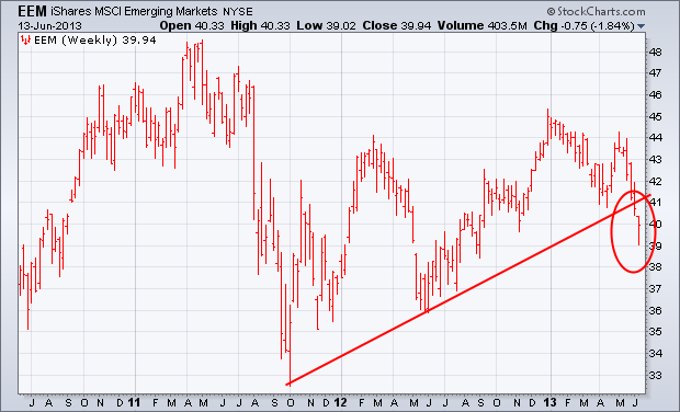
The biggest threat to the global stock rally is coming from emerging markets. The weekly bars in the chart below show Emerging Market iShares (EEM) falling to the lowest level in nine months. It has also broken a support line extending back to the fourth quarter of 2011. Emerging market bonds and currencies have also fallen sharply. My June 1 message explained that rising U.S. Treasury yields undercut demand for emerging markets by reducing the appeal of higher-yielding foreign assets. I also expressed concern that weakness in global markets might cause some profit-taking in the U.S. So far, U.S. stocks have shown amazing resilience in the face of foreign selling. That may change, however, if foreign markets don't stabilize soon.
- John
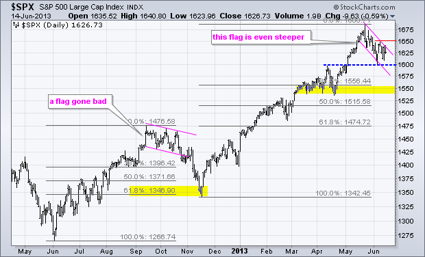
The S&P 500 got a two day bounce last week and a nice surge on Thursday, but fell back Friday as it met resistance at 1650, which is now the short-term level to beat. Overall, notice that the index formed a falling flag type correction the last four weeks. After a sharp advance from mid April to mid May, the index was overbought and ripe for a rest. The falling flag provided this rest and alleviated oversold conditions with a modest pullback. Notice how broken resistance in the 1600 area turned into support.
Click this image for a live chart
The flag is still falling and has yet to be confirmed as a bullish continuation pattern. A falling flag also took shape in September-October 2012. Instead of breaking out for a continuation higher, the index broke the lower trend line and plunged in November. This decline retraced 61.80% of the prior advance before finding support and reversing. The bears have a short-term edge as long as this flag falls, which means further weakness is possible. The March-April lows and 38.2% retracement mark next support in the 1540-1550 area. An upside breakout at 1650 would take this downside target off the radar and project a move to new highs.
Good golf and good trading!
--Arthur Hill CMT
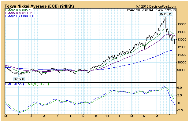
The Tokyo Nikkei Average has been in another free-fall since the top in May, falling -22%. Before we get to the long-term chart, let's look at the one-year daily bar chart.
The average rose +82% in just six months in a parabolic move that was doomed from the start. They almost always are. When a parabolic move breaks, as it did in May, the speed of the decline can be catastrophic. The downside expectation is for prices to return to the level of the basing pattern that preceded it. In this case between 8300 to 9100. That is not a prediction, just the level we at which we might expect to start looking for a tradable bottom.
As dramatic as the the above chart is, it is hard to beat the long-term chart below for drama, when we look at the parabolic rise from 1970 to the all-time high in 1989. Over the last decade prices seem to have found a base at around 7000, instead of 5000, where the pre-parabolic base was. For this we can thank the super-human efforts of the government to avoid the inevitable by printing money. After over 20 years of avoidance, their economy has still not recovered, and recovery is nowhere in sight.

Conclusion: Long-term charts put things into perspective, and the recent, exciting six-month rally is shown to be a mere blip in a long, grinding trading range. Also, the possible downside is at least 7000, or maybe 5000.
- Carl
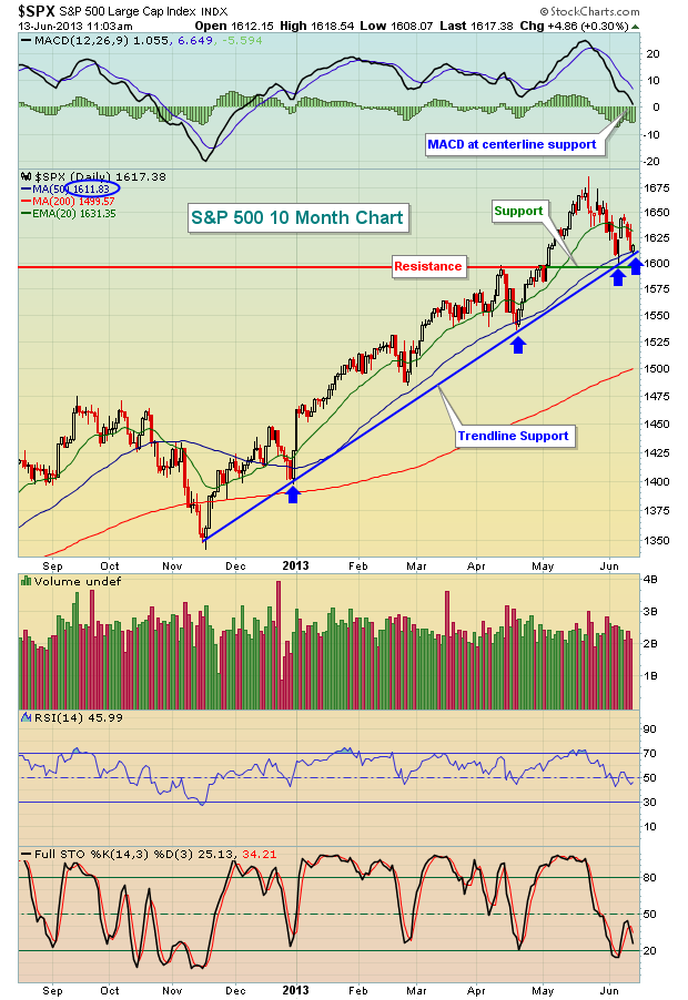
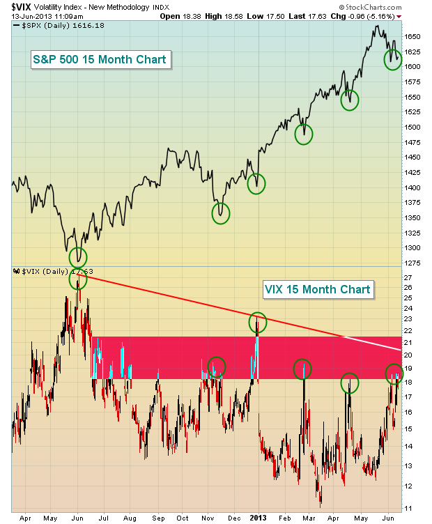
Volatility plays a role in any market environment, but I always look to key areas of resistance on the VIX to help identify tradable bottoms on the S&P 500. In my last article on June 1st, I suggested that the 18-19 resistance on the VIX could prove to be key. Thus far, it has been. The VIX has hit this resistance level with the S&P 500 also sitting almost squarely on trendline, price and moving average support. If the S&P 500 were to lose these support levels, we could see the VIX push up to the 22-23 area, a much bigger level in my view.
Check out the confluence of support on the S&P 500:
As all of this support comes together on the S&P 500, take another look at the VIX:
An area of the market I follow closely to suggest whether a stock market rally (or decline) is sustainable or not is the semiconductor ($SOX) group. The SOX had issues recently as daily momentum showed signs of slowing. The MACD clearly printed lower lows while the index itself was moving to fresh highs. Check this out:
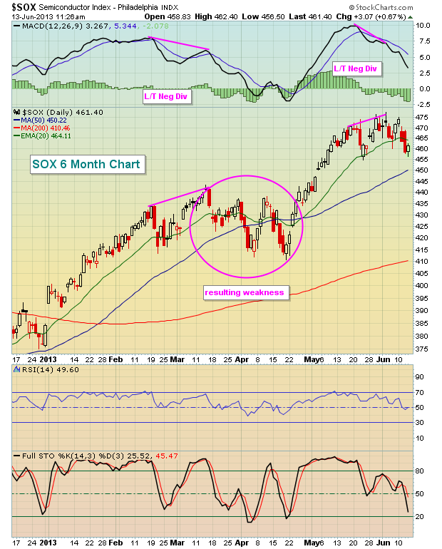
While this chart may look ominous, I'm featuring a much more bullish SOX chart as my upcoming Chart of the Day. One critical move there could begin the next leg higher in the S&P 500.
CLICK HERE for more details.
The US Dollar has declined rather sharply over the past 2-weeks, which given the scope of the decline - has likely pushed it into a bear market. The reasons for this could be myriad; or simply that the Fed will continue upon the bond-buying campaign far longer than the consensus believes. Now, this doesn't mean they will not taper, but perhaps the new Fed Chairman will extend this campaign through 2014...which means that the market is pricing the appointment of Vice Chair Yellen as the Fed Chairwoman.

Regardless, the technical picture is breaking down. The decline has violated the flattening 180-day moving average, which in the past has led on balance to more significant declines. Moreover, the 40-day stochastic has turned lower in negative divergence with prices. This posits a continuation of the current weakness, with major support at 79 the short-term target. Longer-term, one can expect a test of the lows at 73 to materialize soon and perhaps faster than anyone anticipates.
Therefore, sell USD rallies. Our favorite currency to the upside...the Swiss Franc.
Good luck and good trading,
Richard